• Skip to main content
  • Skip to footer
  • Home

The May 13 Group

the next day for evaluation

  • Get Involved
  • Our Work
  • About Us
You are here: Home / Archives for allblogs / freshspectrum

freshspectrum

Apr 06 2022

How to create bar charts in Canva – 5 ways

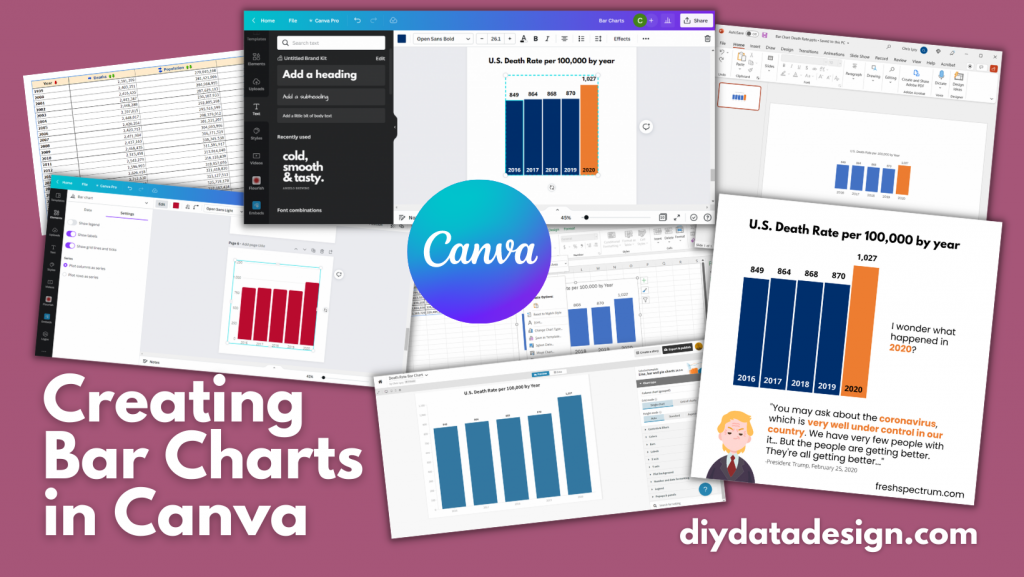
Trying to create an infographic in Canva that features a bar chart?

How will you go about creating that chart? Just a hint, there is definitely more than one way.

In today’s post:

How to create bar charts for your Canva visuals using…

  • the Canva Chart Builder;
  • Excel;
  • PowerPoint;
  • Flourish;
  • Pixel Math.

But first, let’s talk about the Data I’ll be using for this tutorial.

Creating Bar Charts in Canva - Featured Image

The Data

For this set of charts I’m going to use some CDC data on the US death rate per 100,000 for the years 2016 – 2020. I pulled the data from the CDC’s WONDER database.

CDC underlying cause of death data used to create my bar chart tutorials.

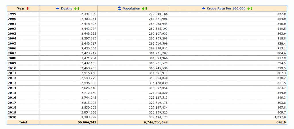
Citation: Centers for Disease Control and Prevention, National Center for Health Statistics. Underlying Cause of Death 1999-2020 on CDC WONDER Online Database, released in 2021. Data are from the Multiple Cause of Death Files, 1999-2020, as compiled from data provided by the 57 vital statistics jurisdictions through the Vital Statistics Cooperative Program. Accessed at http://wonder.cdc.gov/ucd-icd10.html on Apr 6, 2022 9:20:01 AM

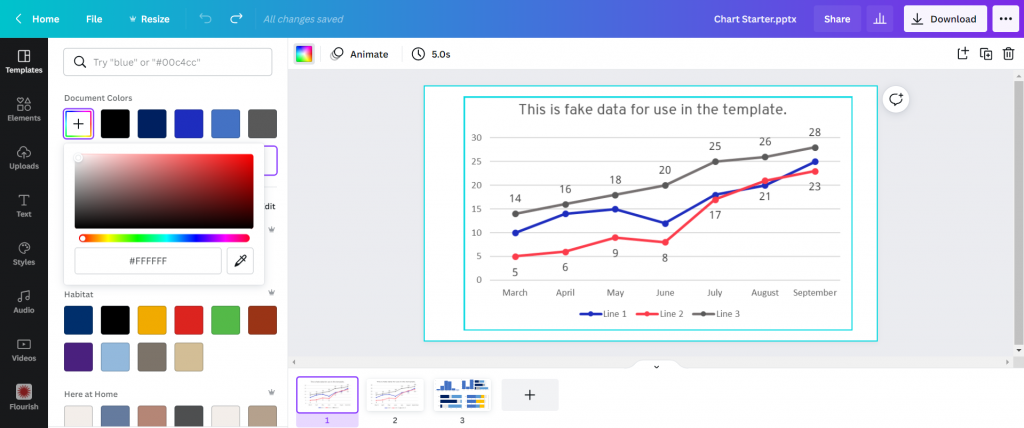
The Canva Chart Builder

So Canva has a built in chart creator. Let’s just go ahead and start with that. You’ll find it in the Elements tab by searching for Charts.

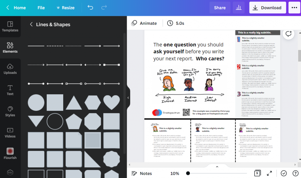
For this bar chart I went with the basic column chart.

How to find the chart builder in Canva.  [Screenshot]

The chart populates with some fake data. I went ahead and cleared that data, then pasted in my own. You’ll also notice that you can also directly connect to data using Google sheets.

Adjusting bar chart data in Canva. [Screenshot]

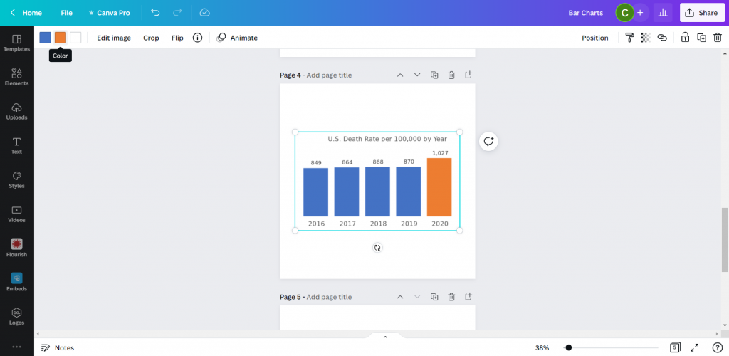
Canva’s chart creator is nothing fancy. There are very few things that you can do with the chart itself.

Settings in Canva's chart builder. [Screenshot]

Conclusion. It works in a pinch, but you have far less control over the chart than you would with other tools. One of the things that I found particularly annoying is the inability to isolate a single bar and change it into another color. That’s something I do all the time with bar charts, and I’d have to hack the bar chart a bit with additional elements to make it look the way I want.

Starting with Excel

So I think at this point most evaluators would just fall back to their comfort zone and open up Excel. Even if they were ultimately trying to create an infographic using Canva. So let’s walk through how you might do that.

Simple Copy Paste

Easiest way to move a chart from Excel to Canva is just to Copy the chart in Excel then paste it into Canva.

Copying charts out of Excel. [Screenshot]

And if you like the way your chart looks in Excel, this works just fine.

Pasting charts into Canva. [Screenshot]

One thing to note is that you lose all of your ability to edit pieces of the chart post-Excel. This is because the copy/paste approach uploads the chart as a PNG file, which is a type of pixel based image.

This could be a good thing for you, because you don’t have to worry about any of your elements changing. But that also limits your ability to tweak the chart, and you could ultimately end up with a pixelated image.

Chart pasted into Canva as a PNG.[Screenshot]

Exporting an SVG

Another way to go would be to export your chart from Excel as an SVG. Simply right click on your chart and click “Save as Picture.” Then set the file type to SVG.

Saving Excel charts as SVG pictures. [Screenshot]

When we drop the svg into Canva, we end up with an image that can be stretched or shrunk without a loss in quality. Although the fonts you use might look a little wonky if the same font is not also found in Canva.

You also get very basic color controls (i.e. I can change the blue color to any other color).

Importing an SVG chart into Canva.  [Screenshot]

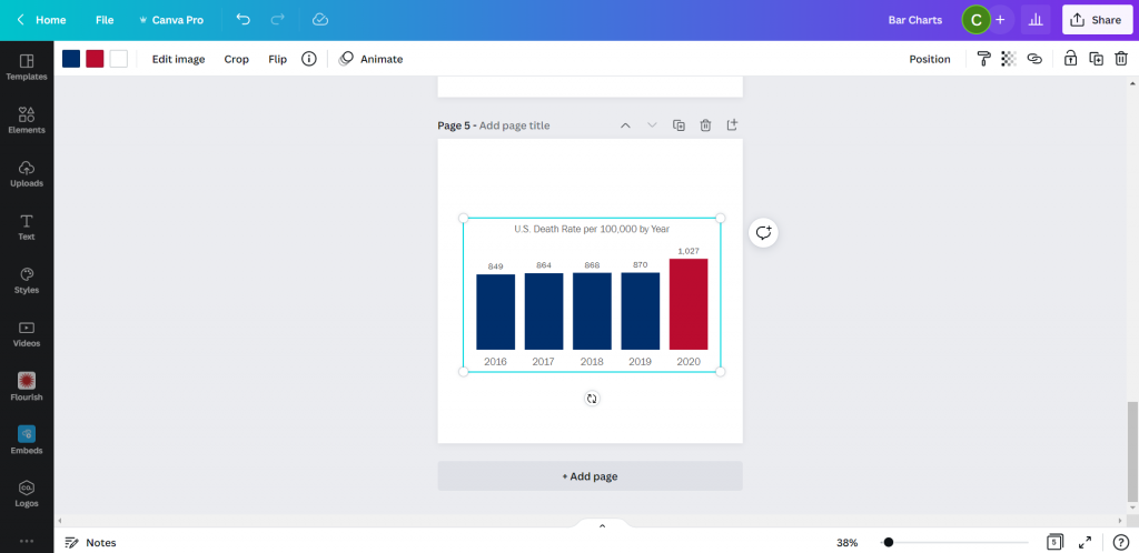
There is another little trick we can do with this. Simply color a bar you want to highlight in Excel with a different color. Then take the same step to save it as an SVG.

Saving an SVG chart with a highlight color in Excel.  [Screenshot]

Now when you drop the SVG into Canva, you’ll be able to change both colors!

Pasting a two color SVG chart into Canva.

See, here is the same chart but I turned the lighter blue to a darker blue and the orange to a red. Without needing to go back to Excel.

Changing the colors of an SVG chart in Canva.

So if that works, why not just rainbow color your chart?

This might be the only time I ever suggest you try to multi-color your bar charts.

Creating a rainbow color bar chart in Excel.  [Screenshot]

Unfortunately, even though the chart ends up in Canva as an SVG, there must be some color limit. Because instead of being able to change all the bar colors, I now can’t change any of them…

Adjusting a multi-color SVG chart in Canva.  [Screenshot]

Conclusion. Sure, it works. But you’re really still just creating the chart in Excel.

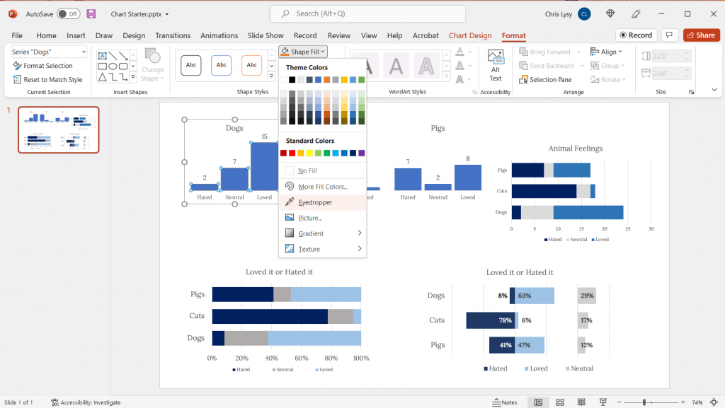
Starting with PowerPoint

Okay, so I know it may seem like PowerPoint and Excel charts would convert the same way into Canva. But that’s not entirely true.

I took my Excel chart and pasted it into a new PowerPoint then saved the file. Then I uploaded the PowerPoint pptx file right into Canva.

Pasting an Excel chart into PowerPoint  [Screenshot]

At first it was buggy, but then I changed the bar color and the chart appeared. Not only did it convert, it converted directly into Canva’s chart creator format. With all the data embedded behind the scenes.

Importing a PowerPoint chart into Canva.  [Screenshot]

So now it works just like Canva’s chart creator.

Changing the color of a powerpoint chart inside Canva.  [Screenshot]

Conclusion. Yes, it works. But it ends up working just like it would with Canva’s built in chart creator. Meaning a reduced ability to change much at all.

Using Flourish

So Canva actually acquired the data visualization chart builder Flourish. You can access the integration down at the bottom of the menu page where it says “More.”

Finding the Flourish app inside Canva.  [Screenshot]

Using Flourish (which is currently Free to use) is more an integration than something you would do directly within Canva. That means you have to register for a free Flourish account and connect it to your Canva account.

Then from there, the easiest way to start is by choosing a template.

Choosing a template inside Flourish  [Screenshot]

I chose a simple column chart.

Even though it’s a simple chart, there are tons of options you have control over. This can be both a benefit and a curse. Because you have to sift through all the options to find the ones you want to change. It can be a bit overwhelming.

Creating a simple column chart using Flourish  [Screenshot]

After you are done creating your chart you can click the “export & publish” button to add your chart to Canva.

Adding a Flourish chart to a Canva presentation.  [Screenshot]

Ultimately though, once you connect your Canva and Flourish accounts, you have access to all of your Flourish visualizations from directly within Canva.

All changes you want to make to your chart, except for size and placement, need to be done inside the Flourish editor.

Finding your connected Flourish charts inside of Canva.  [Screenshot]

Conclusion. Using flourish might seem like overkill, and sometimes it will be overkill. But you can do things with Flourish that you can’t do with a lot of the previously mentioned tools. Flourish can even be used to create interactive visuals, which will then live within your Canva designs. This means you can use Flourish mixed with Canva to build full fledged interactive dashboards.

Pixel Math

Okay, so I don’t know if it’s because I’m a big nerd, but this tends to be the way I create most basic charts. In a nutshell, it’s like a digital version of using a pencil alongside a ruler.

I start with a shape (usually a rectangle).

Using shapes to create a chart in Canva  [Screenshot].

Then I will measure the length of that shape based on the number of Pixels shown when I stretch the image on Canva. The current pixel dimensions of my square canva page are 1080 by 1080. My 5 bars will range in size from 849 to 1027. Each person gets a pixel and I still have a little room at the top and bottom of the page.

Measuring a bar using Pixels in Canva  [Screenshot]

You’ll the see the sizing guide pop up as you stretch a bar. I’ll create the first bar, then copy and paste. Zooming into the page will help you size the bars better as you get closer to your target number of pixels.

Zooming in to help measure a bar using Pixels in canva  [Screenshot].

Then once I’m done, I have a chart that’s way too big (or sometimes too small). But this is easy enough to solve, I just group all the bars together.

After you do your first sets of pixel measurement, you can group your bars and scale them up or down. Just keep in mind that if your numbers are not set (as in you will likely be changing the data in your chart at some point) you are not going to want to change the scale.

The measured pixel math bar chart.  [Screenshot]

Doing my charts this way I have almost complete control over their style. I just need to overlay some text for the labels and title.

Grouping and adjusting the pixel math bar chart in Canva.  [Screenshot]

And then once you have your chart finished, just keep the elements grouped and you can move it all around the page, stretch it, shrink it, change the colors, or change the fonts.

Turning the bar chart into an infographic in Canva.  [Screenshot]

Conclusion. Okay, so this isn’t for everyone. With pixel math you are relying on your own mathematical skills and grasp of geometry. But I find for simple charts, sometimes it’s easier to just measure out some bars than try to bend a chart creation tool to your will.

Parting thoughts

So which chart creation tool is the best?

Probably none of them. I really wish the native Canva chart builder was better. Just being able to isolate the individual bars would make it far more effective.

There are also tons of other chart creation tools out there that can be used alongside Canva. From R to Tableau to Google Sheets.

Just pick the tool that works best for you.

Bar chart showing 5 years of data on the US death rate per 100,000 by year.  In 2016 the rate was 849, then it was 864, 868, and 870.  In 2020 that number jumped to 1,027.

I wonder what happened in 2020?

There is a quote from President Trump at the bottom of the image, "You may ask about the coronavirus, which is very well under control in our country. We have very few people with it...But the people are getting better. They're all getting better..."
President Trump, February 25, 2020.

Written by cplysy · Categorized: freshspectrum

Mar 23 2022

How to design a research poster using Canva

Today’s post is a big one about designing research poster presentations using Canva. Even if you’ve never created a research poster in your life, I think this post can really help you get a solid jump on your next design.

Because ready or not, it’s happening. After a long COVID-19 break, a bunch of evaluation conferences are going to be live again. And with live conferences you also get actual live presentations. Including those big poster presentation nights.

In this post:

  • I’ll show you how to create a research poster, including a new approach I really appreciate.
  • Grid based design and why planning your poster in content blocks is a good idea.
  • A bunch of alternative poster styles that use the same underlying grid.
  • Free research poster Canva templates, and some tools to help you design your next poster.
Designing Research Posters using Canva by diydatadesign.com

The research poster presentation mindset.

So imagine yourself in a room standing in front of a research poster surrounded by people just like you. The attendees at the session might be holding drinks and are continuously running into old friends. Some glance at your work and keep right on walking. Others might ask you a question or two as they peruse your poster.

And there you are, standing in front of your poster that you’ve agonized over. The one you had to carry in a big tube through a crowded airport and then inside a crowded airport shuttle.

A research poster isn’t some stand alone document or social media infographic. It’s your wingman. Your partner in crime. It stays by your side, supporting the communication of your work. A better poster design won’t just help you communicate, it can also make your time in that room feel a little less awkward.

The usual approach to research poster design.

freshspectrum cartoon by Chris Lysy.
"Wow, that's a lot of words."
"Can you believe I was able to fit my entire master's thesis on a single research poster?"

Most research posters tend to just be adaptations of a research paper. As such, a lot of academics will simply take their paper title and put it at the top of the research poster. They will then create sections on the poster that mirror the sections in their paper.

Ultimately they end up with a research poster outline that looks just like a research paper outline. This is definitely not my preferred approach to research poster design. But if this is the way that you decide to create your poster, at least take some basic steps to ensure it’s readable.

Years ago, Stephanie Evergreen and Chris Metzner created a quick little guide on how to design a research poster for the American Evaluation Association’s Potent Presentations Initiative. Definitely check it out if you just want to polish an already created poster.

How to create a better research poster in less time.

I really like this poster approach outlined by Mike Morrison.

The gist, if you don’t feel like watching the video, is that research posters should really be designed more like billboards than infographics.

Because during a poster session there is a lot of competing information. Instead of trying to capture and retain attention from just a few attendees, design your poster to quickly deliver your biggest point. Reaching more people, but with a very specific point. And then use a QR code to link to the full paper and other information.

What is the standard size for a research poster?

Okay this is kind of a trick question. There are standardish sizes, but the people who decide on the size are almost always the ones putting on the conference.

In the past at least, the American Evaluation Association has required a square 44 inch by 44 inch design. Other common sizes include 36 inch tall by 48 inch wide and 42 inch tall by 56 inch wide.

But before you start designing, always check the specific conference’s website and follow their design process.

A research poster design process using Canva.

So for my research poster designs I’m going to use Canva.com.

Research Poster process

Instead of starting with a base template, we’ll just click on the “Create a design” and click custom size. I’ll be creating a square 48 inch by 48 inch poster.

Creating a custom design size in Canva.

Designing research posters with a Grid.

Research posters really just post a layout challenge. Everyone gets the same amount of space, you just have to choose how you will use that space.

I’ve created a couple of basic grids to use with my 48 inch square research poster. The grids themselves are just a series of square shapes. A lot of designers might just stick with 3 columns, but I like to have horizontal guides as well.

A 3 by 3 grid is going to give me 9 total blocks.

Creating a 3 by 3 grid in Canva.

A 4 by 4 grid is going to give me 16 total blocks.

Creating a 4 by 4 grid in Canva

The more blocks you have, the more flexibility you have in your design. But it also increases the complexity. Just remember that there is still a lot that you can do with a 3 by 3 grid.

Using content blocks to design your research poster.

I like to consider each square in my grid as a content block. I can order my overall design by changing the colors of individual blocks, or by deleting them.

Let’s say I want to create a large 2 block by 2 block panel for my big message. I just delete those four blocks in the upper left corner.

Tweaking your canva grid.

Now I can start designing by adding content.

Adding Content to your Canva grid.

Since I’m not at the point where I have the content all figured out, I can either fake some content or use some Lorem Ipsum filler text. There are some fun ones on the web you can find with a Google search. For my templates I’m using some filler text from Office Ipsum.

Template with filler text.

What size font should I use on my research poster?

I’ve seen some guidance that you should use at least 24 pt fonts. I usually bump it up a bit more.

I’ll use a body font, one or two sub heading fonts, and a large main message font. For me that ended up being 32 pt, 48 pt, 64 pt, and 128 pt. I also just used Open Sans (as it’s a really versatile font and I plan to just share out the templates).

Research poster examples.

Okay, so now I’m just going to play around with the grids and different content types. None of this is a real presentation, but I think you’ll see the utility.

Let’s start with the 3 by 3 grid.

This one is really simple, it uses 4 blocks for the big message content in the top left. It uses 2 blocks for the sidebar 1, 2, 3, content. And it uses the final bottom three blocks to expand on the image.

3 by 3 grid research poster version 1

Here is an alternative. It uses the same amount of content, but the order is switched around. I also added a different visual element to highlight the message in the middle.

3 by 3 grid research poster version 2

Here is a third alternative. It uses a little less content (The 1,2,3 sidebar is reduced by about 225 words) but uses a big of negative space and color to make the big message stand out.

3 by 3 grid research poster version 3

There is no perfect one way to create any design. Try different things out, pick the one you prefer. Each orientation will likely change the way the information is perceived at least a little, even with the same content. If you don’t trust your eye, ask others for their insight. But just remember that everyone’s taste is a bit different.

Now let’s play with the 4 by 4 grid.

So with the 4 by 4 grid I’m just going to use a lot of filler text and images. I just want you to get a sense of how this works, and the kinds of things that you can do.

In this example we use a series of charts (small multiple). This let’s you share a lot of data but still make it easy to understand. Each chart block uses 1 content block (out of 16). I used the two in the upper left for the big point. I used the two in the upper right for an image and the signature content.

4 by 4 grid small multiple chart research poster

Sometimes you’ll have a lot more text to share. Just remember that this entire fairly word heavy research poster still has under 1,000 words. If you push your word counts too high, you’re going to start making your poster super wonky.

4 by 4 grid text heavy research poster

Perhaps you are more a qualitative evaluator or researcher. Designing like this is really similar to designing a photo collage or scrapbook. It can be really efficient way to mix pictures and quotes.

The middle is 4 blocks. Then there are 6 picture blocks and 6 text blocks. Each text block has just over 100 words (including the subtitle).

4 by 4 grid qualitative research poster

Finally, sometimes you just want to make a big point and shout it across the room. In this example I increased the font size to 250. We still have some smaller 100 word blocks on the bottom, but this poster is really designed more to lead to an external document or website.

4 by 4 grid billboard research poster

Research poster templates.

So do you want all the Canva templates I shared in this post? Including the 3 by 3 and 4 by 4 grids You can get access to them here:

Research poster canva templates

Want the PowerPoint Research Poster Templates Instead?

Since I used a few premium Canva stock images I didn’t feel comfortable sharing the Power Power Templates. But here is the thing. All you have to do is go into Canva and save the set as a Microsoft PowerPoint.

If you don’t have Canva premium just switch out any premium stock photos before you download. This will make it a free download and not violate Canva’s terms.

Canva download as PowerPoint.

Design tools that can help support the research poster design process.

Canva Stock Icons

Canva has an integrated icon library. There are millions of icons which you can check out here.

Canva Images

Canva has an integrated stock photo library. You can also peruse the stock images here.

Canva Color Wheel

I wrote a whole post the other week on Color featuring a bunch of Canva tools. If you don’t already have colors set before you start your design, I suggest you check it out.

Canva Presentation Templates

Lots of research poster presentations also require handouts. Why not try making a simple slidedoc to go alongside your poster? Just use a Canva Presentation Template but add a bit more text. Enough that the person with the handout can read through without having you there to explain everything.

QR Code Monkey

Need to create a QR code for your poster? Here is a nice free site > qrcode-monkey.com

QRCode Monkey Screenshot

Written by cplysy · Categorized: freshspectrum

Mar 16 2022

How to create logic models and theory of change using Canva.

So by now, you might have guessed that I really like Canva.

Usually I consider myself to be software agnostic. I’m always on the lookout for the best tool for the job. But the thing is, now-a-days, I find that I’m just almost always in Canva. It’s just made my designer life that much easier that I find myself always using the tool.

  • Infographics > Canva
  • Social Media Images > Canva
  • Reports > Canva
  • Videos > Canva
  • What about Logic Models and Theory of Change? I’m pretty sure you can guess.
Canva Logic Models & Theory of Change

In today’s post.

  • A rundown of creating (and adapting) a basic results chain logic model using Canva.
  • A rundown of creating (and adapting) a basic theory of change using Canva.
  • A rundown of creating (and publishing) a web-based interactive logic model using Canva.
  • A couple of Canva templates so that you can start where I finished.
Zombie evaluators cartoon by chris lysy of freshspectrum. 

"Yes, I get it, you all want to eat brains.  But why do you want to eat brains? What is our intended outcome here?"

Guides for developing logic models and theory of change.

Just in case it wasn’t obvious, this is not a guide on how to fully develop a logic model or theory of change for your program or organization. There is a lot of hard thought work behind the scenes that goes into developing models beyond the finished diagram.

  • Here is a UNICEF Methodological Brief written by the amazing Patricia Rogers – Theory of Change
  • Here is a well-loved guide (created in 2004) from the W.K. Kellogg Foundation – Logic Model Development Guide
  • This one is for those who want the CDC Approach to Creating Logic Models
  • If you want an overly simplified approach, I created a guide – How to create a basic logic model [activity book]
  • Or perhaps you would like to create a Theory of Change using guidance from NCVO – How to Build a Theory of Change

Now that that’s out of the way, let’s jump to putting the metaphorical pen to paper.

A Simple Results Chain Logic Model – Example from the W.K. Kellogg Foundation

Kellogg Foundation Logic Model Example

Okay, so as a starting point I’m going to use this example logic model found in the Kellogg Foundation logic model guide.

Recreating the Logic Model using Canva

When it comes down to it, most basic logic models are really simple to design. It’s just a bunch of shapes, arrows, and lines. This is so many people just end up creating these things in Word or PowerPoint. Because it’s easy enough to do.

Kellogg Logic Model Created with Canva

So that’s where I started. I’ll just replicate a logic model from the guide using shapes and text boxes.

Logic Model created in Canva

It didn’t take too long to create something that looked really similar to the original. And because it’s now in Canva, I have a lot of download options. If I just want an image I’ll usually download as PNG. If I want something printable, then I’ll download as a PDF Standard.

Exporting the logic model to PDF

Adapting your Canva Logic Model

The nice thing about Canva is that it’s pretty easy to duplicate and adapt your logic model, trying out different styles. I find the outline boxes to be a little visually jarring. So instead I replaced the outline boxes with some solid color light gray boxes.

Alternative Canva Logic Model Style

The shapes exist separately from the text, so you just insert the rectangle and send it to the back to set behind the text blocks. If you spend a lot of time moving the boxes around it’s a good idea to group the individual text/shape pairs.

Grouping items in Canva

Color coding the logic model.

Once you have the base shape and text there are all sorts of alterations you can do to the design. I know there are a lot of evaluators who like to color code different elements. That’s certainly simple enough to do.

Canva Logic Model Alternative

Occasionally you’ll want a softer color, especially for background elements. One way to do that is just make the boxes slightly transparent.

Changing colors in Canva

Photo annotating the logic model.

If you find yourself creating a lot of different logic models annotating with some photographs and background elements can really help you to differentiate. Especially if the photographs pair well with the actual project. I created this corny version with just some Canva stock photos.

Canva logic model with photo annotations

I use a Canva a lot, so I’ve made the investment in a pro account (~$10/month at the time of this post). Given the amount of stock content I use and the bonus features, this is well the worth the subscription cost. One of the features I like to use is the background remover. It’s a nice way to make certain stock images fit almost anywhere.

Background Remover in Canva

Coding Logic Model Elements

If your logic model is still being developed and fine tuned it can be a good idea to code the individual blocks. This makes it a lot easier to talk about individual elements.

Logic Model element map

For this I just shrunk the text and offset it to the right of the gray boxes. Then I darkened the side to create a space for codes.

Changing font size in Canva

Icon Illustrating your Logic Model

My favorite way to adapt a logic model is to simply icon illustrate the individual elements.

Icon Illustrated Logic Model

Just move from element to element looking for icons that somewhat illustrate each block of text. There are all sorts of icon styles available within Canva.

Showing how to find icons in canva

A Simple Bottom Up Theory of Change – Example from NCVO

NCVO Theory of Change Example

Okay, so maybe you are less of a logic model person and more of a theory of change person. Let’s do the same thing we did for the logic model with this NCVO example theory of change.

Recreating the Theory of Change using Canva

This starts off just like the logic model. Just recreate (or create) your theory of change using Canva shapes and lines.

NCVO Theory of Change Example created with Canva

Adapting your Canva Theory of Change

For this one I am only going to icon illustrate. But I’m also only going to icon illustrate the outputs (not the outcomes). I find collections of different shapes to be just a bit dull, so I replaced the ovals with icons and little circles to anchor the arrows. It’s a really simple tweak but the whole theory of change feels more open to me now.

Illustrated Theory of Change

Turning our Results Chain Logic Model into an interactive web page using Canva

A few years ago I created a prototype of an interactive logic model in a prototyping tool called InVision. I then recreated the same prototype as a PDF. But recently Canva has rolled out a Beta version of a website builder. So since I already had a logic model created I thought I would try adapting it into an interactive.

So that’s what I did, and you can check it out by clicking this link.

Interactive Theory of Change created in Canva

A little bit of copy and paste and poof, now I have an interactive logic model. The goal of this tool is to create a way to walk a reader through the model, piece by piece. This creates ample space for additional context and conversation that just won’t fit in a traditional model.

Example from the Canva created web based logic model

Not only can you publish your design to a canva site domain for free, you can also purchase a fresh domain or publish to an existing domain you own.

Example of how to publish Canva web pages to the web.

Want to start where I finished? [Templates]

No need to start from scratch. Now that I’ve created some basic templates, you can start where I finished.

Here is a link for the Logic Model Starters template.

Canva Logic Model Template

Here is a link for the Theory of Change template.

Canva Theory of Change Template

And if you end up creating something using these templates, please do share it with me in the comments!

Written by cplysy · Categorized: freshspectrum

Mar 10 2022

Color Theory, Color Wheels, Color Themes, Color Pickers, and More.

Gone are the days when all your reports were just in black and white. Sure, black and white is still cheaper to print, but color printers do exist. And who even prints anything anymore when most of what we read sits on a screen.

It’s time to stop hiding from color. Luckily for us, there are a bunch of tools out there to help even the least color-savvy designers. For years, when anyone would ask, I used to send them to Adobe Color. But now-a-days Canva has come through with their own useful set of free tools.

This post highlights a bunch of the useful, mostly free, tools you can add to your own reporting toolkit.

freshspectrum cartoon by Chris Lysy
"Hey, look at us, we're all matchy matchy. I love it when our shirt colors are complementary."

"I think you mean analogous. I'm wearing a greener blue, not orange."

In this post.

  • The Basics of Color Theory
  • Color Wheels for Graphic Design
  • Color Palette Inspiration Tools
  • Color Extractors
  • Color Pickers
  • Color Contract Checkers
  • Personal Color Libraries

The Basics of Color Theory.

Do you know what it means if I say a color combination is monochromatic, complimentary, or analogous? Do you know the difference between hue, saturation, and value? If the answer isn’t a resounding YES, then I suggest you take a few minutes to watch this really solid intro video by GCF.

Color Wheels for Graphic Design

Color wheels are particularly useful tools when you already have at least one color in mind. For instance, you are trying to create a broader color palette for a project that already has a single color logo. You can use that color as your starting point when choosing supporting colors.

Adobe Color’s color wheel gives you 5 color options. Depending on the color harmony rule you choose, change one color and all the colors will change.

https://color.adobe.com/create/color-wheel

Canva’s color wheel runs similarly, although with less colors. For a lot of report palettes, this is probably not a bad thing. I often suggest you use two complementary colors and then monochromatic varieties of each color.

https://www.canva.com/colors/color-wheel/

Canva’s color wheel page also gives a really nice run-down on color theory.

Color Palette Inspiration Tools

If you don’t know where to start, or only have a general feeling on your desired look, a little inspiration might help. Both Canva and Adobe offer a bunch of tools that might get you the inspiration you need to build a palette (or to discover one that they showcase).

Canva’s color palette tool lets you search color palettes based on keywords. Looking for something blue? How about a nature theme? Like pastels or bright colors? Just search away and you’ll be given lots of options to choose from.

https://www.canva.com/colors/color-palettes/

Another thing I like about Canva’s color palette search is that when you click on a palette you like you are brought to a page that shows the palette alongside a photograph that includes the colors. It also gives you related combinations.

Sharing these pages with stakeholders as you mull color choices can really help you get better/faster input on their likes and dislikes.

https://www.canva.com/colors/color-palettes/rosettes-and-cream/

Another tool that Canva offers is a color meanings page. Certain colors have certain societal connotations. When you click on a specific color Canva will give you a run down of that color’s meaning, along with some potential supporting color combinations. You probably don’t need to do this with all of your colors, but it could certainly help you narrow down a list of your primary colors.

https://www.canva.com/colors/color-meanings/

Adobe Color also has some tools that let you search for themes based on color, moods, and other keywords.

https://color.adobe.com/explore

Adobe Color also features color trends drawn from their own designer social network (Behance) and Adobe Stock (Adobe’s stock photo library). These trends are categorized and the color schemes are shown alongside the images that inspired the theme.

https://color.adobe.com/trends

Color Extractors

Do you want to create your own color palettes based on photographs or other images? You can use a color extractor.

Canva’s color extractor (color palette generator) simply requires you to upload a picture. Then Canva will choose four colors drawn from that picture.

https://www.canva.com/colors/color-palette-generator/

Adobe Color’s extract theme feature works similarly but has more features. Instead of 4 colors, it will pull five. If you want a different mood pulled from the same picture, just select the appropriate mood on the left. Also, if you don’t like the colors it picked from the page, you can drag the little circles around to choose different ones.

https://color.adobe.com/create/image

Color Pickers

Just want to pick individual colors from pictures? You can do this using all sorts of tools.

Canva has a color picking eyedrop tool. Just click on the colors button, then on the + (add new document color) and select the eyedropper. Then you can drag the eyedropper around your image to pick a color you want to use.

Adobe has similar eyedropper tools in their pieces of design software. For example, here is the eyedropper tool in Adobe XD.

Even PowerPoint now has an eyedropper. You’ll find it when you click the little drop down menu button next your shape, outline, or text fill buttons.

Another super useful eyedropper tool is one that you can get as a we browser extension. I use the Chrome extension “ColorZilla” often to pick colors from web pages. This gives me the hex code I can then put into other design applications.

https://chrome.google.com/webstore/detail/colorzilla/

Color Contrast Checkers

Wondering how accessible your color palettes would be for different people? One really simple Contrast Checker can found on the WebAIM site. They also provide lots of other information on keeping you designs accessible.

https://webaim.org/resources/contrastchecker/

Adobe Color also recently added Accessibility Tools to their website.

https://color.adobe.com/create/color-contrast-analyzer

Personal Color Libraries

Tired of copying and pasting hex codes?

If you have Canva Pro, you can save multiple color palettes as part of your brand kit.

https://www.canva.com/pro/brand-kit/

If you are an Adobe user, you can also add your color themes to libraries that will be accessible across all of your Adobe software tools.

https://color.adobe.com/mythemes

You can even set up your custom color schemes within PowerPoint. Just click on the design tab, then the dropdown next to “Varients.”

Written by cplysy · Categorized: freshspectrum

Mar 04 2022

Are they really demanding shorter reports, or just less to read?

So I had this idea in my head for a long time.

Given how the web has fundamentally changed the way we design and share information, eventually the new design methods will work their way into the evaluation world. Reports will change because the context has changed. And organizations will demand more from those that design their reports.

But I think I was wrong, at least on that last part.

I don’t think organizations are really demanding “more” from their evaluation report writers. They’re demanding less. Less pages, less words, less content, and ultimately less to read. And it just so happens that by demanding less, it makes creating high quality comprehensive reports a little bit harder. Because how do you fit all you need to say in just a handful of pages?

After decades as a researcher and evaluator, and a good chunk of years as an independent information designer, I think we need to change our mindset. It’s time to stop giving organizations at large credit for being contemporary or modern just because they are demanding less out of their individual reports.

Freshspectrum Cartoon by Chris Lysy.
"Next time could you write a shorter report? It would really help us to pretend like we read it and considered all the findings."

Better evaluation reports are NOT driven by demand.

My inner skeptic tells me that the demand for shorter reports is often a demand for reports that are easier to ignore. Easier to just skim through and then toss in the trash, or more likely now-a-days, click away. It’s so much simpler to say you read the report when it was only 10 highly visual pages and not 100 text heavy pages.

Don’t get me wrong, this isn’t an argument for creating long boring reports. I do believe as professional evaluators that we should be focused on creating minimum viable reports for all of our different audiences.

Just don’t confuse the “demand for less” as simply a “demand for better.”

The real driver for better evaluation reports is not organizational demand. It’s individual evaluators, and evaluation teams, taking on the hard work of improving and modernizing their own reporting strategy.

It’s the evaluators who go above and beyond in designing their reports, not because they were asked to do so but because they believe that their work is important enough to be shared.

Freshspectrum cartoon by Chris Lysy.
"Your team's reports have been amazing lately. What's your secret?"
"Our new research analyst Keisha. She is so amazingly creative, I'm just trying to stay out of her way."

Stop waiting for permission, it’s up to you to create better reports.

The only reason I get to do the interesting information design work that I get to do is because someone in an organization decided to be a champion for better reporting.

The same holds true when I was just starting to get into design as an evaluator and research analyst at Westat. I didn’t get to practice my newly developing design skills because someone asked. I got to start creating interesting things because my boss didn’t tell me no.

Ultimately, your boss or your organization doesn’t know what it doesn’t know. If all they see when they get an evaluation report is a long boring thing that needs to be shorter so that it can be easily ignored, you have already lost.

If you believe in your work, you need to give them better not just shorter. You need to show them why your work is important, and why you are taking the time to create the report in the first place. You need to do such a good job sharing your work that they start to demand more.

YOU are the driver for better reports.

DiY Data Design Header Image
Registration closes Monday, March 7

DiY Data Design Workshop – Spring Registration Closes on Monday.

Things to know.

  • Registration is still open until Monday at 11:59 PM Eastern.
  • After that, public registration won’t open again until June.
  • You can get a 15% off discount code by joining my free 1. 2. 3. Report! course.
  • I offer unlimited no explanation necessary scholarships of 25% off and 50% off, you can read more about that in the FAQ section of the registration page.

Written by cplysy · Categorized: freshspectrum

  • « Go to Previous Page
  • Go to page 1
  • Interim pages omitted …
  • Go to page 30
  • Go to page 31
  • Go to page 32
  • Go to page 33
  • Go to page 34
  • Interim pages omitted …
  • Go to page 54
  • Go to Next Page »

Footer

Follow our Work

The easiest way to stay connected to our work is to join our newsletter. You’ll get updates on projects, learn about new events, and hear stories from those evaluators whom the field continues to actively exclude and erase.

Get Updates

Want to take further action or join a pod? Click here to learn more.

Copyright © 2026 · The May 13 Group · Log in

en English
af Afrikaanssq Shqipam አማርኛar العربيةhy Հայերենaz Azərbaycan dilieu Euskarabe Беларуская моваbn বাংলাbs Bosanskibg Българскиca Catalàceb Cebuanony Chichewazh-CN 简体中文zh-TW 繁體中文co Corsuhr Hrvatskics Čeština‎da Dansknl Nederlandsen Englisheo Esperantoet Eestitl Filipinofi Suomifr Françaisfy Fryskgl Galegoka ქართულიde Deutschel Ελληνικάgu ગુજરાતીht Kreyol ayisyenha Harshen Hausahaw Ōlelo Hawaiʻiiw עִבְרִיתhi हिन्दीhmn Hmonghu Magyaris Íslenskaig Igboid Bahasa Indonesiaga Gaeilgeit Italianoja 日本語jw Basa Jawakn ಕನ್ನಡkk Қазақ тіліkm ភាសាខ្មែរko 한국어ku كوردی‎ky Кыргызчаlo ພາສາລາວla Latinlv Latviešu valodalt Lietuvių kalbalb Lëtzebuergeschmk Македонски јазикmg Malagasyms Bahasa Melayuml മലയാളംmt Maltesemi Te Reo Māorimr मराठीmn Монголmy ဗမာစာne नेपालीno Norsk bokmålps پښتوfa فارسیpl Polskipt Portuguêspa ਪੰਜਾਬੀro Românăru Русскийsm Samoangd Gàidhligsr Српски језикst Sesothosn Shonasd سنڌيsi සිංහලsk Slovenčinasl Slovenščinaso Afsoomaalies Españolsu Basa Sundasw Kiswahilisv Svenskatg Тоҷикӣta தமிழ்te తెలుగుth ไทยtr Türkçeuk Українськаur اردوuz O‘zbekchavi Tiếng Việtcy Cymraegxh isiXhosayi יידישyo Yorùbázu Zulu