• Skip to main content
  • Skip to footer
  • Home

The May 13 Group

the next day for evaluation

  • Get Involved
  • Our Work
  • About Us
You are here: Home / Archives for allblogs / freshspectrum

freshspectrum

May 19 2022

Stop multitasking your report writing.

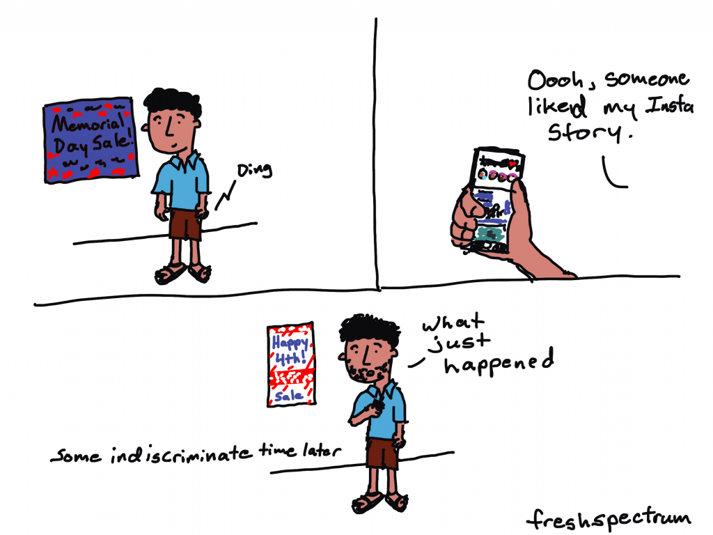
So I have to admit something. I am HORRIBLE at multitasking.

For example, I can’t look something up on my phone while having a conversation. I can’t cook dinner while putting together a grocery list.

“How about listen to your wife while doing anything else?” my wife added after I had asked her for examples.

But the truth is, I’m not alone in this bad at multitasking thing. Most people are really bad at multitasking.

…individuals almost always take longer to complete a task and do so with more errors when switching between tasks than when they stay with one task.”

Multicosts of Multitasking – Cerebrum

So for my report design, I just wanted it to scream, "I was created in Microsoft Word!"

So what does multitasking have to do with report writing?

If it truly was just report writing, there wouldn’t really be an issue. But modern report writing isn’t just report writing.

Creating a modern visual report requires a mix of at least three major tasks:

  • Writing
  • Illustrating
  • Designing

One of the biggest mistakes that can slow down a reporting process is trying to accomplish all three of these major tasks at the same time.

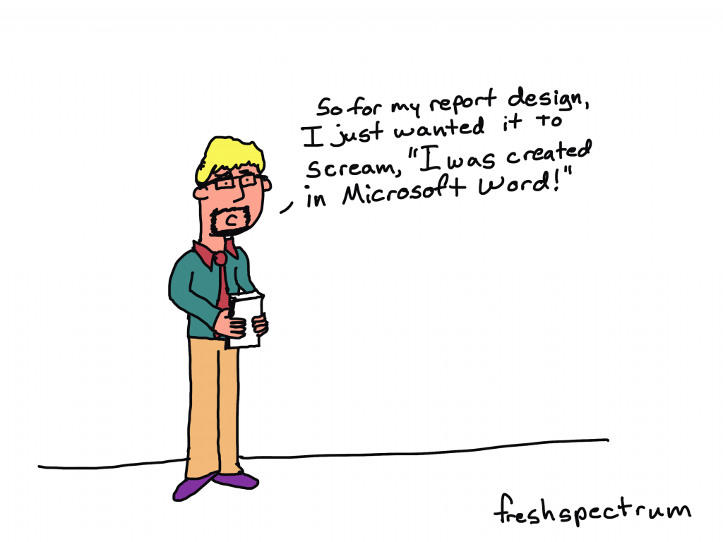
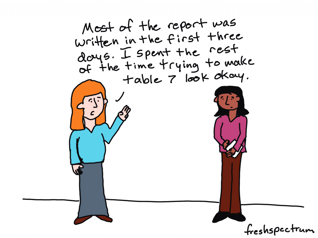
You can complain all you want about Microsoft Word, but you were the one who decided to spend 30 minutes tweaking the design of a table that will eventually need to be recreated in Adobe anyway. You were also the one who spent a bunch of time creating a chart in Excel that will need to be redesigned with new brand colors and fonts.

Cartoon showing social media messing with the passage of time.

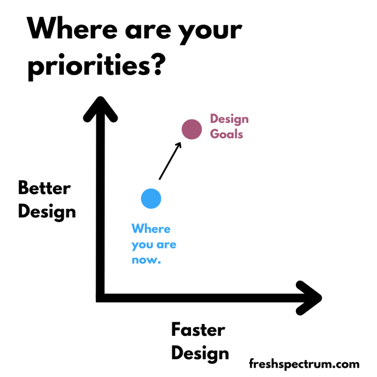
How to single task your report writing.

The solution to the multitasking issue is to intentionally single task your reporting process. This means separating out the different report creation tasks.

Let’s talk about each one of the big three individually.

  1. The design task.
  2. The writing task.
  3. The illustration task.

1. The design task.

So I listed the design task first. This was intentional.

Lots of evaluators tend to think about design as being something you do after you finish your report. But this can be a pretty big mistake.

Here is what happens. Evaluator sits down to write report, opens up Word. Proceeds to brain dump into word document. When nearing end of draft 1, decides that nobody would likely want to read their stream of thought 200 pages.

Okay, so maybe that’s an exaggeration (I hope). But you get the point. One of the things that happens when you just write first is that you tend to over do it. You write more than you need, and sometimes WAY more than you need.

Even before you put pen to paper you know certain things that will influence the design of the report.

Such as…

  • Target page count.
  • How visual you want the report.
  • The branding guidelines for your organization.
  • The sections that need to be included.

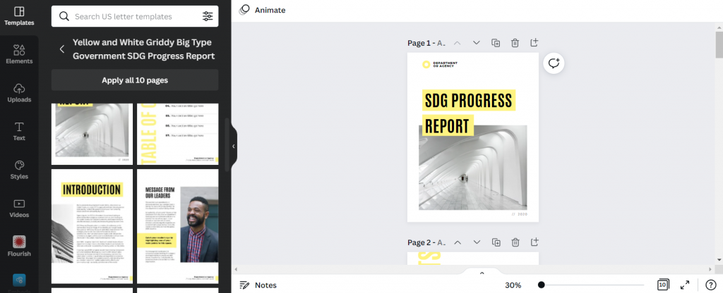
Take all of that and design a report shell with the proper fonts and colors. You can change this later, but having it will show you how many words and pictures you’ll need. It will also give you a sense of what you can’t fit, and save you from writing things that will definitely get cut.

And if you don’t know the proper fonts, colors, and other branding guidelines, now is the time to find out.

2. The writing task.

Now that you know where you’re headed, it’s time to start writing.

This is the time to open up Word or Google Docs. Don’t worry about formatting, charts, or pictures. Just the words. Also make sure to use headings and subheadings where appropriate. And if you have something you want in a call-out box or sidebar, don’t bother creating the call-out box or sidebar. Just write something like “Sidebar:” as a header for the text.

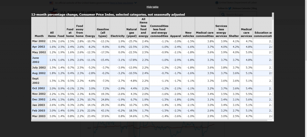
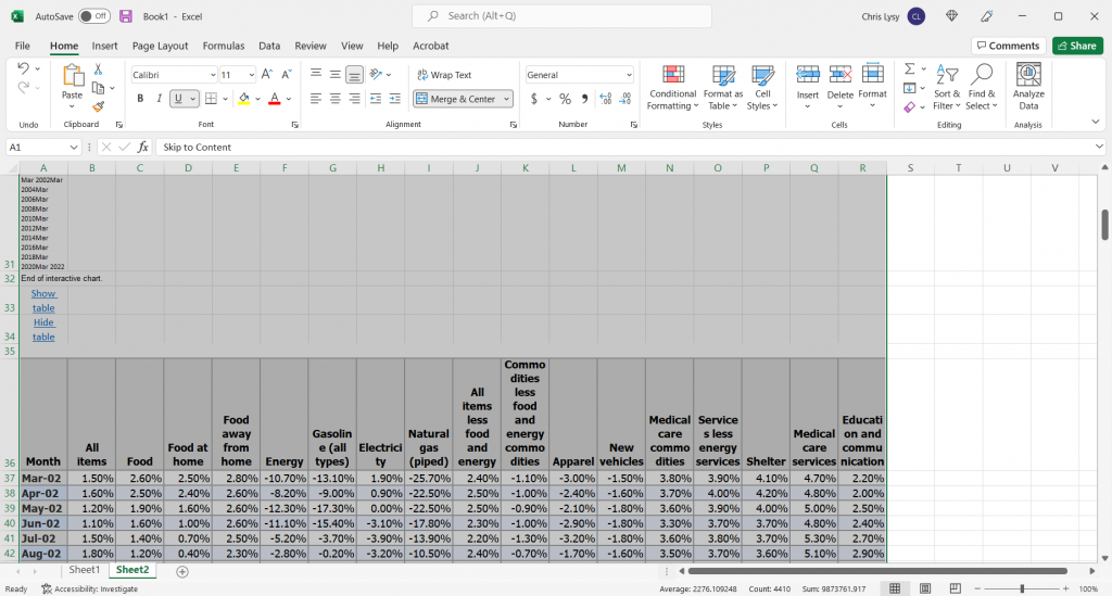
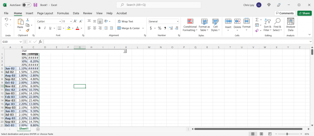
And what about data tables? I would suggest putting in the data tables, but not worrying about the formatting. As long as it is readable. Often it can be really helpful to see the numbers you are discussing during the writing process.

Eventually you are going to take the words from this document and put them into the report shell. But I suggest waiting until you’ve gone through most, if not all, of your drafts and revisions.

Most of the report was written in the first three days. I spent the rest of the time trying to make table 7 look okay.

3. The illustration task.

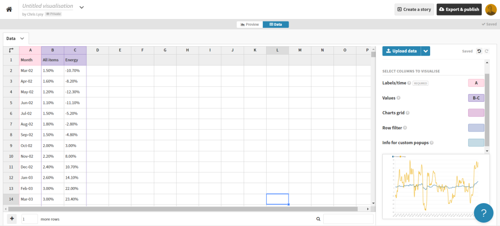
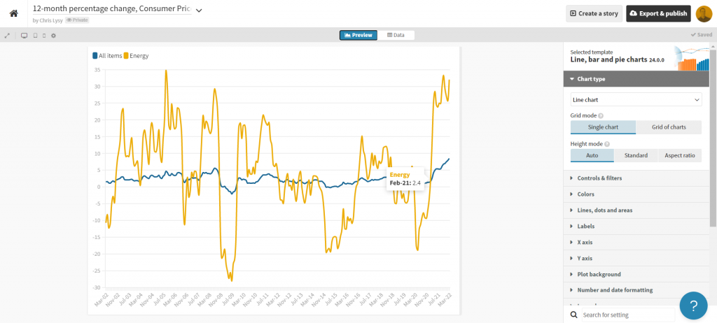
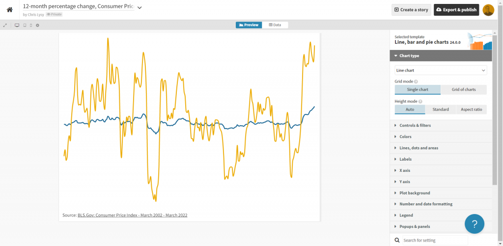
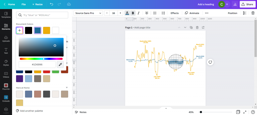
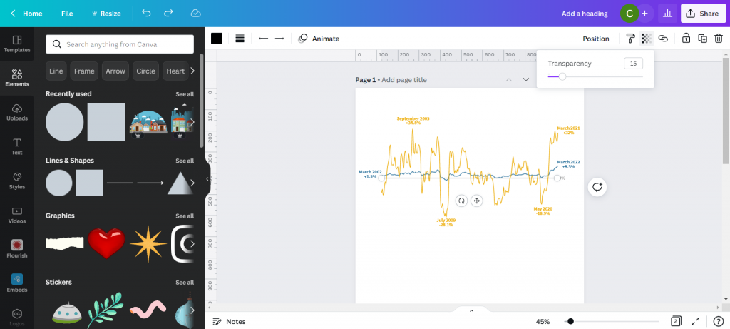
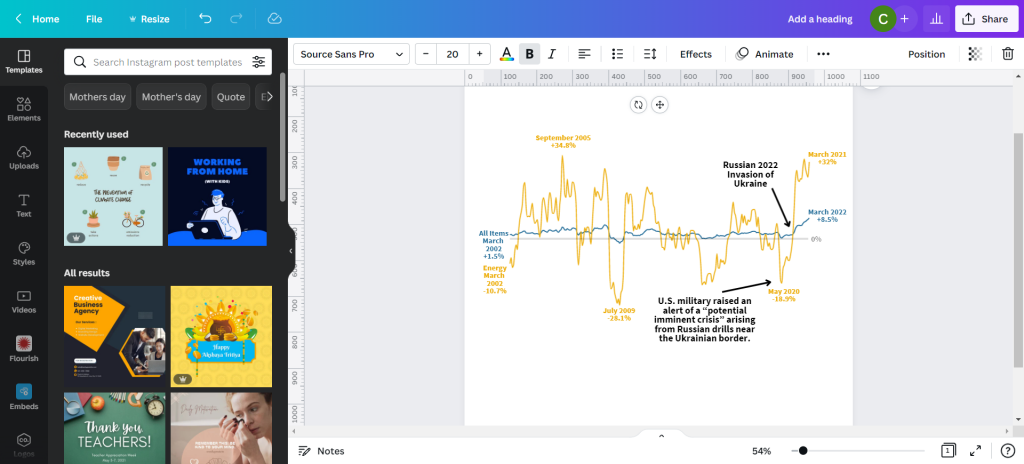
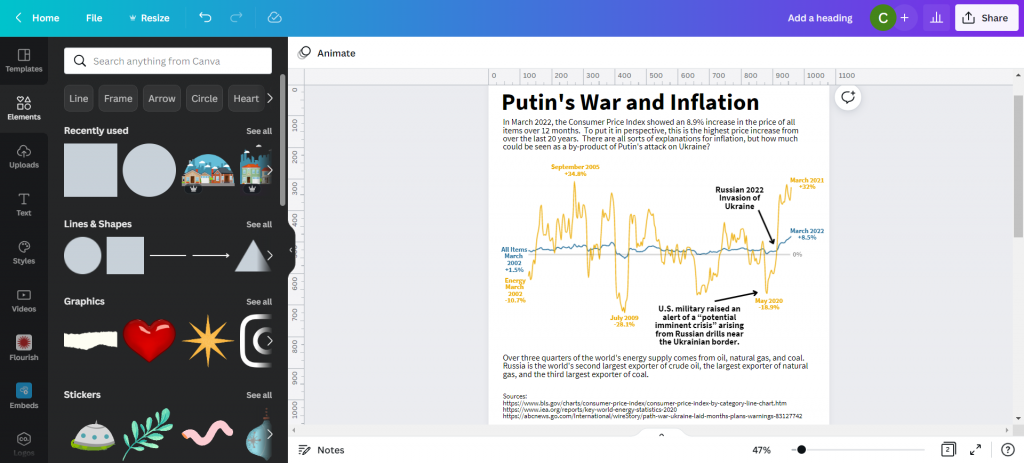
So illustration is not the same as design. During the design process you are going to put in placeholder images and charts. During the illustration process, you are going to create your images and charts.

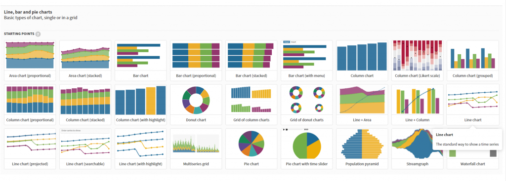
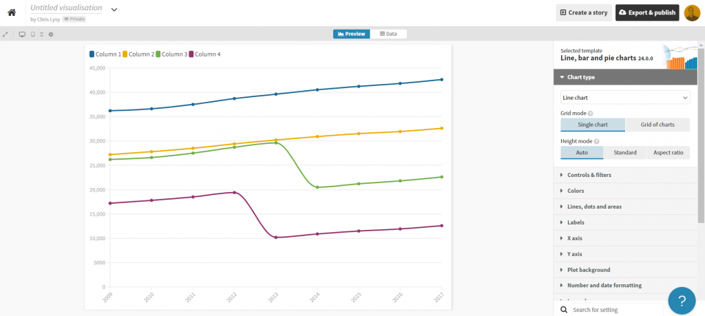
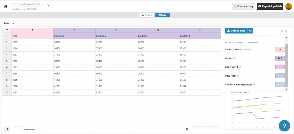
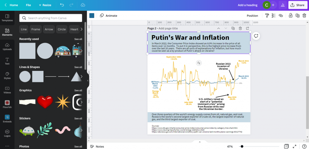
Data visualization is an illustration task. Your goal is to make the data approachable, and you also want it to fit within the context of your report.

Creating explanatory figures and diagrams is an illustration task. Your goal is to create a visual explanation, and fit it within the context of your report.

Deciding on stock images is also an illustration task. The types of visuals you choose should support the words in your report.

Bouncing back and forth.

Okay, so this is almost never entirely chronological. You are likely going to have to task switch throughout your reporting process. But do it intentionally.

I usually start with design then go into writing. After writing I Illustrate. Then I go back into design mode to pull everything together. I also might need to tweak the designs where the content demands a different approach.

If you are working with a team, get feedback at all the different stages. Approve the design shell/template before putting in all the words. Try to get the writing as complete as possible before putting it all into the template (multiple revisions). Same with illustrations.

All the other tasks.

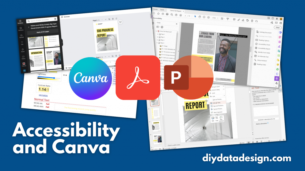
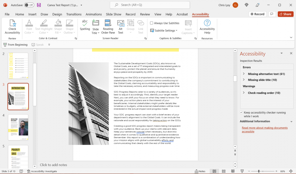
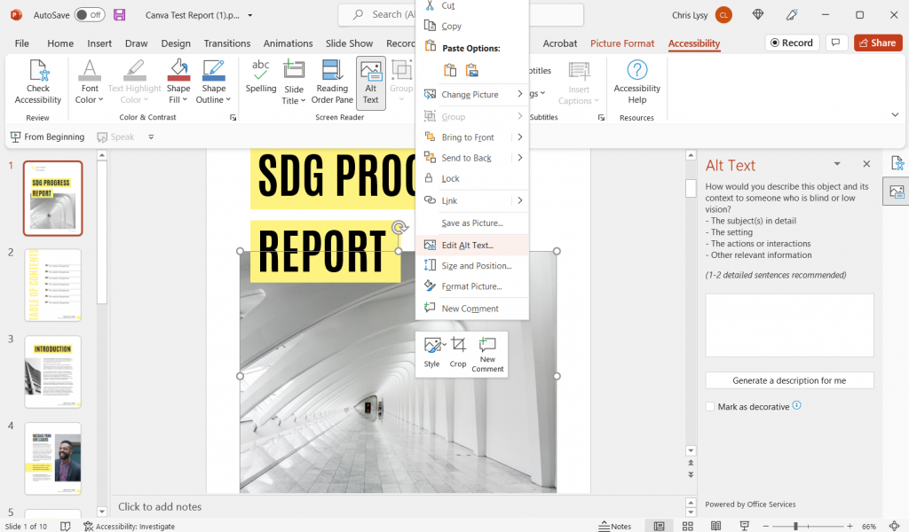
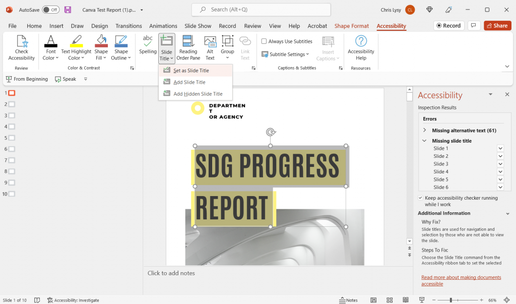
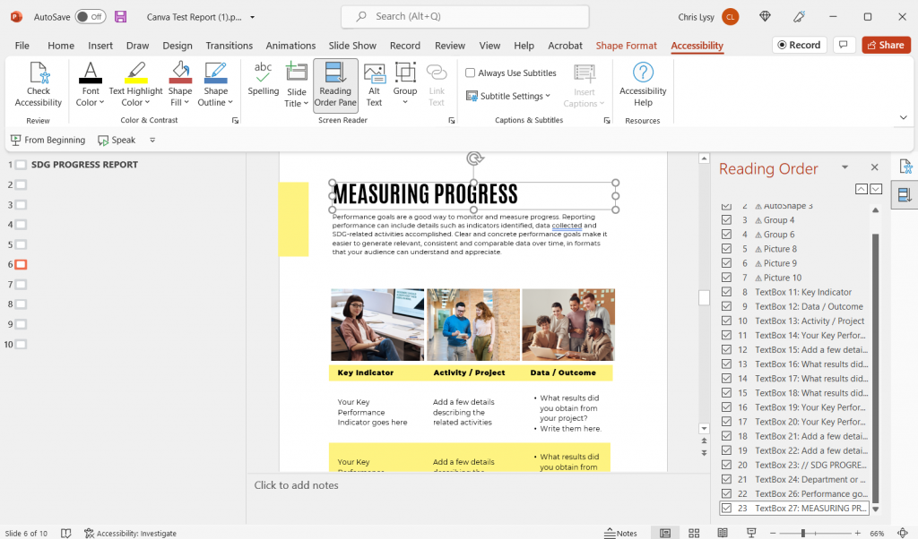
So designing, illustrating, and writing are not the only tasks required when writing a report. You’ll also likely need to incorporate tasks like proofreading, editing, sourcing, accessibility checking, etc. Just like with the other tasks, separate those parts of the process.

How do you create your reports?

  • Do you start with notecards or sticky notes?
  • Do create your design shell first, or just open up Word and start writing?
  • Do you treat illustration as a separate task or just insert images/charts as you write?
  • Do you start by building a detailed outline with bullet points and goals for each section of your report?

Let me know in the comments.

Written by cplysy · Categorized: freshspectrum

May 11 2022

Create a Line Graph Infographic with Canva and Flourish

In today’s post I’ll share the steps I used in creating a line graph centered infographic.

The more I use Flourish, the more I like Flourish. Canva is a super easy tool for infographic design, but its chart builder leaves a lot to be desired. But since there is a native connection to Flourish, there is not really a reason why I should ever need to use Canva’s chart builder.

Canva and Flourish Infographic - Putin's war and inflation.
This is the infographic I’ll walk through creating in this post.

Starting with the Data

Before we can create an infographic we need a story to tell.

Inflation is in the news with rising prices across the globe.

Here in the US we track this data through the Bureau of Labor Statistic’s Consumer Price Index. The most recent numbers that show pricing data through March of 2022 puts us at a 20 year high for prices across all items.

There is a longstanding connection between energy prices and everything else, and when you search the data you can see the correlation.

BLS chart showing CPI data.
12-month percentage change, Consumer Price Index, selected categories – Accessed, May 10, 2022

The argument I’m going to make in my infographic is that Russia’s expanded invasion of Ukraine sparked a rise in energy costs. And with the energy price’s rapid rise, all items have followed.

Total energy supply chart from IEA Key World Energy Statistics.
Key World Energy Statistics 2020 – IEA

According to data from the international energy agency most of the world’s energy comes from three sources, oil, natural gas, and coal. Globally, Russia is the second largest exporter of crude oil, the biggest exporter of natural gas, and the third largest exporter of coal.

So as the war continues, and sanctions bring increased isolation of Russia from the global economy, energy prices continue their rise.

Creating a line graph using Flourish

For this infographic I’m going to redraw the Consumer Price Index line graph shared above using Flourish.

In Flourish, we’ll use the simple Line Chart starting point.

Every time you start a new visualization in Flourish, your first step is to choose a template starting point.

Flourish chart templates.

After selecting the template, Flourish will give us a chart with dummy data.

Flourish default line graph.

Click on the “Data” tab and you’ll see how the line graph data is structured.

Flourish default line graph data structure.

Depending on how your own data is structured, you might simply need to copy/paste. Unfortunately our data needs just a little cleaning.

Preparing our data in Excel for Flourish

So our BLS chart does come with a data table. But in its current format a simple copy/paste into Flourish won’t work. Sometimes you need to try a few things to get your data into the format you need.

BLS "show table" screenshot.

With this table I found I just needed to click on the “Show Table” button. Then use CTL “A” to highlight all the data on the page. Then I just pasted everything into an Excel worksheet.

Pasted data in Excel spreadsheet screenshot.

The copy action took more than just the table, so I just have to delete some rows and extraneous info. And since I really only want to plot two lines I cut the data down to just “All items” and “Energy.”

Cleaned Excel spreadsheet CPI data.

This isn’t a perfect worksheet, but that doesn’t matter. I just wanted to get the data to this point, where I can copy it and paste it right into Flourish.

Creating the line graph in Flourish

Our job now is to paste the data into Flourish, and delete any extraneous rows.

BLS data pasted into Flourish

That’s all I had to do to have a pretty solid starting line graph in Flourish. If my goal was to create an embeddable interactive line graph I might take some more time tweaking the style. But I want to turn this chart into an infographic.

Flourish line chart of BLS CPI data

So instead of making the chart a self-contained finished product, I’m going to strip it down to the bare essentials. Then I’ll take it into Canva.

Clean Flourish chart ready to be opened in Canva.

Turning the Flourish line graph into an infographic using Canva

First thing is to choose the style of infographic I want to create in Canva. I decided just to create a square, so I used a blank Instagram post.

Yes, there is an infographic category in Canva, but I don’t really like the long image format.

Canva instagram post templates

Once I’m in the Canva design app, I’ll venture down to the “More” menu button on the bottom left of the page and find the “Flourish” app.

Canva Flourish App

This let’s me import in visuals I created in Flourish.

Canva with Flourish line graph.

This isn’t simply an image right now, but an embedded interactive graph. I can adjust the size without distorting the visual right within Canva. I can also double click the box to interact with the visual, which lets me see individual data points.

Canva with Flourish line graph.

With my infographic style chart I’m not worried about showing the numbers for all the data. I just want to make sure I label the high point, low point, beginning, end, and any other spot that would be instrumental in telling my story.

I just the eyedropper in document colors to adjust the labels color to match each specific line (All items or Energy).

Canva showing eyedropper color finding tool.

I also went ahead and dropped in a gray heavily transparent line to show where 0% would be in my line graph. I’m not worried about going any deeper because I’ll also share a link to the underlying data source.

Canva line graph labeled.

My next step will be to add annotations to tell the story. You’ll notice that I’m not really being super direct, more inferring the relationship. There is certainly a relationship between the war in Ukraine and the rise in inflation, and while it’s definitely not the only plausible explanation, there is enough of a connection to make for an interesting infographic.

Canva line graph labeled and annotated.

My next step is to just tell a little bit of the story and what we are looking at in the chart. Just because an infographic is a visual thing doesn’t mean we have to rely solely on the graph.

Canva infographic with narrative text.

Not sure if this is an improvement or not, but I ended a few square color blocks to create a little more separation. I think it makes the chart look a little like a widescreen movie and helps to draw your eyes.

Canva infographic with narrative text.

And here is my final infographic.

Canva and Flourish Infographic Line Graph on Putin's War and Inflation.

Written by cplysy · Categorized: freshspectrum

Apr 26 2022

Canva Accessibility is bad, here is how you fix your design.

As much as I love Canva, there is definitely one spot where the tool absolutely fails. And that spot is accessibility.

When you work with a lot of government clients the topic of accessibility is almost always at the top of the considerations list when choosing your software. Making your reports accessible to those in your audience with disabilities is certainly the right thing to do. But it can also be a legal imperative.

If you just create a report in Canva and then export to PDF, that report is likely not accessible.

Does this mean you have to stop using Canva?

No way, Canva is still a super useful tool in so many other ways. But you do have to take additional steps after creating your reports to improve your product’s accessibility.

In today’s blog post.

  • Why Canva Fails at Accessibility
  • The Wrong Argument
  • A Canva PDF Example
  • How to run Accessibility Checks on your Canva Report using Adobe Acrobat Pro
  • How to run Accessibility Checks on your Canva Report using Microsoft PowerPoint
  • Tips for making Accessibility easier when designing in Canva
  • If anyone at Canva is reading this post
  • The Accessibility Law (aka Section 508)
  • What makes a website or report accessible?
Accessibility and Canva Featured Image (showing screenshots and icons for Canva, Acrobat, and PowerPoint)

Why Canva Fails at Accessibility

We don’t have to dig too deep to find the flaws.

When you share visual content digitally, it needs to be readable. So that means when you have an image, you need to have alternate text for those who cannot see the image. Just like you would caption a video for the hearing impaired, you need to add text to your pictures.

The readable text also has to be understandable. If you deliver a pdf with a bunch of text boxes and alternate text, you need them to show up in the proper reading order.

Inside Canva, you currently cannot set the reading order or put in alternate text.

The Wrong Argument

Some people argue that Canva is a graphic design tool, not a content delivery platform. You don’t embed alt text into an image file, you set the alt text when you share the image (for example, you create the image using Canva then set the alt text when sharing via WordPress or Twitter).

But here is the problem with that argument.

Now, as the days move forward, Canva is transitioning into even more of a content delivery platform. You can present a slidedeck directly from canva or share an infographic with a link.

But even beyond that, if you are creating reports using Canva and sharing them as PDFs, you are already past the point where alt text should be added and reading order set.

A Canva PDF Example

Screenshot of a Canva Report Template.
You can find this SDG Progress report template on Canva.

So for this test I just used a Canva template, applied all pages, and then downloaded the 10 page report as a Standard PDF.

Next I’m going to open the PDF report up in Adobe Acrobat Pro.

How to run Accessibility Checks on your Canva Report using Adobe Acrobat Pro

Once open in Acrobat Pro I’m going to click on the “More Tools” button and add Accessibility.

Screenshot of Adobe Acrobat's more tools menu.

Then you’ll want to run an “Accessibility Check.”

Screenshot of an Adobe Accessibility check.

Initial Structure and Alt Text Check

The big surprise is that the document will come out fairly clean. The exported pdf is structured in a way that Adobe recognizes.

Images in Canva’s stock photo library must have a hidden alt text setting based on the document name that translates when you convert to PDF.

But here is a problem. If you were to use any of your own uploaded images, or if you simply wanted to change the alt text on the Canva images, then you would be out of luck without a tool like Acrobat.

Reading Order

So reading order requires a manual check, and you can instantly see a big problem.

Check out page 4. If someone were to try to read this with a screen reader they would hear the text in the following order.

  1. The alt text for the picture of the guy on the right side of the page.
  2. The footer text in the bottom right of the page.
  3. The paragraph under the page header.
  4. The last paragraph on the page.
  5. The second to last paragraph on the page.
  6. The page header “Message from our leaders.”
Screenshot of setting reading order inside of Adobe Acrobat Pro.

To make this document accessible, you are going to have to go page to page manually adjusting the reading order.

Color Contrast

This is another manual check. Let’s go through and see the color combos that need to be legible.

In this report we have…

  • Black Text on a White Background
  • Black Text on a Yellow Background
  • Yellow Text on a White Background
Screenshot of the contrast checker tool by WebAIM.

There are a few ways to check the color contrast, but one is to use this contrast checker tool by WebAIM.

  • Black Text on a White Background (Pass! 21:1 contrast ratio).
  • Black Text on a Yellow Background (Pass! 18.35:1 contrast ratio).
  • Yellow Text on a White Background (Fail! 1.14:1 contrast ratio).

Yea, not a big surprise that the yellow on white Table of Contents header would fail. But if you change out the yellow on white then the contrast is just fine throughout rest of the report.

How to run Accessibility Checks on your Canva Report using Microsoft PowerPoint

So if you are serious about accessibility I would definitely advocate for Adobe Acrobat Pro. Yes it costs money, but Adobe continues to be a leader in accessible design.

That said, you can also check accessibility with PowerPoint.

Screenshot of saving a Canva report as a Microsoft PowerPoint.

The first step is to export your Canva report into Microsoft PowerPoint. Just click on “Share” then “More…” and then scroll down to Save as “Microsoft PowerPoint.”

Screenshot of the report in Microsoft PowerPoint.

The conversion isn’t always perfect. I find that the biggest challenge is usually with the fonts. So you’ll have to do a manual check, scrolling through the document and tweaking any problem spots. You might just need to stretch a text box here and there or reduce a font size.

Another thing to note is that while Canva, or the PDF, would only show you the parts of your file that were within the margins, PowerPoint will show you certain elements that fall outside. For instance, the picture on the Introduction page hangs off the side. The stuff outside the margins won’t print (or be shown when in presentation mode), so this isn’t something that needs fixing. Just don’t freak out.

Once the document looks more or less the same as it did in Canva, go ahead and run your accessibility check.

Screenshot of the Accessibility Check menu item in Powerpoint.

You’ll find the “Check Accessibility” options in the Review tab. Just click the button to run the inspection.

Screenshot of PowerPoint Accessibility Inspection Results.

You’re likely going to find more errors in PowerPoint than in Adobe.

Adding Alt Text

In the Adobe PDF exported from Canva, only the pictures counted as images that required alternate text. PowerPoint is not so sure. It wants alt text for every single color block in addition to the pictures. It also wants you to put in a page title for every page.

Screenshot of Edit Alt Text in Microsoft PowerPoint

If the image doesn’t convey any information (i.e. all the yellow boxes in this report) just click the box below the entry field that says “Mark as decorative.” It will show up with blank text and not be read by a screen reader.

You’ll notice that all of the images that add automatic Alt Text in the PDF version do not in the PowerPoint version. So the setting that sets up alt text when exporting into PDF doesn’t do the same for the PowerPoint save.

Adding Slide Titles

Screenshot of setting a slide title in Microsoft PowerPoint.

If you plan to deliver this report as a PowerPoint, you should also add slide titles.

To add slide titles, go to the slide with the missing slide title. You have three options. You can set an existing text box as the slide title. You can add a slide title. Or you can create a hidden slide title (one that will be read by a screen reader but not seen in the document).

One thing to note, in the conversion from Canva to PowerPoint, some of the text boxes might have been split into two. Some are also grouped with background elements (like the yellow boxes). In order to be set as a title, you’ll want to combine the title text into one box. You also need to ungroup the elements to even see the “set as slide title” option.

Setting the Reading Order

Screenshot of Reading Order in Microsoft PowerPoint.

Okay, reading order in PowerPoint is a bit of a mess. Especially if you have overlapping elements.

It works the same as setting the reading order in Acrobat. Just move elements up and down based on when they should be read.

But here is the thing that will drive you a little nutty. All the decorative elements will show up here, and if your design has overlapping elements (like a title overlapping a picture) you are going to be limited in how you display your reading order.

Why? Because for some odd reason changing the reading order also changes the page display order. And when things overlap, the reading order starts from the back of the group of elements. So if you want a title to slightly overlap over a picture, that picture is going to be read before the title.

Color Contrast

Okay, so this one doesn’t show up in the Accessibility screen, but it’s still an important step. Just follow the same directions as were written out for the PDF approach.

Tips for making Accessibility easier when designing in Canva

There are certain design steps we can take in Canva that will make our Accessibility lives easier.

  1. Use as few text boxes as possible. Meaning, it’s way easier to have one long text box with several separate paragraphs than to have every paragraph in its own text box.
  2. Design with the reading order in mind. Sure, it might feel stylish to put the title in the middle right of the page blended overtop of an image. But that’s just going to be more annoying to make accessible.
  3. Group together decorative elements. By grouping together decorative elements you turn what could be a bunch of elements that need alt text, to a single a element.

If anyone working at Canva is reading this post.

You don’t need to match Adobe on accessibility features. But please advocate for the following features.

  • The ability to add alternate text to visual elements for use in PDF export, and for web display.
  • A reading order pane.
  • An explicit tagging feature (with several levels of header tags & paragraph tags).

The Accessibility Law (aka Section 508)

The concept is pretty simple, if the federal government is providing services and programs over the web, those programs and services should be accessible by its employees and the public, regardless of any disabilities one might have.

This means that the reports you deliver digitally should be readable through a screen reader (including any visuals).

Section 508 (Federal Electronic and Information Technology)

On August 7, 1998, President Clinton signed into law the Rehabilitation Act Amendments of 1998, which covers access to federally funded programs and services. The law strengthens section 508 of the Rehabilitation Act and requires access to electronic and information technology provided by the Federal government. The law applies to all Federal agencies when they develop, procure, maintain, or use electronic and information technology. Federal agencies must ensure that this technology is accessible to employees and members of the public with disabilities to the extent it does not pose an “undue burden.” Section 508 speaks to various means for disseminating information, including computers, software, and electronic office equipment. It applies to, but is not solely focused on, Federal pages on the Internet or the World Wide Web. It does not apply to web pages of private industry.

For more of the legislation you can visit the Rehabilitation Act page on the U.S. Access Board website.

What makes a website or report accessible?

It’s not a checklist or a button.

The best place to start digging into the topic is to check out the Web Content Accessibility Guidelines (WCAG) 2.1. I pulled the following principles from that page.

Understanding the Four Principles of Accessibility

The guidelines and Success Criteria are organized around the following four principles, which lay the foundation necessary for anyone to access and use Web content. Anyone who wants to use the Web must have content that is:

  1. Perceivable – Information and user interface components must be presentable to users in ways they can perceive.
    • This means that users must be able to perceive the information being presented (it can’t be invisible to all of their senses)
  2. Operable – User interface components and navigation must be operable.
    • This means that users must be able to operate the interface (the interface cannot require interaction that a user cannot perform)
  3. Understandable – Information and the operation of user interface must be understandable.
    • This means that users must be able to understand the information as well as the operation of the user interface (the content or operation cannot be beyond their understanding)
  4. Robust – Content must be robust enough that it can be interpreted reliably by a wide variety of user agents, including assistive technologies.
    • This means that users must be able to access the content as technologies advance (as technologies and user agents evolve, the content should remain accessible)

If any of these are not true, users with disabilities will not be able to use the Web.

Looking for resources to help you with Accessibility?

Whether you are looking for tools or just more information, you should definitely check out webaim.org.

Written by cplysy · Categorized: freshspectrum

Apr 20 2022

Evaluation Comics

Big news! I have an evaluation comics page now.

So what does that actually mean?

Click here to visit the new page.

Over the last decade my comics used to live almost entirely within blog posts.

For most of my cartooning life I’ve treated my cartooning as a form of blog post illustration. My cartoons were illustrations of ideas that were found within my blog posts.

For years, just about every blog post would be published with a handful of cartoons. Those cartoons would then spread through social media.

And that used to work just fine.

Click on a cartoon, then you can just cycle through others using the arrow keys on your keyboard.

Why the change?

Because lately my professional life (and this blog) have focused more and more on information design. And my plans for the future involve lots of templates and tutorials.

Templates and tutorials are harder to illustrate with comics. And honestly, only cartooning what I blog limits what I cartoon.

So I’ve decided to give my cartooning a bit of space.

Will all the cartoons show up on the comics page?

Short answer, no.

I plan to post my cartoons first for my Patrons (you can always join us on Patreon). Some cartoons will stay as Patreon exclusives, but most will go to the comics page.

AS for the archives, right now I just have 2022 in there. I plan to back publish my archives. But since I’ve drawn hundreds of cartoons it may take a little while.

Until then, the best way to see all of my cartoons is by becoming a Patron where you’ll get access to my private Dropbox folder.

Will this mean more cartoons?

Yes.

I’ve changed my process, and it’s re-opened the cartoon floodgates. So be prepared for lots more cartoons in the future (even if you choose not to join us in the Patreon community and just stay a public fan).

How do I get there directly?

You can click the menu link on the freshspectrum homepage.

OR, just type evaluationcomics.com into your browser.

Hope you enjoy!

Written by cplysy · Categorized: freshspectrum

Apr 13 2022

Better Report Design or Faster Report Design? Pen and Paper Activity

So what’s better, creating one great report or ten good reports?

In an ideal world we would have ample time to plan, write, develop, illustrate, test, and iterate our evaluation reports. But that’s likely not the professional world you occupy (and it’s certainly not the world I occupy).

Freshspectrum cartoon by Chris Lysy. "We have an award winning internal design team. I suggest getting in touch no less than 3 years before the report is due."

I decided to try out a little activity at the beginning of my workshop session last week. I drew a simple x and y axis. On one axis I wrote “better design” and on the other axis I wrote, “faster design.” Then I asked everyone to find where they were on the grid now, and where they hope to be later.

What are your priorities graph.  Better design by faster design.

The “short activity” ended up taking most of our session. Because the answers were fascinating.

I think in the field of data visualization and report design the general argument you’ll find is, “good design takes time.” So if you want to prioritize good design, you need to budget more time. But what if you don’t have more time, and you’re not likely to get more time for your next report either?

Wouldn’t it be a good idea to learn how to create better reports in less time?

What are your priorities graph.  Better design by faster design.
Slower Design & Better Design (Great report but takes a lot of time to produce)
Slower Design & Worse Design (Ugly/boring and takes a lot of time to produce)
Better Design & Faster Design (Great report quickly produced)
Worse Design & Faster Design (Ugly/boring but quickly produced.

So I want you to try this little activity. On a sheet of paper draw an x and a y axis. On the Y, write “Better Design” and on the X, write “Faster Design.”

Next, draw two points.

The first point is where you think you are right now. Are you a good designer, fast designer, both, neither? The scale is completely yours to decide.

For the second point, draw where you would like to be in the future. As you improve your design skills, do also see yourself committing more time to reporting? If so, your overall design speed might go down.

What are your priorities graph.  Better design by faster design. Marked with "Where you are now" and "design goals."

So why ask the question?

Because better design isn’t always slower design. Sometimes being the better designer is being able to create more reports and reach more audiences in a shorter time period.

Spending a lot of time on your reports is a design choice. Deciding between one great report and ten good reports, that’s a choice you make.

How do you design better?

Short answer, practice and support.

It might not be the answer you were hoping to find, but becoming a better designer just takes a lot of practice. The more practice, the better.

And if you are an organization hoping to grow your team’s data design skills, provide them with support. Give your team opportunities to try new things and get more practice. And seek to eliminate any bureaucratic procedures that may be inhibiting your team’s creativity.

How do you design faster?

Short answer, assets and process.

I have subscriptions Adobe CC and Office 365. I have designed high quality reports and infographics using Adobe Illustrator, InDesign, XD, Sketch, and PowerPoint. But most of the time I choose to use Canva.

It’s not that Canva is a superior graphic design tool. But the access to a huge library of assets (stock photos, icons, templates) speed up my ability to create better design, faster. And often, much faster.

If you want to design faster, surround yourself with assets and develop a streamlined creative process.

And if you are an organization hoping to speed up your team’s data design production, give them assets. Easy to use templates, lots of stock photos, and pre-branded icon libraries. And give them the training and support they need to use the tools.

Written by cplysy · Categorized: freshspectrum

  • « Go to Previous Page
  • Go to page 1
  • Interim pages omitted …
  • Go to page 29
  • Go to page 30
  • Go to page 31
  • Go to page 32
  • Go to page 33
  • Interim pages omitted …
  • Go to page 54
  • Go to Next Page »

Footer

Follow our Work

The easiest way to stay connected to our work is to join our newsletter. You’ll get updates on projects, learn about new events, and hear stories from those evaluators whom the field continues to actively exclude and erase.

Get Updates

Want to take further action or join a pod? Click here to learn more.

Copyright © 2026 · The May 13 Group · Log in

en English
af Afrikaanssq Shqipam አማርኛar العربيةhy Հայերենaz Azərbaycan dilieu Euskarabe Беларуская моваbn বাংলাbs Bosanskibg Българскиca Catalàceb Cebuanony Chichewazh-CN 简体中文zh-TW 繁體中文co Corsuhr Hrvatskics Čeština‎da Dansknl Nederlandsen Englisheo Esperantoet Eestitl Filipinofi Suomifr Françaisfy Fryskgl Galegoka ქართულიde Deutschel Ελληνικάgu ગુજરાતીht Kreyol ayisyenha Harshen Hausahaw Ōlelo Hawaiʻiiw עִבְרִיתhi हिन्दीhmn Hmonghu Magyaris Íslenskaig Igboid Bahasa Indonesiaga Gaeilgeit Italianoja 日本語jw Basa Jawakn ಕನ್ನಡkk Қазақ тіліkm ភាសាខ្មែរko 한국어ku كوردی‎ky Кыргызчаlo ພາສາລາວla Latinlv Latviešu valodalt Lietuvių kalbalb Lëtzebuergeschmk Македонски јазикmg Malagasyms Bahasa Melayuml മലയാളംmt Maltesemi Te Reo Māorimr मराठीmn Монголmy ဗမာစာne नेपालीno Norsk bokmålps پښتوfa فارسیpl Polskipt Portuguêspa ਪੰਜਾਬੀro Românăru Русскийsm Samoangd Gàidhligsr Српски језикst Sesothosn Shonasd سنڌيsi සිංහලsk Slovenčinasl Slovenščinaso Afsoomaalies Españolsu Basa Sundasw Kiswahilisv Svenskatg Тоҷикӣta தமிழ்te తెలుగుth ไทยtr Türkçeuk Українськаur اردوuz O‘zbekchavi Tiếng Việtcy Cymraegxh isiXhosayi יידישyo Yorùbázu Zulu