• Skip to main content
  • Skip to footer
  • Home

The May 13 Group

the next day for evaluation

  • Get Involved
  • Our Work
  • About Us
You are here: Home / Archives for allblogs / freshspectrum

freshspectrum

May 04 2021

Schrodinger’s Outcome

Today’s post is a little evaluation graphic novella inspired by Schrödinger’s cat. No cats, real or fictional, were harmed while creating this post. I’ll drop a plain text version at the bottom.

Shrodinger's Outcome Graphic Novella by Chris Lysy of freshspectrum.com.  Illustration 1.
Shrodinger's Outcome Graphic Novella by Chris Lysy of freshspectrum.com.  Illustration 2.
Shrodinger's Outcome Graphic Novella by Chris Lysy of freshspectrum.com.  Illustration 3.
Shrodinger's Outcome Graphic Novella by Chris Lysy of freshspectrum.com.  Illustration 4.
Shrodinger's Outcome Graphic Novella by Chris Lysy of freshspectrum.com.  Illustration 5.
Shrodinger's Outcome Graphic Novella by Chris Lysy of freshspectrum.com.  Illustration 6.
Shrodinger's Outcome Graphic Novella by Chris Lysy of freshspectrum.com.  Illustration 7.
Shrodinger's Outcome Graphic Novella by Chris Lysy of freshspectrum.com.  Illustration 8.
Shrodinger's Outcome Graphic Novella by Chris Lysy of freshspectrum.com.  Illustration 9.
Shrodinger's Outcome Graphic Novella by Chris Lysy of freshspectrum.com.  Illustration 10.
Shrodinger's Outcome Graphic Novella by Chris Lysy of freshspectrum.com.  Illustration 11.
Shrodinger's Outcome Graphic Novella by Chris Lysy of freshspectrum.com.  Illustration 12.
Shrodinger's Outcome Graphic Novella by Chris Lysy of freshspectrum.com.  Illustration 13.
Shrodinger's Outcome Graphic Novella by Chris Lysy of freshspectrum.com.  Illustration 14.
Shrodinger's Outcome Graphic Novella by Chris Lysy of freshspectrum.com.  Illustration 15.
Shrodinger's Outcome Graphic Novella by Chris Lysy of freshspectrum.com.  Illustration 16.

Plain Text Version

Schrodinger’s Outcome

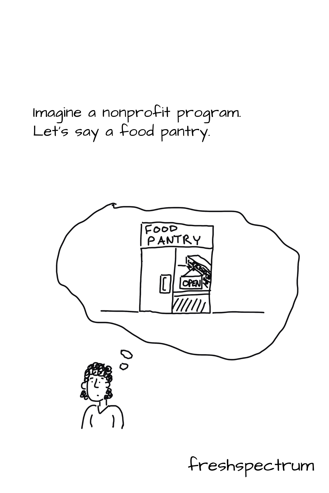
Imagine a nonprofit program. Let’s say a food pantry.

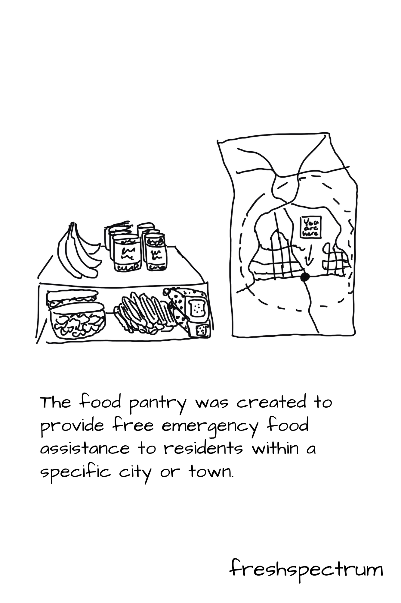
The food pantry was created to provide free emergency food assistance to residents within a specific city or town.

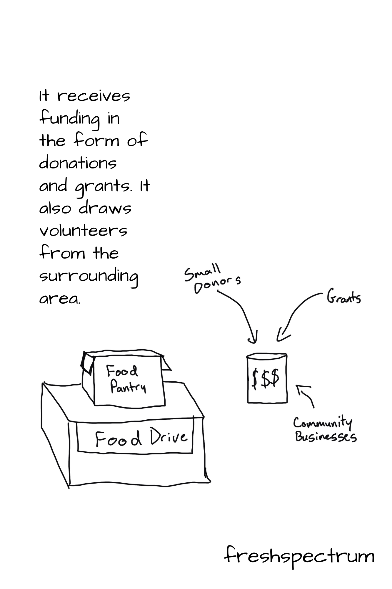
It receives funding in the form of donations and grants.  It also draws volunteers from the surrounding area.

Is it successful?

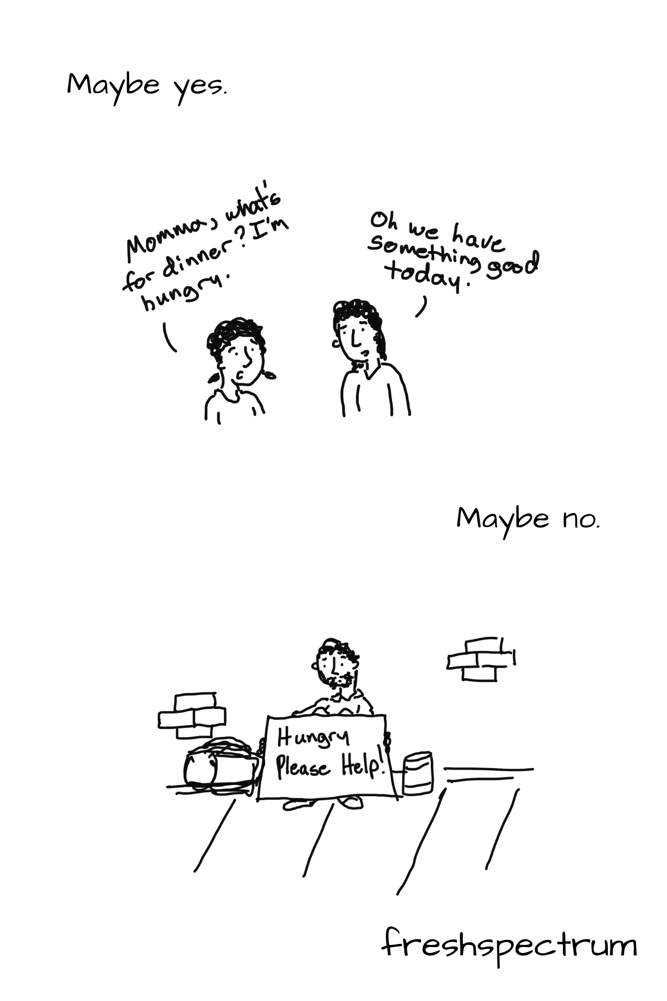
Maybe yes, maybe no.
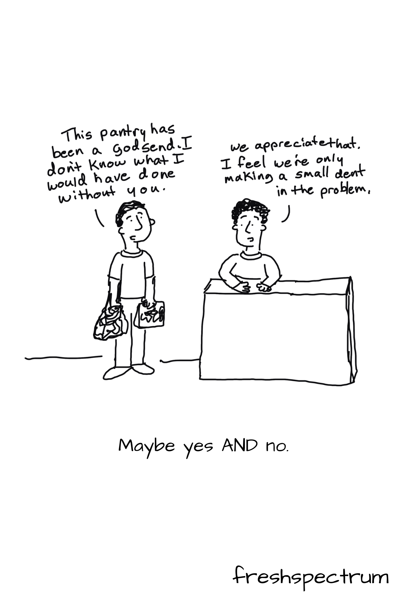
Maybe yes and no.

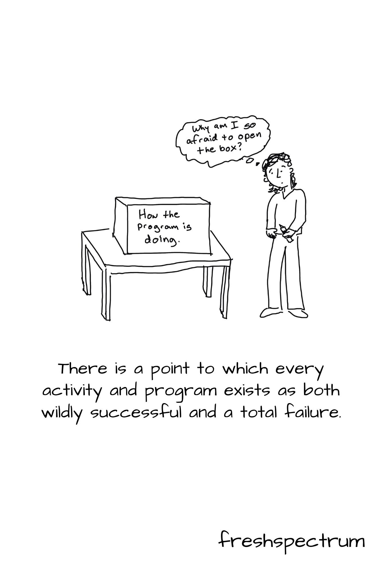
There is a point to which every activity and program exists as both wildly successful and a total failure.

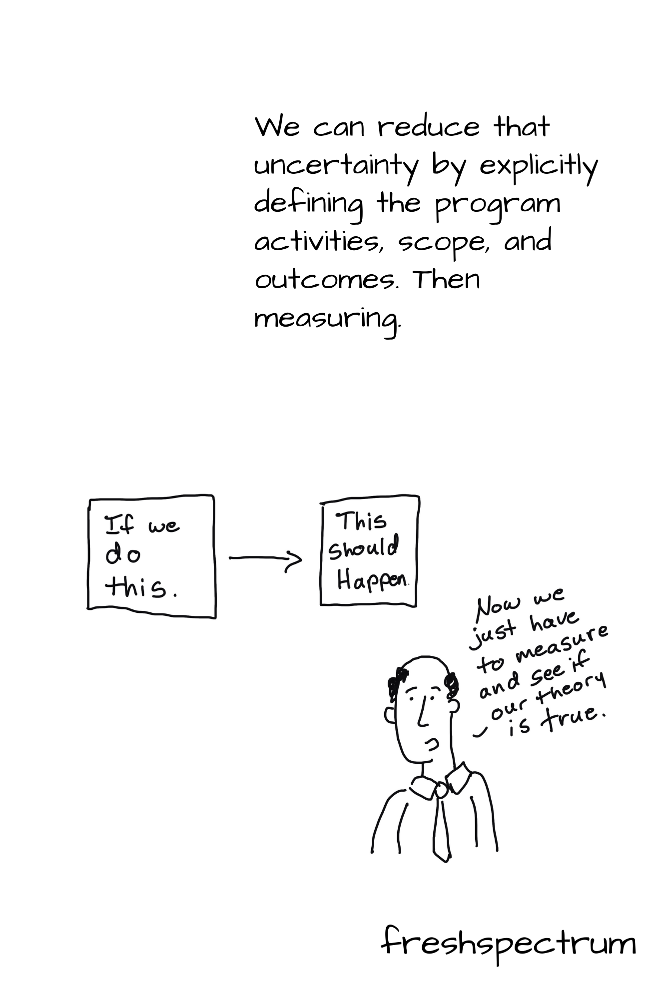
We can reduce that uncertainty by explicitly defining the program activities, scope, and outcomes.  Then measuring.

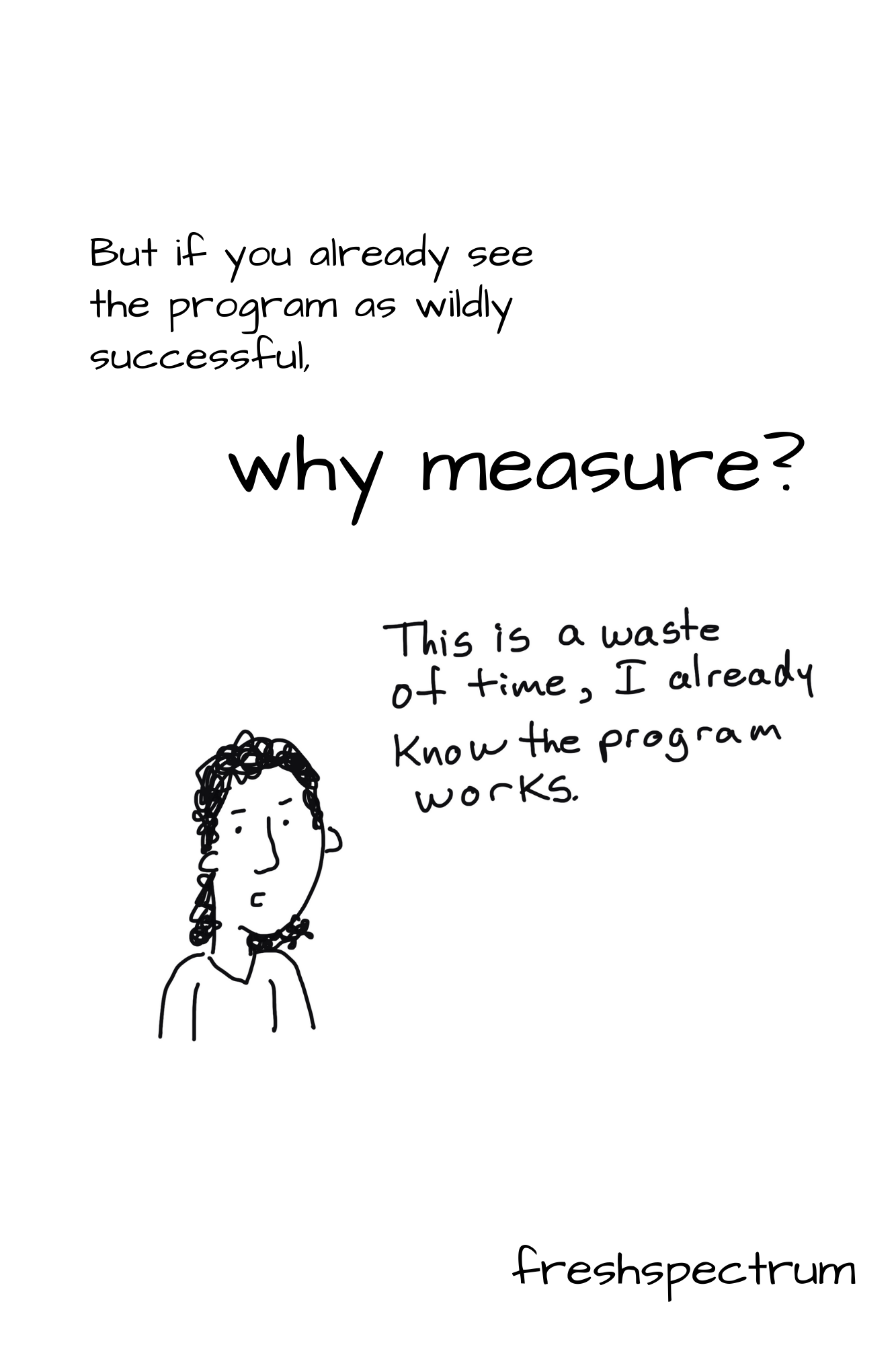
But if you already see the program as wildly successful, why measure?

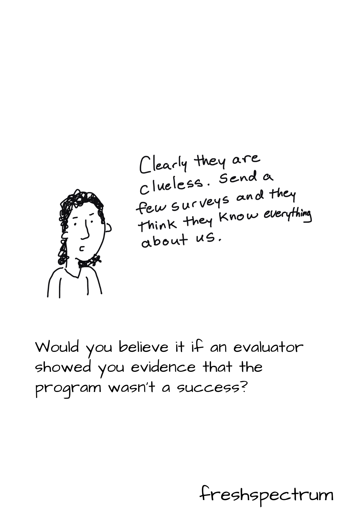
Would you believe it if an evaluator showed you evidence that the program wasn’t a success?

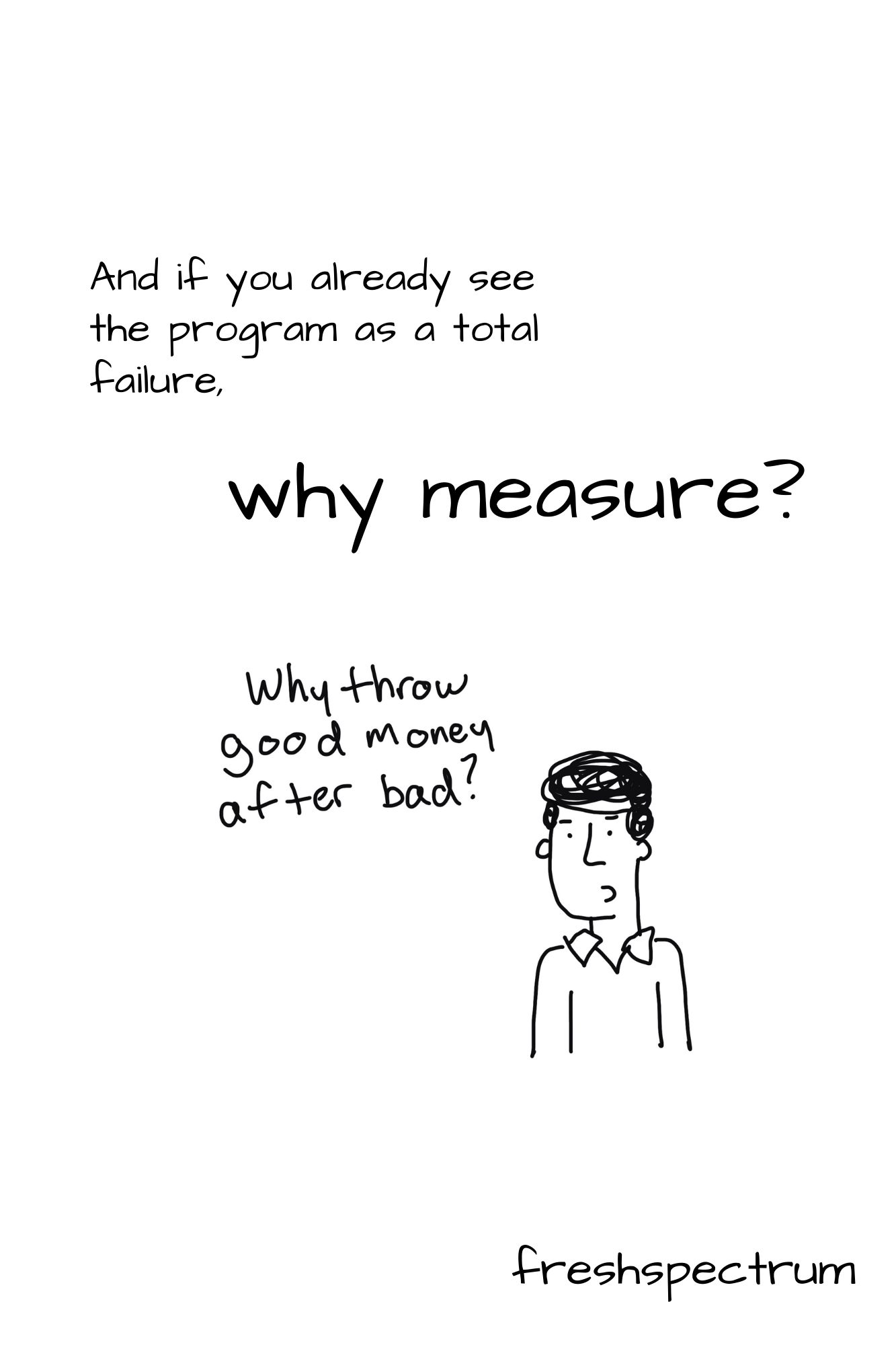
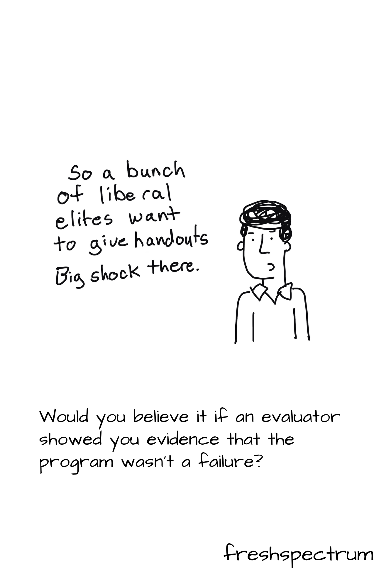
And if you already see the program as a total failure, why measure?

Would you believe it if an evaluator showed you evidence that the program wasn’t a failure?

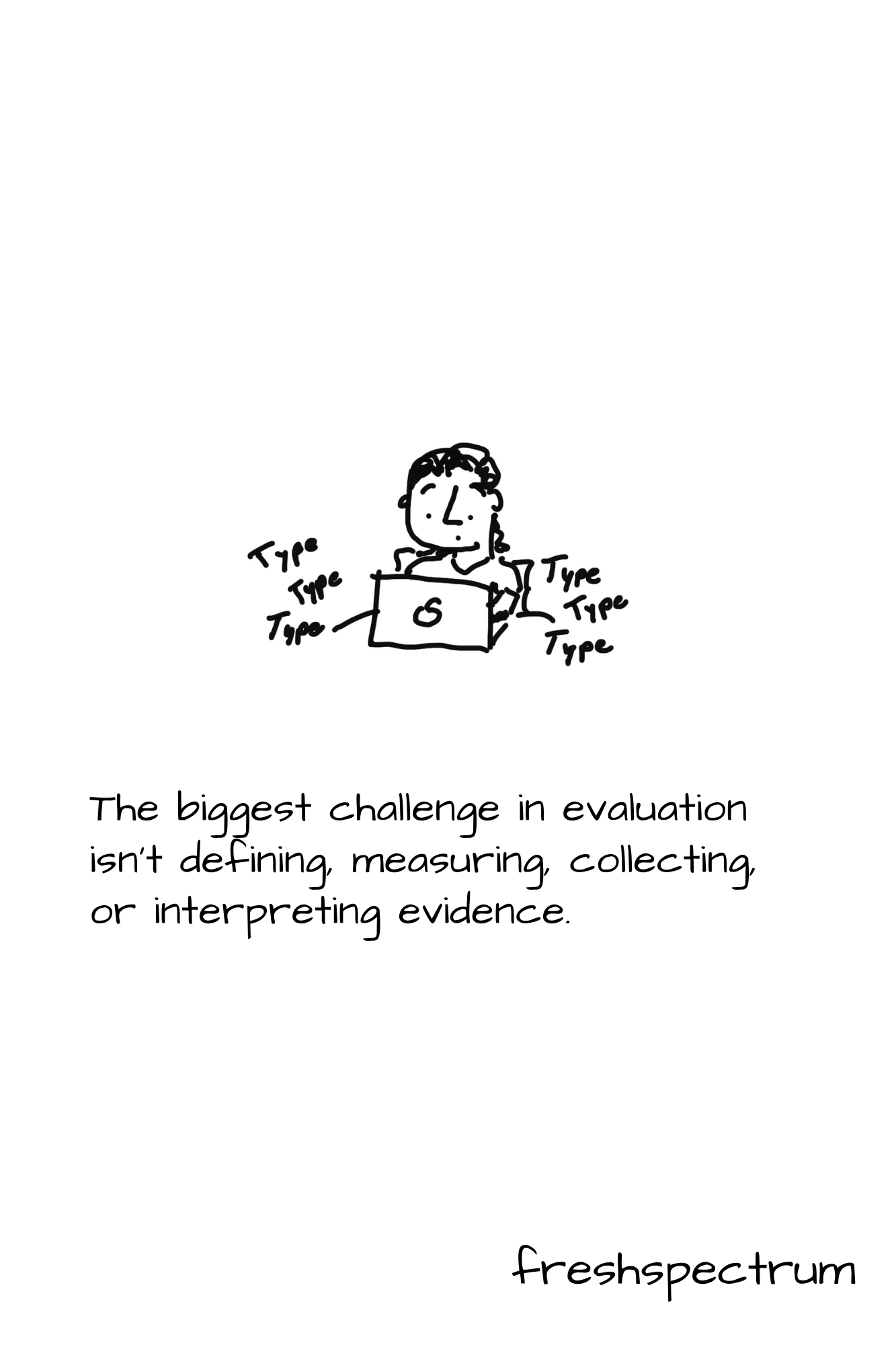
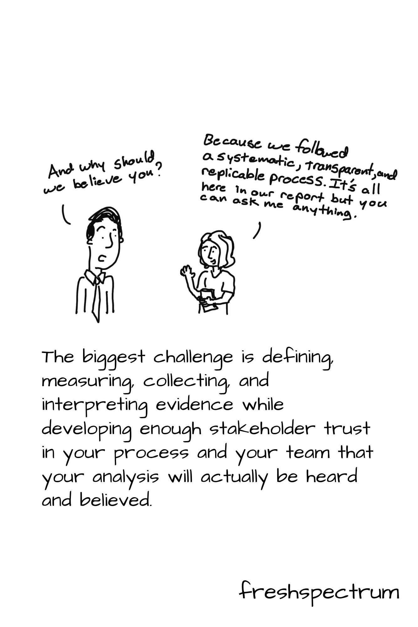
The biggest challenge in evaluation isn’t defining, measuring, collecting, or interpreting evidence.

The biggest challenge is defining, measuring, collecting, and interpreting evidence while developing enough stakeholder trust in your process and your team that your analysis will actually be heard and believed.  

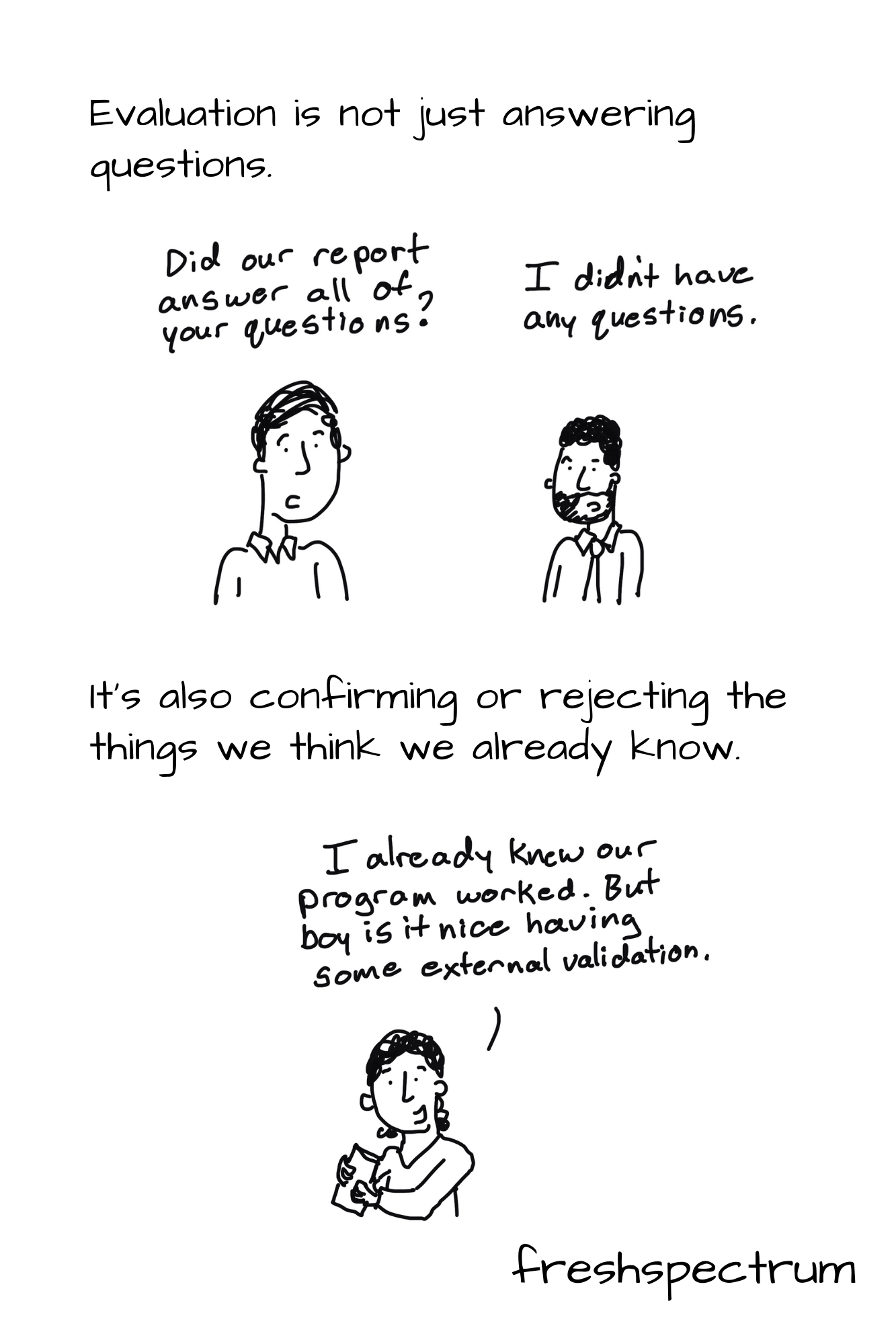
Evaluation is not just answering questions.  

But confirming or rejecting the things we think we do know.

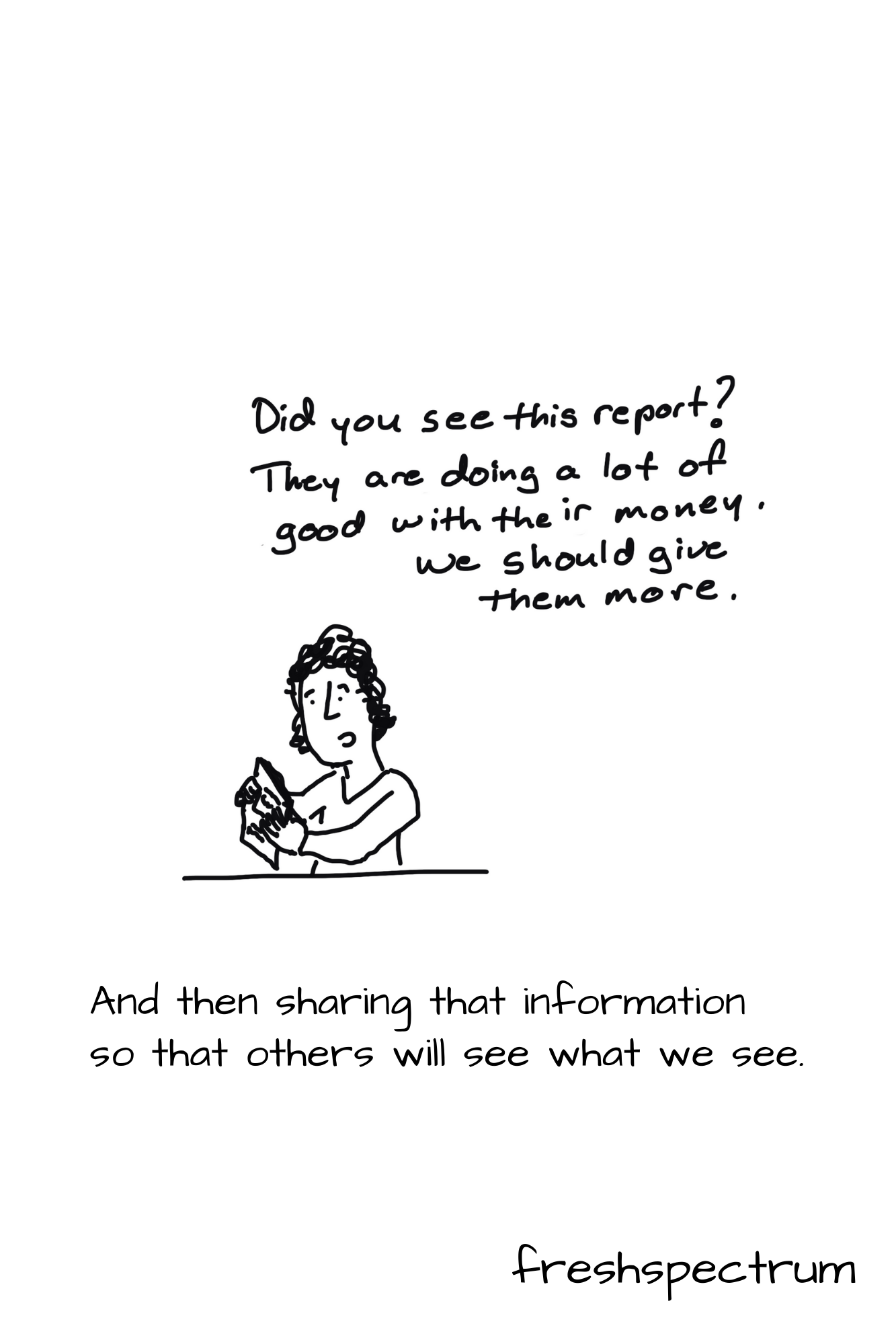
And then sharing that information so that others will see what we see.

Written by cplysy · Categorized: freshspectrum

Apr 28 2021

What are Social Objects? [Behind the Cartoon Podcast]

So I decided to try out podcasting. Today’s first ever episode is about Social Objects. Why? Because it basically covers the theory behind my cartooning.

Show Notes:

  • Just in case the embed above is not working, you can find the podcast by clicking here.
  • Social Objects: Everything You Ever Wanted to Know! (2007 blog post on gapingvoid.com, updated in 2017)
  • Why some social network services work and others don’t — Or: the case for object-centered sociality (a 2005 blog post by Jyri Engeström who was the inspiration for Hugh McLeod)

Related Cartoons

freshspectrum cartoon by Chris Lysy. "Can I tweet a link to my published but paywalled article? Or is that against unwritten social media protocol?"
freshspectrum cartoon by Chris Lysy. "We considered doing something creative, like cartoons or infographics. But we value looking professional over reaching an audience."
freshspectrum cartoon by Chris Lysy. "I'm relying on all of you to help share this critical message with the world."
Later that Day
"How was the presentation?  Any takeaways?"
"I honestly can't remember."
freshspectrum cartoon by Chris Lysy.
Social network analysts (3 people hanging out by an SNA diagram). 
Antisocial Network Analyst (1 person sitting alone at their computer).

Welcome to behind the cartoon. 

This is a podcast about the people and ideas that have inspired the cartoons that I draw on my blog at freshspectrum.com.

My name is Chris Lysy. 

Today’s question.  What are Social Objects?

***

When you think about social networks, what pops into your mind?

You probably see one of those little diagrams with little dots or nodes and connecting lines.  Or maybe even little people icons with lines drawn between them.

Usually we think about these networks as people connecting to other people.

But what this vision misses is the way in which people also connect to objects.  

Often, it’s their connection with those objects that connect them to other people.

Think about it.

Let’s say you have a group of friends you met when you joined a softball league.  The people on the team all became part of your friend network.  But it was the team, and the league, that facilitated the network’s creation.

There are lots of interesting people with interesting ideas.  But it takes a person putting those ideas into some type of object before most other people will discover them.  Books, journal articles, podcasts, blogs, and presentations are all different types of social objects.

And yes, my cartoons are most certainly designed to be social objects.

I learned about the concept from a cartoonist by the name of Hugh Mcleod who goes into a good bit of detail on his blog at gapingvoid.com.  I’ll share one of his blog posts in the show notes.

Hugh applied the idea of social objects to his own cartooning process, focused mostly around business topics.  

And that’s also what I try to do, but with academic topics and concepts.

Most academic fields and subjects are, in my opinion, under illustrated.  When most work is shared behind closed doors in conference presentations and through journal articles, illustration is only really quasi-important.

But on the web, things are different.  The digital world is a visual world.  The inability to depict complex or complicated subjects is problematic, because it limits the spread of ideas.  Often incredibly important ideas.

So I draw cartoons, attempting to illustrate important ideas.  And as a cartoon, that idea spreads much further than it would without the cartoon.  When a cartoon works, you find it in social media posts, blog posts, and presentations.  It becomes an object with an orbit and connects people in a way that no journal article ever will.

Now that’s just what I’m doing with the concept.

There are all sorts of social objects you can create to spread your ideas.  Infographics, podcasts, and webinars all travel pretty well digitally.

What kind of object can you create to help your ideas spread further?

***

Thanks for listening.  Before you go about your day, check out the description for a link to today’s show notes.  In addition to links that include more info on social objects, you’ll also find a few new cartoons inspired by this topic.

Please enjoy and share.  And if this episode inspires you to create your own social object, leave me a comment, I would love to see what you created.

Written by cplysy · Categorized: freshspectrum

Apr 08 2021

How do people read reports and just what is an F Pattern?

When I talk about report design there is always one message I make sure to deliver. People scan reports before they read reports (if they end up reading them at all).

But what does that mean really?

That’s what this post is about. We’ll walk through a couple of common reading patterns identified through eyetracking research. Then we’ll talk a little about the ramifications.

Freshspectrum cartoon by Chris Lysy. "Of course I read your report"
"(then) why the air quotes?"

What do we mean when we say people scan before they read?

Most data people write reports like they were taught to write reports in university. Sentence after sentence after sentence.

Yes, by all means, use figures. But only if they are completely relevant to your words. And if you have no figures…well, that’s okay too.

But if you ask most data people how they read reports (other people’s reports), most will admit that they certainly don’t read the report like a book. Maybe you’ll start at the beginning, but doubtful you’ll read every word. Chances are, you’ll scan and every once and awhile stop to read a sentence or two.

Eyetracking research backs this up. Especially for materials read on the web. If you want to dive deep into the subject, check out some of the work the Nielsen Norman Group has done over the years: How People Read Online: New and Old Findings.

Know that most users will read very little from a wall of text; support them by chunking your content into sections and bulleted lists, by using meaningful subheadings, and by special visual styling for keywords.

Text Scanning Patterns: Eyetracking Evidence

Freshspectrum cartoon by Chris Lysy.
According to an eyetracking study I participated in, I read with a Q-pattern.  I read all the words around the edge of a page along the margins, then a little extra in the bottom right corner.

F Pattern reports in a Z pattern world.

If you followed any of the links above, you’ll have noticed that there are several major eyetracking patterns depending on how the content is setup. I’m only going to focus on two here. The F Pattern and the Z Pattern (a.k.a. the zigzag pattern).

There is no superior pattern (these are just ways our eyes react to words and pictures on a page). But I do think that these reading patterns reflect the changing requirements we see in our own reporting worlds. In a way, we’re stuck between two mindsets.

On one side, the traditional report that is likely scanned with an F-Pattern. And on the other side, the modern visual report, that is likely scanned with an entirely different approach.

What is an F Pattern?

Eyetracking F-Pattern image by Nielsen Norman Group.

The F-Pattern is what happens when our eyes fall upon a big block of text.

At first we give it a shot, reading the top line (potentially the heading) and maybe a line or two following. Then our eyes drop until maybe a new paragraph, section, or sub-header. We’re a little less committed now so we might not make it all the way across the line of words. Then we drop to the bottom of the page.

In reports that are just straight narrative, with little to no section breaks, illustrations, or visual hierarchy, where our eyes stop while scanning is random and arbitrary.

Why People Scan in an F-Shaped Pattern
People scan in an F-shape when all of these 3 elements are present:

A page or a section of a page includes text that has little or no formatting for the web. For example, it has a “wall of text” but no bolding, bullets, or subheadings.
The user is trying to be most efficient on that page.
The user is not so committed or interested that he is willing to read every word.

Designing websites that mirror how our eyes work

What is a Z Pattern?

Eyetracking Z Pattern from an article on theNextWeb.

The wide screens of the web are designed differently. Unlike the paper reports of the past, not everything is left aligned. We have sidebars and illustrations that shift from one side of the screen to the other.

Well designed sites are rarely filled with big blocks of text. Instead they guide the reader through intentionally, block by block, section by section.

As our reports adapt to meet the visual needs of primarily digital audiences, we need to understand that our reader’s eyes work differently on the web.

Think of the Z-pattern as the sister to the F-pattern. Both are naturally occurring eye patterns, as validated by eyetracking studies. The difference is in the type of content the user encounters. Usually, content-rich pages will trigger the F-pattern while pages with strong primary content are more suitable for the Z-pattern…

The Z-pattern is perfect for interfaces where simplicity is a priority and the call-to-action is the main takeaway. In short, the F-pattern organizes content, the Z-pattern emphasizes calls-to-action.

Designing websites that mirror how our eyes work

Freshspectrum cartoon by Chris Lysy.
So, these are the results of our report eyetracking study. You'll notice they don't extend beyond page 3.  By that point all of our study participants had fallen asleep."

Know your report audience and sharing approach. Then design accordingly.

We’re in a period of transition.

We’re no longer governed by the spatial limitations of a typewriter. We can create reports with color and structures that don’t fit traditional molds. Yes, the structure might be different, but our reader’s eyes and reading patterns have been adjusting now for decades.

But even when we do create that long narrative report, adapt the design with respect to how people read. Use call-out boxes with larger fonts to layout the important takeaways. Use color and illustration to draw attention to the points you want to stick in your reader’s mind.

Written by cplysy · Categorized: freshspectrum

Mar 31 2021

How to build an online community of practice (8 Tips)

For a little over a year I have had the pleasure of designing and facilitating a specific public health program focused evaluation community of practice. I have had a great partner in this work and have learned a lot about virtual community building.

Today’s post highlights just some of the tips I have learned through experience.

freshspectrum cartoon by Chris Lysy:
Can they really call it a community of practice if the community members don't know one another?

1. Build the Community First.

Far too many online “communities” are not much more than a virtual lecture series serving a defined audience. There is little space made for peer to peer engagement. Is it really a community if the people within don’t know each other or have the opportunity to interact?

One of the biggest challenges building communities in a virtual space is that you don’t need to just replace the lecture hall, you also need to replace the interactions that occur in the hallways and the line for coffee. Communities are built through interaction and engagement, not just a shared interest in a particular topic or membership in a particular group.

Design activities that don’t just serve your audience, but give your community members the space to learn about one another.

freshspectrum cartoon by Chris Lysy: Online communities are made out of people! They're people!

2. Show Faces.

We all want to belong to groups that include actual human beings. Communities of practice are built so that individual members can learn from “people like me,” not a disembodied voice from on high.

That means not just including the community in conversation, but also offering ways to see their faces. Regular, informal, “camera on” group conversations via zoom can help. So can including faces on your webinar invitations.

It’s easy to hide behind the keyboard, so plan your way around that.

*But don’t require videos be turned on during webinars, and don’t do it all the time for everyone. With so many people juggling household responsibilities (taking care of kids and other family) while participating in professional activities, requiring cameras on can alienate certain members of your community.

freshspectrum cartoon by Chris Lysy: All of you attending this webinar are hand selected experts. The greatest minds in our field. We asked you here so that we could deliver a boring forgettable presentation while you eat your lunch and scroll around on Facebook.

3. Bottom up, not top down.

The goal of a community of practice should be to draw upon the expertise of the community. Don’t just think about what they would like to hear, ask them what they would be willing to contribute.

It is certainly easier to just come up with a list of webinar topics and run with it. But sourcing expertise from your community is the best way I’ve found to increase ongoing participation. It takes time and trust building, but ultimately it builds a better community.

freshspectrum cartoon by Chris Lysy: What, they want me to answer a 5 minute survey? Who has time for that?
They want me to lead next month's hour long presentation? How could I say no?

4. When asking less can be asking too much.

We are all worried about taking up too much of people’s time. But don’t be afraid to ask for something big, like webinar presenters, instead of something smaller, like blog posts or comments.

Asking a community member to present during a webinar sounds like a really big commitment. But often they are presenting from their own personal experiences (without needing much in the way of planning) and there is a well-defined deadline. Plus, it feels good to be asked for your expertise.

Asking a community member who doesn’t participate much in the blogging or social media world to comment on a blog post, while a relatively easy ask, can often fall totally out of their comfort zone.

freshspectrum cartoon by Chris Lysy: When will they invent a vehicle that combines all the benefits of a bicycle, taxi cab, bus, train, and airplane into a single product.

5. Assembling your community tech stack.

I get asked a lot, “so what technology do you use?” The answer is a list, not any singular tool. And it always depends on the community.

I think it’s better to think of your tech as a bundle, not a single tool. Here are my go-to tools. Keep in mind, there are many alternatives for each that work just fine.

  • WordPress – for the community hub.
  • Zoom – for webinars and other virtual gatherings.
  • Mailchimp – for a regular email newsletter.
  • Eventbrite – for webinar/event registration.
  • Teachable – for hosting self paced learning modules.
  • Canva – for designing communications materials.
  • YouTube – for hosting webinar recordings.
  • Slack – for member to member communications.
  • Dropbox – for communal resource libraries.

You don’t need everything for every community. If you are not a techie, and don’t have the money to hire someone like me to handle things for you, I would certainly advise you to start small.

freshspectrum cartoon by Chris Lysy: So this is our current content strategy (we are winging it).

6. Developing a content strategy.

Regular content is important. Just how regular depends on your community.

Don’t make the mistake of creating a forum and expecting your community to just show up and fill it up with great content. Most of the time, this just leads to dead forums and little to no participation.

Instead try to set a content schedule. Not sure where to start, how about a monthly webinar? This requires you to create a registration page, put out an initial announcement blog post, sharing that announcement and post through email, sending a follow-up reminder email, creating a recap blog post after the event, posting the recording, and sharing the recap/recording through an email.

As you can see, even just one webinar a month can fill a content calendar. Especially if you add bonus content/downloads in the prep stages and the recap. Put it all down on a calendar, and repeat each month.

freshspectrum cartoon by Chris Lysy: 
Webinar Agenda
First 15 minutes- fumble around with the technology.
Next 10 minutes - expert presentation (who will be on mute but not know it).
Next 15 minutes- expert loses internet, time spent trying to get them back.
Next 15 minutes - Give up hope, spend rest of the time showing off pets.
Final 5 minutes - Expert returns (out of breath for some reason), tries to cram 40 minutes of presentation into 5 minutes.

7. Mixing your engagement methods.

Try expert seminars, panel presentations, informal roundtables, expert Q&As, and other engagement methods. There is no rule saying you need to stick to one and only one format. Experiment until you find the right mix for your community.

freshspectrum cartoon by Chris Lysy: When i was your age, we presented in front of real people. We could see their eyes and hear their voices. If our presentation was bad, we knew it.

8. Evaluating your efforts and determining needs.

Once you get an active community going, needs assessment should become easier. But it takes time to get to that point, and early surveys might see very low response rates.

Early on in your efforts I suggest forming an advisory group (drawn from your membership) to help guide your ongoing work. Try to get a group that represents different facets of your overall community. Then set up a regular virtual get together once a quarter or bimonthly.

Written by cplysy · Categorized: freshspectrum

Mar 23 2021

How to Create Power Point Infographic Templates Using Canva

In the research and evaluation worlds where I tend to do most of my work, Microsoft Office reigns supreme.

I have nothing against Word, PowerPoint, or Excel. But I just find some other tools are just easier to use for certain tasks (such as creating infographics). And while that’s fine when working independent, so much of my design work is built around collaboration with a broader team.

This usually gives me two options. I can try to teach that team a new tool while we collaborate (not always as easy as it sounds). Or we stick with what they know and create in Office. Luckily with Canva I can get the best of both worlds.

Here is how I would go about creating an infographic template in canva to use in PowerPoint.

How to Create Power Point Infographic Templates Using Canva - Illustration

Before you comment, yes, you can create infographics directly in PowerPoint from scratch.

But I just find it easier to work off of Canva templates, even if my ultimate destination will be PowerPoint. The workflow is smoother in Canva, the templates are easier to search, and shape elements are easier to add.

Freshspectrum cartoon by Chris Lysy.
"I like to make my infographics at a scale of 2:32. Then, when I'm done presenting, I can use it as a belt."

Pick an Infographic Size

How to Create Power Point Infographic Templates Using Canva - Illustration - Pick an Infographic Size

Infographics can be any size. But if you start with an “infographic” template in Canva it starts you with a long thin canvas. So I prefer to start with the size of infographic I want. I’ll still be able to search through all the Canva templates later.

If you are designing something for both print and web, I suggest going with something you can print using your office printer. Lots of U.S. organizations have printers that can print 11 x 17. Added benefit, if you fold it in half the dimensions are 8.5 by 11 (the perfect size to fit into a standard folder with other handouts).

Find a Canva Template

How to Create Power Point Infographic Templates Using Canva - Illustration - Find a Canva Template

Whatever size you choose to start with, search “infographic” using the Templates menu. You’ll be given a whole bunch of options to choose from.

Adapt the Canva Template

How to Create Power Point Infographic Templates Using Canva - Illustration - Adapt the Template

Once you choose a template, you can start adapting the template to meet your brand colors/fonts. You can also get rid of anything you don’t want to be a part of the base template.

If I were designing solely in Canva, I would enter in all my text and icon illustrate. But since I plan to rewrite in PowerPoint, I’ll just leave the template defaults.

Add Additional Pictures or Graphics

How to Create Power Point Infographic Templates Using Canva - Illustration -  Add Additional Pictures or Graphics

Just because you start with a template doesn’t mean you can’t add a little bit of your own style to infographic. You’ll find lots of options in elements and photos.

Download as Microsoft Power Point

How to Create Power Point Infographic Templates Using Canva - Illustration - Download as Microsoft PowerPoint

Once you’re done pulling together your base template, download it into PowerPoint. Use the little menu button in the upper right hand side of the page (you won’t find the option in the Download menu). The download to PowerPoint will be in the “Share” portion of the menu, although you might have to click a “See All” button to find it.

Open and Tweak in Power Point

How to Create Power Point Infographic Templates Using Canva - Illustration - Open and Tweak in PowerPoint

After you download it into PowerPoint, and before you share it with your team, I would suggest cleaning it up a bit. The save as PowerPoint works pretty well in Canva, but some of the shapes/elements might get wonky or fall out of the page boundaries. I like to quickly fix them and send out a clean template.

Share with Your Team for Editing

How to Create Power Point Infographic Templates Using Canva - Illustration - Share with your team for editing.

Alright, now you’re ready to share your PowerPoint with the other members of the team. Since so many people know how to use PowerPoint, they don’t have to come to you every time to edit and revise their work.

Icon Illustrating in PowerPoint

How to Create Power Point Infographic Templates Using Canva - Illustration - Icon illustrating in PowerPoint

You might have noticed that I cleared out all the icons before downloading to PowerPoint. Icons are tricky to have in templates because they might be too specific for all the times the template might be used.

Luckily PowerPoint has it’s own icon library. After the text goes in I often do an icon illustration pass, illustrating the different blocks with icons based on the text.

Save as your desired format.

How to Create Power Point Infographic Templates Using Canva - Illustration - Save as your desired format.

Finally, just because it’s in PowerPoint, doesn’t mean it has to stay in PowerPoint. Depending on your uses, you can always save it as an image file (like a png or jpg) or a PDF.

Written by cplysy · Categorized: freshspectrum

  • « Go to Previous Page
  • Go to page 1
  • Interim pages omitted …
  • Go to page 38
  • Go to page 39
  • Go to page 40
  • Go to page 41
  • Go to page 42
  • Interim pages omitted …
  • Go to page 54
  • Go to Next Page »

Footer

Follow our Work

The easiest way to stay connected to our work is to join our newsletter. You’ll get updates on projects, learn about new events, and hear stories from those evaluators whom the field continues to actively exclude and erase.

Get Updates

Want to take further action or join a pod? Click here to learn more.

Copyright © 2026 · The May 13 Group · Log in

en English
af Afrikaanssq Shqipam አማርኛar العربيةhy Հայերենaz Azərbaycan dilieu Euskarabe Беларуская моваbn বাংলাbs Bosanskibg Българскиca Catalàceb Cebuanony Chichewazh-CN 简体中文zh-TW 繁體中文co Corsuhr Hrvatskics Čeština‎da Dansknl Nederlandsen Englisheo Esperantoet Eestitl Filipinofi Suomifr Françaisfy Fryskgl Galegoka ქართულიde Deutschel Ελληνικάgu ગુજરાતીht Kreyol ayisyenha Harshen Hausahaw Ōlelo Hawaiʻiiw עִבְרִיתhi हिन्दीhmn Hmonghu Magyaris Íslenskaig Igboid Bahasa Indonesiaga Gaeilgeit Italianoja 日本語jw Basa Jawakn ಕನ್ನಡkk Қазақ тіліkm ភាសាខ្មែរko 한국어ku كوردی‎ky Кыргызчаlo ພາສາລາວla Latinlv Latviešu valodalt Lietuvių kalbalb Lëtzebuergeschmk Македонски јазикmg Malagasyms Bahasa Melayuml മലയാളംmt Maltesemi Te Reo Māorimr मराठीmn Монголmy ဗမာစာne नेपालीno Norsk bokmålps پښتوfa فارسیpl Polskipt Portuguêspa ਪੰਜਾਬੀro Românăru Русскийsm Samoangd Gàidhligsr Српски језикst Sesothosn Shonasd سنڌيsi සිංහලsk Slovenčinasl Slovenščinaso Afsoomaalies Españolsu Basa Sundasw Kiswahilisv Svenskatg Тоҷикӣta தமிழ்te తెలుగుth ไทยtr Türkçeuk Українськаur اردوuz O‘zbekchavi Tiếng Việtcy Cymraegxh isiXhosayi יידישyo Yorùbázu Zulu