• Skip to main content
  • Skip to footer
  • Home

The May 13 Group

the next day for evaluation

  • Get Involved
  • Our Work
  • About Us
You are here: Home / Archives for allblogs / freshspectrum

freshspectrum

Mar 17 2021

What is an Infographic?

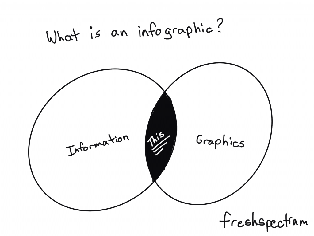
So let’s not overthink this one.

Infographics are the result of asking graphic designers to illustrate data and other information. We can find examples across history of people mixing pictures and text to convey information. There is no singular style and an all encompassing definition is probably not all that useful.

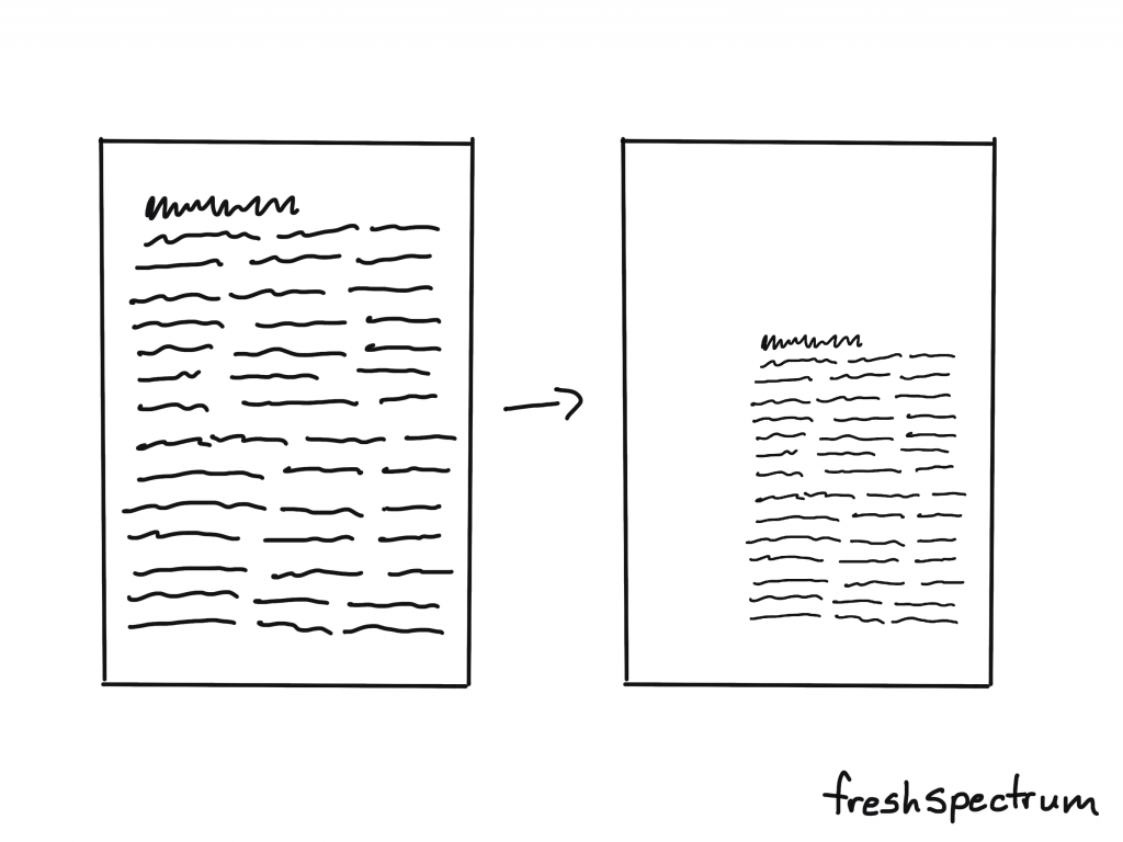
For me, infographics are just a way to adapt a body of work (say a report or a paper) to meet the needs of a particular audience.

What is an infographic? Cartoon by Chris Lysy of Freshspectrum showing a Venn Diagram with Information and Graphics. "This" is shown in the overlap.

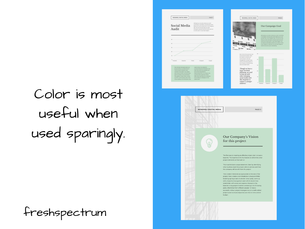
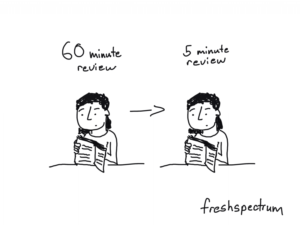
We live in a visual world. And visual reports are slowly becoming the norm, not an exception.

But for a lot of organizations, those fearful of stepping too far away from their normal practices, going all in on visual reporting is a lot to ask. Infographics offer a kind of stepping stone.

Cartoon by Chris Lysy of Freshspectrum.  So basically an infographic is just a poster with charts? Yeah, pretty much.

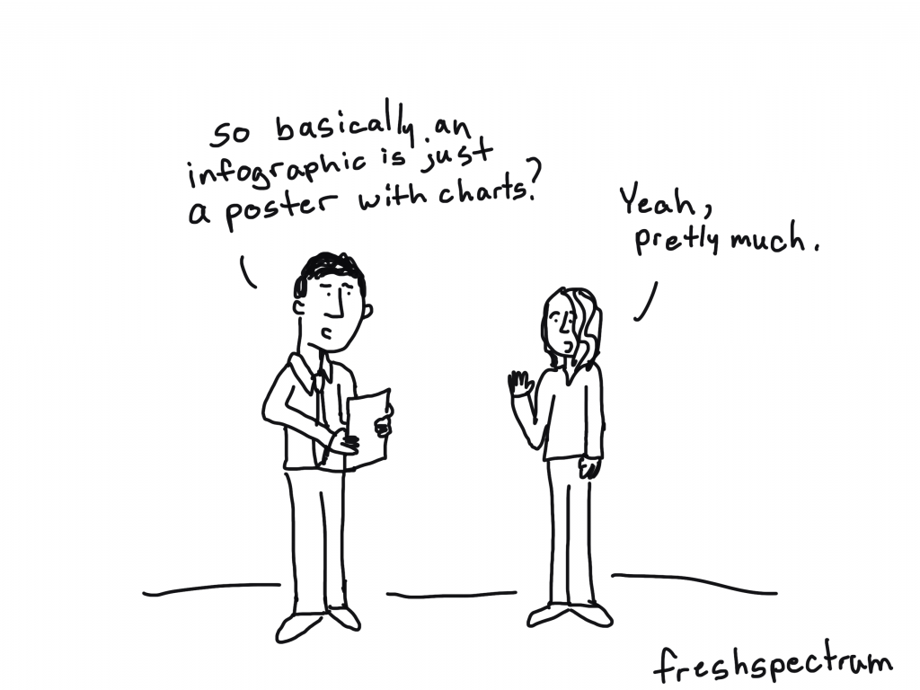
Infographic design as poster design.

The easiest way to think about an infographic is to look at it like a poster.

Posters are purposeful visual communication tools. Posters outside a movie theatre show you what’s playing. Posters outside a music venue tell you what artists are going to be appearing soon, and where else they are playing. Posters in the airport security line tell you how to prep for your turn through the metal detectors.

Yes, you can communicate some useful information. But rarely ever does a poster offer anything comprehensive. Comprehensive is just not the point. Speaking directly and efficiently to an audience is the point.

What tools should I use?

I would suggest using design tools for your infographics. Tools like Adobe XD, Adobe Illustrator, Adobe Photoshop, Sketch, Canva, or even Power Point can be used to make nice infographics.

I would avoid trying to create infographics using analysis tools or dashboard tools (like Tableau, R, or Excel). Same with word processing tools like Word. You can create infographics using anything, but that doesn’t mean you should.

Cartoon by Chris Lysy of Freshspectrum. So the only requirement was that the infographic be printed one-sided. i was having trouble fitting everything until I remembered that a mobius strip is always one-sided.

Examples of Infographic Styles

Just because there isn’t one way to create an infographic doesn’t mean we have to start from scratch. There are all sorts of styles and examples on the web. The type you choose really depends on your information and your specific audience needs.

I’ll share some links where you can find good examples at the end of the post, but before that, here are some basic styles.

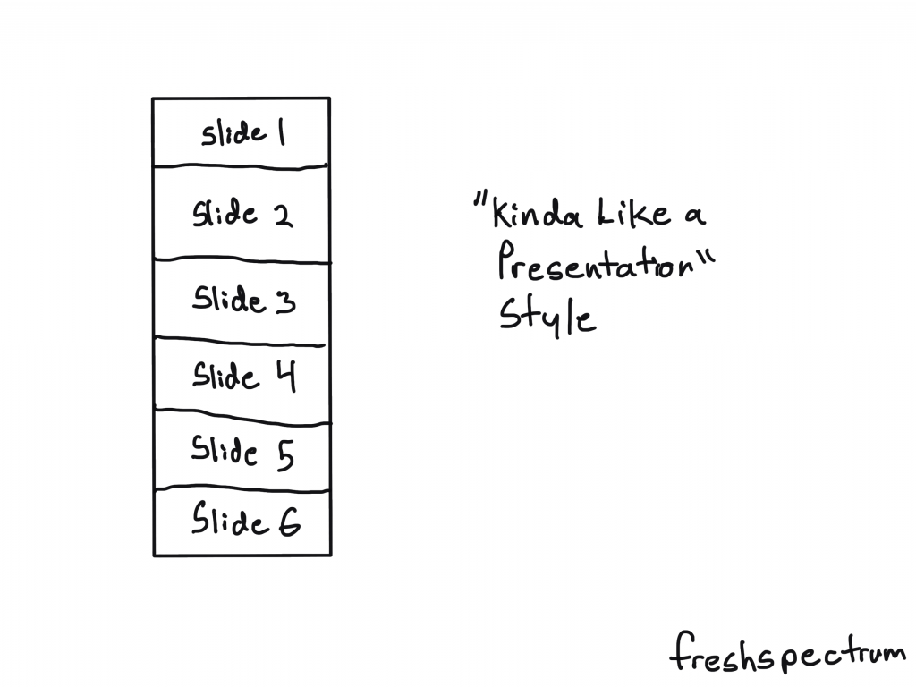
The “Kinda Like a Presentation” Infographic

These infographics used to be all the rage a decade ago. Basically you create your infographic like it’s a power point slide deck (or slide doc). Then you sequence the panels (slides) like you would with a presentation.

Just remember that you won’t be standing in front of the slides when you share it. So you want to make sure people can read it from top to bottom.

What is an Infographic? Illustration - Kinda like a presentation style.

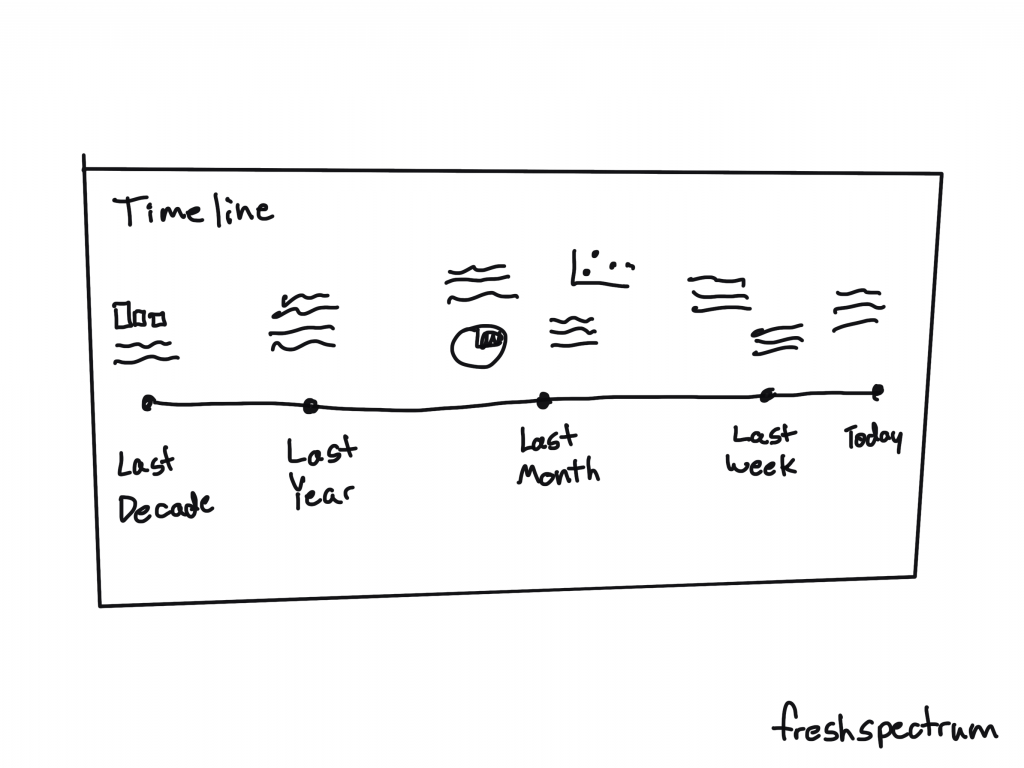
The Timeline Infographic

It’s a timeline. You annotate it with words, dates, pictures, and charts. The timeline itself provides the narrative underpinning.

What is an Infographic? Illustration - Timeline style infographic

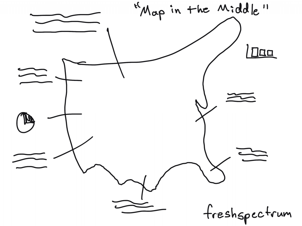
The “Map in the Middle” Infographic

It’s a map. You annotate it with words, pictures, and charts.

People like maps.

What is an Infographic? Illustration - Map in the Middle Infographic

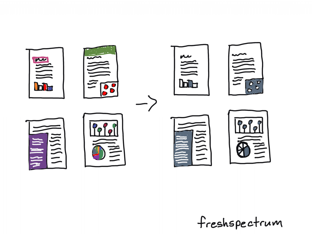
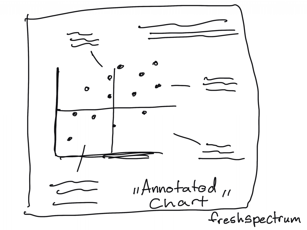
The Annotated Chart Infographic

You start with an interesting chart. Then you annotate it with words, pictures, and other charts.

This is a nice infographic if you have some kind of marquee chart to feature.

What is an Infographic? Illustration - Annotated Chart infographic

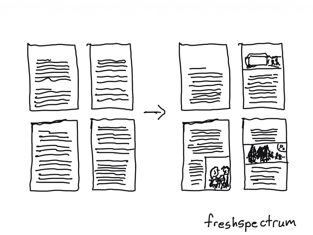
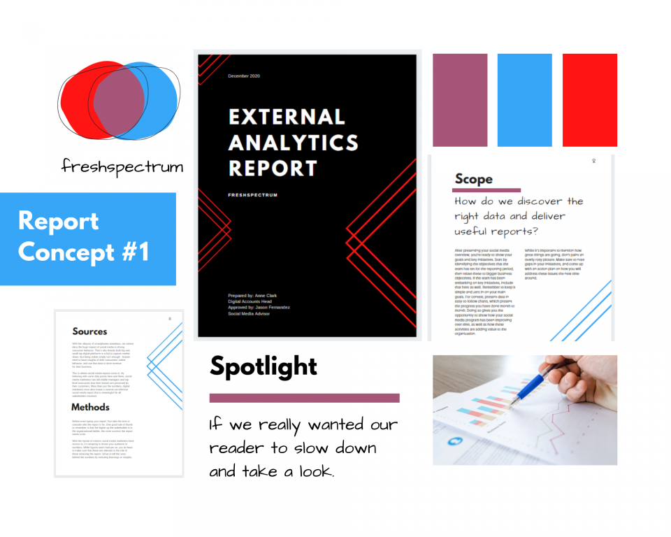
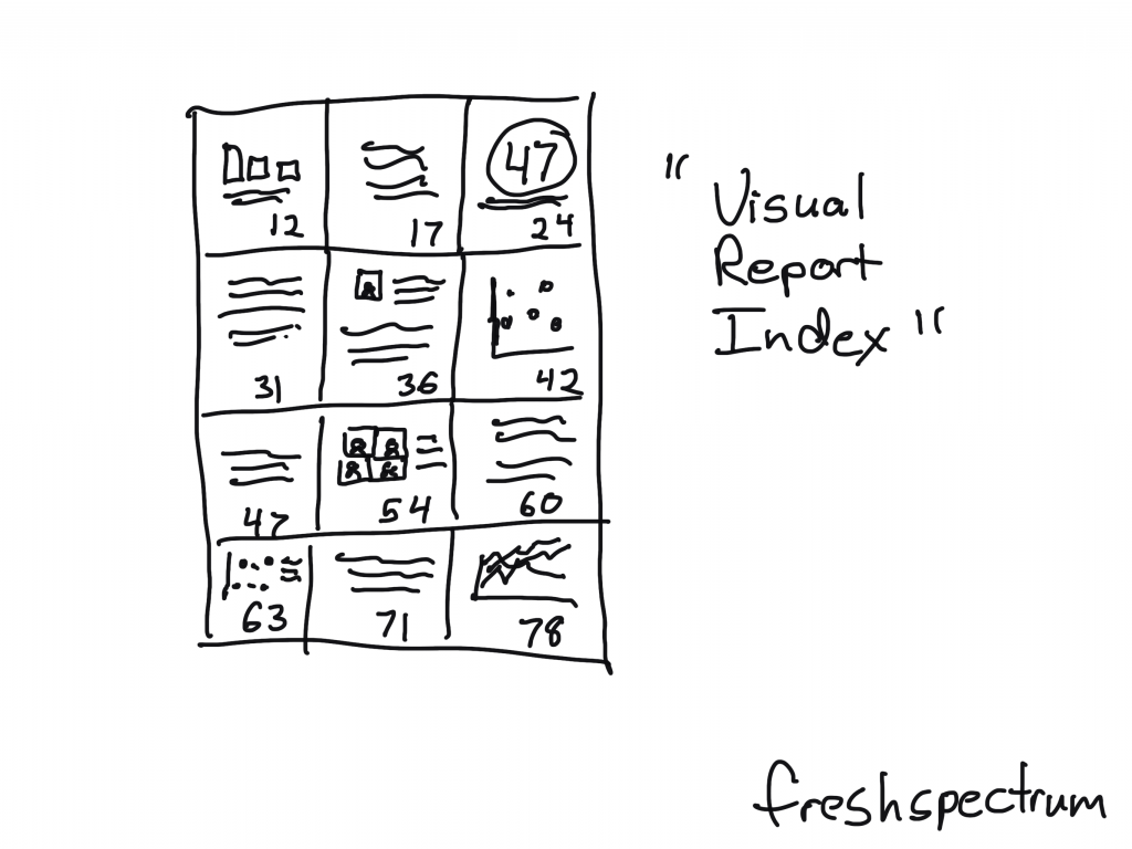
The “Visual Report Index” Infographic

This is an infographic that pairs really well with a longer report.

You just take out quotes, graphics, and charts and put them with their page number. The person reading the infographic will know exactly where to go in the report if they want to dive deeper beyond the single fragment.

What is an Infographic? Illustration - Visual Report Index infographic

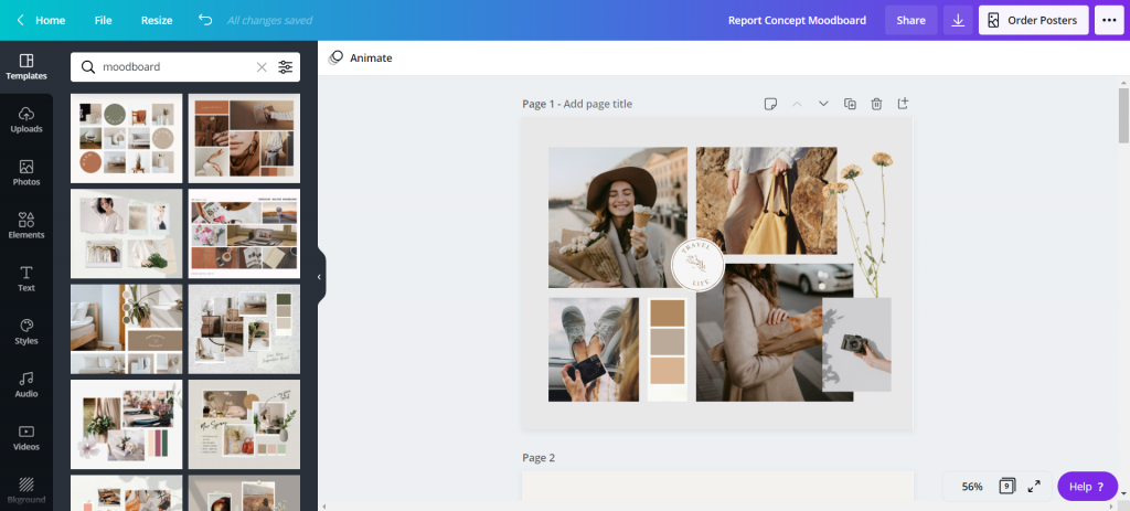
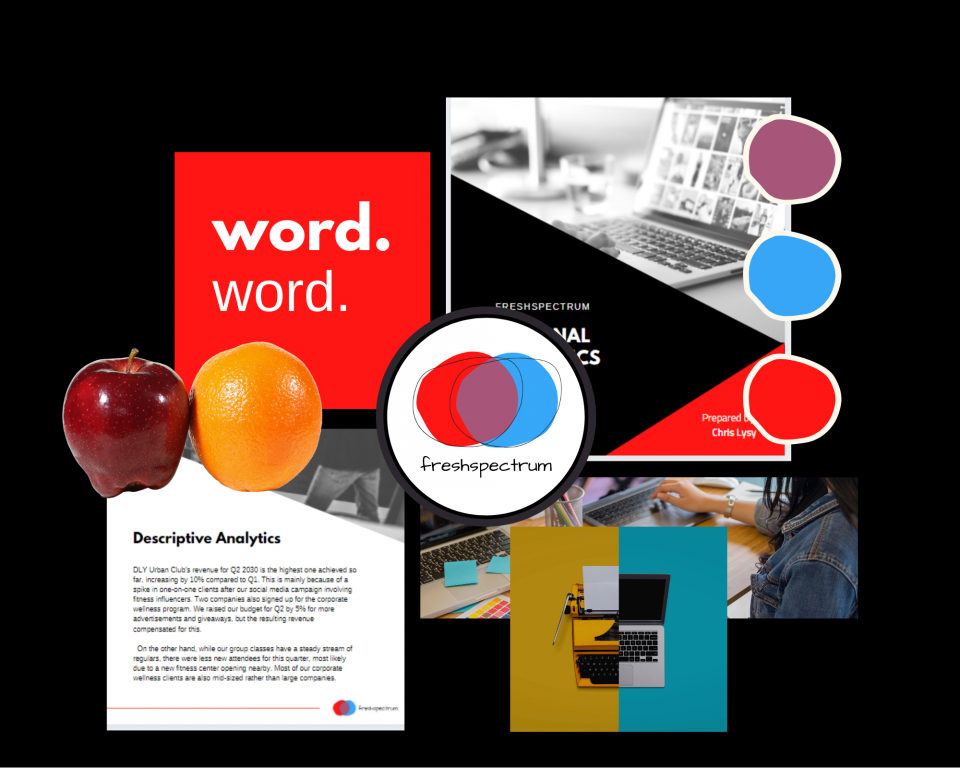
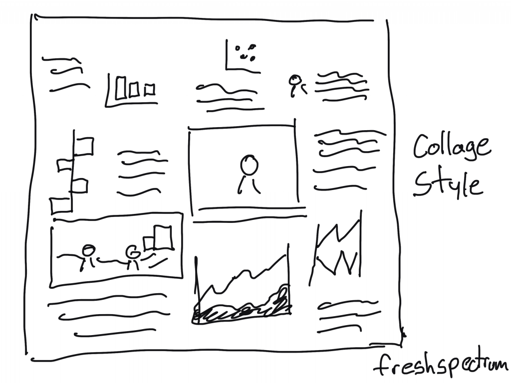
“Collage Style” Infographic

For the people really good at creating scrapbooks. You can pull together a bunch of information in the style of a collage.

What is an Infographic? Illustration - Collage Style infographic

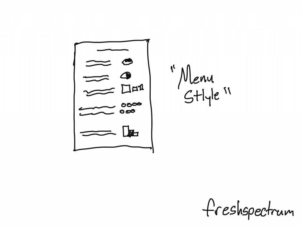
The “Menu Style” Infographic.

With this style you basically just mimic a restaurant menu. But instead of pictures and descriptions of the food, you have charts and annotations.

You could also add page numbers to make index style.

What is an Infographic? Illustration - Menu Style infographic

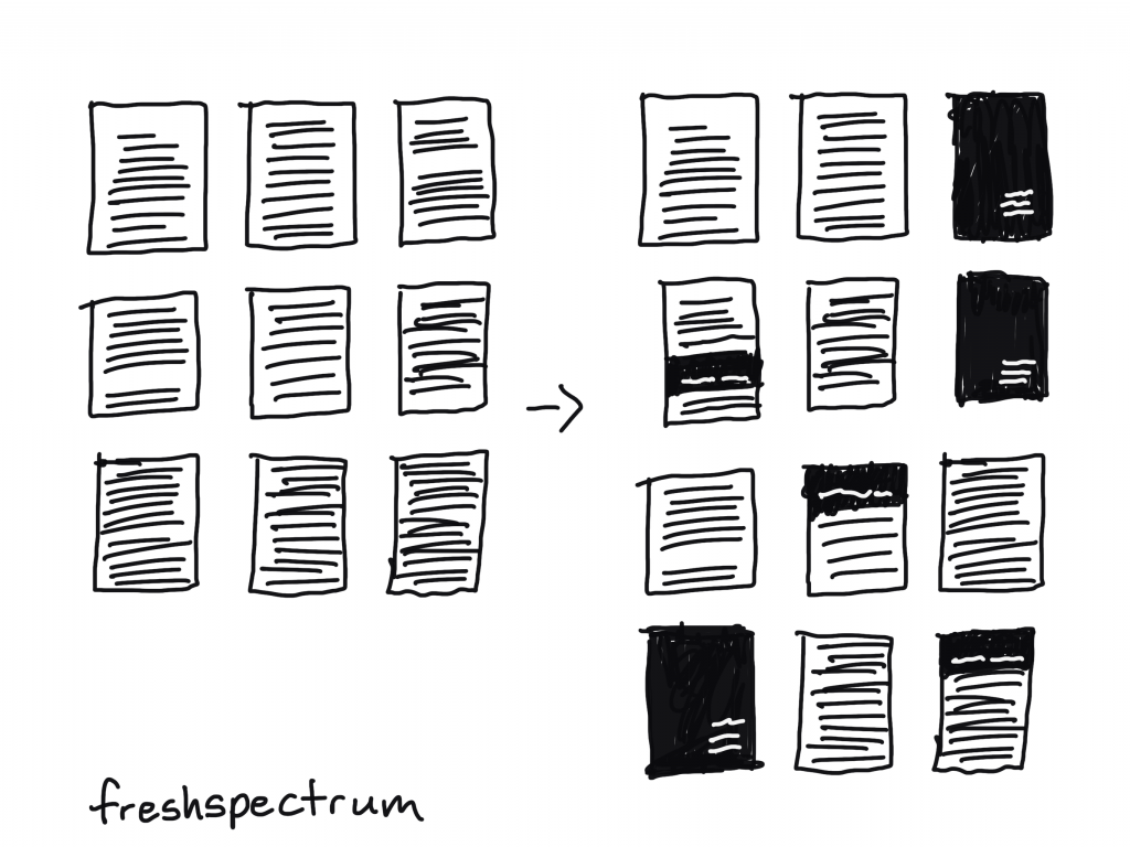
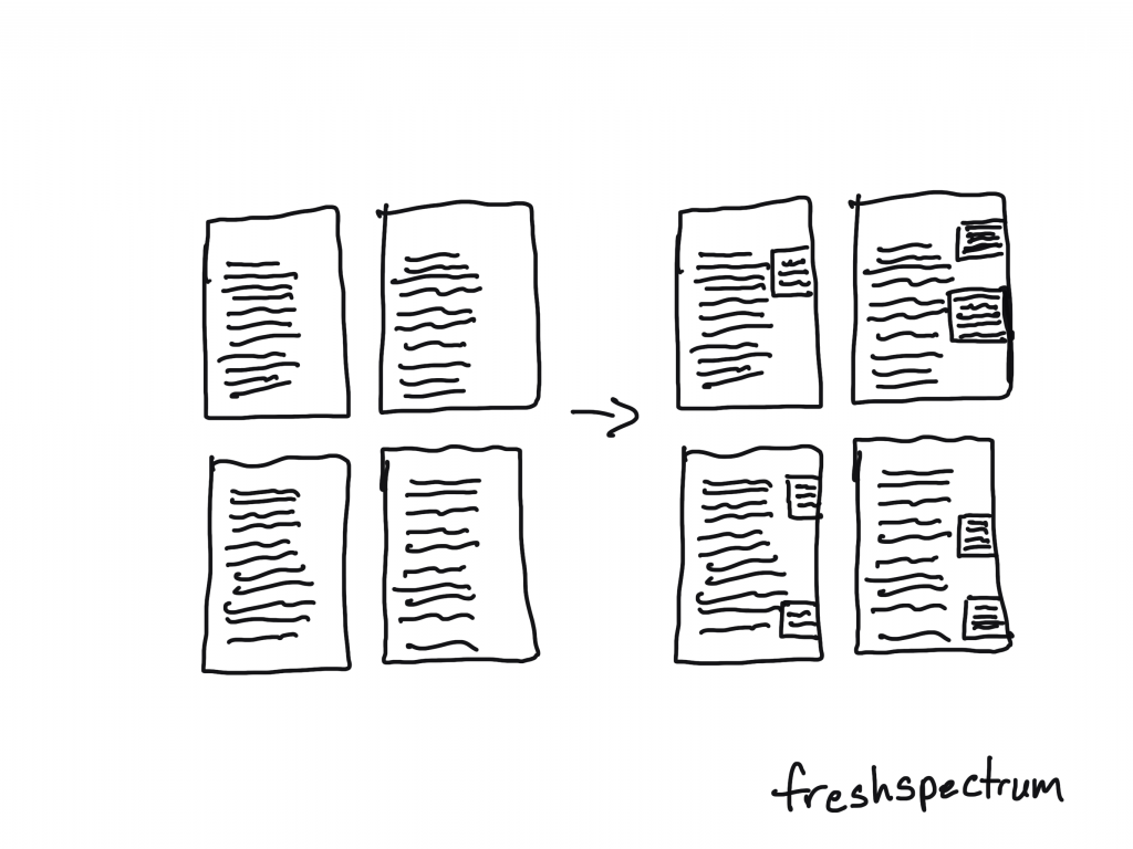
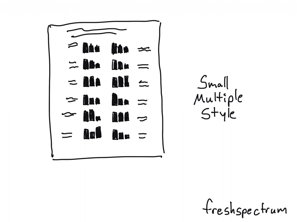
Small Multiple Style Infographic

Small multiples make really solid infographics. You just start with one chart then repeat it over and over again. For example, if you have a program with 20 sites, you create the same chart for all 20 sites then put them together on the same page.

What is an Infographic? Illustration - Small Multiple style infographic

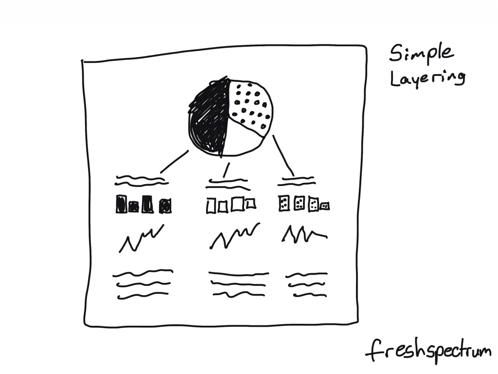
Simple Layering Infographic

Start with one chart.

Then for each of the categories shown in that first chart, you’ll create subsequent charts or share other specific information. This is similar to how you might create an interactive dashboard, showing multiple levels of data, but with an infographic you’ll just do that on one page without the required clicks.

What is an Infographic? Illustration - simple layering style infographic

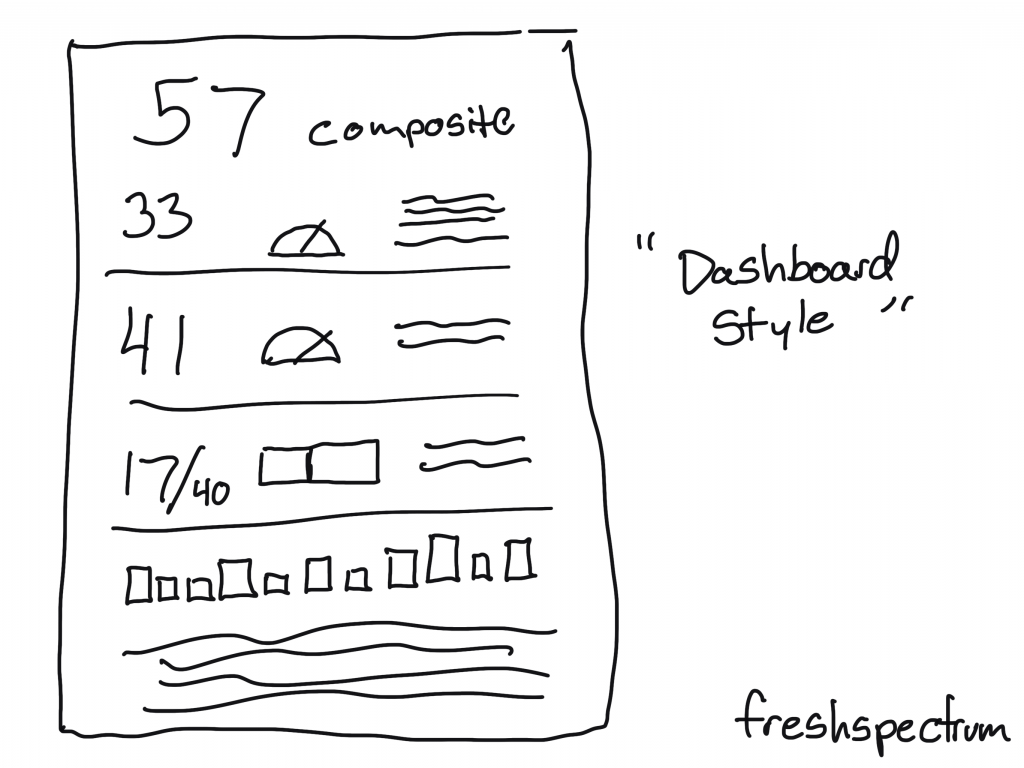
“Dashboard Style” Infographic

This is usually what I suggest when a client wants a dashboard but the data doesn’t continuously update. You create a dashboard look, but then you can release once a month (or once a year).

What is an Infographic? Illustration - dashboard style infographic

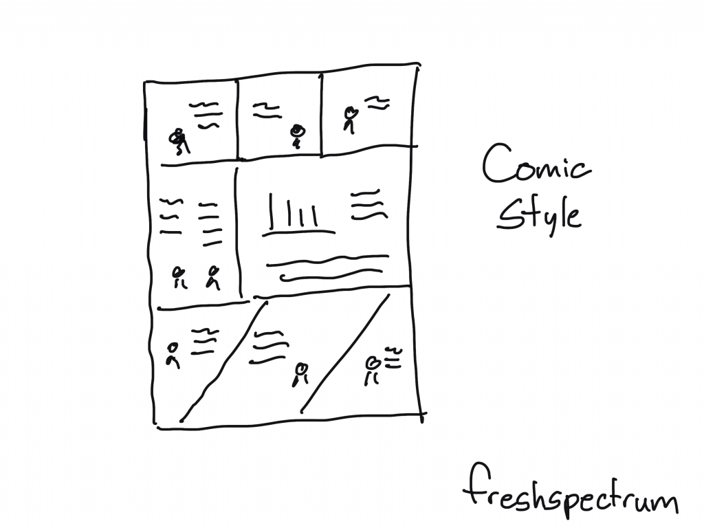
Comic Style Infographic

So for this one you create your infographic like it’s a comic or a graphic novel. I really like this approach, and not just because I draw cartoons.

What is an Infographic? Illustration - comic style infographic

Some Example Infographics

I shared a bunch of styles, but there are tons more out there. Seriously, I could have kept going on and on (diagrams, pathways, flow charts, etc.).

But instead of that, at this point you’re probably just hoping to find some links with good examples. So here you go:

  • What is an Infographic? Examples, Templates & Design Tips
  • What Is an Infographic? Why They’re Great & How to Create Them
  • How designers do it: 15 easy steps to design an infographic from scratch

Written by cplysy · Categorized: freshspectrum

Mar 12 2021

6 Report Design “Quick Fixes”

Imagine going to a fancy restaurant (pre-COVID).

The dish you order is fantastically presented, it looks and smells phenomenal. It looks so delicious you consider taking a picture and sharing on your favorite social media account.

But what would happen if you surrounded that dish with a grungy atmosphere and put it on a dirty table? What if your server is pre-occupied with their phone and forgot to get your drink? What if the food was spoiled before it was cooked and plated? What if it makes you ill?

The presentation of the food is important, but context and quality really matter.

freshspectrum cartoon by Chris Lysy.
"This is a highway rest stop vending machine."
"Yea, but the parmesan risotto it offers is fantastic."

The same goes with a well designed chart. If you put it into a poorly designed report it’s never going to have the same impact. I often get asked to review charts in reports. But most of the time it’s not the charts that need the most work.

Want to make your charts shine? Start by fixing your report design. Here are some ways you can fix your report.

1. Incorporating white space into your template.

Incorporating white space into your template illustration.

When you write a report it’s standard practice just to fill page after page with words. But just because you write it that way doesn’t mean it’s the best way to present your words to others.

A little white space can give your words breathing room. Even if it means reducing the type face, the result is worth it.

My suggestion, put your words into a basic 3 or 4 column grid for your final draft. But keep at least one column empty. Use it only for call-outs and captions. It can do wonders. Not sure how to do that? This post I wrote on creating a sidebar style one-pager in Adobe XD will give you the gist. Then just copy and paste the page until you have enough for your full report.

Let space be space. Just because you can place text from margin to margin doesn't mean you should.

2. Designing your sections and subsections to create a rhythm.

Designing your sections and subsections to create a rhythm illustration.

Blank pages and empty color blocks might seem like wastes of space, but they can really set a nice rhythm for your reader to follow. This improves the overall skimmability and makes the report feel like more than just one continuous stream of thought.

All you really have to do is create a mostly blank page at the start of a new section. And possibly use some kind of color block or large header to denote section breaks. Also don’t be afraid to start the next section or subsection on a new page. This can give your reader a chance to catch their breath.

Ann K. Emery has a nice post that shows the value of sectioning. I suggest you check it out. A Two-Hour Turnaround: How to Transform a Text-Heavy Report into a Visual-Lite Report.

3. Making your colors consistent.

Making your colors consistent illustration.

Color can be an incredibly useful tool in spotlighting specific information or differentiating important points. But you need to see color, not just in a single figure, but in the context of the whole report.

Far too often individual charts/tables/pictures get picked without regard to the other elements in the report. The result is a hodgepodge of colors that don’t fit together.

Before you finish with your report, go back through and make your colors consistent. If there is a reason to break the rule (to showcase a specific point) then do it intentionally. Haphazard colors and formats are quick tells that the report has been designed by an amateur.

Having trouble with colors, this post might be helpful: How to develop a data visualization color palette.

Color is most useful when used sparingly.

4. Add basic illustrations to create visual break points.

Add basic illustrations to create visual break points illustration.

In a lot of reports you only find pictures when there is a chart to share.

But pictures can really help create break points, especially in long narrative sections. Skim readers often react to long narrative sections by skipping to the next section header or visual. So if you want them to stop and look more often, a mid-narrative illustration can really help.

And if it’s an evaluation report, you can always drop in one of my cartoons: 111 Evaluation Cartoons for Presentations and Blog Posts.

5. Systematically spotlight important takeaways.

Systematically spotlight important points illustration.

The idea that your target report audience is going to pick up your report and read it like a book is a good bit outdated. That’s just not how people read. Especially since most reports now-a-days are going to be read on a screen.

Systematically spotlighting take-aways with call-out boxes can help you layout a broader narrative. Even if your reader only skims your report.

If you’re interested in diving deeper into how people read, this Nielsen Norman Group post is a solid read: How People Read Online: New and Old Findings.

The text you spotlight is the text most likely to get read.

6. Review and revise as a skim reader.

Review and revise as a skim reader illustration. Go from a 60 minute review to a 5 minute review.

Okay, so you can complain about how nobody takes the time to read anything but what good does that do. We are oversaturated with information. It overwhelms and reduces our ability to pay attention to even the things that are most important to us.

My suggestion, just understand that and adapt your report.

Your report should tell a story even to people who just skim it. But when you have your head down writing out all the stuff it’s hard to see what the skim reader will see.

So take 5 minutes and review the report like somebody who doesn’t have the time or attention span to properly review the report. What are they going to get out of it? Is there anything interesting that might really draw them in?

If not, don’t be surprised when nobody reads it.

Written by cplysy · Categorized: freshspectrum

Mar 03 2021

How to Create Report Moodboards in Canva

This is the second in a series of posts on data design in Canva. Today I’ll show you how to use Canva to create Moodboards.

How to create report moodboards in Canva (illustration)

Have you ever watched an interior design show?

There is a moment where the designer shows up with a board filled with colors, sketches, and pictures in order to present their design concepts. This is before they start throwing things away and repainting the walls.

Moodboards are used in all sorts of design settings from fashion to magazines to websites. But they can also be really useful for report design.

One of the biggest report design challenges is that a team tends to wait until everything is written before putting together the design. So when it comes time to actually design your report, the person doing it tends to find a quiet room and just create alone.

The problem occurs when they make a design choice or two that somebody with a bit of authority dislikes. Maybe they’ll just decide to stay unhappy or they’ll push for a complete redo of the design.

This is where a moodboard comes in. It’s like an incomplete barebones prototype of a design idea. Here is how to create one in Canva.

Create a Presentation, then search for “Moodboard” templates.

A lot of the templates you’ll find seem made for interior designers and wedding planners. But that’s okay, we can still use them.

Think about the elements they show. For a report, you’ll often want to show a few different page template concepts, the color scheme, a picture or two, and maybe an example of how you’ll do call-out boxes or quotes.

How to create report moodboards in Canva (illustration) Canva moodboard search

Starting with a Wedding Planner Template

This template is clean and includes a lot of rectangles, which can quickly be replaced by page designs. The next section I’ll show you a transformed version.

How to create report moodboards in Canva (illustration) starting with a template

So here is the moodboard redesigned as a report moodboard.

So for this report concept I used my logo to draw out the color scheme.

Since this is just a concept, a single slide will do. I included the logo, a cover page, two inner pages, a picture, the colors, and an idea of how I would spotlight some of the report text.

I changed up the headers, but the words have nothing to do with the report. Depending on how important the concept is, I might go in and turn all the words into descriptive phrases that highlight my design decisions.

Most of the time, early in the process, I’ll create two or three of these to send to the writing team for their feedback. It’s always good to share at least two versions (“this or that” gets better feedback than “thumbs up, thumbs down”).

How to create report moodboards in Canva (illustration) external analytics report concept

Now let’s try a more random moodboard.

The goal of a moodboard isn’t always to give a prototype. Sometimes it’s just about conveying the “feel ” of the report visually. While you might be able to visualize your idea in your head, it’s often harder to convey that visual idea to others.

How to create report moodboards in Canva (illustration) starting with a random template

Visual metaphors and other inspiration.

Okay, so here is another concept for the external analytics report.

My approach to analytics is all about thinking through the eyes of the website user. I also ground my approach using comparisons to other websites. So instead of just showing design elements I also put in a few visual metaphors (apples to oranges, person with two side by side computers, typewriter/computer). Then I have a cover page and an internal page, along with the colors and my font choices.

How to create report moodboards in Canva (illustration) moodboarding visual metaphors

No right or wrong way.

Moodboards are part of my design process. I use them for all sorts of things. It gives me a chance to address certain important design choices before the report is even finished. And it greatly reduces the overall amount of back and forth design choice editing.

Most organization style guides (even the really big guides) still provide a lot of room for different design interpretations. So try it, there is no right or wrong way.

Freshspectrum cartoon by Chris Lysy, "Well, it certainly is creative. But it's just not the way we do things around here. I mean, this is just way too easy to understand. Where is all the jargon?"

Written by cplysy · Categorized: freshspectrum

Feb 26 2021

What is UX Design? Cartoon Glossary

This is a series of posts providing quick overviews of important topics in research, evaluation, and design. Each post in this series will include at least 3 cartoons from my archives and at least 3 links to recommended resources. I only give quotes here and recommend that you follow the links below each quote for more detailed information.

Freshspectrum cartoon by Chris Lysy - At the Verstehen Museum, "Really wish I could put those on and take them for a stroll." Looking at Max Weber's Shoes

The Definition of User Experience (UX)

Summary: “User experience” encompasses all aspects of the end-user’s interaction with the company, its services, and its products.

Don Norman and Jakob Nielsen’s Definition of UX Design

Freshspectrum cartoon by Chris Lysy - "We create web applications for people without internet connections."

What UX Design Is All About

For a long time design has been associated with graphic design (“the look” of a product). As digital technology and our expectations about digital interactions has grown, we’ve begun focusing more and more on “the feel” part of a design, also known as the user experience. If UX is the experience that a user has while interacting with a product, then UX Design is the process by which a designer tried to determine what that experience will be (Note: We can’t really design experiences as a formal entity. However, we can design the conditions of an intended experience).

What Does a UX Designer Actually Do? by Nick Babich on the Adobe Blog

Freshspectrum cartoon by Chris Lysy - "This dashboard you designed is both pretty and useful."  "Thanks, that was my goal."

UI vs. UX: Two Very Different Disciplines that Work in Harmony

UI design and UX design involve very different skill sets, but they are integral to each other’s success. A beautiful design can’t save an interface that’s clunky and confusing to navigate, and a brilliant, perfectly-appropriate user experience can be sunk by bad visual interface design that makes using the app unpleasant. Both UI and UX designs need to be flawlessly executed and perfectly aligned with pre-existing user expectations to create an excellent user interface/experience. And when those stars align the results can be astounding.

What is UI design? What is UX design? UI vs UX: What’s the difference – Found via UX Planet

Written by cplysy · Categorized: freshspectrum

Feb 24 2021

How to Plan and Deliver an Online Presentation with Zoom

This is the first in a series of tutorials on delivering online presentations. We’ll start with creating webinars using the current industry leader, Zoom.

How to Plan and Deliver a Presentation with Zoom (Illustration)

What you’ll find in this post:

  • An Oversimplified How To
  • Going Beyond the Basics
  • Event Registration with Eventbrite
  • Visual Slides with Canva
  • Zoom Meeting vs Zoom Webinar
  • PowerPoint Presenter Notes in Zoom
  • Engaging the Audience
  • Polls, Q&A, Chat
  • Getting Fancy
  • Common Zoom Fails

An Oversimplified How To

To start, you’ll need a Zoom account. If you can stick within a 40 minute time slot you don’t even need to pay Zoom anything and can still lead a webinar with up to 100 people.

How to Plan and Deliver a Presentation with Zoom (Illustration) Zoom Pricing

Everyone with a Zoom account has a Personal Meeting ID. Consider this your personal Zoom office. Basically you can share your personal room with anyone and meet there whenever. You just click on New Meeting, and start with your Personal Meeting ID.

How to Plan and Deliver a Presentation with Zoom (Illustration) Zoom Menu

If you go over to the meetings tab in Zoom, you’ll find your invitation link. It even gives you pre-generated meeting invitation text you can copy and paste.

How to Plan and Deliver a Presentation with Zoom (Illustration) Zoom Personal Meeting ID

Or you could schedule a meeting if you’d prefer…

How to Plan and Deliver a Presentation with Zoom (Illustration) Zoom Schedule Meeting

If you’re the kind of person who just likes to stand in front of a presentation room and talk, this is all you need to know.

How to Plan and Deliver a Presentation with Zoom (Illustration) Hosting a Zoom Meeting

If you’re super new to Zoom, I definitely suggest going through Zoom’s getting started guidance. It won’t take long.

Going Beyond the Basics

Okay, so that’s just the basics. Chances are you’ll want to do a little bit more than just that.

Share Screen

The biggest things is going to be Sharing Your Screen.

To do this, you just click the little “Share Screen” button on the bottom of your window. This will open a menu with a bunch of stuff you could share if you so chose.

How to Plan and Deliver a Presentation with Zoom (Illustration) Share Screen

If you’re sharing a Power Point, or anything else really, I suggest having it open on your computer. Then selecting the specific thing you want to share.

Yes, you could just share your whole screen, but then your computer might pop up with someone annoying you didn’t want other people to see.

Participants and Chat

Anytime I’m giving a presentation I always open up the Chat and Participants panel.

The Participants channel let’s me see who joins (even if they don’t have audio or video connected). It also let’s me see if anyone is stuck in the Webinar waiting room.

The Chat is just an easy way to connect with everyone or share links. Lots of people prefer to respond to webinars via the chat, even if you invite live conversation or questions.

How to Plan and Deliver a Presentation with Zoom (Illustration) Participants and Chat

Security Settings

So in recent times, Zoom has upped their default security settings. This was a response to pandemic era Zoom bombers (a.k.a. anonymous jerks jumping into webinars and sharing inappropriate things).

If you’re using your personal meeting room, it will enable a waiting room by default. This makes you approve all incoming participants. Scheduling a meeting in advance (and using a password) will allow you to have a meeting without the Waiting Room.

By default participants won’t be able to share their screen. So you need to enable that if you would like anyone else to share their own stuff.

How to Plan and Deliver a Presentation with Zoom (Illustration) Security Features

Recording, Polls, Breakout Rooms, and Other Stuff

Okay, so I’m not going into recording (it’s just a button you click and you choose whether to record to Zoom’s cloud services or your desktop).

Polls and Breakout Rooms are things you can do, but if you’re just getting started I would suggest keeping it simple. Some things need to be setup in Zoom settings before you start your meeting. Zoom’s user guides are fairly comprehensive, so just Google your question if you have any specific challenges and the answer will probably pop up.

Event Registration with Eventbrite

Yes, you “could” just send people the link to your event. But chances are you’ll want to do at least a bit more marketing.

Zoom Webinar has some options for this, but I find Eventbrite works better. You can even directly connect your free Eventbrite account with your Zoom account, allowing you to schedule, create, and manager webinars right through Eventbrite.

How to Plan and Deliver a Presentation with Zoom (Illustration) Eventbrite Integration
How to Plan and Deliver a Presentation with Zoom (Illustration) Eventbrite Connect your online event to Zoom

Visual Slides with Canva

Death by power point still applies to online presentations.

My suggestion, use Canva to create your slidedeck. Just follow along with a visual presentation template, making it your own.

How to Plan and Deliver a Presentation with Zoom (Illustration) Canva Slides

Zoom Meeting vs Zoom Webinar

Yes, there are two Zooms (well, at least two main ones, more actually).

Zoom Webinar is more expensive. But it’s setup to be an actual webinar tool, not just a meeting tool that you’ll use for Webinars.

How to Plan and Deliver a Presentation with Zoom (Illustration) Zoom Webinar

You can boost the number of participants of a Zoom meeting using the Zoom large meeting add on. You would use this if you wanted everyone to be able to turn on a camera, share screens, etc.

If you want more administrative control over the experience, with separate experiences for your panelists (who would see a screen more like you see in Zoom meeting) and attendees (who would see a much more stripped down version of the screen), use Zoom Webinar.

Zoom Webinar also adds a Q&A panel, where people can type questions that is separate from the Chat panel.

PowerPoint Presenter Notes in Zoom

Sharing PowerPoint presentation’s in Zoom is super easy. But getting the presentation screen to appear properly for your audience can get a little tricky.

I always suggest having your PowerPoint open on your computer. Then when you click share, you can select the open presentation (and not the screen).

How to Plan and Deliver a Presentation with Zoom (Illustration) Share PowerPoint

Your audience is going to see what’s in the green outlined box, which is the entire Power Point window.

How to Plan and Deliver a Presentation with Zoom (Illustration) Sharing PowerPoint

You can choose to go into slideshow mode, which will show your audience the full presentation screen. But this also means your video gallery will hover over top of your slides and your notes will go away, which could be annoying.

How to Plan and Deliver a Presentation with Zoom (Illustration) Sharing PowerPoint Full Screen

Another option is to click the “reading view” in Point to strip away a lot of the menu items, leaving only the slide in a window. This is my default, just feel like sharing something, approach.

How to Plan and Deliver a Presentation with Zoom (Illustration) Sharing PowerPoint Reading View

Now if you have presenter notes, there is another way to go. This time after you share screen, click on the Advanced tab. Now select “Portion of Screen.”

How to Plan and Deliver a Presentation with Zoom (Illustration) Screen Share Advanced Portion of Screen

This will give you a green box that you can expand or minimize to fit over just your presentation slide. The audience will only see what’s in the green box.

How to Plan and Deliver a Presentation with Zoom (Illustration) Sharing PowerPoint Portion of Screen

This does take away a lot of the Zoom controls. So I usually open up the Participants box by scrolling over the menu (that way I can see who is here and retain mute control over participants). I’ll also open the chat (which is sometimes in the “More” part of the Zoom menu).

How to Plan and Deliver a Presentation with Zoom (Illustration) Sharing Power Point with Notes, Participants, and Chat

There, now I can see my notes, the chat, and the participant’s channel. All my audience sees is the slide.

Engaging the Audience

So most presenters on the web are not actors or hosts. But audience members are definitely people.

Start your webinar by talking to the people as they come in. Ask them if they can hear you by responding in the chat. I usually also ask where people are joining us from. I might also have a little chit chat.

The point, if you want people to connect with your presentation, connect with them. They didn’t tune in to see something static, they would just wait for the replay if that were the case. So engage, engage, engage. Dead air is the enemy.

Freshspectrum Cartoon by Chris Lysy. "The Internet is People"

Polls, Q&A, or Chat

So if you have different options to engage with your audience.

Chat.

Your primary mechanism is going to be the chat. Not everyone is comfortable using the chat, but if you engage they are much more likely. If you start with simple questions like, “can you hear me?” it breaks the chat ice.

Reward people who use the chat by responding to their questions/comments live. Give them an incentive to write, or else nobody will.

Q&A.

Q&A is only an option if you are using Zoom Webinar. It offers a different way for people to ask questions. In small meetings/presentations I find the chat works just fine and a Q&A would just add confusion. In larger audience presentations it can be really helpful in staying on top of questions.

There is also a way for the audience upvote/downvote certain questions, and even try to answer them through typing. You’ll need to adjust the settings prior to the event to get it to work the way you would like.

Polls.

How to Plan and Deliver a Presentation with Zoom (Illustration) Polling Questions

Using polls is yet another way to get some engagement and feedback from your audience. I would suggest using them sparingly, too much and it just feels like a live survey.

You can setup your polls in advance by scheduling your meeting and adding the polling questions through meeting settings. You “can” launch a poll directly from the platform without any planning, but it might take you a few minutes to get it setup.

Polls tend to get higher engagement than chat, but you’ll only want to use them if you have a discrete set of responses (Multi-Choice not Open Response).

Getting Fancy

How to Plan and Deliver a Presentation with Zoom (Illustration) Advanced Sharing

There is a lot that you could do with Zoom. From streaming videos and music to live drawing on an iPad. Just keep in mind that Zoom requires a lot of multitasking in the first place.

It takes enough energy to share a presentation deck, deliver the presentation, keep an eye on the audience with your hand on the mute button, provide basic tech support to audience members, and watch the chat. Adding other potential complications only increases the chances that something might go wrong.

If you do decide to go fancy, I always suggest having backup. Whether that’s someone playing the producer role, a tech savvy friend, or a co-presenter that can tag team the webinar administration.

Common Zoom Fails

Your Video Doesn’t Work

Check to see if another program has hijacked your camera. People are constantly switching between programs like Microsoft Teams, Skype, and Zoom, among other software. Sometimes the camera is already in use, so it won’t show up for Zoom.

You Forget to Record the Zoom

There are settings in Zoom that will auto-record your meeting as soon as you start it up. If it’s important the presentation gets recorded, that might be a good way to go.

Zoom is Pulling from the Wrong Audio Source

Just because you are wearing a headset, doesn’t mean that’s where Zoom is getting its audio. Check your audio settings, even if people can technically hear you.

Somebody in Your Audience is Talking (or Eating) Loudly

When Zoom picks up a voice, that participant is going to fly to the top of the participant list. Keep it open and mute people. It’s way more effective than just lecturing your audience to “put their mics on mute.”

The Audience is Not Seeing Your Screen

Most of the time this is a pretty basic user error. You started to do the screen sharing stuff but just didn’t hit the right button.

For important webinars I usually show up with two computers. One to use as the presenter, and one to give me the audience’s view. I get to keep that one on mute, but it lets me see what they see.

You Lose Your Internet

It happens. For really important things, this is a good reason to have a backup presenter or producer who can keep the audience engaged (and the Zoom running) while you try to get your internet back.

Assuming you have wifi or some form of cable internet and a smart phone. Another thing you could do is have your cell phone at the ready as a secondary internet source. Have the Zoom info ready, and just pick up where you left off. Not a perfect solution, but way better than just disappearing.

FreshSpectrum cartoon by Chris Lysy. "So this is our first attempt at doing a virtual interview. Here is what you should expect. First I'll stumble with the tech accidentally muting your microphone. Then, once you give some rally good answer, I'll realize I never hit the record button and ask you to say it again. Of course, you'll forget what you said."

Written by cplysy · Categorized: freshspectrum

  • « Go to Previous Page
  • Go to page 1
  • Interim pages omitted …
  • Go to page 39
  • Go to page 40
  • Go to page 41
  • Go to page 42
  • Go to page 43
  • Interim pages omitted …
  • Go to page 54
  • Go to Next Page »

Footer

Follow our Work

The easiest way to stay connected to our work is to join our newsletter. You’ll get updates on projects, learn about new events, and hear stories from those evaluators whom the field continues to actively exclude and erase.

Get Updates

Want to take further action or join a pod? Click here to learn more.

Copyright © 2026 · The May 13 Group · Log in

en English
af Afrikaanssq Shqipam አማርኛar العربيةhy Հայերենaz Azərbaycan dilieu Euskarabe Беларуская моваbn বাংলাbs Bosanskibg Българскиca Catalàceb Cebuanony Chichewazh-CN 简体中文zh-TW 繁體中文co Corsuhr Hrvatskics Čeština‎da Dansknl Nederlandsen Englisheo Esperantoet Eestitl Filipinofi Suomifr Françaisfy Fryskgl Galegoka ქართულიde Deutschel Ελληνικάgu ગુજરાતીht Kreyol ayisyenha Harshen Hausahaw Ōlelo Hawaiʻiiw עִבְרִיתhi हिन्दीhmn Hmonghu Magyaris Íslenskaig Igboid Bahasa Indonesiaga Gaeilgeit Italianoja 日本語jw Basa Jawakn ಕನ್ನಡkk Қазақ тіліkm ភាសាខ្មែរko 한국어ku كوردی‎ky Кыргызчаlo ພາສາລາວla Latinlv Latviešu valodalt Lietuvių kalbalb Lëtzebuergeschmk Македонски јазикmg Malagasyms Bahasa Melayuml മലയാളംmt Maltesemi Te Reo Māorimr मराठीmn Монголmy ဗမာစာne नेपालीno Norsk bokmålps پښتوfa فارسیpl Polskipt Portuguêspa ਪੰਜਾਬੀro Românăru Русскийsm Samoangd Gàidhligsr Српски језикst Sesothosn Shonasd سنڌيsi සිංහලsk Slovenčinasl Slovenščinaso Afsoomaalies Españolsu Basa Sundasw Kiswahilisv Svenskatg Тоҷикӣta தமிழ்te తెలుగుth ไทยtr Türkçeuk Українськаur اردوuz O‘zbekchavi Tiếng Việtcy Cymraegxh isiXhosayi יידישyo Yorùbázu Zulu