• Skip to main content
  • Skip to footer
  • Home

The May 13 Group

the next day for evaluation

  • Get Involved
  • Our Work
  • About Us
You are here: Home / Archives for allblogs / freshspectrum

freshspectrum

Feb 19 2021

What is Impact Evaluation? Cartoon Glossary

This is a series of posts providing quick overviews of important topics in research and evaluation. Each post in this series will include at least 3 cartoons from my archives and at least 3 links to recommended resources. I only give quotes here and recommend that you follow the links below each quote for more detailed information.

Freshspectrum Cartoon by Chris Lysy. 
"I called you all here because I need you to stop helping people. It's really messing up my impact assessment."

An impact evaluation provides information about the impacts produced by an intervention – positive and negative, intended and unintended, direct and indirect. This means that an impact evaluation must establish what has been the cause of observed changes (in this case ‘impacts’) referred to as causal attribution (also referred to as causal inference).

If an impact evaluation fails to systematically undertake causal attribution, there is a greater risk that the evaluation will produce incorrect findings and lead to incorrect decisions. For example, deciding to scale up when the programme is actually ineffective or effective only in certain limited situations, or deciding to exit when a programme could be made to work if limiting factors were addressed.

Better Evaluation’s Page on Impact Evaluation

Freshspectrum Cartoon by Chris Lysy. 
"You've been given a great gift, George: A chance to see what the world would be like without you."
"So like a really well designed counterfactual in an impact evaluation?"

An impact evaluation should only be undertaken when its intended use can be clearly identified and when it is likely to be able to produce useful findings, taking into account the availability of resources and the timing of decisions about the programme or policy under investigation. A formal evaluability assessment (EA) might first need to be conducted to assess these aspects.

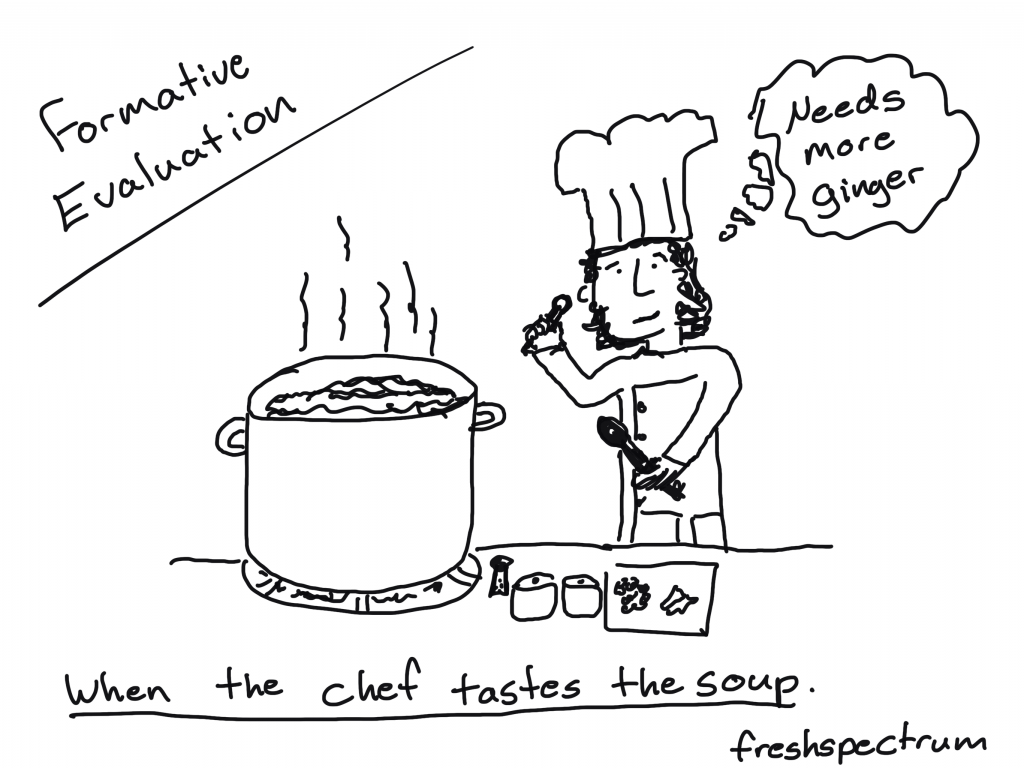
Formative impact evaluations are undertaken to inform decisions in regard to making changes to a programme or policy. While many formative evaluations focus on processes, impact evaluations can be used formatively if an intervention is ongoing. For example, the findings of an impact evaluation can be used to improve implementation of a programme for the next intake of participants.

Summative impact evaluations are undertaken to inform decisions about whether to continue, discontinue, replicate or scale up an intervention. Ideally, a summative impact evaluation not only produces findings about ‘what works’ but also provides information about what is needed to make the intervention work for different groups in different settings, which can then be used to inform decisions.

Overview of Impact Evaluation: Methodological Briefs – Impact Evaluation No. 1. Written by Patricia Rogers in 2014.

Freshspectrum Cartoon by Chris Lysy. 
"We need to accept the fact that what we are doing is measuring with the aim of reducing the uncertainty about the contribution made, not proving the contribution made. John Mayne, 1999"

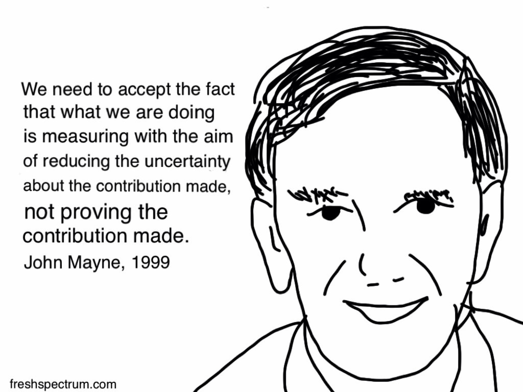
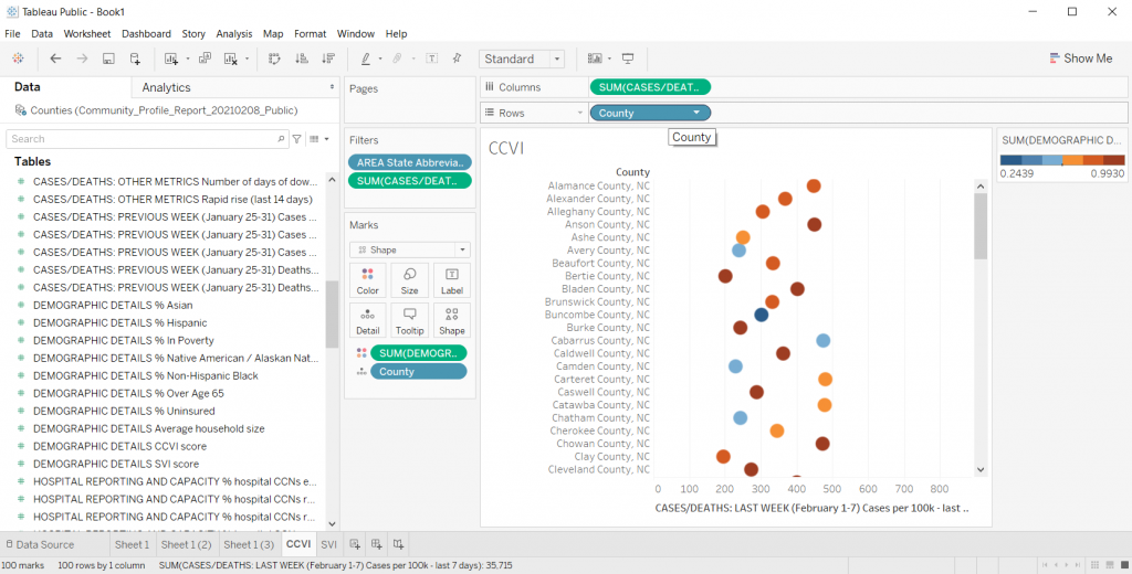
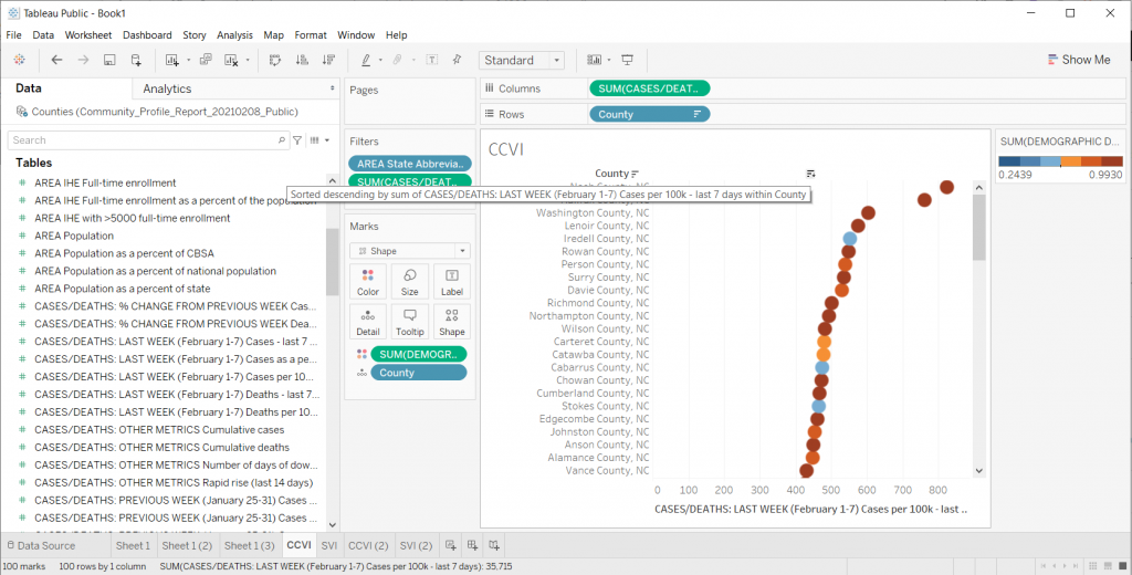
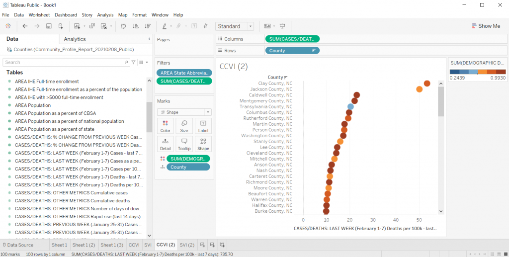
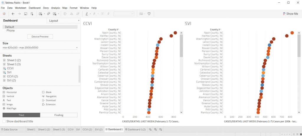
A key question in the assessment of programmes and projects is that of attribution: to what extent are observed results due to programme activities rather than other factors? What we want to know is whether or not the programme has made a difference—whether or not it has added value. Experimental or quasi-experimental designs that might answer these questions are often not feasible or not practical. In such cases, contribution analysis can help managers come to reasonably robust conclusions about the contribution being made by programmes to observed results.

Contribution analysis explores attribution through assessing the contribution a programme is making to observed results. It sets out to verify the theory of change behind a programme and, at the same time, takes into consideration other influencing factors. Causality is inferred from the following evidence:

1. The programme is based on a reasoned theory of change: the assumptions behind why the program is expected to work are sound, are plausible, and are agreed upon by at least some of the key players.

2. The activities of the programme were implemented.

3. The theory of change is verified by evidence: the chain of expected results occurred.

4. Other factors influencing the programme were assessed and were either shown not to have made a significant contribution or, if they did, the relative contribution was recognised.

Contribution analysis is useful in situations where the programme is not experimental—there is little or no scope for varying how the program is implemented—and the programme has been funded on the basis of a theory of change. Many managers and 4 evaluators assessing the performance of programmes face this situation. Kotvojs (2006) describes one way of using contribution analysis in a development context, “as a means to consider progress towards outputs and intermediate and end outcomes” (p. 1).

John Mayne’s 2008 ILAC Brief: Contribution analysis: An approach to exploring cause and effect

Written by cplysy · Categorized: freshspectrum

Feb 17 2021

How to Create Power Point Report Templates in Canva

This is the first in a series of posts on data design in Canva. Today I’ll show you how to use Canva to create Power Point templates.

Power Point is certainly the most designer friendly tool out of Microsoft Office’s big three (Word, PowerPoint, and Excel). When working with clients hesitant to leave the comforts of the tools they know, it’s often my tool of choice for visual reports.

But working in Canva just makes the whole design process a heck of a lot easier (and faster). Lucky for us, there is no reason to choose between the two. We can have both!

How to Create Power Point Report Templates in Canva - Illustration

Choose your report size.

Okay, so go to Canva.com (sign up for an account if you don’t have one already) and pick a size. Reports come in all shapes and sizes these days so you don’t have to default to letter size (8.5 x 11).

But for the sake of this example, we’ll just choose the “Report” option.

How to Create Power Point Report Templates in Canva - Canva Open Screen

Pick out a Base Template

Templates are what make designing in Canva so easy. They take care of a lot of the visual design grunt work, so we can just pick a style we like and adapt for our purposes.

You’ll see the templates on the left side of the page. Some templates (especially report templates/presentation templates/magazine templates) include multiple page styles. Hovering your mouse over a template will scroll through the internal page options (if it has any).

How to Create Power Point Report Templates in Canva - Pick out a Base Template

Choosing the Pages

When you pick a template, you have the option to go page by page adding in the template. Or you can just click the “Apply all…” button to give yourself a base to start.

How to Create Power Point Report Templates in Canva - Choosing a Template

Tweak the Template to Meet Your Needs

Now that you have a base, just tweak the template for your own purposes.

Change colors, pictures, fonts, text, and add your logos. The templates can give you the start, a base aesthetic, but you can really make it your own.

How to Create Power Point Report Templates in Canva - Changing Fonts and Colors

Downloading the PowerPoint

So the basic download options in Canva include image and print standards (PNG, JPG, PDF). These are always the best way to ensure your formatting is maintained in final versions. So you won’t find the PowerPoint option when clicking “Download.”

Saving it to PowerPoint is less about design control, and more about creating something that can be easily altered/adapted by others after you are finished your work. To reach it, instead of clicking download, you are going to click the “…” menu button in the upper right hand of the screen.

How to Create Power Point Report Templates in Canva Illustration - Saving as PowerPoint

Under the “Share” options you will see another “…” button for “See all.” Click on that.

How to Create Power Point Report Templates in Canva Illustration - Saving as PowerPoint

Find the save to Microsoft PowerPoint. When you click that, you’ll have the option to select the pages you want to download (or just download all pages).

How to Create Power Point Report Templates in Canva Illustration - Downloading PowerPoint

Click download and you’ll have a new pptx file on your computer.

How to Create Power Point Report Templates in Canva Illustration - Design Saved

Checking the File in PowerPoint

So it’s not always a perfect conversion, but it’s really close.

Depending on the fonts you have chosen in Canva, and the fonts you have on your computer, the text might get a little wonky. Shapes might also come in with different colors.

Canva also doesn’t show you when a shape extends outside the border of a file, but PowerPoint will. Don’t freak out when you see a shape extend off the edge, it won’t print that part.

How to Create Power Point Report Templates in Canva Illustration - Checking File in PowerPoint

Some of the shapes, even though they might not be initially editable in PowerPoint can be converted with a right click (Convert to Shape). Like for the Venn on the front of this report which inexplicably changed color on the download.

How to Create Power Point Report Templates in Canva Illustration - Converting to Shape in PowerPoint

Sure it’s wonky, but that’s an Office product for you.

We make tradeoffs all the time. By switching over to PowerPoint, you miss out on some of the stuff that’s easy in Canva. And neither is as technically clean as working in a vector program like Adobe Illustrator or XD.

But PowerPoint is a known quantity for over a billion people, and as with everything software, there is a power in numbers.

Freshspectrum Cartoon by Chris Lysy inspired by Stephanie Evergreen.
"Why don't we go with purple for the slide backgrounds?"
"What a coincidence, purple's my favorite color." [lady wearing lots of purple]
Cartoon from 2014 – Inspired through an interview with Stephanie Evergreen about her slide reboots.

Written by cplysy · Categorized: freshspectrum

Feb 12 2021

What is Equitable Evaluation? Cartoon Glossary

This is a series of posts providing quick overviews of important topics in research and evaluation. Each post in this series will include at least 3 cartoons from my archives and at least 3 links to recommended resources. I only give quotes here and recommend that you follow the links below each quote for more detailed information.

Cartoon by Chris Lysy of freshspectrum
As you all know, this leadership team has been facing some criticism for our total lack of diversity. Since equity is one of our core values we have decided to create a space on our team for one person of color to be hired into leadership in the coming year.

Three principles ground the Equitable Evaluation Framework™

As foundations and nonprofits, and the consultants and philanthropy-serving organizations that support them, explore what it means to be about and for equity, they must consider how all their assets and efforts align.

We believe that evaluation for these entities must be re-imagined based on three principles:

EVALUATION WORK IS IN SERVICE OF AND CONTRIBUTES TO EQUITY

Production, consumption, and management of evaluation and evaluative work should hold at its core a responsibility to advance progress towards equity.

EVALUATIVE WORK SHOULD BE DESIGNED AND IMPLEMENTED IN A WAY THAT IS COMMENSURATE WITH THE VALUES UNDERLYING EQUITY WORK

It should be multi-culturally valid and oriented toward participant ownership.

EVALUATIVE WORK CAN AND SHOULD ANSWER CRITICAL QUESTIONS ABOUT THE:

Effect of a strategy on different populations and on the underlying systemic drivers of inequity, and the ways in which history and cultural context are tangled up in the structural conditions and the change initiative itself.

Equitable Evaluation Initiative – The Equitable Evaluation Framework

Cartoon by Chris Lysy of freshspectrum
You know the saying, "do as they say, not as they do."
Sorry, but I have to call BS on that statement.

Supporting equitable evaluation without practicing it is hypocritical. 

It also makes it harder for others to practice equitable evaluation by reinforcing professional norms and orthodoxies that are decidedly inequitable but still widely accepted and practiced. If we are truly committed to it, we have to be willing to bear potential risks to our revenue stream or client relationships.

Equitable Evaluation Framework Applies to all Evaluation – Center for Evaluation Innovation

Cartoon by Chris Lysy of freshspectrum
"This is my racial equity lens. I just put it on when our racist policies and practices trigger the occasional PR crisis."

Equitable evaluation affects everyone engaged in the process, including those who use evaluation findings. Its primary aim is not only to shed light on the factors that impede equity, but also to analyze and assess interventions, investments, and strategies through a lens of promoting equity.

Raising the Bar – Integrating Cultural Competence and Equity: Equitable Evaluation Dean-Coffey, J., Casey, J., & Caldwell, L. D. (2014). The Foundation Review, 6(2)

Written by cplysy · Categorized: freshspectrum

Feb 10 2021

How to Create Dot Plots in Tableau

This is the first in a series of posts on data design in Tableau. Today I’ll show you how to use Tableau (Public or Desktop) to create a Dot Plot. This time we’ll use our Dot Plot for an Exploratory Analysis.

Visualization is not always just about reporting. Visuals can help you to analyze and make sense of your data, not just report it to others. This is one of the biggest values brought to you by a tool like Tableau. And you can get that value even with the free Tableau Public.

Not Getting Overwhelmed by Your Data.

Alright, so let’s find a dataset that is interesting if not a bit overwhelming. Given that we are still immersed in COVID-19, let’s start there.

Here is a National COVID-19 Community Profile Report.

COVID-19 Community Profile Report

On that page you will find a PDF report that’s updated daily. For each PDF there is also a related Excel spreadsheet. That’s what we’ll explore.

There are bunch of sheets here, the one we’ll look at in Tableau is the County Tab.

COVID-19 Community Profile Report Excel Spreadsheet

Not Getting Overwhelmed by Tableau.

So there is a lot you can do with Tableau. As such, it can be overwhelming if you’re not used to the platform.

Let’s not let it. It doesn’t matter if you know everything Tableau can and can not do. We’re just going to use it to make a spreadsheet less overwhelming.

Drag and Drop your Spreadsheet

So when I use Tableau, most of the time I’ll just open up the program. Then I’ll drag and drop a spreadsheet I want to peruse onto the Tableau window.

Tableau will then open it up.

Opening a File in Tableau

Pick a Sheet

Let’s choose the Counties sheet. Just drag it from the left to the spot where it says “Drag tables here”

Picking a Sheet in Tableau

Tableau will show you the data.

If you take a look at the preview, you’ll notice that it didn’t pull the data in a way that’s super useful. This is because of the formatting of the original Excel file.

I used to advise people to tailor the spreadsheet in Excel first then drop it into Tableau. But that’s just extra work, let’s see what happens if we click the little “Use Data Interpreter” box.

Looking at your data preview in Tableau

Clicking the Use Data Interpreter Box

Sweet, that cleaned up our dataset. If I were going to use this for some major analysis I might do some more cleaning. But I don’t really care about that right now, I just want to explore.

Using Tableau's Data Interpreter Box

Clicking on Sheet 1

Once you have the data source setup, you can start exploring by clicking on the first sheet.

Clicking on Sheet 1 in Tableau

Filtering the Data

Alright, so every county in the Country is a lot. Let me start by just looking at my state.

I’ll drop the “State Abbreviation” variable into the Filter spot on the page. This will give me a popup where I’ll select NC.

Choosing a Filter Variable in Tableau

Showing the data.

The first step in creating a dot plot (there is no real order to this but it ended up being the first thing I did) is to drop county in the detail box under marks.

Dragging a variable to the Detail spot in Tableau

Creating the Dot Plot

Now we just need to drop a variable we want to look at in the Column’s spot.

I’ll look at Cases per 100K from the last 7 days. This will give us a nice normalized set of data to compare across NC counties.

Poof, dot plot created.

*Yes, it says “Sum” but since every county has one and only one data point, the “sum” is just the value. You can check this by changing the data from Sum to Average. If the values change it means you have multiple values per data point.

Creating a Basic Dot Plot in Excel

Filter Out Null

Who wants to look at Nulls. I’ll go ahead and filter it away (this one is just an artifact of the dataset).

Filtering out Null in Tableau

Making the dot plot bigger.

If the chart is too small, you can just drag the bottom down (below the horizontal axis). This will make your chart bigger.

Increasing the chart size in Tableau

Changing the shape.

We can the shape of the mark using the shape button. So if you don’t like the little hollow circles, this is where you change it up.

Changing Shapes in Tableau

Adding Transparency

I like this trick when you have smaller datasets with just a bit of overlap. Click on color then lower the opacity. This gives you a kind of heat map effect on your dot plot (this works well with scatter plots too).

Adding Transparency in Tableau

Trying Different Things by Duplicating the Sheet

When I’m exploring data in Tableau, usually I get to a good base visual, then I duplicate the sheet. Just right click on “Sheet 1” at the bottom of the file and click Duplicate.

Honestly, there is too much overlap for this particular chart to be very useful. If NC only had something like 30 counties it would look different, but with 100, it really looks just like a dark line.

Duplicating sheets in Tableau

Adding a Color Variable

So one of the ways to increase the usefulness of a dot plot (for exploration) is to visualize another variable using color.

So there is a CCVI score in the underlying dataset. It’s something called the COVID-19 Community Vulnerability Index (CCVI). A take on the CDC’s Social Vulnerability Index (also in this dataset).

Since there is a CCVI score for every county, I’m going to drag this variable into the color spot. Then I’m going to change the color (by clicking edit colors) to a diverging Orange-Blue. I’ll also click the Stepped color box (6 steps) and click the reversed box to make the scale go from Dark Blue (low vulnerability) to Dark Orange (high vulnerability).

Adding a color variable in Tableau

This is also kind of impossible to see anything with, so I’ll go ahead and duplicate the sheet again to try something different.

Adding a color variable in Tableau

Let’s add some separation.

There are times when I like seeing everything on the same line, especially if I want to bundle something up at say a National level. But this single line dot plot isn’t really showing me much.

Instead, I’ll drop the County variable into the row column. I also took away the transparency on the dots and fiddled with their size a little. This gave me something I could scroll through and sort.

Creating Dot Plot separation in Tableau

Quick Sorting of the Data

So if you put your cursor to the top of the dot plot, you’ll find a way to quickly sort your visual. This certainly gave me a view where I could see some differences. This particular view/variable didn’t shout at me but it definitely gave me a clearer picture of underlying case data.

Quick sorting data in your Tableau visual

Changing the Data

Once you get a view you like, you can start changing the variable still using the same visual. For instance, instead of just looking at cases per 100K, what if I started to look at deaths per 100K?

Instead of looking at CCVI, what if colored the dots using the SVI data instead? Do certain patterns start to emerge?

Changing your data in Tableau

Comparing Views

In Tableau, if you ever want a side by side view, you can just click on the “Dashboard” tab and give yourself a nice large size dashboard. Then put sheets side by side.

It doesn’t have to be perfect, remember, this whole exercise is just about using visuals to explore your data.

Comparing Views in Tableau

So what have I discovered?

Nothing earth shattering. I was just playing around with data as a way to show you how to play around with data in Tableau.

It does look as though the CCVI is more likely to correlate with a higher incidence of COVID-19 compared to the SVI, and even more so with COVID-19 deaths per 100K. I could sense enough of a pattern to get me curious and push me to dive deeper. And ultimately that was really my goal.

Playing with data means a lot of not-finding anything notable, hopefully followed by a “hmm, that’s interesting.”

Try it Yourself

Now it’s your turn, try to dive into the dataset I shared above. Is there anything you can learn?

Freshspectrum Cartoon.  
"Every time I try to zoom in this happens..."
"Like I said before, the paper is not interactive."

Written by cplysy · Categorized: freshspectrum

Feb 05 2021

What is Formative Evaluation? Cartoon Glossary

This is a series of posts providing quick overviews of important topics in research and evaluation. Each post in this series will include at least 3 cartoons from my archives and at least 3 links to recommended resources. I only give quotes here and recommend that you follow the links below each quote for more detailed information.

Formative Evaluation Cartoon by Chris Lysy of freshspectrum. When the chef tastes the soup. Chef holding a spoon thinking "needs more ginger."

When the cook tastes the soup, that’s formative; when the guests taste the soup, that’s summative.

Quote by Bob Stake and shared in Michael Scriven’s 1991 Book, Evaluation Thesaurus 4th Edition.

Formative Evaluation Cartoon by Chris Lysy of freshspectrum.  "So tell me about that new model you're implementing. Is it effective?"
"Honestly, we're still in our formative phase."

Formative evaluation is generally any evaluation that takes place before or during a project’s implementation with the aim of improving the project’s design and performance.

Formative evaluation complements summative evaluation and is essential for trying to understand why a program works or doesn’t, and what other factors (internal and external) are at work during a project’s life.

Formative evaluation does require time and money and this may be a barrier to undertaking it, but it should be viewed as a valuable investment that improves the likelihood of achieving a successful outcome through better program design.

Community Sustainability Engagement Evaluation Toolbox 

Formative Evaluation Cartoon by Chris Lysy of freshspectrum. 
"So this report tells us our program model doesn't work. But it doesn't give us any insight on how we can make it better."
"You said you wanted to know if it worked, so I did a summative evaluation.  I can do a formative evaluation, but that'll cost extra."

Formative evaluation ensures that a program or program activity is feasible, appropriate, and acceptable before it is fully implemented. It is usually conducted when a new program or activity is being developed or when an existing one is being adapted or modified.

CDC STD Program – Types of Evaluation 2-Pager

Written by cplysy · Categorized: freshspectrum

  • « Go to Previous Page
  • Go to page 1
  • Interim pages omitted …
  • Go to page 40
  • Go to page 41
  • Go to page 42
  • Go to page 43
  • Go to page 44
  • Interim pages omitted …
  • Go to page 54
  • Go to Next Page »

Footer

Follow our Work

The easiest way to stay connected to our work is to join our newsletter. You’ll get updates on projects, learn about new events, and hear stories from those evaluators whom the field continues to actively exclude and erase.

Get Updates

Want to take further action or join a pod? Click here to learn more.

Copyright © 2026 · The May 13 Group · Log in

en English
af Afrikaanssq Shqipam አማርኛar العربيةhy Հայերենaz Azərbaycan dilieu Euskarabe Беларуская моваbn বাংলাbs Bosanskibg Българскиca Catalàceb Cebuanony Chichewazh-CN 简体中文zh-TW 繁體中文co Corsuhr Hrvatskics Čeština‎da Dansknl Nederlandsen Englisheo Esperantoet Eestitl Filipinofi Suomifr Françaisfy Fryskgl Galegoka ქართულიde Deutschel Ελληνικάgu ગુજરાતીht Kreyol ayisyenha Harshen Hausahaw Ōlelo Hawaiʻiiw עִבְרִיתhi हिन्दीhmn Hmonghu Magyaris Íslenskaig Igboid Bahasa Indonesiaga Gaeilgeit Italianoja 日本語jw Basa Jawakn ಕನ್ನಡkk Қазақ тіліkm ភាសាខ្មែរko 한국어ku كوردی‎ky Кыргызчаlo ພາສາລາວla Latinlv Latviešu valodalt Lietuvių kalbalb Lëtzebuergeschmk Македонски јазикmg Malagasyms Bahasa Melayuml മലയാളംmt Maltesemi Te Reo Māorimr मराठीmn Монголmy ဗမာစာne नेपालीno Norsk bokmålps پښتوfa فارسیpl Polskipt Portuguêspa ਪੰਜਾਬੀro Românăru Русскийsm Samoangd Gàidhligsr Српски језикst Sesothosn Shonasd سنڌيsi සිංහලsk Slovenčinasl Slovenščinaso Afsoomaalies Españolsu Basa Sundasw Kiswahilisv Svenskatg Тоҷикӣta தமிழ்te తెలుగుth ไทยtr Türkçeuk Українськаur اردوuz O‘zbekchavi Tiếng Việtcy Cymraegxh isiXhosayi יידישyo Yorùbázu Zulu