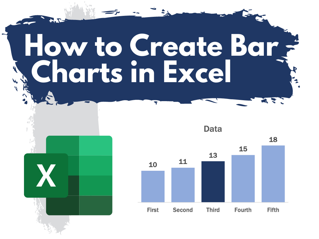
This is the first in a series of posts on chart design in Excel. In each post we will take on a different chart type. Today we start with one of the most ubiquitous and useful charts, the Bar Chart.
What you’ll find in this post:
- An Oversimplified How To
- How to create a good looking bar chart.
- A little bit of inspiration.
- Some other considerations.
An Oversimplified How To
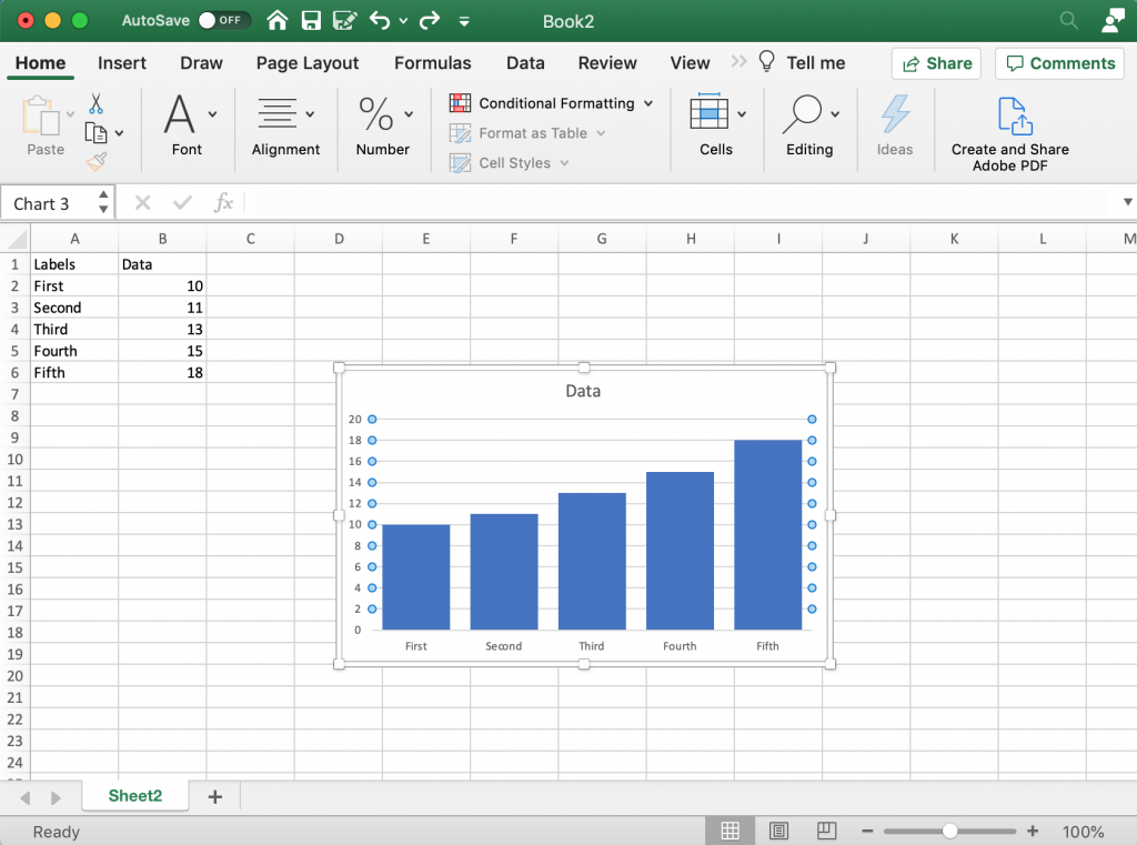
Creating a bar chart (or column chart) is really simple in Excel. It just takes a column of data and a couple of buttons.
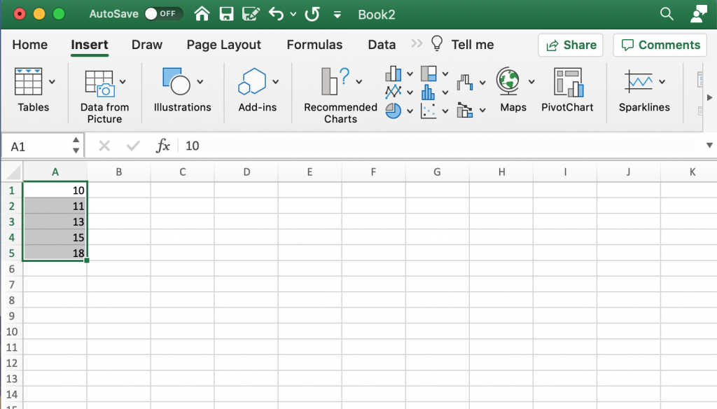
Step 1. Highlight a column of numbers.
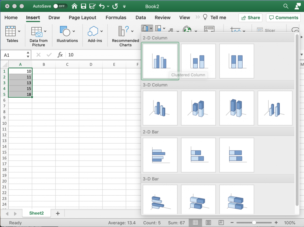
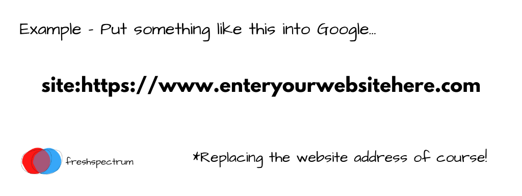
Step 2. Click on the insert tab, then the bar chart icon. Then select the kind of bar chart you would like.
*Note: Avoid the 3-D charts!!!!
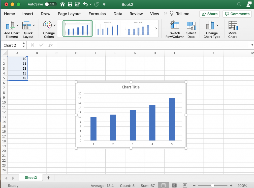
Step 3. Yay, you did it!
How to create a good looking bar chart.
Okay, so maybe you don’t just want to create a chart, but create a chart that actually looks nice. Here are some more steps you probably want to take.
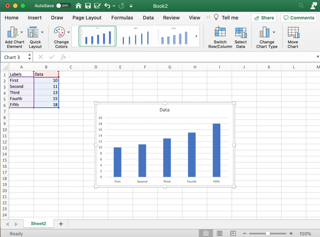
Labeling your bars.
So in addition to just a column of numbers it’s a good idea to have row labels and column headers. When you go to create your chart, highlight these as well. This way Excel will actually label your bars and your chart.
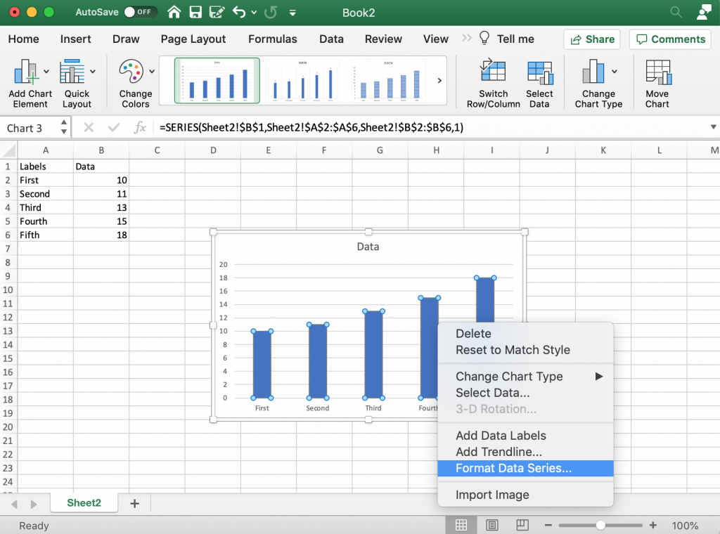
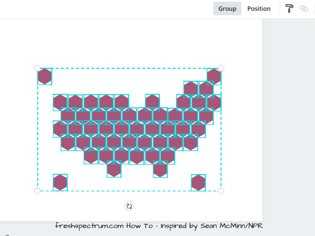
The Formatting Menus
There are a few ways to reach formatting menus in Excel. I find the easiest is usually just selecting elements within the chart itself, then right clicking and selecting the format button.
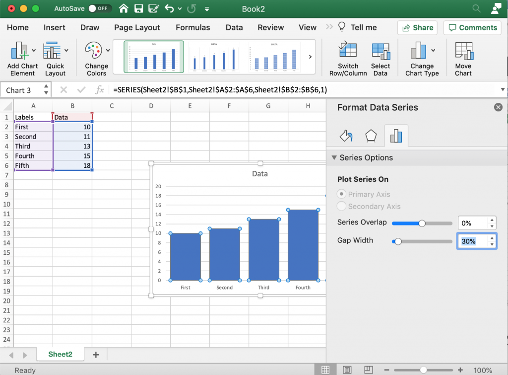
Making the Bars “Bigger”
One of the things I always end up doing is reducing the gap between bars. The default makes the bars tiny with a lot of useless empty space in between. Reducing the Gap Width will make your bars bigger.
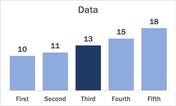
Creating a Clean Chart
I like a clean bar chart, so often I’ll get rid of the gridlines (which I’ll replace with bar labels). To do this you really just click on the lines and delete them. Since I’ll use bar labels I can also get rid of the y axis labels by selecting them and hitting the delete button.
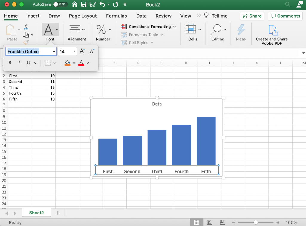
Increasing the Label Sizes
Usually after stripping down the chart a bit I’ll then bump up the label size. Also not a big fan of the default font so I’ll change that up as well.
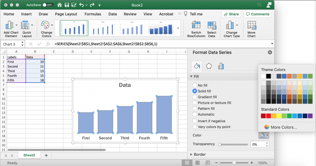
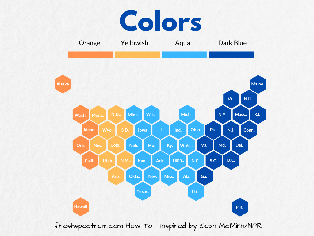
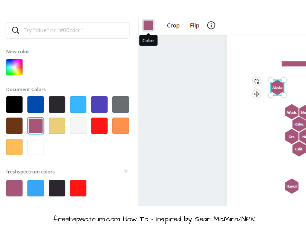
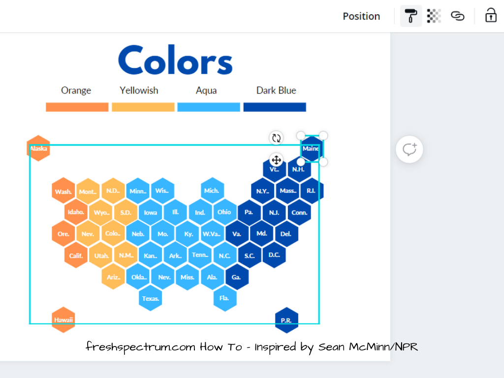
Changing Bar Colors
Good data design practice means using color sparingly but deliberately. Long gone are the rainbow color palettes of the past, which didn’t offer any real value. Instead we use single color unless we would like to high something. Once thing I tend to do is bump the shade down a bit. You can find the color options in the Format Data Series menu after selecting the bars.
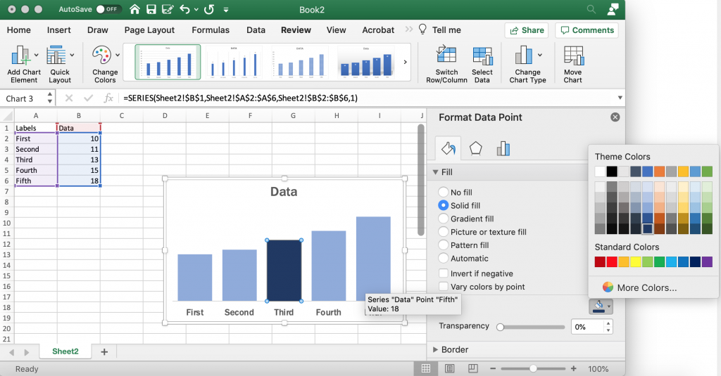
Highlight Color
If there is a specific bar you would like to highlight, you can decide to change only that bar’s color. Just click on the individual bar until it’s the only one selected, then change the color. I tend to go with darker shade whether it is the same color or a different color, this helps if the chart is ever printed in black/white.
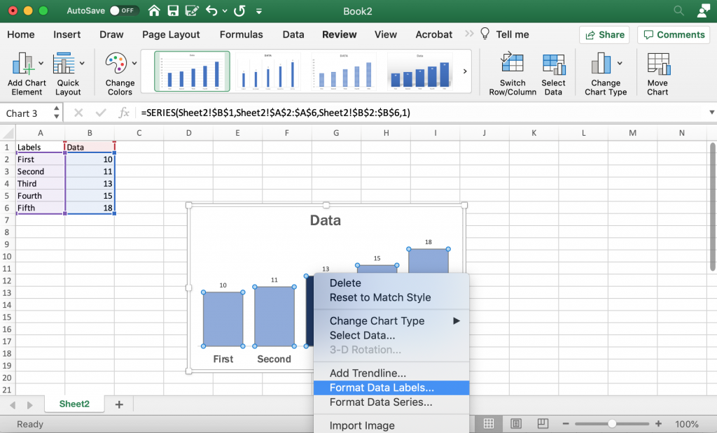
Add and Format Data Labels
I like using data labels instead of an axis/grid lines for most bar charts. You can add labels with a right click on the bars (selecting add data labels). Then I go ahead and format the data labels so that they are bigger and match the font I’m using.
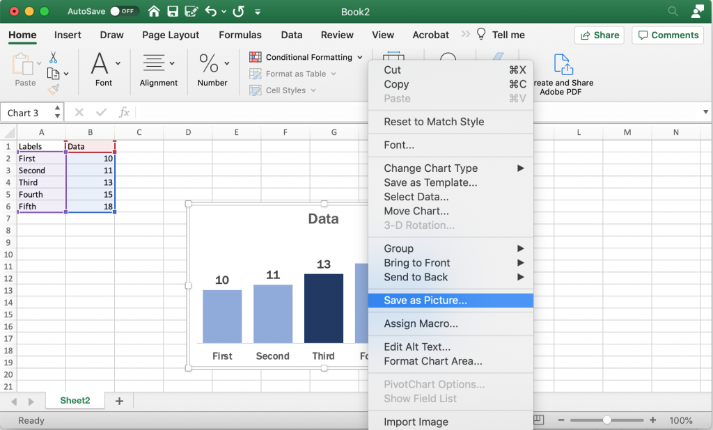
Saving the Image
Once you have made all the changes you want to the chart you can save it as a picture. Just right click on the chart area and click “Save as Picture.”
Alternatively, you can just copy and paste the chart from Excel into Word or PowerPoint. If you’re staying within the Office suite, this is the ideal way to move the image as it retains your full ability to reformat the graphic.
Beyond the Basics
This is just the basics. There are all sorts of things you can do with Bar Charts.
Generally though I suggest keeping the chart itself simple and minimalist. You can always add flare through annotations/additional graphics. Doing things like making your charts 3D doesn’t help the presentation, it just makes the chart harder to interpret and can also skew the data.
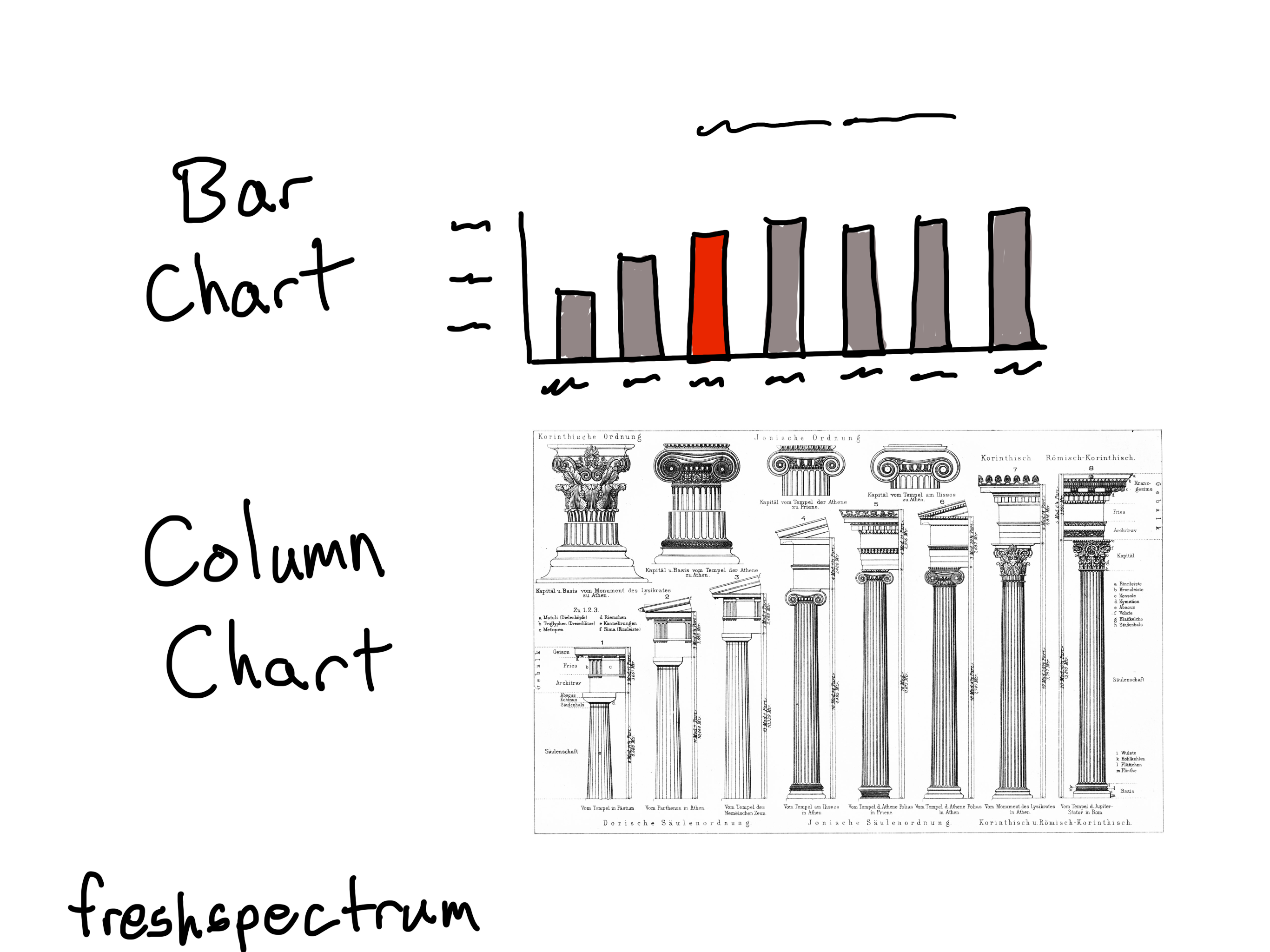
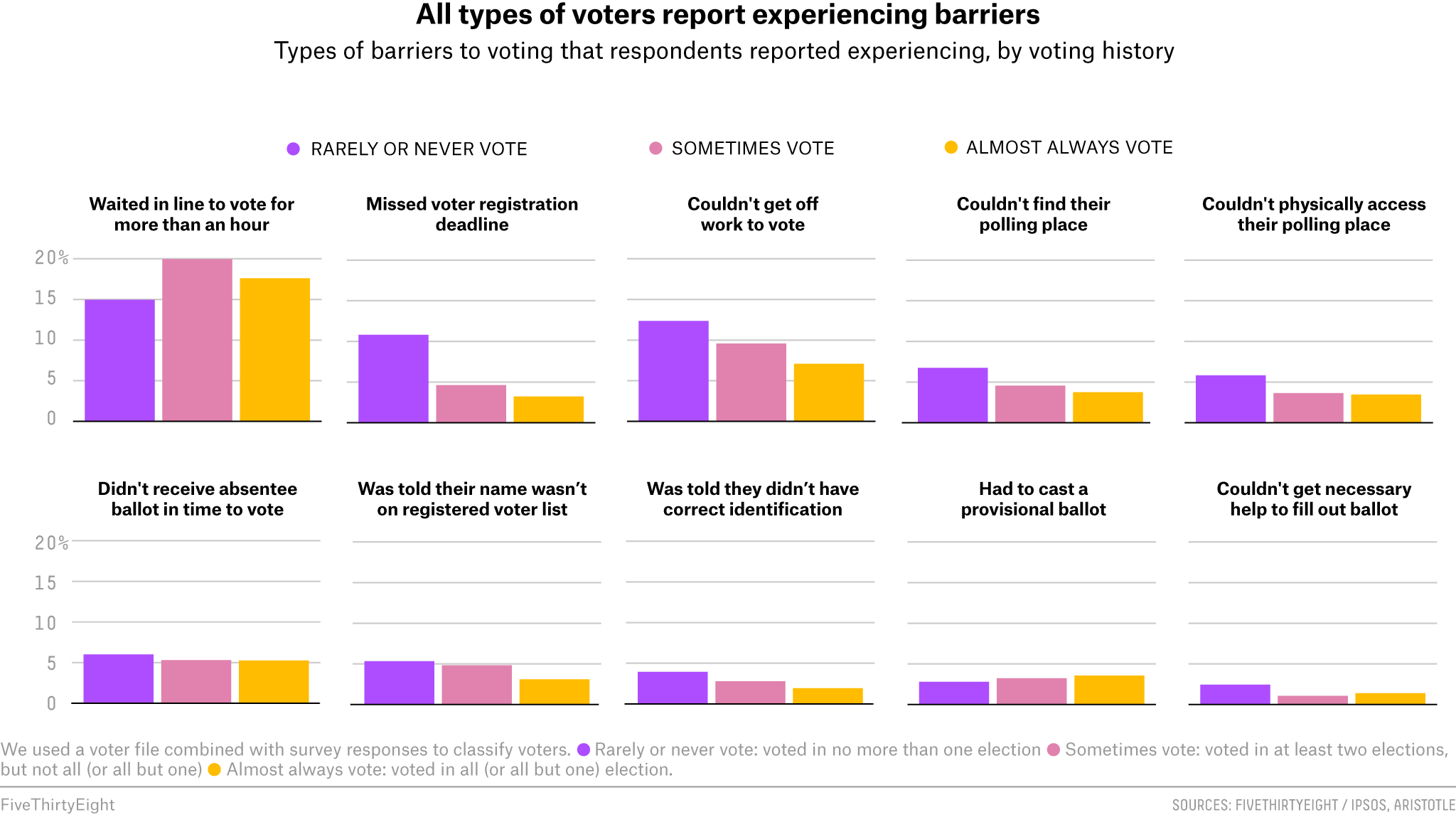
A little bit of inspiration.
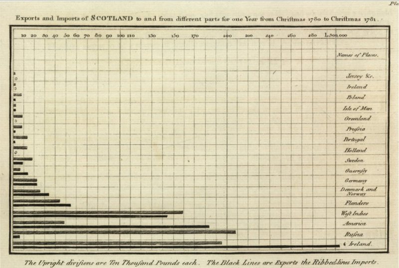
Bar charts go wayyyyy back.
The first bar chart is often credited to William Playfair from all the way back in the early 1800s.
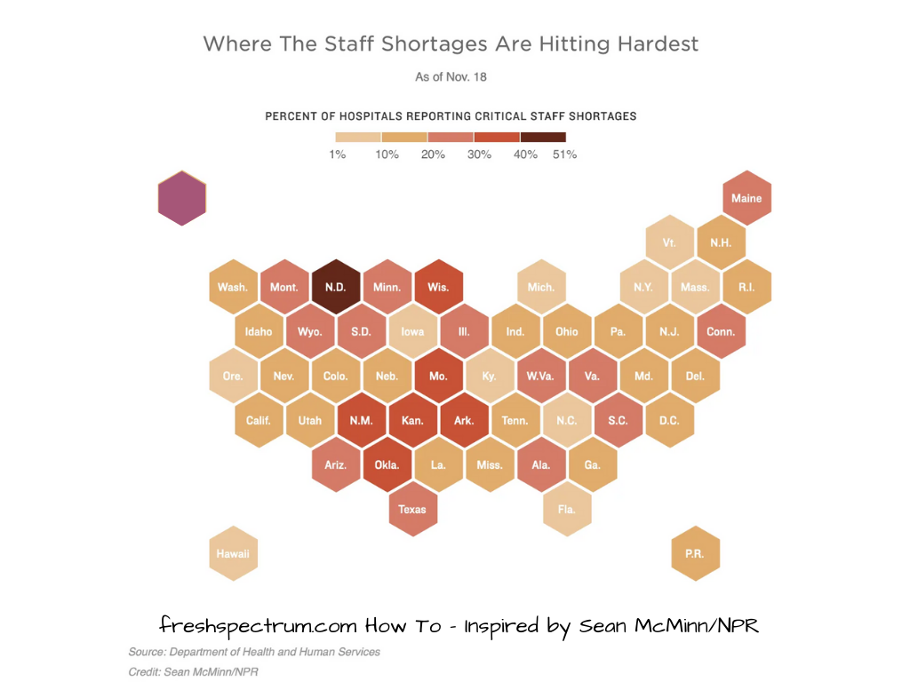
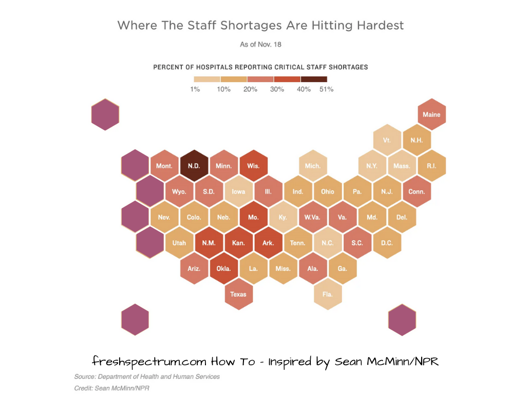
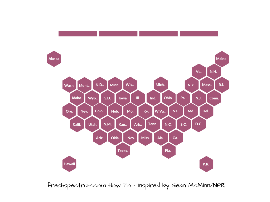
But really we find bar charts (horizontal and vertical) just about everywhere.
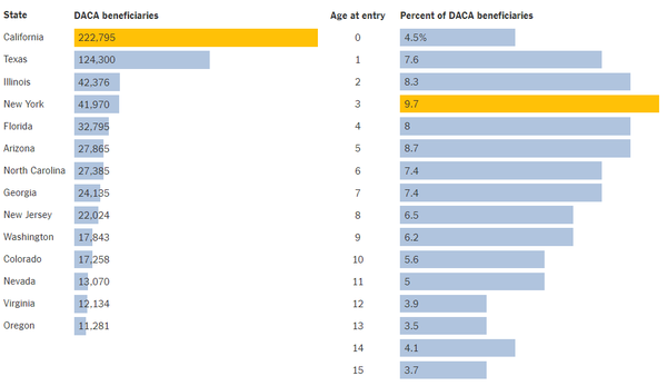
Newspaper sites and modern news blogs provide some of the best examples of clean charts you’ll find on the web. Bar charts are like button up shirts, they might come in all sorts of different colors and sizes but it’s pretty doubtful that they’ll ever fall of style completely.
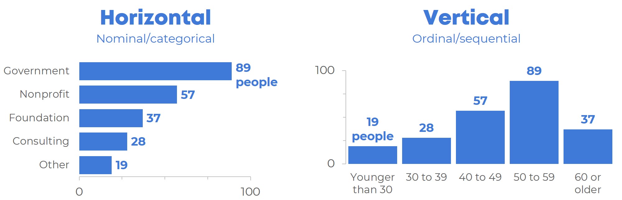
Some other considerations.
Should you go horizontal or vertical?
I often choose horizontal bar charts because they’re easier to label. But vertical bar charts definitely have their place as well. Try not to overthink it, if you’re in doubt just create two versions and decide which one tells your story better.
Ann K Emery offers a good post on choosing between the two styles on her Depict Studio Blog.
What about clusters and stacked bars?
I’ll get into variations on the common bar chart in the future. But for a brief description of the different bar chart variants, this post by Alex Velez on Storytelling with Data does a nice job.