• Skip to main content
  • Skip to footer
  • Home

The May 13 Group

the next day for evaluation

  • Get Involved
  • Our Work
  • About Us
You are here: Home / Archives for allblogs / freshspectrum

freshspectrum

Feb 03 2021

How to Create a Sidebar Style One-Pager in Adobe XD

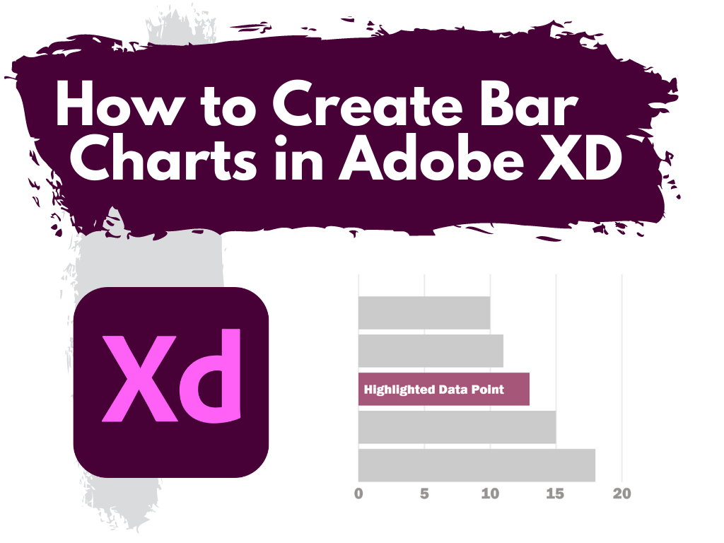
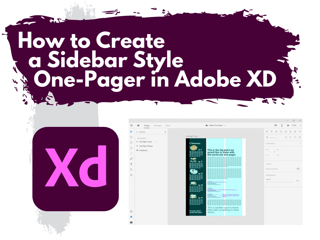
This is the third in a series of posts on data design in Adobe XD. Today instead of charts, I’ll show you how to use Adobe XD as a print design tool for one-pagers. We’ll design a really simple but totally versatile sidebar style one-pager.

What you’ll find in this post:

  • An Oversimplified How To
  • How to do more with your one-pager.
  • Some nice free graphic design guides.
  • My new virtual learning community.
How to create a sidebar style one-pager in Adobe XD.

Before we dive into today’s tutorial. A note about using columns or grids in your designs. Do it. It’s one of the best ways to give your reporting a more polished professional look.

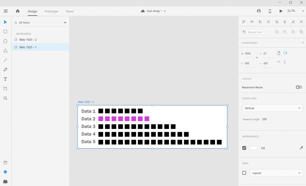
Using a grid permits a designer to more rapidly lay out enormous amounts of information because many design considerations are addressed in building the grid’s structure at the outset of a project.

From Making and Breaking the Grid by Timothy Samara

An Oversimplified How To

Sidebar Style One-Pager in Adobe XD Illustration Step 1

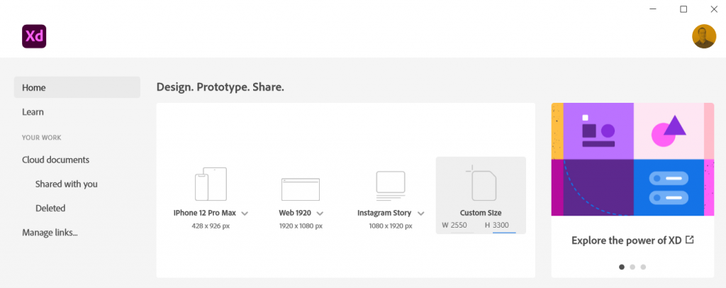
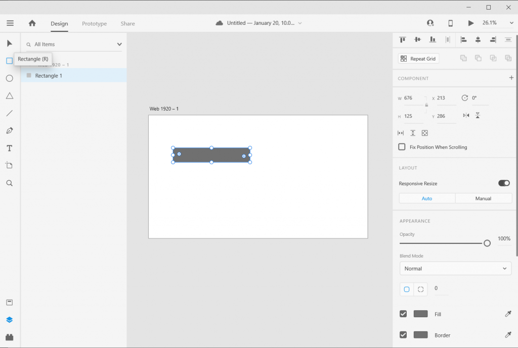
Step 1. Create a custom size artboard in Adobe XD. We’ll be creating a simple 8.5 by 11 one-pager, but we’ll need to convert that to pixels.

A web search will tell you to do 300 pixels for every inch which will give you a 2550 by 3300 art board. (I’ll tell you later in this post the pixel dimensions I use most often for one-pagers, because it’s different).

Sidebar Style One-Pager in Adobe XD Illustration Step 2

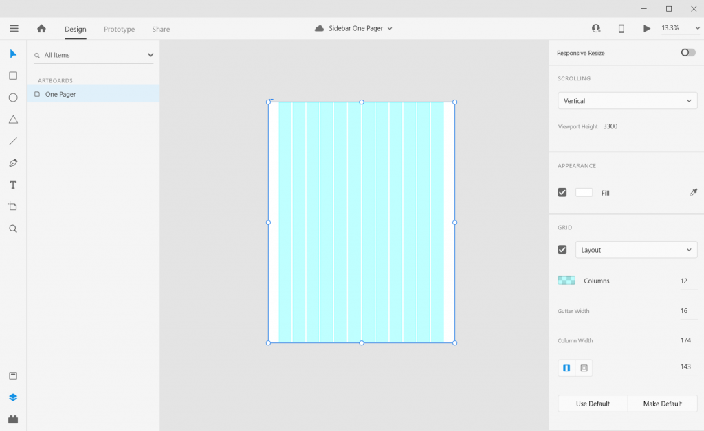
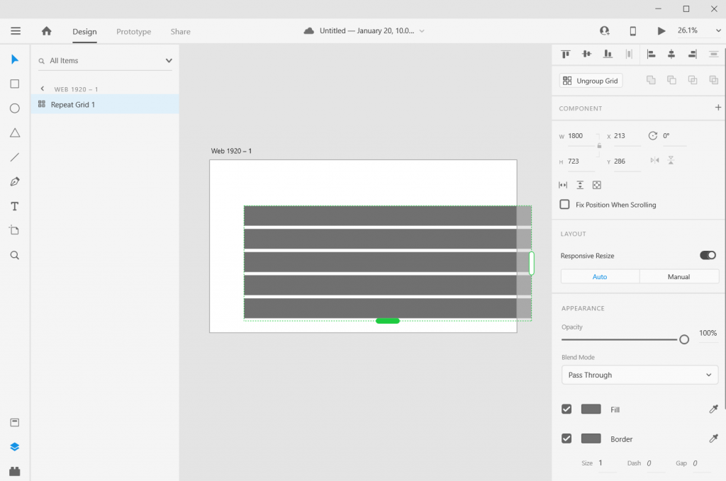
Step 2. Once we create the artboard we’ll select it and check the box under grid for the layout.

Sidebar Style One-Pager in Adobe XD Illustration Step 3

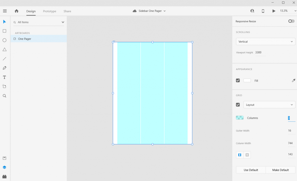
Step 3. Let’s go with one of the most common page layouts and use 3 columns.

Sidebar Style One-Pager in Adobe XD Illustration Step 4

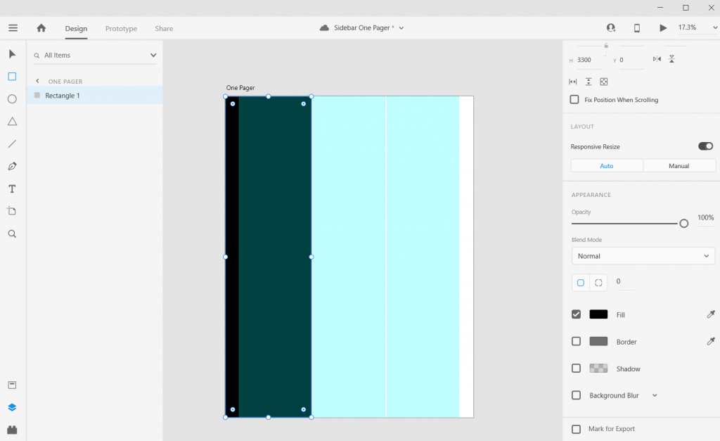
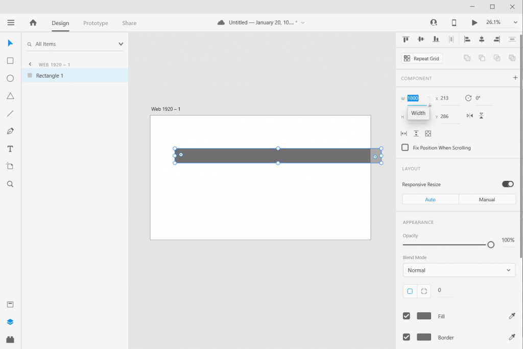
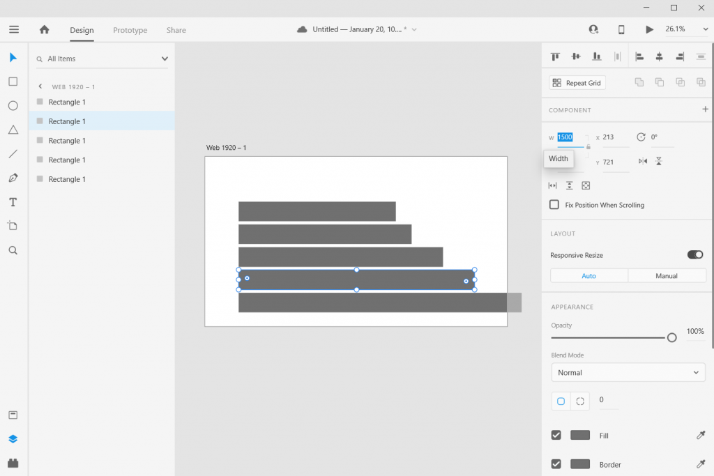
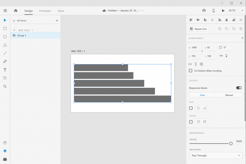
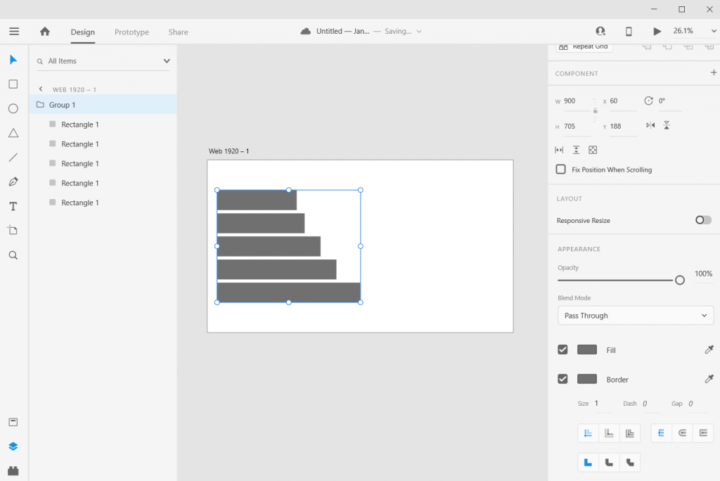
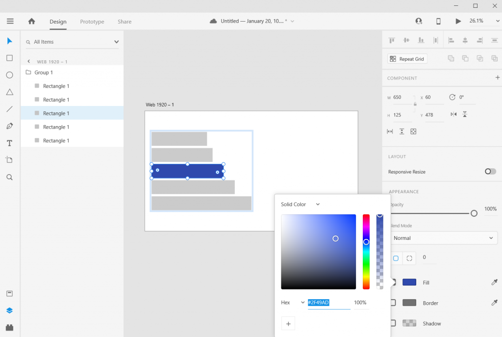
Step 4. Once the columns are set, draw a rectangle (and give it a dark color) and place from the left edge to the edge of the column.

Sidebar Style One-Pager in Adobe XD Illustration Step 5

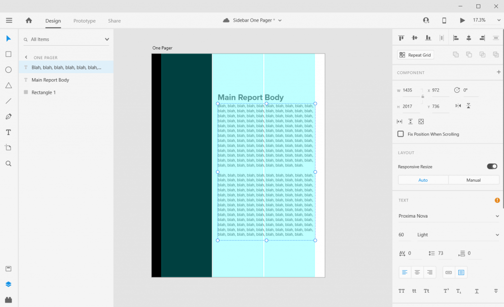
Step 5. Now add some text boxes in the right two grids where the text will go, the font sizing will be wonky so just create what you think looks okay (this is because of the artboard size that I’ll get into later).

Sidebar Style One-Pager in Adobe XD Illustration Step 6

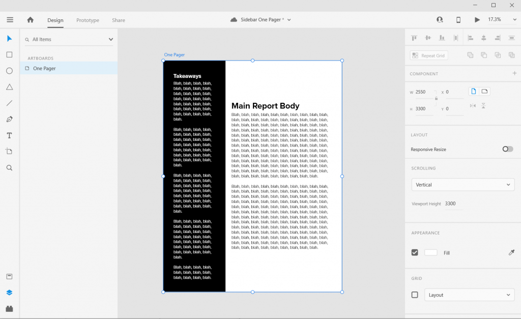
Step 6. Now add some text boxes in white for the left hand sidebar.

Sidebar Style One-Pager in Adobe XD Illustration Step 7

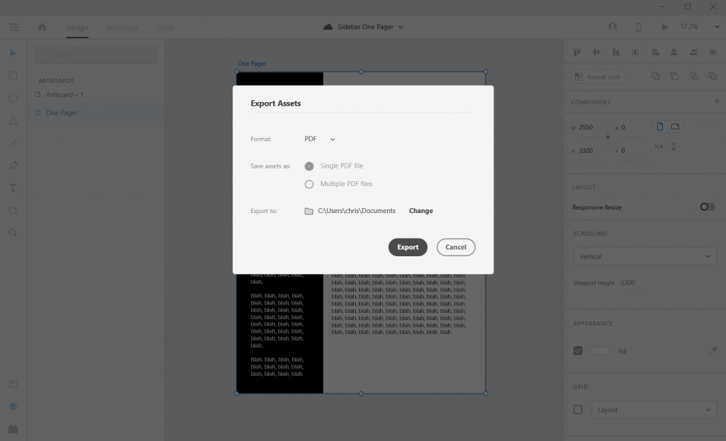
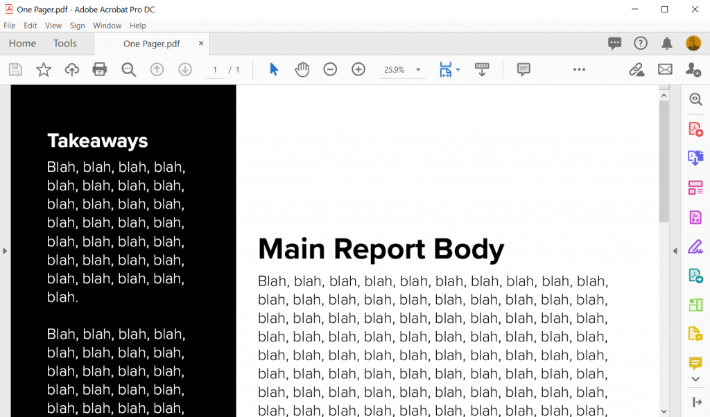
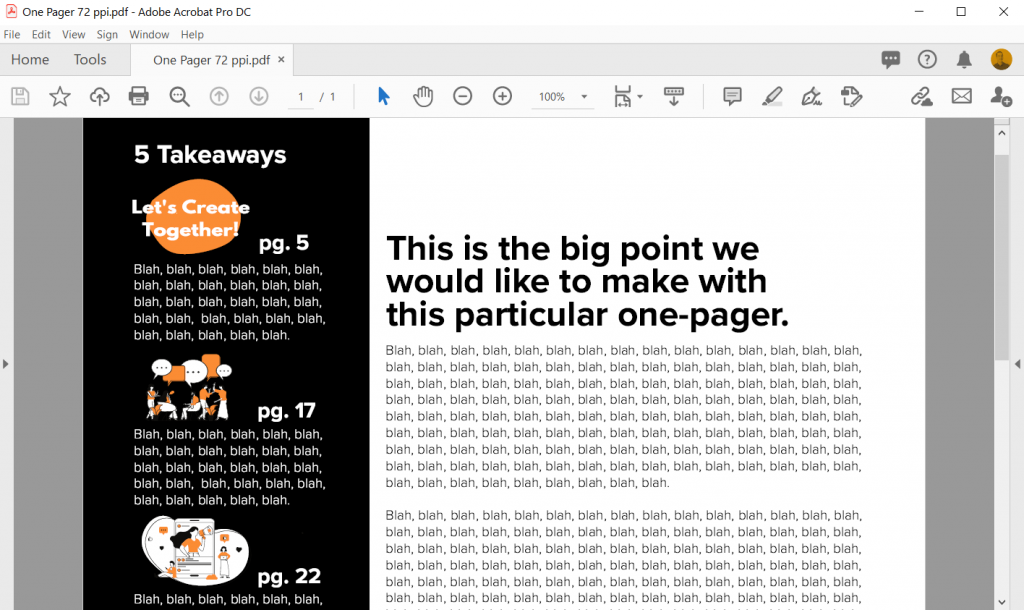
Step 7. Now export your completed one-pager design as a PDF. Then open it in Acrobat and marvel at your new layout design skills.

Sidebar Style One-Pager in Adobe XD Illustration in Acrobat

How to do more with your one-pager.

Okay, so that was a really basic one-pager design. Let’s tweak it a bit and make it cooler/more useful.

Change the Artboard Size to 72 pixels per inch

So the conventional web guidance of 300 pixels per inch is based on old print thinking. The idea goes, well a high quality print is 300 dots per inch, so we should just multiply inches by 300.

But our digital screens are optimized at 72 pixels per inch. And since XD is a vector design tool (the pixel ratio won’t impact quality) and a web design tool, let’s create an artboard that is 612 w and 792 h.

Don’t worry I won’t go anymore into the pixel nerdery. Just know that using this ratio, all of the font sizes suddenly will work out properly!

Sidebar Style One-Pager in Adobe XD Illustration 8.5 by 11 artboard 72 pixel per inch

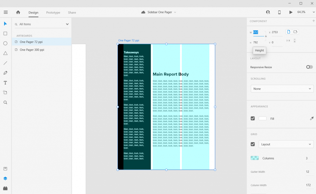
Adjust the Gutter Width, Margins, and Fonts

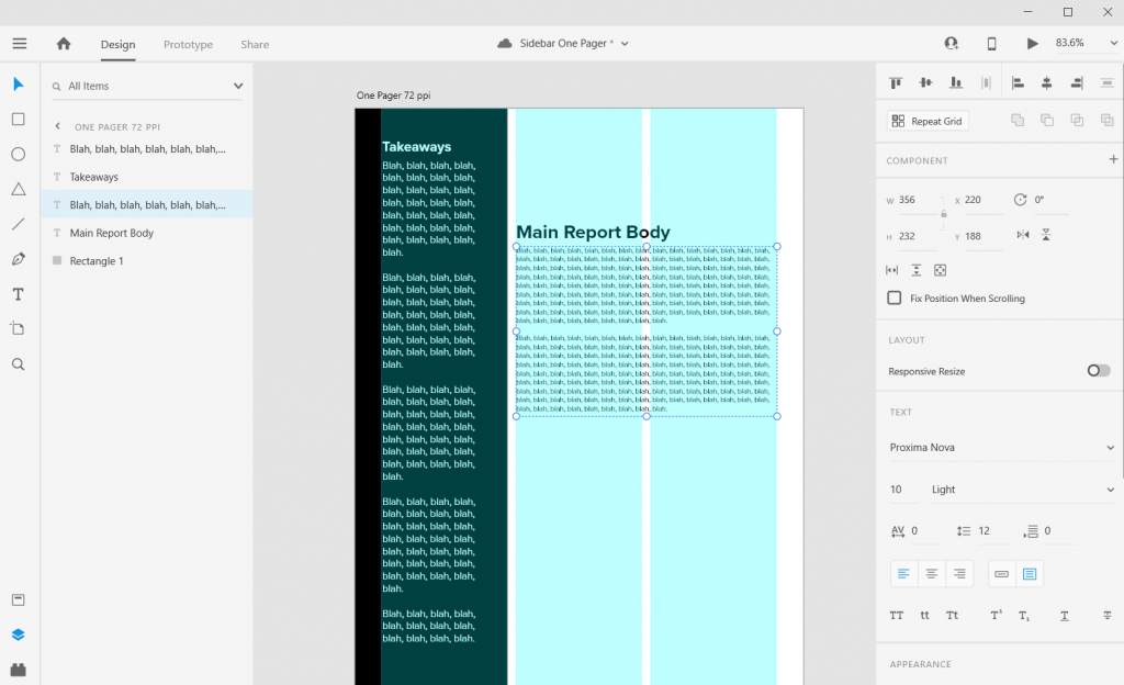
The Gutter is the space between columns (I’ll usually go with multiples of 4). With this one I went with a gutter width of 12 pixels and a margin of 36 pixels. This automatically set the column width at 172 pixels.

Now I can also set the font sizes at appropriate levels. So for the main body text I used a 10 point Proxima Nova font and a size 26 bolded header font.

Sidebar Style One-Pager in Adobe XD Illustration Adding Textboxes

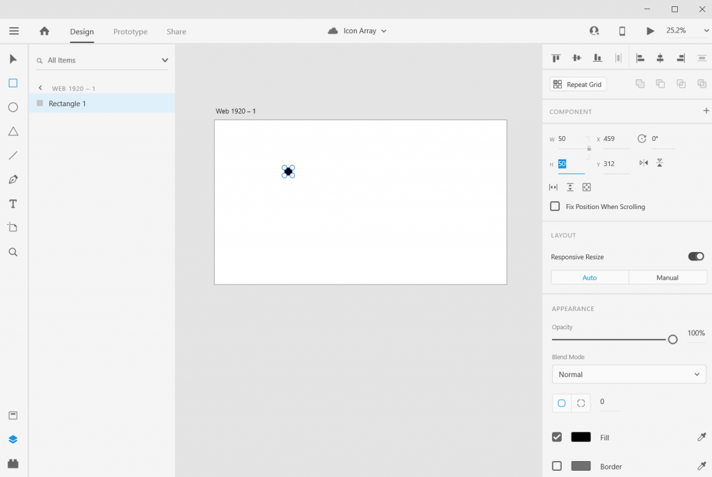
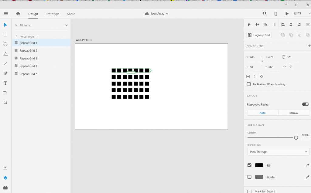
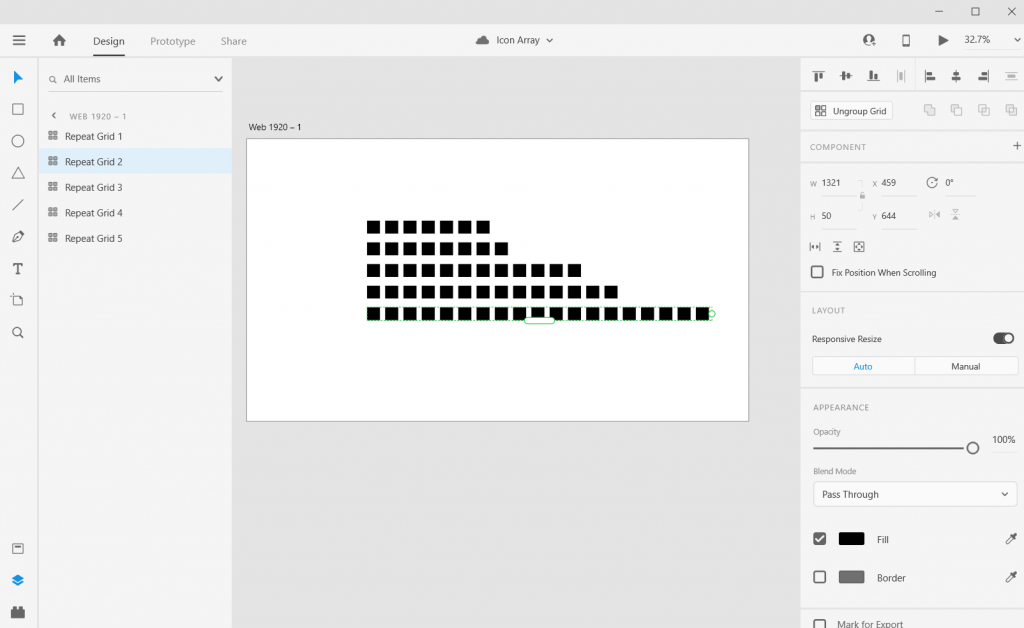
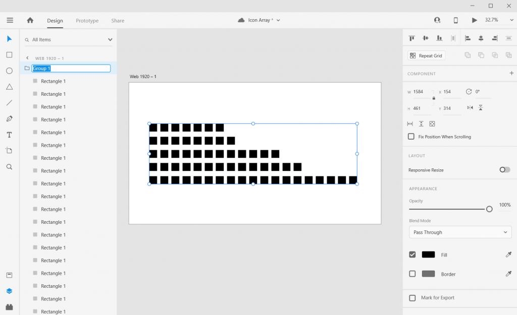
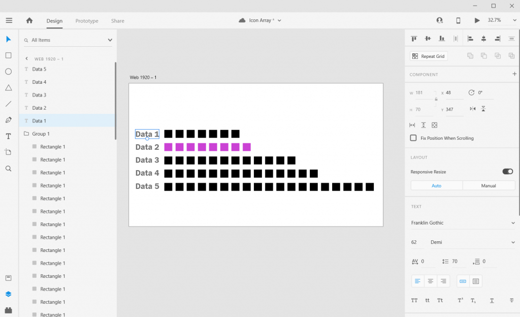
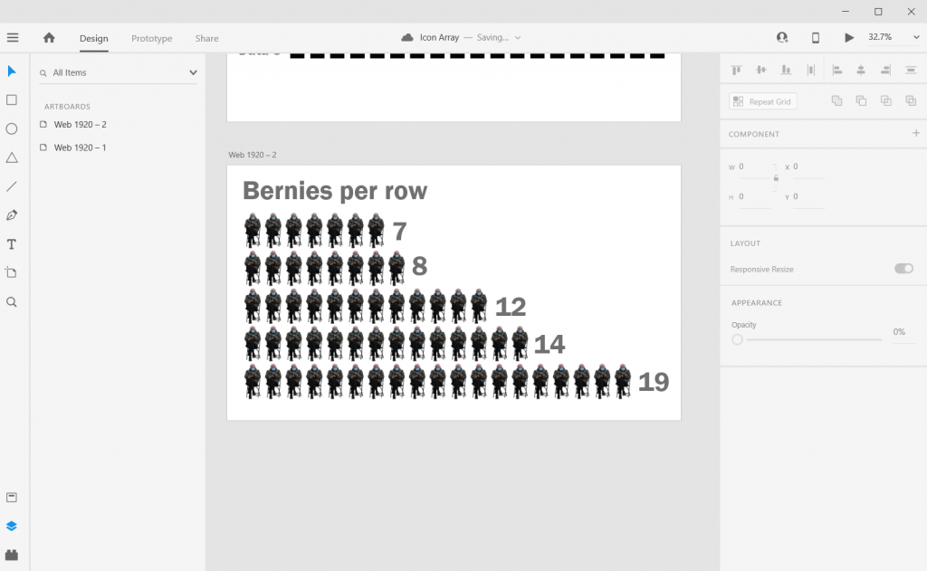
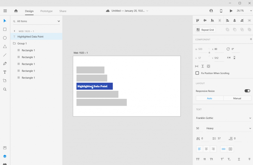
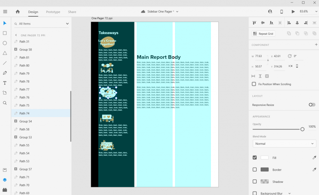
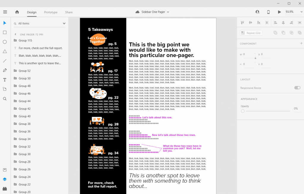
Icon Illustrating the Sidebar

Sidebars are a good spot for a little icon illustration. I’ll left justify those against the side the column (you’ll see why in a few).

Sidebar Style One-Pager in Adobe XD Illustration Icon Illustrating

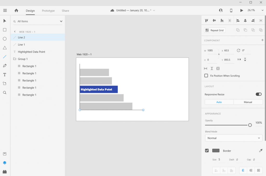
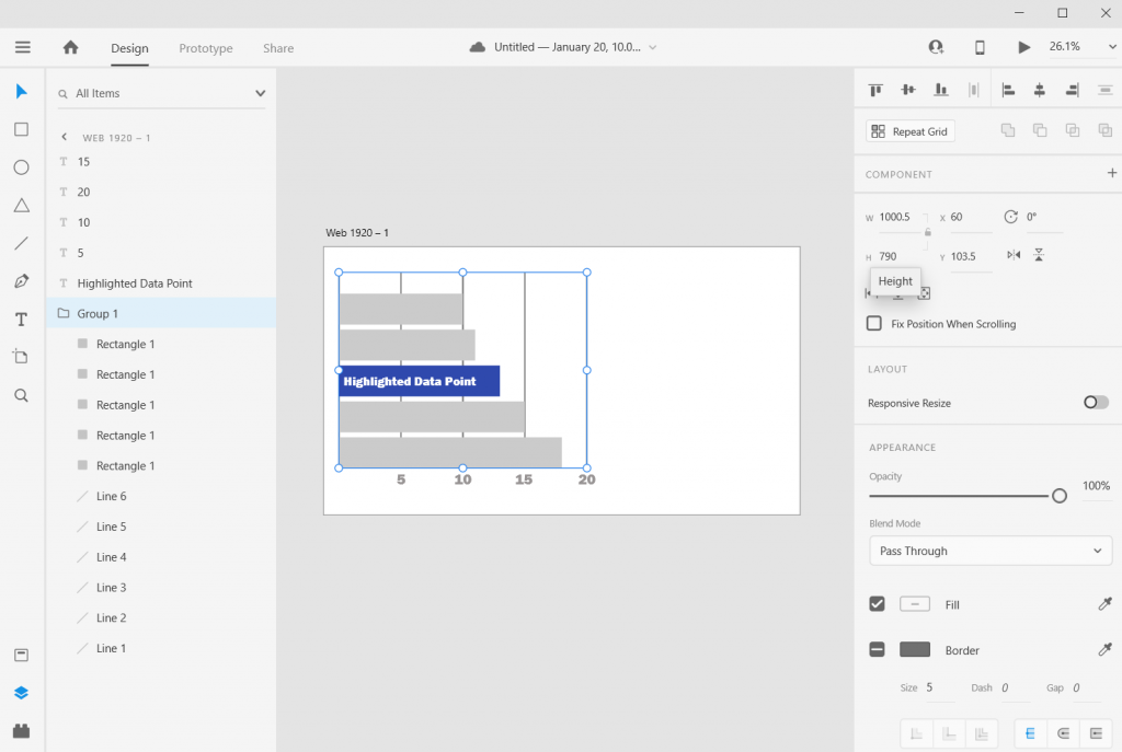
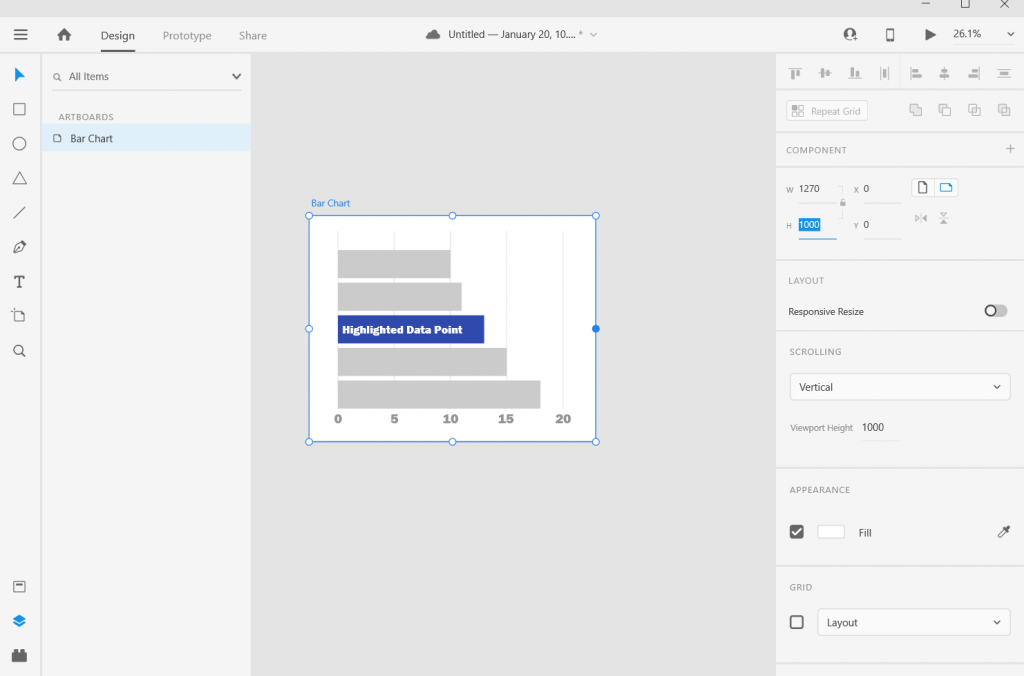
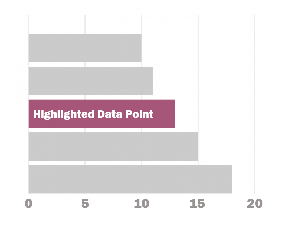
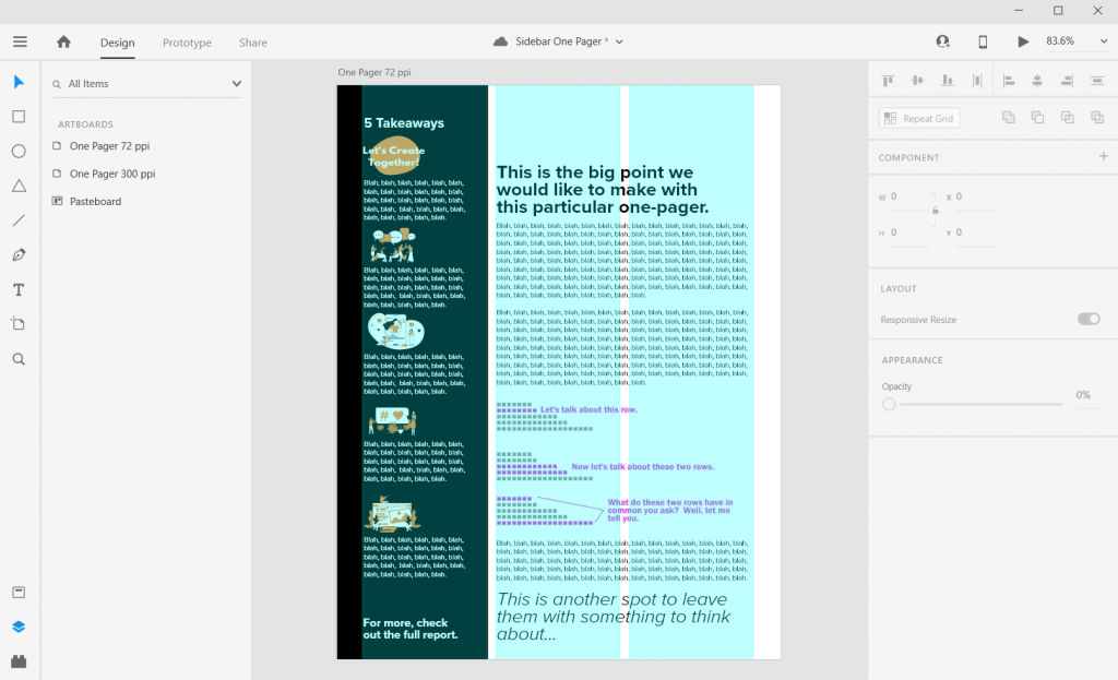
Charts and Pictures in the Main Body Section

I like using the main body to make the major point the one-pager is trying to express, then add any relevant chart or illustration. You can even drop a final thought and make it stand out through italics or a larger size.

In XD your text and shapes will be vector (meaning they will scale to any size without quality loss). If the Pixels/Icons/Charts you enter into the document are not vector (i.e. pngs, jpgs) they might lose quality. Usually if the file size is large enough and you don’t skew it, you won’t notice a difference. But the best way to check is to export it into a pdf and see what it looks like at 100%.

Sidebar Style One-Pager in Adobe XD Illustration Charts and Pictures

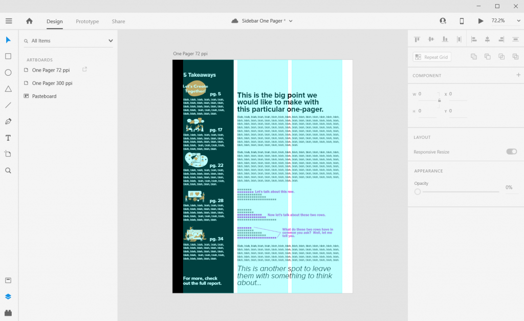
Takeaway – Page Numbers

One-pagers are often sub-reports with content pulled out of larger reports. They don’t tell the whole story, but give teasers.

When there is a larger report, I like to drop in page numbers for anyone wanting more detail.

Sidebar Style One-Pager in Adobe XD Illustration Page Numbers

Don’t be afraid to leave white space.

I like to leave a bit of white space when possible. This can make the one-pager feel less intimidating.

Most often I’ll leave it in the top of the right two columns. Putting it at the top makes it feel more intentional, not like you just ran out of thoughts.

Sidebar Style One-Pager in Adobe XD Illustration Exporting into PDF

Exporting into PDF

You can export your reports right into pdf.

I never suggest writing your report in design program. I usually use Word documents or Google Docs to write. Then I copy and paste the text into prepared templates in XD.

Sidebar Style One-Pager in Adobe XD Illustration Final look in Acrobat

Some nice free graphic design guides.

A lot of my interest in grid based design started when I found the work of the late Massimo Vignelli. There are a couple of his works available on the web for free download, and they are well worth the read.

The Vignelli Canon

massimo vignelli canon free pdf graphic design

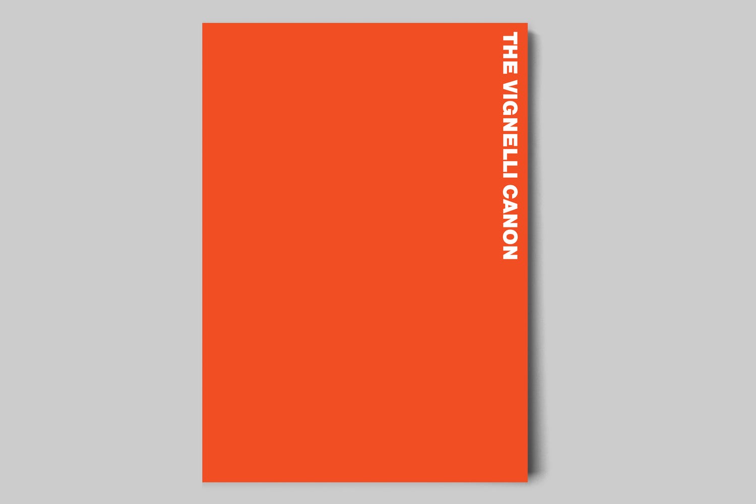
The famous Italian designer Massimo Vignelli allows us a glimpse of his understanding of good design in this book, its rules and criteria. He uses numerous examples to convey applications in practice – from product design via signaletics and graphic design to Corporate Design. By doing this he is making an important manual available to young designers that in its clarity both in terms of subject matter and visually is entirely committed to Vignelli’s modern design.

Designed by Massimo Vignelli, 2009, 96 pages.

From Rationale Design

Graphic Design for Non-Profit Organizations

rationale resources vignelli non-profit organizations manual cover

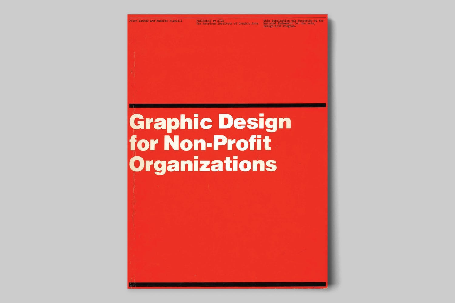
The document presented here focuses on improving structural design and general best practices for Non-Profit Organizations. However, the scope of the teachings apply to achieving good design across any industry. These works are the property of their respective owners and should be used for non-commercial research and education purposes only.

Designed by Massimo Vignelli & Peter Laundy in partnership with AIGA, 1980, 52 pages.

From Rationale Design

A Learning Community for Creative Data People

So I’m considering building a new virtual learning community. This would be a peer learning group, not just me telling you how to do things. It’s for data people (researchers, evaluators, public health professionals, etc.) who are interested in exploring and building up their creative side.

It’s for the people who believe as I do, that if we want people to make data informed decisions, we (the people who know the data) have to be more creative in how we approach doing and sharing our work.

Interested? You can learn more here and join the waitlist:

DiY Data Design Waitlist

Written by cplysy · Categorized: freshspectrum

Jan 29 2021

What is Developmental Evaluation? Cartoon Glossary

This is a series of posts providing quick of overviews of important topics in research and evaluation. Each post in this series will include at least 3 cartoons from my archives and at least 3 links to recommended resources. I only give quotes here and recommend that you follow the links below each quote for more detailed information.

What is Developmental Evaluation Cartoon by Chris Lysy of Freshspectrum.  

"As an evaluator I can help improve your program.

But we don't have a program yet. Just a problem, a few ideas, and a little money."

Developmental evaluation supports innovation and development, especially in complex and dynamic situations.

Accountability evaluation, formative evaluation, and summative evaluation all depend on there being a program or model to evaluate. Developmental evaluation is relevant when the program or model is still being created and those involved are figuring out what they want to do and how to do it. Thus, developmental evaluation helps people developing new initiatives to get ongoing, real-time feedback about what is emerging and its implications for making a difference.

Evaluation Flashcards developed by Michael Quinn Patton for the Otto Bremer Trust

What is Developmental Evaluation Cartoon by Chris Lysy of Freshspectrum.  

"Formative, Summative, is that all you evaluators got?

Umm, well, umm how about dev-el-op-men-tal."

On a cold Minnesota morning in February, I met with them after two and a half years and said, “You folks have been a great group to work with, you’ve been open to feedback, you’ve made changes, you’ve really adapted, but now we’re moving into the summative period, where we have to decide if the model that has been developed works, and so you can’t make any more changes in the program, because if you keep changing, we can’t answer the question of did it work. It’s got to be stable, standardized, fixed, and that’s now the challenge. So change is done, next two and a half years, everybody
gets the same intervention and then we’ll follow up, and see what’s happened to participants, what they’re doing in their communities, what kind of differences they’re making, how they’re communities view [them].”

The director of their program looked at me and he said, “But we don’t want to stop changing the program.” I said, “No, I understand you’ve been really good about changing the program, but we’re now doing what’s called summative evaluation, and that
means you can’t keep changing the program, the formative piece is over. The Board has contracted me to do a summative evaluation to answer the question does it work? There are a lot of people watching what you’re doing. People want to know if they
should emulate this model. That means summative evaluation.” He said, “No, no, no, no, you don’t understand. We understand that we can’t keep the program the same, we need to keep changing the program because the world around us is changing.” Then he
looked at me, fairly hostilely, and he said, “Formative evaluation, summative evaluation, is that all you people have?”

Well, in truth, those have been the dominant paradigms, with an accountability version of summative evaluation, which is a lot of what IEG does. Quite taken back, I said, “Well, I suppose, if you really wanted to, you know, we’d have to renegotiate the contract, but you know if you really wanted to, we could try doing developmental evaluation.” And they said, “What’s that?” I said, “That’s where you keep developing and adapting.” And they said, “That’s what we want to do. How do we do that?” I said, “Well,
we’ll have to figure that out. I’ll get back to you on that.”

Summary of a Workshop High Impact Evaluations Exploring the Potential of Real-Time and Prospective Evaluations A Workshop Conducted by the Independent Evaluation Group. Washington, DC – January 27, 2010

What is Developmental Evaluation Cartoon by Chris Lysy of Freshspectrum.  

Why developmental evaluation exists...

"Our program just started we have no idea where to go or how to evaluate.

We'll start by predetermining the program's outcomes using very little evidence then over the years we'll judge you according to that."

Developmental Evaluation (DE) is an evaluation approach that can assist social innovators develop social change initiatives in complex or uncertain environments. DE originators liken their approach to the role of research & development in the private sector product development process because it facilitates real-time, or close to real-time, feedback to program staff thus facilitating a continuous development loop.

Michael Quinn Patton is careful to describe this approach as one choice that is responsive to context. This approach is not intended as the solution to every situation.

Developmental Evaluation – Better Evaluation

Written by cplysy · Categorized: freshspectrum

Jan 27 2021

How to Create Icon Arrays in Adobe XD

This is the second in a series of posts on chart design in Adobe XD. In each post we will take on a different chart type. Today we’ll talk about one of my all time favorite charts, the Icon Array.

What you’ll find in this post:

  • An Oversimplified How To
  • How to do more with your Icon Array.
  • Icon Array Inspiration
How to Create Icon Arrays in Adobe XD Illustration

An Oversimplified How To

Creating a bar chart (or column chart) in Adobe XD is just a little shape creating.

Adobe XD Icon Array Illustration How To 1

Step 1. Start by creating an artboard in Adobe XD. It doesn’t matter which you choose, you can create multiple artboards of different sizes within each Adobe XD file.

You should also have some data… I’ll just use some random numbers: 7, 8, 12, 14, 19.

Adobe XD Icon Array Illustration How To 2

Step 2. Draw a square by clicking on the little square icon and drawing it on the artboard (you can also change the fill color if you’d like). It’s okay if it’s not a perfect square, we’ll fix that in the next step.

Adobe XD Icon Array Illustration How To 3

Step 3. Adjust the size of the square using the panel in the upper right hand of the screen. I’ll make mine 50 pixels wide by 50 pixels tall.

Adobe XD Icon Array Illustration How To 3

Step 4. Use “repeat grid” to copy the square across, till you have the number you want to visualize (in my case, 7).

Adobe XD Icon Array Illustration How To 4

Step 5. Now Copy/Paste your Grid so you have 5 rows, then drag them apart to create the series.

Adobe XD Icon Array Illustration How To 5

Step 6. Now drag out each row until the number of boxes match the frequency you are trying to visualize.

And there you go, you have an icon array chart.

How to do more with your Icon Array.

Okay, so now you know the basics, let’s look at what else you can do. Adobe XD is a design program, not a spreadsheet. What you lack in automatic charting, you gain in complete control over formatting.

Stretch and Skew

Adobe XD Icon Array Illustration Sketch and Skew

Adobe XD is a vector design program, so you can stretch and skew to your heart’s content without sacrificing quality. Usually I will ungroup all of my individual grids, then group all the squares together. This lets me lock the proportions and turn off the responsive resize. This let’s me move the chart around without changing the initial look.

Adding Color

Adobe XD Icon Array Illustration adding Color

Add color by just selecting a square and then clicking on the box next to “Fill/Border.”

Adding Labels

Adobe XD Icon Array Illustration  Adding Labels

Add labels by clicking the “T” icon and entering the text somewhere on the page. You can easily shift the text placement, change the size, change the font, or change the color.

Adjusting the Art Board

Adobe XD Icon Array Illustration  Adjusting the Art Board

Adjusting the art board is as simple as adjusting the size of any shape within the artboard. Just click on the artboard title, you’ll be given the ability to drag the sides (or you can just change the pixels in the W & H boxes on the right side of the page).

Shapes, Icons, and Pictures

Adobe XD Icon Array Illustration  Shapes, Icons, Pictures

You can create an icon array using this approach with any kind of icon you have. It can be shape you’ve drawn (like the first example), an icon you pulled from a site like the Noun Project, or a picture (like the Bernie Sanders meme cutout).

Alternate Shapes and Sizes

Adobe XD Icon Array Illustration Alternate Sizes and Shapes

You can also copy/paste or duplicate artboards. This lets you create all sorts of different shapes and sizes for different dissemination tools.

Beyond the Basics

Adobe XD Icon Array Illustration Bernie Boxes
Icon Array Example with Annotated Rows

This is just the basics. There are all sorts of things you can do with Icon Arrays in XD.

Icon Arrays, in my personal opinion, are vastly underutilized. Most of your basic charts (bar charts, line graphs, pie charts, etc.) don’t show you the values underlying the visual.

For example, say you have two equal bars, each would show you 50%. In one chart you have an “n” of 2. In the other chart you have an “n” of 1,432. These are very different datasets but the bar charts would look identical. The icon arrays would provide you with more depth.

Icon arrays can also help you individualize the data. If each point represents a person, knowing that as a reader can help you connect with the data.

Icon Array Inspiration

Or, go big-picture with icon arrays. I love this approach, and the school district did, too.
Depict Data Studio – Students Receiving Free and Reduced Meals: From Nested Donuts to an Icon Array

So this Icon Array by Ann K Emery is a pretty simple visual. A lot of Icon Arrays you see in the wild tend to be alternative pie charts using a base 10, 100, 1,000, etc. and highlighting a proportion.

Icon Array of Senate Results from 2018 Election
VOX Midterms 2018

Icon arrays have been seen more often in election data in recent years. This icon array mimics the look of the U.S. Senate chamber.

Icon arrays can also make really easy interactive visuals. Take this Senate chart for instance, each dot represents a senator. If you wanted, you could create an interactive version where you highlight a dot and the individual Senator appears in a pop-up box.

Icon Array of Suicide by Gun Death
Gun Deaths in America – FiveThirtyEight

Icon arrays also make for really good story telling visuals. It let’s you dive into the data, using annotations to highlight individuals as well as groups of people.

If you’re interested in a short course on icon array design, part of my free Data Viz for Anti-Racism course walks through the process of creating an icon array infographic.

Icon Array from DiY Data Design
Icon Array Infographic – from my Free Data Viz for Antiracism Course
Cartoon by Chris Lysy - freshspectrum - 
"33.33% of respondents loved our program."
"Be honest. You only talked to 3 people, right?"
Don’t do this with your axis…

Written by cplysy · Categorized: freshspectrum

Jan 22 2021

What are Evaluation Questions? Cartoon Glossary

This is a series of posts providing quick of overviews of important topics in research and evaluation. Each post in this series will include at least 3 cartoons from my archives and at least 3 links to recommended resources. I only give quotes here and recommend that you follow the links below each quote for more detailed information.

freshspectrum cartoon by Chris Lysy.  Person saying, "Does anyone else feel like we could do better?"

Key Evaluation Questions (KEQs) are the high-level questions that an evaluation is designed to answer – not specific questions that are asked in an interview or a questionnaire. Having an agreed set of Key Evaluation Questions (KEQs) makes it easier to decide what data to collect, how to analyze it, and how to report it.

KEQs usually need to be developed and agreed on at the beginning of evaluation planning – however sometimes KEQs are already prescribed by an evaluation system or a previously developed evaluation framework. 

Try not to have too many Key Evaluation Questions – a maximum of 5-7 main questions will be sufficient. It might also be useful to have some more specific questions under the KEQs.

Better Evaluation – Specify the Key Evaluation Questions

freshspectrum cartoon by Chris Lysy.  Person saying, "Before we develop the survey let's start with the bigger question this evaluation is designed to answer."

Other person, "I'll double check my notes, but I don't think we have one of those."

Before we decide what types of data we need (qualitative or quantitative) we need to know the bigger question of the project: What specific problem does the project or program address? 

Evaluation questions, similar to research questions in academic research projects, guide the methods and tools used to collect data to understand the problem under investigation. Evaluation questions may seem intuitive, and thus be quickly developed to get to the more detailed program planning. But, without well-developed, relevant, and accurate evaluation questions, developed with stakeholders connected to the problem, projects can move around a problem without addressing the most appropriate issues.

American University – Asking Program Evaluation Questions

freshspectrum cartoon by Chris Lysy.  Person saying, "We wanted an evaluation, you're just asking basic who, what, where, when, why, and how questions."
Other person responds, "That's right, before we can evaluate we need to understand what's really going on."

I keep six honest serving-men
(They taught me all I knew);
Their names are What and Why and When
And How and Where and Who.
— Rudyard Kipling (1865–1936), The Elephant’s Child

For professionals as diverse as journalists, police detectives, lawyers, and evaluators, Kipling’s five Ws and one H is the formula for full understanding and a complete report. These are descriptive, factual, and open-ended questions. None can be answered “yes” or “no.” You have to find out what happened. When first entering a program situation (for example, on a site visit), it can be helpful to begin with some basic facts to get the lay of the land. Keep it simple: Who’s proposing to do what? Where? When? How? Why?

Evaluation Flashcards developed by Michael Quinn Patton for the Otto Bremer Trust

Written by cplysy · Categorized: freshspectrum

Jan 20 2021

How to Create Bar Charts in Adobe XD

This is the first in a series of posts on chart design in Adobe XD. In each post we will take on a different chart type. Today we start with one of the most ubiquitous and useful charts, the Bar Chart.

What you’ll find in this post:

  • An Oversimplified How To
  • How to create a good looking bar chart.
  • 6 other things related to creating bar charts with Adobe XD.
How to Create Bar Charts in Adobe XD featured image.

An Oversimplified How To

Creating a bar chart (or column chart) in Adobe XD is just a little shape creating.

Adobe XD Bar Chart Illustration 1

Step 1. Start by creating an artboard in Adobe XD. It doesn’t matter which you choose, you can create multiple artboards of different sizes within each Adobe XD file.

You should also have some data… I’ll just use some random numbers: 10,11,13,15,18.

Adobe XD Bar Chart Illustration 2

Step 2. Draw a rectangle by clicking on the little square icon and drawing it on the artboard (you can also change the fill color if you’d like).

Adobe XD Bar Chart Illustration 3

Step 3. Size it using pixels. I often just multiply all my data by 10 or 100. I also usually start with the largest number (so in my case 18 * 100 = 1800). It doesn’t matter if the bar fits on the artboard.

Adobe XD Bar Chart Illustration 4

Step 4. Use “repeat grid” to copy the bar. Since I have 5 numbers I want five bars (or you can copy/paste, or you can insert new bars).

If you used repeat grid like I did, you should then ungroup the grid.

Adobe XD Bar Chart Illustration 5

Step 5. Now resize the rest of the bars based on your data.

Adobe XD Bar Chart Illustration 6

Step 6. Now select all the rectangles (group them if you would like) and resize or center so it fits on your artboard. As long as you stretch or skew the bars together, the visual will still be accurate.

And there you go, you have a bar chart.

How to create a good looking bar chart.

Okay, so now you know the basics, let’s look at what else you can do. Adobe XD is a design program, not a spreadsheet. What you lack in automatic charting, you gain in complete control over formatting.

Adobe XD Bar Chart Illustration Stretch and Skew

Stretch and Skew.

Adobe XD is a vector design program, so you can stretch and skew to your heart’s content without sacrificing quality. And as long as you group all the bars together prior to changing the size, bar proportions will remain intact.

Adobe XD Bar Chart Illustration Adding Color

Adding Color

Add color by just selecting a rectangle and then clicking on the box next to “Fill/Border.”

Adobe XD Bar Chart Illustration Adding Labels

Adding Labels

Add labels by clicking the “T” icon and entering the text somewhere on the page. You can easily shift the text placement, change the size, change the font, or change the color. Do the same for any bar labels you want.

Adobe XD Bar Chart Illustration Adding an Axis

Adding an Axis

If you want one, add one with a couple of lines. XD makes it really easy to align objects to other objects.

Adobe XD Bar Chart Illustration Adding Grid Lines

Adding Grid Lines

Want Grid Lines, just draw them. Use the pixels/ x and y coordinates to measure and place. XD keeps every object on its own layer, so if you want the grid behind everything, just drag them to the bottom on the left hand side.

Adobe XD Bar Chart Illustration Adjusting the Art Board

Adjusting the Art Board

Adjusting the art board is as simple as adjusting the size of any shape within the artboard. Just click on the artboard title, you’ll be given the ability to drag the sides (or you can just change the pixels in the W & H boxes on the right side of the page).

Adobe XD Bar Chart Illustration Alternate Shapes and Sizes

Alternate Shapes and Sizes

You can also copy/paste or duplicate artboards. This lets you create all sorts of different shapes and sizes for different dissemination tools.

Adobe XD Bar Chart Illustration Matching Colors

Matching Colors

Want to color match your bar chart with a logo or picture? Just paste the image into the XD file then use the eye dropper to pick the color.

Adobe XD Bar Chart Illustration Beyond the Basics

Beyond the Basics

This is just the basics. There are all sorts of things you can do with Bar Charts in XD.

I often use Adobe XD when I want to increase the control I have over the aesthetic presentation. Especially if I am creating infographics or visuals meant to be shared across multiple communication channels.

6 other things related to creating bar charts with Adobe XD

1. Want to know more about pixel math?

Chart Math in Adobe XD

Want to go deeper into the pixel math I use to create charts in Adobe XD? I wrote a post on it that you can check out here: Pixel Math, Charts, and Adobe XD

2. Want to create in Excel and format in Adobe XD?

That’s really easy to do. Just save your Excel chart as a Scalable Vector Graphics (SVG) file.

Saving Bar Charts in Excel as SVG

You can then drop the SVG file right into Adobe XD. The chart will actually show up in layers, making it really easy to tweak colors/styles. If there is a lot of data, it can be easier to create the charts in Excel (or in R or something else) and bring it over to XD for formatting.

Pasting SVG Chart into Adobe XD

3. Adobe XD is FREE-mium.

Okay, so they’ll try to upsell you to the “Single App” or a Creative Cloud plan. But the Starter plan is completely full featured. It’s only missing some of the collaboration features and cloud storage, which you really don’t need most of the time.

Also, if you are already a user of Adobe Creative Cloud (Photoshop, Illustrator, InDesign, etc. (then you already have access to the full program).

Adobe XD Pricing Plans

4. Adobe XD works on both PC and Mac.

There are a couple of tools that are similar to Adobe XD (and better in some respects). One of those tools is called Sketch. Unfortunately with Sketch, you can only use it on a Mac, which might work for many UX designers but not so much for most of the data visualization designers I know.

Sketch Prototyping Tool

5. There are plugins that can act as chart creators.

Another option for those with lots of data is to use one of a Adobe XD few plugins that auto create charts from CSV data. Honestly, I find it easier to just create the basic charts elsewhere and paste in, or just build within the profile. But these options do exist.

Vizzy Charts Adobe XD Plugin

6. Any good bar chart examples?

I shared a few bar chart examples and considerations in my How to create bar charts in Excel post. The cool thing about Adobe XD is that you can replicate just about any static graphic you find on the web. You can also prototype all sorts of interactive graphics as well.

Cartoon where the presenter is showing a bar chart with a bad axis, thinking "don't look at the axis."  Someone in the audience says, "What's up with the axis?"
Don’t do this with your axis…

Written by cplysy · Categorized: freshspectrum

  • « Go to Previous Page
  • Go to page 1
  • Interim pages omitted …
  • Go to page 41
  • Go to page 42
  • Go to page 43
  • Go to page 44
  • Go to page 45
  • Interim pages omitted …
  • Go to page 54
  • Go to Next Page »

Footer

Follow our Work

The easiest way to stay connected to our work is to join our newsletter. You’ll get updates on projects, learn about new events, and hear stories from those evaluators whom the field continues to actively exclude and erase.

Get Updates

Want to take further action or join a pod? Click here to learn more.

Copyright © 2026 · The May 13 Group · Log in

en English
af Afrikaanssq Shqipam አማርኛar العربيةhy Հայերենaz Azərbaycan dilieu Euskarabe Беларуская моваbn বাংলাbs Bosanskibg Българскиca Catalàceb Cebuanony Chichewazh-CN 简体中文zh-TW 繁體中文co Corsuhr Hrvatskics Čeština‎da Dansknl Nederlandsen Englisheo Esperantoet Eestitl Filipinofi Suomifr Françaisfy Fryskgl Galegoka ქართულიde Deutschel Ελληνικάgu ગુજરાતીht Kreyol ayisyenha Harshen Hausahaw Ōlelo Hawaiʻiiw עִבְרִיתhi हिन्दीhmn Hmonghu Magyaris Íslenskaig Igboid Bahasa Indonesiaga Gaeilgeit Italianoja 日本語jw Basa Jawakn ಕನ್ನಡkk Қазақ тіліkm ភាសាខ្មែរko 한국어ku كوردی‎ky Кыргызчаlo ພາສາລາວla Latinlv Latviešu valodalt Lietuvių kalbalb Lëtzebuergeschmk Македонски јазикmg Malagasyms Bahasa Melayuml മലയാളംmt Maltesemi Te Reo Māorimr मराठीmn Монголmy ဗမာစာne नेपालीno Norsk bokmålps پښتوfa فارسیpl Polskipt Portuguêspa ਪੰਜਾਬੀro Românăru Русскийsm Samoangd Gàidhligsr Српски језикst Sesothosn Shonasd سنڌيsi සිංහලsk Slovenčinasl Slovenščinaso Afsoomaalies Españolsu Basa Sundasw Kiswahilisv Svenskatg Тоҷикӣta தமிழ்te తెలుగుth ไทยtr Türkçeuk Українськаur اردوuz O‘zbekchavi Tiếng Việtcy Cymraegxh isiXhosayi יידישyo Yorùbázu Zulu