In reply to Jen.
Thanks Jen 🙂
the next day for evaluation
In reply to Jen.
Thanks Jen 🙂
This is incredibly useful. Thanks, especially for taking the time to spell out the steps in Canva.
Chris, This is one of the most useful blog posts from any source that I’ve received. Rather than just referring us to Canva, you walk through all the steps. I love the idea of creating the powerpoint blocks with color labels. And super thanks for the site to check colors for persons with color blindness, which if I remember correctly affects 11% of people–8% of men and 3% of women.
Your post is great!
Lyn
In this post I am going to walk you through the process of creating your own data visualization color palette.

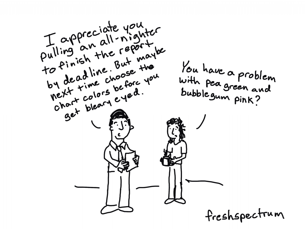
A lot of the researchers and evaluators I know don’t think a lot about color when they go to create charts. And as a result, they end up creating reports with a diverse mix of colors reminiscent of late 80s/early 90s fashion.
This happens even when the data person works for an organization that has a defined style guide. Of course that style guide might be limited and is not always helpful when it comes to data visualization.
Having some pre-defined colors in hand when creating charts can help you stay consistent. Design consistency keeps artificial aesthetic differences from appearing significant in some way. It also takes away a step (saving your brain power) the next time you need to write a report on a deadline.
I like to start with one color, then build out from that color. It helps keep things from getting too overwhelming.
If you already work for an organization, that first color might be decided for you. Often the primary action color sits within an organization’s logo that you’ll find on their website.
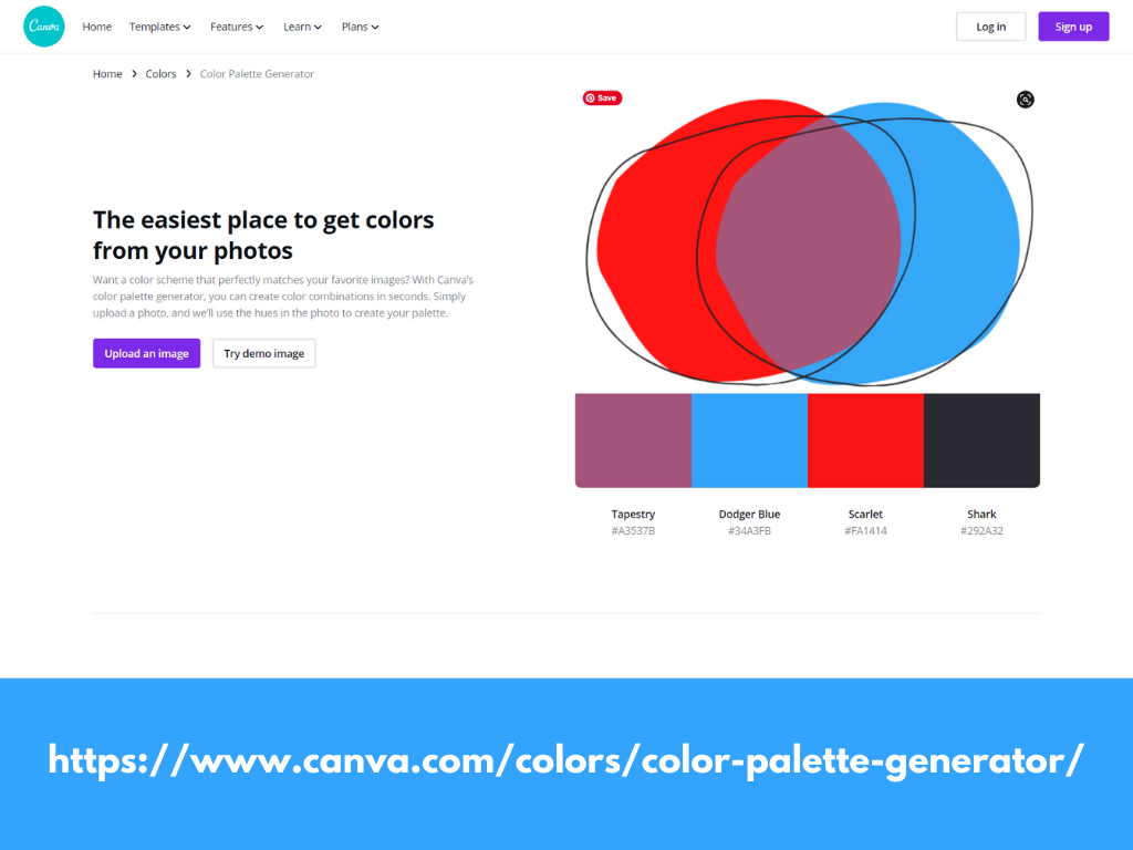
Don’t know what that color is? Canva has a nice free tool that generates a basic palette from a picture. So if you downloaded a logo (or even if you just have picture you find inspires you) you can upload it to the generator and see the colors within.
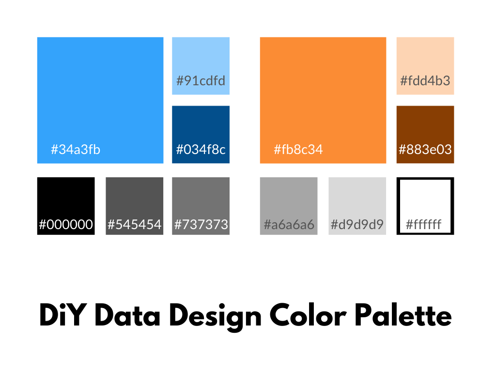
In my case I am going to start with the blue color from my logo, which Canva calls Dodger Blue. You’ll see the hex code (6 digit alpha-numeric) underneath.
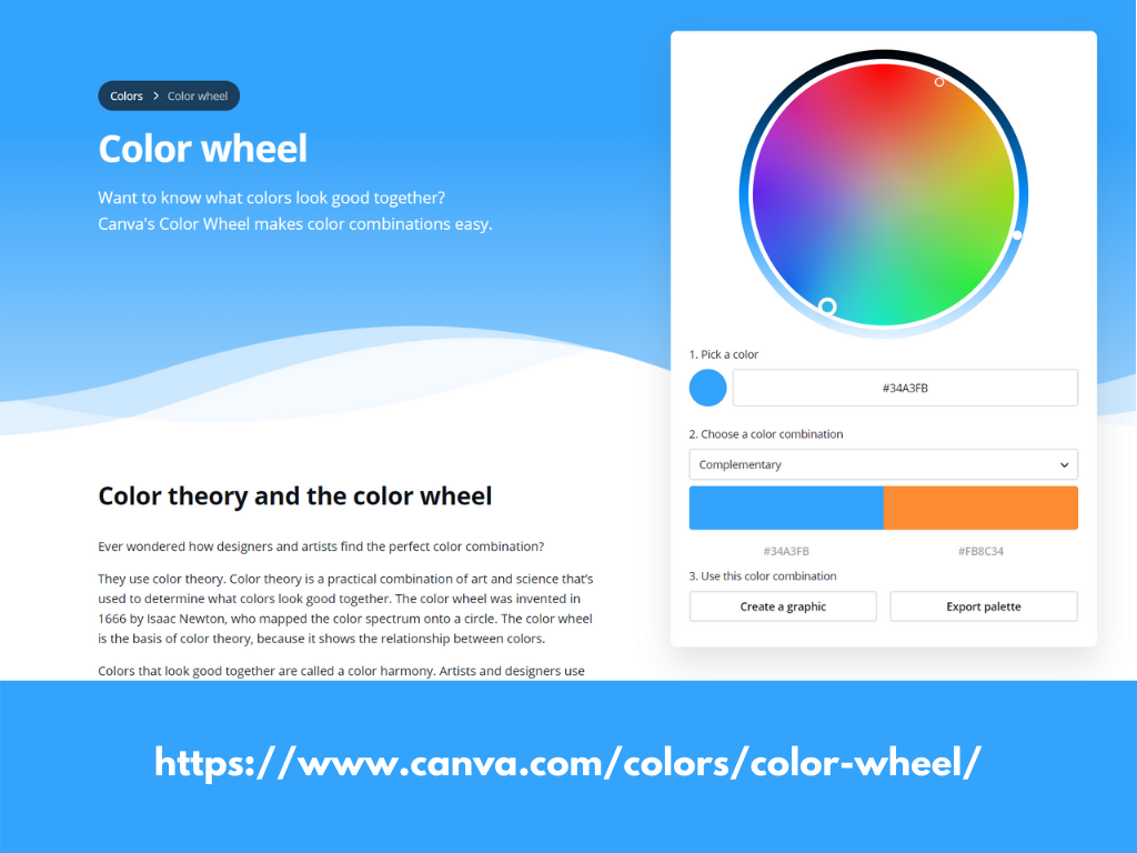
In a lot of charting it’s good to have at least two main colors.
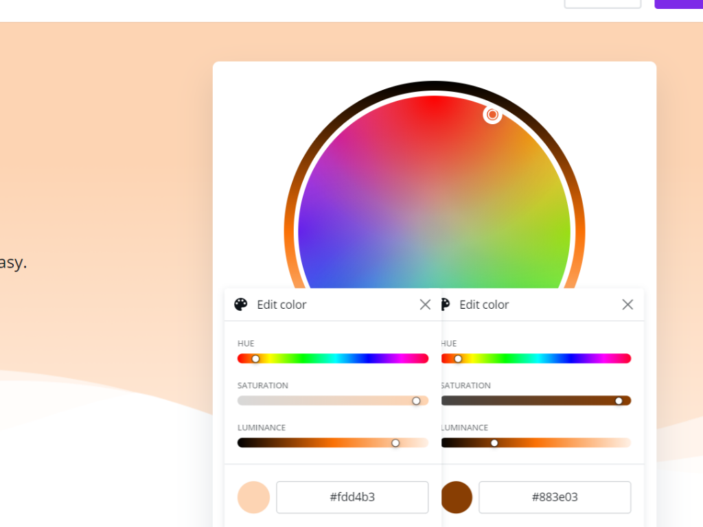
I highly advocate for choosing the second color based on what is sitting on the other side of the color wheel. In other words, the complementary color.
Canva also has a color wheel tool that let’s us see that color.
Just stick in the hex code from your first color into the “Pick a color” space. Then look at the color in the “complementary space.” So for my blue, the complementary color would be an orange.
Here is the thing about charting. You almost always need several colors. But rainbow coloring your report is not going to help anyone.
Instead I like to draw my next 4 colors using monochromatic versions of my first 2.
Again, with just the hex code in the primary color spot, choose “Monochromatic” in the next space. The Canva color wheel will just repeat the one color and give you another shade of that color on the right.
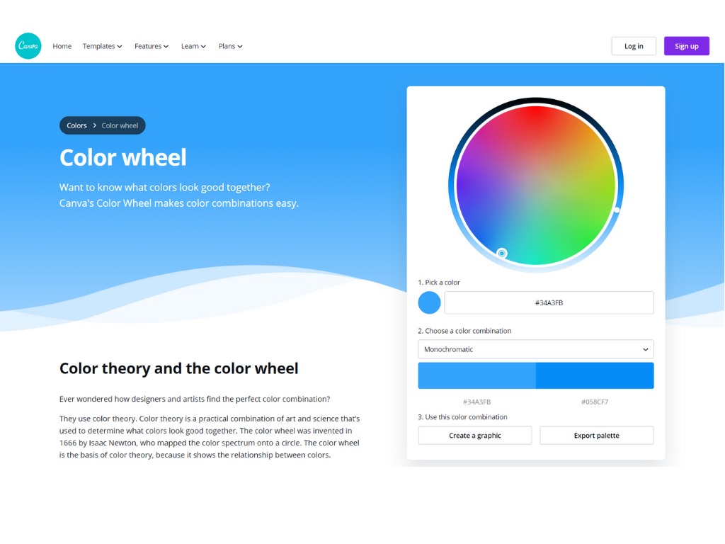
Personally, I don’t think this is different enough to use for most charts. So instead I click on each individual tile it gives me and select “Edit color.” This will give you some sliding scales.
I want to keep the change monochromatic, so the only thing I’m going to move is the luminance. On one I am going to take the base color and make it really light. On the other I’m going to go really dark.
So in my case, I will end up doing this two times for the blue and two times for the orange. This will give me 6 total colors (2 complimentary, and then 2 shade options for each color).
Once you figure out the colors, remember to write down the Hex codes.
Having a whole bunch of handwritten hex codes is probably not super helpful.
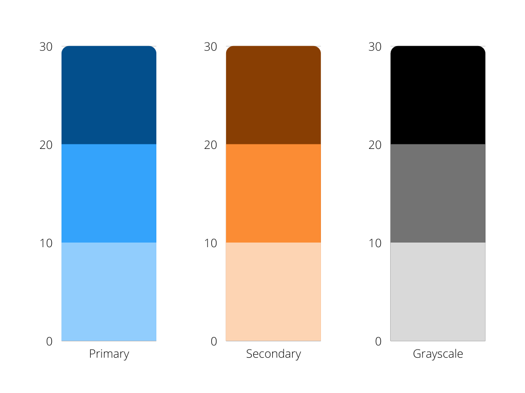
So let’s turn it into a basic color guide using Canva’s regular design tools. I’ll start by creating a blank “Presentation (4:3).” This will be easy to print, share as an image, download to pdf, or even download to Power Point.
Once I create the presentation I just drop in a simple square element.
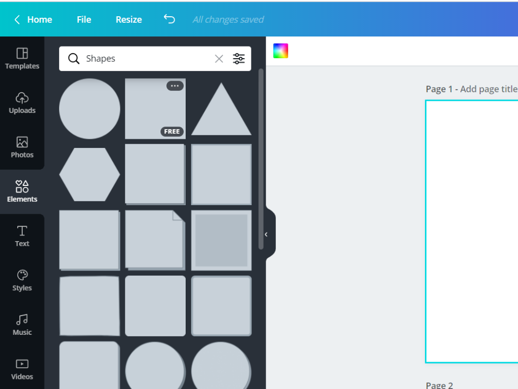

Then I’ll drop in more squares until I have a pattern that has two big blocks in focus (two blocks to the side of each) and then six blocks underneath.

I’m going to want to put the hex codes into the design, so I also go ahead and add some body text in white to each of the blocks.
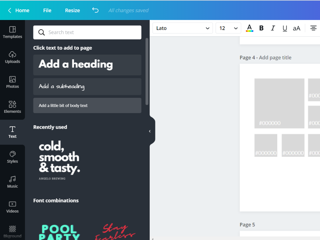
Now comes the easy part. You just click on the first square, then the color up top, and search for your hex code. You’ll also want to paste the code into your label.
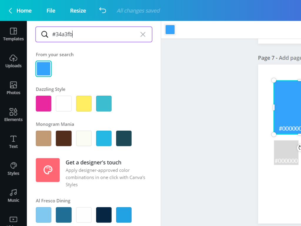
Now just keep repeating the process for your 6 colors.
To round things out I also like adding a simple 6 color gray scale from Black to White. That’s why I put the six blocks on the bottom.
All told, we will have two complimentary colors, 2 additional shade varieties for each, and then 6 grayscale blocks.
This color collection will give you a lot of variety when it’s time to create your charts.
You’ll want to go ahead and download your color guide. I like to download it as a simple PNG.
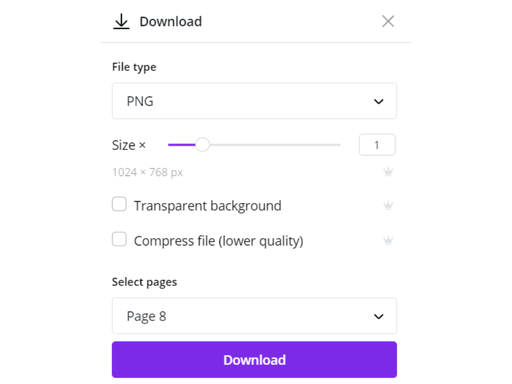
Canva has also added support for downloads directly into Power Point. Which is perfect for pretty much everyone who spends most of their time in Excel, Word, and PowerPoint.

When using color in charts and visualizations it’s good practice to not only use color. Meaning, color should not be the only thing that differentiates different categories.
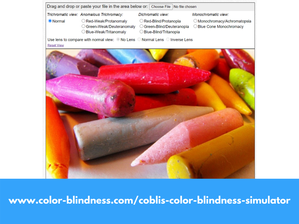
But we should also check our colors for issues in differentiation due to common color blindness. Here is one color blindness simulator you can use to upload your color guide and check it out.
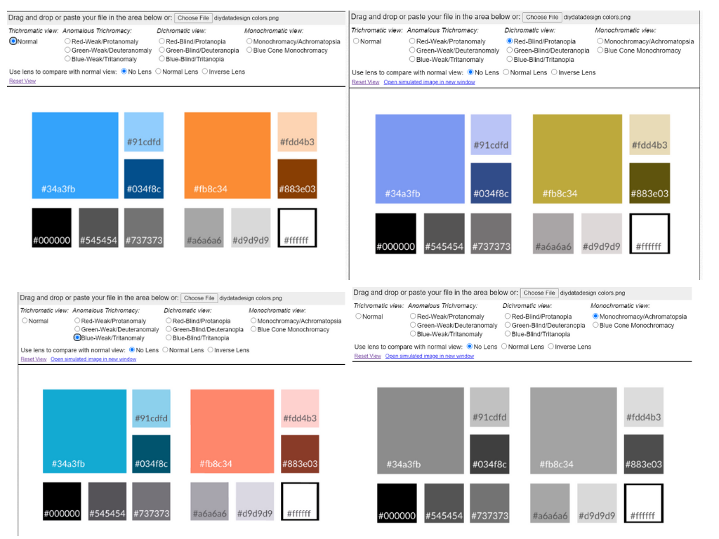
As you can see, my colors do not fair too poorly. The important piece here is having the ability to differentiate.
One additional thing to note is that as different as two colors look it’s the shade that matters when an image gets printed in black and white. If you know your charts will be printed in black and white it’s a good idea to vary not only colors but shades.
Have a happy Thanksgiving, Chris..
I love the cartoons, especially the last one!