• Skip to main content
  • Skip to footer
  • Home

The May 13 Group

the next day for evaluation

  • Get Involved
  • Our Work
  • About Us
You are here: Home / Archives for allblogs

allblogs

Jul 06 2022

The Reporting Revolution

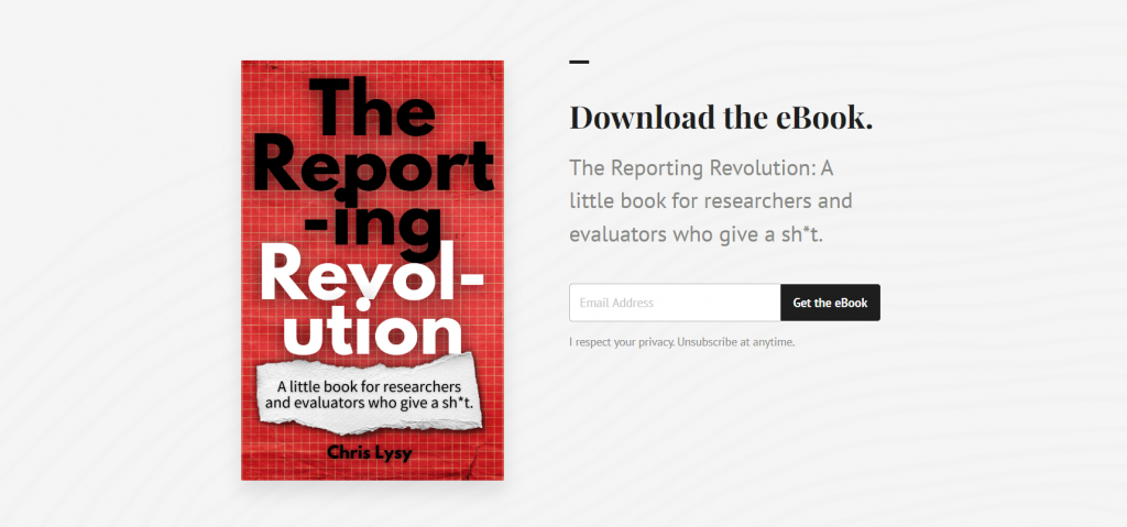
So I started writing a book. It’s called The Reporting Revolution: A little book for researchers and evaluators who give a sh*t.

I wanted to share with you what I have so far.

The final book is nowhere close to finished. I just started writing it a few days ago by collecting some of my most central thoughts on modern reporting. And then I put all of those thoughts into the eBook I share below.

Here’s the deal. If you download the current version of the eBook, I’ll keep giving you updates. All the way until it’s finished (if it makes it that far). Meaning you’ll get something for free that might eventually cost others actual money.

So what’s the catch?

There isn’t one. The currently 20 page book is free. If I gets a good response from readers, I’ll write more pages. If not, it’s still a nice little 20 page book.

Also, I’m hoping you’ll give me feedback.

Here is what’s inside:

  • Chapter 1. Why are we still reporting like it’s 1999?
  • Chapter 2. Our reports tell everyone else a story about our profession.
  • Chapter 3. Seeing our work through our audience’s eyes.
  • Chapter 4. Unintentional gatekeepers.
  • Chapter 5. Mindset change – Noun report to verb report.
  • Chapter 6. Not just better, faster too.
  • Chapter 7. Make it easy.
The Reporting Revolution: A little book for researchers and evaluators who give a sh*t.  
Screenshot of the eBook landing page.
Click here to go to the download page.

Written by cplysy · Categorized: freshspectrum

Jul 05 2022

La gestión del conocimiento personal de l@s evaluador@s

La gestión del conocimiento personal (en inglés Personal knowledge management /  PKM):

(1) Es un proceso que una persona utiliza (a) para recopilar, clasificar, almacenar, buscar, recuperar, compartir, internalizar e integrar conocimientos en sus actividades diarias,  y (b) la forma en que estos procesos respaldan sus actividades laborales. (Grundspenkis 2007 y Wright 2005)

(2) Es un enfoque de abajo hacia arriba para la gestión del conocimiento (KM) y una respuesta a la idea de que l@s trabajador@s del conocimiento deben ser responsables de su propio crecimiento y aprendizaje. (Pollard 2008)

L@s trabajador@s del conocimiento son aquell@s cuyo principal capital es el conocimiento, cuyo trabajo es «pensar para ganarse la vida». Como ejemplo de trabajador@s del conocimiento, tod@s aquellos en torno al sector de la evaluación (consultor@s, gestor@s, investigado@s…). ¿Cómo hacemos en la práctica en el sector de la evaluación para la gestión de nuestro conocimiento «personal»?

Referencias

Grundspenkis, J. (2007), «Agent based approach for organization and personal knowledge modelling: knowledge management perspective», Journal of Intelligent Manufacturing, vol. 18, no. 4, pp. 451–457, doi:10.1007/s10845-007-0052-6, S2CID 6466978.

Personal knowledge management 

Pollard, Dave (2008), PKM: A bottom-up approach to knowledge management. In Knowledge Management in Practice: Connections and Context, ed. T.K. Srikantaiah and M.E.D. Koenig, Information Today, pp. 95–114

Wright, Kirby (2005), «Personal knowledge management: supporting individual knowledge worker performance», Knowledge Management Research and Practice, vol. 3, no. 3, pp. 156–165, doi:10.1057/palgrave.kmrp.8500061, S2CID 58474736.

Written by cplysy · Categorized: TripleAD

Jul 04 2022

Designing Templates to Improve Workflow and Efficiency

I work as a program analyst for a government agency, and it is my job to find ways to improve the efficiency of day-to-day program operations.

An important part of my job is identifying and creating the appropriate communication products for each program, such as standard operating procedures, desk guides, fact sheets, and dashboards.

When I first joined the team, we had no style guide to dictate what fonts, colors, or design to use for our signature products. With multiple people regularly contributing to the same publications, how can we ensure consistency with design and writing? I remember one situation when I was contributing to three publications with three completely different styles. The fonts and colors were all over the place, and each person was manually editing headings and subheadings. Don’t even get me started on the Table of Contents!

I do not consider myself a tech-savvy person at all, but I knew there had to be a better way to create consistently designed reports and products. I made it my mission to learn branding and design tips and tricks to help my team enhance our communication materials.

Not knowing where to begin, I searched the internet and found the Depict Data Studio website. I wanted to sign up for several courses right away, and I tried unsuccessfully to get approval from my employer to cover professional development expenses for report and design courses. So for a long time, I sufficed with Ann’s free resources and blog posts. But I wanted to learn even more, and I registered from the Report Redesign course along with Dashboard Design.

Revamping Report Templates with Skills Learned in Depict Courses

Enrolling in Depict Data Studio courses is one of the best professional development decisions I have made.

I immediately was able to apply the tips and tricks Ann shared to improve my reporting quality and processes.

My greatest takeaway from Ann’s Report Redesign and Dashboard Design courses is that small and simple steps can make a tremendous impact.

One of the most useful and time-saving tricks I was how to set up theme colors and theme fonts. I set up customized colors and fonts for each of the publication types that I regularly produce, so that I can quickly select the appropriate style for any new communication product.

I went a step further and created a detailed template for each communication product. I personally like to start each new publications from a template that has more of the document architecture built into it. My templates usually include the following:

  • Title, Subtitle, and Date
  • Text Hierarchy
  • Table Format
  • Margins
  • Footer with Page Numbers
  • Icons and Symbols (when relevant)

Of course, each template also applies the relevant theme color and font! Below is an example of a standard operating procedure template.

The Outcome: Save Time and Trouble with a Few Straightforward Steps

With just a few straightforward changes, I helped my team save hours of reporting time and formatting trouble.

As soon as I learned something new from Ann’s Report Redesign and Dashboard Design courses, I created templates and job aids to help myself master the process and have a reference tool that applied directly to my job.

I also shared tips and tricks with my colleagues so everyone could benefit.

As a result of implementing the knowledge I learned in Ann’s courses, my team’s report development time reduced by 50%!

Advance Your Professional Development, and Have Fun Too!

I incorporate so much of what I’ve learned from Ann’s courses into my day-to-day work.

Creating report and dashboard templates has made it so much easier for my team to start right away on new projects.

Our branding is consistent with the organization, and my team also created a unique identity for our signature reports.

Senior management loves that our products stand out from the crowd and have a consistent look and feel.

The concepts Ann teaches might seem intimidating at first, but each step is small and simple. A few tweaks and the right attitude can make a very big difference!

Connect with Stephanie Gentle

On LinkedIn: https://www.linkedin.com/in/stephaniegentle/

Written by cplysy · Categorized: depictdatastudio

Jun 30 2022

Comment on Can evaluators be the bridge in the research-practice gap? by Lamin Barrow

Thinking of evaluators as brokers or intermediaries between researchers and practitioners is one of the best scenarios to position the work of the evaluators. As an evaluation and also a research enthusiast, I have been providing that bridge for my organization that is involve in social service business. Sharing this blog post affirms my understanding of the role of evaluators.

Written by cplysy · Categorized: danawanzer

Jun 30 2022

How to create a scatterplot in Canva, and Flourish!

The scatterplot is one of my favorite chart types. So how do you create one in Canva?

In today’s post I’ll show you how you can create a scatterplot directly in Canva, even though you probably shouldn’t. Then I’ll walk through creating a scatterplot using Flourish. Finally I’ll talk a little about when you might want to use a scatterplot, along with an example of how you can make the chart easier to discuss by adding quadrants.

Scatterplots in Canva and Flourish Featured Image

Can you create a scatterplot directly in Canva?

Creating a scatterplot in Canva screenshot

Yes, you can certainly create a scatterplot directly in Canva.

Inside any Canva design just open up the elements menu and search for “Charts”. Then look for the scatterplot.

After you select the element, you’ll get a new Scatterplot dropped onto your page already filled with fake data.

Creating a scatterplot in Canva Screenshot

From here you can simply replace the data on the page with your own. Or you an connect directly to a Google sheet where your data lives.

Then you can tweak the style a bit with some of the options Canva makes available.

Where you might get annoyed.

Canva Scatterplot Fail Screenshot

I personally find the Canva data interface super annoying (the thing on the side that looks like a spreadsheet).

It looks like a spreadsheet, but it really doesn’t act like one. You can paste over the dummy data with your own data, but it’s not easy to move things around. You can’t even select multiple cells at once, which is usually required to move columns around.

Then ultimately, you’ll only have access to a few options you can use to tailor your graph.

Why go with Flourish instead?

Flourish Scatterplot Screenshot

Flourish, a free product that easily integrates directly with any Canva design, is my recommended go to for just about any chart or graph you want to create in Canva.

First off, you get tons of customization options. It can be a little overwhelming at first, but it doesn’t take too long to start figuring out how to tailor your design.

Flourish Data Scatterplot Screenshot

Next, the data entry part of this works really well. I also think the controls are intuitive and love how easy it is to choose columns, colors, names, and other aspects.

Creating a basic scatterplot using Flourish

Creating a Scatterplot in Flourish Screenshot

To create a scatter plot in Flourish, just click “New Visualization” and select one of the Scatter Plot starting points.

Just like Canva, Flourish will start you out with a chart using Dummy data.

Starter ScatterPlot

Then you just paste in or upload your data into the data tab.

Data behind a template scatterplot in Flourish Screenshot

If you need to change the selected columns, just put the letters in the appropriate spots for X values, Y values, and Name.

If you want to add in other variables (such as through color) you can do that here as well.

Scatterplot basics, where continuous data meets continuous data.

Scatterplots are visualizations of two continuous variables.

They are really good at showing correlations. Take for example the following scatterplot I created by matching the Firearm Mortality Rate with a Household Firearm Ownership Rate.

Believe it or not there is a pretty solid correlation between the percentage of households with guns and the total number of gun deaths. Also the highest firearm mortality rates are in mostly red states (shocking I know).

Mixing Two Data Sources (CDC’s Firearm Mortality by State & RAND’s State-Level Estimates of Household Firearm Ownership)

Turn your scatterplot into a “perceptual map style” 4 by 4 quadrant.

One of the downsides of a scatterplot is that it can be a bit tough to discuss.

Unlike a bar graph, where you have very specific tangible values, scatterplots are more about pattern recognition than individual data points. And while you can highlight and annotate individual points, sometimes you want to discuss the graph a little more broadly.

In these kinds of situations I like adding a 4 by 4 quadrant grid.

Screenshot of bringing a Flourish Graph into Canva
  1. To do this I start by connecting to my Flourish account from within Canva.
  2. Next I drop the chart into a design.
  3. After that I just add lines to make it a two by two.
  4. Then I label each of the four quadrants.

Now this chart is really simple to discuss. Here are a couple thoughts I had when looking at the final version.

  • I thought there would be a red state/blue state divide, but this is pretty extreme.
  • The High Ownership/Low Mortality quadrant is interesting. It also includes most of the high gun ownership blue states (like Vermont and New Hampshire). I’m curious as to why they don’t see the same kind of high mortality numbers as some of the red states with similar ownership rates.
Final Example Scatterplot created with Flourish and Canva
Click here for an Interactive Version
Mixing Two Data Sources (CDC’s Firearm Mortality by State & RAND’s State-Level Estimates of Household Firearm Ownership)

Written by cplysy · Categorized: freshspectrum

  • « Go to Previous Page
  • Go to page 1
  • Interim pages omitted …
  • Go to page 123
  • Go to page 124
  • Go to page 125
  • Go to page 126
  • Go to page 127
  • Interim pages omitted …
  • Go to page 310
  • Go to Next Page »

Footer

Follow our Work

The easiest way to stay connected to our work is to join our newsletter. You’ll get updates on projects, learn about new events, and hear stories from those evaluators whom the field continues to actively exclude and erase.

Get Updates

Want to take further action or join a pod? Click here to learn more.

Copyright © 2026 · The May 13 Group · Log in

en English
af Afrikaanssq Shqipam አማርኛar العربيةhy Հայերենaz Azərbaycan dilieu Euskarabe Беларуская моваbn বাংলাbs Bosanskibg Българскиca Catalàceb Cebuanony Chichewazh-CN 简体中文zh-TW 繁體中文co Corsuhr Hrvatskics Čeština‎da Dansknl Nederlandsen Englisheo Esperantoet Eestitl Filipinofi Suomifr Françaisfy Fryskgl Galegoka ქართულიde Deutschel Ελληνικάgu ગુજરાતીht Kreyol ayisyenha Harshen Hausahaw Ōlelo Hawaiʻiiw עִבְרִיתhi हिन्दीhmn Hmonghu Magyaris Íslenskaig Igboid Bahasa Indonesiaga Gaeilgeit Italianoja 日本語jw Basa Jawakn ಕನ್ನಡkk Қазақ тіліkm ភាសាខ្មែរko 한국어ku كوردی‎ky Кыргызчаlo ພາສາລາວla Latinlv Latviešu valodalt Lietuvių kalbalb Lëtzebuergeschmk Македонски јазикmg Malagasyms Bahasa Melayuml മലയാളംmt Maltesemi Te Reo Māorimr मराठीmn Монголmy ဗမာစာne नेपालीno Norsk bokmålps پښتوfa فارسیpl Polskipt Portuguêspa ਪੰਜਾਬੀro Românăru Русскийsm Samoangd Gàidhligsr Српски језикst Sesothosn Shonasd سنڌيsi සිංහලsk Slovenčinasl Slovenščinaso Afsoomaalies Españolsu Basa Sundasw Kiswahilisv Svenskatg Тоҷикӣta தமிழ்te తెలుగుth ไทยtr Türkçeuk Українськаur اردوuz O‘zbekchavi Tiếng Việtcy Cymraegxh isiXhosayi יידישyo Yorùbázu Zulu