• Skip to main content
  • Skip to footer
  • Home

The May 13 Group

the next day for evaluation

  • Get Involved
  • Our Work
  • About Us
You are here: Home / Archives for allblogs

allblogs

Apr 11 2022

How to Present Dense Data Visualizations (Without Losing Your Audience)

Ten years ago, I had terrible insomnia.

I was working full-time and finishing graduate school at night.

My stress came out as insomnia.

I’d get tired of laying in bed… and go make YouTube videos. 😊

For me, being up in the middle of the night + making YouTube videos = intertwined.

I was up in the middle of the night again to speak at the Present to Succeed Conference (it’s mostly a European conference – different time zones).

I woke up at 3, presented at 4, and decided to make a YouTube video for you at 5.

Ann K. Emery from Depict Data Studio is smiling at her desk in her home office.
The wee hours of the morning at the Present to Succeed Conference

I was up anyway, and I wanted to share some highlights from the conference session with you. Enjoy!

Watch a 16-Minute Segment

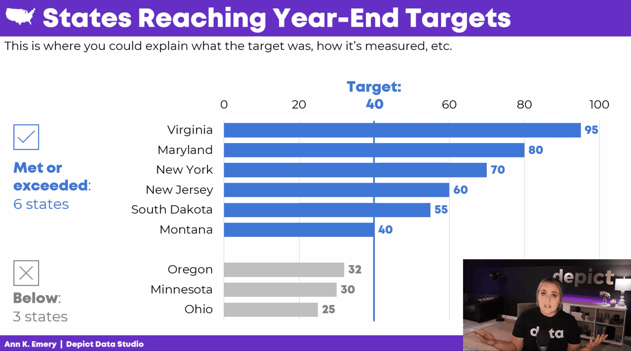
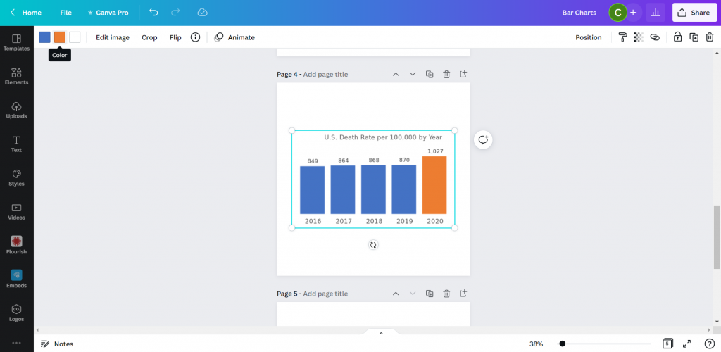
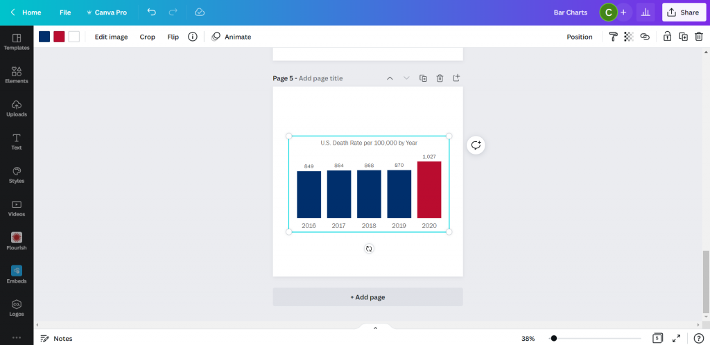
In the conference session, we learned about avoiding Death by PowerPoint by storyboarding.

Instead of presenting a single graph all at once, we’d explain the graph one piece at a time.

Here’s what’s inside.

How to Edit the Existing Graph

In the video, you’ll learn about:

  • adding target lines (if/when that applies to your project);
  • grouping data with space (top vs. bottom categories);
  • grouping data with color (blue vs. gray categories);
  • adding words to explain our categories; and
  • adding icons to increase memorability.

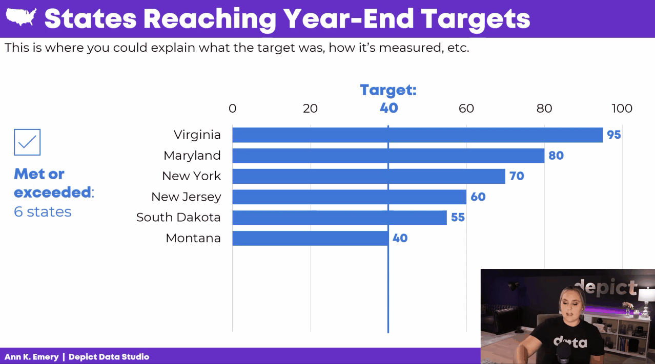
How to Storyboard the Graph

In the video, you’ll see me turn on my presentation voice and give a mini presentation.

I talk through the graph one piece at a time.

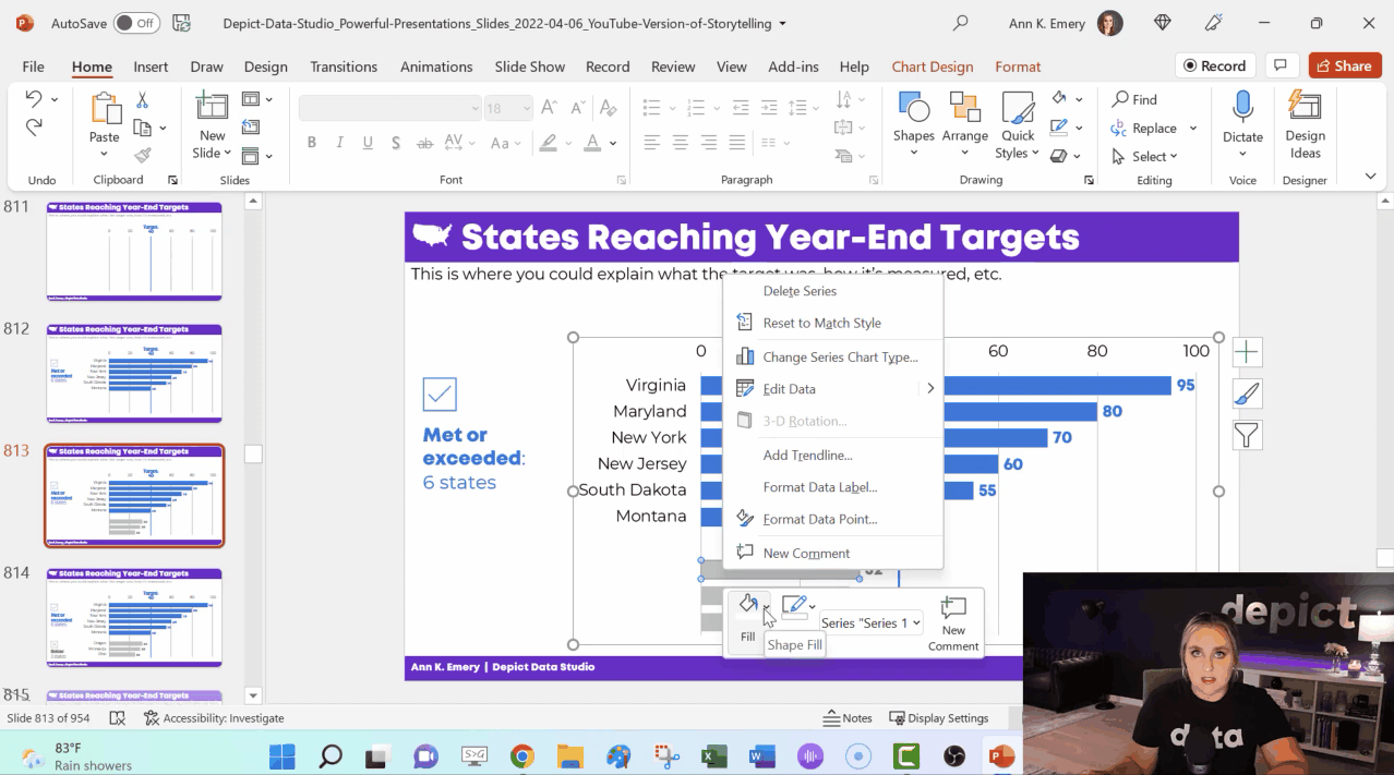
Behind the Scenes in My PowerPoint

In the video, you’ll see how I:

  • make the finished graph;
  • copy and paste that slide; and
  • delete or hide one thing.

I’ve got all sorts of not-so-magical magic tricks: deleting icons and text boxes; adding white rectangles to cover words; changing the color of some bars to make them transparent; and deleting some of the numeric labels.

When It’s Worth Storyboarding Your Dense Graph

You don’t have to break up every graph across multiple slides.

I use storyboarding:

  1. at the beginning of a presentation (to start with a bang), and
  2. to explain dense, complex visualizations one piece at a time.

Bonus

Download my PowerPoint slides and explore them on your own.

Your Turn

If or when you apply this technique, get in touch! I’m cheering for you.

Written by cplysy · Categorized: depictdatastudio

Apr 10 2022

Una fundamentación del desarrollo de la capacidad de evaluación en la teoría de sistemas

Tras una decada de trabajo en Desarrollo de Capacidades en Evaluacion (ECD) en el Instituto Alemán para la Evaluación del Desarrollo (DEval), algunos de los miembros del proyecto Focelac+ (Sarah D. Klier, Raphael J. Nawrotzki, Nataly Salas-Rodríguez y Sven Harten), con la colaboracion de especialistas en teoría de sistemas (Charles B. Keating y Polinpapilinho F. Katina), han escrito un articulo (abril de 2022) sobre la práctica en ECD, fundamentarla desde la teoría de sistemas. El artículo “Fundamentación del desarrollo de la capacidad de evaluación en la teoría de sistemas” ilustra cómo aquellos que trabajen en el desarrollo de la capacidad en evaluación pueden utilizar la teoría de sistemas como una herramienta conceptual para obtener una mejor comprensión del funcionamiento y las interrelaciones presentes dentro de un sistema de evaluación determinado. Este post es un extracto de ese artículo.

Si bien el “pensamiento sistémico” es popular en el contexto del desarrollo de capacidades y la evaluación, no hay una comprensión profunda acerca de los beneficios de emplear la teoría de sistemas en el desarrollo de capacidades de evaluación. La teoría de sistemas proporciona una orientación útil para el trabajo relacionado con sistemas complejos (por ejemplo, sistemas de evaluación nacional).

Este artículo ilustra cómo l@s evaluador@s y profesionales del desarrollo de capacidades de evaluación pueden utilizar la teoría de sistemas como una herramienta conceptual para obtener una mejor comprensión de los aspectos funcionales y las interrelaciones presentes dentro de un sistema de evaluación dado. Específicamente, la perspectiva de la teoría de sistemas puede ayudar a dilucidar las razones del éxito o fracaso de un determinado programa o actividad de desarrollo de capacidades de evaluación. Con el objetivo de motivar a l@s evaluador@s y profesionales del desarrollo de capacidades de evaluación a utilizar la teoría de sistemas en su trabajo, este artículo presenta un marco de teoría de sistemas para el desarrollo de capacidades de evaluación y ofrece ejemplos prácticos de cómo se puede adoptar.

Como ejemplo práctico, este artículo se basa en el trabajo de desarrollo de capacidades de evaluación realizado en el DEval, que tiene el mandato del Ministerio Federal Alemán de Cooperación Económica y Desarrollo (BMZ) para evaluar la cooperación para el desarrollo financiada por el BMZ.

El desarrollo de la capacidad de evaluación se ha llevado a cabo en DEval durante casi 8 años. Las evaluaciones externas y los datos del sistema de monitoreo y evaluación de DEval muestran que sus proyectos de desarrollo de capacidades de evaluación son exitosos. Este éxito se puede atribuir en parte al uso implícito de la teoría de sistemas, que informan la mayoría de las aplicaciones de desarrollo de capacidades de evaluación en DEval.

La teoría de sistemas se ha utilizado con éxito y de manera más formal en los campos del desarrollo de capacidades (por ejemplo, Fisher, 2010; Morgan, 2005) y evaluación (por ejemplo, Reynolds et al., 2016; Williams e Imam, 2006). Además, diversos estudios han reconocido su utilidad potencial en el contexto del desarrollo de capacidades de evaluación (Krapp y Geuder-Jilg, 2018; Ortiz Aragón y Macedo, 2010).

Sin embargo, la literatura actualmente no contiene ninguna descripción de cómo integrar sistemáticamente el trabajo de desarrollo de capacidades de evaluación en la teoría de sistemas. Esta es una omisión crítica, ya que dicha información podría proporcionar una orientación para que los profesionales del desarrollo de la capacidad de evaluación basen su trabajo en consideraciones teóricas, con muchos beneficios adicionales. Este artículo aborda esta brecha al proporcionar la primera descripción teórica de cómo las actividades de desarrollo de capacidades de evaluación y los componentes del programa pueden anclarse en la teoría de sistemas, ilustrada con ejemplos prácticos del trabajo en DEval.

Referencias tomadas del articulo

Fisher C (2010) Between pragmatism and idealism: Implementing a systemic approach to capacity development. IDS Bulletin 41(3): 108–17.

Krapp S and Geuder-Jilg E (2018) Evaluation Capacity Development: A Systemic Project Approach by Deval in Latin America. DEval Policy Brief 7/2018, Policy Brief. Bonn: German Institute for Development Evaluation.

Morgan P (2005) The Idea and Practice of Systems Thinking and Their Relevance for Capacity Development. Maastricht: European Centre for Development Policy Management.

Reynolds M, Gates E, Hummelbrunner R, et al. (2016) Towards systemic evaluation. Systems Research and Behavioral Science 33(5): 662–73.

Written by cplysy · Categorized: TripleAD

Apr 10 2022

Comment on Dissertation RQ2: To what extent do interpersonal factors relate to use beyond research factors? by полное описание

полное описание

blog topic

Written by cplysy · Categorized: danawanzer

Apr 09 2022

Celebrating 1 Year of Solopreneurship

One year ago, I filed my LLC paperwork. Two weeks later, I gave notice at my full time job. Two weeks after that, I said goodbye to my old position. This post describes and celebrates the process of stepping into solopreneurship.

The post Celebrating 1 Year of Solopreneurship appeared first on Elizabeth Grim Consulting, LLC.

Written by cplysy · Categorized: elizabethgrim

Apr 06 2022

How to create bar charts in Canva – 5 ways

Trying to create an infographic in Canva that features a bar chart?

How will you go about creating that chart? Just a hint, there is definitely more than one way.

In today’s post:

How to create bar charts for your Canva visuals using…

  • the Canva Chart Builder;
  • Excel;
  • PowerPoint;
  • Flourish;
  • Pixel Math.

But first, let’s talk about the Data I’ll be using for this tutorial.

Creating Bar Charts in Canva - Featured Image

The Data

For this set of charts I’m going to use some CDC data on the US death rate per 100,000 for the years 2016 – 2020. I pulled the data from the CDC’s WONDER database.

CDC underlying cause of death data used to create my bar chart tutorials.

Citation: Centers for Disease Control and Prevention, National Center for Health Statistics. Underlying Cause of Death 1999-2020 on CDC WONDER Online Database, released in 2021. Data are from the Multiple Cause of Death Files, 1999-2020, as compiled from data provided by the 57 vital statistics jurisdictions through the Vital Statistics Cooperative Program. Accessed at http://wonder.cdc.gov/ucd-icd10.html on Apr 6, 2022 9:20:01 AM

The Canva Chart Builder

So Canva has a built in chart creator. Let’s just go ahead and start with that. You’ll find it in the Elements tab by searching for Charts.

For this bar chart I went with the basic column chart.

How to find the chart builder in Canva.  [Screenshot]

The chart populates with some fake data. I went ahead and cleared that data, then pasted in my own. You’ll also notice that you can also directly connect to data using Google sheets.

Adjusting bar chart data in Canva. [Screenshot]

Canva’s chart creator is nothing fancy. There are very few things that you can do with the chart itself.

Settings in Canva's chart builder. [Screenshot]

Conclusion. It works in a pinch, but you have far less control over the chart than you would with other tools. One of the things that I found particularly annoying is the inability to isolate a single bar and change it into another color. That’s something I do all the time with bar charts, and I’d have to hack the bar chart a bit with additional elements to make it look the way I want.

Starting with Excel

So I think at this point most evaluators would just fall back to their comfort zone and open up Excel. Even if they were ultimately trying to create an infographic using Canva. So let’s walk through how you might do that.

Simple Copy Paste

Easiest way to move a chart from Excel to Canva is just to Copy the chart in Excel then paste it into Canva.

Copying charts out of Excel. [Screenshot]

And if you like the way your chart looks in Excel, this works just fine.

Pasting charts into Canva. [Screenshot]

One thing to note is that you lose all of your ability to edit pieces of the chart post-Excel. This is because the copy/paste approach uploads the chart as a PNG file, which is a type of pixel based image.

This could be a good thing for you, because you don’t have to worry about any of your elements changing. But that also limits your ability to tweak the chart, and you could ultimately end up with a pixelated image.

Chart pasted into Canva as a PNG.[Screenshot]

Exporting an SVG

Another way to go would be to export your chart from Excel as an SVG. Simply right click on your chart and click “Save as Picture.” Then set the file type to SVG.

Saving Excel charts as SVG pictures. [Screenshot]

When we drop the svg into Canva, we end up with an image that can be stretched or shrunk without a loss in quality. Although the fonts you use might look a little wonky if the same font is not also found in Canva.

You also get very basic color controls (i.e. I can change the blue color to any other color).

Importing an SVG chart into Canva.  [Screenshot]

There is another little trick we can do with this. Simply color a bar you want to highlight in Excel with a different color. Then take the same step to save it as an SVG.

Saving an SVG chart with a highlight color in Excel.  [Screenshot]

Now when you drop the SVG into Canva, you’ll be able to change both colors!

Pasting a two color SVG chart into Canva.

See, here is the same chart but I turned the lighter blue to a darker blue and the orange to a red. Without needing to go back to Excel.

Changing the colors of an SVG chart in Canva.

So if that works, why not just rainbow color your chart?

This might be the only time I ever suggest you try to multi-color your bar charts.

Creating a rainbow color bar chart in Excel.  [Screenshot]

Unfortunately, even though the chart ends up in Canva as an SVG, there must be some color limit. Because instead of being able to change all the bar colors, I now can’t change any of them…

Adjusting a multi-color SVG chart in Canva.  [Screenshot]

Conclusion. Sure, it works. But you’re really still just creating the chart in Excel.

Starting with PowerPoint

Okay, so I know it may seem like PowerPoint and Excel charts would convert the same way into Canva. But that’s not entirely true.

I took my Excel chart and pasted it into a new PowerPoint then saved the file. Then I uploaded the PowerPoint pptx file right into Canva.

Pasting an Excel chart into PowerPoint  [Screenshot]

At first it was buggy, but then I changed the bar color and the chart appeared. Not only did it convert, it converted directly into Canva’s chart creator format. With all the data embedded behind the scenes.

Importing a PowerPoint chart into Canva.  [Screenshot]

So now it works just like Canva’s chart creator.

Changing the color of a powerpoint chart inside Canva.  [Screenshot]

Conclusion. Yes, it works. But it ends up working just like it would with Canva’s built in chart creator. Meaning a reduced ability to change much at all.

Using Flourish

So Canva actually acquired the data visualization chart builder Flourish. You can access the integration down at the bottom of the menu page where it says “More.”

Finding the Flourish app inside Canva.  [Screenshot]

Using Flourish (which is currently Free to use) is more an integration than something you would do directly within Canva. That means you have to register for a free Flourish account and connect it to your Canva account.

Then from there, the easiest way to start is by choosing a template.

Choosing a template inside Flourish  [Screenshot]

I chose a simple column chart.

Even though it’s a simple chart, there are tons of options you have control over. This can be both a benefit and a curse. Because you have to sift through all the options to find the ones you want to change. It can be a bit overwhelming.

Creating a simple column chart using Flourish  [Screenshot]

After you are done creating your chart you can click the “export & publish” button to add your chart to Canva.

Adding a Flourish chart to a Canva presentation.  [Screenshot]

Ultimately though, once you connect your Canva and Flourish accounts, you have access to all of your Flourish visualizations from directly within Canva.

All changes you want to make to your chart, except for size and placement, need to be done inside the Flourish editor.

Finding your connected Flourish charts inside of Canva.  [Screenshot]

Conclusion. Using flourish might seem like overkill, and sometimes it will be overkill. But you can do things with Flourish that you can’t do with a lot of the previously mentioned tools. Flourish can even be used to create interactive visuals, which will then live within your Canva designs. This means you can use Flourish mixed with Canva to build full fledged interactive dashboards.

Pixel Math

Okay, so I don’t know if it’s because I’m a big nerd, but this tends to be the way I create most basic charts. In a nutshell, it’s like a digital version of using a pencil alongside a ruler.

I start with a shape (usually a rectangle).

Using shapes to create a chart in Canva  [Screenshot].

Then I will measure the length of that shape based on the number of Pixels shown when I stretch the image on Canva. The current pixel dimensions of my square canva page are 1080 by 1080. My 5 bars will range in size from 849 to 1027. Each person gets a pixel and I still have a little room at the top and bottom of the page.

Measuring a bar using Pixels in Canva  [Screenshot]

You’ll the see the sizing guide pop up as you stretch a bar. I’ll create the first bar, then copy and paste. Zooming into the page will help you size the bars better as you get closer to your target number of pixels.

Zooming in to help measure a bar using Pixels in canva  [Screenshot].

Then once I’m done, I have a chart that’s way too big (or sometimes too small). But this is easy enough to solve, I just group all the bars together.

After you do your first sets of pixel measurement, you can group your bars and scale them up or down. Just keep in mind that if your numbers are not set (as in you will likely be changing the data in your chart at some point) you are not going to want to change the scale.

The measured pixel math bar chart.  [Screenshot]

Doing my charts this way I have almost complete control over their style. I just need to overlay some text for the labels and title.

Grouping and adjusting the pixel math bar chart in Canva.  [Screenshot]

And then once you have your chart finished, just keep the elements grouped and you can move it all around the page, stretch it, shrink it, change the colors, or change the fonts.

Turning the bar chart into an infographic in Canva.  [Screenshot]

Conclusion. Okay, so this isn’t for everyone. With pixel math you are relying on your own mathematical skills and grasp of geometry. But I find for simple charts, sometimes it’s easier to just measure out some bars than try to bend a chart creation tool to your will.

Parting thoughts

So which chart creation tool is the best?

Probably none of them. I really wish the native Canva chart builder was better. Just being able to isolate the individual bars would make it far more effective.

There are also tons of other chart creation tools out there that can be used alongside Canva. From R to Tableau to Google Sheets.

Just pick the tool that works best for you.

Bar chart showing 5 years of data on the US death rate per 100,000 by year.  In 2016 the rate was 849, then it was 864, 868, and 870.  In 2020 that number jumped to 1,027.

I wonder what happened in 2020?

There is a quote from President Trump at the bottom of the image, "You may ask about the coronavirus, which is very well under control in our country. We have very few people with it...But the people are getting better. They're all getting better..."
President Trump, February 25, 2020.

Written by cplysy · Categorized: freshspectrum

  • « Go to Previous Page
  • Go to page 1
  • Interim pages omitted …
  • Go to page 132
  • Go to page 133
  • Go to page 134
  • Go to page 135
  • Go to page 136
  • Interim pages omitted …
  • Go to page 310
  • Go to Next Page »

Footer

Follow our Work

The easiest way to stay connected to our work is to join our newsletter. You’ll get updates on projects, learn about new events, and hear stories from those evaluators whom the field continues to actively exclude and erase.

Get Updates

Want to take further action or join a pod? Click here to learn more.

Copyright © 2026 · The May 13 Group · Log in

en English
af Afrikaanssq Shqipam አማርኛar العربيةhy Հայերենaz Azərbaycan dilieu Euskarabe Беларуская моваbn বাংলাbs Bosanskibg Българскиca Catalàceb Cebuanony Chichewazh-CN 简体中文zh-TW 繁體中文co Corsuhr Hrvatskics Čeština‎da Dansknl Nederlandsen Englisheo Esperantoet Eestitl Filipinofi Suomifr Françaisfy Fryskgl Galegoka ქართულიde Deutschel Ελληνικάgu ગુજરાતીht Kreyol ayisyenha Harshen Hausahaw Ōlelo Hawaiʻiiw עִבְרִיתhi हिन्दीhmn Hmonghu Magyaris Íslenskaig Igboid Bahasa Indonesiaga Gaeilgeit Italianoja 日本語jw Basa Jawakn ಕನ್ನಡkk Қазақ тіліkm ភាសាខ្មែរko 한국어ku كوردی‎ky Кыргызчаlo ພາສາລາວla Latinlv Latviešu valodalt Lietuvių kalbalb Lëtzebuergeschmk Македонски јазикmg Malagasyms Bahasa Melayuml മലയാളംmt Maltesemi Te Reo Māorimr मराठीmn Монголmy ဗမာစာne नेपालीno Norsk bokmålps پښتوfa فارسیpl Polskipt Portuguêspa ਪੰਜਾਬੀro Românăru Русскийsm Samoangd Gàidhligsr Српски језикst Sesothosn Shonasd سنڌيsi සිංහලsk Slovenčinasl Slovenščinaso Afsoomaalies Españolsu Basa Sundasw Kiswahilisv Svenskatg Тоҷикӣta தமிழ்te తెలుగుth ไทยtr Türkçeuk Українськаur اردوuz O‘zbekchavi Tiếng Việtcy Cymraegxh isiXhosayi יידישyo Yorùbázu Zulu