• Skip to main content
  • Skip to footer
  • Home

The May 13 Group

the next day for evaluation

  • Get Involved
  • Our Work
  • About Us
You are here: Home / Archives for allblogs

allblogs

Dec 01 2020

Data Placemats & Emergent Learning Tables

Data Placemats & Emergent Learning Tables: Tools to Meaningfully Engage Diverse Perspectives in Evaluation Sensemaking

Image created by Veena Pankaj, Innovation Network

In an earlier post that highlights Reflections on the Intersection of Evaluation and Emergent Learning, I shared insights generated through my application of Emergent Learning principles and tools to my work. Through this experience I came to realize that the true intersection between evaluation and emergent learning lies in the interpretation of data and its use for reflection and learning. Data interpretation is a key part of the evaluation life cycle. It’s the space where we start to make meaning of and draw conclusions about the data collected through the evaluation. Often, this data is an accounting of the experiences and observations of community members and other stakeholders who aren’t typically involved in the sensemaking conversation.

I believe that involving different stakeholders in the interpretation process, those most connected to the programs, initiatives, and systems we are evaluating, invites a diversity of perspectives that can strengthen insights and lead to new ways of moving forward.

This post focuses on using data placemats within the context of emergent learning, as a vehicle to meaningfully involve stakeholders in the sensemaking process (to learn more about data placemats, check out this article).

The Data Interpretation Meeting

As part of the multi-site health equity initiative that Innovation Network is evaluating, our evaluation team conducted approximately 60 interviews with participating community members. As we analyzed and reflected on the data, I realized that we were only capturing a part of the story…

To truly understand and leverage the data into meaningful action, we would need to involve those that are connected to the communities and the communities themselves in the sensemaking process.

While I often involve the client and relevant stakeholders in the interpretation of data, I usually do a fair amount of data interpretation in advance and feel pressure to come up with insightful findings and recommendations of my own. For this evaluation, I scheduled a full-day, in-person data interpretation meeting with foundation staff and members of the technical assistance/coaching team.

The purpose of this meeting was to use the emergent learning table as a means to share evaluation data, create space to add additional observations and experiences, and collaboratively engage in conversation to generate meaningful insights and new ideas for moving the work forward.

Through this conversation, I wanted to gather the experiences, interpretations, and reflections of the individuals that were working closely with the communities.

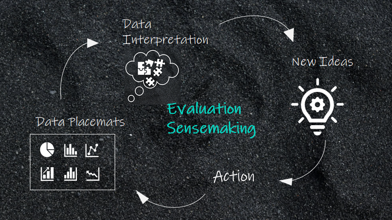
The Emergent Learning Table

4QP’s Emergent Learning Platform

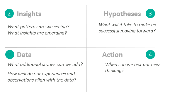
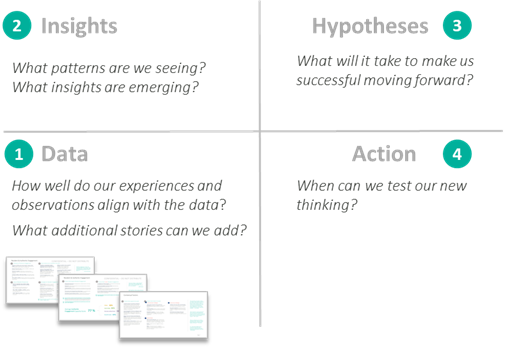
The emergent learning table helps groups articulate their best collective thinking about what it will take to be successful by providing a platform to engage stakeholders in a process designed to 1) reflect on data, 2) generate insights, 3) establish hypotheses, and 4) move towards action. Through this platform, conversation is organized into four quadrants:

  • Quadrant 1: Ground Truth/Data (discussion of experiences and stories)
  • Quadrant 2: Insights (an opportunity to collaboratively reflect on the data to highlight patterns and generate insights)
  • Quadrant 3: · Hypotheses (an opportunity to generate new ideas for moving forward)
  • Quadrant 4: Moving to action (making a plan to test new hypotheses)

For more information on emergent learning tables, checkout Fourth Quadrant’s Guide to Emergent Learning Tables.

While I was initially apprehensive about using a new approach for the interpretation process, I was also excited about the possibilities it could create. Our team had lots of data to share and we would be engaging with a group of people that were truly involved and invested in the outcomes of this initiative. What better group of people to engage in this conversation!

Through interviews and surveys, our evaluation team collected a large amount of data. The interviews in particular yielded some great qualitative data.

How could we share this information in a way that could facilitate the sense-making process so participants can readily comprehend the data and surface insights?

Data Placemats

I often use data placemats as a way to organize the evaluation data into topic areas to help meeting participants understand and make sense of data.

The visual nature of the data placemat makes it easier for participants to digest information, enabling them to more readily engage in productive conversation around the data.

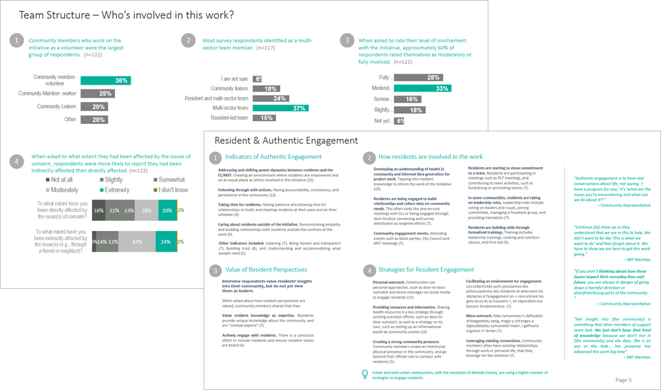
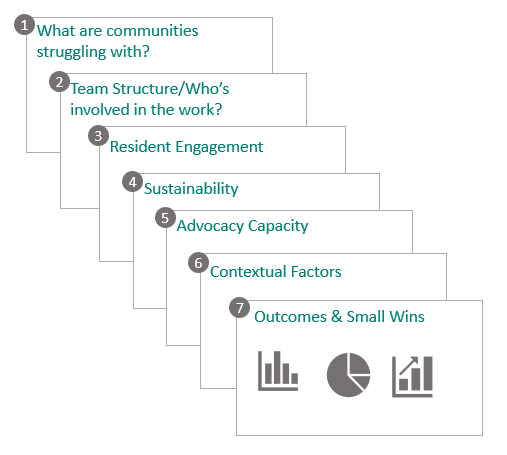
For this meeting, we used a combination of data placemats and an emergent learning table to facilitate the data interpretation meeting. We created a total of seven data placemats, each focusing on a specific thematic area that emerged from the evaluation team’s preliminary analysis:

Each placemat contained a combination of interview quotes organized around sub themes and supporting charts and graphs. The placemats were used as a vehicle to discuss data during the Quadrant 1 conversation.

Using data placemats to help participants understand and make sense of the data allowed us to facilitate a conversation that flowed from data to insights to hypotheses to action.

Adapted from 4QP’s Emergent Learning Platform

What did this make possible?

Moving to Action. Using the Emergent Learning Table as a platform for data interpretation made it possible for the group to go beyond insights to action. This is where evaluation often falls short. The collaborative nature of the conversation and involvement of multiple stakeholders helped increase buy-in to the hypotheses that were generated. This buy-in helps ensure hypotheses are followed through and tested.

Renewed sense of purpose. Going through the quadrants together gave folks in the room a renewed sense of purpose. While many of the insights generated involved issues associated with structural racism and the devastating impacts of white privilege, the group did not feel deflated. Rather, the group worked together to identify existing barriers and brainstorm new ways of moving forward. Coalescing around a common goal/framing question helped inspire a commitment to reflection and ongoing learning.

Creating space for transformation. All too often, grantees and community members experience evaluation as transactional and one-sided and are viewed primarily as subjects of data collection. For evaluation to be truly reflective of the of the experiences and learnings that are emerging from the ground, we must treat recipients of program services (e.g. grantees and community members) as learning partners not just as individuals called upon for data collection. Inviting the subjects of data collection to the sensemaking table as experts in their own lived experience along with other forms of knowledge and expertise, creates the possibility for transformation through collaborative conversation grounded in data and experience.

What did we learn?

Power of collaborative conversation. Inviting a diverse group to the table helped leverage the knowledge and experience of each person and added depth to the conversation. Each person that participated in the data interpretation meeting had their own experiences, observations, and insights to contribute. This was especially pronounced when different technical assistance providers reflected on their experiences working with their designated communities. By having multiple perspectives at the table, we could learn from each other’s experience and work together to identify emerging patterns in the data and the stories that were being shared.

Engaging a diversity of voices. The emergent learning table discussion involved foundation staff, community coaches, and technical assistance providers. The diversity of perspectives led to more meaningful conversation captured by the stories and experiences of those in the room and helped generate new hypotheses grounded in experience.

Moving forward, I would like to broaden the table by inviting community members into the sensemaking conversation to gather their perspectives on this work. By engaging a diversity of perspectives in these conversations, we will be able to leverage the experiences and knowledge of individuals across a broader cross-section of the community and work towards developing a more holistic understanding of what it takes to advance health equity in communities.

The emergent learning table demonstrated the power of incorporating real-time, collaborative reflection in the evaluation sense-making process. Data placemats offered a way to share data collected through the evaluation to help participants digest large amounts of information to meaningfully engage in collaborative sensemaking and idea generation.


Data Placemats & Emergent Learning Tables was originally published in InnovationNetwork on Medium, where people are continuing the conversation by highlighting and responding to this story.

Written by cplysy · Categorized: innovationnet

Dec 01 2020

Video: How To Create a Visually Impactful Column Chart


In this video tutorial, we show you how to create a column chart in Microsoft Excel. Learn the basics of creating and transforming your column charts into something clean, informative, and impactful:

To download a PDF version of this tutorial to save for future use, click here.

To download the Excel spreadsheet and use it with your own data, click here.


Sign up for our newsletter

We’ll let you know about our new content, and curate the best new evaluation resources from around the web!


We respect your privacy.

Thank you!


Written by cplysy · Categorized: evalacademy

Dec 01 2020

Women in Data

In September, I was invited to speak at a Women in Data panel alongside Rebeca Pop. Thanks to Kanchan Malhotra for inviting me and for organizing the event! 

Women in Data is an international non-profit organization started in 2015 whose mission is to bring women together for career advancement and an opportunity to uplift one another. They have chapters throughout the world and each hold quarterly symposiums that include enlightening talks, expert panels and networking opportunities. 

Co-presenter Rebecca Pop is the founder of Vizlogue, a data visualization and storytelling lab that offers training and consulting services. 

Watch the Recorded Panel 

What’s Inside 

Here are some of the topics addressed during the panel. 

  • Can you share your personal journey and how you got started with data visualization? 
  • How do you approach data visualization problems? When you are working on a dataset, do you have standard steps/best practices that you follow every time? Are there any key focus areas one should be mindful of? Ann said, “Something so important to know in advance, is whether your audience is technical or non-technical. Technical audiences are people who like data, who love opening a spreadsheet, and are in a data career on purpose. Non-technical audiences are the opposite. They’d rather hire a consultant or let another staff member handle it. It’s probably the last thing on their to do that they want to tackle (and they probably procrastinate!)” 
  • Important aspects to keep in mind while working with data are data integrity and data ethics. What is your take on data integrity and data ethics?  
  • For someone just getting started in data visualization, it can be overwhelming with the number of tools and courses available these days, what is your advice for beginners? Can you also share some resources? Ann said, “At first, learn the one-hour version of about 10 different tools, but then take a 10-hour training on just one tool and go deeper and specialize. There’s a lot of great courses out there.”  
  • What is the future of data visualization? How do you anticipate data visualization to differ in the coming years? 
  • Data visualization is a very competitive field, how can one stand out from the crowd and make an impression? Ann said, “Don’t worry too much about having to be the best at everything, I don’t think it’s even possible. Just pick one and play on the strength that you already have and make that public in some way… For example, if you like Tableau post a lot of visualizations on your Tableau public profile. If you like R, post to your code on Github and connect with other people.” 
  • What are the key skills required to be successful in data viz? How important is the tool? Ann said, “Chart choosing [is so important]. Are you going to use a pie chart, bar chart or something else altogether? It’s very difficult to take a table, rows and columns of summary statistics and figure out what chart that is going to be. I think a lot of people go to the standards like pie charts or bar charts.” She added, “One activity that you can try for yourself is find a table of data, set a timer for 10-15 minutes and see how many ideas you can come up with in that time period. When I started doing this, I could only come up with a couple of ideas in a 15-minute brainstorming session. Now I come up with 15 ideas in that same time period.” 

Learn More 

Here are some of the resources we mentioned during the panel: 

  • The 3-step process for sharing data with users through data placemats: https://onlinelibrary.wiley.com/doi/full/10.1002/ev.20181  
  • Ann’s favorite dataviz podcasts, which were mentioned in the Q&A after the recording ended: Explore Explain with Andy Kirk, Data Stories with Enrico Bertini and Moritz Stefaner, Data + Love with Zach Bowders, Data Viz Today with Alli Torban and Storytelling with Data with Cole Knaflic.

Written by cplysy · Categorized: depictdatastudio

Dec 01 2020

Numbers Can’t Tell the Whole Story

You should know by now that I’m a bit of a data nerd. 

I love spreadsheets. I love organizing data and using it to illuminate patterns. I love the “ah-ha” moments when clients realize how much their own data can tell them about the kids and families they’re serving. 

So it may surprise you that I’m here to say that numbers and spreadsheets don’t tell us everything. 

That doesn’t mean that numbers (or quantitative data) are irrelevant. 

It just means that they are even more informative when paired with stories, quotations, or anecdotes (qualitative data). 

(See the box for a quick refresher on the difference between the two). 

Quantitative Data

  • Numerical information
  • Can be condensed to numbers and statistics
  • Can be aggregated, combining data to look at the highest level (Ex. school-wide) or disaggregated, to look at the smallest level (Ex. student-level data)

Qualitative Data

  • Contextual information
  • Can be gained from interviews, focus groups, and observations
  • Can be analyzed and condensed into patterns and trends or used as case studies or anecdotes from individual people or schools
Here’s an example. Yesterday, I was re-reading an article from The Columbus Dispatch, my local paper, about the spike in youth violence that has occurred during the pandemic.

It’s been horrible to hear about how many children and teens (well, really anyone, for that matter) have been victims of gun violence since the spring.

The article cites a number of statistics — that the number of children treated in Columbus for gunshot wounds this spring and summer was double the rate from 2019 (from 16 to 32); and that children from racial or ethnic minorities are twice as likely to be shot than white children. 

Those are AWFUL statistics – and they certainly help me see that there is a dire situation here. 

But then, the article talks to a teacher whose student — an eight year-old boy — was killed. Here’s what the article shares about (and from) the teacher: 
​

Thalgott has lost a handful of former students during her 20 years of teaching on the South Side. She’s seen even more students who have lost a parent to gun violence. 
​

“The sad thing is it no longer shocks me,” Thalgott said. “And that’s what is scary. How have we let this get to the point where it is no longer shocking?”

​Having lost some former students or their family members to gun violence — either as victims or perpetrators — this quote really gets to me.

This quote conjures up such raw emotions that suddenly it puts the statistics they cited into context. 

Those 32 children are somebody’s child, somebody’s sibling, somebody’s student, somebody’s mentee. Hearing from a person who actually experienced that loss made a big difference in how I processed this article. I imagine it did for you too. 

Quantitative data can be so powerful, but its impact is amplified when we lift up the voices of those we are serving or studying. 

Qualitative data — gathered through interviews, focus groups, open-ended survey questions, or observations — can sometimes more effectively communicate the experience ​of what is happening in your school or community.

I’ll be doing a series of posts on qualitative data over the next few weeks — how to collect it, how to use it, and how using a combination of data can truly help you tell your story.

Written by cplysy · Categorized: engagewithdata

Dec 01 2020

Persistence: The Innovation Process Outcome

When looking to evaluate innovation many seek to find numbers related to product adoption, revenue generated, people reached, when what they ought to consider first is process outcomes.

Sustainable innovation — a process, practice, and culture of design-driven creation — is the most valuable outcome for any organization. Innovation is not about creating a single item — product, service, policy — it’s about doing it regularly, consistently, over time.

Regular innovation only comes from persistence or what Seth Godin calls The Practice.

Measuring the practice — the amount of activity, persistence, and consistency of effort — is what any organization should be evaluated against. It fits with what we know about design thinking, performance and innovation: the more ideas you generate, the more prototypes you create, and the more attempts you make the more likely you are to have better ideas, more successful products, and create transformation.

Coming up with a single successful innovation is mostly good if you’re seeking to be bought up by a competitor and, while that can be lucrative, it’s not a sustainable strategy and is contingent on having one very good idea. Having many good ideas and having them implemented into practice is what creates sustainable, resilient organizations. It is what allows organizations to adapt in times of crisis and create new opportunities in times of contraction within your market.

This is what a culture of innovation is all about.

Metrics of Effort

There are many metrics and methods that can help capture the effort of your team in developing that culture of innovation. These can be used to complement questions we might ask about design thinking. Here are a few:

  • Number of attempts
  • Number of ideas generated / ideation sessions engaged in
  • Number of concepts proposed and prototypes developed
  • Background research gathered (e.g., artifacts)**
  • Consistently of application (i.e., ongoing use of a process and fidelity)
  • Number of solicitations for feedback from internal and external sources
  • Integrations within existing processes and tools
  • Materials used
  • Evaluation designs created for products or services
  • Evaluations implemented
  • Number of products launched outside of the organization
  • Number of new innovations generated (may be products, processes, or policy improvements)
  • Persistence of effort (e.g., continuity of activity, sequencing, and time-spent)

** note that research can be a trap. It’s easy to get stuck in over-researching something. While important as a product, it’s only useful if the research converts to real process or product efforts.

These are part of an Innovation Implementation Index that can help you to assess what innovation activities that you are undertaking and whether they are leading to an actual output or outcome.

By looking at not only what you do but how often and persistent your efforts are you will later be able to assess how your organization adopts, builds, and benefits from a culture of innovation.

Are you looking to build this with your organization, unit, or team? Contact us and we can help you build, assess, and sustain a culture of innovation in your organization.

Written by cplysy · Categorized: cameronnorman

  • « Go to Previous Page
  • Go to page 1
  • Interim pages omitted …
  • Go to page 218
  • Go to page 219
  • Go to page 220
  • Go to page 221
  • Go to page 222
  • Interim pages omitted …
  • Go to page 310
  • Go to Next Page »

Footer

Follow our Work

The easiest way to stay connected to our work is to join our newsletter. You’ll get updates on projects, learn about new events, and hear stories from those evaluators whom the field continues to actively exclude and erase.

Get Updates

Want to take further action or join a pod? Click here to learn more.

Copyright © 2026 · The May 13 Group · Log in

en English
af Afrikaanssq Shqipam አማርኛar العربيةhy Հայերենaz Azərbaycan dilieu Euskarabe Беларуская моваbn বাংলাbs Bosanskibg Българскиca Catalàceb Cebuanony Chichewazh-CN 简体中文zh-TW 繁體中文co Corsuhr Hrvatskics Čeština‎da Dansknl Nederlandsen Englisheo Esperantoet Eestitl Filipinofi Suomifr Françaisfy Fryskgl Galegoka ქართულიde Deutschel Ελληνικάgu ગુજરાતીht Kreyol ayisyenha Harshen Hausahaw Ōlelo Hawaiʻiiw עִבְרִיתhi हिन्दीhmn Hmonghu Magyaris Íslenskaig Igboid Bahasa Indonesiaga Gaeilgeit Italianoja 日本語jw Basa Jawakn ಕನ್ನಡkk Қазақ тіліkm ភាសាខ្មែរko 한국어ku كوردی‎ky Кыргызчаlo ພາສາລາວla Latinlv Latviešu valodalt Lietuvių kalbalb Lëtzebuergeschmk Македонски јазикmg Malagasyms Bahasa Melayuml മലയാളംmt Maltesemi Te Reo Māorimr मराठीmn Монголmy ဗမာစာne नेपालीno Norsk bokmålps پښتوfa فارسیpl Polskipt Portuguêspa ਪੰਜਾਬੀro Românăru Русскийsm Samoangd Gàidhligsr Српски језикst Sesothosn Shonasd سنڌيsi සිංහලsk Slovenčinasl Slovenščinaso Afsoomaalies Españolsu Basa Sundasw Kiswahilisv Svenskatg Тоҷикӣta தமிழ்te తెలుగుth ไทยtr Türkçeuk Українськаur اردوuz O‘zbekchavi Tiếng Việtcy Cymraegxh isiXhosayi יידישyo Yorùbázu Zulu