Have a happy Thanksgiving, Chris..
I love the cartoons, especially the last one!
allblogs
Happy Thanksgiving
What can I say about 2020. It’s been strange, and this Thanksgiving will continue that strangeness. But there is some promise on the horizon, optimistic results from vaccine trials that are progressing with lightning speed, so let’s hold on to that together.
And today, I am thankful for you. I continue to draw cartoons because of you. Having amazing people who read and share my work is no little thing. It means the world to me, and I am grateful.
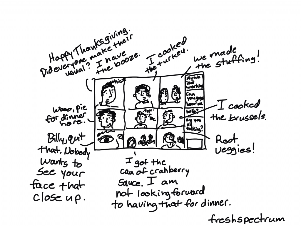
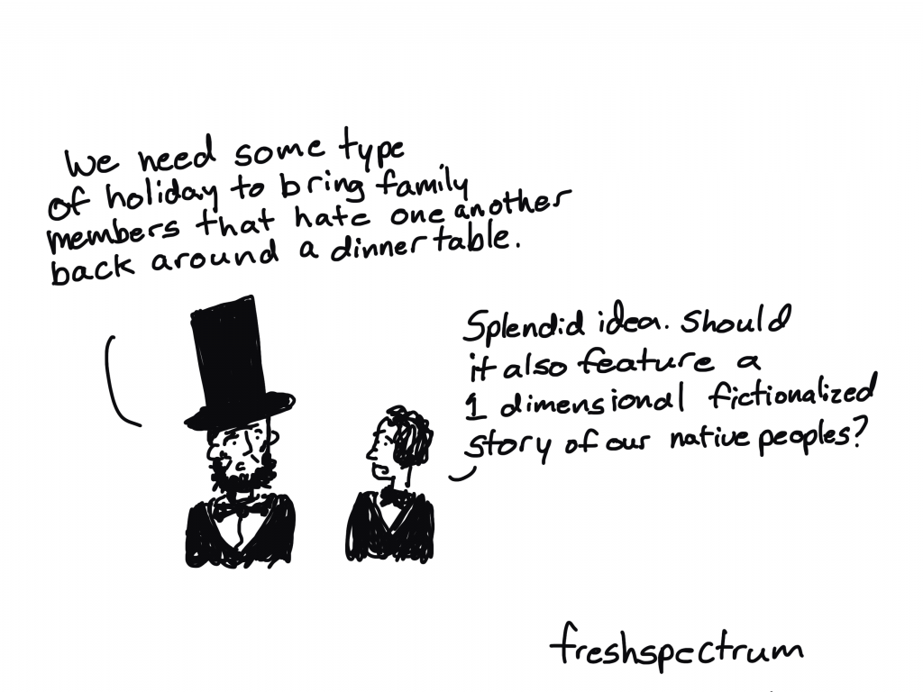
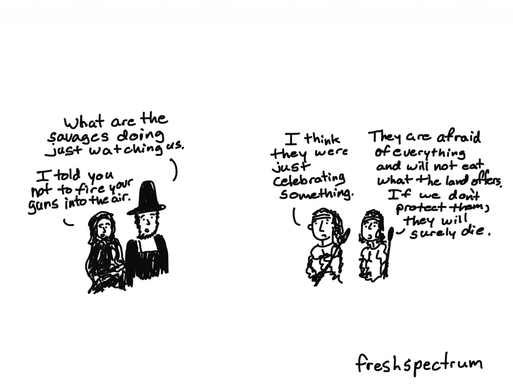
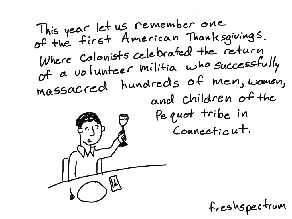
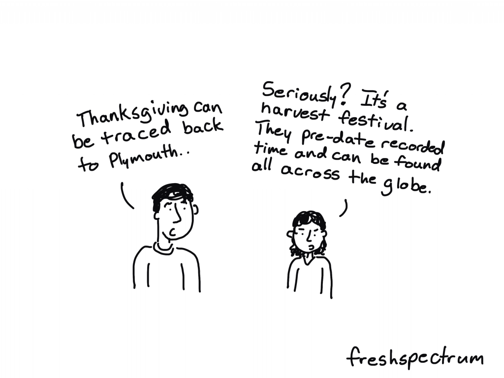
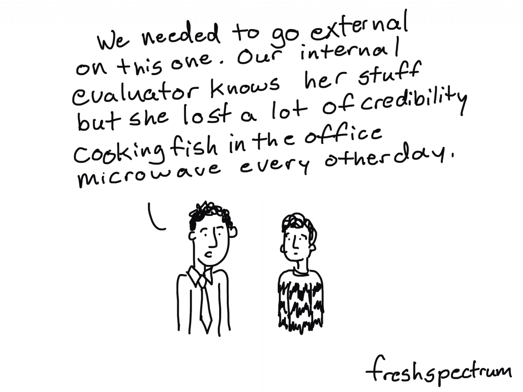
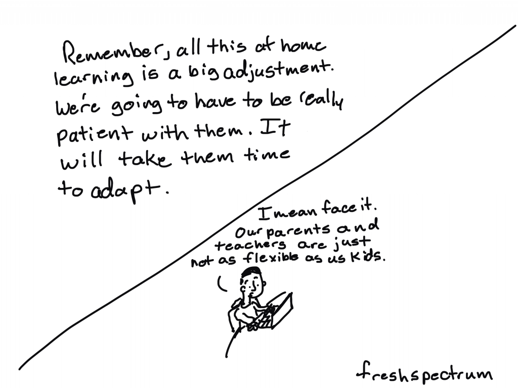
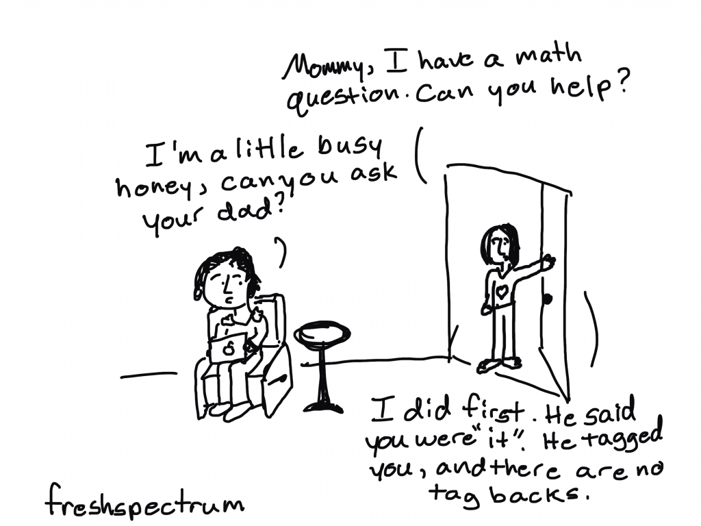
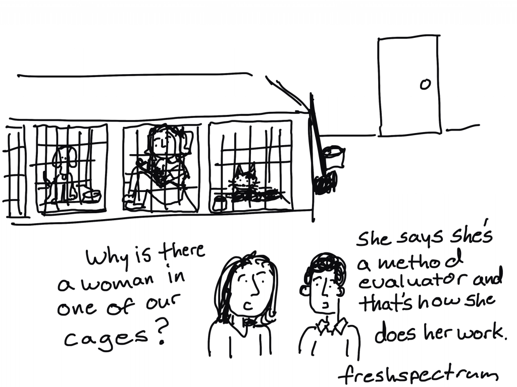
- In the first part of this post I share a handful of cartoons inspired by Thanksgiving.
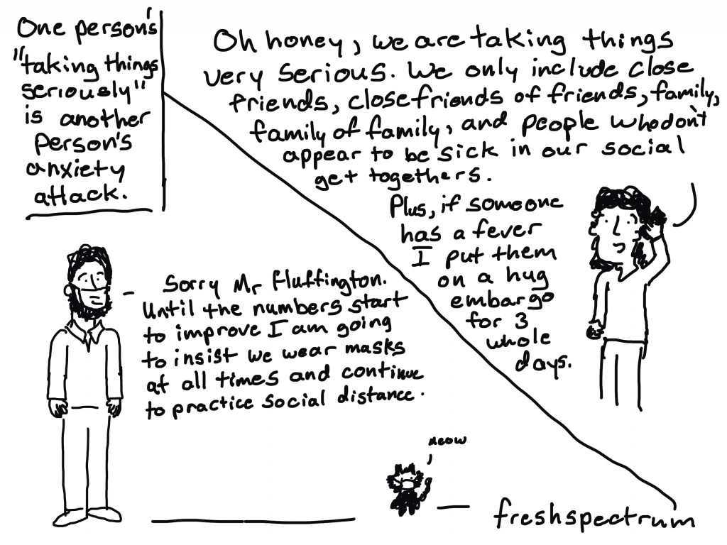
A big thank you to Nicole Bowman for sharing this article on LinkedIn: Decolonizing Thanksgiving: A Toolkit for Combatting Racism in Schools. - In the second part I share some cartoons inspired by my cartoon together session last week. A thank you to Conny Graft, Swanand Mokashi, and Maria Gutknecht-Gmeiner for helping to inspire the cartoons.
Thanksgiving Set
Cartooning with Chris
Stay safe everyone!
Evaluator Competencies Series: Evaluation Topics and Questions
Since it’s been a while since I last wrote a blog psoting in this series, and since I stopped in the middle of the “technical competencies” domain, let’s review where we are at. The first competency in the “Technical Domain” was about figuring out what the purpose and scope of an evaluation – what is the evaluation trying to do and what ground is it going to cover (and what is it not going to cover). The next competency was about figuring out if a program is in a state in which it is ready to be evaluated and the third competency was about making program theories explicit. This brings us to the fourth competency in the technical domain:
2.4 Frames evaluation topics and questions

People often get confused when we say “evaluation questions”, thinking that we are referring a question you might ask in an interview or survey (like “were you satisfied with the services you received?”). But the “evaluation question” we are referring to here (sometimes referred to a “Key Evaluation Questions” (KEQ)) are a higher-level than that; they are an overarching question (or a few questions) that guide the development of the evaluation.
An important thing to remember about evaluation questions is that they should be evaluative. Not just “what happened as a result of this program?” but “how “good” were the things that happened from the program?” (where “good” needs to be fleshed out – e.g., what do we consider “good”? how “good” is good enough to be considered “good?”).
The Better Evaluation website gives us some useful tips on developing KEQs:
- they should be open-ended (not something that you can answer with “yes” or “no”)
- they should be “specific enough to help focus the evaluation, but broad enough to be broken down into more detailed questions to guide data collection”
- they should relate to the intended purpose of the evaluation
- 7 +/- 2 is a good number to have
- you should work your stakeholders to development them
I think it’s really important to think about who gets to decide on what the evaluation questions are. Since the rest of the evaluation will be built based on the questions, whoever gets to decide on the questions holds a lot of power. This could be a whole blog posting topic on its own, but in the interest of actually getting this posted, I think I will leave that for another day.
Resources
A nice resource on working with your stakeholders to develop evaluation questions is Preskill & Jones’ A Practical Guide for Engaging Stakeholders in Developing Evaluation Questions. The CDC’s Good Evaluation Questions Checklist can also be helpful in thinking through/improving your evaluation questions.
Image source: Posted on Flickr with a Creative Commons license.
Make it pop!
Six hacks for renovating your evaluation report
Part 4
This series of posts walks you through how to reno your evaluation reports using six of Canva’s design lessons. In this series of articles, Part 1 focused on how to take your audience on a journey using storytelling techniques. Part 2 focused on how to format your report with a consistent, cohesive look using colour and font. Part 3 dove into grouping and spacing elements in your reporting. Part 4 in the series is going to explore how to make elements in your report pop using focal points.
The importance of focal points
I heard recently “if you’re marketing to everyone, you’re marketing to no one.” The same applies when it comes to creating emphasis – if everything pops, then nothing pops. A focal point is something that draws our readers to a specific element on a page. It is different or unique and something that is distinct from the rest of the information on a page. It could be a title, a graph, a picture or even a link, but ultimately focal points create something called dominance.
Creating a dominant element in your report shows your reader where to look first. Dominant elements reveal what is most important in your report. If used properly, these elements can even direct how your audience processes the information in your report. For example, in the image below your eyes likely go to the “look here” box first and then down to the “now here” box and then to the bottom left “finish here.” The reason our eyes follow this path has to do with visual weights – our eyes are attracted to elements with greatest visual weight.

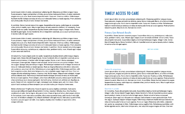
Creating elements with visual weight helps our readers to easily process information. Look at the two pages below. If you are anything like me, you will look at the left and automatically feel overwhelmed. Without a focal point, like a heading, we are creating unnecessary work for our reader that may cause them to close the report. The page on the right is still text heavy, but we have added in some emphasis using headings and graphs that draws the reader’s attention to what is contained in the text. You will increase readability and have a higher likelihood of engaging your audience using focal points that break up your text.
Creating focal points using visual weights
You should create focal points to emphasize what you want your audience to take away. The page on the right contains focal points that were created using some simple elements that you can incorporate in your reporting.
Size
Large elements have more visual weight than small elements. In the example above, “Timely Access to Care” has the largest font (i.e. more visual weight than other headings) so it draws the eyes to it. Likewise, the graphs are the largest elements on the page so they draw the eyes there.
Position
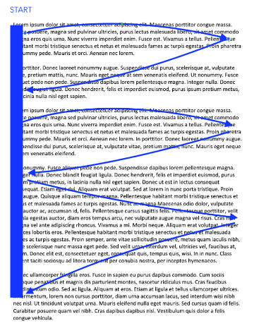
Elements located higher on the page are perceived to weigh more than elements located lower on the page. Generally, our eyes will flow from the top left to right in a sweeping pattern as illustrated below. Therefore, your most important information should be positioned in the top left of the page (at least for languages based on the Latin alphabet where we read left to right.)
Colour
Darker elements have more visual weight than lighter elements. You’ll notice in the example above we’ve chose blue to highlight titles, headings and key takeaways from the graph. We then muted the other colours on the page to make the blue pop (hint: contrast also creates visual weight.)
Saturation
Saturated colours appear heavier than desaturated. We have bolded our heading of “Timely Access to Care” to create more visual weight.
Intrinsic interest
Some things are more interesting than others – graphs and pictures are some examples of elements that attract the eye. By inserting the graphs in our report, we are creating another focal point to draw the eye to.
The elements described above are just five different elements you can use to create focal points in your report; however, there are many others that you can incorporate as well (i.e., textures, shape, orientation, complexity.) When you start considering all of the different elements it begins to get confusing wondering what has more visual weight. The bottom line is there are no hard and fast rules – ultimately, creating visual weight depends on how all the elements are used together. Some might say the title on our page has the most visual weight while others would say the graphs. The most important thing is that you use these elements together to create focal points that draw your audience’s attention to key takeaways in your report.
Take a look at some of the reports you are creating. Are there opportunities to make something pop? Try it out and make sure to stay tuned for the fifth article in our six-part series, “Photo Love” where I talk about the importance of imagery and show you how to use images in your reporting.
Sign up for our newsletter
We’ll let you know about our new content, and curate the best new evaluation resources from around the web!
We respect your privacy.
Thank you!
Inspiration As Outcome

Anyone working in design or consulting knows that no amount of advice will guarantee action with your clients or colleagues. Great, thoughtful designs are important to success yet are not guarantees for adoption.
What is critical above all is that designs inspire people. Without inspiration and excitement, there is no action.
Designer Bruce Mau came to this realization during his teaching when he was asked by trainees how it was that he designed and while he was able to speak to the production and philosophy behind his work, he was stuck with how to describe the process of the work. It was in reflecting upon this process that he came to realize that without inspiration design was dead. Prototypes would not get realized. Design culture within an organization would not change and the kind of transformation and innovation requested by clients and communities would never materialize.
For our clients, we are recommending that inspiration be considered the primary outcome of any project. No matter what kind of process is undertaken to create something — whether it was co-design, expert-driven, or some other model — the end result must be that what you produce must inspire people.
That will not guarantee success, but without it there is near guarantee of failure.
Consider inspiration as the precursor to any kind of innovation adoption or impact and you may find the correlations between those projects where people felt inspired, saw a future vision and felt motivated to act and their overall success rate in being implemented is close to 100 percent.