• Skip to main content
  • Skip to footer
  • Home

The May 13 Group

the next day for evaluation

  • Get Involved
  • Our Work
  • About Us
You are here: Home / Archives for allblogs

allblogs

Oct 27 2020

Listening to What Data Users *Say* They Need… but Giving Them What They *Actually* Need

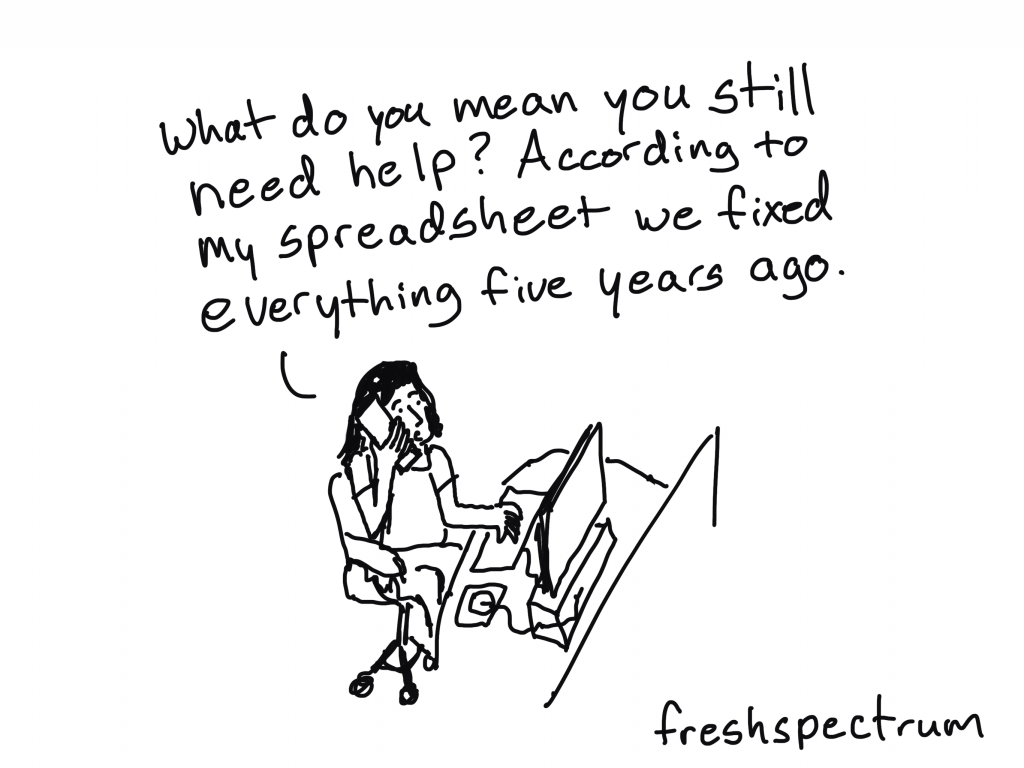
I recently had the chance to talk with Zach Bowders on his podcast, Data + Love. Zach is a data analyst, a Tableau Public Ambassador, and passionate about data visualization and data storytelling.

We sat down at night after our kids were in bed (8 pm for Zach and 9 pm for Ann!) and talked about how to distinguish between IT and data professionals, how to narrow what users *actually* need, understanding your audience and how to speak up when data isn’t useful.

Watch Our Conversation

Listen to the Podcast

Prefer to listen? Download the episode here. 

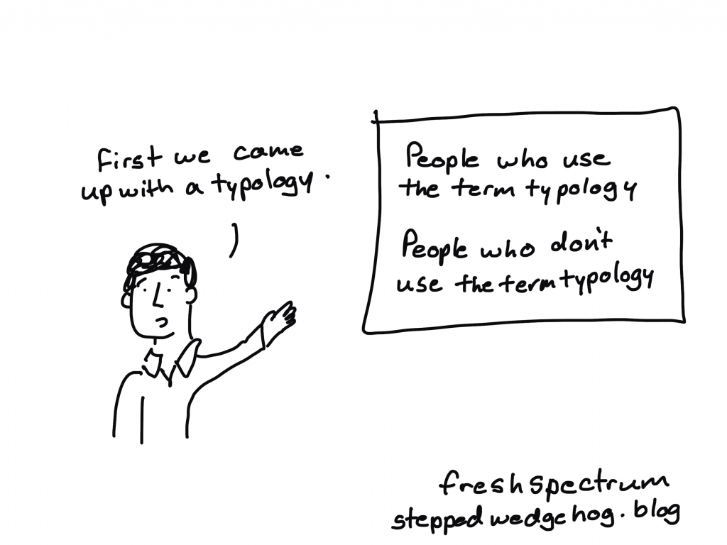
Distinguishing between IT Professionals and Data Professionals

We discussed an idea Zach brought up in a previous podcast: The difference between a traditional IT role and a data professional.

Those working in the traditional IT role typically receive instructions or a request. Let’s pretend they’re being asked to make a dashboard. Sometimes it’s a specific request with lots of planning, and you can tell the person making the request really thought things through. They might’ve even requested a specific chart type, like “Make a bar chart about xyz topic.”

Those working as a data professional also might receive those requests. The value-add of the data professional is that you’re supposed to push back a little bit. Professionally and respectfully, of course. You read between the lines of what’s requested and then give them what they actually want and need. The value you can add is to ask more questions and dig deeper. You might ask what the data’s going to be used for and what types of actions will be taken based on that data.

Zach added, “A data professional is not more skilled than the IT worker. It’s not to say one is better than the other, just that they’re different roles.”

“You could easily put together something that is technically correct and absolutely worthless,” he explained.

Designing Three Dataviz Ideas to Narrow Down What Users Actually Need

Here’s what I recommend:

  • You listen to the request for data. You’re listening, you’re nodding, not interrupting, asking clarifying questions.
  • You come up with three ideas. I call these “ideas,” not “makeovers.”
  • Idea #1: The original.
  • Idea #2: Slightly different.
  • Idea #3: Very different. (This is usually the winner, and what people actually need).  

For example, I recently worked I worked with a transportation agency. Their original graph was a pie chart with seven or eight slices representing their revenue sources. It was 3D, had a separate legend, and used tiny font… All of the usual challenges.

Here are the ideas I presented to them:

  • Idea #1: An easier-to-read pie chart. We developed a pie chart with one dark slice and the rest grayed out. We also used direct labels in lieu of the separate legend.
  • Idea #2: A bar chart to make it easier to compare each revenue source.
  • Idea #3: An icon array focusing on how one-third of their revenue comes from ticket sales.

Understanding Who Your Audience Is

Zach and I both agreed that understanding your audience is paramount.

“One of the things I find most important in terms constructing a data viz is your understanding of who the audience is – who is this for?” Zach said. “Because if you don’t know who it’s for, it has to be for everyone. And if it’s for everyone, it’s really for no one. It’s impossible to satisfy all audiences, to bridge all gaps.”

Zach said that people been pictorially expressing ideas for a very long time and that a big part of the process of taking something visual and explaining it to someone is the idea of closure. He explained that, “In the sense that in everything you create, there’s a silent partner that you have (a second creator) which is the audience. So, when you’re constructing your visualization, you and the audience are both pouring meaning into it. You’re not always going to be able to stand next to it, hold their hand and explain exactly what it means.”

He went on to share an example about a grocery store aisle with two-liter bottles. You can see part of the image on each one but you can’t quite see what they are. But it’s enough from your life experience to put together, “Oh! It’s a row of Pepsi logos.” You don’t see a single complete logo, but you can take the incomplete thoughts and knowledge of grocery stores to figure out what it is.

Zach said that this is true of when you’re working on a data visualization project. The people at the organization you’re working with have an understanding of their organization and their data, but also in terms of visual language in general. 

He said that the better you can understand their level of literacy, confidence, and competence with the data, the better you can leverage their own creative ability that they’re bringing to it to figure out what you don’t need to say.

“Part of it is, what you need to bring to it. And the other part is, what can you leave out?” said Zach. “If you’re working on some geographic data and people are wanting to know what sales look like for the United States, what’s the real question they’re asking? Do they really want to see all 50 states? They may, and that may be valid, but if they’re really wanting to see the winners to losers, you may be able to get away with two bar charts showing the top five and bottom five states. That might be exactly what they need. The temptation would be to show all 50 states. They don’t need that. They know there’s 50 states. You don’t have to remind them of that. For the most part, you can leverage many of those ideas as use them as a silent partner to help you get your ideas across better.”

Technical vs. Non-Technical Audiences

One of the most important things to understand about your audience, is not just their titles or roles but whether your audience is technical or non-technical.

A technical audience is people who love data and want to dig deeper into it (both inside and outside of work). They love decimal points and tables. Data isn’t a chore for them. In my experience, this is about 1% of the population.

About 99% of the world is likely non-technical. They don’t like data, find it to be a chore, and would rather do something else. They’re very smart, highly educated, and hard-working, but they have a skill other than data.

If you can identify which you are and which your audience is, you can then recognize when there might be a difference. This helps you determine the right chart type and the right dissemination format. Whether your audience is technical or non-technical informs all design decisions.

Connect with Zach Bowders

Data + Love Podcast: https://www.buzzsprout.com/739517

Twitter: @ZachBowders

Written by cplysy · Categorized: depictdatastudio

Oct 27 2020

Activity Analysis

This simple technique is among the most powerful at eliciting a lot of information. When we look at an existing service, it may be easy to describe what people do to deliver, manage, and receive the service in simple terms. For example, an exchange between a bank teller and a client might be described as simply as a person walking up to a desk, asking for money, inserting their bank card, receiving money from the teller, and leaving.

An Activity Analysis would break this down even further. It would involve tracking the experience of the client. It would denote what the client did from the moment she entered the bank, what she saw, what she smelled or experienced, her feelings or thoughts, and the steps she took toward the desk.

You might ask how long she took, whether she stopped en route to the desk, knew where it was (did she ask for directions?) or did she wait in line and for how long.

We can also track what the teller was doing up to and including the moment of engagement with the client. What tasks was she doing? Where was her focus? What is she thinking or feeling?

This is a micro-method version of A Day in the Life, which is another method that helps us understand what our service clients do and use.

How to do it

Activity Analysis can be done as a group, facilitated by a leader to help organize and manage the activity. It’s a great way to get people talking about all that is going on with the actors, the environment, and the tasks. By opening up the discussion and walking through each step in the journey through the service with each actor, everything that shapes the environmental conditions, and the tasks that are performed, you’ll reveal an enormous amount of data about what actually transpires with even the simplest transaction.

This can be used to seed further questions like:

  • What infrastructure is needed to support the interaction?
  • What would be ideal?
  • How might this interaction look different?
  • What other variables could affect the journey and the outcome?
  • What could be done or introduced to make this better?

Activity analysis is something that can be done in small groups over the course of 20 to 60 minutes, depending on the complexity of the task and the amount of knowledge the participants have of the task or activity.

This simple analysis can reveal information about flows, resources, outcomes, and processes that are in place to support your service and help you see what’s not only in place, but what is possible, too.

This can be a great way to bring people together as well as lead your service design and evaluation efforts. If you want to implement this approach in your organization and need help, reach out to us. We’d welcome hearing from you.

Written by cplysy · Categorized: cameronnorman

Oct 21 2020

Try This: A Simple Way to Get Feedback on Your Program

Try this out and let me know how it goes. One of my favorite things to do is come up with things on the fly, and today’s Try This is one of those moments. I was hired by a client organization early in my consulting business to conduct several focus groups for their program participants, […]

The post Try This: A Simple Way to Get Feedback on Your Program appeared first on Nicole Clark Consulting.

Written by cplysy · Categorized: nicoleclark

Oct 21 2020

Try This: A Simple Way to Get Program Feedback

Try this out and let me know how it goes. One of my favorite things to do is come up with things on the fly, and today’s Try This is one of those moments. I was hired by a client organization early in my consulting business to conduct several focus groups for their program participants, […]

The post Try This: A Simple Way to Get Program Feedback appeared first on Nicole Clark Consulting.

Written by cplysy · Categorized: nicoleclark

Oct 21 2020

Evaluator Inspired Cartoons

The majority of what I would consider to be my best cartoons have always been the products of simple collaboration.

Here is how it works. I talk to another evaluator and ask them if there is anything they are struggling with or if there are any complicated things they are having a hard time describing to others. And then we talk.

Eventually, through the conversation, cartoon ideas appear.

Inspired by Jindra Cekan and posted to my Patreon feed

Years ago I started using Patreon as a way to fund my cartooning habit. I only have a handful of patrons (it’s gone up and down over the years), but their support has been instrumental in keeping my website alive.

I never really offered anything extra for my supporters. They helped because they valued the work I was already sharing.

But lately I find myself drawing more cartoons. Sometimes for others, sometimes for myself, and then weekly for this newsletter. They haven’t had a proper place to go (some of my cartoons don’t really fit on this blog and even though I use social media, I kind of hate it).

Inspired by Jennifer Puma and Rebecca Casciano of Glass Frog for an upcoming podcast and posted to my Patreon feed.

So I have decided to just start sharing ALL of my cartoons on Patreon. Whether the cartoons are destined for freshspectrum, some other website, a digital campaign, or simply my private collection, I’ll be sharing them.

Inspired by Ann Gillard and posted to my Patreon feed

So what does that mean for you?

Well, for most of you, nothing changes. I still plan to send out weekly newsletters with a handful of cartoons. All of my cartoons will still be creative commons licensed for use in presentations or blog posts. Basically, you’ll see the same number of cartoons you would normally see.

But if you are so inclined as to want to see more cartoons. I suggest becoming one of my patrons.

Inspired by Katherine Dawes and posted to my Patreon feed

By being a Patron, you get the opportunity to directly influence my cartooning. So if there are certain ideas you wish I cartooned, well, here is your chance.

Inspired by Richard Hooper and posted to my Patreon feed

Want an autographed copy of my book?

So I’m running a special offer right now on Patreon. If you become a VIP Patron or above ($15/month), and stay for two months, I’ll mail you an autographed copy of my book.

In addition to that, I’m also running a secret offer that only people who read this newsletter will know about. I’ll be giving away 5 signed copies of my book to a random set of my Patrons who are there on November 1st. Then I’ll have a second drawing, giving away 5 more signed copies on December 1st.

So even $3/month Patrons get a pretty decent shot of getting a copy of my book signed and delivered.

Random cartoon from my private collection posted to my Patreon feed

Join Us!

Become a patron today > https://www.patreon.com/freshspectrum

Written by cplysy · Categorized: freshspectrum

  • « Go to Previous Page
  • Go to page 1
  • Interim pages omitted …
  • Go to page 226
  • Go to page 227
  • Go to page 228
  • Go to page 229
  • Go to page 230
  • Interim pages omitted …
  • Go to page 310
  • Go to Next Page »

Footer

Follow our Work

The easiest way to stay connected to our work is to join our newsletter. You’ll get updates on projects, learn about new events, and hear stories from those evaluators whom the field continues to actively exclude and erase.

Get Updates

Want to take further action or join a pod? Click here to learn more.

Copyright © 2026 · The May 13 Group · Log in

en English
af Afrikaanssq Shqipam አማርኛar العربيةhy Հայերենaz Azərbaycan dilieu Euskarabe Беларуская моваbn বাংলাbs Bosanskibg Българскиca Catalàceb Cebuanony Chichewazh-CN 简体中文zh-TW 繁體中文co Corsuhr Hrvatskics Čeština‎da Dansknl Nederlandsen Englisheo Esperantoet Eestitl Filipinofi Suomifr Françaisfy Fryskgl Galegoka ქართულიde Deutschel Ελληνικάgu ગુજરાતીht Kreyol ayisyenha Harshen Hausahaw Ōlelo Hawaiʻiiw עִבְרִיתhi हिन्दीhmn Hmonghu Magyaris Íslenskaig Igboid Bahasa Indonesiaga Gaeilgeit Italianoja 日本語jw Basa Jawakn ಕನ್ನಡkk Қазақ тіліkm ភាសាខ្មែរko 한국어ku كوردی‎ky Кыргызчаlo ພາສາລາວla Latinlv Latviešu valodalt Lietuvių kalbalb Lëtzebuergeschmk Македонски јазикmg Malagasyms Bahasa Melayuml മലയാളംmt Maltesemi Te Reo Māorimr मराठीmn Монголmy ဗမာစာne नेपालीno Norsk bokmålps پښتوfa فارسیpl Polskipt Portuguêspa ਪੰਜਾਬੀro Românăru Русскийsm Samoangd Gàidhligsr Српски језикst Sesothosn Shonasd سنڌيsi සිංහලsk Slovenčinasl Slovenščinaso Afsoomaalies Españolsu Basa Sundasw Kiswahilisv Svenskatg Тоҷикӣta தமிழ்te తెలుగుth ไทยtr Türkçeuk Українськаur اردوuz O‘zbekchavi Tiếng Việtcy Cymraegxh isiXhosayi יידישyo Yorùbázu Zulu