• Skip to main content
  • Skip to footer
  • Home

The May 13 Group

the next day for evaluation

  • Get Involved
  • Our Work
  • About Us
You are here: Home / Archives for allblogs

allblogs

Jul 13 2020

Making the Most of Microsoft Excel

I love a good spreadsheet. I mean, I really get excited about it. You may have read on the About page how my business evolved from the development of a really fancy spreadsheet. True story. Now I get to help others learn to use Excel to improve their work and watch them get excited about it too.

One positive thing to come out of the pandemic is an increased appetite for online professional development. Recently, I’ve gotten to connect with old friends and colleagues by providing a three-part Excel workshop series for the Family League of Baltimore. So on top of hanging out with my old network, I’ve gotten to teach them about all the fun stuff Excel can do. Win-win!

Here’s an overview of the series:

Part 1: Excel Basics
A lot of educators just haven’t been trained in how to use data. They may be consumers of it, using someone else’s spreadsheet to glean information, but often, they just don’t know how to utilize Excel’s features for themselves. The Excel Basics workshop starts from the top and discusses formatting, functions, and formulas that beginners can use to build their Excel capacity. 

Part 2: Creating and Using Templates in Excel
In the engagement world, there is so much to track! This session built on what was covered in the Basics session and walked participants through the process of designing their own customized tracking sheets. We used breakout rooms to discuss how to track different topics, and we walked through some more advanced features and functions to make these tools as automated as possible.

Part 3: Reporting and Visualizing Data in Excel
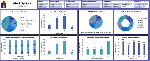
Data visualization is a hot topic in evaluation right now, and I get why. When you’re able to effectively show your data graphically, you can make your results accessible for a much wider audience. In this session, we talked about so many fun parts of Excel – PivotTables, creating charts and tables for reporting, and … drumroll, please … creating interactive dashboards! Did you know you can create dashboards like the one below to share with your team? 

Picture

Here’s what some of my past workshop participants had to say about their experience: 

  • “Practical examples applicable to daily work. Presented at the right pace. Great content.”
  • “My approach will be to allow my understanding of the various features to help me work smarter not harder. I am encouraged to continue to use excel, not run away from it.”
  • “I feel more aware of how to efficiently organize my data! This will be helpful for reporting, and analyzing data for my own outreach strategies.”
  • “I really enjoyed this session. They did a great job reaching participants of many levels.”

​
Besides my obvious bias towards using Excel for … well, everything … I think it is even more important now for schools and districts to be effectively tracking their work. As we navigate through so many unknowns with school reopening, it will be critical to keep an eye on students who are at risk of falling through the cracks.

​Good news – Excel can help (and so can I!). 

I’d love to bring this workshop series to more places, so if your team could use a bit of an Excel boost, let’s talk! 

Written by cplysy · Categorized: engagewithdata

Jul 09 2020

How To Transcribe Interviews Like a Pro


Evaluators have several options for transcribing audio from qualitative interviews, including voice-to-text software, outsourcing, and doing it ourselves. Depending on the budget for the project, you may not be able to afford software licenses or the cost to hire someone else to transcribe your interviews, so you might be left transcribing interviews yourself.

If you are taking the DIY approach, here are four tips to get you transcribing like a pro!

Screen Shot 2020-07-09 at 9.31.07 AM.png

1. Decide on the appropriate level of accuracy

Before you start, you need to decide how accurate your transcriptions need to be. You have a range of options for how precise to transcribe, and your choice depends on how the data will be analyzed. Some commonly used levels of accuracy are (from most accurate to least accurate):

  • Exactly verbatim: Type exactly what is said, including every “um,” “uh,” and “hmmm.”

  • Intelligent verbatim: Type exactly what is said, EXCEPT for filler words that do not change the meaning. At this level, you would skip phrases like “um,” “you know,” and “like” when appropriate.

  • Edited transcription: Skip irrelevant sentences that don’t relate to the evaluation. For example, someone might start telling a tangential personal story – if it is not relevant to the purpose of the interview, you might not transcribe it.

  • Summary transcription: Only important passages are transcribed. For example, you may only require the answers to the questions in the interview guide, and any other comments are skipped.

When choosing a level of accuracy, you face a trade-off between the time it takes and the level of detail. Exactly verbatim transcriptions take the longest to type, while summary transcriptions are the fastest. However, summary transcriptions necessarily exclude some information, so you risk missing important data. It is up to you as the evaluator along with the stakeholders involved to navigate this trade-off between accuracy and resource-use in a way that makes sense for the particular evaluation.

2. Document interview meta-data

At the top of your Word document where you will transcribe the interview, you should include relevant meta-data (i.e., data about the interview). This could be:

  • Interview ID#

  • Project name

  • Participant’s name or initials (remember to maintain appropriate levels of confidentiality)

  • Interview group, if applicable (e.g., client, program manager, funder)

  • Interviewer’s name

  • Date of interview

  • Location of interview

  • Transcriber’s name


In the metadata section, also identify any abbreviations that will be used in the transcription. For example, you may simple use “P” to denote the participant, and “I” to denote the interviewer. My transcriptions usually look like this:

I: Can you tell me about your use of the program?

P: Sure, I started using this program when I first moved to the city.

I: When was that?

P: About a year ago.


3. Use audio software

Rather than using the default audio player on your computer, like iTunes or QuickTime, it can greatly speed up your transcribing to use an audio software with more advanced features. I recommend ExpressScribe because it is reasonably priced and has some really important capabilities:

  1. Fine-tuned control over playback speed. It might seem counterintuitive, but slowing down the audio playback speed can actually increase the speed of your transcription. Most of us can’t type as quickly as people talk, so by slowing the audio down to about 50-60%, you will be able to type at the same pace as the speaker. This reduces the amount of time you spend pausing and rewinding the audio!

  2. Global hot-keys. This was a game-changer for me: ExpressScribe allows you to control the audio playback (play, pause, rewind) using keyboard shortcuts that work even when the program is running in the background (that’s why they’re called global hotkeys). The set-up I use is:

    • Ctrl/Cmd + down arrow = Stop

    • Ctrl/Cmd + up arrow = Play

    • Ctrl/Cmd + left arrow = Step back 3 seconds

    • Ctrl/Cmd + right arrow = Step forward 3 second

With these advanced controls, you can play/pause and rewind without leaving the Word document you’re typing in!

4. Include time stamps

While you transcribe, it is helpful to include a time stamp in the transcription about every 5 minutes. This allows someone reading the transcript to easily find passages in the audio recording if necessary. I keep an eye on the audio player for when I reach an interval of five minutes, and I document it in the text using square brackets:

I: Can you tell me about your use of the program?

P: Sure, I started using this program when I first moved to the city.

[5:00]

I: When was that?

P: About a year ago.

Time stamps should also be included when you reach a passage you can’t understand. Especially when people refer to place names, people’s names, or words in another language, it can be hard to get the word right. This should be flagged inside square brackets along with the time stamp. For example:

P: After that, we went to [place name 12:05] to gather berries. 


After incorporating all of these tips, you can expect verbatim transcriptions to take about 3-6 hours for each hour of recorded audio. Keep this in mind while planning the project: 10 interviews, each an hour long, could take up to 60 hours to fully transcribe!


Sign up for our newsletter

We’ll let you know about our new content, and curate the best new evaluation resources from around the web!


We respect your privacy.

Thank you!


Written by cplysy · Categorized: evalacademy

Jul 08 2020

Your Plan B Should Be as Strong as Your Plan A

Take off and land successfully. I don’t like flying, but I do because I enjoy experiencing new locations, plus all of my family lives in Georgia and the majority of my current client organizations are not based in Washington, DC where I’m located. It’s already unsettling being propelled through the air at 36,000 feet in […]

The post Your Plan B Should Be as Strong as Your Plan A appeared first on Nicole Clark Consulting.

Written by cplysy · Categorized: nicoleclark

Jul 07 2020

Why You Need to Create a Data Visualization Style Guide to Tell Great Stories (Part 1)

I met Sara DeLong a few summers ago when I led a dataviz training at her agency. We’ve stayed in touch, and she’s contributed fantastic articles like Could Your Long Report Become a City Billboard? and Report Redesign Tricks That Really Work. In this two-part series, Sara will teach us how to create data visualization style guides. Thanks for another time-saving resource, Sara! –Ann

Is this you?

  • Different members of your team are working with data and creating charts.
  • All of your charts look a little different.
  • You would like to redesign or improve your upcoming data reports, presentations, and dashboards to better align with data visualization best practices and your agency’s brand.
  • You would like to build trust with your stakeholders and tell clearer stories using your data.

A Data Visualization Style Guide is a great tool to enhance brand cohesion and save you and your co-workers lots of time in the long run. This resource will reduce the number of decisions your team members have to make about font, font size, line thickness, color, and chart size each time you make a chart. Maybe creating a Data Visualization Style Guide sounds really exciting to you (like me!) or maybe you would prefer to put it at the bottom of your to do list right after scanning and filing all your paper documents (nice in thought, but really never going to happen). I am here to tell you, if you follow these steps and create a Data Visualization Style Guide, the payoff will be incredible for both you and your team.

Benefits of Creating a Data Visualization Style Guide

  1. Time Saver: You won’t have to spend 15 minutes trying to decide what colors to use in your latest chart, what font size your title should be, or the line thickness in your line chart. This style guide will already have clear recommendations on all the data visualization steps that eat up your time.
  2. Get everyone using data visualization best practices: If you are reading this blog, maybe you and some of your team members are excited about how thoughtful data visualization can improve your communication skills. However, a style guide can help get the rest of your colleagues on board to create effective charts that are accessible to a variety of audiences.
  3. Tell great stories: Incorporating data visualization best practices using a cohesive look for all your charts will improve your professionalism and help communicate your message to all your stakeholders more effectively.

Getting Started with a Data Visualization Style Guide

Here are the first steps to create a user-friendly Data Visualization Style Guide:

Identify a need for a Data Visualization Style Guide

My public health team had to redesign all our major data reports and create new data one-pagers for a variety of audiences, including the general public, nurses, doctors, and other public health professionals. Several team members analyzed the data and created charts. Our team wanted to make sure all the reports looked cohesive, while also using our limited time efficiently. I proposed creating a Data Visualization Style Guide to better align all of our upcoming reports. This avoids one person having to make all the charts or edit all the charts so they look cohesive.

Secure Team Buy-In

Before you create a Data Visualization Style Guide, it is crucial that you secure buy-in from majority of your colleagues who will be using the guide. Make sure your leadership team is also on board. Getting buy-in before you start will help ensure this document is relevant to your coworkers and will be used to create future data reports.

For example, to get buy-in, I coordinated multiple meetings with several data experts and project teams would be creating charts for our annual reports and future data presentations and dashboards. It only makes sense to create this resource if your team is generally on board and can see the benefit of developing this new tool.

In these meetings, I shared some of the existing charts from various reports to illustrate the current lack of cohesion among all our charts.

In these meetings, I shared some of the existing charts from various reports to illustrate the current lack of cohesion among all our charts.

I also showed some examples of Data Visualization Style Guides from other organizations, and explained how this kind of resource might benefit my team.

Then I asked our future Data Visualization Style Guide users: “What should be included in our Data Visualization Style Guide that would make this resource useful to you and increase the chances that you will use this tool to guide chart creation in the future?” This question is key because it ensures that you include what is important to your team of data users in this document.

Timeline

It took seven months to go from project proposal to completed resource guide because I created this document while also redesigning several data reports.

Timeline showing how it took seven months to go from project proposal to completed resource guide.

Creating this guide was a trial and error process. This meant that when I sent out the completed style guide, it had already been used to create six different published materials, which proved that it made sense and was applicable to my colleagues and their work.

A key takeaway is to create a Data Visualization Style Guide as you are editing data documents. Don’t try to create a style guide and then apply it to lots of documents. Working on a new guide and data materials side by side will ensure you create a new tool that actually works and not one you think will work with your data and the materials your team creates.

Software Used to Create a Data Visualization Style Guide

I created the charts for my style guide in Microsoft Excel and did the layout of this document in Microsoft Publisher. However, this style guide could be created in whatever Microsoft program you feel most comfortable working in, whether that is Word, PowerPoint, Excel, or Publisher.

Researching Existing Data Visualization Style Guides

Once it was clear my team was on board with using a Data Visualization Style Guide, I went to work researching the best ways to create this new resource. This research phase was extremely helpful and outlined the process for creating my guide. Here are my favorite resources to check out before you start:

  1. Amy Cesaal’s presentation on why you need a style guide. Her presentation has some great tips that helped me get started, including the advice to update documents while creating my guide.
  2. Policy Viz’s list of Data Visualization Style Guides. Take a look at how other agencies approached style guides and see what components you want to include in yours.

Coming Soon

In my next post, I’ll outline the key components of every Data Visualization Style Guide and show you how to ask for feedback, so your new resource is immediately applicable for you and your team.

Written by cplysy · Categorized: depictdatastudio

Jul 07 2020

Surfacing Invisible Rules

What often can hold our change initiatives back are mental models about how or why something happens. Historically, many innovations and discoveries were held back or failed outright because people were unable to see or believe what was in front of them. By asking a set of questions at the outset and throughout your project you can avoid many mishaps.

The scene below from Men In Black illustrates what happens when our mental models about the world get upended and ask a simple question about what we know*. (*Just prior to this scene, Will Smith’s character confronts alien life forms for the first time — something that Tommy Lee Jones’ character already knows and lives with.)

One way to surface these hidden assumptions is through an exercise we might call ‘Invisible Rules‘. This three-part exercise can help you surface and uncover those ‘hidden’ rules we live by that might be holding us back from what we are seeking to change.

The exercise involves asking a series of questions in three stages:

1. Assumptions

  • What assumptions am I operating under?
    • Consider things like people (populations, characteristics, traits, knowledge, skills, preferences), time and timing, the likelihood of success, resources required.
  • How did these assumptions come about?
    • Is the evidence based on fact or folk knowledge?
  • What evidence is there to support that these assumptions are true?
    • Is this evidence still valid? (e.g., is it based on a historical or current position? Has something changed considerably since the evidence was first generated to prompt questions about its relevance?)

2. Design

With these answers, we move to a new set of questions tied to the design of your innovation (project, product, service, etc..)

  • Can I modify any part of the design (e.g., remove, reduce, amplify, or replace) that might make it better?
  • What can I learn (borrow, modify, adapt) from other designs addressing similar issues?

3. Future-casting

Lastly, it is useful to ask yourself three “How might” questions about your innovation.

  • How might this project fail?
    • For whom? Under what conditions?
  • How might we learn about what we’re doing while we’re doing it?
    • The evaluation and reflection metrics, measures, and processes in place to learn what works and doesn’t as you go.
  • How might things change beyond our control?
    • Possible surprises that might sidetrack your plans (e.g., pandemic, government change, policy change).

These simple set of questions can produce an enormous amount of data for you and your team. In just a few hours you might save years of pain and problems and see beyond the fence into the pool of opportunity beyond.

Want help in seeing things differently and asking better questions in your work? There are some simple steps that can help your team see things that others can’t. Contact us. This is what we do.

we’d be happy to help.

Written by cplysy · Categorized: cameronnorman

  • « Go to Previous Page
  • Go to page 1
  • Interim pages omitted …
  • Go to page 250
  • Go to page 251
  • Go to page 252
  • Go to page 253
  • Go to page 254
  • Interim pages omitted …
  • Go to page 310
  • Go to Next Page »

Footer

Follow our Work

The easiest way to stay connected to our work is to join our newsletter. You’ll get updates on projects, learn about new events, and hear stories from those evaluators whom the field continues to actively exclude and erase.

Get Updates

Want to take further action or join a pod? Click here to learn more.

Copyright © 2026 · The May 13 Group · Log in

en English
af Afrikaanssq Shqipam አማርኛar العربيةhy Հայերենaz Azərbaycan dilieu Euskarabe Беларуская моваbn বাংলাbs Bosanskibg Българскиca Catalàceb Cebuanony Chichewazh-CN 简体中文zh-TW 繁體中文co Corsuhr Hrvatskics Čeština‎da Dansknl Nederlandsen Englisheo Esperantoet Eestitl Filipinofi Suomifr Françaisfy Fryskgl Galegoka ქართულიde Deutschel Ελληνικάgu ગુજરાતીht Kreyol ayisyenha Harshen Hausahaw Ōlelo Hawaiʻiiw עִבְרִיתhi हिन्दीhmn Hmonghu Magyaris Íslenskaig Igboid Bahasa Indonesiaga Gaeilgeit Italianoja 日本語jw Basa Jawakn ಕನ್ನಡkk Қазақ тіліkm ភាសាខ្មែរko 한국어ku كوردی‎ky Кыргызчаlo ພາສາລາວla Latinlv Latviešu valodalt Lietuvių kalbalb Lëtzebuergeschmk Македонски јазикmg Malagasyms Bahasa Melayuml മലയാളംmt Maltesemi Te Reo Māorimr मराठीmn Монголmy ဗမာစာne नेपालीno Norsk bokmålps پښتوfa فارسیpl Polskipt Portuguêspa ਪੰਜਾਬੀro Românăru Русскийsm Samoangd Gàidhligsr Српски језикst Sesothosn Shonasd سنڌيsi සිංහලsk Slovenčinasl Slovenščinaso Afsoomaalies Españolsu Basa Sundasw Kiswahilisv Svenskatg Тоҷикӣta தமிழ்te తెలుగుth ไทยtr Türkçeuk Українськаur اردوuz O‘zbekchavi Tiếng Việtcy Cymraegxh isiXhosayi יידישyo Yorùbázu Zulu