• Skip to main content
  • Skip to footer
  • Home

The May 13 Group

the next day for evaluation

  • Get Involved
  • Our Work
  • About Us
You are here: Home / Archives for allblogs

allblogs

Jun 29 2020

Why is it so hard to get a survey translated?

I admit: I didn’t think it was that hard to get a survey translated. 

Over the past few weeks, I learned just how wrong I was — and ate a big piece of humble pie in the process. 

With colleagues, I’m working on a landscape analysis of how families and educators in California feel about family engagement and the state’s requirements for incorporating stakeholder feedback into district plans for improvement. We’re designing a training program around these topics, but to make sure our program will be relevant, we wanted to hear from the people who would be participating in it. We designed a survey and planned for focus groups, and I naively thought we were good to go.

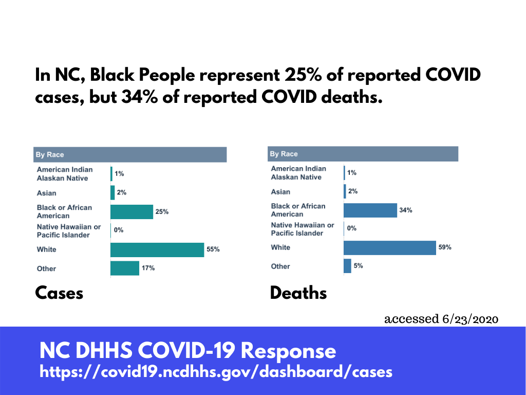
Although Baltimore has a growing — but fairly localized — population of English Language Learners, the families at the schools where I worked were predominately Black and English-speaking.  When I worked at the district, we had a cadre of interpreters we regularly contracted with for events, and we used large-scale survey software that easily facilitated (mostly adequate) translations. 

So when we decided to translate the California survey into nine additional languages, I didn’t anticipate just how difficult that would be. 

Our survey was fairly basic and brief, so I built it out in Google Forms … only to learn that despite the widespread availability of their free translation technology, there was no mechanism for translating surveys in their tool. (I’m honestly still scratching my head about this.) The most straightforward (ha!) way I found to create a multilingual survey in Google was to independently translate the survey into each language, build a separate page in the survey for each language, copy and paste each line of the translated surveys, and then use skip logic to direct people to the page with the language they selected. 

Umm what?

We gave up on Google. We found out that our client had a Survey Monkey account that included the ability to create multilingual surveys. I was excited. Finally – a logical way to complete this seemingly simple task! 

Nope. I was still wrong.

​While this platform at least offers a dropdown menu of languages on the survey page (thereby making it easier for respondents and avoiding the skip logic silliness on the back end), it turns out that this paid feature was just as cumbersome to use as the Google option. What I ended up having to do was download a coded text file for each language, pay to independently translate each of the languages (Thank you, Stepes Translation, for coming to our rescue!), copy and paste each line of the translations into specific sections of the text file, and then upload the translated file to the system. NINE TIMES.

With my hand cramping from all of that Ctrl-C and Ctrl-V action, I was stunned by how technically difficult and frankly, inaccessible the survey translation process was. Who is actually going to go through all this? More importantly, what does this mean for the voices of those who are not native English speakers? Without access to a large, institutional subscription to a powerhouse survey software, my gut tells me that very little translation is likely to happen. As a result, many important voices are being silenced. 

I don’t have a solution to offer here, but I’m glad that this is a lesson I learned. This has opened my eyes to the institutional roadblocks that prevent equitable language access in our country… and I know I’ve just scratched the surface. Translation services, albeit not 100% reliable, are widely accessible and free online, yet they are not integrated into lower-cost survey platforms. This not only causes a huge headache for survey designers, but it inhibits the ability to hear from non-English speakers about important issues. As I seem to say in a lot of my blog posts, we have to do better. 

If anyone has a better solution than the relay race I just ran, please share in the comments! I do hope that a more accessible and user-friendly option exists.

Written by cplysy · Categorized: engagewithdata

Jun 25 2020

Three Ways to Increase the Chances Your Evaluation Results Will Actually Get Used


Utilization of evaluation results can be underwhelming to the well-intentioned evaluator. Time and time again, we hear of people going through an evaluation only to be disappointed that the findings didn’t give them the answers they wanted. It is such a big problem that Michael Quinn Patton decided to design an entire approach to evaluation called Utilization-Focused Evaluation (UFE). I’m going to save you from reading all 600-and-some pages of it and instead share three ways we at Three Hive Consulting help clients use the results from our evaluations.


1. Identify your A-Team and get them involved!

People will use information if it is the right information — in other words, the information they want or need for decision making. However, you need to find the “right” stakeholders to work with and to provide the right information to. It sounds simple enough, but the more complex the initiative, the more complex the number and type of stakeholders. You can try to meet the needs of everyone, but doing so often leads to not adequately meeting anybody’s needs. Unless you have unlimited resources, which in my experience is never the case, you will need to identify your A-team. In UFE these are called ‘primary intended users.’ Primary intended users are the stakeholders that have the willingness, authority and ability to use the findings. When you have identified your A-team, it will be much easier to design your evaluation  — people drive purpose and purpose drives design.

A stakeholder matrix is a simple tool that organizes:

  • stakeholders,

  • the group they belong to,

  • what they see as the purpose for the evaluation,

  • how they will use the results, and;

  • how they want to be involved throughout the evaluation.


Below is an example:

Stakeholder matrix where Service Providers are the A-team. The nature of their involvement is to 1) inform data collection and tool development, 2) collect and/or provide data, and 3) inform findings and recommendations.

Stakeholder matrix where Service Providers are the A-team. The nature of their involvement is to 1) inform data collection and tool development, 2) collect and/or provide data, and 3) inform findings and recommendations.

Notice the last column, “Nature of Involvement.” Can you guess who the A-team is? Chances are your A-team are the service providers. They are the ones that have multiple ways they can and should be involved throughout the evaluation. I say should because the more involved your A-team is throughout the evaluation process, the greater chance they will use the findings in a meaningful way.


2. Tailor reporting to needs

One size does not fit all when it comes to evaluation reporting. Your findings need to be accessible and relevant to each stakeholder group, which means some extra work tailoring your reporting. One way to help meet the information needs of various stakeholder groups is to layer your content. In Kylie Hutchinson’s “A Short Primer to Innovative Evaluation Reporting”, she uses the analogy of a burger to explain that not everyone can digest the entire burger, so we need to layer in the fixings (i.e. executive summaries, one-page overviews, appendices, etc.) if people only want to digest some of the burger.

A few years ago, we worked on a project where we needed to do just that. We ended up layering our reporting by providing the full burger (i.e. the final report), but also producing a variety of other reports throughout the evaluation:

Results briefing for the A-team:  Detailed reports to help inform next steps in the evaluation (Left)   Results briefing for leadership group:  A one-page summary report showing interim findings and next steps in the evaluation (Right)

Results briefing for the A-team: Detailed reports to help inform next steps in the evaluation (Left)

Results briefing for leadership group: A one-page summary report showing interim findings and next steps in the evaluation (Right)

Final Evaluation Report:  A comprehensive report that contains detailed methods, findings, recommendations, conclusions and appendices

Final Evaluation Report: A comprehensive report that contains detailed methods, findings, recommendations, conclusions and appendices

Whiteboard video:  A six-minute whiteboard video using  Videoscribe  to visually tell the story (Left)   Evaluation Summary:  A one-page evaluation brief that summarized the final report and the Social Return of Investment (Right)

Whiteboard video: A six-minute whiteboard video using Videoscribe to visually tell the story (Left)

Evaluation Summary: A one-page evaluation brief that summarized the final report and the Social Return of Investment (Right)

3. Stop being so boring! Facilitate use through interactive strategies

One of Three Hive’s core values is “intelligence having fun.” We don’t believe that evaluation should be a boring make-work project where some outsider comes in and tells someone what needs to be done, asks for data, tells them what is wrong and then recommends a bunch of things that aren’t feasible or relevant. There is very little chance that any learning will result from that approach. As we know, most people do not truly learn through passively listening or reading  — we learn by doing. This means that if we want people to truly understand and transform what they are doing, they need to be involved in the evaluation process. 

Jean King and Laurie Stevahn’s “Interactive Evaluation Practice” is a book I frequently refer to when I am looking for facilitation ideas. In it, they lay out what they call “An Evaluator’s Dozen of Interactive Strategies.” They go on to describe the materials needed, instructions for how to conduct the strategy, facilitation tips, variations on the strategy, and when they can be used throughout the evaluation process (see the figure below).

Screen Shot 2020-06-25 at 10.24.47 AM.png

People may initially moan and groan at the idea of interactive activities, but in the end, they really do enjoy them. After putting the time in to use these strategies, I have received feedback that described the strategies as “engaging,” “productive,” and “approachable” ways to be involved in evaluations.


You’ll notice that the title of this article isn’t “Three simple ways to increase the chances your evaluation results will actually get used.” You do have to build in extra time and resources to take the time to: 

  1. identify your A-team and involve them throughout the process,

  2. tailor your reporting, and;

  3. make things fun through interactive strategies.

However, the investment in these three areas will make a difference for how your clients understand and utilize findings and, as a result, your credibility as an evaluator.


Sign up for our newsletter

We’ll let you know about our new content, and curate the best new evaluation resources from around the web!


We respect your privacy.

Thank you!


Written by cplysy · Categorized: evalacademy

Jun 24 2020

Caution: Laying Off Museum Educators May Burn Bridges to the Communities Museums Serve

I started this blog about a month ago in frustration about the layoffs of museum educators (and other front-of-house staff although I am going to speak specifically about my experiences with museum educators).  I wrote it in a fury one night, and each day since my anger and sadness have grown as I have witnessed more layoffs of talented museum workers who are critical to the museums’ missions and social and emotional learning (SEL) so important in this world.

Museum educators are essential to museums and make the institution what it is in a community.  Trained as an educator, I certainly have a bias towards the value of museum educators.  But, my evaluation experience reinforces my perception of the importance of museum educators.  Museum educators are often a museum’s lifeline to the community, and particularly within the K-12 community as evidenced here:

Support of K-12 Teachers: I have been interviewing some preschool teachers about museum programs for the Zimmerli Museum of Art at Rutgers University. They often mention to me their museum educator contact by name and praise them for how helpful they have been.  This echoes past evaluations I have done with teachers who participate in the Philadelphia Museum of Art’s Sherlock program and the National Gallery of Art’s Teacher Institute.  The teachers highly value the respect and support they receive from museum educators.  The work of K-12 educators is hard and can go unnoticed.  But of all the museum educators I know, they consider K-12 educators essential to the well-being of our students and communities.  As such, museum educators’ frame their work as bolstering the self-regard and confidence of K-12 educators.

Support of K-12 Students: I have had a long-term relationship with the Philadelphia Museum of Art as an evaluator for a multi-visit program with students in 5th and 6th In this multi-visit program, I have seen the progressive eagerness of students to participate in conversations with museum educators over several months. I also see the eagerness with which students seek out individual conversations with the museum educators as they move between artworks.  Sometimes the students point out something they see to the museum educator, but other times the conversation is completely un-museum related—they just seem to seek adult engagement and interest.  These individual museum educators are important to them.  This was underscored to me when I administered assessments to students in the program.  Students, knowing they were doing something related to the museum program, immediately asked me where are their museum educators (Adam, Ah-Young, Alicia, Barbara, Lindsey, Sarah, Suzannah)? They were notably disappointed to see me instead of their friends at the museum.

The kinds of relationships I have observed as an evaluator clearly demonstrates to me that museum educators are essential to a museum’s missions.  Museum educators are often the name and face of the museum to the community.  If these names and faces go away, I worry museum will have burned bridges into their communities.

The post Caution: Laying Off Museum Educators May Burn Bridges to the Communities Museums Serve appeared first on RK&A.

Written by cplysy · Categorized: rka

Jun 24 2020

Evaluation, Compassion Fatigue, and Health Inequity

Doing something is a good start. But it’s not enough.

As evaluators we deal with all sorts of programs and activities that were launched out of a need to do something. Programs that keep on doing something, or something else, or something ineffective, or something effective, or something counterproductive, or something amazing, or nothing.

And it’s easy to come in and say, “well, why are you doing that?” or “what are you trying to accomplish?” That’s one of our jobs right? As an outsider, or quasi outsider, it’s not all that hard to ask these existential questions.

But what about the stuff that “we” do? Our work?

Not our methods, those are really just us doing things. What are we for?

EEI seeks to shift the evaluation paradigm so that it becomes a tool of and for equity and one that embraces the complexity of the age in which we live. 

An Interview with Jara Dean-Coffey, Founder, Luminare Group

Seizing Momentum and Resisting Fatigue

Do you feel it?

The news cycle slowly shifting away.

Back to the usual.

We have never been more aware of the appalling events that occur around the world every day. But in the face of so much horror, is there a danger that we become numb to the headlines – and does it matter if we do?

Elisa Gabbert – Is compassion fatigue inevitable in an age of 24-hour news?

I was listening to Sam Sander’s fantastic podcast, It’s been a minute. One question came up when he was speaking with his guest Candace Carty-Williams on the Black Lives Matter protests the UK. It was the why now question.

Would these protests be happening at this scale if so many people across the globe were not stuck inside their houses? Because things are different, are we less likely to let the monotony of everyday work take our attention away from important issues like normalized systems of white supremacy?

I worry about the overwhelm that seems to be a major component of our modern world.

Understanding that there is a problem and that I am part of that problem is a step. The compelling desire to do something, and following through, is another step. But to keep things moving forward, we have to counter the systemic racism with systemic anti-racism. We have to contribute to change that is bigger than any one of us.

Not just because channeling our efforts into changing the system brings more potential. But because failing to channel our efforts can quickly lead to fatigue.

Despite the predicted prevalence of CF, the literature also suggests that compassion fatigue can be mitigated through activities that promote resilience such as: self-awareness, self-care, and mindfulness training.

Tara Tucker, Maryse Bouvette, Shauna Daly, and Pamela Grassau – Finding the sweet spot: Developing, implementing and evaluating a burn out and compassion fatigue intervention for third year medical trainees

Don’t get me wrong, this is not a call for inaction. We’re in a moment, there’s momentum, we need to leverage that momentum.

Just doing things is a great start, but is rarely ever a great long term solution.

Health Inequity

Today, Du Bois’ observation still stands true, as communities of color continue to experience higher rates of premature death and chronic disease compared to Whites, due to an interplay of social and economic factors, many grounded in the legacy of institutional racism and discrimination.

Shenae Samuels-Staple, PhD, MPH – The State of COVID-19 in Florida and South Florida: An Early Look at Disparities in Outcomes?

I’ve been working on the next module for my free dataviz for anti-racism course. It should be live sometime in the next week. I’ll send a message to everyone who is enrolled when it’s up.

The first module focuses on localizing police arrest data. The second module will dive into basic infographic design using special education data.

But given current COVID-19 trends, I thought I would take a little space today to run through uncovering inequity in public health data.

First things first, there is strong evidence of inequity within the COVID-19 data.

But it might not be easy to decipher in the numbers you see…

Data gets collected, analyzed, and reported in all sorts of ways. It varies across countries, states, and localities. But by and large, number of cases and number of deaths are common metrics.

In most states, this data is also further broken down by race and ethnicity. The CDC also has a report that shows the incomplete aggregate data at the national level.

You could look at this data and say, whoa, look at the White People numbers. They represent 39.4% of the deaths but only 16.7% of the cases…

But we are also talking about a group of people that represent 60% of the US population. A lot of the COVID data we have on cases is pretty suspect, so comparing deaths to the overall population is likely to give a more reliable view.

Given the incompleteness of the national data, let’s zoom down to the state level. And since general population data is often missing from datasets, let’s take a look at the overall population distribution first.

State data varies. But for health data I almost always start from the state’s health department. On NC’s site I found a page with the breakdown. And it was already in a format that made comparing cases and deaths pretty easy.

But as was mentioned before, let’s assume the death data is more reliable. So…

In North Carolina, Black People represent 22% of the population but 34% of the COVID-19 deaths. White People represent 71% of the population and 59% of the deaths.

This is the trend that seems almost universal across all sorts of data sources and fields. When something is bad, it’s usually worse for Black People than it is for White People. And the data reflects that.

So what about COVID-19 testing…

So after months and months, it’s still hard to trust the data we have on cases of COVID-19.

But like all things COVID, it’s harder to trust the case data in some states more than others. Johns Hopkins has a nice little visualization that compares all the states on their testing efforts. Let’s pull out a few.

So we start with number of tests. That number is then normalized to the population (making it so much easier to compare!). We also see the percent positive.

A combination of a high percent positive rate mixed with a low tests per 1,000 is a bit scary. It suggests under testing, which is also likely masking bigger numbers of cases.

Two other southern states, Florida and Georgia, are also showing low testing rates and higher percent positive. Simultaneously, we’re still seeing pretty large spikes in cases for each of these states.

If only we could see how this testing slow down is impacting BIPOC communities.

But this data is not being shared…

Having that data could help inform local efforts in combating the spread. But there is nothing to say that having testing data broken down by race will alleviate disproportional negative outcomes.

But it is distressing to think that the most reliable way to currently monitor the inequities relies on death rates.

It’s hard to properly drive a car when you close your eyes.

June 24, 1PM Eastern (10AM Pacific) Eval Central UnWebinar

I hope you can join us for this week’s Eval Central UnWebinar.

Special Guest: Mary Davis

This week’s seed topic: What do Public Health evaluators do? 

Public health is a big, inclusive tent with evaluators from many disciplines and backgrounds. From her more than 25 years of experience, Mary will discuss the many roles that evaluators have in public health including preparedness–preparing for, responding to, and learning from pandemics and disasters.

Register Here

Written by cplysy · Categorized: freshspectrum

Jun 23 2020

Modelo ADDIE para el diseño y ejecución de procesos de capacitación

https://blog.evalcentral.com/wp-content/uploads/2020/06/5cd5af6a84e7f.MODELO_ADDIE-scaled.jpg

El modelo ADDIE es un marco que lista procesos genéricos que utilizan diseñadores instruccionales y desarrolladores. Representa una guía descriptiva para la construcción de herramientas de formación y apoyo (como talleres) gracias al desarrollo de sus cinco fases que proceden de las iniciales de cada una de ellas en inglés:

  • Análisis
  • Diseño
  • Desarrollo
  • Implementación
  • Evaluación

ADDIE es el marco de un Sistema de Diseño Instruccional (SDI). La mayoría de los modelos actuales de la SDI son variaciones del proceso ADDIE.

Otros modelos incluyen el Dick y Carey y modelos ISD Kemp. El prototipado rápido es una alternativa de uso común de este enfoque; prototipado rápido es la idea de la revisión de retroalimentación continua o formativa, mientras se lleva a cabo la creación de materiales de instrucción. Este modelo se esfuerza para ahorrar tiempo y dinero por la captura de los problemas cuando todavía son fáciles de solucionar. Una expresión más reciente de prototipado rápido es SAM, por sus siglas en inglés (successive approximation model).

Las teorías de instrucción también juegan un papel importante en el diseño de materiales de instrucción. Teorías como el conductismo , el constructivismo , el aprendizaje social , y el cognitivismo ayudan a dar forma y definir el resultado de los materiales de instrucción.

Historia: La Universidad del Estado de Florida desarrolló inicialmente el marco ADDIE para explicar ” … los procesos que intervienen en la formulación de un programa de desarrollo instruccional (ISD) para el entrenamiento militar entre servicios que formará a los individuos de manera adecuada para hacer un trabajo en particular y que también pueden ser aplicados a cualquier actividad de desarrollo curricular.”  A mediados de la década de 1980, apareció la versión familiar de hoy en día.

Fases del Modelo ADDIE

1.Fase de análisis: La fase de análisis aclara los problemas instruccionales y objetivos, e identifica el entorno de aprendizaje y los conocimientos y habilidades existentes de los estudiantes. Las preguntas para la fase de análisis incluyen:

  • ¿Quiénes son los estudiantes y cuáles son sus características?
  • ¿Cuál es el nuevo comportamiento deseado ?
  • ¿Qué tipo de restricciones de aprendizaje existen?
  • ¿Cuáles son las opciones de entrega ?
  • ¿Cuáles son las consideraciones pedagógicas ?
  • ¿Cuáles consideraciones de teorías de aprendizaje que los adultos aplican?
  • ¿Cuál es la fecha límite para la conclusión del proyecto ?

2.Fase de diseño: La fase de diseño trata sobre (1) los objetivos de aprendizaje, (2) instrumentos de valoración, (3) ejercicios, (4) contenido, (5) materia de análisis, (6) planificación de las lecciones, y (7) selección de los medios de comunicación.

La fase de diseño debe ser sistemática y concreta: (a) Sistemático significa un método lógico y ordenado de identificación, desarrollo y evaluación de un conjunto de estrategias planificadas dirigidas a la consecución de los objetivos del proyecto . (b) Específico significa que cada elemento del plan de diseño de instrucción deben ser ejecutados con atención a los detalles .

3.Fase de desarrollo: En la fase de desarrollo, los diseñadores instruccionales y los desarrolladores crean y reúnen ventajas de contenido para una guía en la fase de diseño. En esta fase, los diseñadores crean presentaciones y gráficos. Si el aprendizaje en línea está implicado, los programadores desarrollan o integran tecnologías. Los probadores hacen pruebas de depuración de los materiales. El proyecto es revisado según la retroalimentación.

4.Fase de implementación:  La fase de implementación desarrolla procedimientos para los facilitadores y estudiantes. Los facilitadores cubren el currículum del curso, resultados de aprendizaje, método de entrega, y procedimientos de prueba. La preparación para estudiantes incluye entrenarlos en las nuevas herramientas (software o hardware) e inscripción estudiantil. La implementación incluye evaluación del diseño.

5.Fase de evaluación: La fase de evaluación consta de dos aspectos: formativo y sumativo. La evaluación formativa está presente en cada etapa del proceso ADDIE, mientras que la evaluación sumativa está conducida en la finalización de los programas de instrucción o productos.


Written by cplysy · Categorized: TripleAD

  • « Go to Previous Page
  • Go to page 1
  • Interim pages omitted …
  • Go to page 252
  • Go to page 253
  • Go to page 254
  • Go to page 255
  • Go to page 256
  • Interim pages omitted …
  • Go to page 310
  • Go to Next Page »

Footer

Follow our Work

The easiest way to stay connected to our work is to join our newsletter. You’ll get updates on projects, learn about new events, and hear stories from those evaluators whom the field continues to actively exclude and erase.

Get Updates

Want to take further action or join a pod? Click here to learn more.

Copyright © 2026 · The May 13 Group · Log in

en English
af Afrikaanssq Shqipam አማርኛar العربيةhy Հայերենaz Azərbaycan dilieu Euskarabe Беларуская моваbn বাংলাbs Bosanskibg Българскиca Catalàceb Cebuanony Chichewazh-CN 简体中文zh-TW 繁體中文co Corsuhr Hrvatskics Čeština‎da Dansknl Nederlandsen Englisheo Esperantoet Eestitl Filipinofi Suomifr Françaisfy Fryskgl Galegoka ქართულიde Deutschel Ελληνικάgu ગુજરાતીht Kreyol ayisyenha Harshen Hausahaw Ōlelo Hawaiʻiiw עִבְרִיתhi हिन्दीhmn Hmonghu Magyaris Íslenskaig Igboid Bahasa Indonesiaga Gaeilgeit Italianoja 日本語jw Basa Jawakn ಕನ್ನಡkk Қазақ тіліkm ភាសាខ្មែរko 한국어ku كوردی‎ky Кыргызчаlo ພາສາລາວla Latinlv Latviešu valodalt Lietuvių kalbalb Lëtzebuergeschmk Македонски јазикmg Malagasyms Bahasa Melayuml മലയാളംmt Maltesemi Te Reo Māorimr मराठीmn Монголmy ဗမာစာne नेपालीno Norsk bokmålps پښتوfa فارسیpl Polskipt Portuguêspa ਪੰਜਾਬੀro Românăru Русскийsm Samoangd Gàidhligsr Српски језикst Sesothosn Shonasd سنڌيsi සිංහලsk Slovenčinasl Slovenščinaso Afsoomaalies Españolsu Basa Sundasw Kiswahilisv Svenskatg Тоҷикӣta தமிழ்te తెలుగుth ไทยtr Türkçeuk Українськаur اردوuz O‘zbekchavi Tiếng Việtcy Cymraegxh isiXhosayi יידישyo Yorùbázu Zulu