• Skip to main content
  • Skip to footer
  • Home

The May 13 Group

the next day for evaluation

  • Get Involved
  • Our Work
  • About Us
You are here: Home / Archives for allblogs

allblogs

Jun 23 2020

Learn How to Make Great Graphs in Excel with Ann K. Emery

Are your takeaway findings getting lost?

Bad graphs can slow down the viewer’s comprehension… increase cognitive load… and fail to inform decision-making processes.

Examples of bad graphs.

Dusty Shelf Reports aren’t inevitable.

With intentional editing, you can design visualizations that inform and inspire–right inside of Excel, PowerPoint, and Word.

You don’t have to be a computer programmer or a graphic designer to be a great communicator.

You don't have to be a computer programmer or a graphic designer to be a great communicator.

I started building this course three years ago.

We added to it, and added to it, and added to it.

We quadrupled the videos and templates. We added Office Hours so you can pick my brain about your individual projects. We added Discussion Boards and a Facebook group to build community. We added Guest Experts so you can learn about programs beyond Excel. We added Lifetime Access.

This Excel dataviz training is the best it’s ever been.

Great Graphs: Excel How To’s is open for registration this week only.

What’s Included in Great Graphs: Excel How-To’s

  • 142+ video lessons that you can watch anytime
  • Step-by-step instructions for making beginner, intermediate, and advanced graphs in Excel
  • 18+ templates to download and follow along
  • Discussion boards to interact with fellow dataviz enthusiasts
  • 2 Office Hours sessions every month to talk about your projects and hear from guest speakers
  • Private Facebook community of fellow participants
  • Weekly emails to cheer you on
  • Lifetime access so you don’t feel rushed
  • Examples from a variety of industries (public health, juvenile justice, museums, and more)
  • Behind-the-scenes Excel magic tricks guaranteed to make your jaw drop

This is a software how-to course. You will see videos about “First, click this button” and “Then, click this button.” I’ll share my insider tips so you know which common mistakes to avoid.

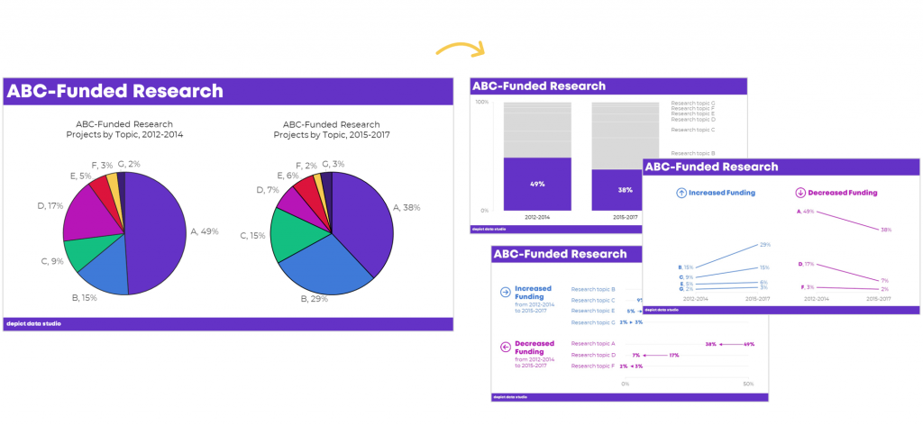
Research-based data visualization best practices are baked into the entire course. I’ll teach you how to format the graphs so they’re accessible, intuitive, and backed by research.

We believe that anyone can design amazing visualizations using everyday software you already own, like Excel, PowerPoint, and Word. You don’t have to be a computer programmer or a graphic designer to be a great communicator.

Register by Friday, June 26.

Who This Training is For

This training IS for those of us who make graphs ourselves. This course is NOT for supervisors who delegate all their graph production to someone else. (Supervisors, enroll your staff. Ask me about group rates.)

This training IS for people using everyday software like Excel, Word, and PowerPoint. This course is NOT for graphic designers who exclusively use Adobe Illustrator or Acrobat.

This training IS for people who love learning Excel magic tricks. This training is NOT for computer programmers who exclusively write code in programs like R or Python.

This training IS for people who are ready to dive deeper. This training is NOT for people just hearing about data visualization for the first time. (Not sure why a 3D pie chart with 50 slices is impossible to read? Let me train you on best practices first; then, come back and enroll in this course next year.)

This training IS for people whose time is precious. I’ve got two kids and I run a business. I’m well past the phase in life where I can afford to learn the long, hard way. This training is a one-stop-shop and a shortcut.

Register by Friday, June 26.

142+ Video Lessons

You’ll get instant access to 142+ step-by-step video lessons–the equivalent of a two-day training. You can watch these lessons anytime around your own schedule.

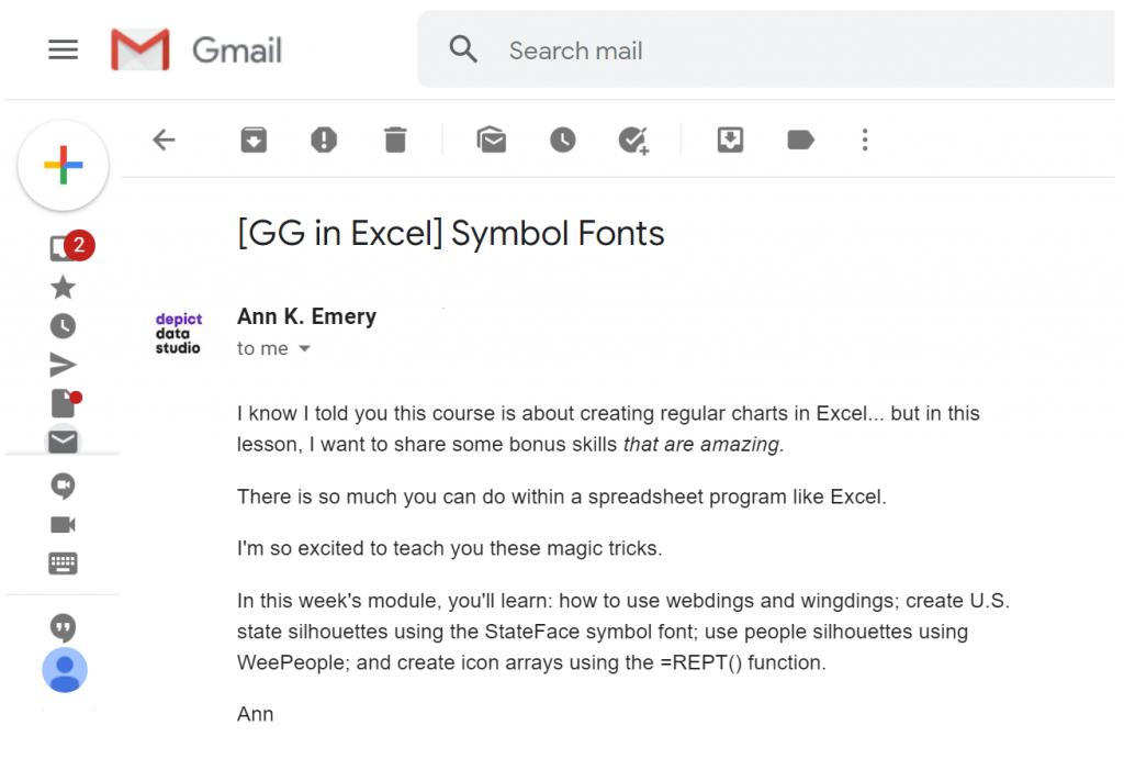
  • Symbol fonts (4 lessons; 40 minutes)
  • Spark lines (8 lessons; 34 min)
  • Data bars (7 lessons; 39 min)
  • Heat tables (8 lessons; 42 min)
  • Bar charts (11 lessons; 57 min)
  • Waffle charts (7 lessons; 33 min)
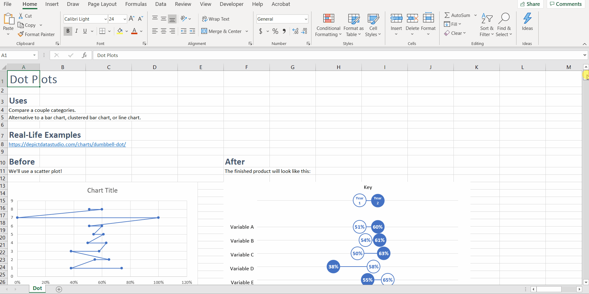
  • Dot plots (18 lessons; 1 hr)
  • Small multiples bar charts (14 lessons; 55 min)
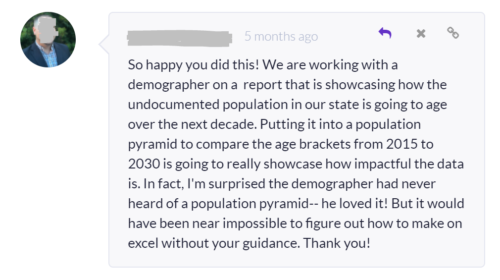
  • Population pyramids (12 lessons; 45 min)
  • Line charts (12 lessons; 54 min)
  • Slope charts (13 lessons; 40 min)
  • Small multiples line charts (8 lessons; 36 min)
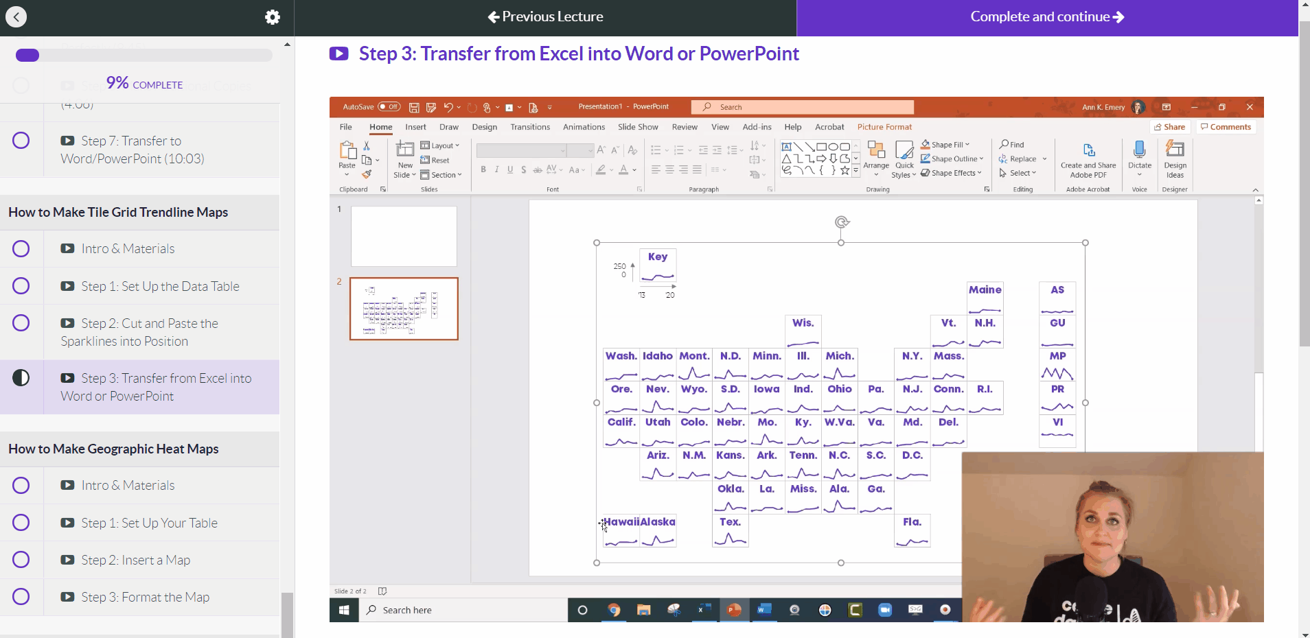
  • Tile grid trendline maps (4 lessons; 31 min)
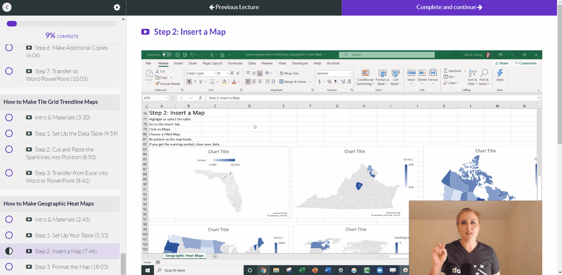
  • Geographic heat maps (4 lessons; 34 min)

Register by Friday, June 26.

Step-by-Step Instructions

You’ll learn exactly how to create symbol fonts, spark lines, data bars, heat tables, bar charts, waffle charts, dot plots, small multiples bar charts, population pyramids, line charts, slope charts, small multiples line charts, tile grid trendline maps, and geographic heat maps.

Variety of Graph Types

You’ll create familiar charts like bar charts and line charts, but I’m most excited about teaching you about Excel’s lesser-known secrets.

18+ Templates to Download and Follow Along

You can download and keep all 18+ Excel spreadsheets that accompany the video lessons.

You can download and keep all 18+ Excel spreadsheets that accompany the video lessons.

Discussion Boards to Ask Questions

Every module includes discussion boards where you can ask questions, comment on the lessons, and share your own tips with the community.

Every module includes discussion boards where you can ask questions, comment on the lessons, and share your own tips with the community.

Live Office Hours Twice a Month

We’ll share screens and work through your drafts together.

We'll share screens and work through your drafts together.

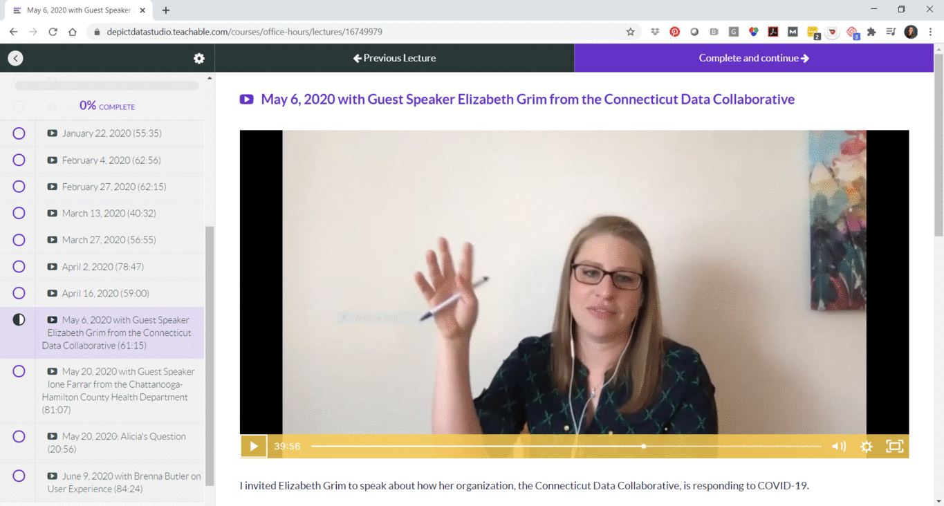
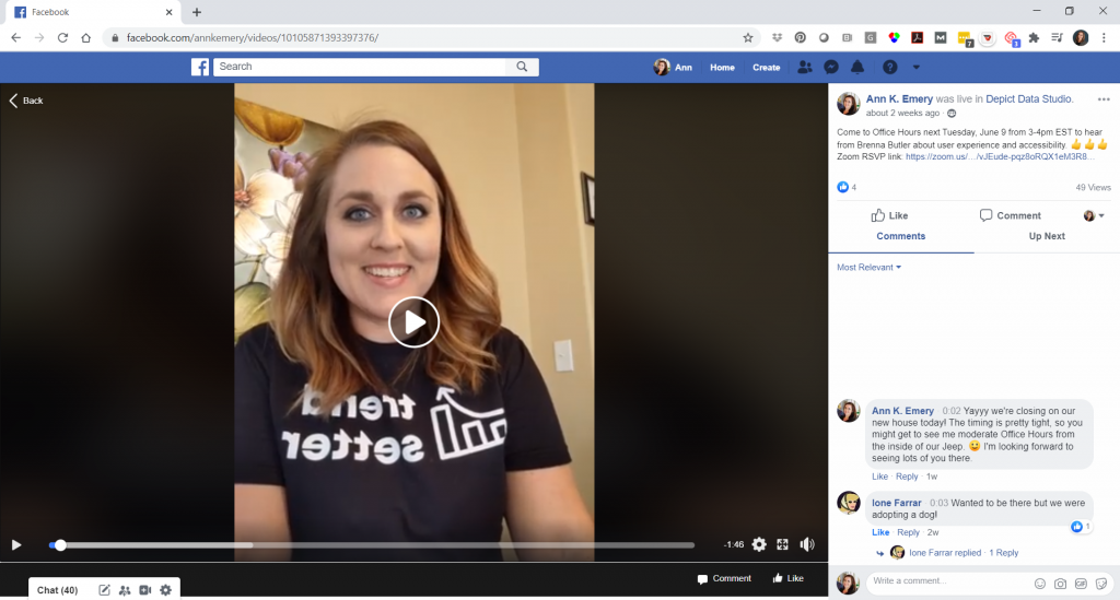
Guest Speakers in Office Hours

Sometimes we invite guest experts to speak with us during Office Hours. You’ll be able to access recordings from our sessions with Elizabeth Grim (about Connecticut’s COVID-19 response), Ione Farrar (about Tennessee’s COVID-19 response), and Brenna Butler (about user experience). You’ll also be invited to upcoming sessions with Jane Zhang, Chris Lysy, Sara Vaca, Esther Nolton, and Jason Melchi.

Sometimes we invite guest experts to speak with us during Office Hours.

By Popular Demand! 6 Live Trainings

Office Hours are open to everyone who’s taking online courses with me. By popular demand, we’ll also hold six additional Live Trainings just for the participants in this course.

  1. Monday, June 29, 2020 from 4 – 5 pm EST
  2. Monday, July 27, 2020 from 4 – 5 pm EST
  3. Monday, August 31, 2020 from 4 – 5 pm EST
  4. Monday, September 28, 2020 from 4 – 5 pm EST
  5. Monday, October 26, 2020 from 4 – 5 pm EST
  6. Monday, November 30, 2020 from 4 – 5 pm EST

The sessions will be recorded in case you can’t make it live.

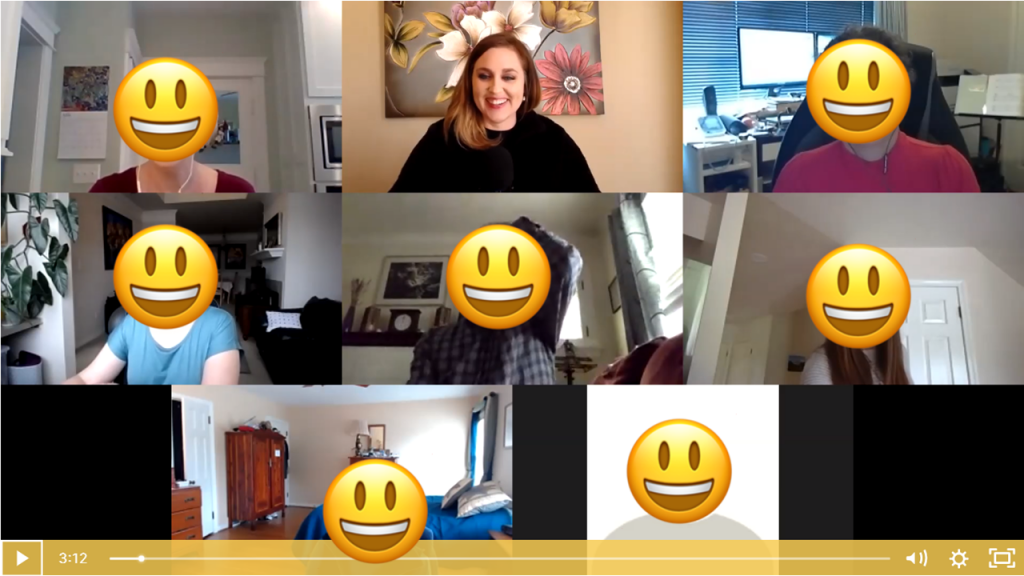
Private Facebook Community of Fellow Participants

You’ll be invited to join our private Facebook community, where I offer additional Facebook lives. You can also post your own questions and get feedback from me.

You'll be invited to join our private Facebook community, where I offer additional Facebook lives.

Weekly Emails to Cheer You On

I know you’re going to skip straight to the juicy dataviz magic tricks, but I’m going to email you on Mondays around 11 am EST and pretend like we’re working through the course one module at a time.

I know you’re going to skip straight to the juicy dataviz magic tricks, but I’m going to email you on Mondays around 11 am EST and pretend like we’re working through the course one module at a time.

Once-a-Year Registration

Mark your calendars! This course only opens once a year for registration. The 2020 enrollment window is Monday, June 22nd through Friday, June 26th. When it’s open, it’s open. When it’s closed, it’s closed.

We’ve also got special Early Bird Bonuses for the earliest registrants.
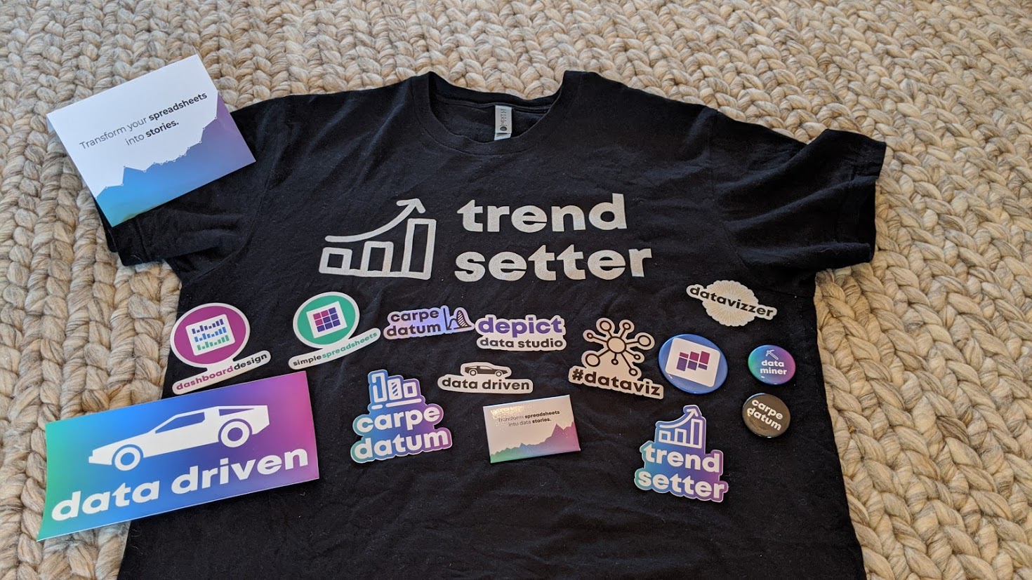
First 25 People

The first 25 people to register will receive a Swag Bag with a dataviz shirt, stickers, buttons, and magnets.

First 10 People

The first 10 people to register will ALSO receive verbal feedback on their graph, report, dashboard, or infographic. The feedback will be recorded and posted as a case study inside the course.

First 5 People

The first 5 people to register will ALSO receive an Excel makeover. You’ll send me your spreadsheet, report, or slide. Then, I’ll work on it directly during one of the Live Trainings with the 2020 cohort. This is a great opportunity to have me consult on your project.

What Participants Are Saying

3,390+ researchers, evaluators, scientists, and analysts have taken online courses with us.

Here’s what recent participants are saying.

“Having attended Ann’s keynote address at the 2017 Southeastern Library Assessment conference, I learned a few quick tricks to transform a stock Excel graph to something better. Once I moved into an assessment role full-time, I knew I would be writing more reports and wanted to up my game with Excel graphs and charts so I knew just where to go for help. Ann’s course in Great Graphs offered that and so much more. When I had to write a summary of a laptop loan program survey, I transformed the plain, ordinary graphs to uncluttered, with clearly understandable graphs of the survey results. Ann takes you beyond the basic Excel charts and graphs to learn how to make super cool waffle charts and icon arrays and adding spark lines and bars to a spreadsheet for quick visual analysis. Two of my favorite tips were learning how to create new theme colors to input the color brand from my organization and using bold colors to highlight your point with the remaining graph in gray or lighter tones. I found this course to be very practical with beneficial tips to use immediately in my work and would recommend it to anyone desiring to up their game with charts and graphs for data visualization.”

– Lee Ann Lannom, Assessment Librarian, Jean & Alexander Heard Libraries, Vanderbilt University

“The Great Graphs tutorials are exactly what I was looking for in learning data design techniques in Excel, especially using examples that makes sense in a nonprofit and philanthropic setting. I like the short snippet format where I can quickly learn about a technique and then instantly apply it. For instance, I was working on multiple data tables showing the number of services delivered and number of clients accessing housing services by quarter across multiple homeless services programs. Program leadership wanted a quick scan of the numbers by quarter for the entire fiscal year. They were used to looking at numbers this way. I decided to add sparklines to the data tables so that program leadership can also quickly visualize the trend over time. I quickly reviewed the Great Graphs tutorial on sparklines and added trends to the data tables. I also learned other tips to create sparklines quicker and add other visual features such as high and low points in the data. A data analyst I was working with on this project was amazed that this could be done in Excel. He was used to doing all his analysis in python or R, and wasn’t too familiar with data design techniques in Excel. Thank you, Ann, for creating these quick tutorials that anyone can follow, especially those in the nonprofit sector.”

– Rocele Estanislao, Assessment & Evaluation Analyst, Kaiser Permanenete Bernard J. Tyson School of Medicine

Register by Friday, June 26.

Frequently Asked Questions

How long do I have access to the course?

Indefinitely. I used to limit access to just 12 months. I wanted to encourage you to get in here and learn with me, but instead it just stressed you out, so I’m not cutting off your access anymore.

I know you’re a perfectionist and always update your courses.

Yes, and you’ll be grandfathered-in to all future updates to this course.

What if I am unhappy with the course?

We would never want you to be unhappy! If you are unsatisfied with your purchase, contact us in the first 30 days and we will give you a full refund.

Register

  • $747 USD one-time purchase
  • Or, 3 payments of $249/month

See you in the training program!

Ann

P.S. Wondering whether this course is right for you? Here’s a link to my secret calendar so you can chat directly with me: https://calendly.com/depictdatastudio/20min

Written by cplysy · Categorized: depictdatastudio

Jun 23 2020

Using Theories for Change

The concept of Theory of Change is meant to provide program planners and evaluators with guidance on how to make sense of the mechanisms that guide how something transforms. Theory of Change as a technique is usually visual, participatory and consultative in nature, and is something that is developed alongside the program itself. What is given less attention are the change theories that underpin a Theory of Change.

Confused? You’re not alone.

Clarifying this is critical if your Theory of Change is to have any meaning.

Change Theories & Theory of Change

Change theories are based (largely) on psychological and sociological evidence applied to human behaviour at different levels. These levels include:

  • Individuals
  • Groups (e.g., teams, families)
  • Organizations
  • Communities
  • Societies & Systems

Some change theories will apply at all of these levels, while some are designed more specifically for a specific level. For example, Kotter’s 8-step model for leading change is primarily an organizational change theory.

Change theories are meant to describe what is to change and explain how change is to come about. These serve as the bedrock for what a Theory of Change is meant to convey. A Theory of Change links the structures and resources tied to a specific program, unit, or process with various change theories to explain why it should facilitate transformation.

Design Considerations

While we might have a viable change theory, we might not have a strong design. We often see organizations that seek to make changes that their programs or policies were not designed to accomplish. For example, cognitive rational change theories are built upon the basic assumption that knowledge informs attitudes and beliefs which influence behaviour.

If your program or service doesn’t have a design that facilitates information accessibility that allows your end user (those who are the focus of your service) to understand and use that information, it’s unlikely we will see change. Just-in-time knowledge delivery (e.g., doing a Google search) implies that people have the means (e.g., tools and technology), the literacy, the skills, and the opportunity to access and use that knowledge, otherwise it’s not likely to facilitate change.

Being able to locate a family doctor isn’t useful if you can only do it at a time and place when such a professional isn’t needed.

Theories of Change can help us plan our programs and service offerings and plot the points of impact, but without good change theories and design considerations it’s quite possible we won’t achieve what we set out to do.

Want to learn more about how to develop Theories of Change and what an understanding of social and behavioural science and design can do to help you learn and create impactful programs? Contact us. We’d love to connect.

Written by cplysy · Categorized: cameronnorman

Jun 22 2020

Capacidades de Seguimiento y Evaluación al nivel institucional/organizacional

En el post Componentes de un sistema de seguimiento y evaluación mostramos una lista de 12 componentes de un sistema de Seguimiento y Evaluación (SyE)

Estos componentes han sido utilizados por ejemplo:

-Por el Banco Mundial para identificar componentes para un sistema de SyE nacional para gobiernos y socios (Gorgens & Kusek, 2009)

-En una herramienta de ONUSIDA y desarrollada para apoyar la implementación de una valoración del sistema nacional de SyE del VIH. El objetivo era facilitar una comprensión común de lo que se evalúa entre los diferentes actores involucrados en Seguimiento y Evaluación (SyE). La versión del libro de trabajo de Excel de la herramienta, que incluye cuadros de mando para mostrar los resultados de la evaluación y las acciones de mejora planificadas, se puede encontrar aquí. La guía detallada sobre cómo preparar e implementar dicha evaluación, utilizando la herramienta, se puede encontrar aquí.

A continuación los Componentes de un sistema de SyE:

  • Componente 1: Estructuras organizacionales con funciones de SyE
  • Componente 2: Capacidad humana para SyE
  • Componente 3: asociación para planificar, coordinar y gestionar el sistema de SyE
  • Componente 4: Plan de SyE
  • Componente 5: Plan de trabajo de SyE anual y presupuestado
  • Componente 6: Comunicación, promoción y cultura para el sistema de SyE
  • Componente 7: Rutina de seguimiento de los programas
  • Componente 8: Encuestas y Control
  • Componente 9: Bases de datos
  • Componente 10: Supervisión del apoyo y auditoría de datos
  • Componente 11: Evaluación e investigación
  • Componente 12: Difusión y uso de datos


Si hablamos de construcción de capacidad en SyE al nivel Organizacional, hay cinco áreas en las que los sistemas de las organizaciones y sus subsistemas pueden ser conceptualizados, de acuerdo a la escala, el objeto y la complejidad de sus gestión y operación:

1.Procesos y estructuras de gestión

2.Recursos y práctica de SyE

3.Recursos y práctica de construcción de capacidades

4.Redes de trabajo y enlaces

5.Cultura y demanda organización

Referencias

Gorgens & Kusek, (2009) Making M&E systems work. A capacity development toolkit. Washington DC: WB

Written by cplysy · Categorized: TripleAD

Jun 21 2020

Evaluación y gestión adaptativa durante la respuesta al COVID 19

http://www.usat.edu.pe/web/wp-content/uploads/2020/04/miedo-coronavirus.jpg

En estos tiempos inciertos durante la respuesta al COVID 19, retomamos el post “Enfoques adaptativos frente a los fallos en nuestros sistemas de evaluación“, donde se indicaba que las soluciones a algunos de los retos o fallos en nuestros sistemas de evaluación señalados en los dos posts anteriores… En qué estamos fallando (más) para el uso evaluativo: en la(s) evidencia(s)/resultados o en la(s) pregunta(s)/procesos ¿En qué estamos fallando (más): en la oferta o en la demanda evaluativa? (I) …vienen de nuestra capacidad de utilizar enfoques adaptativos .

Los enfoques adaptativos en la función de evaluación durante la respuesta al COVID se orientarían:

(1) hacia la cambiante utilización de los procesos/productos de la función de evaluación en tiempos de COVID 19: (i) asesorar sobre la mejor manera de medir y monitorear, (ii) proporcionar evidencia de alta calidad y (iii) hacer que la evidencia y las lecciones sean mucho más accesibles para los formuladores de políticas) y

(2) hacia una demanda evaluativa por reforzar (dado que está en gran medida saturada de carga de trabajo) y no tanto (o no solo)

(3) hacia la producción de evaluaciones.

Hemos tratado en numerosas ocasiones sobre enfoques adaptativos, pero recordemos en especial dos posts anteriores sobre enfoques adaptativos:

A. En este posts definíamos “La gestión adaptativa“ es (1) un proceso estructurado e iterativo de toma de decisiones robusta frente a la incertidumbre, (2) con el objetivo de reducir la incertidumbre a través de la continua supervisión del sistema.

De esta forma, la toma de decisiones (1) cumple simultáneamente con uno o más objetivos de gestión de recursos y, (2) de forma pasiva o activa, acumula la información necesaria para mejorar la gestión futura. La gestión adaptativa es una herramienta que puede usarse no solo (a) para cambiar un sistema, sino también (b) para aprender sobre el sistema.

Debido a que la gestión adaptativa se basa en un proceso de aprendizaje, mejora los resultados de gestión a largo plazo.

El desafío al utilizar el enfoque de gestión adaptativa en tiempos de COVID 19 radica en encontrar el equilibrio correcto entre (1) la obtención de conocimiento para mejorar la gestión de la respuesta al COVID 19 y (2) la obtención del mejor resultado a corto plazo basado en el conocimiento actual.

B. Por otra parte en este post “Programación adaptativa“, se daban pistas/soluciones frente a desafíos que estamos experimentando con el COVID 19:

1) El desafío de la gobernanza, la colaboración externa, la coordinación entre las organizaciones en la gestión en la respuesta al COVID 19: Esto incluye  planes de respuesta conjuntos detallados que cubran pocos meses o presupuestos flexibles.

2) El desafío de las habilidades equilibradas y la colaboración dentro del equipo y de las organizaciones en la respuesta al COVID 19: tema ya tratado en post pasados “La colaboración en los equipos de trabajo”  y “Diez retos del trabajo en equipo” y  “Características de un buen trabajo en equipo”

3) El desafío del seguimiento y el aprendizaje continuo en la respuesta al COVID 19: Un enfoque adaptativo requiere una cultura de aprendizaje dentro del equipo del programa porque sin aprendizaje y buen seguimiento es difícil generar el conocimiento y la información que puedan ayudar a cambiar el curso, adaptar actividades o detener experimentos de políticas que no funcionan.  Desarrollar o reforzar la cultura de aprendizaje (superando las enormes barreras para el aprendizaje) es clave para la gestión adaptativa en la respuesta al COVID 19. Llevar esto a un aprendizaje conjunto y mutuo, supone aumentar la complejidad del reto.

Written by cplysy · Categorized: TripleAD

Jun 20 2020

Desarrollo de capacidades en evaluación: tendencias y principios

Siguiendo con el tema que ya hemos tocado en otros posts sobre el desarrollo y construcción de capacidades, en el post Desarrollo de capacidades: Tendencias emergentes, teníamos algunas tendencias emergentes para poner en práctica el desarrollo de capacidades. Si bien existe cierto consenso internacional sobre la nueva comprensión del desarrollo de capacidades, los enfoques operativos, los marcos y los métodos para poner en práctica del desarrollo de capacidades aún están tomando forma. Las siguientes pueden considerarse algunas tendencias emergentes:

  1. Del enfoque en aspectos simples y únicos hacia una perspectiva sistémica.
  2. De los  modelos fijos a una planificación flexible y soluciones específicas de la situación.
  3. De la transferencia de conocimiento al fortalecimiento de los procesos endógenos de creación de conocimiento.
  4. De la planificación fija hacia procesos adaptativos e incrementales de gestión
  5. Del taller al aprendizaje.
  6. De la ejecución externa a la facilitación
  7. De la medición cuantitativa de los resultados hacia enfoques más holísticos
  8. De soluciones rápidas al compromiso a largo plazo

De la misma forma en el post  Principios rectores para el desarrollo de capacidades señalamos que el concepto de desarrollo de capacidades se basa en una serie de principios inspirados en el debate internacional sobre la eficacia de la ayuda, que se basa en la Declaración de París y la Agenda de Acción de Accra. La FAO ha suscrito los siguientes principios en su Estrategia corporativa sobre desarrollo de capacidades:

1 – Apropiación y liderazgo del país

2 – Alineación con las necesidades y prioridades nacionales

3 – Uso de sistemas nacionales y experiencia local

4 – No hay un enfoque con una receta que sirva para todos

5 – Enfoque de niveles múltiples

6 – Rendición  de cuentas mutua

7 – Armonización de la acción y la asociación


Recursos:

FAO. 2012. Enhancing FAO´s practices for supporting Capacity Development of member countries. LM1 Learning Module 1.

Written by cplysy · Categorized: TripleAD

  • « Go to Previous Page
  • Go to page 1
  • Interim pages omitted …
  • Go to page 253
  • Go to page 254
  • Go to page 255
  • Go to page 256
  • Go to page 257
  • Interim pages omitted …
  • Go to page 310
  • Go to Next Page »

Footer

Follow our Work

The easiest way to stay connected to our work is to join our newsletter. You’ll get updates on projects, learn about new events, and hear stories from those evaluators whom the field continues to actively exclude and erase.

Get Updates

Want to take further action or join a pod? Click here to learn more.

Copyright © 2026 · The May 13 Group · Log in

en English
af Afrikaanssq Shqipam አማርኛar العربيةhy Հայերենaz Azərbaycan dilieu Euskarabe Беларуская моваbn বাংলাbs Bosanskibg Българскиca Catalàceb Cebuanony Chichewazh-CN 简体中文zh-TW 繁體中文co Corsuhr Hrvatskics Čeština‎da Dansknl Nederlandsen Englisheo Esperantoet Eestitl Filipinofi Suomifr Françaisfy Fryskgl Galegoka ქართულიde Deutschel Ελληνικάgu ગુજરાતીht Kreyol ayisyenha Harshen Hausahaw Ōlelo Hawaiʻiiw עִבְרִיתhi हिन्दीhmn Hmonghu Magyaris Íslenskaig Igboid Bahasa Indonesiaga Gaeilgeit Italianoja 日本語jw Basa Jawakn ಕನ್ನಡkk Қазақ тіліkm ភាសាខ្មែរko 한국어ku كوردی‎ky Кыргызчаlo ພາສາລາວla Latinlv Latviešu valodalt Lietuvių kalbalb Lëtzebuergeschmk Македонски јазикmg Malagasyms Bahasa Melayuml മലയാളംmt Maltesemi Te Reo Māorimr मराठीmn Монголmy ဗမာစာne नेपालीno Norsk bokmålps پښتوfa فارسیpl Polskipt Portuguêspa ਪੰਜਾਬੀro Românăru Русскийsm Samoangd Gàidhligsr Српски језикst Sesothosn Shonasd سنڌيsi සිංහලsk Slovenčinasl Slovenščinaso Afsoomaalies Españolsu Basa Sundasw Kiswahilisv Svenskatg Тоҷикӣta தமிழ்te తెలుగుth ไทยtr Türkçeuk Українськаur اردوuz O‘zbekchavi Tiếng Việtcy Cymraegxh isiXhosayi יידישyo Yorùbázu Zulu