• Skip to main content
  • Skip to footer
  • Home

The May 13 Group

the next day for evaluation

  • Get Involved
  • Our Work
  • About Us
You are here: Home / Archives for allblogs

allblogs

Sep 18 2023

How to Make Interactive Dashboards in Excel

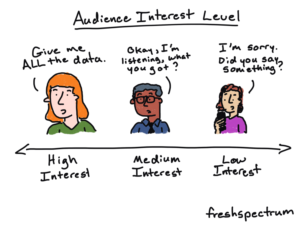
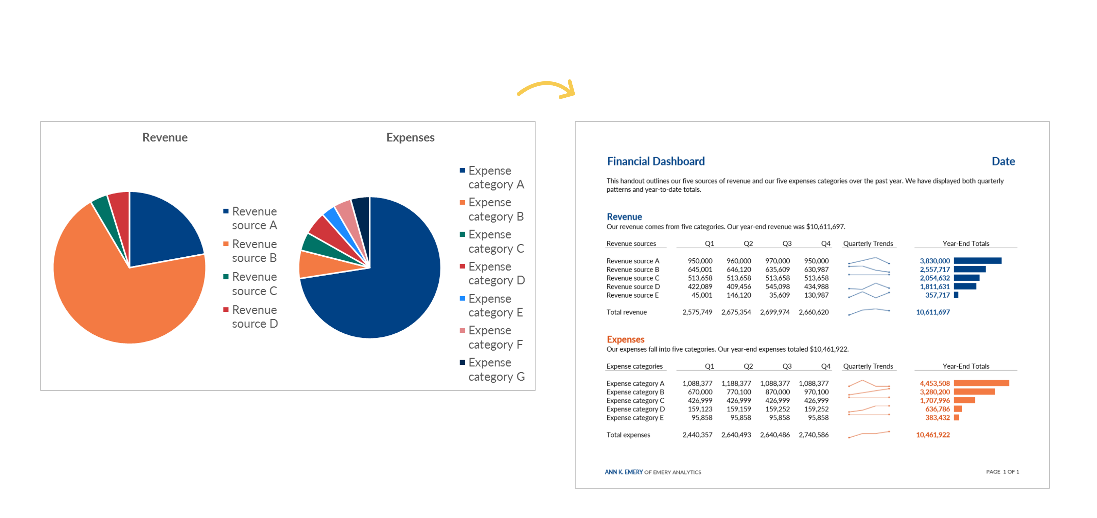
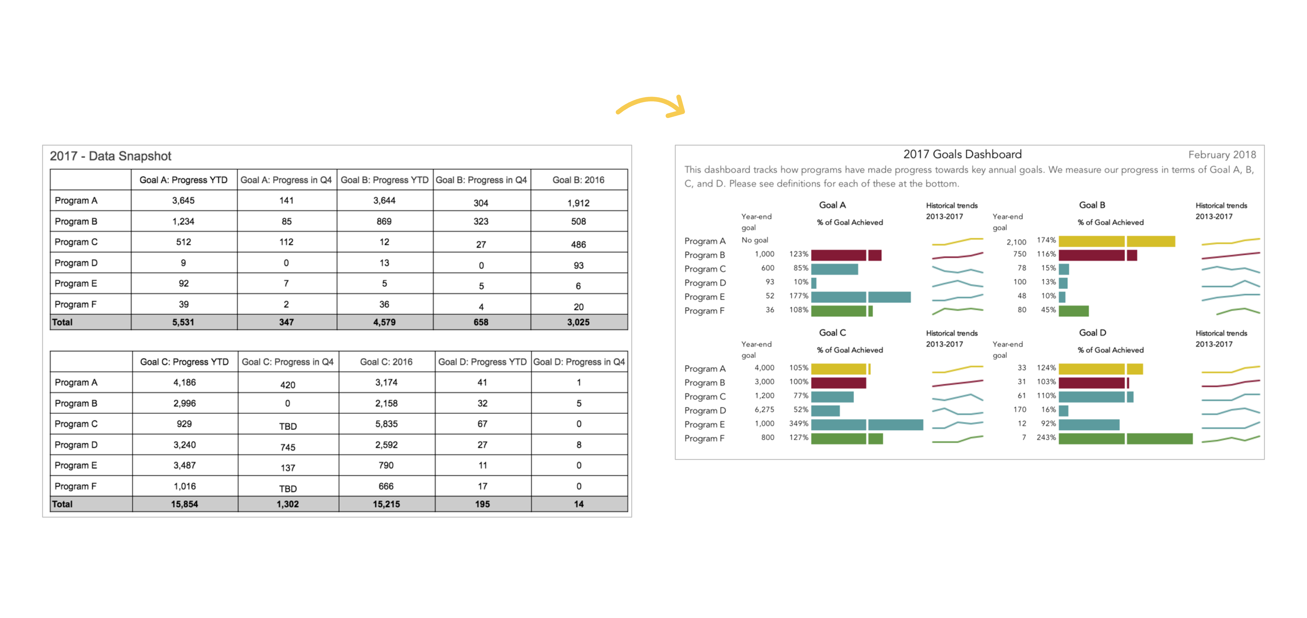
Want to make an interactive dashboard in Microsoft Excel?

Interactive (a.k.a. dynamic) dashboards are a great option for technical audiences that have the time and interest to explore the data for themselves.

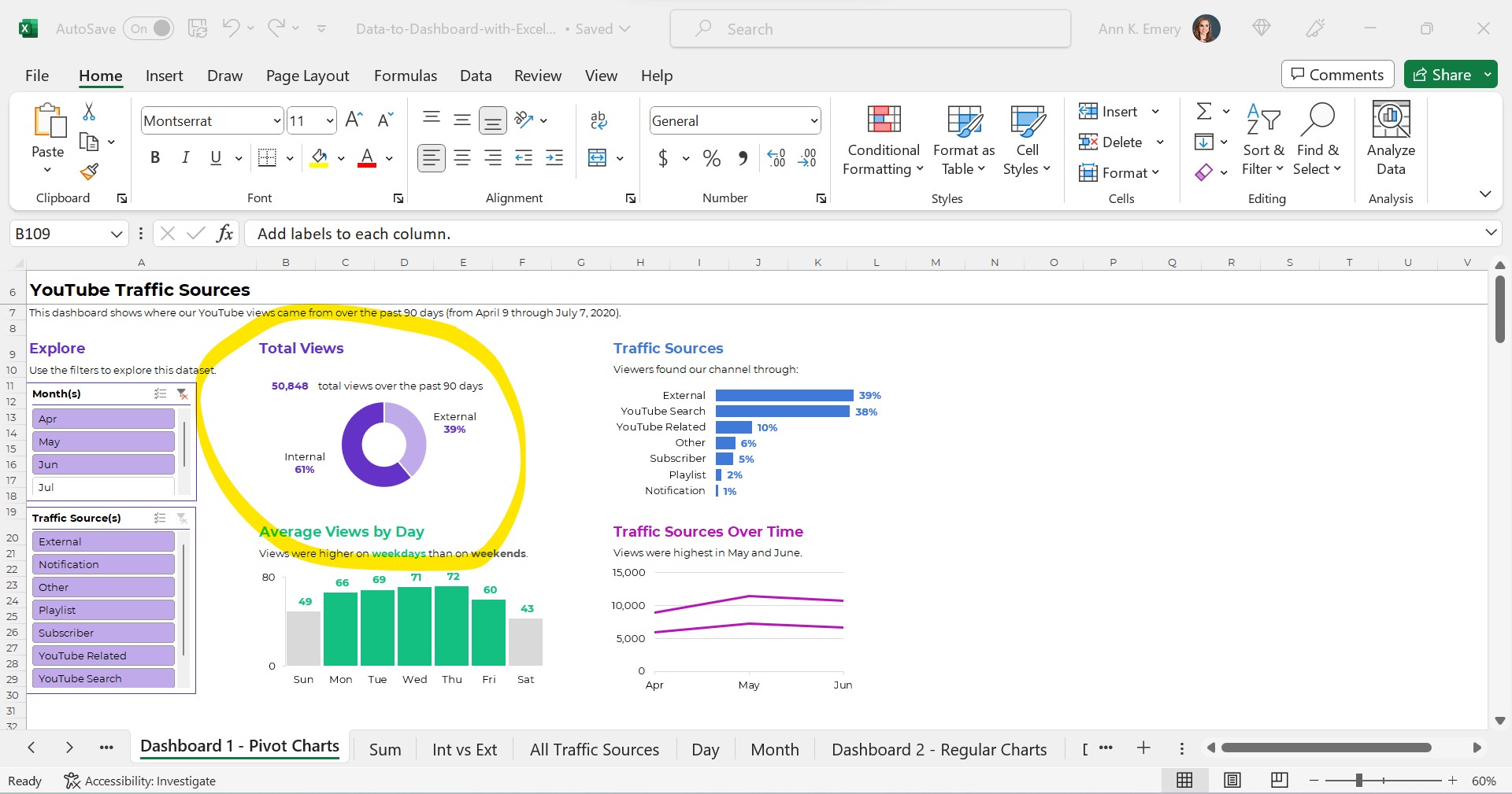
They’ll look something like this:

Interactive dashboards are easy to create — sort of. It depends on your existing skill level.

You’ll need four pieces:

  1. A Clean, Contiguous Dataset (maybe stored as an Excel Table)
  2. Pivot Tables
  3. Pivot Charts
  4. Slicers

Are you already using these four features regularly? Great! Linking them together in a dashboard will be easy for you.

Are you new to Excel Tables, pivot tables, pivot charts, or slicers? Be patient with yourself. You’ll need to be fluent in the building blocks before you can put them together seamlessly.

Let’s walk through each of the four pieces in more detail.

Step 1: Build the Clean, Contiguous Dataset

From previous blog posts, you know that table is a tricky term.

There are several different types of tables, like datasets vs. tabulations. In short, a dataset is the underlying numbers, and the tabulation is the summary table.
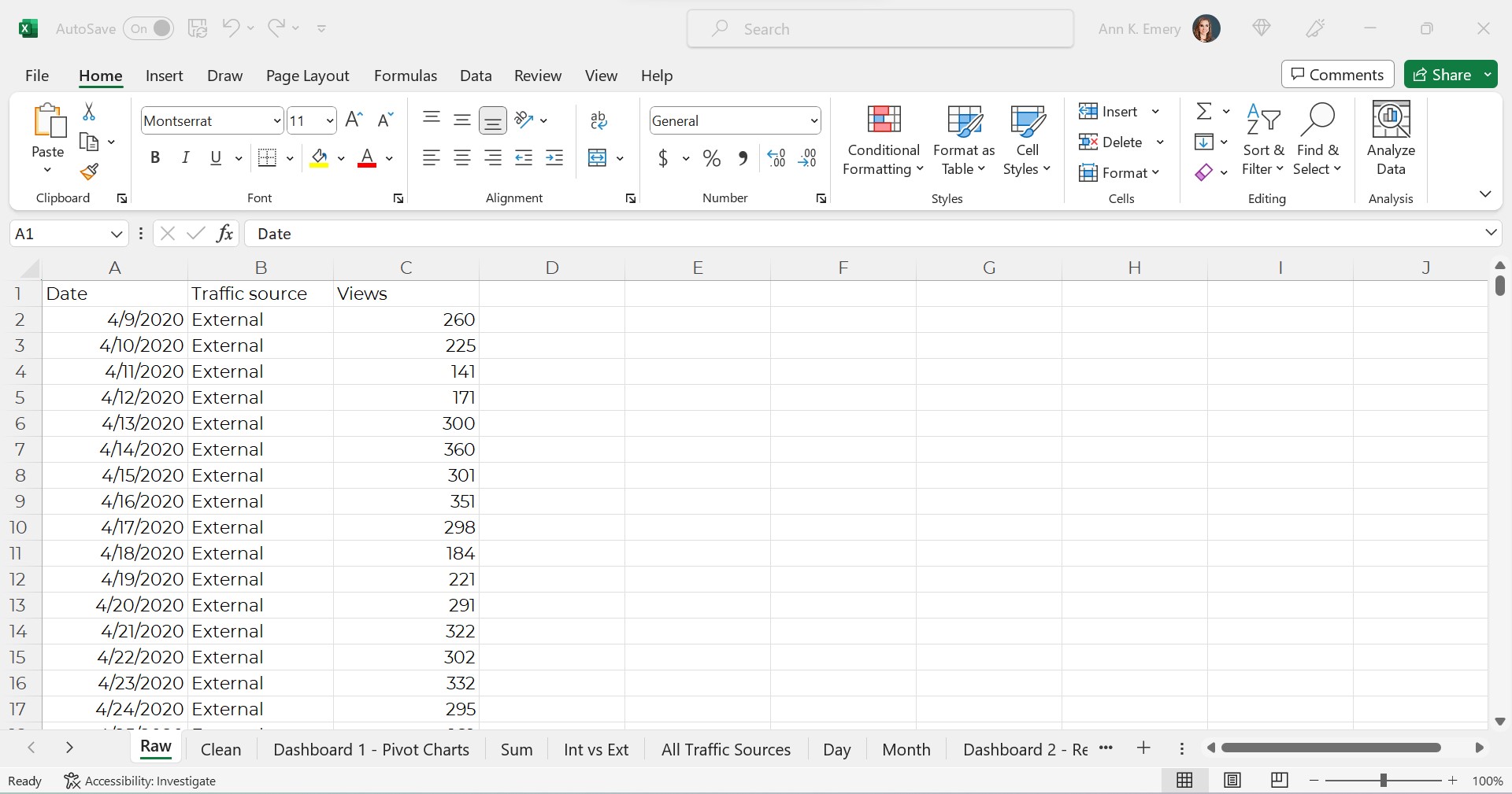
The Raw Dataset

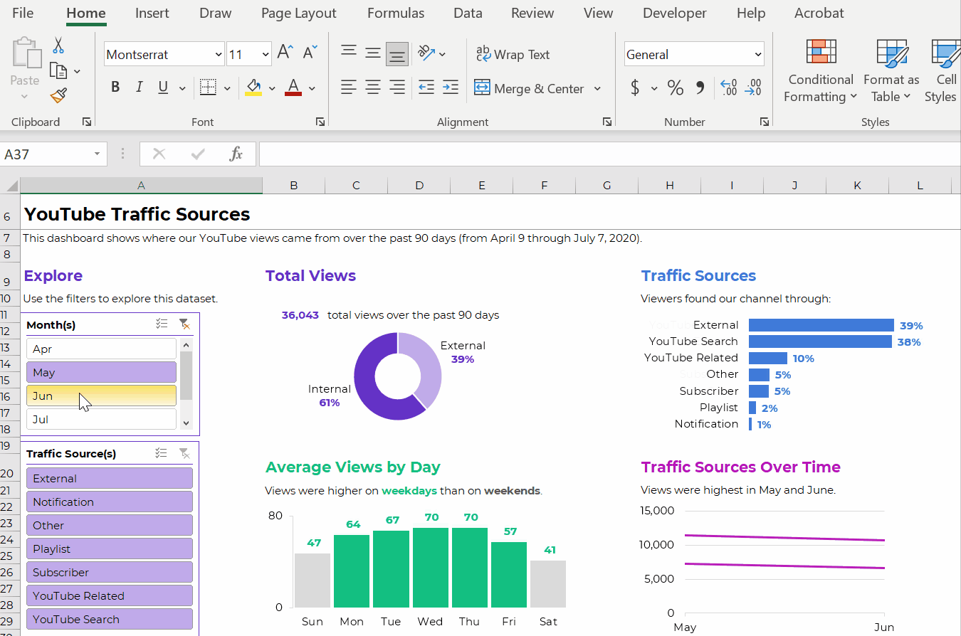
To build our interactive dashboard, we’ll start with our raw dataset.

This is semi-fictional data. We’re pretending that we’ve downloaded YouTube stats directly from YouTube.

The raw dataset would look something like this, with one entry per date and traffic source.

It’s raw because this is exactly what it looks like when downloaded from YouTube. We haven’t made any changes (yet!).
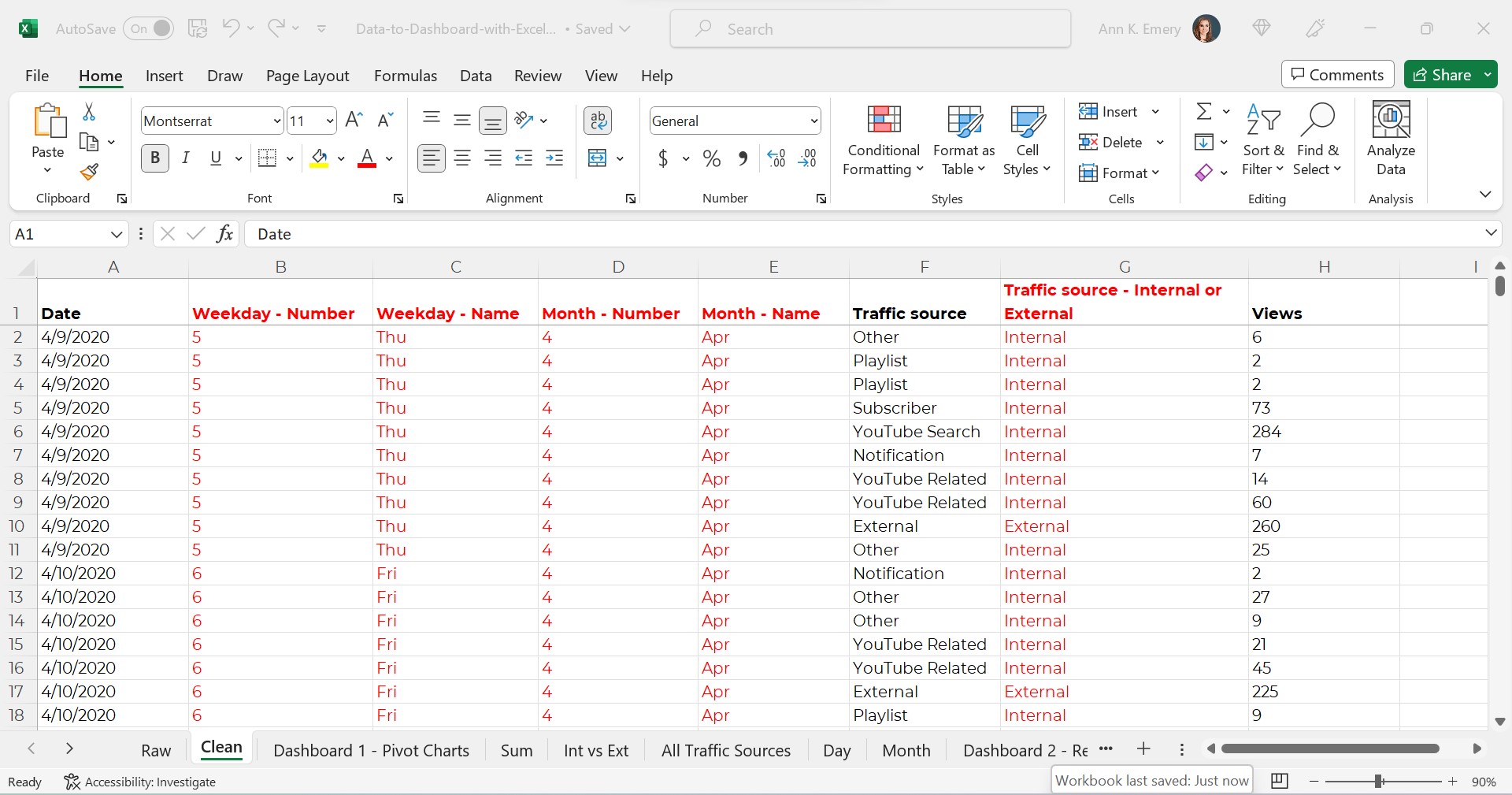
The Clean Dataset

Next, we’d clean the dataset.

We might check for and deal with duplicates.

We might check for and deal with missing data.

We might add lots of new columns of recoded data. For example, if I want to make a donut chart comparing the internal and external traffic sources, then I’ll need a column (a variable) that categorizes each traffic source as being internal or external.

If I want to make a graph that compares YouTube visits by day of the week (Monday vs. Tuesday views), then I’ll need a column that turns MM/DD/YYYY into weekday. And so on.

(You can learn more about cleaning, recoding, and transforming datasets inside Simple Spreadsheets, my prerequisite course. Again, you’ll need to be 100% fluent in these skills. Otherwise, dashboards will feel daunting.)

Years ago, a coworker taught me to turn all my new variables red so my Future Self could find them. As you can see, I still follow that advice today.

The clean dataset would look something like this:

Required: A Contiguous Dataset

As usual, my clean dataset is contiguous.

In other words, all the cells are touching or sharing a border.

I don’t have dozens of mini datasets (like one per month, or one per traffic source).

You can learn more about contiguous datasets and why they’re necessary for dataviz in this blog post.

Optional: An Excel Table

Next, we might transform our clean dataset into an Excel Table. This step is optional.

As explained in this blog post, Excel Tables are helpful when we need to append tables (that is, when we’ll be adding more rows over time).

Alright, that’s it for the first piece! We’ve got a single, clean, contiguous dataset as our base. We might store it as a regular ol’ table/dataset. Or, we might turn it into an Excel Table for easy appending.

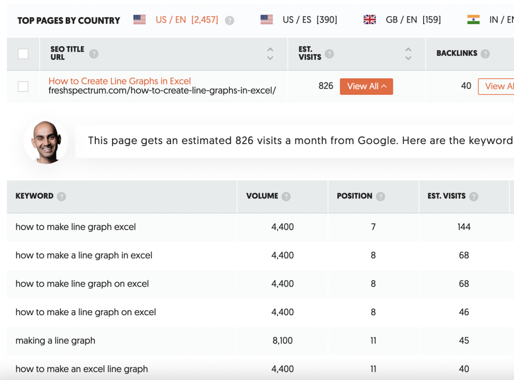
Step 2: Tabulate the Dataset with Pivot Tables

We can tabulate our dataset with either (1) formulas or (2) pivot tables. You can learn more about the pros and cons of each approach in this blog post.

In short, if we’re aiming to build an interactive dashboards… which has to involve slicers… which have to involve pivot charts… then we simply have to use pivot tables.

Again, interactive dashboards are easy — sort of. You have to understand all the nuances of when to use regular ol’ tables vs. Excel Tables, and when to formulas vs. pivot tables, in order to work both backwards and forwards and put everything together quickly and correctly.

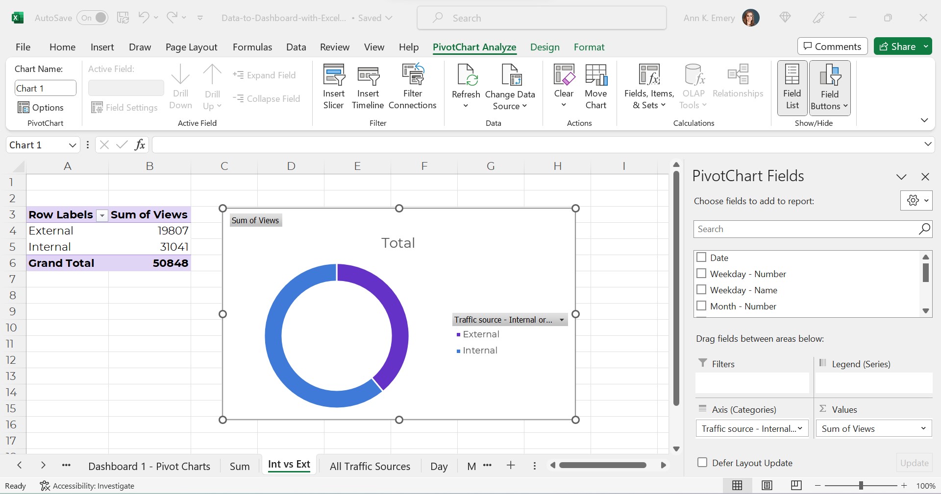
Our pivot tables will look something like this:

Interactive dashboards involve pivot tables — plural.

We’ll need one pivot table for each of our charts.

In the finished example, there were four charts + a sum of the total views. That means there are five separate pivot tables behind the scenes.

If you’re familiar with pivot tables, great! Building a few pivot tables for your dashboard will be easy.

If you’re brand new to pivot tables, no worries! I’ve got plenty of beginner-level blog posts to get you started.

Step 3: Build (and Format) the Pivot Charts

Next, we’ll simply add a pivot chart to each of our pivot tables.

In case you’re brand new to pivot charts, here’s how you add them:

  • Click on the pivot table to activate it.
  • Go to the Insert tab.
  • Choose which chart type you’d like (bar, line, donut, etc.).
  • That’s it!

Please, don’t forget the formatting!!!

Our unformatted chart — which doesn’t pass 508/ADA compliance guidelines — would look like this:

The formatted chart would look like this.

Do you notice the binary color-coding, white outlines around touching shapes, and the direct labels?

Once we’ve built and formatted each of the charts, we’ll simply cut and paste them together into a new sheet. That’s where our soon-to-be-completed dashboard will live.

Step 4. Add a Slicer(s)

Finally, we’ll add a slicer(s) to the first pivot chart.

A slicer is just a fancy name for a filter. They’ve existed in Excel since 2010 (!!!). But, don’t worry if you haven’t seem them or used them before. It takes years for new features to be widely adopted. (Hence the point of blog posts like these — to introduce you to features you might not have discovered before.)

Connect the Slicer to the First Chart

In case you’re brand new to slicers, here’s how you add them:

  • Click on one of the pivot charts to activate it.
  • Go to the Insert tab.
  • Click on the Slicer option.
  • You’ll see a list of all the variables. In this example, our variables from the clean dataset are Date, Weekday – Number, Weekday – Name, Month – Number, Month – Name, Traffic Source, Traffic Source – Internal or External and Views. If I want viewers to be able to slice and dice by month, then I’d select Month – Name to feed into the slicer.
  • That’s it!

Connect the Slicer to the Rest of the Charts

The slicer won’t automatically be connected to all of our charts.

We’ll need one more step:

  • Click on the slicer to activate it.
  • Go to the Slicer tab.
  • Click on the Report Connections button.
  • We’ll see a list of all our pivot tables. Check all the boxes.
  • That’s it! Now, when we filter data with the slicer, all the charts will correctly filter and change, too.

Final Formatting

As usual, we’ll make sure to follow dataviz best practices.

We’ll need to:

  • Add words. We’ll need a title, date, subtitles, and explanatory text. Yes, there’s concatenation behind the scenes that automatically writes the sentences for me.
  • Use brand colors and brand fonts.
  • Color-code by category. (One brand color per category/section/chart.)
  • Leave plenty of white space between the charts. My rule of thumb: A thumb’s width (a half-inch or inch of white space between each chart).

Now it’s time to sit back, relax, and let our colleagues have fun exploring the dashboard for themselves.

Learn More

If this tutorial is easy for you, then congrats!!! You’re all set. Go forth and build magnificent, accessible, interactive dashboards for your technical-minded colleagues.

If this tutorial was jargony for you, don’t worry!!! You can walk through each of the steps in more detail, and download the spreadsheets to follow, and come to live Office Hours inside the Dashboard Design course.

Written by cplysy · Categorized: depictdatastudio

Sep 15 2023

Facilitando mediante Estructuras liberadoras

Hay cinco «microestructuras» convencionales principales que usamos de manera predeterminada en nuestras organizaciones y grupos:

  1. Presentaciones
  2. Debates moderados
  3. Informes de estado
  4. Discusiones abiertas
  5. Lluvia de ideas

El problema con estas «microestructuras» es que son demasiado restrictivas (en el caso de presentaciones, debates moderados e informes de estado) o demasiado flojos (en el caso de discusiones abiertas y tormentas de ideas).

Estructuras liberadoras-EL (Liberating Structures) es una selección de 33 «estructuras» alternativas para facilitar reuniones y conversaciones .

Las Estructuras Liberadoras introducen pequeños cambios en la forma en que conversamos, planificamos, decidimos y nos relacionamos unos con otros. Resitúan el poder innovador y facilitador, en el pasado reservado sólo a expertos, en manos de todos. Treinta y tres microestructuras adaptables hacen que sea rápido y sencillo para grupos de personas de cualquier tamaño cambiar radicalmente su forma de interactuar y trabajar juntas. Las Estructuras Liberadoras pueden sustituir o complementar esos cinco grandes enfoques convencionales que usamos todo el tiempo (presentaciones, debates moderados, tormentas de ideas y discusiones abiertas). En contraste, las EL están diseñados para incluir y apoyar a todos en la configuración de su propio futuro.

Las Estructuras Liberadoras, por otro lado, están diseñadas para adoptar el control distribuido e incluyen un número más justo y mayor de personas en la configuración de los próximos pasos. Sus beneficios son la innovación, inclusión, participación, claridad, propósito, diversión.

No se necesita ser un/a facilitador/a (profesional) para liderar estructuras liberadoras: Las estructuras liberadoras son deliberadamente simples y cualquiera puede dirigirlas, lo que significa que pueden propagarse viralmente en una organización o grupo. Una vez que haya experimentado un@, es muy fácil comenzar a experimentar.

En el post de Nadia von Holzen “El poder mágico de Estructuras Liberadoras: una mirada más allá de la caja de herramientas hacia los principios”, nos contaba sobre los 10 principios de Estructuras Liberadoras (EL). Estructuras Liberadoras es más que una caja de herramientas. Es un enfoque, una mentalidad, una filosofía, una forma de pensar, colaborar, ser y liderar.

Estos son los 10 principios de EL:  

Practica el autodescubrimiento dentro de un grupo (1).

Aprende cayendo hacia adelante (2)

Participar en una curiosidad lúdica seria (3)

Puerta de entrada: Con este espíritu, la caja de herramientas es la puerta de entrada al mundo mágico de Estructuras Liberadoras. La mayoría de las estructuras son increíblemente fáciles de aprender y aplicar

Buceando más profundo. Se trata de estructura pero amplifica libertad y responsabilidad (4):  Necesitamos estructura, alguna forma de límite, que cree espacios, oportunidades e invitaciones para encontrar soluciones y dar forma al futuro juntos.

Se trata de interacción. Incluyamos y demos rienda suelta a todos (5) Se trata de personas

Practiquemos respeto profundo por la gente y las soluciones locales (6)

Creemos confianza en el camino (7)

Seamos «posibilistas», enfaticemos las posibilidades: intentemos creer antes de ver (8) Se trata de colaboración, co-facilitación, co-creación:

Invitemos a la destrucción creativa para posibilitar la innovación (9)

Nunca empecemos sin un propósito claro (10)

Los diez principios mencionados destacan lo que se vuelve posible cuando se utilizan estructuras liberadoras para estructurar las interacciones cotidianas.

Encontremos otros centros de gravedad…permanentes (o no).

Fuentes:  

“The Surprising Power of Liberating Structures” por Henri Lipmanowicz and Keith McCandless

«What are Liberating Structures?» Lisa Gill

Written by cplysy · Categorized: TripleAD

Sep 14 2023

What Does Reproductive Justice Actually Look Like?

In Loretta Ross’ essay “What is Reproductive Justice?” in Reproductive Justice Briefing Book: A Primer on Reproductive Justice and Social Change, Loretta writes: “Reproductive Justice can be used as a theory for thinking about how to connect the dots in our lives. It is also a strategy for bringing together social justice movements. But also, […]

The post What Does Reproductive Justice Actually Look Like? appeared first on Nicole Clark Consulting.

Written by cplysy · Categorized: nicoleclark

Sep 13 2023

How to Evaluate your Reporting

If you are serious about creating better reports, it’s time to take a step back. In this post I’m going to share my F.R.E.D. method for evaluating modern report dissemination.

But let’s start with something I’ve learned slowly over the last two decades of my data design career.

The biggest problem with most evaluation, research, and data reports is NOT the quality of the charts or visual design of the report. The biggest problem IS that most reporting is not designed to reach and engage an audience.

You can create the most interesting, delightfully designed, value packed report and still fail at reporting. Because if that report does not fall into the hands of your target audience, that report will not have an impact.

So how do you assess whether or not your reporting is reaching your audience?

You can use my F.R.E.D. method.

Why tracking PDF downloads is not enough.

PDF downloads is a pretty lame measure without any additional context.

It tends to be used like any other vanity metric (ex. social media followers). Without knowing how many people are in your target audience, which members of your target audience actually know your report exists, or even how many members saw your download page (without downloading), it’s just an out of context number.

Is 100 downloads good? What about 1,000 or 10? Any of these can be an absolute success or disappointing failure. But if you don’t do a little extra work, you won’t have any idea of what success looks like.

What is the F.R.E.D. method?

F.R.E.D. stands for Frame, Reach, Engage, Deliver. These are the four basic steps I would suggest you follow when evaluating your reporting efforts.

For the sake of this post I am going to assume you are actually interested in report engagement and uptake. I’ve talked about this a lot in recent presentations, like the Eval Cafe I delivered for the Evaluation Center at Western Michigan. There is a big difference between a technical report and the kind of reporting designed for reach and engagement.

Let’s walk through each phase one by one.

FRAME your audience.

For a lot of evaluation reports the audience is either unidentified, a laundry list of disconnected groups of people, or generically described through the use of blanket phrases like “the general public.” It’s often nebulous or just a bunch of wishful thinking.

I would suggest that for each and every identified audience type, you should be able to identify by name a specific member of that audience. If you can’t, you’re likely too disconnected to actually reach that audience. That is, if it exists at all.

Once you can name your audiences, try to frame them.

For one of my projects I was working with evaluation teams in ~66 individual state or local jurisdictions. For each team I could anticipate an average of 3 members. So in total, I would have an audience of about 198 (we’ll make it easy and round up to 200).

Additionally, we had other stakeholders that were part of our the broader audience. Around 20 members associated with the client and perhaps 50 more who were loosely connected.

I can total these audiences, but it’s actually more valuable to keep them separated. But running with this example, let’s say I have 270 members overall. Getting 2,000 downloads of a report would be incredibly bizarre and probably mean I reached outside my target.

Whom do you REACH and ENGAGE?

I’ll talk about these two together as the data for each is usually found in the same place.

REACH

A report reaches potential audience members when it shows up on a social media feed, inside their email inbox, or within web search results. You can REACH an audience member via social media even if they do not follow your account. You are not guaranteed to REACH an audience member just because they follow your social media accounts or subscribed to your email list.

REACH stats can be influenced through a good social media campaign, so it’s a good number to track.

REACH stats include Impressions, Opens, and Keyword Search Volume.

ENGAGE

A reader is engaged when they perform some action when seeing your report. This means they did not simply let it scroll by on their social media feed or mindlessly mark it as read in their email inbox.

ENGAGE stats can be influenced through content design, such as infographic design and copywriting.

ENGAGE stats include Reactions, Comments, Reposts, Retweets, Clicks, and Expands.

Finding REACH and ENGAGE stats.

You’ll find reach and engage stats mostly inside of your organization’s communication platforms.

For instance, inside of LinkedIn you can see post impressions and view analytics for any of your own LinkedIn posts.

You can find the same information in Twitter (now X) by visiting analytics.twitter.com and logging into your account.

Most email providers will also give you data on recipients, opens (or open rate), and clicks (or click rate).

There are a number of tools that exist that allow you to see search engine stats. One of those tools is called Ubersuggest. Here you can search your page and find out its usual position in Google search results.

Based on the keywords where your page is found, the search volume for that term, and the relative position on the search page (lower the better), Ubersuggest provides you with estimated visits.

When is the report DELIVERED?

I like to think of reporting as a conversation but generally there is a desired reporting output. Historically the key DELIVER stat is often downloads.

If your report exists in HTML you could also consider unique pageviews as a key metric. Then, if you would like to dive deeper, you can look at other stats like time on page or bounce rate.

If the bounce rate is high, it means people are visiting the page but not diving any deeper into supporting content. If the time on page is low, it means people are leaving quickly and not likely digesting much of your report.

If you do decide to still deliver a downloadable PDF, that will also give you additional stats. You can find out how many people downloaded (or registered to download) your report. You may also learn how many people visited the page where your report is set to download.

TLDR Recap

Frame your audience: Try to identify real humans and come up with actual numbers to estimate audience size.

Whom do you reach? How many people actually noticed your reporting (ex. impressions & opens)? What percentage of your total audience had an opportunity to engage with your reports?

How many engaged? Of those who you reached, how many engaged with your work? This could be things like clicking on links in your emails or engaging with social media posts.

How many reports were delivered? Given the number that engaged, how many people actually viewed your web report? If HTML, how long did users stay on the page to read? If it was downloadable, how many were downloaded?

All of this information can be used in the future to help you improve your report delivery. Or in the present to be more strategic about reaching missed audiences.

More Resources

If you are more concerned about the quality of your reports, and not your reporting strategy, I have a guide for that as well. It’s my User Experience evaluation approach to evaluating dashboards, reports, and data visualization. You can download the eBook by following this link.

Written by cplysy · Categorized: freshspectrum

Sep 13 2023

Don’t Start from Scratch! Make One of these Dashboards Instead

Dashboards aren’t supposed to take forever.

They’re not supposed to cost an arm and a leg.

They don’t even need to be outsourced to a consultant.

Dashboards are supposed to be fast and easy. We make ’em quickly. We give the numbers to leaders. They make data-driven decisions. That’s it! Stop overthinking it.

In this article, you’ll see examples of real dashboards that you can use as inspiration for your own workplace. No need to start from scratch. Adapt one of these dashboards instead.

Grant Deliverables

In this blog post, you’ll see how Josephine Engels did need to start from scratch — she was visualizing these metrics for her organization for the first time — and then made several dashboards to track grant deliverables.

Josephine writes, “My colleagues have given very positive feedback, as the dashboards have made it easier to analyze their program data more comprehensively. They especially appreciate one-pagers that can be shared with different stakeholders, including board members and program collaborators.”

Board Packets

In this blog post, you’ll see how Kristen Summers used “better storytelling with the same data” to transform a couple packets for her board.

Kristen writes, “This resulted in a much more well-received document with lots of compliments from board members! I have begun creating a cohesive aesthetic for all the documents I produce for the board to give them the information they need but in the most streamlined way possible.”

University Monthly Reports

In this blog post, you’ll see how I transformed a university library’s monthly report.

I write, “The before version only looked at one month at a time… I visualized the percentage of the goal that had been achieved so far… In some areas, the library has already exceeded their goal, so the bars spill past the 100% mark—a cause for celebration!”

Quarterly Monitoring

In this blog post, you’ll see how Shawna Rohrman designed “a prettier and more effective dashboard” with Excel.

Shawna writes, “Even with just these few changes (and using a program nearly everyone can access!), our new performance monitoring dashboard has made it so much easier for our team to review quarterly progress in one place and visualize how our system of early childhood programs are working for children and families in the county. The dashboard has become a quarterly staple at our staff meetings, where we review as a group and use the data to generate next steps. It is also easy to share with senior leadership, so they can see at-a-glance the important work our programs are doing.”

Agency Progress

In this blog post, you’ll see how Danci Greene, Emily Rose Barter, and Britani Baker used “an iterative process to hone the perfect data visualization.”

They write, “[We] recently used an iterative process to turn my agency’s annual goals document into a dynamic visual dashboard… Our iterative process has taken us all the way from a Word document to this dynamic, visual dashboard that uses length and color to bring the numbers to life.”

Revenue and Expenses

In this blog post, you’ll see how “transforming your pie charts into a dashboard – built in good ol’ Microsoft Excel – can be more useful for your organization’s leaders.”

I write, “The pie charts and bar charts above were only giving the viewers a single snapshot in time. To manage effectively, leaders need to monitor trends over time… Viewers should never have to lay two pages beside each other or scroll through documents to make comparisons.”

A Tired Data Table

In this blog post, you’ll see how Mia Schmid revamped a “tired data table” that “did a terrible job of communicating what we needed to know.”

Mia writes, “This is a huge improvement to how we have tracked organization-wide goals! The dashboard is so much easier to read compared to the table format and is a much more engaging way to communicate our progress than merely throwing a bunch of numbers into a table and expecting staff to make sense of it. This dashboard also communicates more than just progress towards goals. When I first put this dashboard together I was struck by how many of our programs either exceeded or under-achieved on their goals for 2017. Goal setting is one area we have been working on with each program and this dashboard has also enabled us to communicate to leadership why appropriate goal setting is so important—achieving a goal by 349% signals to me that the target set by the program is questionable.”

24 School Districts

In this blog post, you’ll see how Amadu Sidi Bah visualized 24 school districts’ submissions with a dashboard in Excel.

Amadu writes, “On sending this final dashboard to the project manager and colleagues, the project manager sent a reply in less than five minutes, and I quote him: ‘…Wow, comprehensive and nice visuals! This should help us prepare for the Review Team meeting and help shape the option paper.’”

Family Trivia Event

In this blog post, you’ll see how Emily Ross used dashboards “to make a family trivia event even better.”

Emily writes, “I can’t wait to continue to apply the tips and techniques I learned both at work and for fun! Maybe at next year’s trivia I’ll have to test some of the dashboard designs for comparing change over time.”

Learn More

Want to transform your tired tables into effective dashboards? Learn how inside Dashboard Design.

Written by cplysy · Categorized: depictdatastudio

  • « Go to Previous Page
  • Go to page 1
  • Interim pages omitted …
  • Go to page 73
  • Go to page 74
  • Go to page 75
  • Go to page 76
  • Go to page 77
  • Interim pages omitted …
  • Go to page 310
  • Go to Next Page »

Footer

Follow our Work

The easiest way to stay connected to our work is to join our newsletter. You’ll get updates on projects, learn about new events, and hear stories from those evaluators whom the field continues to actively exclude and erase.

Get Updates

Want to take further action or join a pod? Click here to learn more.

Copyright © 2026 · The May 13 Group · Log in

en English
af Afrikaanssq Shqipam አማርኛar العربيةhy Հայերենaz Azərbaycan dilieu Euskarabe Беларуская моваbn বাংলাbs Bosanskibg Българскиca Catalàceb Cebuanony Chichewazh-CN 简体中文zh-TW 繁體中文co Corsuhr Hrvatskics Čeština‎da Dansknl Nederlandsen Englisheo Esperantoet Eestitl Filipinofi Suomifr Françaisfy Fryskgl Galegoka ქართულიde Deutschel Ελληνικάgu ગુજરાતીht Kreyol ayisyenha Harshen Hausahaw Ōlelo Hawaiʻiiw עִבְרִיתhi हिन्दीhmn Hmonghu Magyaris Íslenskaig Igboid Bahasa Indonesiaga Gaeilgeit Italianoja 日本語jw Basa Jawakn ಕನ್ನಡkk Қазақ тіліkm ភាសាខ្មែរko 한국어ku كوردی‎ky Кыргызчаlo ພາສາລາວla Latinlv Latviešu valodalt Lietuvių kalbalb Lëtzebuergeschmk Македонски јазикmg Malagasyms Bahasa Melayuml മലയാളംmt Maltesemi Te Reo Māorimr मराठीmn Монголmy ဗမာစာne नेपालीno Norsk bokmålps پښتوfa فارسیpl Polskipt Portuguêspa ਪੰਜਾਬੀro Românăru Русскийsm Samoangd Gàidhligsr Српски језикst Sesothosn Shonasd سنڌيsi සිංහලsk Slovenčinasl Slovenščinaso Afsoomaalies Españolsu Basa Sundasw Kiswahilisv Svenskatg Тоҷикӣta தமிழ்te తెలుగుth ไทยtr Türkçeuk Українськаur اردوuz O‘zbekchavi Tiếng Việtcy Cymraegxh isiXhosayi יידישyo Yorùbázu Zulu