• Skip to main content
  • Skip to footer
  • Home

The May 13 Group

the next day for evaluation

  • Get Involved
  • Our Work
  • About Us
You are here: Home / Archives for cplysy

cplysy

Sep 17 2020

Reflections on the Intersection of Evaluation and Emergent Learning

How I applied emergent learning tools to connect evaluation, learning, and strategy

Photo by PhotoMIX Company from Pexels

All too often evaluation, learning, and strategy are disconnected. How many times have you been involved in an evaluation that’s meticulously collecting data to answer questions that may no longer be relevant to the stakeholders involved? In 2019, I had the opportunity to participate in the Emergent Learning Certification Program sponsored by Fourth Quadrant Partners. At the start of this journey I was guided by curiosity and viewed emergent learning as a chance to expand my toolbox as an evaluator — borrowing from different approaches and practices as needed. I entered the program with the following question in mind:

How can emergent learning be leveraged in my own evaluation practice to advance experimentation and ongoing learning across a diversity of stakeholders?

I was looking for a way to tighten the connection between evaluation, learning, and strategy. During the time I was enrolled in the program, I was able to apply the tools and concepts I was learning to an evaluation of a multi-site initiative designed to advance health equity through resident engagement. This work was emergent. The foundation and its partners were learning along the way and our thinking about how to define progress was also evolving as we continued to learn from the communities and their residents. In my mind, this was the perfect opening to apply the emergent learning framework and tools.

Here’s what I learned by applying emergent learning tools to my work:

Lesson 1: Applying line of sight thinking when developing or revisiting a theory of change can highlight areas of ambiguity and surface assumptions embedded in our thinking.

In emergent learning, we refer to line of sight as a way to maintain an unobstructed view from strategies to the ultimate outcomes we desire. By asking questions such as — What will this strategy make possible? Or What will it take to get there (desired outcome)? — we are making our thinking explicit and surfacing underlying assumptions about what we think is needed to reach our ultimate outcomes.

Similarly, in evaluation, we think of a theory of change as a snapshot of our best thinking at a point in time. It’s a platform to make our thinking visible and demonstrates how the strategies of an initiative or a program are connected to the desired changes we are hoping to see.

By developing a clear line of sight that illustrates how strategies are linked to desired outcomes, a group can stay focused on their collective vision for change as they continue to test and adapt their strategies over time.

In my work with the health equity evaluation, applying line of site thinking when revisiting the initiative’s theory of change, gave us the space to surface our initial assumptions and reflect on how these assumptions were changing based on what we were seeing in the communities. For more information on strengthening line of sight, check out Fourth Quadrant Partners’ Strengthening Line of Sight.

Photos by Alex Azabache and Roman Odinstov from Pexels

Lesson 2: Creating a forward-facing learning question can advance a group’s learning over time.

In emergent learning, we often create a question to help frame and focus our learning. The answer to this learning question is intended to accelerate the group’s ability to move towards their desired goal. Learning questions are typically forward facing (unlike evaluation questions which tend to be retrospective in nature) and invite the group to think together about how to tackle a specific challenge or achieve a desired outcome.

For the health equity evaluation, our forward-facing learning question was — What will it take to engage and empower residents experiencing health inequities to advance health equity in their communities? — Through the evaluation, we answered several retrospective evaluation questions designed to provide data about the various hypotheses that were being tested. The evaluation questions would evolve over time as the initiative’s strategies evolved, but all data collected through the evaluation was to inform the forward-facing learning question. Constructing a forward-facing learning question that was relevant to the group encouraged us to stay focused on our desired outcome as we explored new ideas for moving forward. For more on crafting learning questions, checkout Tanya Beer’s webinar on How to Ask Powerful Questions.

Lesson 3: Systematically applying Before and After Action Reviews can harness learning from one event to another, helping to ensure that the same mistakes don’t get repeated.

Before and After Action Reviews (BARs and AARs) offer a set of questions to help groups learn iteratively and improve results over time. For more information check out Four Quadrant Partner’s Introduction to Before and After Action Reviews (BARs and AARs).

Fourth Quadrant Partners

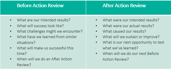
As part of this initiative, the funder convened community stakeholders at multiple points during the year to promote information exchange, peer learning, and networking. At the time of these convenings I was still in the process of figuring out the value of these reviews — at first glance, the questions seem almost too simple. Upon review of my own AAR notes taken after the first convening, I noticed that some of the shortcomings of the second convening could have been prevented if we had systematically conducted these reviews. Many of the ideas brought up after the first convening around — What will make us successful next time? — were not implemented. This demonstrated to me how easy it is for learnings to get lost from one event to another.

Oftentimes our best ideas flow freely after a shortcoming or failure. However, over time those lessons tend to lose salience.

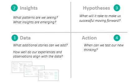
Lesson 4: Using the Emergent Learning Table as a platform for data interpretation helped move the group from data to insights to action.

The emergent learning table provides a platform to facilitate a group of stakeholders through a process designed to 1) reflect on data, 2) generate insights grounded in data, 3) establish hypotheses based on the insights that were generated, and 4) move towards action. For the health equity evaluation, I used a combination of data placemats and an emergent learning table as part of the data interpretation process with foundation staff, community coaches, and members of their technical assistance team.

This combination created a space for stakeholders to digest the data, ask questions, share experiences, recognize patterns, and generate insights for moving forward. This process facilitated the connection between evaluation and learning.

The collaborative nature of the conversation and involvement of multiple stakeholders helped increase buy-in to new ideas that were generated.

Adapted from 4QP’s Emergent Learning Framework

For me, the learning took place when I moved away from the one-off applications of the tools across disparate projects and focused on one project to cultivate learning over time.

Over the course of the year I tested and applied various aspects of emergent learning. By integrating emergent learning tools and practices throughout the health equity evaluation, I started seeing the through-line across these applications. My breakthrough moment came when I facilitated a data interpretation meeting using the emergent learning table as a platform for discussion.

Moving Forward…

How can emergent learning be leveraged in evaluation to advance experimentation and ongoing learning?

Image created by Veena Pankaj, Innovation Network

Take-Away #1: The true intersection between evaluation and emergent learning lies in the interpretation of data and its use for reflection and learning.

The emergent learning table demonstrated the power of inserting real-time, collaborative reflection into the evaluation sensemaking process. Facilitating stakeholders through the sensemaking process, creating a space for digestion, reflection, and the generation of new ideas helps connect evaluation to learning and action.

Take-Away #2: A forward-facing learning question encourages the exploration and testing of new ideas, while keeping the ultimate goal in mind.

This helps ensure that the evaluation is focusing on questions that matter and inform the collective learning of the group. All too often in multi-year evaluations, the questions that are developed at the beginning of the evaluation become outdated and irrelevant over time. When this occurs, there’s a disconnect between the data being collected and the decisions that need to be made to inform strategy.

Take-Away #3: Building in opportunities for reflection and sense-making throughout the evaluation creates a reflective practice that accelerates the learning potential of the group.

Opportunities for reflection help to create touchpoints for learning and adaptation of strategy.

Take-Away #4: Involving different stakeholders in the sensemaking process invites a diversity of perspective that can strengthen insights and lead to new ways of moving forward.

Inviting a diverse group of stakeholders to the table and valuing their experiences and perspectives helps make evaluation less transactional and paves the way for transformation.

Emergent learning tools provide avenues to gather experiences, generate insights, and formulate new ideas in a way that encourages experimentation, learning, and adaptation. It further provides a platform that inspires collaboration and a diversity of thought and perspective.

When coupled with emergent learning, evaluation has the potential to accelerate learning, magnify impact, and move us closer to our collective vision.


Reflections on the Intersection of Evaluation and Emergent Learning was originally published in InnovationNetwork on Medium, where people are continuing the conversation by highlighting and responding to this story.

Written by cplysy · Categorized: innovationnet

Sep 17 2020

Comment on Dealing with my first journal article rejection by Rajendra

Nicely put…..
Rejection of any kind hurts a lot……
But if we take it positively, it gives us a lot of force to surge ahead….. Nothing matches that force.
Having said that, I read it somewhere, ‘Awaiting Score’, ‘Awaiting Recommendation’, ‘Awaiting final decision’ all these things have a simple meaning…….start working on your next Paper….

Written by cplysy · Categorized: danawanzer

Sep 16 2020

The Power of Cartoons

This week I decided to take a dive into the world of cartoonists.

Aside from my childhood love of the funny pages (especially Peanuts, Garfield, and The Far Side) I wouldn’t say I had ever been that much of a cartoon connoisseur. Cartooning in my past was more a diversion than anything else, and that continued, even as I started to become known as the evaluation cartoon guy and cartoons helped shape my professional life.

But lately I’ve been wondering about all those influential cartoonists that I don’t yet know. What lessons have I been missing by keeping my eyes solely on the road ahead?

Today’s batch of cartoons with one exception, is inspired by cartoonists of bygone days. Artists and activists who understood the stuff that’s still so new to me.

First the exception – why data visualization might just be too precise for its own good.

One day I’m going to do a study. I’m going to put a bunch of “best practice” data visualizations against a series of cartoons designed to illustrate a data set.

For a long time I’ve felt like the biggest advantage for data visualization is that it is an academically acceptable form of illustration. I don’t believe that most charts are more memorable or more effective at delivering key messages than any other form of illustration.

I recently stumbled into this article interviewing Mona Chalabi, I’m a super fan of her work and think her philosophy is spot on.

I was inspired by the fact that I was bored out of my tiny mind in a dead end job. My desk was in a little booth so it was easy to doodle discreetly. Slowly though, when people started to respond to my early work, I found it enormously encouraging that there was another way of doing data visualisation — one that would reach more people without compromising on precision. A big part of my philosophy is that computer-generated images overstate certainty, my hand-drawn graphics show the real margin of error in the numbers while reminding people that a human was responsible for the data gathering and analysis.

“If it’s about farts, draw a butt for god’s sakes”: Mona Chalabi tells us how to illustrate data

Cartooning and Women’s Suffrage

Regardless of nationality and which group the artists belonged to, they all recognized the importance of using visual imagery to reach larger audiences. So did the anti-suffrage campaigners who very quickly created their own visual propaganda and stereotypes. Stereotypes are implicitly negative (although positive stereotypes can also exist, they are usually used for negative reasons): they take an idea or object or person which in real life exists in various forms and they impose a single form which essentially denies those variations. The challenge for the suffragists was the challenge of subverting anti-suffrage stereotypes which already existed and creating equally compelling new stereotypes which would be recognizable but communicate an opposing message.

 Art Responds to Women’s Suffrage: Pro and Con

Exploring the Hilarious Chaos

Oliver Wendell Harrington’s work could be put into the papers today and be just as relevant. The more things change…

It was the first black comic strip to receive national recognition. Harrington later wrote about the birth of Bootsie: “I simply recorded the almost unbelievable but hilarious chaos around me and came up with a character. I was more surprised than anyone when Brother Bootsie became a Harlem celebrity.” Harrington became the first African American to establish an international reputation in cartooning.

Oliver Wendell Harrington: “America’s Greatest Black Cartoonist”

Hidden in the Funny Pages

If you draw cartoons, you have a lot of latitude to just draw ridiculous things.

And lots of racist cartoonists would take that opportunity to just create one-dimensional ridiculous stereotype-laden characters of color.

Jackie Ormes did the opposite, drawing characters with elegance and nuance and infusing her comics with so much wit and truth.

While editors and writers would often be threatened and intimidated into reining in their content, cartoonists were largely left alone. And with lack of oversight they could criticize unjust policies without consequence.

An Unstoppable Force: The Story of Cartoonist Jackie Ormes [Illustrated Video]

Twitter Book Selfies and Coloring the Cartoons

I was super humbled after sharing my newly published book last week.

And this week I had some new surprises. I didn’t actually expect that my amazing readers would sharing pictures and videos of themselves with my book in hand on Twitter.

Then after exchanges with @AyeshaBoyce and @erbradfield, came another surprise. Because my cartoons are mostly black ink with lots of white space, I inadvertently created a coloring book.

Just in case you don’t know me well enough, both of these things (Book Selfies and Coloring) are totally encouraged!

Oh, and in case you missed last week’s email. I published a book. Here is where you can buy it.

On Amazon – Softcover

  • United States – US
  • Canada – CA
  • United Kingdom – UK
  • Germany – DE
  • France – FR
  • Spain – ES
  • Italy – IT
  • Japan – JP

On Amazon – eBook

  • United States – US
  • Canada – CA
  • United Kingdom – UK
  • Germany – DE
  • France – FR
  • Spain – ES
  • Italy – IT
  • Netherlands – NL
  • Japan – JP
  • Brazil – BR
  • Mexico – MX
  • Australia – AU
  • India – IN

Other Retailers

  • Barnes and Noble
  • More to come…

Written by cplysy · Categorized: freshspectrum

Sep 16 2020

7 Tips for Better Data Visualizations


Data visualization is an effective approach for improved data comprehension. Seeing the data presented in a clear, concise fashion drives your overall message home much better than cluttered tables. In this article I outline seven simple tips that will help to improve your visuals.


1. Choose the correct chart

There are a multitude of charts that may adequately represent your data. However, before selecting a chart, you need to be clear on what you, and your data, are trying to communicate. Consider the message you want to convey to your audience and select your chart accordingly.

As a side note, 3D graphics are never the correct chart. They distort the data and reduce the comprehension of your chart.

Instead of a pie chart, try a stacked bar chart.

Instead of a pie chart, try a stacked bar chart.


2. Opt for simplicity

After you have selected the chart that tells the story of your data, it is time to visualize your data. In Excel, the default chart is accompanied by excess gridlines, uninformative titles, and poorly positioned legends. The goal: remove anything that does not support the message you are communicating to your audience.

Simplifying your chart will help your message shine through. You want your audience to focus on what is important. Therefore, remove what is not crucial for understanding your data. Excess gridlines and axis labels can be removed if you have labeled data points. Your chart title can be re-written to highlight the core message of the data. Legends can be deleted in favour of a custom-made legend that better aligns with the theme of your chart.

Simplify your chart to let the message shine through.  Source: https://www.alberta.ca/stats/covid-19-alberta-statistics.htm

Simplify your chart to let the message shine through.
Source: https://www.alberta.ca/stats/covid-19-alberta-statistics.htm


3. Order data

Ordering data improves the overall comprehension of your chart. By ordering data, random data points can be reorganized in such a way that is meaningful for your audience. This allows for the clear interpretation and understanding of the data.

Categories should be ordered both logically and consistently. Categories independent? Order by value. Categories sequential? Order sequentially. Ordering by value or sequentially does not quite work? Order alphabetically. Regardless, the ordering should improve the comprehension of your chart.

Order your data in a logical way.

Order your data in a logical way.


4. Include a zero baseline

Truncating axis baselines is an efficient method to lie with data. Truncated axes skew visual comparison, exaggerating differences within your chart. As a result, minor differences appear larger and more significant.

To avoid errors in interpretation, include a zero baseline in your charts. This allows for more accurate interpretation of results. This improves the overall comprehension of your chart and better communicates your overall message.

There are exceptions to the rule, although most often, it is suggested that you use a zero baseline. Line charts are used to compare between lines and a truncated y-axis may be opted for to emphasize differences between lines. If highlighting clear variations between your lines is the goal, truncating the axes may be an option. In this case, clearly identify to your audience that you are using a non-zero baseline.

Avoid misleading with your data by including a zero baseline.

Avoid misleading with your data by including a zero baseline.


5. Use colour to highlight the important information

Colour is a great way to highlight important data within your chart. While you should be mindful to use like colours for like data, it is often beneficial to use accent colours to emphasize a point. These accent colours will pull the reader’s attention and help them focus in on the core message of the chart.

Use an accent colour to highlight important information.  Source: https://www.geonames.org/CA/largest-cities-in-canada.html

Use an accent colour to highlight important information.
Source: https://www.geonames.org/CA/largest-cities-in-canada.html

6. Select an appropriate colour palette

Avoid using mixed colour palettes. While a mixed palette may provide ample contrast between your data, it also reduces the efficacy of your chart. Instead opt for different shades of the same colour. Use darker shades to emphasize important data (based on value, hierarchy, etc.) and lighter shades for less important data.

Choose a cohesive colour palette.

Choose a cohesive colour palette.


7. Experiment, revise and edit

Initially, all charts are limited in their ability to communicate the desired message. However, with simple tweaks, you can create charts that are clean and comprehensible. Plus, data visualization should be fun. Seek inspiration from the many great visualizations online and experiment with your own charts. Through experimentation, revision, and editing, your charts will be able to “wow” both colleagues and clients.


Conclusion

Simple changes to the default Excel chart can lead to significant improvements in your data visualizations. Following the tips outlined above will help you get started creating better charts that will both impress and inform.


Some Data Visualization resources

Chart Selection:

Data Viz Project: https://datavizproject.com/

The Data Visualization Catalogue: https://datavizcatalogue.com/


Inspiration:

Information is beautiful: https://informationisbeautiful.net/

Depict Data Studio: https://depictdatastudio.com/

Evergreen Data: https://stephanieevergreen.com/


Sign up for our newsletter

We’ll let you know about our new content, and curate the best new evaluation resources from around the web!


We respect your privacy.

Thank you!


Written by cplysy · Categorized: evalacademy

Sep 15 2020

How to Overcome your FEAR of Evaluation

What are you most afraid of?

For me, it definitely heights.

For my husband, its bees or anything that buzzes or remotely sounds like a bee.

For some nonprofit and community leaders, what they fear most is evaluation. Sometimes, there are good reasons for that fear. Some nonprofit leaders have told me about their bad experiences with evaluation (evaluation reports that were too long, didn’t answer their questions, made no sense to them, or were not actionable).

Here are some common objections I have heard from some community leaders about their reluctance to participate in evaluation.

  • I am not a “data person.”
  • I hate Logic Models.
  • I don’t “speak” evaluation.
  • I don’t want to have our program judged.
  • Evaluation takes money from programs.

A profound fear of evaluation is often at the core of these objections.

Let’s go through these together objections one by one.

Ready to face your fears? Click here.

Written by cplysy · Categorized: communityevaluationsolutions

  • « Go to Previous Page
  • Go to page 1
  • Interim pages omitted …
  • Go to page 232
  • Go to page 233
  • Go to page 234
  • Go to page 235
  • Go to page 236
  • Interim pages omitted …
  • Go to page 304
  • Go to Next Page »

Footer

Follow our Work

The easiest way to stay connected to our work is to join our newsletter. You’ll get updates on projects, learn about new events, and hear stories from those evaluators whom the field continues to actively exclude and erase.

Get Updates

Want to take further action or join a pod? Click here to learn more.

Copyright © 2026 · The May 13 Group · Log in

en English
af Afrikaanssq Shqipam አማርኛar العربيةhy Հայերենaz Azərbaycan dilieu Euskarabe Беларуская моваbn বাংলাbs Bosanskibg Българскиca Catalàceb Cebuanony Chichewazh-CN 简体中文zh-TW 繁體中文co Corsuhr Hrvatskics Čeština‎da Dansknl Nederlandsen Englisheo Esperantoet Eestitl Filipinofi Suomifr Françaisfy Fryskgl Galegoka ქართულიde Deutschel Ελληνικάgu ગુજરાતીht Kreyol ayisyenha Harshen Hausahaw Ōlelo Hawaiʻiiw עִבְרִיתhi हिन्दीhmn Hmonghu Magyaris Íslenskaig Igboid Bahasa Indonesiaga Gaeilgeit Italianoja 日本語jw Basa Jawakn ಕನ್ನಡkk Қазақ тіліkm ភាសាខ្មែរko 한국어ku كوردی‎ky Кыргызчаlo ພາສາລາວla Latinlv Latviešu valodalt Lietuvių kalbalb Lëtzebuergeschmk Македонски јазикmg Malagasyms Bahasa Melayuml മലയാളംmt Maltesemi Te Reo Māorimr मराठीmn Монголmy ဗမာစာne नेपालीno Norsk bokmålps پښتوfa فارسیpl Polskipt Portuguêspa ਪੰਜਾਬੀro Românăru Русскийsm Samoangd Gàidhligsr Српски језикst Sesothosn Shonasd سنڌيsi සිංහලsk Slovenčinasl Slovenščinaso Afsoomaalies Españolsu Basa Sundasw Kiswahilisv Svenskatg Тоҷикӣta தமிழ்te తెలుగుth ไทยtr Türkçeuk Українськаur اردوuz O‘zbekchavi Tiếng Việtcy Cymraegxh isiXhosayi יידישyo Yorùbázu Zulu