“Let’s take a shortcut back to the car.”
I was 19 and hiking through the woods with one my best friends. We were both eagle scouts, and had spent much of our young lives wandering through the woods. The area we were exploring was one of our favorites and we had hiked it a dozen times over the preceding couple of years.
But as we traveled down our little mountain shortcut, things seemed different. We were walking by a camp we had never visited. Then we came to roads we had never traveled and a few small country houses we had never seen.
We spotted a county maintenance pickup truck sitting on the side of the small road with two guys seemingly catching a break. And we asked them, “do you happen to know which way it is to the Wolf Rock parking lot?”
They looked at each other then pointed to the back of the pickup and said, “we’ll take you.” It was as we drove out towards the main highway that my friend and I came to a realization that almost seemed too obvious.
Our shortcut had taken us down the wrong side of the mountain. And lucky for us, we stumbled upon two county workers who had the time to provide a ride for a couple of clearly lost hikers.
Even in the best of circumstances.
When the origin and the destination are both well-known. And the path between the two is one that has been ventured over and over again. And the people on the journey have ample experience.
We are always just one wrong turn from ending up on the wrong side of the mountain.
The World in the Weeds
Our world is complex.
The faraway problems that were once obscured by distance are now delivered right to your social media feed.
And our society, it’s changing rapidly. Symptoms of overwhelm can be seen everywhere. Things like increasing anxiety, depression, and a general sense of disconnect.
If you have ever worked in a restaurant you might have heard the phrase, “in the weeds.” It’s the line you use when a fellow server gets overwhelmed. Their eyes and actions communicate that overwhelm as a silent call for help.
As I walk around my co-working space I can’t help but notice that look. I see the same look in the eyes of colleagues and friends. And I see the look in the eyes of the people who are tasked with changing the world.
Our society is in the weeds.
And when you’re in the weeds, when the origin is fuzzy, when the destination is unknown, when the path is unclear, and when design is really just a series of educated guesses, it is not the best of circumstances.
Our society needs help.
Our society needs evaluators.
Evaluation as Wayfinding
As the voyages became longer, they developed a highly sophisticated navigation system based on observations of the stars, the ocean swells, the flight patterns of birds and other natural signs to find their way over the open ocean.
Thousands of years before Europeans on their big ships began conquering and colonizing the world (a.k.a. “exploring”), the indigenous peoples of the Pacific were discovering and populating new lands.
The Europeans were surprised when “discovering” Pacific islands already inhabited by people who only seemed to possess the simplest of tools. The Polynesians didn’t have the metal, maps, or fancy instruments that the Europeans believed to be prerequisites to cross such distances. But yet, here they were.
The traditional way of navigating used all the natural science to guide the canoe. And that would be in the heavens, the stars and the moon at night, the sun and the moon during the day, as well as the ocean waves. The system incorporated reading the signs of the clouds and also the animals, especially the seabirds to determine where land is. It was an ingenious system that required tremendous observation of the elements of nature to make successful landfall.
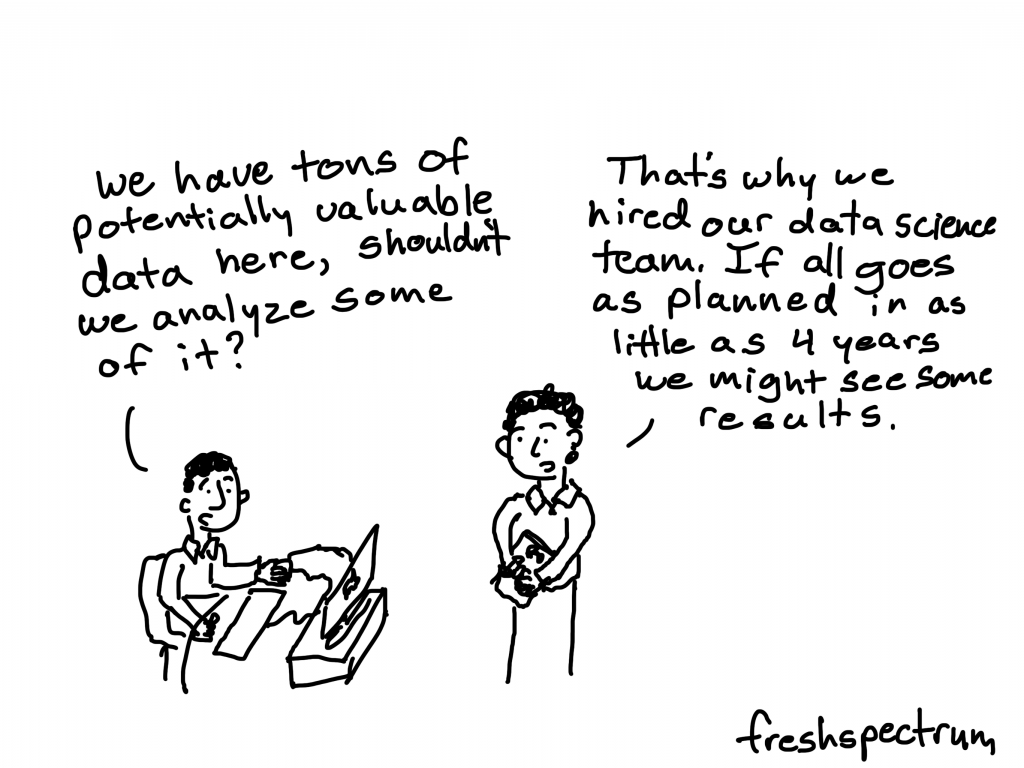
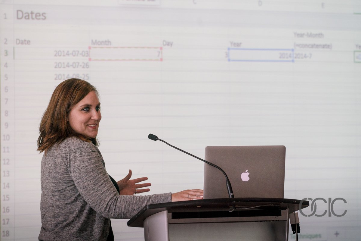
In the years that I have spent working as a UX designer and visual data scientist I have noticed something peculiar. We are faced with an overwhelming abundance of data and evidence. And our response is usually to develop something technical and complex (AI/Machine Learning/Blockchain) in an effort to make the complex digestible.
But while inventors work to develop the modern equivalents of sextants and compasses, much of the evidence remains accessible but untapped.
We don’t need the expensive tools to navigate our way through the modern world. We just need the discipline to see the evidence, understand our origin, imagine our destination, and plot our course.
This is the role of the evaluator.
To leverage evidence and expertise in order to help our society navigate out of the weeds and toward a better future.


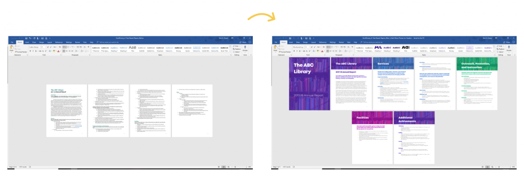
 (@annkemery)
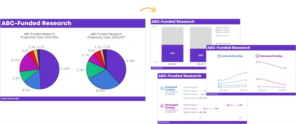