• Skip to main content
  • Skip to footer
  • Home

The May 13 Group

the next day for evaluation

  • Get Involved
  • Our Work
  • About Us
You are here: Home / Archives for allblogs / depictdatastudio

depictdatastudio

Dec 04 2023

How to Bring Your Technical Tables to Life

Just because I’m pro-graph, I’m not anti-table.

Technical tables have so much value, especially as visual appendices for reports.

In this blog post, you’ll get ideas for bringing your technical tables to life.

Before

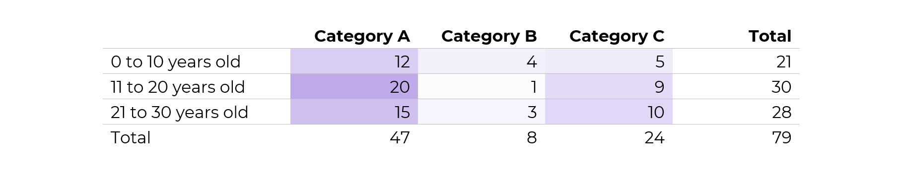
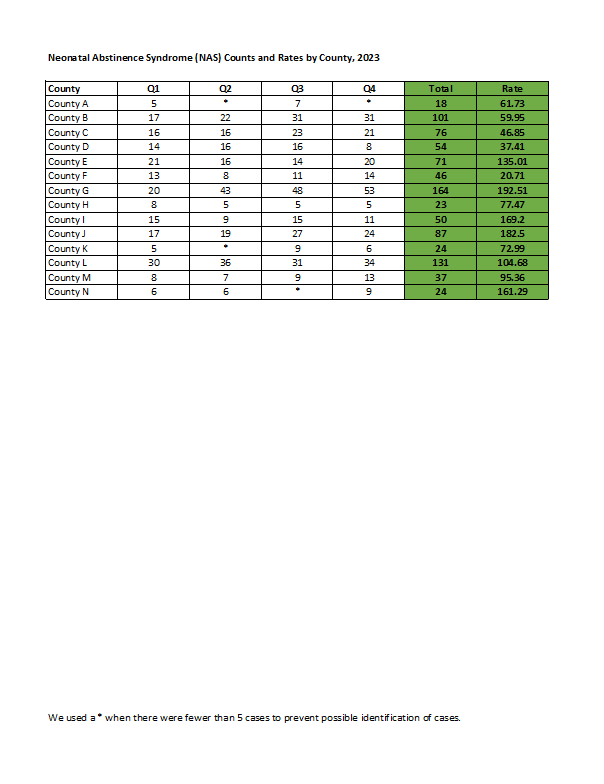
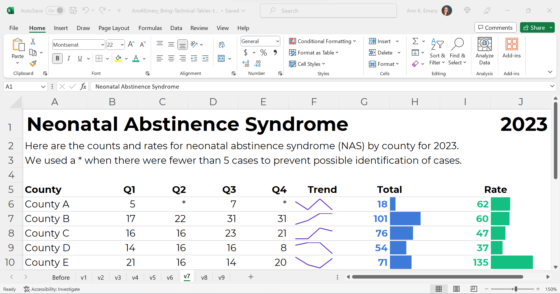
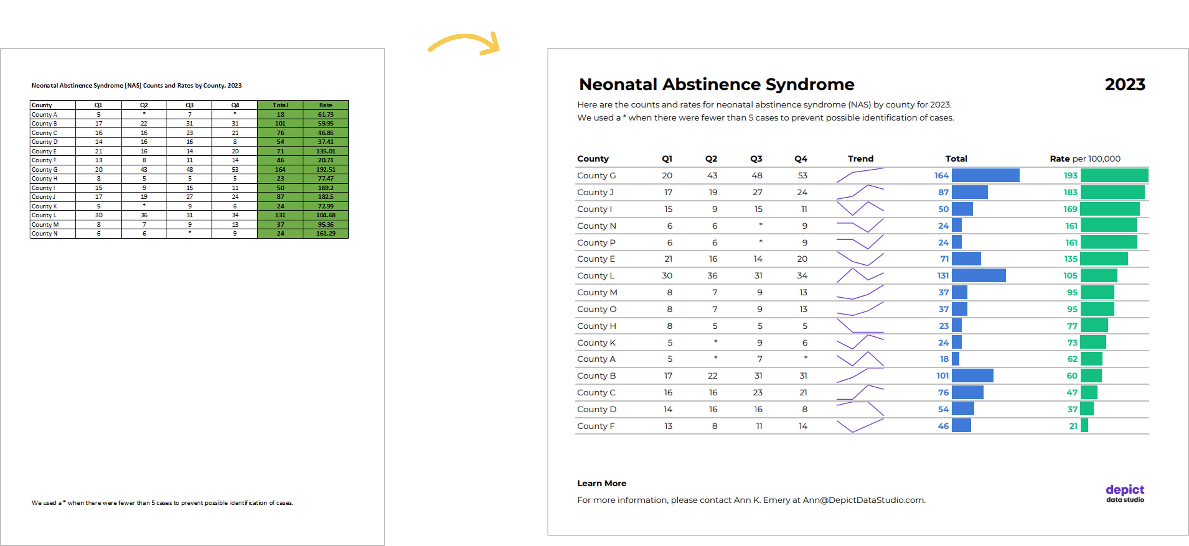
Here’s what the “before” version of some technical tables looked like.

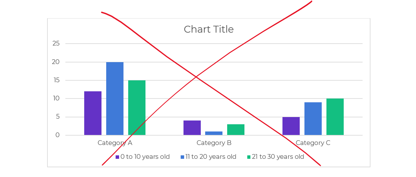
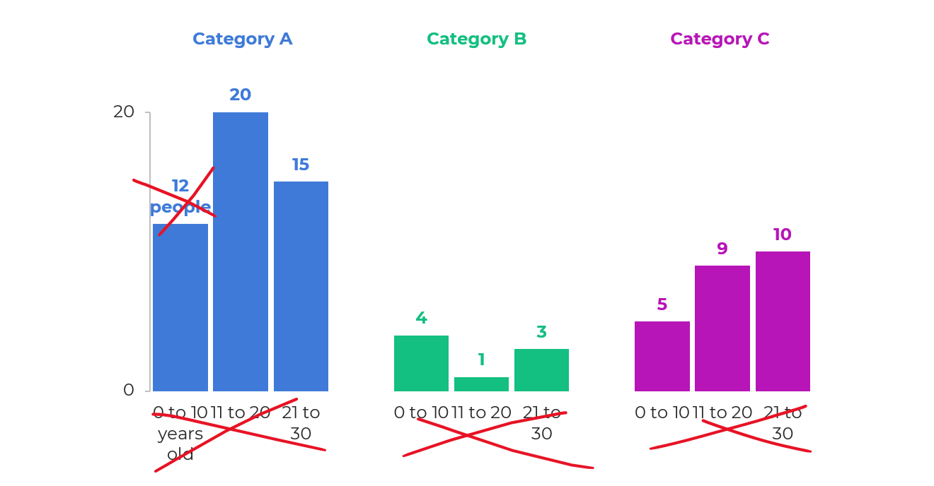
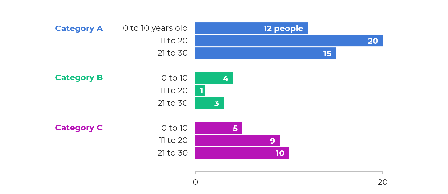
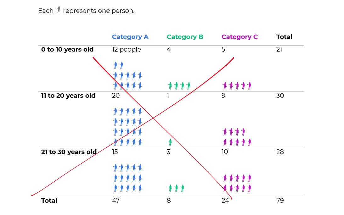
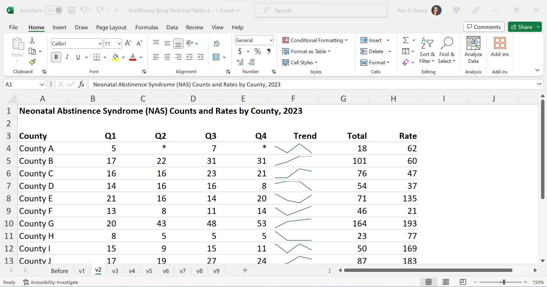
These are made-up numbers, but you get the idea.

The public health staff wanted to look at quarterly numbers, the total annual number, and the rate (the number of cases per 100,000 live births).

Even if you’re not measuring neonatal abstinence syndrome, I bet there are numbers that you track each quarter. You might even want to look at the total annual number, too. Get some inspiration from this blog post, and then adapt the ideas to your own workplace.

Re-Created in Excel

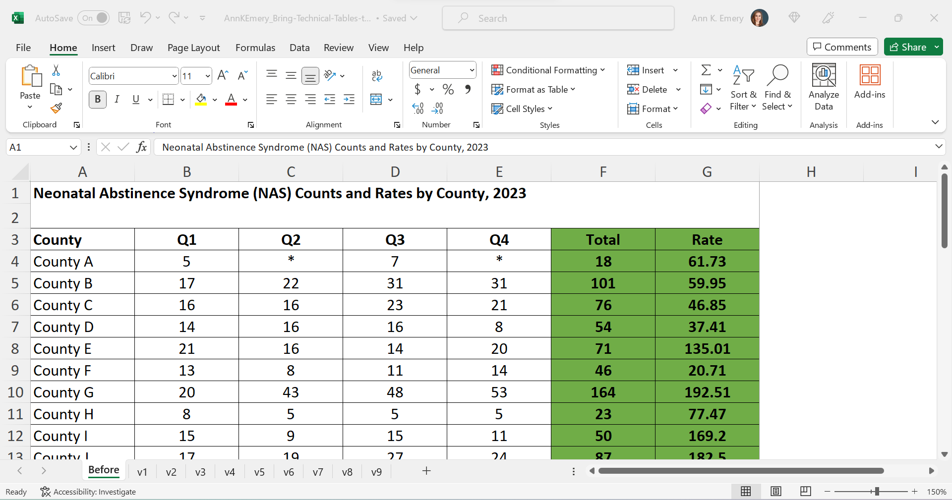
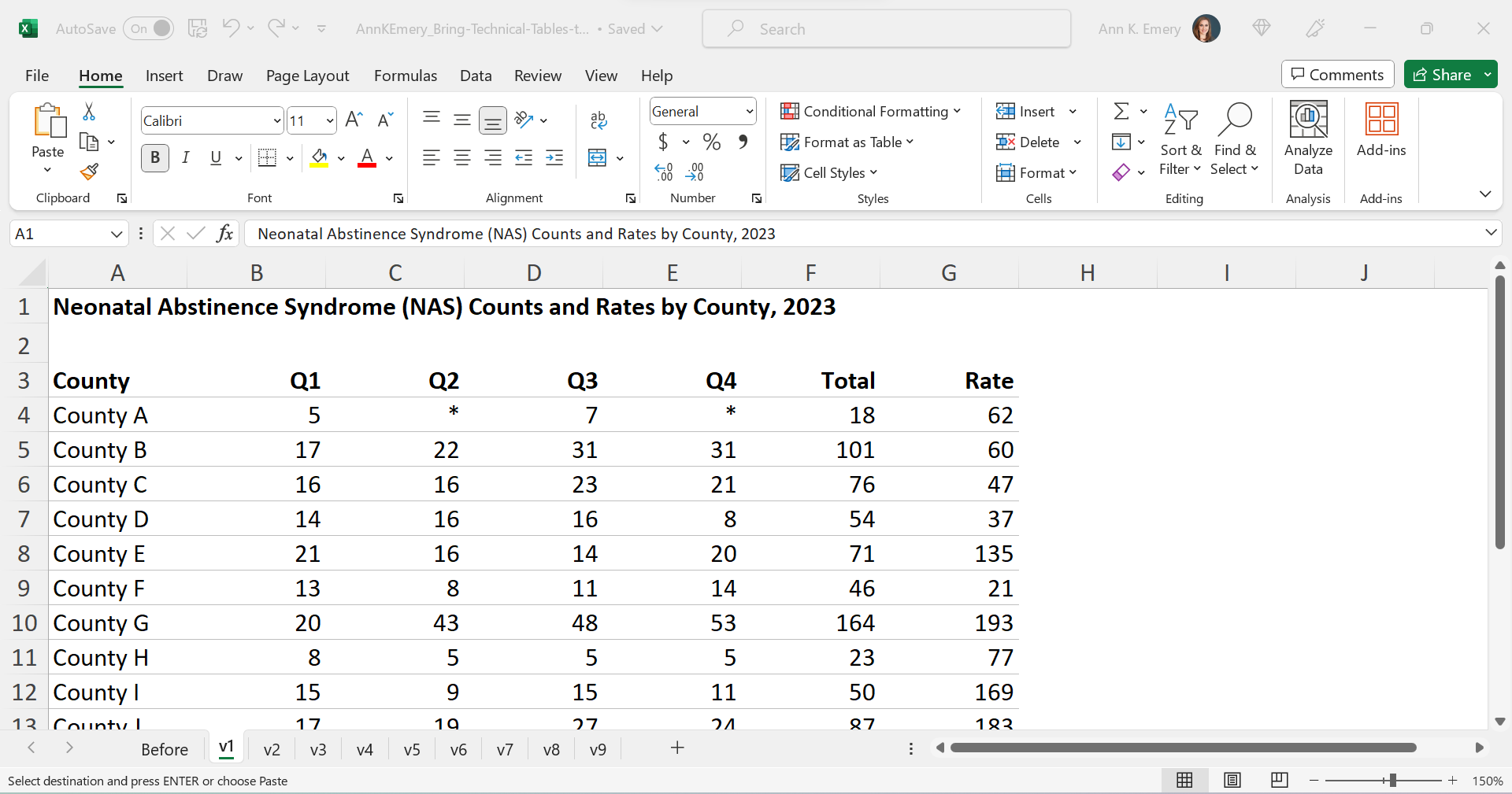
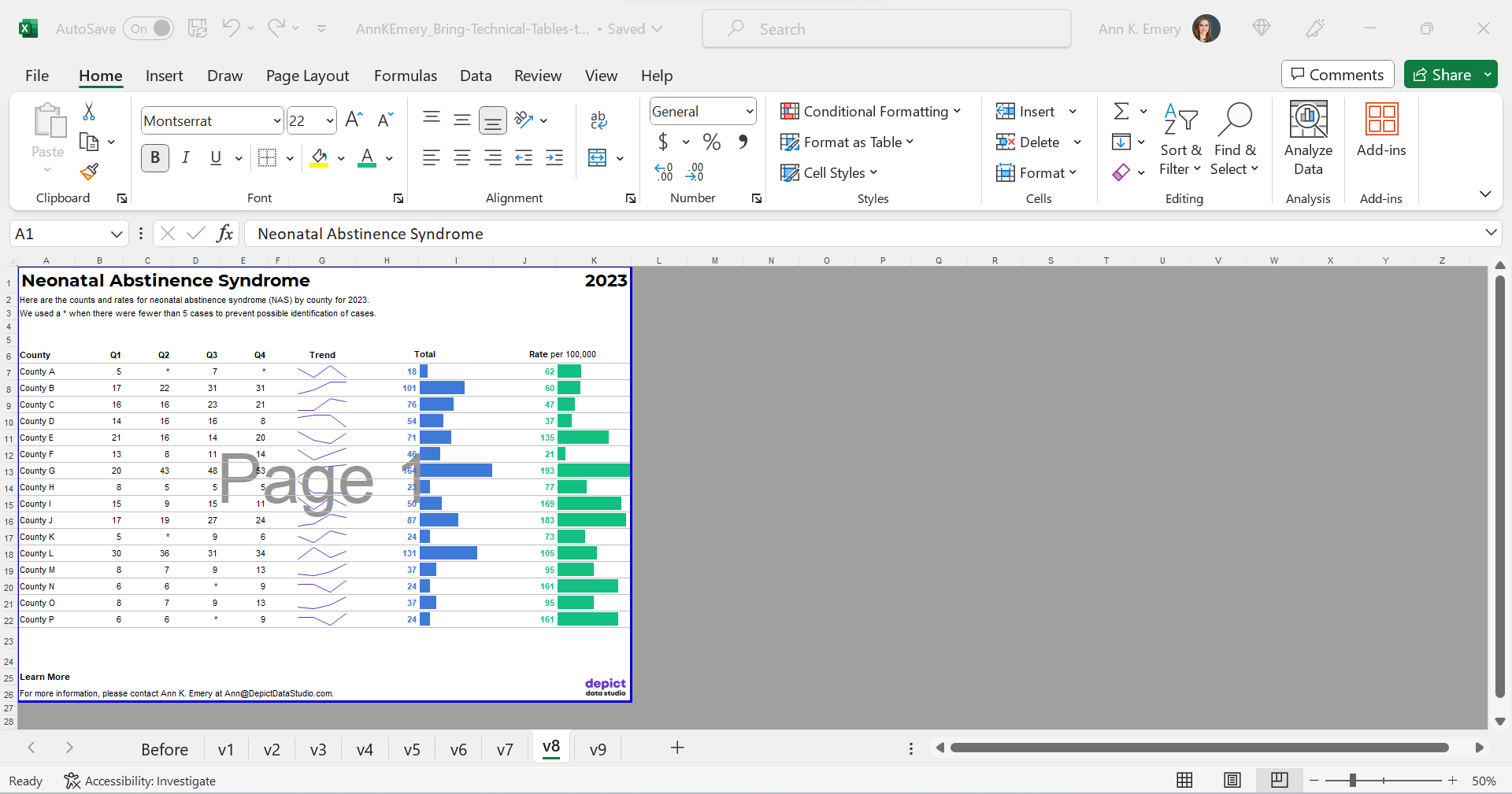
First, I re-made their table in good ol’ Excel.

The finished product will be a PDF, but the most efficient way to bring technical tables to life is to keep the numbers inside Excel the entire time. We’re not going to transfer anything to Word.

Declutter

Let’s tackle the easy edits, such as:

  • removing all the borders;
  • adding back just the gray horizontal borders;
  • removing the background fill; and
  • left-aligning the text and right-aligning the numbers.

Add Trendlines

We’ll bring the quarterly trends to life with sparklines.
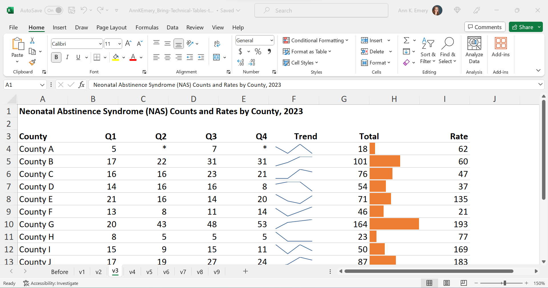
Add Bars

We’ll bring the annual totals to life with data bars:

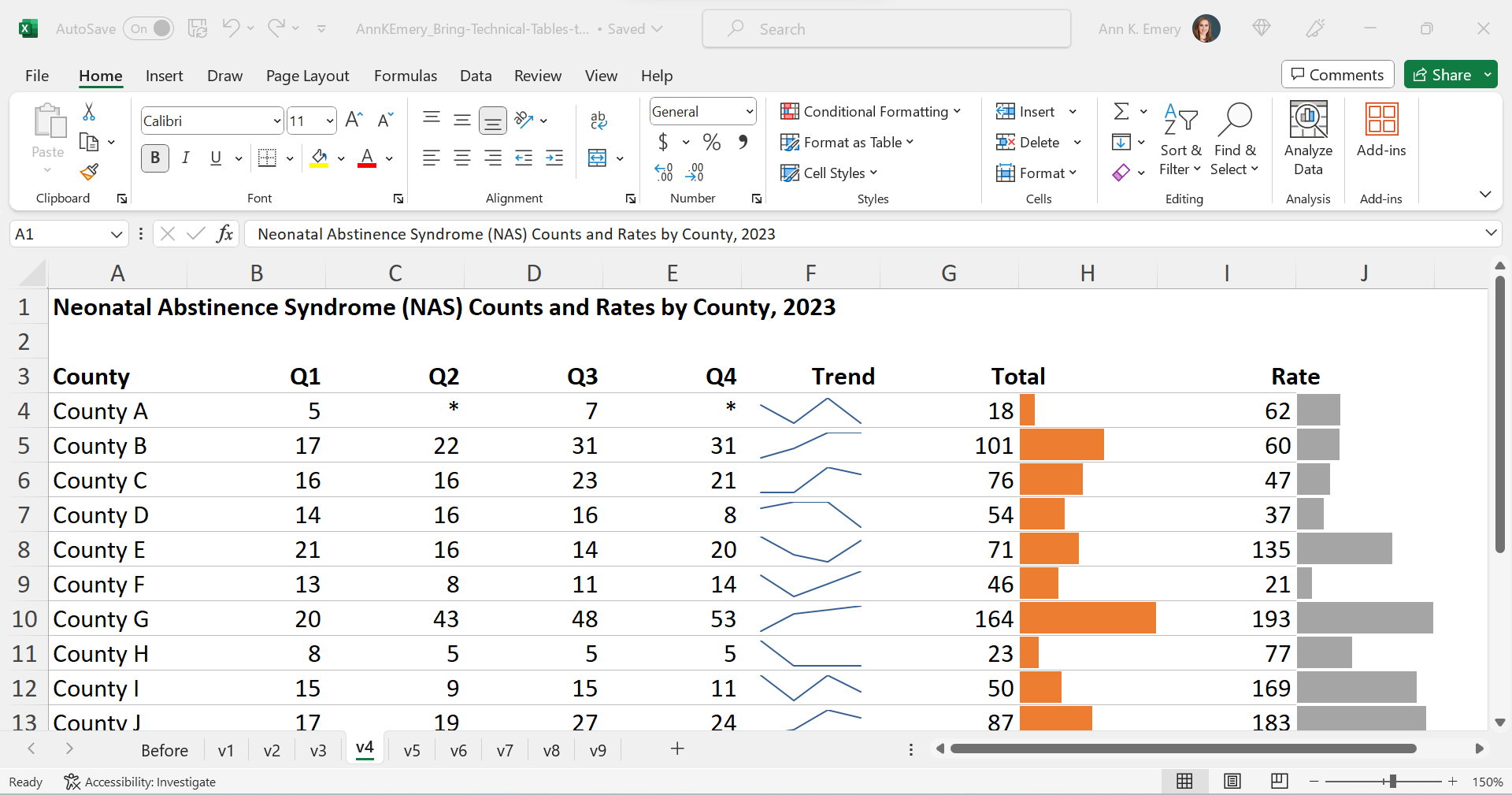
We’ll bring the rates to life with data bars, too:

Brand Colors & Brand Fonts

Time to format!

We’ll apply brand colors and brand fonts:

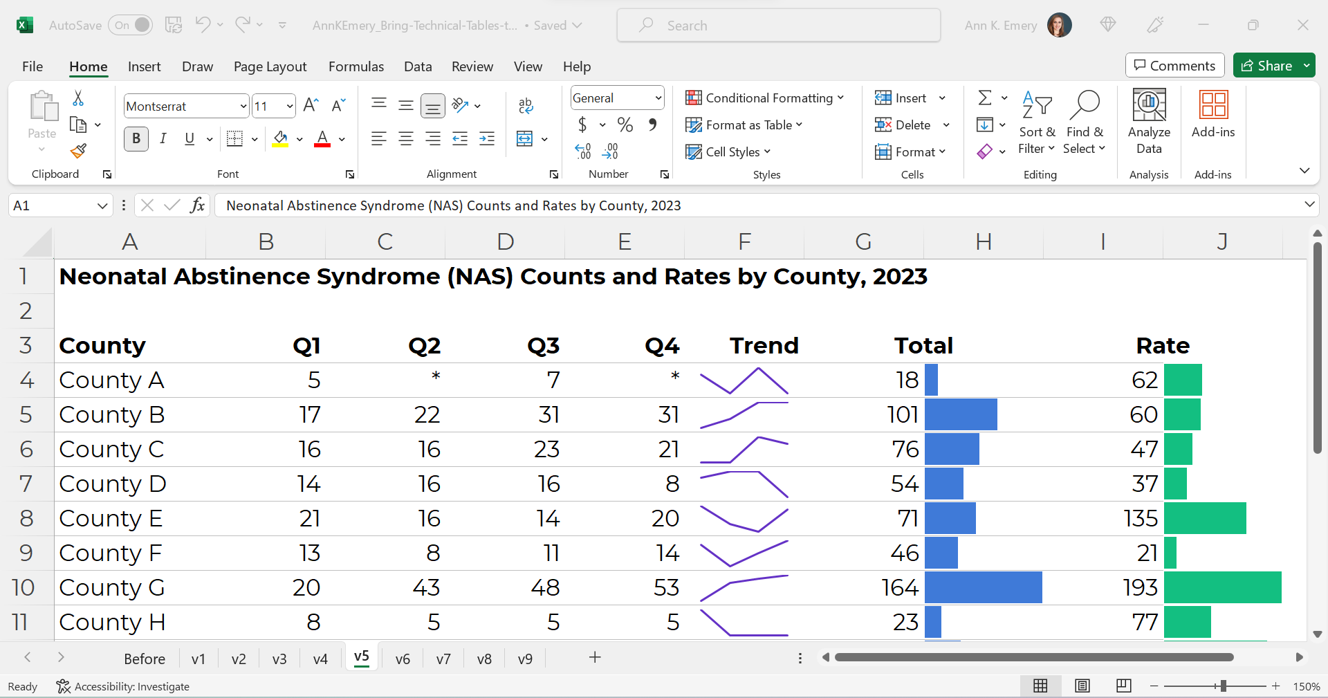
We’ll color-code the text to match the bars.

(Sometimes the table’s columns get so narrow that it’s tricky to tell which number corresponds to which bar. That’s where color-coding comes to the rescue.)

As a general rule of thumb, colored font should be bold so that it passes 508/ADA color contrast guidelines.

Text Hierarchy & Intro Sentences

A text hierarchy means the title should be largest, boldest, and darkest so that it’s easiest to spot. (Followed by H1s and H2s if we had them.) We’re developing a hierarchy of information so our readers can stay organized.

As a general rule of thumb, I make sure headings are twice as big as body font. The body font is size 11, so this title is size 22 and bold.

We’ll also add intro sentences, and move that footnote info about the asterisks to the top. (People need to read that sentence before the table, not after.)

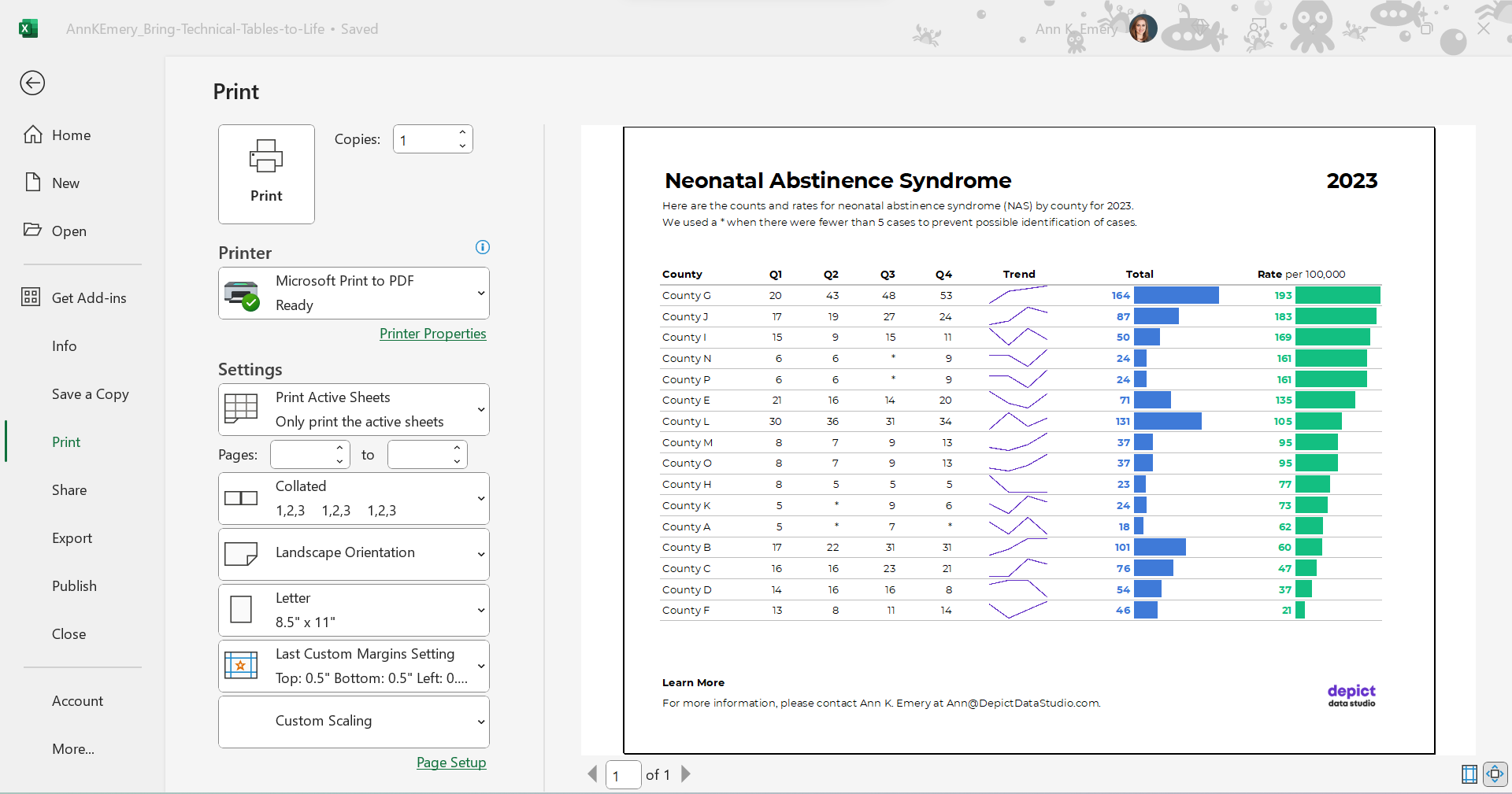
PDF- and Printer-Friendly

We’ve kept everything in Excel — that’s the only way to add the spark lines and data bars, and pasting tables into Word is a waste of time — but the final version will be shared with others as a PDF.

In the real version of this project, the PDF was about 15 pages long. There were various tabulations on various topics, not just neonatal abstinence syndrome.

We’ll need to:

  • set the Print Area;
  • adjust the Page Layout (portrait to landscape for easier on-screen reading);
  • adjust the margins (0.5 to 1 inches is sufficient);
  • add contact info and a logo so people can get in touch with questions; and
  • adjust the column widths and row heights so everything fits juuust right.

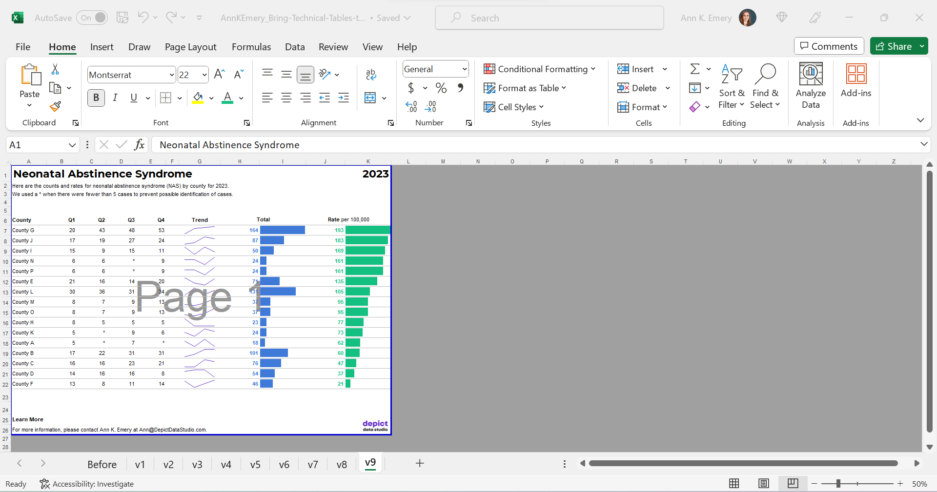
Optional: Sort by Rates, Not Alphabetically

Finally, we might choose to sort the table by the most important column (rates, in this example) instead of alphabetically by county name.

I’m usually a fan of sorting. But I’m on the fence here. I also see the value in the leaving the counties alphabetized so readers can search for their own county. Hmm.

The Final Version

The visuals help us spot the patterns (thanks, Picture Superiority Effect).

The branding will help us look more professional to outside audiences (so we don’t look Frankensteined — when all our colleagues use different colors and fonts, and we put everything together in one doc, and it’s a hot mess).

The PDF’d appendices can be merged with the PDF’d report (thanks, Adobe Acrobat).

The Before-After Transformation

Once you’ve got intermediate/advanced Excel vizardry skills, the whole process will take less than an hour.

Really, this should take you less than 15 minutes!

If not, you’ll simply need to brush up on your Excel skills.

Dataviz is supposed to be fast and easy.

Bonus: Download the Materials

Want to explore my spreadsheet? Download my Excel file and adapt it for your own project.

Written by cplysy · Categorized: depictdatastudio

Nov 06 2023

When Graphs Have Multiple Takeaway Messages

Sometimes our graphs have a single, overarching takeaway message.

Maybe the numbers simply went up over time. Or down.

Other times, it’s more complicated.

Here’s how to explain multiple takeaway messages in presentations: with multiple slides, one per takeaway message.

Before: Everything Smushed on One Slide

Here’s what I typically see: lots of possible takeaway messages shoved into a single graph on a single slide.

The presenter says something like this:

“Next, let’s talk about gonorrhea diagnoses in our state. We’re looking at the number of diagnoses per 100,000 people. We’re also looking at age ranges. This is the person’s age when they were diagnosed with gonorrhea. We’ve got five years’ worth of data: from 2018 through 2022. Let’s look at a few key findings. Gonorrhea diagnoses were highest for people in their early twenties. In 2020, for example, there were 735 gonorrhea diagnoses per 100,000 people ages 20-24 in our state. Gonorrhea was lowest for ages 40-49. In 2022, for example, there were 88 diagnoses per 100,000 people ages 40-49 in our state. Here’s another pattern we found: Gonorrhea diagnoses generally went up from 2018 through 2020. For the three younger age groups, at least. And, gonorrhea diagnoses went down from 2021 to 2022 for all age groups.”

And while you’re talking through allllllll those numbers and age ranges and timeframes, the audience only sees this:

You see the problem, right??

The presenter is talking about one thing… but the audience is probably looking at something else.

That’s the very definition of Death by PowerPoint.

After: Describing One Takeaway Message at a Time with Multiple Slides

Instead, let’s use multiple slides!

We’re aiming for a single takeaway message per slide.

That way, what we say = what the audience sees.

There should be a perfect cohesion between sight and sound.

The presentation would look and sound like this:

“Next, let’s talk about gonorrhea diagnoses in our state. We’re looking at the number of diagnoses per 100,000 people.”

“We’re also looking at age ranges. This is the person’s age when they were diagnosed with gonorrhea.”

“We’ve got five years’ worth of data: from 2018 through 2022.”

“Here are the patterns at a glance. Next, let’s look at a few key findings.”

“Gonorrhea diagnoses were highest for people in their early twenties. In 2020, for example, there were 735 gonorrhea diagnoses per 100,000 people ages 20-24 in our state.”

“Gonorrhea was lowest for ages 40-49. In 2022, for example, there were 88 diagnoses per 100,000 people ages 40-49 in our state.”

“Here’s another pattern we found: Gonorrhea diagnoses generally went up from 2018 through 2020. For the three younger age groups, at least.”

“And, gonorrhea diagnoses went down from 2021 to 2022 for all age groups.”

Finally, you’d show the “full” graph again, pausing for questions and a discussion.

The Bottom Line: Use More Slides!!!

We’re not making the presentation longer. We’re speaking for the same amount of time as before.

We’re not rushing or slurring our words. We’re speaking at the same pace as before.

We’re not wasting paper or ink. These are the slides shown on screen during a presentation. If you want to print something, just print the “full” graph (which is slide 462 in the screenshot below).

We’re syncing our words and visuals.

We’re keeping our audience’s attention.

Because if they’re not even paying attention… How will they possibly understand, remember, and use the findings for decision making?!

Written by cplysy · Categorized: depictdatastudio

Oct 30 2023

How to Visualize Confidence Intervals in Presentation Slides

Do you need to share statistics in presentations?

Maybe you’re getting ready for a talk at a conference.

Or, maybe you’re sharing updates with coworkers in a staff meeting.

In this blog post, you’ll learn how to explain dense graphs one slide at a time, which makes it easier for our audience to follow along.

Before

Last summer, I was keynoting the National Birth Defects Prevention Network’s annual conference in Atlanta.

Here’s what one of the health department’s original graphs looked like.

We wanted to make a presentation-ready version.

If you work in public health, then you know that the tiny text and statistical terminology is pretty common in scientific graphs. (BUT IT DOESN’T HAVE TO BE!!!)

After

We don’t need a complete overhaul.

I made some very light edits to the existing graph:

  • Direct labels (instead of legends) ensure that the graph is “Big A” Accessible (a.k.a. 508/ADA compliant).
  • Horizontal text (instead of vertical text) is faster to read.
  • I removed the grid lines.
  • I enlarged the font (the body font is size 18, which is my bare-minimum font size for presentation slides).

Storyboarding for a Live Presentation

Now that we’ve tackled the quick edits, we’re ready to adjust the graph for a presentation.

We’ve already done the hardest part: Getting the “final” slide ready.

Now, with a few more minutes of planning time, we’ll create the “build-up” slides, like this:

What the Presentation Will Look & Sound Like

For statistical graphs, I often begin by explaining the axes.

I’d show the y-axis, and say, “Next, let’s talk about coarctation of the aorta. We’re going to look at the prevalence per 100,000 births.”

I’d click, move to the next slide, and say, “…and we’re looking at data from 2007 through 2019. The numbers vary a lot each year, so we’re looking at 5-year moving averages in this graph. The moving averages are going to help us focus on the bigger picture.”

“Here’s what we predicted would happen. You can see some slight variations over time, but we generally estimated that there would be 3.6 to 3.7 cases of coarctation of the aorta per 100,000 births.”

“Here’s what actually happened. There were slightly fewer cases of coarctation of the aorta than what we predicted. And the numbers are actually going down slightly over time.”

Finally, I’d click, move to the next slide, and say, “Here’s the confidence interval with a 95% band.”

The graph is explained piecemeal, RATHER THAN SHOWING EVERYTHING ALL AT ONCE.

If we show everything all at once, then my audience would be looking at one thing while I’m talking about something completely different. That’s Death by PowerPoint.

The Bottom Line

We don’t have to delete or dumb-down our statistical graphs.

We just have to explain them piecemeal.

It’s counterintuitive, but sometimes we need more slides — one slide per sentence or two of speaking points.

We’re not talking for longer, or running over time.

We’re not talking faster, or slurring our speech.

We’re simply clicking through our slides one at a time to match our speaking points.

A few more minutes of planning time on our end… to make sure our audience can follow our dense graphs. A necessary trade-off.

Learn More

Browse more examples of storyboarding in these blog posts.

You’ll also practice this technique inside Powerful Presentations.

Written by cplysy · Categorized: depictdatastudio

Oct 23 2023

How to Visualize Small n’s with Icon Arrays

I was recently working with an online course student to visualize data for her country’s government officials.

These aren’t her real categories or real numbers, but you get the idea.

Before: Reading Numbers

Her “before” version looked something like this:

She had small n’s — a unique situation!

My definition of a “small” number is less than 100 — an arbitrary cut-off point that I learned from a past supervisor, and I’ve stuck with for years.

Not only was the total under 100, but each of the cells was under 100, too.

After: Skimming Visuals

There are several ways to bring the table to life.

During a 1:1 consultation, we talked through a few ideas together.

Idea 1: Heat Table

This easy visual — made via Excel’s Conditional Formatting — would be a great addition to the appendix.

If you’re familiar with the 30-3-1 approach to reporting, then you know I put allllll the tables in the appendix.

In other words, I aim for zero or few tables within the body of the report. The report’s body should focus on key findings with graphs, not dilute the data with eeeeeeverything in a table.

Idea 2: Clustered Columns

This is Ann K. Emery’s least favorite chart of all time. I’ll never let any of my students use one of these bad graphs!!!!

It’s the default option — we simply highlight the summary table in Excel, and insert a chart — and we get this lazy chart.

There’s too much going on, so it doesn’t tell us anything.

The color-coding by category is off.

There’s a separate legend, which is an accessibility no-no.

Idea 3: Small Multiples Histograms

With a re-orientation and re-coloring, it’s easy to build small multiples histograms.

But, the vertical columns didn’t fit her portrait Word doc:

The the horizontal bars would be totally fine.

My only hesitation was that bar charts are… boring.

I’ll never let my students have only bar charts in their reports, slides, dashboards, or infographics. Our viewers deserve variety.

Plus, this was a unique small n situation. Let’s capitalize on that!

Idea 4: Icon Arrays

To bring the small n to life, we tried an icon array.

The student liked this option because:

  • It’s very, very, very fast to create — much faster than creating and formatting a chart.
  • It was similar to her original table — the same rows and columns.
  • Right away, she could see how much bigger Category A was than the other categories.

Yes, I realize the irony…

I just wrote a blog post asking you to humanize your data with realistic people icons, which would be a step above shapes like circles and squares.

We tried realistic people icons, too.

They look fine close-up.

But they simply didn’t fit. In other words, there would have to be fewer icons, and/or they’d have to be much larger, to even be legible.

They just look like chicken scratch, sigh.

Behind the Scenes

I’ve written and spoken about symbol fonts a million times.

Webdings, StateFace, and WeePeople are personal favorites.

Yep, these are simply Webdings n’s!

Never, ever add a bajillion individual circles to your Word doc or PowerPoint slide. What a waste of our own time. Just use symbol fonts.

Made Within Minutes

Can you type n’s into your table?

And change the font into Webdings?

Even if you’re the slowest typer in the world… I promise it won’t take long to type some n’s.

Then, simply adjust the font colors, so that you’re using one brand color per category.

Bonus: Download the Materials

Want to see the Excel file and Word doc used in the blog post? Download them here.

Written by cplysy · Categorized: depictdatastudio

Oct 09 2023

Use Icons to Visualize Data, Not Just Decorate

Something wonderful — and terrible — has started happening.

Researchers, evaluators, and scientists complete my online courses. Or they bring me in for private workshops.

And they start applying what they learned. GREAT!!!

But it’s a little off. OOPS.

This is entirely my fault. I’ve been recommending that we use icons for years now — but I haven’t been clear enough about how to use them, and how not to use them.

In this blog post, you’ll see 8 different types of icon use. The good, bad, and ugly.

(1) Multi-Color 1990s-Era Clip-Art: NOOOOOOOO

Let’s start with what not to do: clip-art.

Icons and clip-art are similar, but not identical.

Icons use one color, so they hold up well in grayscale printing, or when very small.

Clip-art uses several colors, so it doesn’t hold up well in grayscale printing, and it’s hard to see when it’s small.

For these obvious reasons — clip-art is outdated and hard to see — clip-art gets The Big Red X.

(2) Cheesy, Posed Stock Photography: NOOOOOOOO

Gosh, I hope this one’s obvious.

I love adding photographs to reports, slideshows, and infographics.

But not the cheesy, posed type, like this.

Another Big Red X.

(3) One-Color Icons to Replace Words: NOOOOOOOO

One-color icons are okay.

But icons can only accompany words, not replace words.

(4) Icons to Accompany Words: Yes!

Let’s start by adding words: males and females.

Then, we’ll turn those choppy phrases into full sentences to remove guesswork.

We’ll bold a few key words to make it more skimmable.

We’ll color-code the keywords to match the icons (blue keywords for blue icons).

Finally, we’ll color-code by category: blue for one group, and green for another. You’d obviously use your brand colors, not mine, but the technique is the same: one hue per category.

Even if you’re the slowest typer in the world, these bare-minimum edits should only take a minute.

(5) Icons to Categorize: Yes!

Next, let’s add some actual, ya know, graphs.

Bar charts are fine, but they’re super boring if that’s all we have.

These are binary variables — a.k.a. yes/no variables — so two-slice pies are perfectly fine.

(Here’s my list of pie chart guidelines if you’re not familiar with my stance on pies.)

This is where we can add icons to categorize.

You see the difference, right?

I’m not a fan of using icons on their own, like the previous examples. They feel overly-simplistic and dumbed-down. But I am a fan of using icons to accompany other graphs, and to aid with categorization, like this:

We’re not limited to pies for binary variables.

We could use pies, donuts, or square pies.

No matter the graph type, the icon usage is the same: They’re accompanying the graphs, and aid with categorization.

(6) Icons to Show Proportions: Yes!

We can also use icons as the visualization itself.

Collages of icons are called icon arrays. The square version is also known as a waffle chart.

For bonus points, we could add the male/female icons to aid with categorization, too.

You see the distinction, right? The primary icons (the collages of squares or circles) are used to visualize the data, not just decorate it.

(7) Overly-Simplistic Icons to Humanize: NOOOOOOOO

The only thing worse than one dumbed-down Gingerbread Person is a hundred of them.

NO MORE GINGERBREAD PEOPLE!!!

(8) Realistic Icons to Humanize: Yes!

I am a fan of using realistic icons to humanize the data.

You see the differences, right? We’re not using single icons just to decorate, like the first couple examples. We’re using icons to categorize and/or to show proportions.

And we’re not using dumbed-down Gingerbread People. We’re using realistic human silhouettes.

More Examples of Realistic Icons to Humanize

I want to normalize these realistic icons for you. Here are a couple examples from the wild:

  • The proportion of female chairs in board or CEO positions in German companies
  • COVID-19 won’t spread as easily when Oregon reaches herd immunity

Using Smaller Denominators

All icons — squares, circles, Gingerbread People, and realistic human icons — get tricky to read when they’re tiny.

In some projects, we can simplify our fractions.

I tried changing 42% of men to 42 of 100 men, and then to 21 of 50 men. That worked fine!

But when I tried changing 37% of women to 37 of 100 women, and then to 18.5 of 50 women… yuck. If our unit of analysis is people, we can’t talk about or visualize half a person. That’s confusing to our audiences.

So while I’d prefer to simplify the fraction, I can’t in this specific example.

Traditional and Storytelling Versions

Hopefully you’ve heard me talk about traditional vs. storytelling graphs before. If not, you can watch this video for a quick overview. Both versions are correct, but they’re correct for different types of audiences.

The Bottom Line

There are several different ways to use icons in data visualization, and some are better than others.

I don’t recommend clip-art (version 1) or cheesy stock photos (version 2).

I don’t recommend icons to replace words (version 3).

I don’t even recommend icons on their own (version 4).

Instead, at a bare minimum, we should be using icons to accompany other graphs and to categorize (version 5).

Better yet, I’d prefer that we use icons (like little squares or circles) to show proportions (version 6).

And when our unit of analysis is humans, I’d prefer that we use realistic human icons (version 8) and never the dumbed-down Gingerbread People (version 7).

Your Turn

Which version of icons are you currently using? Which one might you try in the future? Comment below with all your ideas! Bonus points for sharing links to your public-facing projects so we can learn from each other.

Written by cplysy · Categorized: depictdatastudio

  • « Go to Previous Page
  • Go to page 1
  • Interim pages omitted …
  • Go to page 11
  • Go to page 12
  • Go to page 13
  • Go to page 14
  • Go to page 15
  • Interim pages omitted …
  • Go to page 37
  • Go to Next Page »

Footer

Follow our Work

The easiest way to stay connected to our work is to join our newsletter. You’ll get updates on projects, learn about new events, and hear stories from those evaluators whom the field continues to actively exclude and erase.

Get Updates

Want to take further action or join a pod? Click here to learn more.

Copyright © 2026 · The May 13 Group · Log in

en English
af Afrikaanssq Shqipam አማርኛar العربيةhy Հայերենaz Azərbaycan dilieu Euskarabe Беларуская моваbn বাংলাbs Bosanskibg Българскиca Catalàceb Cebuanony Chichewazh-CN 简体中文zh-TW 繁體中文co Corsuhr Hrvatskics Čeština‎da Dansknl Nederlandsen Englisheo Esperantoet Eestitl Filipinofi Suomifr Françaisfy Fryskgl Galegoka ქართულიde Deutschel Ελληνικάgu ગુજરાતીht Kreyol ayisyenha Harshen Hausahaw Ōlelo Hawaiʻiiw עִבְרִיתhi हिन्दीhmn Hmonghu Magyaris Íslenskaig Igboid Bahasa Indonesiaga Gaeilgeit Italianoja 日本語jw Basa Jawakn ಕನ್ನಡkk Қазақ тіліkm ភាសាខ្មែរko 한국어ku كوردی‎ky Кыргызчаlo ພາສາລາວla Latinlv Latviešu valodalt Lietuvių kalbalb Lëtzebuergeschmk Македонски јазикmg Malagasyms Bahasa Melayuml മലയാളംmt Maltesemi Te Reo Māorimr मराठीmn Монголmy ဗမာစာne नेपालीno Norsk bokmålps پښتوfa فارسیpl Polskipt Portuguêspa ਪੰਜਾਬੀro Românăru Русскийsm Samoangd Gàidhligsr Српски језикst Sesothosn Shonasd سنڌيsi සිංහලsk Slovenčinasl Slovenščinaso Afsoomaalies Españolsu Basa Sundasw Kiswahilisv Svenskatg Тоҷикӣta தமிழ்te తెలుగుth ไทยtr Türkçeuk Українськаur اردوuz O‘zbekchavi Tiếng Việtcy Cymraegxh isiXhosayi יידישyo Yorùbázu Zulu