• Skip to main content
  • Skip to footer
  • Home

The May 13 Group

the next day for evaluation

  • Get Involved
  • Our Work
  • About Us
You are here: Home / Archives for allblogs / evalacademy

evalacademy

Aug 06 2024

Beyond Biases: Insights for Effective Evaluation Reporting

This article is rated as:

I just finished reading a book called Factfulness, by the late Hans Rosling, a Swedish physician and statistician who dedicated his life to promoting a more accurate and optimistic view of the world. In his book, he identifies ten common cognitive biases that distort our perception of reality and prevent us from seeing the progress and potential of humanity. He also offers practical tips on how to overcome these biases and adopt a fact-based mindset that can help us make better decisions and communicate more effectively. This was a pleasure-read book that I didn’t think had strong applications to evaluation, but by the time I finished, I couldn’t stop thinking about what these ideas meant for evaluation reporting.

As evaluators, we are constantly dealing with data, evidence, and complex problems that require critical thinking and sound judgment. We also encounter data and projects that can trigger our emotional reactions and cognitive shortcuts. I have always been interested in cognitive biases, of which there are countless versions, and how they cloud what we think is independent, objective decision-making. Rosling has a top ten, that he calls instincts, so let’s start with those and think about how we can apply the insights from Factfulness to evaluation practice.

Bias #1: The Gap Instinct

The gap instinct is the tendency to divide the world into two distinct and often conflicting groups, such as the rich and the poor, or us and them. This instinct can lead us to overlook similarities between groups and the diversity within them. It also leads us to exaggerate the differences and gaps between the two groups. Rosling suggests that we should look for the majority or the middle, rather than focusing on the extremes and the averages.

Application to evaluation: Have you ever used a Likert scale on a survey and dichotomized the responses in your reporting? For example, “75% agree and 25% disagree” or “92% were satisfied but 8% were dissatisfied”. The Gap Instinct suggests that this is possibly (or likely?) a misrepresentation, where, in reality, many of your respondents were probably somewhere in the middle, with significant overlap between the agree-ers and disagree-ers.

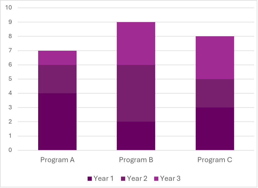
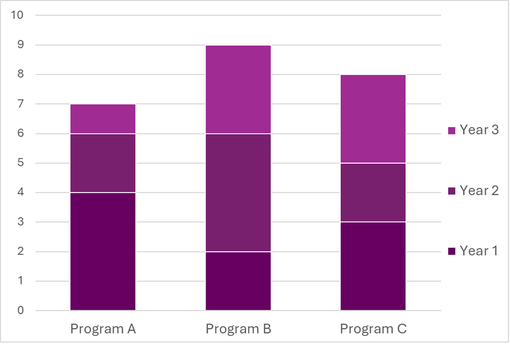
The Gap Instinct also applies when we compare two (or more) averages. For example, if you report “On average, Program A has 100 participants a year, and Program B has 200 participants a year” it can lead to misunderstanding and exaggeration of the differences in the two programs, when in reality, any given session of either program may have significant overlap in the number of attendees.

Accurate reporting is representative reporting, including ambivalence or indifference, and including ranges, medians or modes if they better represent reality.

Bias #2: The Negativity Instinct

The negativity instinct is the tendency to notice and remember the bad more than the good, and to assume that things are getting worse. This instinct can make us pessimistic, cynical, and fatalistic, and blind us to the positive changes and opportunities that are happening in the world. Rosling suggests that we should balance our negative impressions with positive facts and recognize that bad and good can coexist and that improvement is possible.

Application to evaluation: I recently wrote a report where my client said, “It reads as very critical of us.” I was surprised. That wasn’t my intent, nor did I think the data pointed to being overly critical. Sure, there was some room for change and improvement, but I didn’t think the key takeaway was criticism. After reading Factfulness, I now think this reaction was the Negativity Instinct in action. My client was focusing on the bad more than the good.

We’ve written before about how to present bad results. I do think it is our role to share negative and unexpected findings, but I think in the future I’ll be more cautious of this bias to focus on the negative. That doesn’t mean we need to hide bad results in overly flowery or optimistic language, but I also don’t want clients to focus only on the negative.

An overarching theme of Factfulness is that things can have room for improvement but also be improving at the same time or co-exist with good things.

Bias #3: The Straight Line Instinct

The straight line instinct is the tendency to assume that a trend will continue in a straight line, without considering the factors that might affect its direction, speed, or shape. This instinct can make us overconfident, complacent, or fearful, and lead us to make inaccurate predictions and projections. Rosling suggests that we should look for curves, bends, and levels, and remember that most trends are S-shaped, not linear. To illustrate, Rosling uses the example of global population forecasting:

Application to evaluation: I think there is a potential evaluation application anytime we present data over time. I know I often look at line chart trajectories and assume they will continue without pausing to reflect on a potential plateau or factors that may influence that trajectory, (e.g., seasonality).


My time working in quality improvement taught me that six points on a timeline indicate a non-random pattern. Simple rules of thumb like this can help in evaluation so that we are not over (or under) emphasizing trajectories.


Bias #4: The Fear Instinct

The fear instinct is the tendency to pay more attention to things that are scary, dangerous, or threatening, and to overestimate their probability and impact. This instinct can make us anxious, paranoid, and irrational, and prevent us from taking reasonable risks and opportunities. Rosling suggests that we should distinguish between risks and fears and calibrate our level of worry to the actual level of harm.

Application to evaluation: I think this applies to the decision making and action that we encourage our clients to take after an evaluation. I think we can encourage our clients to think about likelihood of and exposure to certain scenarios. Project management tools that rate risk levels and likelihood are probably helpful here.

Bias #5: The Size Instinct

The size instinct is the tendency to focus on the size or quantity of something, without considering its proportion, perspective, or relevance. This instinct can make us impressed, amazed, or alarmed, and lead us to misinterpret or misuse numbers and statistics. Rosling suggests that we should compare, divide, and contextualize, and use ratios, proportions, and comparisons to make sense of numbers.

Application to evaluation: Have you ever seen the recommendation to report a single number? It’s literally on the Quantitative Chart Chooser I have stuck to my wall. This approach to data visualization is purported to make your message memorable and sticky. Rosling, however, suggests it can be misleading without context.

If you report “90% of participants loved the program”, how does your audience know if it was 97% of last year? Or that 90% is actually only representing 10 participants that completed surveys, not the 73 total participants. Of course there are solutions, one being to ensure your data analysis itself isn’t misleading, like overweighting small sample sizes. Reporting a single big number may be appropriate in evaluation if your audience has all the necessary context, including the denominator or any key differences over time or between groups.

Another application to evaluation is when you report lists. Reporting a large list gives the impression that every item on the list is equally weighted, but in reality it’s likely that a smaller proportion have the greatest impact. For example, if you have a list of influencing factors on a specific outcome, it is likely that there are just a handful that have the greatest influence. In Factfulness, Rosling uses the example of pharmaceutical commercials that list off a dozen side effects, ranging from itchy feet to heart failure. By listing them all, the audience struggles to apply appropriate weight and meaning to each item on the list and can end up ignoring them all, leading to poor outcomes through inaction.

Bias #6: The Generalization Instinct

The generalization instinct is the tendency to categorize and label things, people, and places, and to assume that they are homogeneous, static, and typical. This instinct can make us stereotypical, prejudiced, and ignorant, and prevent us from seeing the diversity, complexity, and uniqueness of reality. Rosling suggests that we should question our categories, look for differences and changes, and beware of the majority illusion.

Application to evaluation: The key here is to look for differences. It is unlikely that your program participants are homogenous in all regards. What makes them different? And how can you understand those differences? Solutions may be about the demographic or characteristic questions you collect, or about how you stratify and analyze your data. Though some clients may not explicitly ask for a gender-based analysis or exploration into participant characteristics, these deeper dives in analysis may add valuable insights to your reporting.

Bias #7: The Destiny Instinct

The destiny instinct is the tendency to believe that things are predetermined by nature, culture, or history, and that they cannot or should not change. This instinct can make us fatalistic, resigned, or resistant, and stop us from recognizing the potential and agency of ourselves and others. Rosling suggests that we should keep track of gradual changes, acknowledge the power of human intervention, and celebrate the progress that has been made.

Application to evaluation: For me this comes into play when making recommendations. It’s likely I’ve omitted recommendations because they seem unlikely to change, perhaps governed, in my biased view, by nature, culture, or history. Even small changes can accumulate over time to big changes; perhaps, as evaluators, our recommendations don’t all have to be system-level change, or program restructuring change, but can leave the door open for small changes that slowly shift the way things are done.

Bias #8: The Single Perspective Instinct

The single perspective instinct is the tendency to adopt a single idea, discipline, or framework, and to apply it to everything, without considering other perspectives, dimensions, or angles. This instinct can make us dogmatic, narrow-minded, or biased, and limit our understanding and creativity. Rosling suggests that we should use multiple perspectives, tools, and methods, and seek out different viewpoints and sources of information.

Application to evaluation: For me, the application here is in evaluation methodology. This is the “if you have a hammer, everything is a nail” adage. I think it’s easy to get stuck in ruts as evaluators and rely on the trusted surveys, interviews and focus groups without stopping to think if other data collection strategies might be more effective. Here are a few suggestions: World Cafés,  Photovoice, Outcome Harvesting, or Arts-Based Data Collection.

Bias #9: The Blame Instinct

The blame instinct is the tendency to look for a scapegoat, a villain, or a hero, and to attribute the cause or solution of a problem to a single individual, group, or factor. This instinct can make us angry, judgmental, or naive, and distract us from the systemic and structural causes and solutions of complex problems. Rosling suggests that we should resist pointing fingers; look for causes, not villains; and look for systems, not heroes.

Application to evaluation: I have definitely fallen into this trap. I worked on a project that wasn’t implemented well and didn’t produce the outcomes it had aimed for. From my arms-length, contracted evaluator position it looked obvious to me that poor communication was a likely culprit. Sure, poor communication was a key factor, but the risk here is that I had found my thing-to-blame and stopped looking for other answers or solutions. Evaluations should be comprehensive and offer multiple perspectives.

Bias #10: The Urgency Instinct

The urgency instinct is the tendency to act quickly and impulsively, without taking the time to gather evidence, analyze data, or think critically. This instinct can make us stressed, panicked, or reckless, and lead us to make hasty and poor decisions. Rosling suggests that we should take a breath and insist on data.

Application to evaluation: The application to evaluation here may take the form of how we encourage our clients to take action with a level head, but I think there is another application. Rosling says you should always insist on data. As evaluators, we can ensure we have triangulated our data with appropriate perspectives and sample sizes to ensure that our clients are given a fulsome story on which to base their decisions.


It’s been on my to-do list for some time to write about biases in evaluation, but reading this book finally motivated me to get started. What are some biases that you keep top of mind? I’d love more direction on how evaluators can work against our biases in practice.

For more info on Rosling and his family’s work to present an accurate worldview check out https://www.gapminder.org/ and https://www.gapminder.org/dollar-street.

Written by cplysy · Categorized: evalacademy

Aug 06 2024

10 Tips for Making Your Evaluation Report More Accessible

This article is rated as:

“Accessible” content sounds like a great thing to aim for! But what does that actually mean? It can have different meanings, but “accessible” tends to refer to one of two ideas (or both at the same time):

  1. It might refer to content that is designed to be accessible for people with disabilities, where barriers have been removed so that everyone can access and understand it.

  2. It could also refer to content that is approachable to an audience, where the content is jargon-free and easy to follow.

Addressing both of these definitions of “accessible” in your written reports maximizes the reach of your work and ensures that everyone has equal access to the information in the report. It’s worth noting, however, that written reports are not the best and only way to present your findings. Depending on your audiences, there are a wide range of other creative formats you can use to share learnings, such as one-pagers, newsletters, infographics, videos, presentations, or even a podcast!

Even so, written reports are common in evaluation and may be the most suitable format for a specific project or audience. Some simple tips can help create a written report that is still engaging for all, including people with vision impairments or colour blindness, people who use assistive devices, and neurodivergent people. Accessible reports also help all readers by reducing eye strain, providing a clear structure, and communicating the message in multiple ways!


How do you make a report more accessible? Here are a few components to consider:

  • Colour: Are you using colour intentionally? Is colour the only way to make sense of something (like a legend)? 

  • Contrast: Does your text clearly stand out from its background?

  • Images: Would someone miss important content if they weren’t able to see the images and graphs?

  • Font: Would the text be comfortably legible if it were on a smaller screen or printed? 

  • Headings: Are there properly formatted headings that divide the content?

  • Logical, clear structure: Does your report flow logically from one idea to the next?

  • Language: Is your text written in language that is clear and jargon-free?

These are just some questions to get you thinking about what can impact accessibility. But don’t worry—the rest of the article will take you through some of my favourite tips for improving accessibility!


1. Colour

While colour can make documents brighter and more interesting, it may not be accessible to everyone reading your report. Using similar shades or certain colour combinations can make them challenging to distinguish, whether it’s due to colour blindness, visual impairment, computer screen quality, or greyscale printing.

Be thoughtful with the colour palette of your report. If working with a client, use their established brand colours whenever possible, as they are usually designed to offer cohesiveness and contrast. In addition, you may want to consider the meanings that certain colours have in different cultures (read more about Color Symbolism in Different Cultures Around the World). You can also use the Coblis Color Blindness Simulator to check how your colours might look to people with various colour vision deficiencies.

A general rule is to avoid relying solely on colour to communicate something. Aside from colour, you can use text, icons, labels, or positioning to help identify elements. While colour is often used in graphs for example (like in legends), it shouldn’t be the only way to read them. It’s a good idea to keep labels as close to their bars or lines as possible, so that colour legends aren’t necessary.

Another way to make charts and graphs more readable is to use contrasting colours. The next tip in this article goes into more detail about contrast, but in simple terms, use both light and dark colours to make them more distinguishable. Using white outlines (e.g., an outline of ¾ to 1.5pt weight) around any coloured objects can also help prevent neighbouring colours from “merging” if you aren’t able to switch colour palettes completely.

In the example below, I took a chart with very similar colours, applied white outlines, and moved the legend to match the bars. Even without abandoning these colours, the edited version is much easier to follow thanks to a few very simple changes.

 If you’re ever not sure about the accessibility of your colours on a page or chart, simply print it out in greyscale and you can see for yourself how easy or hard it is to read or follow!

2. Contrast

Have you ever struggled to read a website or document that uses white text on a yellow background, or black text on a dark blue background? That’s because there’s low contrast!

Certain colours are easier to detect on some background colours than others, because of the difference in brightness between the two colours (the contrast). The less contrast there is (the more similarly bright or dark the colours are), the more challenging it will be to read or understand the content. There are standard combinations we use because they make text “pop,” such as black or dark grey text on white or pale backgrounds and white or pale text on black or dark grey backgrounds.

Contrast is especially important with smaller text or objects. You might be able to use a less contrasting font colour for your bolded, 20pt heading, but you should stick to high contrasting colours in your body text or small graphics.

A general tip is to be mindful of how light and dark your text, objects, and backgrounds are. If you’re using a colour that’s lighter or closer to white, make sure to contrast it with a dark colour that’s closer to black. When you’re limited in colour choice (e.g., you’re using a client’s brand colours), try using other techniques to enhance the readability by using boxes around content, applying an outline in a higher contrasting colour to your text, or increasing the font size.

My favourite tool for this is this WebAIM Contrast Checker. You enter your foreground (text or object) colour and your background colour, and it calculates the contrast ratio. The tool suggests aiming for a ratio of 4.5:1 or even 7:1 for adequate contrast. Some Microsoft tools also guide you in choosing contrasting colours. Look for the icons below the colour sample when choosing text and highlight colours (see below images for examples).

3. Alt Text and Captions

Visual elements in your report, like images and charts, often contain crucial information; it’s important that everyone has access to it! In digital contexts, alternative text (or alt text), captions, and image descriptions therefore serve to describe visual content for people who cannot see it. A built-in alt text or similar feature should be available in most programs, including Word, PowerPoint, Canva, and Pages. 

Screen readers will announce that it’s an image, so your description doesn’t need to state this. Just aim to provide a concise summary of the image’s content so that someone could understand its purpose without seeing it—think Tweet length! For example, for the below image, the alt text might read: “A diagram showing a cycle of four stages. Clockwise starting at the top, the four stages are: assess, plan, implement, and evaluate. Evaluate is highlighted in purple.”

Images that serve a purely decorative purpose and do not contain any necessary content do not need to be described. You can choose the “Mark as Decorative” option, if available, or enter “Decorative” in the Alt Text description field. Any images, charts, or graphs that contain content that is not found anywhere in the text should have alt text. For visual elements where the content can also be found in the text, treat them as decorative images.

4. Font

The font style you choose can impact how readable your report is. Some types of fonts can be much more challenging to read, like cursive, all caps, narrow, and wide fonts. Avoid these fonts! On the other hand, certain fonts are recognized as being more accessible, such as Arial, Tahoma, Verdana, Aptos, and Calibri. In general, sans serif fonts are easier on the eyes, but familiar serif fonts (like Times New Roman) will work too.

To reduce eye strain and increase cohesiveness in your report, stick to just a few fonts. For example, you might choose one font for your body text and one font for your headings, or you might use a single font for everything. If you do use more than one font, make sure you are consistent in how you use them (i.e., don’t use your headings font to add emphasis in the middle of a section of body text).

 Read more about consistency in our article, Six Hacks for Renovating Your Evaluation Report: Consistency is Cool!

5.   Font Size

Consider your medium when choosing font sizes. For reports that will be read on computers, body text of 11pt or even 10pt font is acceptable, as readers can zoom in easily. To ensure your report can be read when printed out, aim for a font size of at least 12pt for body text. All headings and titles should be larger than your body text, increasing based on hierarchy. For example, if your body text is 12pt, you might use 14pt for Heading 4, 16pt for Heading 3, 18 pt for Heading 2, 20pt for Heading 1, and your title might be 24pt. Use consistent font sizes for the different types of text throughout your document (tip: use a style guide for this—check out our style guide template!).

These are general guidelines, but you know your audience best! You may want to go larger than the recommended body text size if you know that your readers are very likely to print out your report, are less familiar with the content or language, or may have visual impairments.

6. Text Effects

Whenever possible, it’s best to choose your words thoughtfully to add emphasis, as this is available to everyone. That said, if you do want another way to make something stand out visually, bolding is usually the most accessible text effect; italics can be hard to read, and underlining should be reserved for hyperlinks. If you choose to use text effects like italics or bolding, restrict yourself to only one or two. Using too many text effects can make your document look overwhelming and cluttered. It’s also important to be consistent in the meaning, so if you use italics to indicate definitions, then italics should only be used for definitions.  

A note on bold text: Some people use bolding to highlight main ideas in a paragraph, as I have done in this article. It creates focal points on the page that draw and direct a reader’s eyes (read our hack for making things pop). When used thoughtfully, this can help your audience, including people with cognitive or learning differences, navigate written text. Just make sure to be intentional about it and only bold the most important points! 

7. Headings

A common way to make quick headings is to put them on a separate line and bold them (or underline, or use a different font, etc.). When a screen reader or text-to-speech program reads these headings, however, they can’t necessarily identify that it’s a heading. It might read it out as part of the following sentence, making it hard to understand.

Did you know that Microsoft Word has built-in heading styles that you can customize however you’d like? This is a great way to provide structure and cohesiveness to reports and ensure that screen readers can detect and properly read out headings. It also allows people to quickly navigate to specific sections of your report.

To change the default heading styles in Microsoft Word, look for the Styles section under the Home ribbon. Right-click one of the heading styles (such as Heading, Heading 2, or Heading 3), and choose Modify. You can then edit the font, size, colour, and effects on your text to help it stand out.

8. Structure and Flow

Navigating a poorly structured report can make reading much harder and slower, for everyone! Help guide your audience through your ideas smoothly by incorporating some easy organization tips.

  • Transitions: Make sure your ideas flow clearly from one sentence to the next. It can help to use transition words and phrases like “in addition,” “similarly,” and “however” to create links between ideas.

  • Lists: Use bullet points or numbering for lists longer than three items.

  • Hyperlinks: If you have any hyperlinks, use descriptive text stating where the link leads to, rather than using an ambiguous phrase like “click here.”

  • Headings: Use headings and subheadings to logically organize different topics.

  • Paragraphs: Separate distinct ideas into different paragraphs.

  • Page breaks: Consider using page breaks when beginning a new section of the report, to avoid starting at the bottom of a page.

  • Sentences: Avoid long sentences with lots of commas. Instead, break them into shorter sentences that are easier to follow. Vary sentence length to reduce fatigue and keep readers engaged.

A good rule of thumb is that if it looks visually overwhelming or sounds long to you, it probably would to others, too!

Check out the following articles for more tips to improve the structure and flow of your writing:

9 Common Writing Mistakes in Evaluation

Practice Proximity – Six Hacks for Renovating Your Evaluation Report

9. Plain Language

Using plain language in reports benefits many types of readers! From English language learners to people with cognitive challenges to busy executives, writing in a simple, concise, and straightforward way helps people engage with your report.

Check out this article about plain language for some tips and tools for incorporating this technique into your writing!

10. Symbols and Punctuation

Using symbols, special characters, and punctuation correctly makes it easier for everyone to read your writing the way it was intended.

A common mistake is to create a bulleted list by typing symbols, like asterisks or dashes. Screen readers may or may not be designed to read these kinds of symbols out loud. As a result, they may read out the symbol itself, or they may not recognize that it is a list of items. Instead, use built-in bulleting or numbering features. 

Symbols can also create a burden for your readers. Limit unnecessary symbols or special characters, like asterisks (*), ampersands (&), number/pound signs (#), arrows (← ↑), equals signs (=), greater than or lesser than symbols (< >), and tildes (~). These symbols aren’t always read aloud by screen readers, and they make sentences harder to skim or read.

It’s best to use proper punctuation while keeping it simple. Stick to periods, commas, question marks, and colons. Use other punctuation like exclamation marks, semi colons, and ellipses sparingly. To sum up, save your audience time and effort by taking a few extra seconds to check your symbols, special characters, and punctuation marks.


It’s  a great idea to strive to make your report more accessible for everyone. There’s a lot to think about when it comes to accessibility, but even incorporating just one or two of these tips into your next report will make it more approachable and readable for your audience. You can also check the accessibility of your report by testing it out. Ask a colleague to review it for visuals, readability, and language, or try one of the following tools and techniques:

  • Test how your colours and images might look to people with various colour vision deficiencies with this Color Blindness Simulator

  • Apply a greyscale filter to images and charts to check if they are still easily understood

  • Use the WebAIM Contrast Checker to check for sufficient contrast

  • Try reading out your alt text to a colleague who isn’t looking at your image or chart. Can they understand it?

  • Hear your report for yourself by using a screen reader like VoiceOver (on Mac) or Word’s built-in screen reader, called Immersive Reader (found in the View tab)

  • Use a readability checker to check the complexity of your writing

  • Try out Word’s built-in Accessibility Assistant, which will check for colours and contrast, missing alt text, and headings


Which tips will you try out first in your next report? Let us know in the comments!


Learn more about designing reports with these templates and articles:

New Template: Style Guide Template! — Eval Academy

New Infographic: 10 tips for designing quality reports! — Eval Academy


Or read more about how to incorporate equity into all parts of an evaluation:

How can we incorporate diversity, equity and inclusion in evaluation — Eval Academy

Written by cplysy · Categorized: evalacademy

Aug 06 2024

New Template: Stratified Sampling Tool (Single Strata)

This article is rated as:


Eval Academy just released a new template, “Stratified Sampling Tool”!


Who’s it for?

The Stratified Sampling Tool is designed for researchers, evaluators, and data analysts who need to collect representative samples from large datasets. Anyone dealing with diverse populations and needing to ensure fair representation across different subgroups will find this tool invaluable.


What’s the purpose?

In the world of data analysis and evaluation, getting a truly representative sample can be challenging. This is where the Stratified Sampling Tool comes in handy.

The primary purpose of the Stratified Sampling Tool is to generate a stratified random sample across independent strata. But what does that mean in practice?

  • Representative Sampling: It helps you capture a representative cross-section of a population, ensuring that all subgroups are adequately represented in your final sample.

  • Flexibility: The tool supports both proportionate and disproportionate stratified sampling, allowing you to tailor your approach based on your specific needs.

  • Precision: By dividing the population into homogeneous subgroups, it increases the precision of your sample, leading to more accurate results.

  • Studying Underrepresented Groups: With disproportionate sampling, you can focus on underrepresented groups that might be overlooked in simple random sampling.

  • Efficiency: It’s especially useful when you have a large amount of data available and need a manageable, yet representative sample.

What is Stratified Sampling?

Stratified sampling is a sampling technique used to capture a representative cross-section of a population. Rather than randomly selecting individuals from a population as in random sampling, stratified sampling divides the sample or population of interest into distinct subgroups, or stratum, based on designated characteristics (e.g., gender, age range). With the population stratified, a random sample is taken from each of the stratum. This ensures that each subgroup is adequately represented in the final sample.


What’s included?

Our Stratified Sampling Tool includes 2 Excel files:

  • Stratified Sampling Tool for Single Strata – Sample Data Version (a non-editable example to show you how the tool is supposed to work)

  • Stratified Sampling Tool for Multiple Stratum – Data Input Version

The Stratified Sampling Tool file comes with an instructions tab for how to input your data and use the tool. Step-by-step instructions are included.


Learn more: related articles and links

You can learn more about sampling in evaluation on Eval Academy by checking out the following links:

  • Template: Sample Size Calculator

  • Sampling and Recruitment 101

  • Sampling bias: identifying and avoiding bias in data collection

Written by cplysy · Categorized: evalacademy

Aug 06 2024

Research and Evaluation – The Article

This article is rated as:

Early in my studies in health sciences, I was under the impression that research and evaluation were largely the same – after all, many of the job postings I saw were for ‘research and evaluation analysts’. To me, it seemed that evaluation was a sub-branch of research looking at one specific program or intervention, while research aimed to identify areas in need of programming and compare outcomes across programs to understand best practices for different demographic groups. As I progressed through my program, I came to learn that this was not the case!

In this article, I summarize some key differences between research and evaluation in terms of their purpose, methods, dissemination, and implications.

[If you’re pressed for time, bookmark this article to read later and check out our brief infographic on differences between research and evaluation instead!


Goals and Purpose

  1. Research

  • Purpose: The primary goal of research is to generate new knowledge, test theories, and contribute to the academic body of literature. Research seeks to answer specific questions or hypotheses.

  • Product: Research outcomes are usually published in academic journals and are intended to advance scientific understanding and theory.

  • Evaluation

    • Purpose: The main purpose of evaluation is to assess the effectiveness, efficiency, and impact of programs or interventions. Evaluation aims to inform decision-making, improve programs, and guide policy.

    • Product: Evaluation outcomes are often actionable recommendations for program improvement, detailed in reports for individuals involved in the program’s development and delivery, including program managers, funders, and policymakers.


    Flexibility and Adaptation

    1. Research

    • Flexibility: Research methods are generally less flexible, with a strong emphasis on maintaining methodological consistency and control to ensure validity and reliability, and to allow for replication by other researchers in the field.

    • Adaptation: Research designs are usually pre-specified and less likely to change once the study begins.


    1. Evaluation

    • Flexibility: Evaluation methods are more flexible and can be adapted as the evaluation progresses to better suit the needs of the program and those involved in its development and delivery.

    • Adaptation: Evaluators may adjust their approaches based on ongoing feedback and emerging findings, making the process more responsive and dynamic.


    Data Collection Methods

    1. Research

    • Design: Research design is often rigid and follows a predefined methodology to ensure replicability and validity. This might include controlled experiments, longitudinal studies, or cross-sectional surveys.

    • Sample Selection: Sampling strategies in research are usually aimed at generalizability, ensuring that findings can be extrapolated to a larger population. Researchers will often try to obtain as large of a sample as possible to justify extrapolation and minimize the influence of bias.


    1. Evaluation

    • Design: Evaluation design is more flexible and adaptive and is often tailored to the specific context and needs of the program being evaluated. Depending on the needs of the program, data may be collected through surveys, observations, interviews, or focus groups. There are different types of evaluation approaches, which include formative, summative, developmental, most significant change, and principles-focused evaluations, among others.

    • Sample Selection: Sampling in evaluation is typically purposive, focusing on individuals and groups directly involved in or affected by the program to gain relevant insights. Some examples of individuals you may want to collect data from for an evaluation may include individuals directly served by the program, members of the community for which a program serves, and staff or facilitators involved in the implementation of a program.


    Analytic Methods

    1. Research

    • Quantitative Analysis: Involves statistical methods to test hypotheses, identify patterns, and establish correlations or causations. The primary focus of quantitative analysis in research is to determine whether outcomes are statistically significant, or in other words, unlikely to be due to random chance or forms of bias. Common tools include SPSS, R, Stata and SAS, among others.

    • Qualitative Analysis: Uses methods like thematic analysis, grounded theory, or discourse analysis to interpret textual or visual data. The goal of qualitative analysis in research is to generate or identify common or impactful narratives, theories, or phenomena among the population from which participants were sampled. Software like NVivo or ATLAS.ti are often used to aid in the analytic process.

    • Multi- and Mixed-Methods Analysis: Researchers may use a combination of different quantitative and/or qualitative approaches to data collection and analysis, often to address a specific research question or aim.  


    1. Evaluation

    • Quantitative Analysis: Similar methods to research analyses may be used but are often applied to assess program outcomes, efficiency, and impact. The focus is on practical significance rather than just statistical significance; in other words, quantitative analysis in program evaluation aims to determine whether the program contributed to positive changes for those it serves, not whether those changes are statistically significant.

    • Qualitative Analysis: Involves methods like content analysis, case studies, and thematic analysis to provide actionable insights and recommendations.

    • Multi- and Mixed-Methods Analysis: The use of multiple methods is common in evaluation, where one or more quantitative and/or qualitative approaches to data collection and analysis are used to address various evaluation questions or aims. The use of multiple methods allows evaluators to conduct a comprehensive evaluation capturing both the practical impacts of a program as well as the perspectives and experiences of the individuals receiving or delivering the program.


    Reporting and Dissemination

    1. Research

    • Format: Research findings are typically reported in academic articles, dissertations, or conference presentations. The focus is on theoretical contributions, methodological rigor, and scholarly discourse. Often, these reports adhere to strict word limits, specific formatting rules, and limited creative freedom in visualizing data compared to evaluation reports.

    • Audience: The primary audience for research reports includes academics, scholars, and students in the relevant field.


    1. Evaluation

    • Format: Evaluation findings are presented in practical, accessible reports that include recommendations for program improvement. These reports often incorporate easily digestible graphs and infographics to enhance readers’ understanding. Compared to research reports, reporting findings from evaluations often provides more leniency regarding formatting which is often based on the depth of evaluation findings and the specific needs of the program. 

    • Audience: The audience for evaluation reports includes program managers, funders, policymakers, and other impacted community members. The focus is on actionable insights and practical recommendations. Since evaluation reports are intended to be read by audiences from a wider range of academic and practical backgrounds, it is often beneficial for evaluators to create a variety of deliverables (including comprehensive reports, executive summaries, infographics, slide decks, etc.) to tailor to the needs of particular audience members.


    Conclusion

    While both research and evaluation involve systematic data collection, analysis, and reporting, their goals, methods, and outcomes differ greatly. Research aims to generate new knowledge and advance theory, using rigid methodologies and targeting an academic audience. In contrast, evaluation focuses on assessing and improving programs, employing flexible and adaptive methods to provide practical recommendations for impacted and involved parties. Despite differences in goals, methods, and outcomes, both research and evaluation are crucial in driving change and improving health and social well-being for individuals and communities.


    Did we miss any key differences between research and evaluation? Let us know in the comments!

    Written by cplysy · Categorized: evalacademy

    Jun 27 2024

    New Template: Environmental Scan Template in Excel

    This article is rated as:


    Eval Academy just released a new template, “Environmental Scan Template in Excel”!


    Who’s it for?

    Whether you’re new to conducting environmental scans or an experienced evaluator, our Excel template is designed to streamline the process of completing an environmental scan and systematically tracking your findings. An environmental scan is a crucial tool for gathering and interpreting information about current social, economic, technological, and political conditions that could impact the future direction of your organization, project, program, or service. Simply download the template to track your environmental scan findings!


    What’s the purpose?

    The purpose of the template is to facilitate the systematic completion of an environmental scan and the organized tracking of findings. It aims to simplify the process of gathering, interpreting, and documenting information collected through your scan.


    What’s included?

    Our Excel template includes customizable column headings designed to facilitate the collection of information through an environmental scan. You’re encouraged to adapt these headings to align with the specific requirements of your project. Unnecessary columns can be deleted to streamline the data collection process, ensuring that only essential information is gathered for effective analysis and decision-making.


    Learn more: related articles and links

    You can learn more about environmental scans on Eval Academy through the following links:

    • How to complete an environmental scan: avoiding the rabbit holes

    • Environmental scan definition

    Written by cplysy · Categorized: evalacademy

    • « Go to Previous Page
    • Go to page 1
    • Go to page 2
    • Go to page 3
    • Go to page 4
    • Go to page 5
    • Go to page 6
    • Interim pages omitted …
    • Go to page 43
    • Go to Next Page »

    Footer

    Follow our Work

    The easiest way to stay connected to our work is to join our newsletter. You’ll get updates on projects, learn about new events, and hear stories from those evaluators whom the field continues to actively exclude and erase.

    Get Updates

    Want to take further action or join a pod? Click here to learn more.

    Copyright © 2026 · The May 13 Group · Log in

    en English
    af Afrikaanssq Shqipam አማርኛar العربيةhy Հայերենaz Azərbaycan dilieu Euskarabe Беларуская моваbn বাংলাbs Bosanskibg Българскиca Catalàceb Cebuanony Chichewazh-CN 简体中文zh-TW 繁體中文co Corsuhr Hrvatskics Čeština‎da Dansknl Nederlandsen Englisheo Esperantoet Eestitl Filipinofi Suomifr Françaisfy Fryskgl Galegoka ქართულიde Deutschel Ελληνικάgu ગુજરાતીht Kreyol ayisyenha Harshen Hausahaw Ōlelo Hawaiʻiiw עִבְרִיתhi हिन्दीhmn Hmonghu Magyaris Íslenskaig Igboid Bahasa Indonesiaga Gaeilgeit Italianoja 日本語jw Basa Jawakn ಕನ್ನಡkk Қазақ тіліkm ភាសាខ្មែរko 한국어ku كوردی‎ky Кыргызчаlo ພາສາລາວla Latinlv Latviešu valodalt Lietuvių kalbalb Lëtzebuergeschmk Македонски јазикmg Malagasyms Bahasa Melayuml മലയാളംmt Maltesemi Te Reo Māorimr मराठीmn Монголmy ဗမာစာne नेपालीno Norsk bokmålps پښتوfa فارسیpl Polskipt Portuguêspa ਪੰਜਾਬੀro Românăru Русскийsm Samoangd Gàidhligsr Српски језикst Sesothosn Shonasd سنڌيsi සිංහලsk Slovenčinasl Slovenščinaso Afsoomaalies Españolsu Basa Sundasw Kiswahilisv Svenskatg Тоҷикӣta தமிழ்te తెలుగుth ไทยtr Türkçeuk Українськаur اردوuz O‘zbekchavi Tiếng Việtcy Cymraegxh isiXhosayi יידישyo Yorùbázu Zulu