• Skip to main content
  • Skip to footer
  • Home

The May 13 Group

the next day for evaluation

  • Get Involved
  • Our Work
  • About Us
You are here: Home / Archives for allblogs / freshspectrum

freshspectrum

Jan 13 2022

Inform, Engage, Inspire, with data visualization.

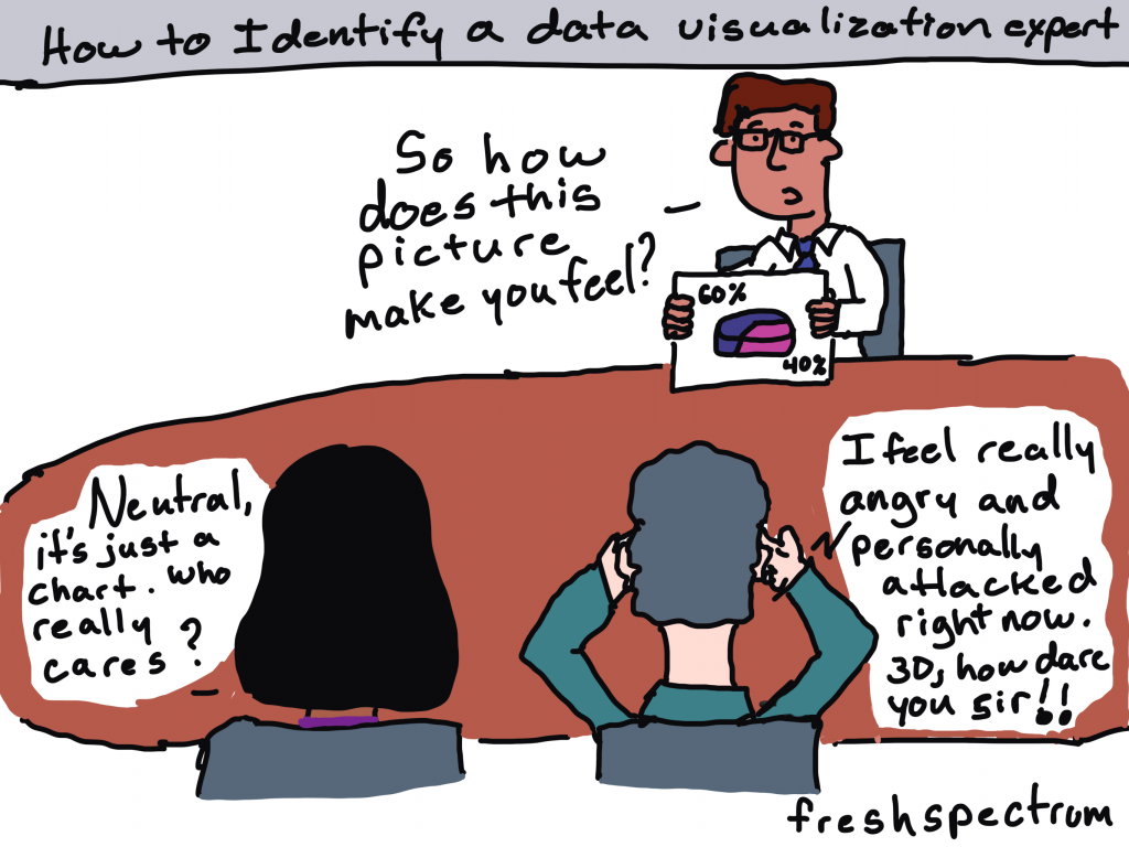
Are you the kind of person who likes to nitpick other people’s charts?

I’m really not.

I wasn’t there when they decided to use that chart. I don’t know what factored into their decision. As far as their intended audience, I don’t know if anybody actually cares what chart gets chosen. So when a conversation among data folk about a chart pops up on social media, I usually stay out of it (unless it’s funny, or intentionally misleading, or I’m super bored).

Cartoon by Chris Lysy of freshspectrum.com
"How to Identify a data visualization expert."
Person holding up a photo of a 3D pie chart. He asks, "so how does this picture make you feel?"
Two people at the table.
Person one says, "Neutral, it's just a chart. Who really cares?"
Person two says, "I feel really angry and personally attacked right now. 3D, how dare you sir!!"

But last week, right around the time I was posting my blog post on tailoring your reports based on interest level, there was one of those conversations about a chart published by the NY Times.

This week I want to talk about that chart and a few others, not to nitpick, but because they are good examples to highlight the differences between Engage style data visualizations and Inform style data visualizations.

Quick Recap: Inform, Engage, Inspire

Cartoon by Chris Lysy of Freshspectrum.com
Audience Interest Level Spectrum
High Interest, Medium Interest, Low Interest.  
The High Interest person says "Give me ALL the data."
The Medium Interest person says, "Okay, I'm listening, what you got?"
The Low interest person says, "I'm sorry. Did you say something?"

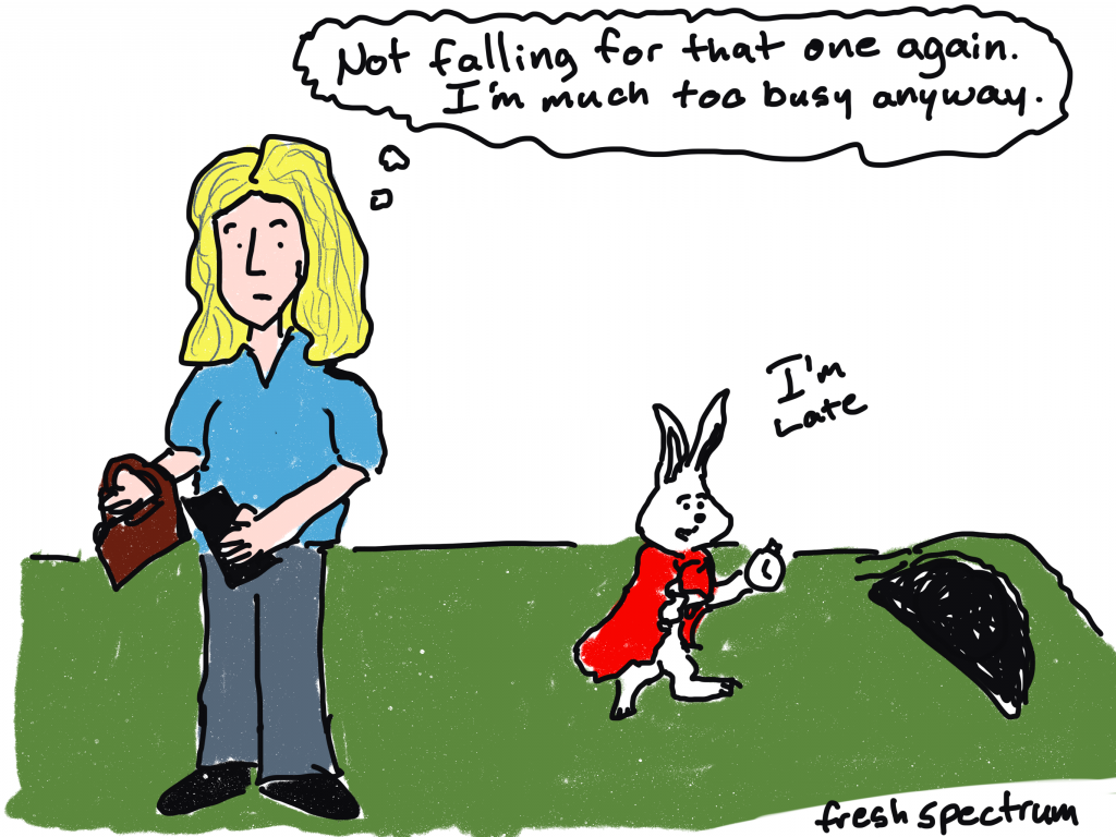
Your audiences’ interest levels in the data that you are sharing vary WIDELY (unless nobody cares, in which case they don’t vary at all).

Some audiences care a lot about the data you are trying to share. For those people, your goal should be to INFORM. When someone is already super engaged and looking for specific answers, they just need the data. Your job is to give them the data and get out of their way.

Some audiences care enough about the topic to be mildly interested in what you have to say. But you have to pique their curiosity to get them to stay with you. In these times your goal should be to ENGAGE.

Finally, some audiences are not even mildly interested. If we have any shot at getting them interested, we need to INSPIRE.

The Spiral Graph

So last week, at the top of a New York Times guest essay there was a spiral graph.

This was an out of the ordinary way to report time series data.

A spiral graph showing Covid-19 cases from January 2020 to January 2022.  Created by the NY Times for the article Here's when we expect Omicron to peak"
Chart from NYTimes -> “Here’s When We Expect Omicron to Peak”

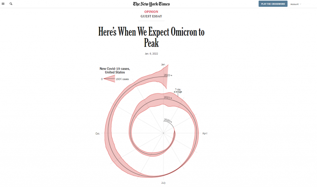
And when something is different in a major publication known for its high quality visualizations, data people talk. Right after it was published I started to see multiple social media conversations and a string of blog posts discussing the merits of this particular chart.

Maybe alluding to seasonality? What are your thoughts? https://t.co/5OSQWJOEMA

— Amanda Makulec MPH (@abmakulec) January 6, 2022

The Spiral Graph is an ENGAGE Chart

If we’re just talking straight up minimalist well designed data communication, the spiral graph is not it.

But let’s talk about context:

  • This chart is just a lead-in illustration to an Opinion piece.
  • It’s not even the only chart in the essay, there is another that plays more of an inform role.
  • The NY Times has created and shared MANY other Coronavirus visualizations over the last couple of years.

What the spiral graph does well is attempt to change the way we look at data we have come to know all too well.

In just about every usual chart we see in the modern digital world, the width of the chart is dependent on the device we are using to read the article. That width stays fixed, as days go and more data gets added, the chart stays the same width.

By spiraling the chart, you get to show something about the length of the pandemic that you wouldn’t be able to show in the standard line graph. You get to make the chart longer, without forcing a scroll by the reader. And ultimately, it’s strange enough to pique curiosity.

Cartoon by Chris Lysy of freshspectrum.com
Person presenting says, "So before we dive in, I thought I would start with a little story."
Someone asks, "Could you move to the side? You're blocking the chart."
Second someone asks, "Did you bring data tables with you?"

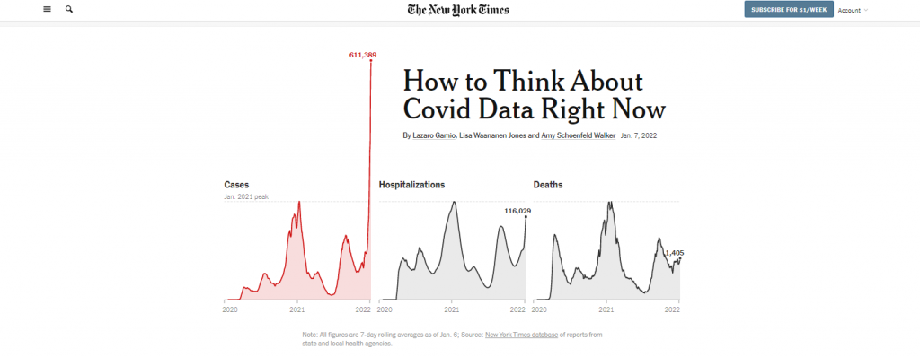
For an INFORM graph check out the NY Times Case Count page.

If you want an INFORM style graph head over to the NY Times case count page. This data presentation is phenomenal as a dashboard style information sharing device.

The goal with this kind of graphic is to give the data and get out of the way. I can’t tell you how many times in the last couple of years I have turned to the NY Times to get informed about the current state of the Coronavirus, but it’s been a lot.

New York Times Coronavirus in the US Case Count screen shot.
NY Times Case Count page as seen on January 13, 2022.

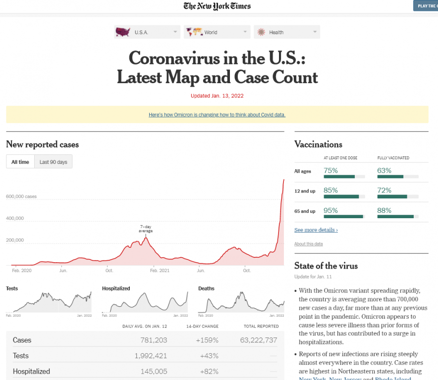
The simple line graph delivers the information on case waves almost effortlessly. Add in that it is interactive, provides analysis, and is followed up by collections of supporting graphs that provide other key metrics and break the data down by important categories like age and state.

But no matter how amazing the delivery, if you keep repeating the same graphic it gets stale. And considering this page lives in parallel to the far more short lived opinion essay, you can’t just use the same charts if your goal is entice readers to read on.

Another example of a NY Times ENGAGE graph.

Okay, so there are certainly ways to make an inform style graph a little more engaging without making it really odd.

Check out the leading graph in this piece that was put out on Friday January, 7. The Omicron case wave is so big in the US that it jumps out of the normal bounds of the graphic into the header space.

In a usual NY Times article, the article title would be centered and the chart would not start until after the by line. But in this case, they let the chart extend to the top of the page. And they actually shifted the whole title off to the right of center so that the line could fit.

Why could they do that? Well the Covid wave peaked so much that the chart was naturally unbalanced. So instead of just shifting everything down as normal, they let the wild peak break their formatting structure.

Screenshot of the top of the New York Times article, "How to Think about Covid data right now."
“How to Think About Covid Data Right Now”

Okay, what about an INSPIRE graph?

So we’ll stick with the NY Times because I found a good one.

To INSPIRE with data visualization, we usually have to tell some kind of story. And it needs to be a big story, a major idea or moment in time.

The following is a snapshot from an interactive visualization put out by the NY Times in May of 2020, just as the US reached a COVID death toll of 100,000. For this moment in time the Times was trying to connect the big number to the thing it represented…Human Lives.

So instead of a chart, we have lots of little people silhouettes, some annotated with names and little obituaries. The The page is a scroller, and it takes time to go through. As you scroll down the date changes and the number of deaths increase. Little bits of story also find their way into the visualization.

Screenshot from the New York Times interactive called "An Incalculable Loss"
“An Incalculable Loss” the NY Times interactive when the US Death Toll reached 100,000 at the end of May in 2020

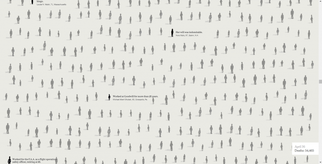
This isn’t the way you simply inform a data hungry audience of the numbers. It’s also not just a simple engaging graphic designed to pique interest that will lead a reader forward.

This is the kind of data visualization that tries to connect with human emotion. To convey a big idea and leave a lasting impression.

So what do you think?

Have you ever created a graph or other visualization just to pique interest?

See any examples from within your own domains of expertise that could fall in any of these three buckets?

If so, would love to hear about them. Write me a comment, I most certainly read the comments and try to respond to every single one.

Written by cplysy · Categorized: freshspectrum

Jan 06 2022

Who cares? And why engaging reports are not always important or even necessary.

So just the other day here in North Carolina, it was in the 70s. Short sleeve weather for sure.

Then the rains came and the temperature dropped into the 30s over the course of hours. Enough for the rain to turn into snow, but not cold enough for it to stick to the ground.

I care about the weather a lot because I have an energetic puppy who needs lots of exercise. So I walk a lot. And before I go for a walk I check the weather. Sometimes we need to walk in the rain, but if I can avoid that by delaying our regular walk by a half hour, that’s just what I’ll do.

freshspectrum cartoon by Chris Lysy. 
Woman holding an umbrella says to man looking at his phone.
"How long does it take to check the weather?"
Man responds,
"Sorry, I'm still making it through the methods section of today's weather report."

Same time, same weather system, snow fell in Virginia. Enough snow to jam up traffic. And the usual couple hour commute between Richmond and DC became a nightmare for all sorts of motorists (including a senator who was stuck on the road for over 24 hours).

I started my normal 2 hour drive to DC at 1pm yesterday. 19 hours later, I’m still not near the Capitol. My office is in touch with @VaDOT to see how we can help other Virginians in this situation. Please stay safe everyone. pic.twitter.com/Sz1b1hZJZ5

— Tim Kaine (@timkaine) January 4, 2022

Also going on right now, my mother-in-law is trying to get back to her home in MD after her holiday visit here in NC. She booked a flight the other day, but it got cancelled. Then her replacement flight was also cancelled.

When her flight was cancelled I could have driven her home. We have a four wheel drive vehicle and have done the trip countless times. Of course, that takes us right up I-95 past Richmond towards DC…

So why does this matter?

Because we use data in our daily lives ALL THE TIME. From tracking the weather for dog walks and picnics, to watching traffic for short commutes and long road trips, to following flight cancellation trends, and watching Omicron spread.

And with the highly relevant things that we care about A LOT, like the weather, traffic, and COVID waves we rarely desire fancy engaging stories, illustration filled reports, or complex graphs. We just want the damn data.

Not everything needs to be engaging.

Do they care… a lot, a little, or not yet? (A.K.A. the “give a shit” spectrum)

freshspectrum cartoon by Chris Lysy. 
Audience Interest Level
Scale High Interest, Medium Interest, Low Interest.
High Interest Woman "Give me ALL the data."
Medium Interest Man "Okay, I'm listening, what you got?"
Low Interest Woman, "I'm sorry. Did you say something?"

Audience is always important. As I’ve mentioned many times before on this blog, your report can’t serve all audiences.

But it’s also not just the audience type that matters. It’s also the audience’s interest level in the data that you have to share.

For each audience you are trying to serve, ask yourself “do they care?”

  • If an audience cares a lot about the data, they don’t need to be engaged. They are already engaged. They just need the data.
  • If an audience cares just a little about the data, which covers many types of stakeholders (usually including boards, politicians, and executive directors), then YES, you need to engage.
  • If the audience doesn’t really care about the data yet, they need to be inspired before they can even be engaged.

Inform, Engage, Inspire

After you ask the “who cares?” question for each of your audience types (or personas), it’s time to tailor your reporting approach.

Inform

freshspectrum cartoon by Chris Lysy. 
Two women in a car, the car is swerving over into the incoming lane of traffic.
Woman driving says..."I love this new smart dashboard. It's so engaging. Look, you can play Candy Crush!"

For the people who care a lot. Usually project staff and program administrators, your job is usually to get them the data they need to do their work as efficiently as possible. Then get out of their way. This is what I call the Inform step.

The inform step is where executive summaries and data dashboards live. Improving your reports in this area is all about good user experience design.

If you get fancy here, add a bunch of questions or extraneous data, your audience will get annoyed. This is where a well-meaning dashboard developer might fail their audience by trying too hard to engage an already-engaged audience.

Engage

freshspectrum cartoon by Chris Lysy. 
An older Alice from Alice in Wonderland thinking "Not falling for that one again. I'm much too busy anyway." 
As the white rabbit heads to the rabbit hole looking at his watch and saying, "I'm late."

For the people who are interested but are not engaged enough with the material to even know what questions to ask. Where the inform step was all about answers, the engage step is about questions. Your goal is to take a somewhat interested audience and turn them into an engaged audience.

Engaging reports leverage your audience’s partial interest while attempting to ramp up their curiosity. The goal is to get them to start asking questions in their own heads. This is where you’ll find reports like infographics, magazine style reports, and webinar presentations.

These types of reports are easier to develop effectively if you can take control of the narrative. That means leveraging your own expertise in finding what’s interesting and then telling the stories. There are exceptions, but this is usually NOT the time to use data dashboards.

Inspire

freshspectrum cartoon by Chris Lysy. 
Man says to woman, "So you don't find long wordy evaluation reports inspiring? That's just me?"

For every program or initiative there are all sorts of audiences on the fringe. Close enough that they might be able to hear you, but not enough for them to be that interested in what you have to say.

This audience might include social media followers, community members, and other people who might be more interested in what you have to say if they knew anything about what you were trying to accomplish.

The inspire step is about connecting your audiences with the bigger story. Think of this like the TED Talk stage, where you have a short time to pique interest but might be reaching an audience who has no clue who you are. So compared to the engage step, you’ll want to spend more time setting up the big story and less time attempting to engage your audience with the little stories.

Written by cplysy · Categorized: freshspectrum

Dec 31 2021

What you do is important.

freshspectrum cartoon by Chris Lysy

There is a lady sitting at a table drinking coffee. There is a logic model on the wall. The room is on fire.  She is saying, "This is fine."

This cartoon is a knockoff of the amazing cartoon (turned meme) by KC Green

I had a really hard year back in 2017.  

It was filled with the loss of close family which left a lingering mark on both my personal and professional lives. The couple years that followed saw my business falling apart and then a promising new job ending with a layoff. 

And by the end of 2019, the mix of depression, uncertainty, anxiety, and entrepreneurship had darkened my outlook on life and spiked my cynicism.

I shared my troubles with a mentor, who sent me a framed inside joke.  And stuck to the back of the frame, written in type, were these words…

“What you do is important.”

I know for many of you, 2021 was a shitty year. 

Undoubtedly, some of you have lost close family or friends. Our daily lives have been flipped upside down with a massive jolt of change. We see constant reminders of unjust and unfair systems still thriving in our contemporary society.

The hope and optimism surrounding the vaccines has soured a bit with every new variant. And then there is the significantly large anti-vax movement.

The beginning of the pandemic was hard, but this sustained social anxiety and trauma wears on the soul. 

freshspectrum cartoon by Chris Lysy.

Lady sitting at a desk.  There is a hammer on the desk next to a shattered web camera.

She says, "unfortunately I can't turn on my video for today's Zoom. My webcam just stopped working."

It’s okay…

  • if you haven’t accomplished what you wanted to accomplish this past year.
  • if you have no clue what your plan should be for next year.
  • if you don’t know who you’re supposed to be.
  • if you feel stuck.
  • if you feel lost.

Tomorrow is a new day.

And if tomorrow doesn’t work out, well, there will be another.

freshspectrum cartoon by Chris Lysy

Lady sitting on couch staring ahead with an overwhelmed look.

I never cease to be amazed that there are people who read this blog.  People who appreciate the cartoons that I draw.  People who share what I write with their friends and colleagues.

And when I start to feel lost, I think about all of you.

Because you care.

It’s why you’re here. It’s why you can appreciate and share my cartoons.

Most of your audiences are not demanding cartoons from your presentations or better charts from your reports. They’re not looking to you to provide them with more engagement. 

But it’s not enough for you to just present or report. To just show up at 9 and then leave at 5 (metaphorically speaking). You believe in your work, and you want your audience to be engaged.

You want your work to have an impact.  To change the way your audience thinks or acts based on your collected evidence.

So you put in the work to try to make that happen.

freshspectrum cartoon by Chris Lysy

Guy on phone says... 
"So there is no style guide, format requirements, content requests, or other additional guidance.  Just keep it short?"

"One quick follow-up, does anyone actually give a shit?"

Evidence is insufficient.

It’s not enough to just know something to be true if you can’t convince anyone else to hear what you say or trust what you share. Especially if the evidence you are sharing is counter to your audience’s beliefs. Just think about all the ways you can finish this sentence.

Despite ample evidence to the contrary…

  • many republican politicians continue to claim that the 2020 election was stolen. 
  • global warming is seen by large sectors of the population as not a man-made problem.
  • many Americans hold onto the fictional historical perspectives they learned in grade school.
  • some communities hit hard by COVID-19 continue to downplay the virus and refuse even the most basic precautions.
The back of a picture frame.  In type is reads, "What you do is important."

While evidence is insufficient, it is indeed necessary.

We can’t change this world for the better without it.  We need you to engage, collect, analyze, and support our communities, programs, and changemakers.

Our role as data people and evaluators can sometimes be thankless, lonely, and frustrating.  Our best work is not always celebrated.  Our audiences can be hard to engage.

But whatever happens in this new year. Don’t stop trying.

That’s the only way to fail completely.

I believe in you.

What you do is important.

Till next year,

Chris.

Written by cplysy · Categorized: freshspectrum

Dec 16 2021

Never Released 2020 Holiday Cartoons

I drew most of these cartoons in 2020 (one in 2019) but I’m not sure I ever shared. I certainly never created a blog post.

Honestly, last year around this time, I think I was just a little bit burnt out. And it shows in some of the cartoons.

Presents are Outputs

This is a cartoon I redrew in 2019 from an earlier iteration. Not sure it ever made it into a post.

Cartoon by Chris Lysy
"Before we open any gifts, remember, presents are just outputs. It's the outcomes that really matter."

Christmas Tree Chart

I believe this chart type may be a default in Excel.

Cartoon by Chris Lysy
"So I created this chart using a dual axis mix of a scatterplot and a line graph...The data is meaningless but it looks like a super cute Christmas tree, so I thought I would share."

Virtual Christmas

This cartoon is probably a good representation of my headspace last Christmas.

Cartoon by Chris Lysy
"Dear Santa, This year I encourage you to switch to a virtual Christmas. I know it won't be the same, but the numbers keep going up and since you are super old you must be in a high risk group. Stay safe so we can return to normal next Christmas. Send my love to Mrs. Clause and the elves. Love, M"

When PJs are Business Casual

I live in NC, we don’t have enough snow days.

Cartoon by Chris Lysy
"Every year I would look forward to our first snowy day. It was an excuse to just hang out at home in our PJs, not daring the roads to go into the office. But this year it doesn't feel quite the same."

Virtual Snow Day

I loved snow days as a kid in Maryland. And when everything was switching to virtual, the idea of snow not stopping school just sounded wrong.

Cartoon by Chris Lysy
"Dad, how many inches of snow does it take to shut down the internet? I want a snow day."

Want this year’s batch, including a few favorites from past years?

You can find them here: Evaluation Christmas Cartoons 2021 (my favorite is the elf one)

Written by cplysy · Categorized: freshspectrum

Dec 15 2021

How to convert Canva reports into Microsoft Word.

As my diydatadesign workshoppers know, Canva is one of my favorite visual reporting tools. It just makes the process of creating high quality visual reports much faster and easier.

Cartoon by Chris Lysy.
"Check out this visual report template I created for our next report."
"Wow, looks amazing. But I just learned it needs to be delivered in MS Word. Can you build this there?"

But there are still times when you’re working with a team that moving outside of Microsoft Word is a non-starter. And while you can create nice looking reports in Word, it just takes a bit more work and time. But what if you could jumpstart your report template using Canva then transition it to Word?

Here is how you can do that.

FYI, this method does require access to a licensed Adobe Acrobat Pro. I’m a designer so I pay for Adobe Creative Cloud monthly (which gives me Acrobat Pro). Even if you have no use for the full Adobe CC, depending on how much time you spend reporting, a license for Acrobat Pro might be a worthwhile investment.

Step 1. Jumpstarting your report template in Canva

So I use Canva for all sorts of documents (including activity books, worksheets, executive summaries, one-pagers, and visual reports). Usually when it’s just me designing the document, I’ll simply create it in Canva then export to PDF for sharing with others.

But there is no reason why you can’t just create the basic framework of a report in Canva, then do the rest of the report design work using Word. Basically we are going to adopt a basic template and bring that template into Word (as a docx).

Screenshot of creating an Annual Report Template using Canva.

Use Canva’s templates to find one a style that you like. Then adjust the colors, fonts, and supporting visuals to meet your own company style guide needs. You don’t need to have a finished version of a report, this can be a first step before even writing anything.

Here are just some of the pages you’ll want to have in your template.

  • Cover Page
  • Table of Contents
  • Section Breaks
  • Spacing Pages
  • Any Specialty Pages (i.e. case studies, chart pages, table pages, etc.)

Step 2. Download your report template as a PDF from Canva

Now that you have your basic template, it’s time to download it as a PDF.

Screenshot of downloading a Canva document as a PDF.

Just click the download button in Canva. You’ll have the option to download as PDF Standard or PDF Print.

The PDF Print version is going to have a larger file size. If your main report is going to be shared mostly via the web (which most reports are these days), you can go ahead and just download the standard. It’s still going to print just fine for those that print.

Now if you are working with a print shop and want to have the highest quality printed report, definitely go ahead and download as PDF Print!

Step 3. Open your PDF in Adobe Acrobat Pro and Export into Word

This step is really easy as long as you have Adobe Acrobat Pro.

Screenshot of sharing a PDF document as a Word document.

Just open up your PDF using Acrobat Pro.

Then go to File > Export To > Microsoft Word > Word Document.

Change to whatever file name you want and save it as a DOCX.

Step 4. Check your template in Word.

Anytime you export a file from one file type into another, it’s a good idea to check the results before sharing.

Screenshot of our original Canva document opened up in Word.

Things to check.

  • Did any of the fonts change (for example, the one I’m sharing above used a League Spartan font that isn’t on my computer)? In the Word version that font became Tahoma.
  • Do any of your pages look wonky? Changes in fronts can also really make a page look wonky and require some tweaking.
  • What happens if you try to edit a page?

Your goal in all of this is to make something that your team can edit and use. So make sure they can. Either tweak the Word document until it’s easy, or go back to your original Canva template and add a lot more filler text.

Written by cplysy · Categorized: freshspectrum

  • « Go to Previous Page
  • Go to page 1
  • Interim pages omitted …
  • Go to page 32
  • Go to page 33
  • Go to page 34
  • Go to page 35
  • Go to page 36
  • Interim pages omitted …
  • Go to page 54
  • Go to Next Page »

Footer

Follow our Work

The easiest way to stay connected to our work is to join our newsletter. You’ll get updates on projects, learn about new events, and hear stories from those evaluators whom the field continues to actively exclude and erase.

Get Updates

Want to take further action or join a pod? Click here to learn more.

Copyright © 2026 · The May 13 Group · Log in

en English
af Afrikaanssq Shqipam አማርኛar العربيةhy Հայերենaz Azərbaycan dilieu Euskarabe Беларуская моваbn বাংলাbs Bosanskibg Българскиca Catalàceb Cebuanony Chichewazh-CN 简体中文zh-TW 繁體中文co Corsuhr Hrvatskics Čeština‎da Dansknl Nederlandsen Englisheo Esperantoet Eestitl Filipinofi Suomifr Françaisfy Fryskgl Galegoka ქართულიde Deutschel Ελληνικάgu ગુજરાતીht Kreyol ayisyenha Harshen Hausahaw Ōlelo Hawaiʻiiw עִבְרִיתhi हिन्दीhmn Hmonghu Magyaris Íslenskaig Igboid Bahasa Indonesiaga Gaeilgeit Italianoja 日本語jw Basa Jawakn ಕನ್ನಡkk Қазақ тіліkm ភាសាខ្មែរko 한국어ku كوردی‎ky Кыргызчаlo ພາສາລາວla Latinlv Latviešu valodalt Lietuvių kalbalb Lëtzebuergeschmk Македонски јазикmg Malagasyms Bahasa Melayuml മലയാളംmt Maltesemi Te Reo Māorimr मराठीmn Монголmy ဗမာစာne नेपालीno Norsk bokmålps پښتوfa فارسیpl Polskipt Portuguêspa ਪੰਜਾਬੀro Românăru Русскийsm Samoangd Gàidhligsr Српски језикst Sesothosn Shonasd سنڌيsi සිංහලsk Slovenčinasl Slovenščinaso Afsoomaalies Españolsu Basa Sundasw Kiswahilisv Svenskatg Тоҷикӣta தமிழ்te తెలుగుth ไทยtr Türkçeuk Українськаur اردوuz O‘zbekchavi Tiếng Việtcy Cymraegxh isiXhosayi יידישyo Yorùbázu Zulu