• Skip to main content
  • Skip to footer
  • Home

The May 13 Group

the next day for evaluation

  • Get Involved
  • Our Work
  • About Us
You are here: Home / Archives for allblogs / freshspectrum

freshspectrum

Mar 01 2022

8 reasons why you should join my report design workshop community.

Before I was an information designer I was just a data guy. I learned to design because I got tired of seeing good evaluation work quickly fade into obscurity because it was poorly reported.

Now my days are spent helping evaluators in large organizations simplify and modernize their reports.

I created the DiY Data Design workshop community to teach the stuff I do with my own information design clients to my fellow evaluators. It initially launched about 6 months ago and has evolved quite a bit over that time.

For the next week (March 1 – March 7th at 11:59 PM) the workshop community is open to new members.

Here are 8 reasons why I think YOU should join us.

DiY Data Design Workshop Illustration

Reason 1: We learn better together.

This isn’t just a set of self-paced modules. It’s a community. Just about everything I teach is taught live to a group of aspiring data designers. The community is designed using the principles of an effective community of practice.

What does that mean? It means you also get to hear real questions from your peers. And you get to hear about other people’s experiences, and lessons learned, not just my own.

And when we learn together as a community, it amplifies the value and everyone wins.

The best thing about this group is meeting other people with a similar interest in using data for quality improvement but with expertise and insight from different fields!"

Reason 2: Less theory more practice.

If you want to become better at data design, create. Then create some more. Then create some more.

I love design theory and diving into the why behind how things work. But ultimately you don’t need an advanced degree in design to create a sleek effective modern report.

So we take shortcuts. Lots of shortcuts. And we don’t get bogged down in theory. Because you can always come back to that later.

My goal is to help you create better reports, faster.

freshspectrum cartoon by Chris Lysy

"I use lots of jargon because I care more about precision than you understanding my lesson."

Reason 3: You’ll get ongoing report support.

Every member gets access to an always open Zoom chat room. It’s a place where you can share your work and ask general questions.

But you can also ask really specific questions. You know the kind that you need answered because your report is due in a couple of days. And you’re stuck. And you need help.

Help is here.

Very much enjoying our creative reporting workshop with Chris. 

He has gone the extra length to help me with an annual report and gave feedback on an article I wrote. Our weekly sessions are informative and practical and helping me moving forward in my data and design journey!"

Reason 4: You don’t know what you don’t know.

Have you ever created printable infographics, interactive web reports, social media featured image infographics, data dashboards, qualitative illustrations, GIFs, animations, or videos?

I have.

Look, I’ve always been a jack-of-all-trades. And while I might not be the best at any one thing, I know a little about a LOT of things. So we cover a wide range of reporting topics.

Because while some things are hard to do, there are a lot of things that are fairly easy if you just knew how.

freshspectrum Cartoon by Chris Lysy

"So to create the histogram we're going to put the quantitative data in these happy little bins."

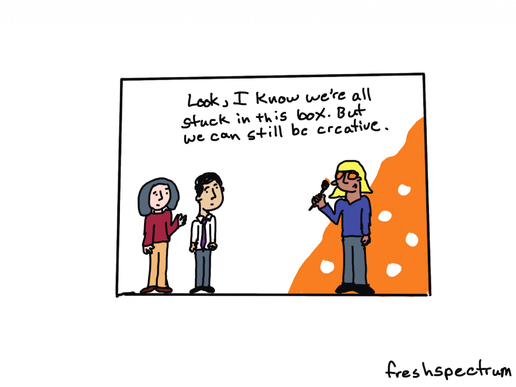
Reason 5: The stuff nobody else teaches.

Yes, we’ll occasionally use the normal tools everybody else teaches (i.e. Excel, PowerPoint, Tableau, Adobe CC).

But more often than not we’ll be using other tools. Because these other tools make creating easier and faster. They are also free to use and easy to learn. I’m talking about tools like Adobe Elements, Adobe XD, and Descript.

But the one tool we use most in this workshop, way more than any other data design workshop I know:

Canva.

More and more Canva has become my go to reporting tool for everything from infographics to dashboards to explainer videos. Because it’s easier to use and makes everything faster. And in this workshop, you’ll learn why.

freshspectrum cartoon by Chris Lysy

"Not sure how they did it. It's only a 3 page executive summary but it reads like a 50 page report."

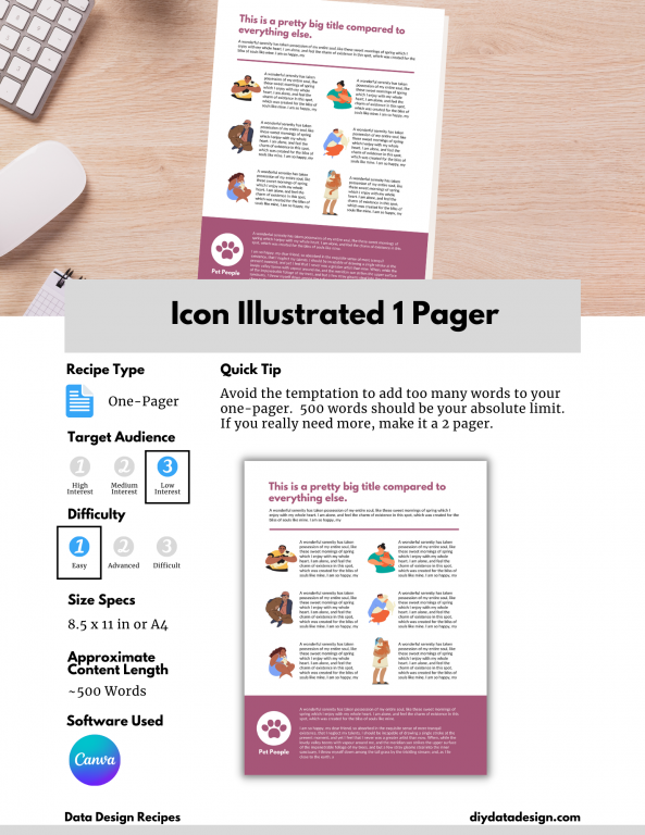
Reason 6: Recipes, Recipes, Recipes.

Okay, so if you peruse through the DiY Data Design offerings you’ll notice a bunch of “Coming Soon” data design recipes. And when I say coming soon, I mean in the upcoming weeks not months from now. I already have a bunch created, I just need to get them onto the site.

Recipes focus on practical designs that we discuss as part of the workshop. They are things that you can create and adapt. They often come with supporting tools like templates and worksheets. Every recipe is also discussed and recorded prior to it showing up in the library.

You can expect to see around 50 recipes added over the next three months. And 100 recipes over the next six months.

DiY Data Design Example Recipe - Icon Illustrated 1 Pager
Here is an example data design recipe. Each recipe will also be linked to the video lesson where it was discussed.

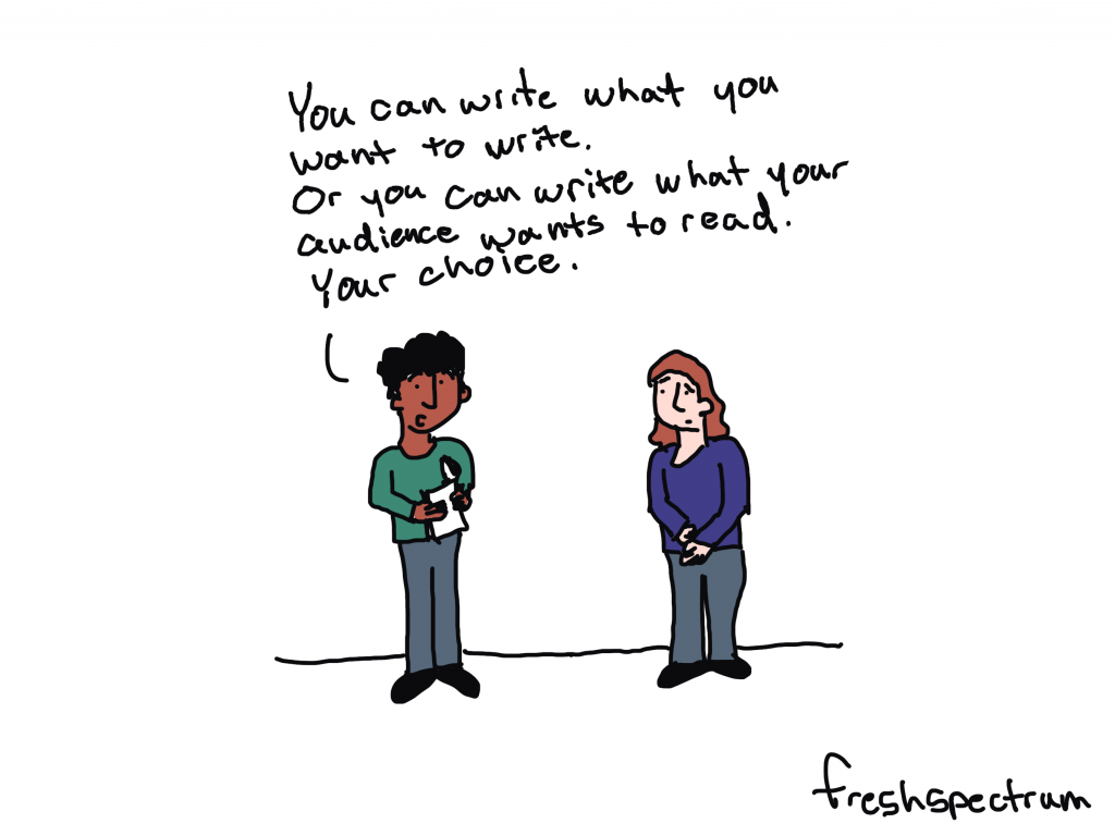
Reason 7: Because YOU want to create better reports.

You know how everyone says it’s the audience that matters the most.

Well, that’s only kind of true. Most audiences are not actually demanding better reports. They’re simply ignoring the organizations that don’t take reporting seriously.

The person that matters the most is YOU. Because YOU can make your reports better, even if nobody demands it. And not because someone told you to, but because you believe in the power of your work. You believe in sharing data and evidence. You want people to see your work.

freshspectrum cartoon by Chris Lysy

"So there is no style guide, format requirements, content requests, or other additional guidance. Just keep it short?  
One quick follow-up, does anyone actually give a shit?"

Reason 8: Because there is NO RISK (and scholarships, and a coupon).

Starting this time around, all my member plans come with 30 days free. That means if you join and decide you don’t like it, just cancel within 30 days and you won’t be charged.

I’m also offering no explanation necessary scholarships (see the FAQs) of 25% and 50% off.

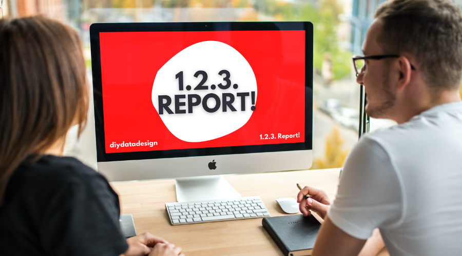
And, even if you don’t think you need a scholarship, you can still get 15% off by just enrolling in my free self-paced 1. 2. 3. Report! course.

Join us at DiYDataDesign.com

Written by cplysy · Categorized: freshspectrum

Feb 24 2022

Modern Reporting – Why you should design before you write.

Seriously, and I don’t mean after you’ve written several drafts. I really mean before you write.

In today’s post.

  • Most creativity happens inside the box.
  • Why waiting till the end to design your report is a bad idea.
  • Why designing first is a better idea.
  • This is something I call reverse design.
  • Introducing my FREE Course – 1. 2. 3. Report!
freshspectrum cartoon by Chris Lysy.   Three people in a box, one with a paintbrush and an orange painted wall saying, "Look, I know we're all stuck in this box. But we can still be creative."

Most creativity happens inside the box.

There is this notion out there that to be creative you need to think “outside the box.” Or that you need to draw “outside the lines.”

But I think that’s BS.

Because not only can creativity happen inside the box, the box can help us be creative. Because even though the box limits freedom, it also takes away a bunch of decisions that just get in the way. That clears space to let you focus on the decision points that are most important.

This is why a simple writing prompt is more useful for creative writing than a blank page. It’s why a set of canned WordPress templates can help you create a fresh looking, but functional, web page. It’s why the simple format of a slogan or elevator pitch can help an entrepreneur communicate their business idea.

freshspectrum cartoon by Chris lysy
Person one (holding a report and talking to person two at a desk).  "So we need you to take this 50 page Word doc and turn it into a 25 page visual report.
Oh, and the client's already approved the text, so we can't change anything."

Why waiting till the end to design your report is a bad idea.

I have been on a bunch of evaluation teams where the thought of report design is something that you don’t even entertain until you’ve already written several drafts.

It’s very possible that by the time the designer gets a hold of the report, the wording is completely set in stone. So the designer is stuck with what is written, even if the way something is written makes the report design that much harder.
Here is the deal. A well-designed report, with lots of white space, charts, photos, illustration, and icons, is usually going to have far less space for text than you have written in your Word document. Your 25 pages of Word document narrative might translate better to a 40 page modern report, not a 25 page report.

A good designer can usually still make it look okay. But it’s going to feel heavy. Or it’s going to go way over your desired page count.

freshspectrum cartoon by Chris Lysy.
One person to another, "You can write what you want to write.  Or you can write what your audience wants to read.  Your choice."

Why designing first is a better idea.

This is why I like to design the report template first. Even before writing your report you usually know:

  • The target report page length.
  • The must have report sections.
  • Your branding and style guidance.

With that information you can pull together a basic template using dummy text (i.e. lorem ipsum or something a little more narrative like). There is a saying within my wife’s family that I think makes sense here, “start the way you mean to finish.”

By creating a template in the beginning, that has the right overall look and feel, you get to create specific word count goals. You’ll know around how many words you have for every section of your report to keep it clean.

And you’ll also know when you are breaking that style by going over word counts.

This is something I call reverse design.

It’s about starting a report from your ideal final product and working backwards. I talk about it, along with my 3 audience approach in my new free course on simplifying and modernizing your reporting approach.

It’s called 1. 2. 3. Report! and it’s open for enrollment right now.

Two people looking at a computer with 1.2.3. Report! written on the screen.
Take my free course!

My FREE Course – 1. 2. 3. Report!

The full free course is just over 30 minutes and includes:

  • 9 total videos
  • 4 lessons on my simple modern report design approach.
  • 4 reporting activities you can complete using Canva.

This includes activities on creating a 25 page pdf report, 3 page pdf executive summary, 1 page pdf report, and a listicle infographic.

You’ll also get access to a discount code for when my full workshop opens back up for registration on March 1st.

Written by cplysy · Categorized: freshspectrum

Feb 02 2022

How to User Test a Report, Toolkit, or Dashboard (a.k.a. usability testing)

How do you know if a report, toolkit, or data dashboard works?

If you’re like most organizations, you probably copyedit your reports and have multiple people read them through. But how often do you actually put your reports into your users’ hands?

Today’s post is about usability testing, a.k.a. “how to assess if the thing you created is actually useful for the purpose for which it was created?” Oh, and also, “how to get the feedback you need to make the thing you created better?”

freshspectrum cartoon by Chris Lysy
Person 1 "I was told you find our new report really useful?"
Person 2 pointing at computer "Oh, I do. I needed to raise my monitor and it was just the right height."

What is User Testing/Usability Testing?

So as far as this article is concerned, we’ll use the two terms “User Testing” and “Usability Testing” interchangeably.

Basically, Usability Testing is a method for testing how something is used for the purpose of improving the product. But let me pull the definition from what I think is one of the best resources for this kind of thing on the web:

In a usability-testing session, a researcher (called a “facilitator” or a “moderator”) asks a participant to perform tasks, usually using one or more specific user interfaces. While the participant completes each task, the researcher observes the participant’s behavior and listens for feedback.

From the Nielsen Norman Group’s fantastic Guide to Usability Testing

If you’re really interested in usability testing from a user experience perspective, that guide is a really good rabbit hole to fall into. This post is specifically focused on usability testing reports, toolkits, and dashboards. The kind of stuff we create all the time as evaluators and researchers.

How is Usability Testing different from Cognitive Testing?

If you have spent a significant amount of time in social science research or program evaluation, usability testing might feel pretty similar to the cognitive testing methods you might use when developing surveys. And yes, the methods used are very similar and there is a lot of overlap.

Cognitive testing is built around the cognitive process respondents use when answering questions. Here is a nice short focused guide on cognitive testing from the Harvard University Program on Survey Research.

If you try to answer a question, you’re going to need to do four things.

  • First, you need to comprehend the question.
  • Second, you need to retrieve the information the answer the question from memory.
  • Third, you’ll need to summarize the information so that you can answer the question.
  • Fourth, you’ll need to actually answer the question.

Understanding where the process breaks down can help you better understand why a survey question may or may not work so that you can fix it and make it better. The methods are designed around this cognitive process, which may be close to what you are evaluating in a run-of-the-mill usability test, but also might not be super relevant.

freshspectrum cartoon by Chris Lysy
Person 1 "I thought we were doing user testing today but my calendar is clear?"
Person 2 "You said to only schedule with likely report readers. There are none."

What is the Purpose of a Report, Toolkit, or Dashboard?

It’s really easy to badmouth a report that’s too long or really ugly. But I think the biggest problem in reporting is when a report is just plain useless. I will take a long, ugly, useful report over a short, pretty, useless report any day.

Useless reports are just collections of information someone thought should be catalogued in a pdf. Not because that information has a purpose, but because the writer just felt like it should be included.

In order to properly usability test anything, you have understand how someone would use that thing.

For example…

  • a non-profit executive director might use an evaluation report to decide whether they should continue funding a particular project.
  • a school board might use a COVID-19 case report to decide whether schools in their system should go virtual.
  • a program director might use a needs assessment report to better tailor their programming to meet community needs.
  • project staff might use a step by step guidance document to enter information about their program into a data system.
  • a program officer might use a data dashboard to ensure project sites are following through on their commitments.

Try to write your own sentences.

A [insert type of person in your audience] will use [insert product] to [purpose of using the product]

freshspectrum cartoon by Chris Lysy
Someone speaking through computer, "As you complete the task, please think aloud so we can understand your thought process."
Person at the computer, "Sure, no problem. Right now I'm thinking I should have eaten lunch before this because all I can think about is food."

What are the Basic Steps in Usability Testing?

Let’s not overcomplicate this (which is always really easy to do) and just go with the basics.

You will need…

  • Someone to facilitate the usability test (usually filled by a good qualitative interviewer).
  • A participant to use the product (should ideally be someone from your target audience).
  • A set of tasks for the user to perform.

One of the easiest ways to go about usability testing is to ask your participant to perform a task while thinking out loud. The job of the facilitator is to observe, listen, and prompt the participant but mostly stay quiet.

Definition: In a thinking aloud test, you ask test participants to use the system while continuously thinking out loud — that is, simply verbalizing their thoughts as they move through the user interface.

Thinking Aloud: The #1 Usability Tool

For the prompts, ask questions like, “why did you go straight to that page?” or “what were you thinking when you clicked on that link?” Try to ask neutral questions and try not to influence their decisions.

For a lot of us, all of this now-a-days is likely to be performed over Zoom, or a similar tool. If that’s the case, ask your user to share their desktop screen and ideally their webcam. You want to see if they get confused and having the ability to see their face is helpful.

You don’t have to test a lot, usually you can get a good amount of information from just 5-10 users.

Depending on your needs, you can make usability testing a really formal process or keep it informal. To formalize the process, consider writing a testing protocol and training your interviewers. Also consider recording the session and/or having your project team present on the call (in listen mode) during the session.

freshspectrum cartoon by Chris Lysy

"How NOT to user test."

One person sitting next two and talking to another person sitting at a computer.
"What the heck. Why did you click that button? Are you some kind of idiot? Do you even know how to use a computer?

What NOT to do when Usability Testing?

Stuff you don’t want to do.

  • Talk too much (listen/watch);
  • Guide their actions (you are facilitating the usability test, not the use);
  • Answer all their questions (you want your tester to work through the problems as though you are not there as much as possible)
  • Have multiple team members asking questions (everyone other than the facilitator should be completely silent/in listen mode.”)

Listening to a user openly critique your work can be hard. Not all comments will be useful, but try not to close your mind.

Written by cplysy · Categorized: freshspectrum

Jan 26 2022

How to fall into evaluation – a cartoon post.

So what does it mean to “fall into evaluation?”

That’s today’s cartoon post inspiration from Ann Price via Twitter.

@clysy Hey Chris, have you created a cartoon for the often used phrase, “I just kind of fell into evaluation?”

— Ann Price (she, her, hers) (@annwprice) January 21, 2022

There are lots of social scientists working as evaluators.

Unless you’re in academia it’s hard to be something like a Sociologist professionally. Practical fields like program evaluation and contract research offer a good career path for social science grads.

Fresh Spectrum Cartoon by Chris Lysy. One person talking to another, "So yea, I went to school for social science, and, yada, yada, yada, now I'm a program evaluator."

Professional Sidetracker

If you ask the right question at the right time, you can totally sidetrack a meeting. But if it’s a critical question, maybe that’s not such a bad thing.

Fresh Spectrum Cartoon by Chris Lysy.
Three people at a table.
Person 1 says, "Amara, you keep sidetracking our meetings with important but hard to answer questions. Have you ever considered becoming an evaluator?"
Person 2 just stare at person 3.
Person 3 responds, "That's a job?"

The tools make the evaluator.

I see a lot of people with certain skillsets get funneled into evaluation or quasi-evaluation roles. Especially those who fall into evaluation from specific roles in non-profits or government agencies.

Fresh Spectrum Cartoon by Chris Lysy.
Written across the top, "What it means to "fall into" evaluation."
Person standing but speaking to another person sitting at a desk, "Our grant application requires an evaluation plan. You're good with Excel and Power Point right?"

Sometimes it’s just about filling a need.

People who become evaluators are usually pretty self-aware and good at noticing things other people tend not to see. So sometimes becoming an evaluator is just a response to an existing societal need.

Fresh Spectrum Cartoon by Chris Lysy.
Two people talking. 
Person 1, "So you just fell into evaluation?"
Person 2, "I considered starting my own nonprofit. But then I thought, we don't need more nonprofits. We need the one's we have to be more effective."

Falling into evaluation is not without its risks.

Some pursuits and programs just don’t make a ton of rational sense. At least rational sense that we can see and measure.

Fresh Spectrum Cartoon by Chris Lysy.
One person stopping a second person from falling into a hole labeled "Evaluation."
Person 1 says, "Careful! You fall into that and you'll never see our program in the same light again."

Are you an evaluator? How did you fall into evaluation?

Seriously, I want to know. Do any of these cartoons strike a chord? Let me know in the comments.

Fresh Spectrum Cartoon by Chris Lysy,
Two people talking.
Person 1, "Oh, I just kind of fell into evaluation."
Person 2, "What does that mean? Did you trip on a logic model or something?"

Written by cplysy · Categorized: freshspectrum

Jan 19 2022

UX Evaluation and Creative Reporting Webinars [Free Replays]

In early December I was given the opportunity to join The Youth Research and Evaluation eXchange (YouthREX) for a couple of Zoom webinars.

And, if you’re interested, the replays for both are now live and free to watch.

freshspectrum cartoon by Chris Lysy.

Person talking while holding paper. "Not sure how they did it. It's only a 3 page executive summary but it reads like a 50 page report.
A screenshot of the YouthREX webinars page, showing two webinars.  User Experience Evaluation and Creative Reporting in Evaluation.
Both webinars are currently available on the YouthREX Webinars page.

User Experience (UX) Evaluation

I’ve embedded below, but you can also watch/download the slides for this webinar by following this link.

  • How can evaluations of youth programs be enhanced by User Experience Design?
  • What are emerging UX Design methods and tools for better understanding participants of youth programs?

An effective program evaluation ensures that the data collected, interpreted, and shared are relevant to program stakeholders.

We explored ways that UX strategies can improve the design of the process evaluation component of an evaluation of a youth program.

This webinar paid attention to recent innovations in online platforms and software tools that enhance youth participation in a program evaluation.

freshspectrum cartoon by Chris Lysy
Two people talking. Person one says,
"Why are we spending time on evaluation? We already know what's working and not working."
Person 2 replies, "Because if we want to succeed, we need to prove that to others."

Creative Reporting in Evaluation

I’ve embedded below, but you can also watch/download the slides for this webinar by following this link.

  • How can we share our evaluation findings in more creative, accessible, and engaging ways?
  • What tools can we start using today to enhance our reports and presentations?

Sharing evaluation insights can be fun and rewarding. This webinar challenged us to revisit the common ways we share evaluation findings and presented a number of creative solutions for keeping stakeholders engaged and informed.

Participants explored practical ways (infographic design, cartoon illustration, meme design, and social media reporting strategy) to mobilize knowledge and examined how Slidedoc Reporting can offer unique advantages to youth programs who are looking to create exciting and professional presentations through everyday software tools.

freshspectrum cartoon by Chris Lysy
Person presenting says, "We suggest using a modern 1:3:25 reporting strategy."
Power Point slide says, "1 Slidedoc, 3 Blog Posts, 25 Social Media Posts."

Written by cplysy · Categorized: freshspectrum

  • « Go to Previous Page
  • Go to page 1
  • Interim pages omitted …
  • Go to page 31
  • Go to page 32
  • Go to page 33
  • Go to page 34
  • Go to page 35
  • Interim pages omitted …
  • Go to page 54
  • Go to Next Page »

Footer

Follow our Work

The easiest way to stay connected to our work is to join our newsletter. You’ll get updates on projects, learn about new events, and hear stories from those evaluators whom the field continues to actively exclude and erase.

Get Updates

Want to take further action or join a pod? Click here to learn more.

Copyright © 2026 · The May 13 Group · Log in

en English
af Afrikaanssq Shqipam አማርኛar العربيةhy Հայերենaz Azərbaycan dilieu Euskarabe Беларуская моваbn বাংলাbs Bosanskibg Българскиca Catalàceb Cebuanony Chichewazh-CN 简体中文zh-TW 繁體中文co Corsuhr Hrvatskics Čeština‎da Dansknl Nederlandsen Englisheo Esperantoet Eestitl Filipinofi Suomifr Françaisfy Fryskgl Galegoka ქართულიde Deutschel Ελληνικάgu ગુજરાતીht Kreyol ayisyenha Harshen Hausahaw Ōlelo Hawaiʻiiw עִבְרִיתhi हिन्दीhmn Hmonghu Magyaris Íslenskaig Igboid Bahasa Indonesiaga Gaeilgeit Italianoja 日本語jw Basa Jawakn ಕನ್ನಡkk Қазақ тіліkm ភាសាខ្មែរko 한국어ku كوردی‎ky Кыргызчаlo ພາສາລາວla Latinlv Latviešu valodalt Lietuvių kalbalb Lëtzebuergeschmk Македонски јазикmg Malagasyms Bahasa Melayuml മലയാളംmt Maltesemi Te Reo Māorimr मराठीmn Монголmy ဗမာစာne नेपालीno Norsk bokmålps پښتوfa فارسیpl Polskipt Portuguêspa ਪੰਜਾਬੀro Românăru Русскийsm Samoangd Gàidhligsr Српски језикst Sesothosn Shonasd سنڌيsi සිංහලsk Slovenčinasl Slovenščinaso Afsoomaalies Españolsu Basa Sundasw Kiswahilisv Svenskatg Тоҷикӣta தமிழ்te తెలుగుth ไทยtr Türkçeuk Українськаur اردوuz O‘zbekchavi Tiếng Việtcy Cymraegxh isiXhosayi יידישyo Yorùbázu Zulu