• Skip to main content
  • Skip to footer
  • Home

The May 13 Group

the next day for evaluation

  • Get Involved
  • Our Work
  • About Us
You are here: Home / Archives for allblogs / freshspectrum

freshspectrum

Dec 06 2021

Evaluation Christmas Cartoons 2021 (my favorite is the elf one)

Tis the season for holiday cartoons!

Some of my favorite cartoons over the past years were drawn to celebrate the holidays. Not sure if I have any big winners this year, but it’s still fun.

Here is this year’s batch, along with random commentary.

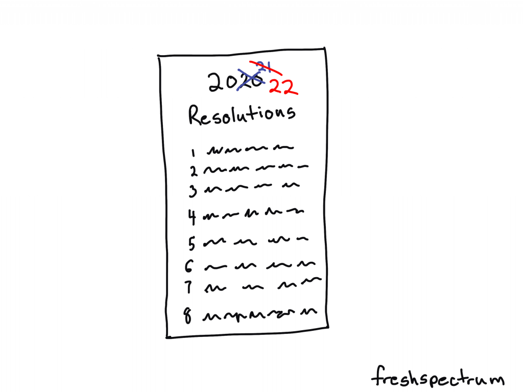
2020 2021 2022 Resolutions

I remember when the year started. Sure 2020 was a bust with COVID and all, but surely 2021 would be better…right?

So naive.

If you didn’t feel super productive or accomplished this past year, don’t worry. You are in good company with all the rest of us.

Freshspectrum cartoon by Chris Lysy.
Illustration of a Resolutions list, with 2020 and 2021 crossed out, then showing 2022.

Elfing from Home

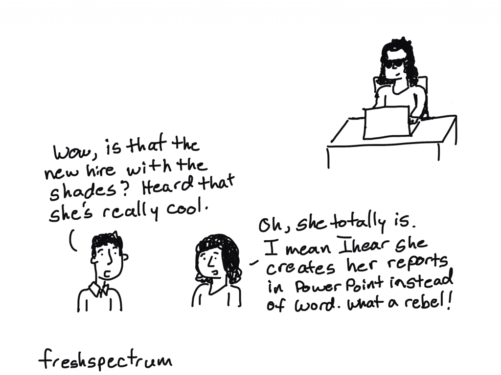
You know if Santa allowed remote work we would see more elves around. Wonder if they are also part of the “great resignation.”
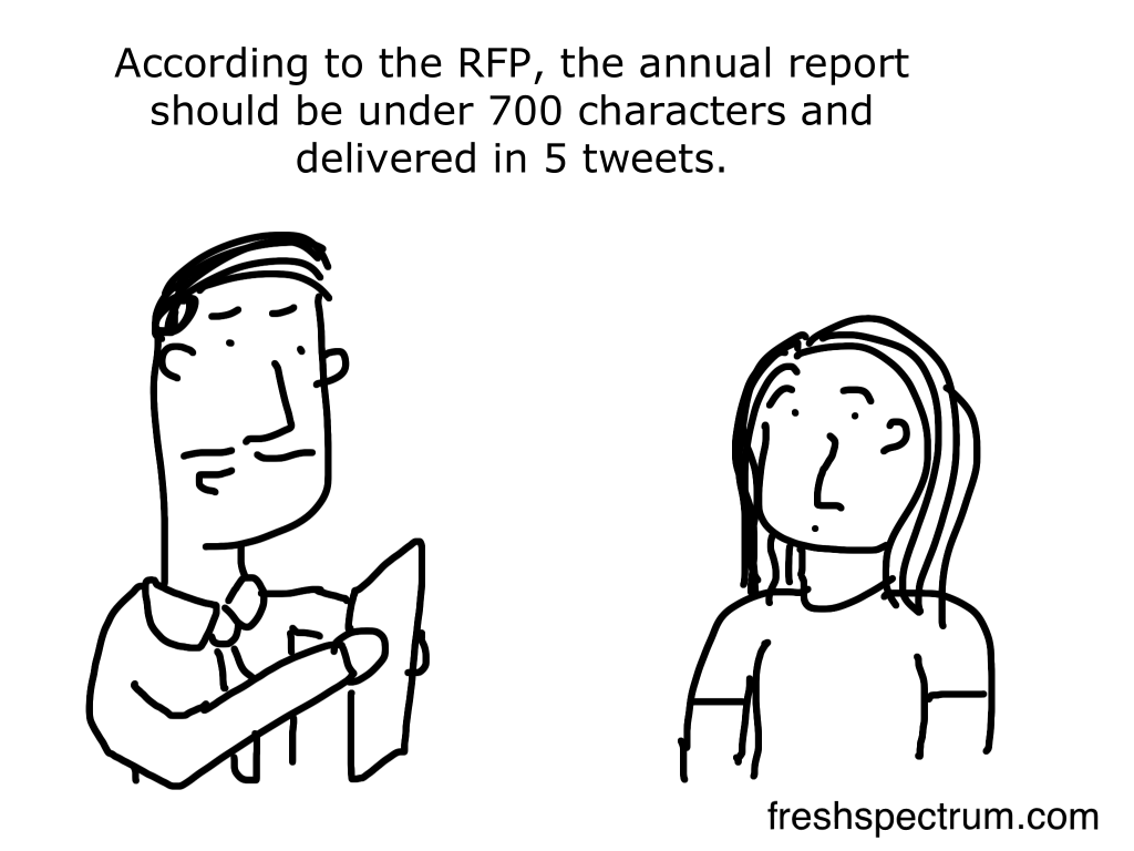
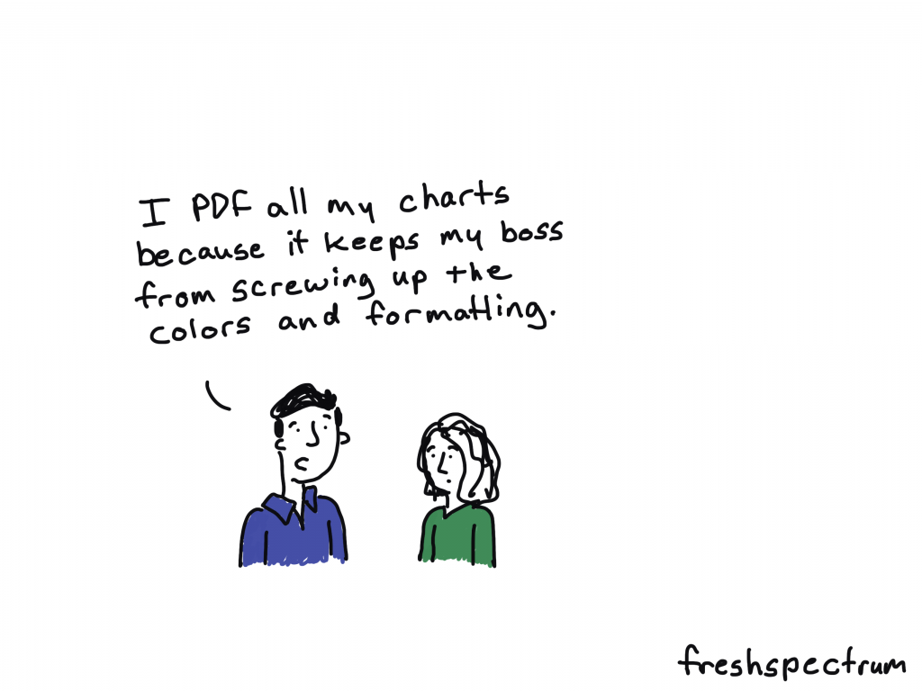
Freshspectrum cartoon by Chris Lysy.
Elf chatting with a person at the beach. "I used to work in HQ up north. But when the Big Guy started allowing remote, I hopped on the next plane."

Dissemination Magic

Every time a bell rings, a stakeholder reads your report.

Freshspectrum cartoon by Chris Lysy.
"Perhaps our dissemination strategy shouldn't rely entirely on Christmas magic."

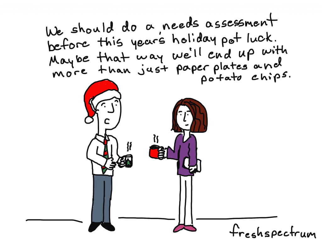
Pot Luck Needs Assessment

I drew this cartoon even though I’m not sure if anyone is really potlucking these days. I still avoid any situation with unmasked non-family members. And everyone bringing a dish, yikes!
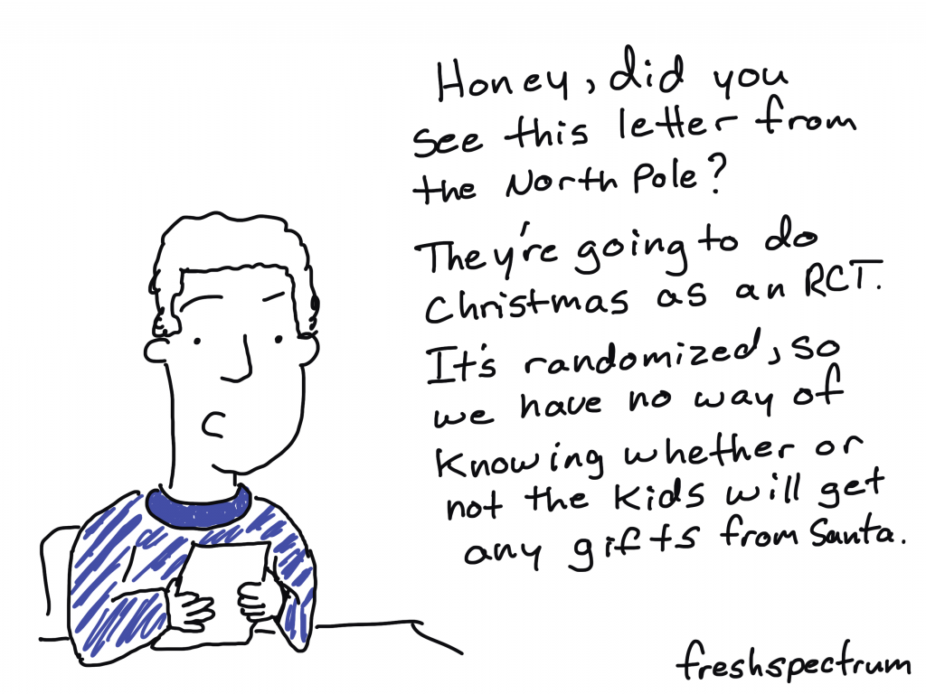
Freshspectrum cartoon by Chris Lysy.
"We should do a needs assessment before this year's holiday pot luck. Maybe that way we'll end up with more than just paper plates and potato chips."

RCT Christmas

It’s too easy to pick on RCTs.
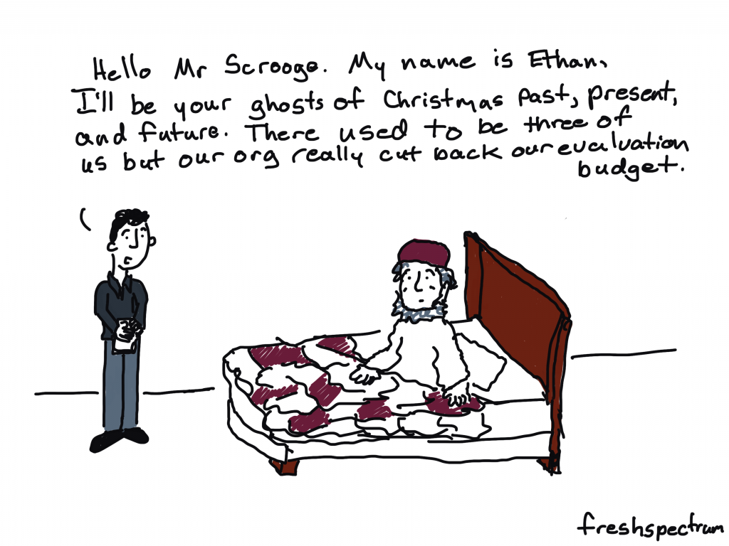
Freshspectrum cartoon by Chris Lysy. "Honey, did you see this letter from the North Pole? They're going to do Christmas as an RCT. It's randoized, so we have no way of knowing whether or not the kids will get any gifts fro Santa."

Ghost Downsizing

Did you know that instead of spirits, Dickens first draft of a Christmas Carol featured three evaluators?

Freshspectrum cartoon by Chris Lysy. "Hello Mr Scrooge. My name is Ethan, I'll be your ghosts of Christmas past, present, and future. There used to be three of us but our org really cut back our evaluation budget."

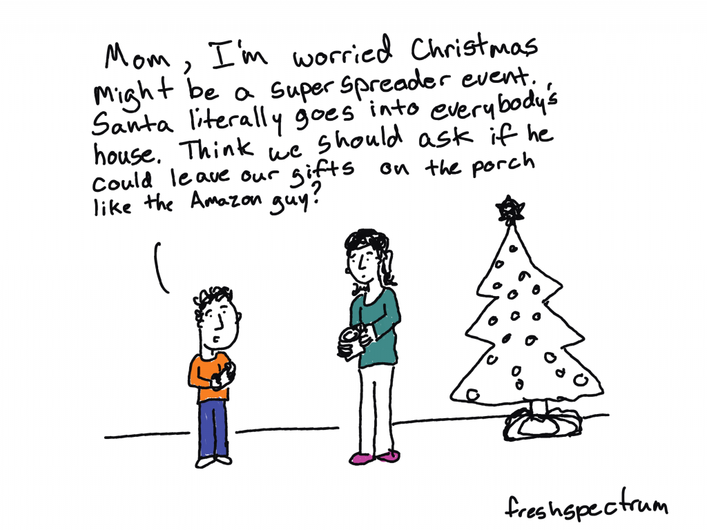
Superspreader Christmas

Toyed with drawing a cartoon about Santa being high risk for COVID. You know given his weight, age, and habit of bingeing on cookies and milk.

Freshspectrum cartoon by Chris Lysy. "Mom, I'm worried Christmas might be a super spreader event. Santa literally goes into everybody's house. Think we should ask if he could leave our gifts on the porch like the Amazon guy?

A few oldies.

Given that my audience fluctuates, thought I would share some of my favorite holiday cartoons from past years.

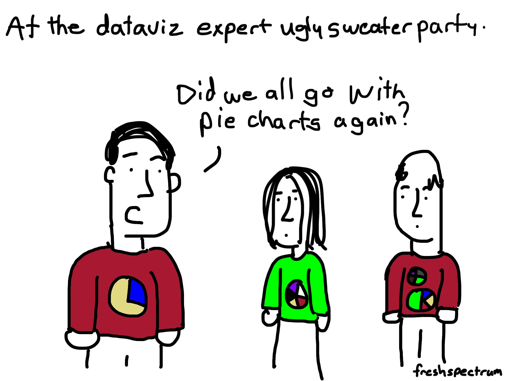
Perennial audience favorite – pie chart ugly sweater

Freshspectrum cartoon by Chris Lysy. "At the dataviz ugly sweater party."
"Did we all go with pie charts again?"

Counterfactual Wonderful Life

Freshspectrum cartoon by Chris Lysy.
"You've been given a great gift George: A chance to see what the world would be like without you."
"So like a really well designed counterfactual in an impact evaluation?"

Time to census some cookies

Freshspectrum cartoon by Chris Lysy. "Would you like to sample the cookies"
"They all look so good. I think I would prefer to census them."

Elf on the Shelf M&E

Freshspectrum cartoon by Chris Lysy. 
Referring to an Elf on a Shelf.
"What is that creepy thing staring at us?"
"According to mom, it's Santa's new monitoring and evaluation system.

Bad, Good, and Child IDs

Freshspectrum cartoon by Chris Lysy.
"Santa, in order to do this data collection the right way we're going to need a more specific definition of "bad and good." We're also going to need to assign unique child IDs, this first name stuff won't fly."

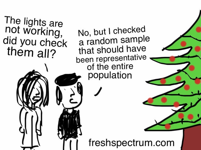
Checking the lights.

Freshspectrum cartoon by Chris Lysy.
"The lights are not working, did you check them all?"
"No, but I checked a random sample that should have been representative of the entire population.

Any favorites of yours that I’ve missed?

Written by cplysy · Categorized: freshspectrum

Nov 19 2021

5 reporting myths that need to die.

Researchers and evaluators have developed some bad reporting habits. This post seeks to dispel some of the myths that keeps those bad habits thriving.

In today’s post:

  • Myth #1. Your final report should be 8.5 by 11 (or A4).
  • Myth #2. Illustration is not required.
  • Myth #3. Your report can serve all audiences.
  • Myth #4. Telling stories and adding personal insight is unethical.
  • Myth #5. Reports are annual, or end of project deliverables.
  • My Creative Reporting Workshop Black Friday Sale
"Nobody wants to read my reports."
This you? Consider joining my creative reporting workshop: diydatadesign.com

Myth #1. Your final report should be 8.5 by 11 (or A4).

Here is a question I’ve often asked while delivering my creative reporting workshops. “When you read a report now-a-days, what do you use to read it?”

  • It’s on Paper
  • A Smart Phone
  • A Tablet/eReader
  • A Desktop/Laptop

The overwhelming answer is…

A Desktop/Laptop.

We have a reporting habit that dictates that every report should be written on standard pieces of paper. And even though we have produced our work digitally for decades and moved the vast majority of our report distribution online, we are still stuck with this idea that a report should be “regular paper” sized and formatted.

But here is the thing. The vast majority of your audience are likely reading your report on a regular computer in a landscape orientation. Producing your report in a profile orientation makes people have to scroll to read it.

Alternative: Create your report like a set of presentation slides.

Featured image example cartoon by Chris Lysy of freshspectrum.com

Myth #2. Illustration is not required.

Have you ever noticed how few illustrations you’ll find in academic journals?

For a long time now, if you want to add a picture to your academic writing you really have to justify the use. The idea of introducing visuals simply to have visuals is not a common value. And for awhile, when things need to be printed to be shared and black and white text only journals were cheaper to print, this seemed to make sense.

Given that the fields of research and evaluation are filled with the academically trained, this not-so-visual habit has carried forward to reporting. Because evidence and reasoning doesn’t need illustration…

Except that it does. Especially now.

The web is a space where visuals are required, regardless of the content. Because visuals help us to map out our world. And if you want to share your work effectively on social media, through blogs, or any other digital media channel, it requires more pictures.

Quick Read: Featured Image Paradigm

Cartoon by Chris Lysy.  Dr. Frankenstein's Audience. Board Member, Scholar, Program Participant, Parent, Staff Member, Funder. All represented as a Default Audience Avatar that looks like Frankenstein's monster.

Myth #3. Your report can serve all audiences.

You can’t make everyone happy.

But you can make everyone unhappy.

I get this argument every time I talk about report reader personas. Basically we work through a set of activities that pushes participants to think about the people they are trying to reach with a report. And ultimately somebody says, “well we have lots of audiences, and if we focus on just a few personas, we are going to leave some of those audiences out.”

And it’s true. If you create a good report you are going to leave audiences out. But creating a report that serves nobody just leaves everyone out. It’s better to be intentional about who your report serves, and even more importantly, who it does not serve.

Because pretending we don’t make that design choice every time we communicate anything doesn’t make it not true.

Alternative: Consider adapting your report into multiple infographics to reach different audiences.

Cartoon by Chris Lysy
"It's far too complicated to explain, so you'll have to trust me."
"But I don't trust you."

Myth #4. Telling stories and adding personal insight is unethical.

Evaluation’s move toward becoming a discipline was delayed by the prominence of the value-free doctrine in the standard social sciences centering on the assertion that evaluation could not be objective or scientific and therefore had no place as a scientific discipline.

Michael Scriven on the Differences Between Evaluation and Social Science Research

I think we have inherited this idea from Social Science’s inferiority complex. That in order to be objective and scientific, we should leave our own commentary and stories out of our work.

But regardless of where you stand on the value-free doctrine, reports are not meant to be devoid of all humanity. They are the result of an expert (or set of experts) collecting, analyzing, and sharing evidence and analysis.

These are people hired because of their expertise and insight. They also tend to be the ones who have spent the most time with the specific findings they are attempting to share. As such, their commentary is valuable.

And if that describes you. Remember that the audience would like to see what you see. Understanding what you have experienced in the process of collecting and analyzing can help them see the data through your eyes. Don’t keep it secret and just hope that they see it in the same way.

Don’t know how to find the stories in your data? Start here.

Cartoon by Chris Lysy
"According to the RFP, the annual report should be under 700 characters and delivered in 5 tweets."

Myth #5. Reports are annual, or end of project deliverables.

For lots of data people, reports are an every once and awhile thing.

  • You create a report when the project is coming to its end.
  • Or if the project is long term, you might create a report annually.

This kind of deliverable reporting is what I call the noun form of report. The problem with this type of reporting is that it usually involves a lot of waiting. And then, when it finally comes time to report, you have either run out of funding, run out of time to properly share your work, or you have just lost interest and have moved onto the next thing.

But report is also a verb. Reporting is something that can be done on a regular basis, when the methods have been constructed, during the data collection, and while the evidence is being analyzed. Since distribution is now a button click (and not anything that needs lots of organization) why wait until you can package everything together?

Diydatadesign.com creative reporting workshop

What to report differently? Join my creative reporting workshop. Black Friday Sale through Nov. 30.

Want to boost your creative reporting skills? Now’s the time to join my workshop as I’m offering the biggest deal since the launch.

The deal.

7 Day FREE Trial + 25% off with Annual Plan (that’s a $125 discount)

You can also get a 7 Day FREE Trial with our new Monthly Plan ($50/month).

What you get:

  1. Weekly Live Group Coaching Sessions
  2. Recorded Coaching Sessions
  3. Practice Activities, Short Lessons, and Inspiration
  4. Accountability and Support Forum
  5. COMING SOON – Self-Paced Courses

You can learn more and register at diydatadesign.com.

Written by cplysy · Categorized: freshspectrum

Nov 10 2021

Data Storytelling starts with Data Story Finding

You may have heard a data expert or two talking about data storytelling. But before you can tell a story, you need to find a story. This post walks through some strategies on how to do just that.

In today’s post.

  • The Graph is NOT the Story.
  • What is data storytelling?
  • Being able to find good stories is as important as good storytelling.
  • Sometimes the story just hits you in the face.
  • Putting the data into a line graph.
  • Surrounding the data with context.
  • Disaggregating interesting data points.
  • By viewing the chart through a single data point.
Freshspectrum cartoon by Chris Lysy.
"All the data was boring, so I just added some Pusheen cartoons to liven up the presentation."
"This chart is boring so I'll just eat this donut."

The Graph is NOT the Story.

I’ve heard lots of people say that data visualization is storytelling. But I always thought that was a bit disingenuous.

For me, data visualization is not storytelling, it’s story illustrating. The story itself is always much bigger and more meta than the chart or graph could ever hope to become.

It’s why Marvel can make millions upon millions of dollars adapting comic books into movies. Because the super hero stories don’t just make good books, they also make really good blockbuster action movies.

What is data storytelling?

While interpretations vary, most experts describe data storytelling as the ability to convey data not just in numbers or charts, but as a narrative that humans can comprehend.

The next chapter in analytics: data storytelling – MIT Sloan

There are some people in this world who tell fascinating stories.

I had a sociology professor in grad school who told some amazing stories. Talking about interviewing in opium huts or playing underground poker under the watchful eyes of the local police captain. But those great stories came from a life that was rich with experience.

Not all datasets are story rich. And while you might be able to package any data into a narrative format, that won’t make it a good story.

Good stories don’t just exist because someone knew how to tell a story. They just exist, and we need to find them before we can visualize them.

Freshspectrum cartoon by Chris Lysy.
"I'm sorry, but the only stories I get from this infographic are that you really like donut charts and don't understand the data."

Being able to find good stories is as important as good storytelling.

In a lot of ways story finding is really just data analysis.

A good analyst has an ability to find stories in datasets. While they might not be able to package the story, they can often pull up a chart or graph and walk you through what they see.

Finding good stories in datasets is a skill that most graphic designers do not have, because it’s a skill that takes years of practice. It’s the reason that my workshop focuses on helping data people become designers and not the other way around. I find it easier to teach someone who can find data stories how to package them into stories than to show someone who can design well how to find data stories.

But no matter where you fit in that spectrum, here are some strategies for finding the stories in your data.

Sometimes the story just hits you in the face.

Not all data stories require a lot of additional insight to find.

Take this chart from the CDC’s COVID Data Tracker. It shows the different rates of COVID-19 cases by vaccination status. The big story is pretty simple, unvaccinated people are at a greater risk of testing positive for COVID-19 and an even greater risk of dying from COVID-19. And when we see an overall case spike, that difference gets amplified.

Chart showing rates of COVID-19 cases by Vaccination Status from April 4, 2021 to September 4, 2021.
https://covid.cdc.gov/covid-data-tracker/#rates-by-vaccine-status
Chart captured on November 10 from the CDC’s COVID Data Tracker.

Putting the data into a line graph.

Narrative is often defined as a sequence of events. And given that line graphs are really representations of data over time, they make for really solid story telling devices.

You can find stories by putting your data into line graphs. Since the graph walks the data through time, your goal is talk through the parallel narrative. What does a spike in your line graph signify? What about a dip?

Since people are going to read your line graphs from left to right, annotations offer the chance to layout the story point by point.

Infographic created by Chris Lysy using data provided by the St Louis Fed.

Surrounding the data with context.

In research and evaluation we use a lot of descriptive statistics. Means, medians, and standard deviations can be helpful when trying to interpret a dataset. But descriptive stats often take data out of the original context.

One easy way to find stories in data is to add the context back into the picture. Yes, if the average is important visualize the average. But if your dataset is not too large, which includes many research and evaluation datasets, showing all the data gives you more to draw upon.

For instance, it’s one thing to tell the story that your program is performing above average. It’s another story entirely to say that you are performing better than all other programs for a particular indicator.

Oregon Outdoor School evaluation infographic
Infographic created alongside the Oregon Outdoor School evaluation team, this is an example version using fake data.

Disaggregating interesting data points.

If you have a percentage, step back and look at the underlying frequencies. Every percentage started with a numerator and denominator, look at those numbers. Do this even if you have to estimate the numbers based on the percentage.

UNICEF Infographic -
Before COVID, 47% of children lacked access to essential services (education and/or health)
COVID has added 150 million children. 
To put that number in context. That's more than the total populations of the United Kingdom, Spain, and Canada combined.
According to an analysis by Save the Children and UNICEF.
For more data visit: data.unicef.org/covid-19-and-children
Infographic created by Chris Lysy based on data provided by UNICE

By viewing the chart through a single data point.

If you are having trouble finding a larger story sometimes it’s helpful to focus on a singular data point. If every point is a person, try to see the data through the person’s eyes. What does the data say about their experiences. Whenever possible this is also a place for exploring supporting qualitative data.

I know I’ve done this in the past but I couldn’t find an example of my own to share. So here is an example from a USAID infographic. The data source for this infographic is certainly not individualized. But the infographic switches the perspective when talking through the data.

Infographic: Learning out of Poverty - Education is foundational to human development and has a clear multiplier effect with benefits in health, broad-based economic growth and poverty reduction.

A child born to an educated mother is more than 2x as likely to survive to age five.
Educated mothers are 50% more likely to immunize their children than mothers without an education.
Every extra year of school increases productivity by 10-30%
A girl who completes basic education is 3x less likely to contract HIV/AIDS
Educated women re-invest 90% of their income in their family. Men invest 30-40%
But still today:

1 in 4 women around the world cannot read this sentence
Girls make up 53% of the children out of school
98% of people who can't read live in developing countries.
Sources: The Global Campaign for Education and RESULTS Educational Fund, Make It Right, Ending the Crisis in Girls' Education 2007 | Literacy Matters Fact Sheet | Van der Graag and Tan, The Benefits of Early Childhood Education Programs: An Economic Analysis, World Bank (1998) | The Global Campaign for Education and RESULTS Educational Fund, Make It Right, Ending the Crisis in Girls' Education 2007 | Sperling, Gene and Barbara Herz, What Works in Girls' Education: Evidence and Policies from the Developing World, Council on Foreign Relations (2004) | The Global Campaign for Education and RESULTS Educational Fund, Make It Right, Ending the Crisis in Girls' Education 2007 | UNESCO. Global Monitoring Report 2011: The hidden crisis: Armed conflict and education. France: UNESCO Publishing, 43.
USAID Learning out of Poverty Infographic

What other story finding approaches have you used in your own work?

If you have an approach I would love to hear it. Just leave me a comment below.

Written by cplysy · Categorized: freshspectrum

Nov 02 2021

How to edit a PDF graph.

In this post I am going to show you how to edit a vector based PDF graph. You’ll also learn why you might need to so such a thing and how to discover if your PDF graph is indeed vector based.

In this post:

  • First, a little data backstory
  • How I turned this graph…
  • …into this infographic.
  • A PDF is a sometimes Vector.
  • How to Check if a PDF Graph is Vector (aka editable).
  • Editing the PDF Graph with Adobe Acrobat Pro.
  • Turning the PDF Graph into an Infographic with Adobe XD.
  • [Alternative for Non-Creative Cloud Subscribers] Editing the PDF Graph with Inkscape.
Title slide from blog post "How to edit a PDF Graph."

First, a little data backstory

Goodbye. Farewell. Adios. Sayonara. Workers have been giving their bosses an earful of such words as of late. Last week, the U.S. Bureau of Labor Statistics announced that 4.3 million Americans, or 2.9% of the entire workforce, quit their jobs in August. That was a record-breaking month, piggybacking on previous record months. “The Great Resignation” is real, and it can be seen across virtually all industries.

Why are so many Americans quitting their jobs? – NPR

It’s late October 2021 and I keep this story headline talking about the “The Great Resignation.” The stories mention 4.3 million Americans quitting their jobs in August, an all time high. When you click the link to follow the data, you find a news release and then a table without a ton of extra context.

This has been a weird time for economic data. COVID19 put a dent in any of the regular metrics making the pandemic stick out in a way that’s completely unavoidable. My curiosity led to a dive into the data. I found a new data source that gave wider picture based on the same datasets.

And the need to convert and edit a PDF chart brought me to this post.

How I turned this graph…

A chart from the Federal Reserve Economic Data showing Job openings, quits, and hires from 2000 to 2021.  Data can be found: https://fred.stlouisfed.org/graph/?id=JTSJOL,JTSQUL,JTSHIL,

If you look at this chart: the red line is quits, the blue line is job openings, and the green line is hires. It tells a little different story than what we see from “The Great Resignation.” The source of this chart is FRED (Short for Federal Reserve Economic Data). I wanted to clean it up a bit; add focus, put in annotations, and create a social media friendly infographic.

…into this infographic.

An infographic.
The great resignation is really a Job Market Flood. 
A big deal has been made of the increasing number of Americans quitting their jobs. And yes, it's never been this high, but it's really only 19% higher than it was in January 2020. 
The  number of monthly job openings on the other hand is 54% higher than it was pre-COVID in January 2020.
July 2009 - 2.2 million job openings
January 2020 - 7.2 million job openings
July 2021 - 11.1 million job openings

August 2009 - 1.6 million quits
January 2020 - 3.6 million quits
August 2021 - 4.3 million quits

To create this square infographic I didn’t have to recreate the line graph. I just used the one provided by FRED. At the top of the chart there was a “DOWNLOAD” button.

As a designer I would have loved to see “SVG” as one of the download options. The “Image (graph)” downloads a PNG file (which is not Vector and not so flexible to edit). The “PowerPoint (graph)” option downloads a PowerPoint file that includes a slide with the chart (but that chart is also not vector).

That leaves the “PDF (graph)” option, which did happen to be a vector file (woohoo)!

FRED graph screenshot showing download options.

A PDF is a sometimes vector.

So a PDF is a bit of a wildcard file type.

Sometimes with a PDF you’ll be able edit every single element (words, numbers, tables, charts, and colors). Other times it’s really just a static pixel based image file (more similar to a PNG or JPG). But that makes sense, because you can turn just about any picture or text file into a PDF.

As a designer looking to tweak a graph, when I pull open a PDF I really hope to find a vector format.

Freshspectrum cartoon by Chris Lysy. 
"I PDF all my charts because it keeps my boss from screwing up the colors and formatting."

How to Check if a PDF Graph is Vector (aka editable)

You can find out if a PDF is vector based pretty quickly. All you have to do is Zoom in on the file.

As you Zoom, if the image pixelates (turns into little squares) then your graph is not Vector based. Which basically means it’s easily editable. You’ll have to either recreate using the data, edit in an image editing tool (like photoshop), or recreate using some other approach.

Screenshot of a pixelated PDF graph.
Here is a PDF version where the chart is not a vector format.

If you can Zoom in and not lose any image quality, the image is Vector. This will give you a lot more options as a designer.

Screenshot of a clean zoomed in PDF Vector graph.
This a PDF version of the same chart but is definitely vector. The screenshot you see above is the pdf zoomed in 6400%. As you see, no drop in clarity.

Editing the PDF Graph with Adobe Acrobat Pro

Screenshot of a graph being edited in Acrobat Pro.

So if you have Adobe Acrobat Pro, you can do some basic editing. This includes editing words on the page, deleting certain formatting blocks, and even deleting or adjusting certain elements in a graph.

Keep in mind that PDF Vectors, especially auto-generated PDF vectors, are not always the cleanest files. There can be empty transparent blocks on top of your graph that you’ll need to delete to get to the chart elements underneath. You are also pretty limited in what you can do.

Editing the PDF Graph with Adobe Illustrator

Screenshot of a graph being edited in Adobe Illustrator.

If you have Adobe Creative Cloud, Adobe Illustrator is definitely the tool you will want to use to open up Vector PDFs. You’ll be able to see every single layer and element that makes up the image.

I’ll use Illustrator to open PDFs even when I plan to design my infographics using other tools. To identify an specific element just keep clicking on it until the specific layer is isolated. If you’re an accomplished user of Illustrator you can do all of your editing here.

Turning the PDF Graph into an Infographic with Adobe XD

Screenshot of a graph being edited in Adobe XD.

Over the last few years, Adobe XD has become my infographic design tool of choice. While you can drop SVG files right into Adobe XD, you can’t open a PDF. Even if it’s vector.

But what you can do is copy elements right from Adobe Illustrator and paste them into Adobe XD. That’s what I did here, copying the the two lines (each one is it’s own path) in Illustrator and pasting them into my XD file. Now I can do a lot with them, including changing colors and changing each line’s thickness.

[Alternative for Non-Creative Cloud Subscribers] Editing the PDF Graph with Inkscape

So I know there are a lot of you who do not have, and will likely never have, a subscription to Adobe Creative Cloud. That’s okay, you can still edit PDF graphs.

There is an open source vector drawing tool called Inkscape. And with Inkscape you can do a lot of the same things you could do in Illustrator (including opening up a PDF). Still want to use Adobe XD to create your infographic? That’s no problem, just save your file as an SVG. Then drop the SVG into Adobe XD.

Screenshot of a graph being exported from PDF to SVG using Inkscape.

Written by cplysy · Categorized: freshspectrum

Oct 28 2021

What is a Slidedoc?

Slidedocs are versatile reporting tools that are an almost ideal format in the visual heavy digital world.

In today’s post.

  • What is a Slidedoc?
  • What is a Slideument? Is it the same thing?
  • The advantages of creating a slidedoc.
  • The disadvantages of creating a slidedoc.
  • Tips for Creating Slidedocs
  • A few example Slidedocs.
  • Shortcut: Creating Slidedocs Using Canva
  • Additional Slidedoc Resources
Freshspectrum cartoon by Chris Lysy.
"Wow, is that the new hire with the shades? Heard that she's really cool."
"Oh, she totally is. I mean I hear she creates her reports in PowerPoint instead of Word. What a rebel!"

What is a Slidedoc?

Slidedocs are visual documents developed in presentation software that are intended to be read and referenced instead of projected.

Slidedocs – Nancy Duarte

Every time I think about slidedocs I get this little tune in my head from schoolhouse rock. “A man and a woman had a little baby.” But instead it becomes, “a slidedeck and a document had a little baby.”

Slidedocs are reports created with PowerPoint. They’re designed to be read, not seen behind a presenter on a stage.

Freshspectrum cartoon by Chris Lysy.
"I like to create my presentations using Word. It's easier to put a lot more text on each slide. I call it a docdeck."

What is a Slideument? Is it the same thing?

So both terms merge two words, slides and documents. But they refer to two different things.

Slideuments, as discussed in 2006 by Garr Reynolds, are by-products of a pretty common conference organizer request. You know when you give a presentation and the conference organizer asks for your slides?

Slides are slides. Documents are documents. They aren’t the same thing. Attempts to merge them result in what I call the “slideument” (slide + document = slideument). Much death-by-Powerpoint suffering could be eliminated if presenters clearly separated the two in their own minds before they even started planning their talks.

“Slideuments” and the catch-22 for conference speakers – Presentation Zen

Modern presentation slidedecks are visual and rely on the presenter to deliver the words. So when a presenter gets asked to share those slides, it can make them feel like they need to up the number of words on the slides or else they are just delivering a bunch of out of context images. This results in a bullet heavy slidedeck that is not quite a report and not quite a presentation.

A Nancy Duarte Slidedoc is a type of visual report. It is intentionally created using presentation software and designed to act as a stand alone report. It is not designed as a presentation.

Freshspectrum cartoon by Chris Lysy.
"The conference prep email said to upload our decks a week ahead. What if we don't plan to use slides?"
"Oh, just upload a blank power point. Attendees never really download them anyway."

The advantages of creating a slidedoc.

  • You probably already know how to use PowerPoint (you don’t need to learn new design tools).
  • It’s way easier to work with visuals in PowerPoint than it is to do so in Word.
  • PowerPoint is also Microsoft, so software conservative (we only use Microsoft stuff) organizations don’t need as much convincing to try it out.
  • Presentation decks are wide format and that is a superior format when most reports are going to be read using computer screens (laptops/desktops).
Freshspectrum cartoon by Chris Lysy.
"If your report is most likely to be read on a laptop or desktop...Why do you insist on designing it for a sheet of paper?

The disadvantages of creating a slidedoc.

  • “Track changes” works better in Word than with PowerPoint or PDFs.
  • Lots of data people still have issues reporting visually, no matter the tool.
  • PowerPoint can be a pretty effective design tool, but it doesn’t match the power of some Adobe Creative Cloud tools.
Freshspectrum cartoon by Chris Lysy.
"We have a professional design process. The research team spends months wordsmithing and reformatting our tables and charts in Word. Then we hand it off to our design team who recreate everything from scratch using some kind of Adobe software."

Tips for Creating Slidedocs

In a Slidedoc, Ann recommends titles that contain the takeaway message. In a slide deck, you can just have the main title. The amount of text for Slidedocs she suggests is full sentences or even paragraphs as it is a report that simply happens to be made in slide software. 

Ann K Emery on Data Visualization and Slide Design [Podcast]

Here are some of my tips.

  • Think like a presenter. One idea per slide, but share enough text so that it can be read without any additional interpretation necessary.
  • Break down confusing slides into multiple slides. It’s better to have more slides that are less confusing than it is to have less slides that are more confusing.
  • Just like people skim regular word reports, they skip quickly through slidedocs. Using headers is important (with takeaway messages). If they are interested enough, they’ll stop and read the rest of the text on a slide. But if the page isn’t relevant, they’ll skip it, and that’s okay.
  • Use Section Breaks. Break your slidedoc into sections. When each section is about to start use a section title slide. I like to flip the background color for these title slides. It makes the report feel less like one big long narrative.
  • Export some of your slides as stand along infographics. One of the benefits of a slidedoc is that your slides are perfect featured image dimensions. So create some pages with the idea that they can be exported as stand alone featured image infographics. These are great for sharing on social.
  • Create navigation guides. It’s easy to get lost in slidedocs, so creating a little bar at the bottom of the pages that show which section you are in (and how many sections are upcoming) can be really helpful for your audience.

A few example Slidedocs.

This first example was created by a friend and former colleague, Encompass Senior Communications Specialist, Crystal Cason. I asked Crystal what advice she would give to others considering designing slidedocs.

The key thing for me when helping folks structure their content for slidedocs is to get a really clear outline before going into it. Ideally, if you can “chunk” your information into sections, and then focus on one key message per page (that ideally includes narrative + some visual element), you’ll end up with a really nice end product that users can easily digest.

Crystal Cason

USAID TRANSFORM: Primary Health Care - Slidedoc.
You can see the full pdf slidedoc here: USAID TRANSFORM: PRIMARY HEALTH CARE

Here is a spread of pages to give you a sense of what it looks like. I really like the way Crystal uses color to differentiate text on the pages. If it were all the same color the pages would like more intimidating. She uses simple section break slides that include these little mini tables of contents. I also really like the section indicator at the bottom of the page.

USAID TRANSFORM: Primary Health Care - Slidedoc. Screen shot of internal pages.

If you want to see a little more of Crystal’s work, she was also behind this slidedoc and this slidedoc.

The next example is one of my own. When I create eBooks these days I usually opt for a slidedoc format. You’ll see it at play in several of my eBooks including this one on UX Evaluation.

UX Evaluation eBook Cover

Here is a spread of pages. The format is a really simple repeating structure that features a lot of white space.

UX Evaluation eBook screenshot of internal spread.

One more example would be this Annual Evaluation Report from the International Labour Organization.

ILO Annual evaluation report cover.

The report feels very much like a well-designed and polished annual report. Compared to the other two examples, this one features a lot more text. But it does feature repeating patterns and more charts/visuals than you would find in a lot of large organization evaluation reports.

ILO Annual Evaluation Report Internal Spread Screen Shot

Shortcut: Creating Slidedocs Using Canva

My favorite Slidedoc shortcut is to use canva.

Search Canva for presentation templates (there are a ton). I prefer to use the 4:3 presentation format (you know, the old presentation size). You could use the widescreen format, but a 4:3 prints better (if anyone does decide to print the slidedoc).

Canva Presentation Templates (Screenshot)

Choosing a template that includes a bunch of internal pages is the easiest way to go.

Since these templates are really designed for a traditional presentation, reduce the font size. People don’t read slidedocs while sitting far away from the screen. You can use 12 point font, but I still tend to keep the headers fairly large.

Canva, working on creating a presentation using a template. Screenshot.

The cool thing about Canva, is even if you start with Canva you don’t have finish in Canva. You can “share” your presentation as a PowerPoint, downloading it to your computer. If you do this, just remember to check it before sending it forward. Sometimes in the shift from Canva into PowerPoint the formatting will get a little askew.

If you just want something that looks exactly as you create it, you can always opt to download it as a PDF.

Canva, saving a presentation as a PowerPoint. Screenshot.

Additional Slidedoc Resources

  • Already mentioned, but definitely download Nancy Duarte’s Slidedoc on Slidedocs.
  • A few years ago Nick Visscher wrote a guest post for Depict Data Studio on How to Write Your Reports in PowerPoint Instead of Word: Nine Tips for Getting Started.
  • Speaking of Ann, she worked with then AEA ED Denise Roosendaal for an AEA Vision Slidedoc. They shared a bit about their process in this AEA365 post. DVR TIG Week: Ann K. Emery and Denise Roosendaal on Fonts, Photos, and Colors: Three Techniques that Reinforce Branding

Written by cplysy · Categorized: freshspectrum

  • « Go to Previous Page
  • Go to page 1
  • Interim pages omitted …
  • Go to page 33
  • Go to page 34
  • Go to page 35
  • Go to page 36
  • Go to page 37
  • Interim pages omitted …
  • Go to page 54
  • Go to Next Page »

Footer

Follow our Work

The easiest way to stay connected to our work is to join our newsletter. You’ll get updates on projects, learn about new events, and hear stories from those evaluators whom the field continues to actively exclude and erase.

Get Updates

Want to take further action or join a pod? Click here to learn more.

Copyright © 2026 · The May 13 Group · Log in

en English
af Afrikaanssq Shqipam አማርኛar العربيةhy Հայերենaz Azərbaycan dilieu Euskarabe Беларуская моваbn বাংলাbs Bosanskibg Българскиca Catalàceb Cebuanony Chichewazh-CN 简体中文zh-TW 繁體中文co Corsuhr Hrvatskics Čeština‎da Dansknl Nederlandsen Englisheo Esperantoet Eestitl Filipinofi Suomifr Françaisfy Fryskgl Galegoka ქართულიde Deutschel Ελληνικάgu ગુજરાતીht Kreyol ayisyenha Harshen Hausahaw Ōlelo Hawaiʻiiw עִבְרִיתhi हिन्दीhmn Hmonghu Magyaris Íslenskaig Igboid Bahasa Indonesiaga Gaeilgeit Italianoja 日本語jw Basa Jawakn ಕನ್ನಡkk Қазақ тіліkm ភាសាខ្មែរko 한국어ku كوردی‎ky Кыргызчаlo ພາສາລາວla Latinlv Latviešu valodalt Lietuvių kalbalb Lëtzebuergeschmk Македонски јазикmg Malagasyms Bahasa Melayuml മലയാളംmt Maltesemi Te Reo Māorimr मराठीmn Монголmy ဗမာစာne नेपालीno Norsk bokmålps پښتوfa فارسیpl Polskipt Portuguêspa ਪੰਜਾਬੀro Românăru Русскийsm Samoangd Gàidhligsr Српски језикst Sesothosn Shonasd سنڌيsi සිංහලsk Slovenčinasl Slovenščinaso Afsoomaalies Españolsu Basa Sundasw Kiswahilisv Svenskatg Тоҷикӣta தமிழ்te తెలుగుth ไทยtr Türkçeuk Українськаur اردوuz O‘zbekchavi Tiếng Việtcy Cymraegxh isiXhosayi יידישyo Yorùbázu Zulu