• Skip to main content
  • Skip to footer
  • Home

The May 13 Group

the next day for evaluation

  • Get Involved
  • Our Work
  • About Us
You are here: Home / Archives for allblogs / freshspectrum

freshspectrum

Sep 15 2021

Find Excel Chart Formatting Annoying? Do this instead.

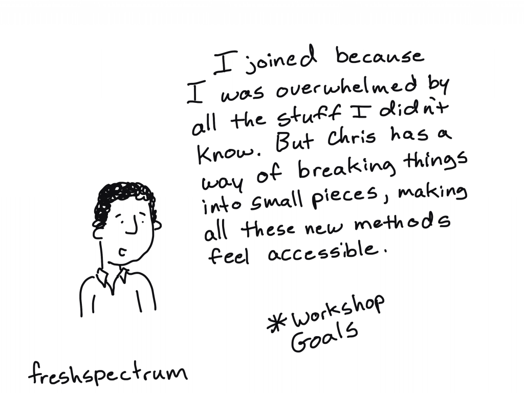
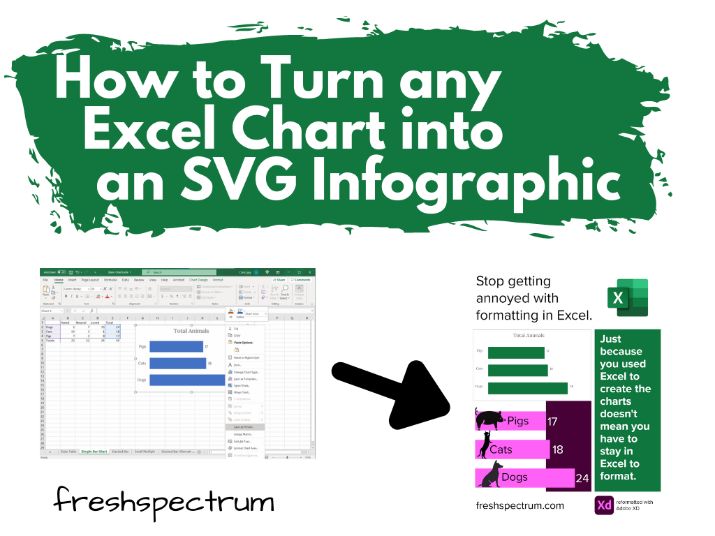
Ever get annoyed with formatting after you create a chart in Excel?

It’s pretty easy to create a chart in Excel. A couple of button clicks and poof, there you go, chart created. But if you want to create a chart that actually looks good, you often have to do a bit more work. For example…line graphs…scatter plots.

But sometimes, formatting in Excel just makes you want to…uh, how do I put this?

Throw your computer out the window.

freshspectrum cartoon by Chris Lysy.  "How long do you think it will take to write the report? 5 days?"
"To be safe. I'll have the report written in a few hours. I'll need the rest of the time to format the charts in Excel."

Lucky for us though, just because we created our chart in Excel, doesn’t mean we have to stay there to format the thing.

Believe it or not, Excel is a vector design tool. And even though it’s hard to take advantage of that while using Excel (stupid textboxes won’t go where I want them to go!!!!!) we can take control by sending our chart outside of Microsoft.

How to turn any Excel Chart into an SVG infographic.

Start with a Chart in Excel

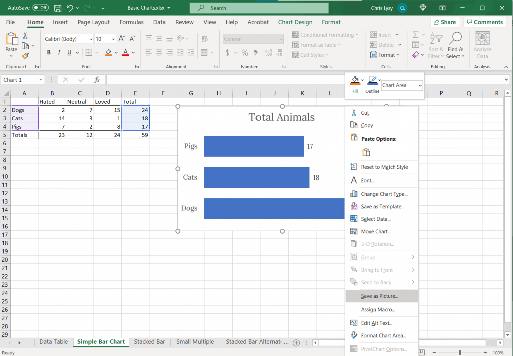
So let’s start with a chart in Excel.

Just right click on the chart you want to format and click on “Save as Picture…”

Screenshot. Clicking on a chart in Excel and saving as a picture.

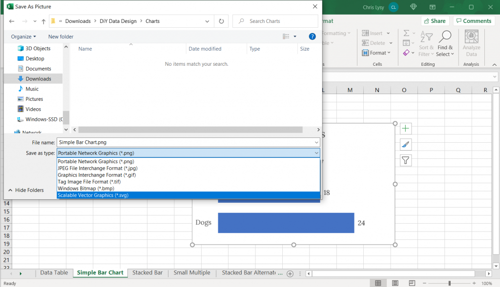
Export as Scalable Vector Graphics (A.K.A. an SVG)

Now when we save it we want to save it as a vector format (or else this won’t work). With my PC Office 365 version of Excel I’m given 6 options.

Of the 6, five are pixel based (aka raster)…PNG, JPG, GIF, TIF, BMP.

But number 6 is the trusty Scalable Vector Graphics format…SVG. This is our vector file format.

Screenshot, saving an Excel chart as an SVG.

Open your SVG in a graphics program.

Now that we’ve saved our SVG somewhere on our computer (or somewhere else) we need a program that works with SVGs.

Luckily there are bunch that fit the bill. Here are three big ones.

  • Adobe Illustrator (ye olde graphic design industry standard that requires a pro creative cloud account)
  • Figma (new fangled UI design tool that is both a pro tool and FREE to use)
  • Adobe XD (also a new fangled UI design tool that is both a pro tool and FREE to use by the same people who brought you ye olde graphic design industry standard Adobe Illustrator)

Any of these three will let you pick apart and redesign this chart. If you are not an Adobe CC person already, I would suggest starting with either Figma or Adobe XD.

Here is what the Excel Chart looks like in Adobe Illustrator

Screenshot of Adobe Illustrator with an SVG Excel chart.

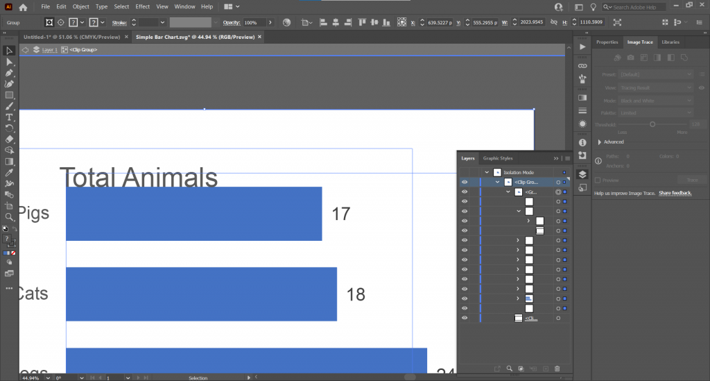
See that over there on the right side? That’s a layers panel.

Every single element in an Excel chart can be isolated and changed through the SVG. You’re also going to find a bunch of empty rectangles that can be deleted away if they get in your way.

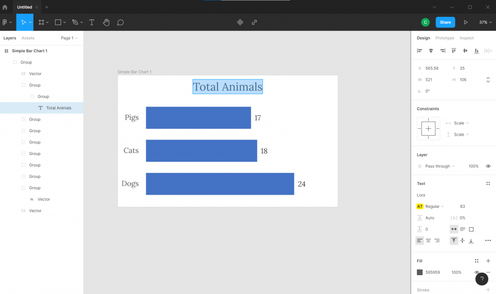
Here is what the Excel Chart looks like in Figma

Here we are in Figma with the layers on the left.

Screenshot of Figma with an SVG Excel chart.

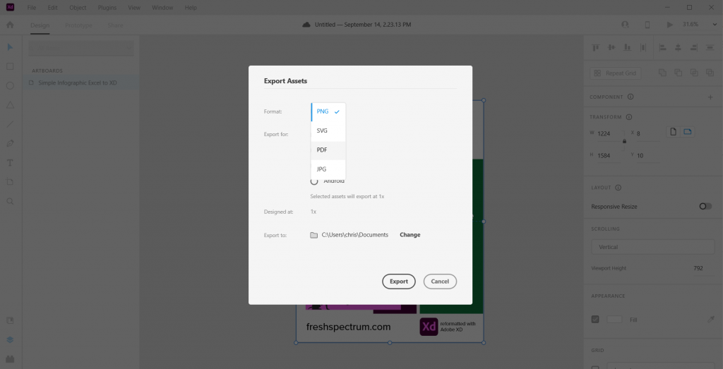
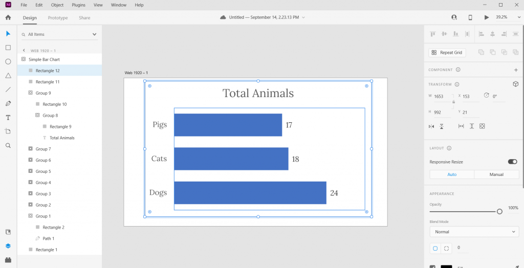
Here is what the Excel Chart looks like in Adobe XD

And here we are in Adobe XD. Looks pretty similar to Figma, doesn’t it?

(See also sketchapp).

Screenshot of Adobe XD with an SVG Excel chart.

Pick it apart and rearrange to your heart’s content.

Ultimately the bar graph is just a single vector path buried within one of the groups. We can stretch it or recolor. As long as you keep the main chart pieces together, the graph will remain in the right proportion.

Screenshot of an infographic created from an Excel chart.

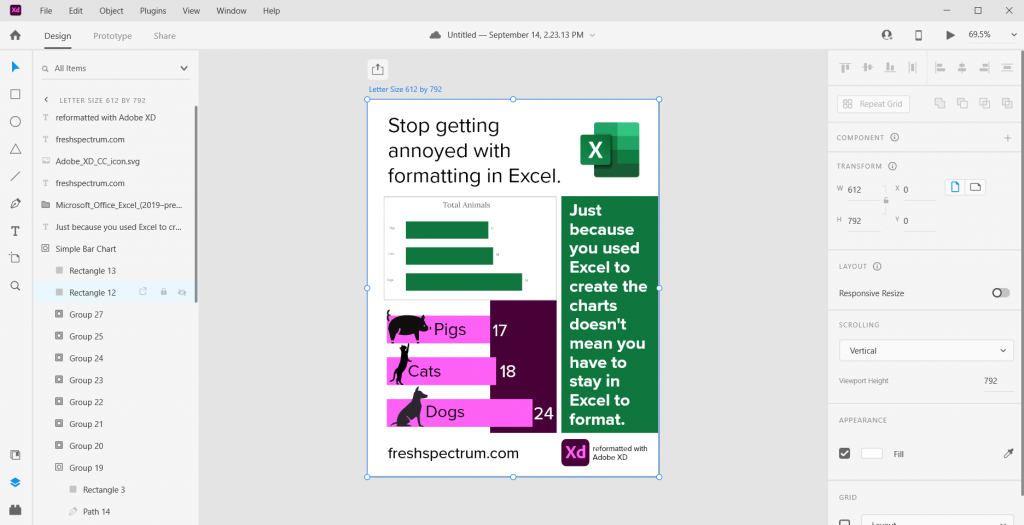
The best part about using a tool like this? We have total control over what goes where. And we can shift elements pixel by pixel.

Freshspectrum Infographic 
-Stop getting annoyed with formatting in Excel. 
-Just because you used Excel to create the charts doesn't mean you have to stay in Excel to format.
-Two charts, one generic Excel chart and the other an updated version created with Adobe XD
Started with a fake chart, ended with a random infographic.

Bonus. Want to save your new infographic as a PDF?

No problem.

Screenshot of Adobe XD, exporting an infographic as a PDF.

Written by cplysy · Categorized: freshspectrum

Sep 07 2021

What you will learn if you join my workshop.

Just a note before I jump in. The pre-launch discount for my workshop expires tomorrow (9/8) at 12PM eastern. The workshop will never be cheaper!

Over the years, when a colleague would take a workshop at a conference, I would ask them what they learned. And then I would ask, “was it worth the money?”

The answers would vary of course, depending on the subject, the workshop host, and who paid for it in the first place. It’s always easier to give a good review of a workshop if someone else is paying the bill.

But regardless, over and over again, the answer to the “was it worth it question” almost always came down to one thing…takeaways.

What is a takeaway?

A workshop takeaway is that thing that sticks in your head well after the workshop has ended. It’s the tool, the method, or the idea that you will take home from the workshop and then put into practice.

Most workshops are designed to deliver a few takeaways. Usually one or two big ones and then maybe a few secondary little ones. It’s incredibly hard to expect to deliver anything more in just a few hours sitting with some peers inside a stuffy hotel conference room.

The value of an online workshop.

The value of an online workshop is TIME.

Some of my peers use this time to deliver a comprehensive curriculum designed to bring about a specific transformation. If you join _____ you will become ____.

But that’s not the only way to use that extra time.

What if instead of trying to deliver a transformation, I used that extra time to deliver lots and lots of takeaways? So instead of this being just a workshop, I lead something equivalent to lots of workshops.

Lots of Workshops in one Workshop.

Ummmmm well I don’t know what I don’t know so I’m excited to learn some of that.

I love that quote from one of my new workshop registrants. After she registered I had asked what she was most looking forward to learning. It didn’t occur to me until that moment, but that’s exactly what I’m trying to teach.

Each week we’ll dive into something different. Each time a practical topic that I find useful in my own work but likely a topic that many of my data peers don’t know much about.

I want each week to feel like a self-contained mini-workshop, with it’s own takeaways.

These first 8 weeks are just a start.

  • Session 1: Building slide style infographics. (9/8 at 2PM Eastern)
  • Session 2: The web is filled with funnels, how to build yours. (9/15 at 2PM Eastern)
  • Session 3: Building one-filter dashboards with Tableau. (9/22, time TBD)
  • Session 4: External analytics as inspiration. (9/29, time TBD)
  • Session 5: Illustrating social media with data. (date & time TBD)
  • Session 6: The continued importance of building an email list. (date & time TBD)
  • Session 7: An intro to powerful (and free) UI design software. (date & time TBD)
  • Session 8: Social media insight tools and how to use them. (date & time TBD)

My starting plan is to meet weekly on Wednesdays at 2PM Eastern. But depending on the response (you are part of a global audience) we may shift/stagger the time/days to meet participant needs.

Join US!

It’s not too late to get the starting pre-launch 30% off discount, but that will expire on Wednesday, September 8 at 12PM Eastern. So click this link and join us today.

Written by cplysy · Categorized: freshspectrum

Aug 31 2021

It’s not about the charts.

If you just want to create better charts, don’t join my workshop.

I have no desire to compete with my friends Stephanie Evergreen and Ann K Emery on fundamental visual reporting and chart literacy.

If you just want to code with R or Python, don’t join my workshop.

Two suggestions. David Keyes for all things R and George Mount for moving into Python/R from Excel.

Let's create together. freshspectrum.com/diydatadesign

So who should join?

In short, the people who want to go beyond creating better charts but who don’t feel like diving into code.

Examples:

  • The non-profit data person who doesn’t just have to “write reports” but find a way to communicate that data to an incredibly diverse virtual audience.
  • The public health worker who creates data dashboards but has no clue if anyone uses them or if there is anything they could do to make them better.
  • The evaluation capacity building team member who finds that all their work that used to be in-person is now virtual, and it might not be as short-term as they first thought.
  • The researcher who is not content writing an amazing paper or report only to have it fade into obscurity the minute it hits the web.
  • The independent data consultant who is overwhelmed by the number of software tools and methods they need to learn to effectively do their job.
  • The data person who wants to learn more about graphic design and web design tools.

21st century reporting is not about one thing, but a ton of little things.

Freshspectrum cartoon by Chris Lysy. "Of course I "read" your report."
"Why the air quotes?"

My four big themes.

  • Creative Reporting – because you have to get creative to reach different people across different platforms.
  • Content Strategy – because if you really want to reach a specific group of stakeholders, you need to be intentional and understand how the web works.
  • UX/UI Design – because if you are trying to share access to something bigger than can fit on a page, you need to understand interface design and how real people use the web.
  • Digital Evaluation – because if you are not evaluating, you are just guessing what people want and that what you are doing is working.

Our first 8 weeks.

This workshop is taught live (but with each session recorded). I’ve put together the topics for our first 8 weeks, here is the list.

  • Session 1: Building slide style infographics. (9/8)
  • Session 2: The web is filled with funnels, how to build yours. (9/15)
  • Session 3: Building one-filter dashboards with Tableau. (9/22)
  • Session 4: External analytics as inspiration. (9/29)
  • Session 5: Illustrating social media with data.
  • Session 6: The continued importance of building an email list.
  • Session 7: An intro to powerful (and free) UI design software.
  • Session 8: Social media insight tools and how to use them.

Plus Community and Quick Tips.

I’ve learned over time, that the fastest way to build a community is to meet a bunch in person (via Zoom).

But included in this workshop will also be an asynchronous community space for asking questions, sharing your work, and connecting with your peers. And sets of quick video lessons on very specific topics that I find myself teaching people over and over again.

Want in?

My plan is to keep enrollment open and rolling (instead of closed). But the first people who sign up will definitely get the best deal (in the form of a discount) and will be in the best position to inform the direction of the workshop.

So, if you’re even remotely interested, I suggest joining the waitlist NOW!.

Written by cplysy · Categorized: freshspectrum

Aug 25 2021

Beyond Better Charts – My New Workshop on 21st Century Reporting

If nobody sees your amazing chart, can you still call it amazing?

For data to have an impact, it needs to be the right data, reaching the right person, at the right time, and in the right format.  

That’s a lot that has to go right. And only a little of it has anything to do with your chart choices.

freshspectrum cartoon by Chris Lysy "I had some amazing charts in our last report. It's too bad nobody will ever see them."

Do you have the skills necessary to create modern reports?

Most reports these days are created digitally, sent digitally, and experienced through a screen.  In other words, modern report design is web design. 

Our grad programs are still training for an analog world, not the digital one where we currently reside. So many of the 21st century skills necessary to create a modern report were not taught in grad school.

I’m launching a new virtual workshop, here is what I plan to teach.

In short, a little about a lot of things.  Generally they all fit within four categories that I believe are fundamental components of 21st century report design.

  • Creative Reporting
  • Content Strategy
  • UX/UI Design
  • Digital Evaluation

Theme 1. Creative Reporting. Escaping the standard downloadable PDF report rut.

DiY Data Design Creative Reporting - Escaping the standard downloadable PDF report rut.

The internet has brought us countless ways to reach an audience. Each channel is unique, with its own rules, design standards, and cultures.  This means that a modern report design might look very different from how it used to look.

Topics under this theme include infographic design, social media illustration, video production, slide doc creation, multimedia report development, and vector design.

Theme 2. Content Strategy. Reaching beyond the usual audience.

DiY Data Design - Content Strategy - Reaching beyond the usual audience.

Many organizations are following the Field of Dreams model of report sharing, “if you share it on your website, they will come.” But sharing a report publicly on your website is just the absolute bare minimum. Reaching beyond the usual audience takes strategy. 

During sessions on this theme we will take on topics like content strategy, audience avatars, marketing funnels, alternative dissemination strategies, push/pull strategies, and newsletter design.

Theme 3. UX/UI Design. Making more data, less complicated.

DiY Data Design - UX/UI Design - Making more data, less complicated.

The reality of our digital world is that we now have access to more data than ever and the potential to reach more people than ever.  Unfortunately, so many of those people are just completely overwhelmed. So it puts us into a tough position, how do we present more data, while making the experience less complicated?

Topics for this theme will include things like user experience methodologies, user interface design, interactive visualization design, and report automation. 

Theme 4. Digital Evaluation. Determining what works so you can do better.

DiY Data Design - Digital Evaluation - Determining what works so you can do better.

Evaluation helps us identify opportunities, assess the results of our actions, and improve our strategies. There are all sorts of ways to evaluate digital reporting efforts but the knee jerk method among most of the data people is just to send a survey. I’m not anti-survey, but there are a lot of other data sources we can leverage to improve our approaches.

Topics for this theme include web analytics, social media insights, funnel analytics, keyword analytics, backlink evaluation, and user experience evaluation.

How the workshop will be structured.

DiY Data Design workshop goals. "I joined to learn some new software and methods. But I think I get the most value from directly connecting with data people just like me."

We will meet live on Zoom for an hour, 4 times each month.  Each session will focus on a different subtopic from one of the four themes. You can expect 30-45 minutes of content with the rest of the time reserved for questions/conversation.  Every session will be recorded and available to watch later. 

What you will learn.

The goal for the workshop is to teach all the little things you need to know to improve your 21st century reporting skills.

This will include:

  • Introductions to new design software and tools.
  • Instruction on practical creative processes and methods.
  • Opportunities to practice new skills and present your work.
  • Direct support as you work to improve your skills.
DiY Data Design workshop goals. "I joined because I was overwhelmed by all the stuff I didn't know. But Chris has a way of breaking things into small pieces, making all these new methods feel accessible."

How much will the workshop cost?

The workshop has a buffet style all-you-can-learn pricing model.  The price is based on the length of your commitment.  No matter the length you choose, you get access to all live webinars and recorded sessions.

  • 3 months: $199
  • 6 months: $349 (includes a single 1 on 1 coaching call with Chris)
  • 12 months: $499 (includes two 1 on 1 coaching calls with Chris)

What if I enroll and don’t like learning from you?

Let me know within 30 days and I’ll refund your enrollment.

DiY Data Design workshop goals. "I feel pretty confident with my data design skills. But in my org I am the only one who does this stuff. I joined for the thought partners and peers. It's nice to know that I'm not the only person trying to innovate and facing so much resistance."

Will you offer scholarships for…?

Yes. Scholarships will be available and will vary based on need.

When will it launch, and where do I sign up?

DiY Data Design - Workshop Waitlist

The plan is to launch in early September.  

If you would like to be one of the first to know when registration is live, just add your name to the waitlist here: 

Written by cplysy · Categorized: freshspectrum

Aug 13 2021

Why your online evaluation capacity building efforts are doomed to fail

This post was written for, and originally appeared, on AEA365.

Hello my fellow evaluators. My name is Chris Lysy, and I am a freelance evaluator, designer, and trainer based in Cary, North Carolina.  My consulting work involves helping organizations deal with the virtual shift (shifting programs from the “real world” to the “virtual world”).

Over the last couple of decades lots of organizations have evolved from being fundamentally place-based operations to global digital entities. An evolution that started well before COVID.

Yet for some reason we still have this image of an organization being a place where people who work together regularly come into face to face contact.

Cartoon / illustration of two individuals where one says "Where is everyone? I brought doughnuts" and the other is saying "Either remote or working from home. I only come in because I like the quiet."

So why are your online efforts doomed to fail?

I believe we consistently underestimate how much the social environment has changed as the virtual world has grown.  

  • A 60 minute webinar is not the same as a 60 minute in-person brown bag. 
  • A virtual summit is not the same as a multi-day in-person conference.  
  • A 30 minute zoom chat is not the same as a cup of coffee with a colleague.

It’s similar, not necessarily better or worse, but different.

A lot of what has been written about evaluation capacity building is focused on what concepts to cover. It assumes that evaluators know how to effectively engage people at an organizational level. For the pre-virtual organization, that could mean showing up with free doughnuts in the lobby or hosting a large event in the “big conference room.”

But in order to bring the same level of change in the virtual world, we have to approach the capacity building challenge differently.  Or else our efforts will be doomed to fail.

Capacity Building Requires Community Building

Most organizations are not full of vibrant virtual communities. IRL (“In Real Life”) when people get together, community happens. Not so in the digital world.  People tend to know their teams (from regular Zoom calls) but they might not know anyone else outside their project bubble.

So if you want to engage a certain community of people (say project leaders or internal data people) you have to start by building that specific virtual community.

Cartoon illustration of two people where one is saying "I hear your company has a digital community" and the other is saying :Yeah, we launched out internal social network a few years ago." The first person asks "Does anyone use it?" and the second responds "no."

A Dead Forum is NOT a Community

Yes we all have lovely dreams of an active forum where people go to ask questions and support one another. But the reality is that good forum communities are hard to build and often require far more people than you even have in your organization.

A Webinar Lecture Series is NOT a Community

Somebody wants a community. So they create a webinar lecture series with topics of interest for that specific community. That might work for community building IRL but it doesn’t work the same online. Do this instead.

  • Hold webinar conversations, not lectures.
  • Source presenters from inside the prospective community.
  • Hold panel webinars to distribute the content responsibility and increase exposure to peers.
  • People need to see/hear people to connect, so encourage cameras/headsets (just don’t require them!).
Cartoon illustration where a person is at a computer with headphones on and is saying "I got the email and thought 'I'm free at 2, so why not?'" and the person on the computer screen is saying "So why did you join today's webinar?"

An Email Newsletter is a Good Place to Start

It’s easy to create and just shows up in their email inbox (no need for them to visit a specific site or remember any kind of password/username). You can source newsletter content from the community and it pairs really well with a conversational webinar strategy.

Want more guidance?

I created a short practical guide.

Image of a flyer for Virtual Community Building 101: Because Virtual Capacity Building Starts with Virtual Community Building by Chris Lysy of freshspectrum.com

You can download it here: Virtual Community Building 101

Written by cplysy · Categorized: freshspectrum

  • « Go to Previous Page
  • Go to page 1
  • Interim pages omitted …
  • Go to page 35
  • Go to page 36
  • Go to page 37
  • Go to page 38
  • Go to page 39
  • Interim pages omitted …
  • Go to page 54
  • Go to Next Page »

Footer

Follow our Work

The easiest way to stay connected to our work is to join our newsletter. You’ll get updates on projects, learn about new events, and hear stories from those evaluators whom the field continues to actively exclude and erase.

Get Updates

Want to take further action or join a pod? Click here to learn more.

Copyright © 2026 · The May 13 Group · Log in

en English
af Afrikaanssq Shqipam አማርኛar العربيةhy Հայերենaz Azərbaycan dilieu Euskarabe Беларуская моваbn বাংলাbs Bosanskibg Българскиca Catalàceb Cebuanony Chichewazh-CN 简体中文zh-TW 繁體中文co Corsuhr Hrvatskics Čeština‎da Dansknl Nederlandsen Englisheo Esperantoet Eestitl Filipinofi Suomifr Françaisfy Fryskgl Galegoka ქართულიde Deutschel Ελληνικάgu ગુજરાતીht Kreyol ayisyenha Harshen Hausahaw Ōlelo Hawaiʻiiw עִבְרִיתhi हिन्दीhmn Hmonghu Magyaris Íslenskaig Igboid Bahasa Indonesiaga Gaeilgeit Italianoja 日本語jw Basa Jawakn ಕನ್ನಡkk Қазақ тіліkm ភាសាខ្មែរko 한국어ku كوردی‎ky Кыргызчаlo ພາສາລາວla Latinlv Latviešu valodalt Lietuvių kalbalb Lëtzebuergeschmk Македонски јазикmg Malagasyms Bahasa Melayuml മലയാളംmt Maltesemi Te Reo Māorimr मराठीmn Монголmy ဗမာစာne नेपालीno Norsk bokmålps پښتوfa فارسیpl Polskipt Portuguêspa ਪੰਜਾਬੀro Românăru Русскийsm Samoangd Gàidhligsr Српски језикst Sesothosn Shonasd سنڌيsi සිංහලsk Slovenčinasl Slovenščinaso Afsoomaalies Españolsu Basa Sundasw Kiswahilisv Svenskatg Тоҷикӣta தமிழ்te తెలుగుth ไทยtr Türkçeuk Українськаur اردوuz O‘zbekchavi Tiếng Việtcy Cymraegxh isiXhosayi יידישyo Yorùbázu Zulu