• Skip to main content
  • Skip to footer
  • Home

The May 13 Group

the next day for evaluation

  • Get Involved
  • Our Work
  • About Us
You are here: Home / Archives for allblogs / freshspectrum

freshspectrum

Nov 19 2024

What is adult learning, and its role in evaluation?

This week’s post was written by Chantal Hoff. Chantal is an epidemiologist by training, who works as an evaluator and Senior Consultant at Data+Soul Research. You can learn more about Chantal on LinkedIn and about Data+Soul Research on their website.

How it started: Enthusiasm for evaluation.

At the end of my first year of my first job working as an evaluator, my supervisor was cleaning out her desk. She found her notes from when she interviewed me – “Chantal is VERY enthusiastic about evaluation.”

It’s true! I am very enthusiastic about evaluation.

You see, after getting my start in academic research spaces, the appeal of evaluation immediately stood out to me. I was frustrated and disenchanted by participating in research projects that were published in journals behind paywalls and never shared back with the communities they were supposed to serve. I was thrilled to find a field that prioritized the questions that communities were asking and generated findings that could immediately be used to improve programs or services, shift ways of thinking, and shine a light on uncomfortable truths.

Cartoon guy on phone: So, let me see if I have this right.  You'll publish our research.  In exchange, you get to put it behind a paywall and charge universities large licensing fees to access our work.

But, enthusiasm is not always enough.

To me, the value of evaluation was so clear that I was genuinely surprised when I worked with teams who didn’t seem to see the value of evaluation. Sure, they knew the evaluator could help them write their grant reports. But otherwise, couldn’t I just leave them alone to do their important work?

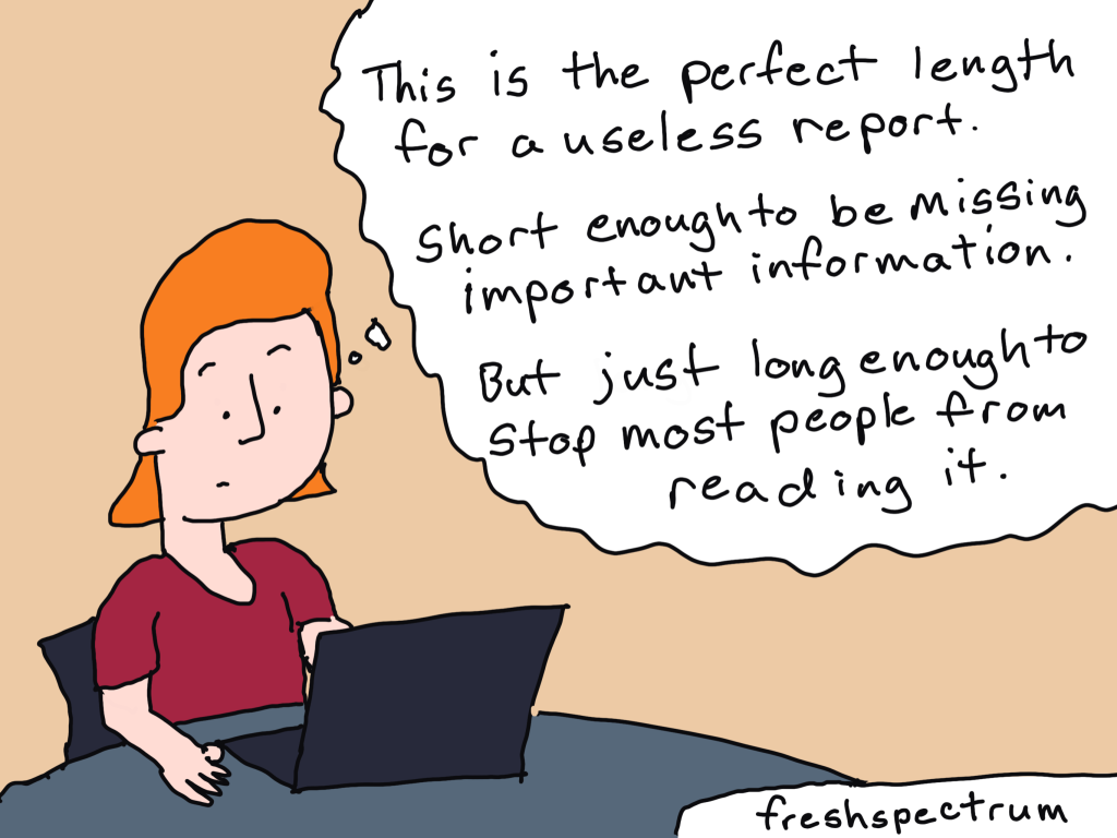
It wasn’t on them to just go along with what I was saying about the importance of evaluation. It was my responsibility to earn their trust and to make the case for evaluation. I realized pretty quickly that a summative evaluation report shared back months after the program ended wouldn’t cut it; I had to show them how they could use and learn from the data they were gathering every week to improve program design and implementation.

Cartoon person talking to people at a table: Thanks for joining me for this evaluation kickoff meeting.

People at table.
Person One: Is this going to take long? I have a lot of important work to do.
Person Two: Me Too.
Person Three is just looking at their phone.

Enter: Adult Learning.

I took exactly one evaluation class in grad school. So, while I was familiar with approaches like “utilization focused evaluation,” I was largely on my own to figure out how to apply it to my current setting. 

I started experimenting – trusting teammates to articulate evaluation questions using their experiences on the ground, using team meetings to build awareness and knowledge around key evaluation concepts, and recognizing skepticism and pushback as valuable insights rooted in experience. I listened closely to their problems and pain points, recognized the many (many!) insights and experiences they were bringing into the work, and, whenever possible, connected the dots to show how evaluation could be a resource for their work.

Little did I know that many of these ideas and concepts were part of something bigger, something that even had a name! Adult learning.

Person talking to a table of three:
Before we wrap up, does anyone have any questions?
One person at table with their hand up: "I do...Why are we here?"

So, what is Adult Learning?

Adult learning theory, or “andragogy,” is the “art and science of adult learning” (as opposed to child learning, “pedagogy”). While Malcolm Knowles is credited with popularizing the idea in the 1970s, a quick search will reveal many adult learning frameworks with different numbers of principles and origins.

While there’s no one specific source or list that I follow, here are a few adult learning principles that continue to resonate with me:

1. Adults bring their backgrounds, experiences, and prior knowledge into learning spaces.

They are not blank slates. Invite them to share their knowledge and create ways for them to build on existing knowledge.

2. Adults are often motivated to learn because they have problems they want to solve.

Listen closely for problems and pain points; if you don’t know, ask! Tailor learning opportunities to help learners solve problems that are relevant to them.

3. Be clear about the “why.”

Nothing is worse than sitting in a sensemaking session or training and wondering, why am I here? Be clear and direct about the purpose behind activities. If the why isn’t clear to you, consider, “should I still be doing this?”

4. Practice makes permanent.

Adults need to practice skills and apply knowledge in order to internalize and integrate learning.

Cartoon person in front of a white board: There are three types of learning theory.
On the board:
Pedagogy: Kids
Andragogy: Adults
Overwhelmedagogy: Distracted People

Even better, these principles complement many other frameworks and approaches that our team uses in our daily evaluation work, including utilization-focused evaluation, culturally responsive and equitable evaluation, human-centered design, and appreciative inquiry.

How do I apply it to my work?

I’ve now had a few roles at a few different organizations since my first evaluation job. In 2022, I made the transition from internal evaluation roles in non-profit organizations to working as a consultant for a small firm that supports non-profits, grantmaking institutions, community-based organizations, and municipalities. Adult learning is now an official part of my job description. 

Here are a few examples of how it shows up:

1. Evaluation technical assistance and coaching.

I support non-profit clients and grantees to design and implement their own evaluations. In kickoff calls, you’ll hear me ask questions like:

  • What prior experience do you have with evaluation? 
  • What’s already working for you? What data systems and learning practices do you already have in place?
  • What are you stuck on? What’s a question that keeps coming up for you? How can evaluation help?

2. Reporting and sensemaking.

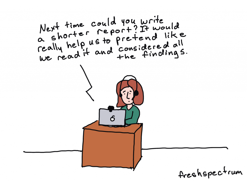
When writing reports, I ground myself in what problem our client is trying to solve and what decisions they need to make about it. I tailor the headings and executive summary to tell a brief, compelling story focused on use, while using links to make it easy to navigate to pages with more detail.

In sensemaking sessions, I open with an invitation to share what hopes and burning questions folks would like to explore together. I connect the report findings and visuals to these hopes and questions, and create ample space for folks to process findings and identify shifts or next steps for their work.

3. Workshops and trainings for fellow evaluators.

I had the privilege of co-facilitating a pre-conference workshop at AEA this year; it’s part of a larger training series for evaluators and researchers that Data+Soul Research is rolling out this year. While sharing content and ideas is great, most aha moments come when folks get to put things into practice – whether through individual reflection, sharing in pairs or groups, or using resources to try new practices out with their own teams. 

How is adult learning showing up in your practice? I’d love to hear in the comments below!

Written by cplysy · Categorized: freshspectrum

Nov 07 2024

It’s not enough to know.

Evaluation is a systematic process to determine merit, worth, value or significance…

But then what?

Let’s say you followed a systematic process and came to some conclusions about the value of a program. Your evidence shows that this particular program *doesn’t work so well.

What comes next? It’s pretty unlikely that your work is completed once you come to your determination. Once you know.

Do you just write it up in a complicated precise report that few will ever read and call it a day?

Perhaps.

I think for some evaluators, that’s the job. To make a determination. For these evaluators, deciding what to do with that determination is for somebody else.

But if that’s not you, do you spend additional time breaking down your findings so that the evidence and rationale can be explained to your primary audience of likely decision makers?

Perhaps.

It is usually the likely decision makers who pay your bills. They are your boss or your client. As long as they understand your determination, and are happy with your work, maybe that’s when you call the job done.

But let’s say you don’t stop there, do you spend time adapting your evidence and rationale to meet the specific needs of other audience members? The people who are directly or indirectly connected to the program, the funding stream, or the outcomes.

Perhaps.

As long as we include everyone as an audience for our reporting, and create a string of reporting products to meet a variety of needs. And these reports will be shared by the organization’s communications department. That should be enough, right?

But maybe you want to know if it actually reached all these different audiences, or at least some of the major ones. You also want to know if the audiences actually understand the evaluation findings and their implications. Do you then evaluate your sharing efforts and adapt your reporting strategy based on the findings?

Perhaps.

At this point, you’ve put in a lot of effort to see that your findings reach all your different audiences. Could anyone ask for anything more?

But what if the findings are contrary to popular belief? Your determination means a program that people believe in, one that looks good on paper, doesn’t actually lead to desired positive outcomes. It does not work as it is designed to work.

Do you put in the effort to build a level trust with all of these different audiences, so that they believe you when you share your results? Do you put in the work to convince these different audience members that your determination is right, even if it’s hard to believe at first.

Perhaps.

At some point in this blog post did you start to feel overwhelmed?

Did you say to yourself, “okay, but we just don’t have the budget or time to do all of this…”?

When I see evaluators describing evaluation to others, they often focus on what it means to do an evaluation. The process they follow, the methods they use, and the people they involve. The “then what” piece is always a little bit on the fuzzy side.

So my question for you, when does it end?

*This is all pretend, of course, because rarely does any program you are called to evaluate show little to no merit. Nor does any program ever seem like it works flawlessly. In other words, most determinations are “complicated.”

Written by cplysy · Categorized: freshspectrum

Oct 23 2024

Attending a conference? Do this.

I’m writing this at the start of the American Evaluation Association’s national conference.

Unfortunately it’s another year that I won’t be attending. But I want to pass some advice to all of you who attend conferences like this one with hopes of building both your skills and your professional reputation.

It’s time to think beyond the physical space, networking opportunities, and personal connections.

First, the secret.

For every conference that draws thousands of people to a physical space somewhere in the world, there are lots of people (in the same network) who won’t be present. That potential audience could be 10 times, or even a hundred times, the number of participants that show up live.

This is an opportunity.

My evaluation comics started drawing an audience because I drew them and shared them during evaluation conferences that I attended. And the comics, along with associated blog posts, carried with them a snapshot of the lessons learned during the live conference.

Because even if it feels like there are lots of people at the conference, there are more people on the outside looking in. And these people are often hoping to learn a little by extension.

This comic comes from a post I wrote about evaluation blogging.

Here are some ways that you can leverage your participation at a conference to help amplify lessons learned, while also boosting your own reputation.

1. Turn your presentations into blog posts.

This can be a really quick win. Chances are, if you are presenting, you spent a lot of time thinking through and planning that presentation. Take the opportunity to turn it into a blog post. And if you don’t have a blog, you can write a LinkedIn article.

I know I’ve done this before, but I couldn’t find an example when writing this. So here is a guest post written by Kylie Hutchinson based on her experiences at the 2011 evaluation conference.

Kylie Hutchinson (@EvaluationMaven) with 23 tips for a better conference presentation #eval11

2. Turn your presentation into a YouTube video.

As you’re practicing your presentation, turn on your mobile phone selfie style, and create a recording. If it’s a long presentation, give a shortened version. Then upload to YouTube to share.

Want to see my first ever AEA presentation? Here it is…

3. Amplify other people’s presentations with social posts.

Attend presentations, and then share your takeaways on social. It doesn’t have to be much, just a simple post on LinkedIn. You can also tag the presenters and hashtag the conference.

Inspired by a Michael Quinn Patton presentation, shared on AEA365.

4. Ask your fellow attendees questions, take a picture, then make a small infographic to share.

This is a strategy that can also help you network, even if you’re an introvert like me.

Pick some interesting questions based on your background. Then ask everyone you meet that question and take their picture (if they let you). After that, put each question & answer, with the photo, onto a slide sized image in Canva or PowerPoint. Now you have a bunch of original infographics to share.

5. Simply document your experience for others who can’t make it live.

The most valuable parts of a conference are not always the presentations or workshops. I always got most value from personal conversations and connections with peers. There can be long days, and it can be exhausting, but simply documenting your experience can provide value for all the people who won’t be there live.

Back in 2014, Isaac Castillo lost his voice. He asked if I could turn into a cartoon, this was the result.

What else am I missing?

Do you have any suggestions for turning a personal conference experience into something that can be shared more broadly? Let me know in the comments.

Written by cplysy · Categorized: freshspectrum

Oct 08 2024

Formstorming Charts, Graphs, and Illustrations

You want to know the secret to improving the quality of your charts, graphs, and illustrations?

It’s simple. Create more than one chart, graph, or illustration. Then pick the best one.

Or, in other words, formstorm it.

Stop taking the easy way out.

The following comes from a presentation given by John Cleese on Creativity In Management, which you can watch in full on YouTube.

I was always intrigued that one of my Monty Python colleagues who seem to be to me more talented than I was did never produce scripts as original as mine. And I watched for some time and then I began to see why.

If he was faced with a problem and fairly soon saw a solution, he was inclined to take it. Even though I think he knew the solution was not very original. Whereas if I was in the same situation, although I was sorely tempted to take the easy way out and finish, I just couldn’t. I’d sit there with the problem for another hour and a quarter and by sticking at it would, in the end, almost always come up with something more original.

It was that simple. My work was more creative than his simply because I was prepared to stick with the problem longer. So imagine my excitement when I found that this was exactly what MacKinnon found in his research. He discovered that the most creative professionals always played with the problem for much longer before they tried to resolve it. Because they were prepared to tolerate that slight discomfort and an anxiety that we all experience when we haven’t solved a problem.

Most everyday chart designers move forward too fast on a single chart design or icon choice.

  • “Categorical data, I’ll create a bar chart.“
  • “Time series data, I’ll create a line graph.”

And most of the time that’s fine. But if the data is important, don’t just stop with the quick default chart choice. Because every chart you create, and variation, can tell a different story.

And instead of checklists or chart choosers, my suggestion is to create a bunch of possible charts before picking the one you want to use in your report or presentation.

What is formstorming?

Formstorming is a process I read about in the second edition of Graphic Design The New Basics by Ellen Lupton and Jennifer Cole Phillips.

Formstorming is an act of visual thinking — a tool for designers to unlock and deepen solutions to basic design problems.

Generating multiple iterations of one subject is a means of digging deeper.

This is my favorite example from the book. How many ways can you illustrate an egg?

You might be familiar with some of the daily challenges you’ll see ln Social Media. Things like daily drawing challenges or the 30 day chart challenge. These kinds of challenges can be really great for creative practice.

Prompts from the #30DayChartChallenge – April 2024

But it can also be really useful to take on that mindset when just doing your regular data visualization work.

More iterations, more creative solutions.

So how many chart or illustration iterations should you consider?

When I get a new potential design client, before we settle on a budget, I always ask how important the project is to that client. Because the process involved in any creative project is not usually dependent on the amount of time it takes to “do the work.” But the importance of that work.

If you are creating a logo for a side project, you probably won’t sink that much time into it. But if you are creating a logo for a city, one that will be on signs, documents, vehicles, and more, you probably want to spend more time than a lunch break.

The same thing goes with chart iterations. If sharing the data is important, spend more time creating more iterations. If it’s not that important, just stick with a few. If you currently just create one chart option, try creating 3. If you already create a few, and the project is important or the message is critical, try to create far more (say 15).

But if you just want to stretch your creative limits, I would suggest approaching the visual with a nice 3 by 3 (9 iterations).

Keep in mind, you don’t have to go all in on a final design. You could start by just brainstorming options with a marker and sketch pad.

Want some more tips on practical creativity?

There is still time to register for my Compelling Qualitative Data Visualization course, which will be held on October 15 & 17.

I’ve been reading a LOT of qualitative data sections inside of reports, and trust me, there are a lot of people who could use some support. It’s just not something anybody is taught in their social science programs in grad school.

You can learn more about the course on my workshop page at diydatadesign.com.

Written by cplysy · Categorized: freshspectrum

Oct 02 2024

Is your report too wordy? Don’t do this.

Have you been told your report is too wordy?

Or maybe you received input that your report was “too long” or “not reader friendly.”

And then perhaps you were given the advice, “make it shorter.”

STOP!

Don’t follow that advice.

In this post I’ll tell you why making your report shorter is often bad advice, and what you should do instead.

Shorter is not the same as easier to read.

When I was a kid my mom always had a few magazine subscriptions. We were not a Newsweek, Atlantic, or National Geographic family, more of a Southern Living and Better Homes and Gardens. These magazines would then accumulate over time and you would find them all around the house, from end tables to bathrooms.

Magazines were always the kind of thing that you could just pick up and read an article or two then set down. But even though they were really easy to pick up and read, it’s not like they were necessarily that short.

Most magazines are around 100 pages, but do you hear people complaining that a People magazine is too long? A lot of reports that people complain about are around the same page length, and sometimes much shorter. You could even get a comment that a 5 page executive summary is too wordy.

And maybe it is. Because here’s the secret.

People only complain about length or wordiness, when something is hard to read. But length (and even wordiness) isn’t the thing that makes our work hard to read.

So if it’s not a length or wordiness issue, what is it?

In short, poor organization and the wrong format.

A lot of reports are written like novels. There is an expectation that the reader is going to start from the beginning and work their way to the end.

Most people don’t read reports from start to finish. They don’t want a novel. They just want to skim. Then when they find something they want to read more about, they read more about it.

And if your report isn’t designed in a way that could be easily skimmed, people are going to complain that it’s too wordy.

Here are a few approaches for improving your report design (some are counterintuitive).

Try these things before you start summarizing your analyses and cutting out chunks of your rich data.

1. Turn your headings into a story.

Think about it. If people are just going to flip through your report, they are going to start by reading all of your headings. If your headings just say, Executive Summary, Introduction, Methods, Findings, Recommendations, your reader is not going to get anything out of their skim.

If you change each heading into a short narrative sentence, and do this systematically throughout the whole report, the headings themselves will tell the reader a story. Even if they only skim.

2. Add more pages.

If people are complaining that your 10 page report is too long, try making it 20 pages. Just don’t add any new words. With the added space create blocks of white space and make room for illustration. In our digital world readability is more important than physical space. It’s very possible you can make something easier to read just by giving it more space.

3. Reduce font size.

Not everywhere. But if you have long sections, layer your text by staggering font size. Make the first intro paragraph a larger font and the rest of the section smaller. This creates a path for your skim readers to go from header to first paragraph to next header, and on and on.

4. Spotlight important things.

If you have important findings, interesting quotes, or just stuff you really want the person reading to know, format the information so it won’t be skipped. This could be as simple as using a colored block and position to highlight a couple sentences or using an icon. The goal is to intentionally break your reader’s skim through the use of formatting.

5. Systematically illustrate.

Most evaluators and researchers have this academic bad habit of only using visuals if they can fully justify their existence. But in our visual first digital world, visuals are no longer optional. Images have become visual cues that certain information is important, or that a section has changed.

If the visuals don’t exist, everything just lumps together into a big block of text.

Want to learn how to illustrate your report?

My compelling qualitative data visualization course will be live on October 15 & 17.

Reports filled with rich qualitative data are much more likely to feel too wordy. But the answer to improving those reports is NOT to just summarize the data. I have an approach to qualitative data visualization that enhances your work and increases readability without destroying the richness that makes qualitative data so valuable.

You can learn more about the course on my workshop page at diydatadesign.com.

Written by cplysy · Categorized: freshspectrum

  • « Go to Previous Page
  • Go to page 1
  • Interim pages omitted …
  • Go to page 4
  • Go to page 5
  • Go to page 6
  • Go to page 7
  • Go to page 8
  • Interim pages omitted …
  • Go to page 54
  • Go to Next Page »

Footer

Follow our Work

The easiest way to stay connected to our work is to join our newsletter. You’ll get updates on projects, learn about new events, and hear stories from those evaluators whom the field continues to actively exclude and erase.

Get Updates

Want to take further action or join a pod? Click here to learn more.

Copyright © 2026 · The May 13 Group · Log in

en English
af Afrikaanssq Shqipam አማርኛar العربيةhy Հայերենaz Azərbaycan dilieu Euskarabe Беларуская моваbn বাংলাbs Bosanskibg Българскиca Catalàceb Cebuanony Chichewazh-CN 简体中文zh-TW 繁體中文co Corsuhr Hrvatskics Čeština‎da Dansknl Nederlandsen Englisheo Esperantoet Eestitl Filipinofi Suomifr Françaisfy Fryskgl Galegoka ქართულიde Deutschel Ελληνικάgu ગુજરાતીht Kreyol ayisyenha Harshen Hausahaw Ōlelo Hawaiʻiiw עִבְרִיתhi हिन्दीhmn Hmonghu Magyaris Íslenskaig Igboid Bahasa Indonesiaga Gaeilgeit Italianoja 日本語jw Basa Jawakn ಕನ್ನಡkk Қазақ тіліkm ភាសាខ្មែរko 한국어ku كوردی‎ky Кыргызчаlo ພາສາລາວla Latinlv Latviešu valodalt Lietuvių kalbalb Lëtzebuergeschmk Македонски јазикmg Malagasyms Bahasa Melayuml മലയാളംmt Maltesemi Te Reo Māorimr मराठीmn Монголmy ဗမာစာne नेपालीno Norsk bokmålps پښتوfa فارسیpl Polskipt Portuguêspa ਪੰਜਾਬੀro Românăru Русскийsm Samoangd Gàidhligsr Српски језикst Sesothosn Shonasd سنڌيsi සිංහලsk Slovenčinasl Slovenščinaso Afsoomaalies Españolsu Basa Sundasw Kiswahilisv Svenskatg Тоҷикӣta தமிழ்te తెలుగుth ไทยtr Türkçeuk Українськаur اردوuz O‘zbekchavi Tiếng Việtcy Cymraegxh isiXhosayi יידישyo Yorùbázu Zulu