• Skip to main content
  • Skip to footer
  • Home

The May 13 Group

the next day for evaluation

  • Get Involved
  • Our Work
  • About Us
You are here: Home / Archives for allblogs / freshspectrum

freshspectrum

Sep 24 2024

Creating Fuzzy Icon Arrays

One of the cool things about teaching data design is that I get to personally learn from the people who take my workshops.

Today’s concept comes from Celestyna Galicki. This is the second time I’ve featured one of Celestyna’s creations (see her post on Shadow Logic Models).

If you have ever taken one of my workshops you’ll probably know that I love using icon arrays. You don’t need fancy tools, at the most basic level you can just copy and paste shapes. But Celestyna came up with an interesting way to display the array data that tweaks the visual story quite a bit. So I asked her if she would share her process on this blog.

Simple Tweaks with Icon Arrays (Celestyna’s section)

Simple tweaks to popular data visualizations can change what they communicate and how they are interpreted by the audience. For example, we have 800 squares (representing units of something) and we want to illustrate the scale and impact if we remove 200 of them.

The standard way to do it would be to grey out the 200 squares…

… or to delete them, which will work in a slide or video transition where they disappear from the starting picture:

We can also remove the squares randomly and create an animated transition in which the starting picture becomes full of holes. This is what I’ve done, and it worked very well for the story I was telling.

See, the “cut a piece off” reduction still leaves us with a very solid pattern. The implication is that the new situation will work in the same way, only on a smaller scale. What I wanted to say is that the change will leave us with something that will work in a new, different way, and presenting it in this form effectively underscored this message.

If you want to illustrate a change in numbers, ask: What does this change mean for how things work? How can we reflect this in how we show this change? That set of squares can be a floor and when holes appear whoever walks on it can fall through, but it could also be a wall in which we knock out a few bricks to let in some light and create space for innovation while the wall is still stands and serves its purpose. Or it could be a net that can handle the smaller holes but will lose its functionality if there is a big enough hole. Which of these visual metaphors fits the story you’re telling?

(You could make the visual metaphor explicit by making the squares look like floor tiles or bricks in a wall. I don’t, for two reasons: I do not have time, and I find that it works well enough when the audience discovers that meaning on their own – “this looks like ….!”. What you write in the report or speak in the presentation can guide them towards this interpretation.)

Did you use any modifications of common graphs or visualisations to support the meaning of the story you were telling? Share in the comments!

Playing around with Fuzzy Icon Arrays in Canva (Chris’ section)

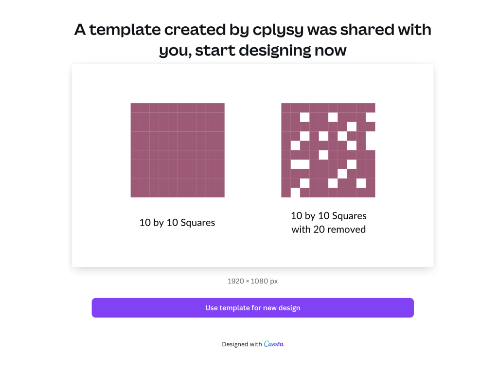
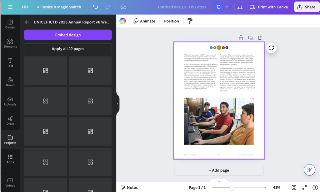
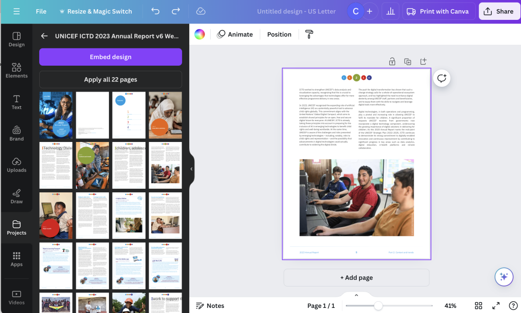
Celestyna’s icon array made me think of a pixelated photo. So I thought, what if we actually purposefully pixelated to tell a story about what a photo shows and does not show. I ended up putting this together in Canva.

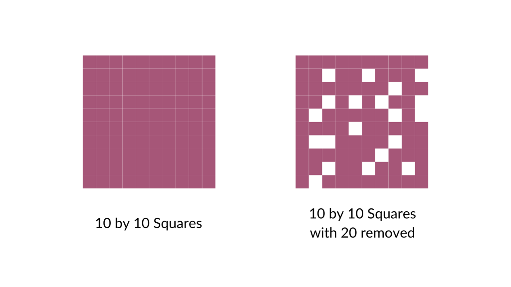
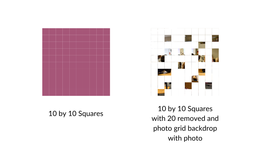
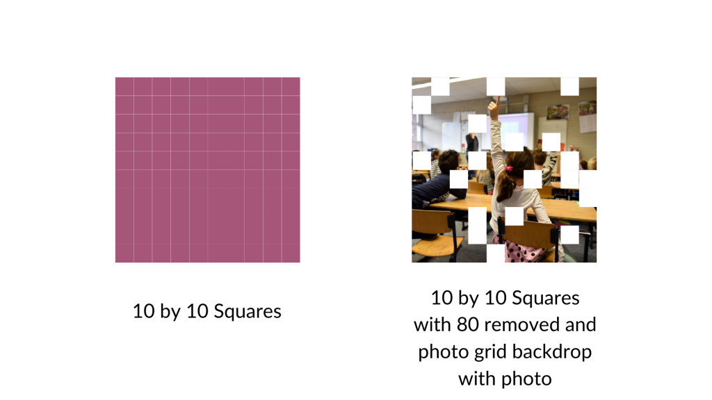
I started by turning a bunch of squares into a ten by ten grid (so 100 little squares). Then I arbitrarily removed 20 (leaving 80).

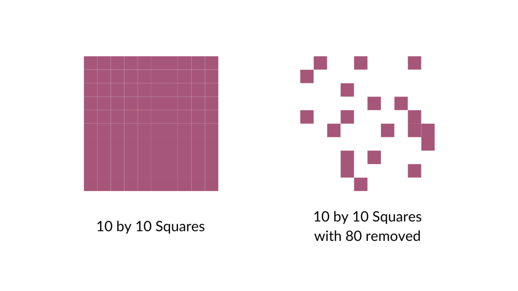
And then I did it again, removing 80 (leaving 20).

For the next step I went ahead and put a square photo grid behind my array. Now only the removed pieces will show the grid.

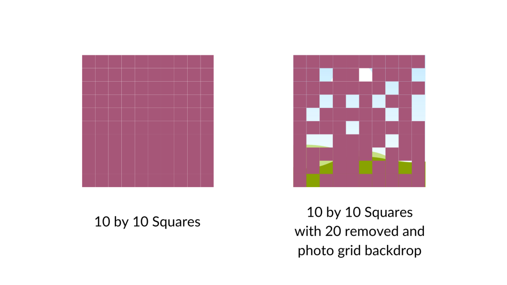
If you wanted to do something like this I would say it works better if you treat the background image as your base. So if you want to show 80 out of 100, remove 80 (not 20). You’ll see what I mean in a second.

Here is the grid with 20 squares removed and the remaining squares turned the same color as the background. As you can see, the picture is really fuzzy as we are only seeing it through 20%.

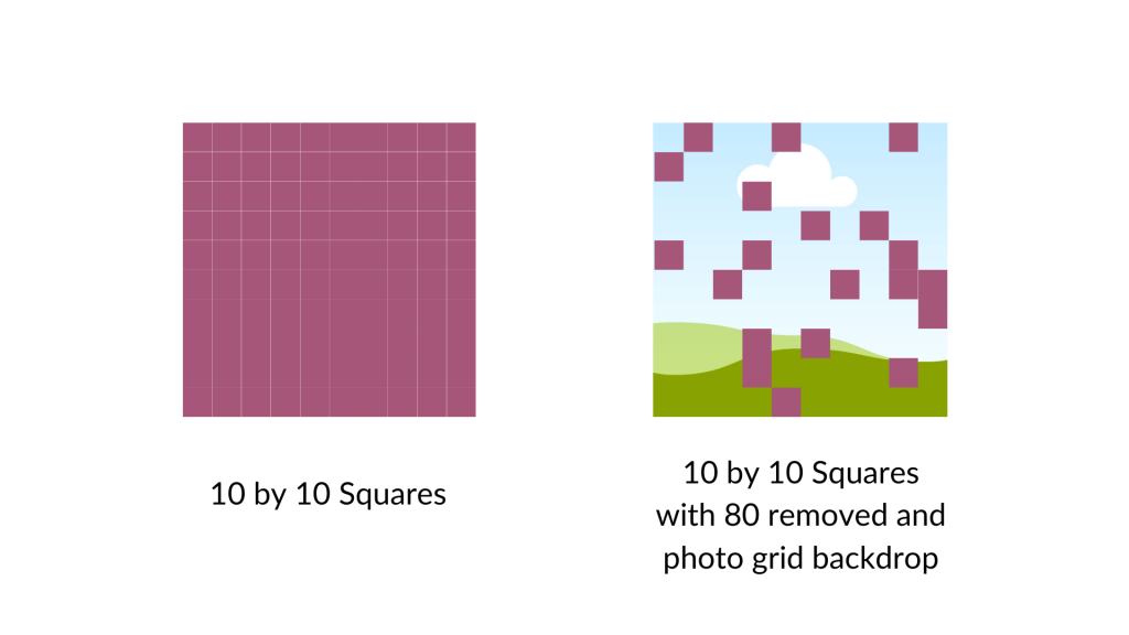
Now here is that same picture with the 80 squares removed. You can see almost the full picture.

I could see this being a really cool way to show off response rates to surveys (especially when doing a census approach). It gives you a sense of the missing data, and how we can still see the big picture. But if we were to have a lower response rate, the picture would show up less. A nice visual metaphor while showing off real data.

Want to access my Fuzzy Icon Array Canva Template?

Just follow the link below (just make sure to sign into your Canva account first). Also, it’s okay if you only have a free account as I only used free Canva elements for this template.

Written by cplysy · Categorized: freshspectrum

Sep 05 2024

How to Use Icons in Reports

Icons can be a really easy and effective way to illustrate reports and visualize qualitative data.

In this post I’ll share some examples, give you some icon use tips, and talk about some specific ways you can develop and use your own icons using Canva.

In a previous blog post I talked about qualitative data visualization and my O.S.E.E. approach. I’ll use that same framework in this post to talk about icon usage.

How to use icons to organize your report.

Icons can be useful for giving a pretty dull looking report just a little bit of life. But they can also act to help organize information. In this way icons become a lot like feature images on web pages, helping the reader navigate a report.

Take this example from IDEO’s Field Guide to Human Centered Design [PDF] & DesignKit website. Icons are used throughout the pdf copy with every single method having an associated icon. These icons are also then used on the designkit website as clickable menu items.

Not only do the icons provide small introductory illustrations, they can also be color coded to match different categories.
Having the same icon on both the menu page and the individual method page confirms to the website user that they have clicked the right link. This kind of utilitarian function is super important when organizing information on the web.

How to use icons to spotlight important information.

Pictures can be an important tool for spotlighting important messages and takeaways. In this way appropriate icons can be used to illustrate quotes, blurbs, and factoids. Icons can also be used to illustrate menu items on a page to help guide the reader to where they would like to go next.

Organizations like UNICEF use a lot of icons in their reports and web pages. Without the icons the information would feel a lot more dense.
In this example, small icons are used with every section header. We also see small country flag icons next to the photographs of people representing those countries.

How to use icons to engage your report reader.

Icon arrays are one of my favorite ways to visualize small sets of data. But they can also be really helpful in illustrating stories to increase engagement. You might be used to icon arrays as simple pictures with “bathroom people icons” but icon arrays are really only limited by your imagination.

I like the use of icon arrays in this NY Times story about about COVID outbreaks in prisons from 2021. The watercolor feel to the arrays is much more intriguing than a bar chart.

This particular icon array feels more chart link with 5 rows with 20 icons in each row.
This form of icon array feels more like a natural scene with actual people in a big room. It can make the data feel more real.
You don’t need watercolors to create this kind of effect, just a Canva account and your imagination.

How to use icons to enhance your qualitative data.

Icons can provide really subtle enhancements to your data presentations. This especially true for any qualitative information that can be coded.

Take for instance the UN Sustainable Development Goals. There is a discrete set of 17 goals, each with its own related icon. In this publication archive the related goals for each report were highlighted on the publications page as small simplified number icons.

You can also create little icon matrices. Especially when you plan to revisit a topic over and over again. Take this political people profile icon array from the NYTimes. Rather than saying 17 out of 20, you can show the 17 people. Then do it again for another question with the same base set of 20 in the same matrix order.

This kind of setup is really easy to do using a tool like Canva. Just create the matrix, duplicate the page for each question, and the gray out the ones that don’t apply for each use.

A few icon use tips and considerations.

Simple tip, try to match your icons with text weight.
  • Your icon sets should feel cohesive, as if they belong together. If you use a hodgepodge of different styles and colors your whole report will feel like an unorganized mess.
  • Try to use SVG icons when possible. SVG is a scalable format, meaning it will look clean and clear when tiny or huge. This keeps it from being pixelated and from taking up more digital space than necessary.
  • Icons are often used in user interface design to organize information. You can find a lot of tips and tricks from that world.

How to find and select the right icons in Canva.

Here are some tips for working with icons in Canva.

Tip 1. If you find an icon you like, or is close but not perfect, click on the icon for more information.

There you might find a see more like this option that will give you a set of what Canva believes are related icons.

Tip 2. Some Canva icons are part of collections.

This can be super helpful in finding a set of matching icons.

Tip 3. If you like an icon check out other icons by that same creator.

Icon creators often have sets of icons with similar styles, even if not necessarily shared as a collection.

Tip 4. A lot of the icons you can find in Canva have color options (but not all).

This can be a really good way to integrate brand colors or match somewhat unrelated icon sets.

Tip 5. Here is a trick for standardizing the size and shape of icons.

A lot of icons you might want to use will come in different shapes and sizes. Using them as is might feel like a bit of a mess.

The easiest way to standardize is to place a shape in the background. Squares, circles, and other shapes can be perfect backdrops. This can quickly standardize a set.

You can also add text to the images, as it’s good practice not to assume people will understand exactly what the icon signifies.

My workshop on Qualitative Data Visualization.

If you’re interested in more tips like this, I’ll be covering a good bit in my upcoming course on qualitative data visualization. It’s still in development but I’ll more information about it soon.

Written by cplysy · Categorized: freshspectrum

Aug 29 2024

How to open a PDF in Canva (3 simple ways).

Did you know that you can open a PDF using Canva?

For years and years, the PDF has been the status quo way to share any kind of research or evaluation report. I think that’s changing a little as organizations push for more accessible formats (like what I offer through ReportPress), but there are still tons and tons of PDFs.

Unlike a Word document or web page, a PDF can be hard to edit or update without the right tools. PDFs are one of the things that keep Adobe Creative Cloud in business. And if you work with a PDF first organization, you will still get a lot of value out of Acrobat Pro or Adobe Illustrator.

But PDFs are not the proprietary formats they were in the past. There are other tools that you can use to open and edit a PDF, outside of Adobe.

When to open a PDF using Canva (and when not to open a PDF using Canva).

Okay, first things first, just because you “can” open a PDF using Canva doesn’t mean you should.

I don’t believe I have ever opened a PDF in Canva and felt it was ready to republish. It is not the perfect editable version you would get opening up the PDF in Acrobat Pro, so if you’re just looking to tweak a PDF this is probably not the go to approach.

But that doesn’t mean there is not value in opening the PDF using Canva. Here are a few of the major benefits.

  1. It makes it easy to pull brand colors into Canva. Since Canva will parse the colors in individual shapes. You will also be able to use Canva’s color dropper on any of the elements.
  2. You can pull out things like icons and logos. These are often individual elements, sometimes available as vector images embedded inside of the PDF.
  3. You can copy out individual photos and other images.
  4. Sometimes the text blocks are actually well formatted in the Canva translation.

One more thing to keep in mind is that PDFs are weird in that they are technically an image file but can include vector elements, pixel based elements, text, and shapes. How the PDF was constructed will impact how it will come into Canva. PDFs that were originally scanned images, or flattened PDFS, will have a lot less to break apart.

Three simple ways to open a PDF using Canva.

For these examples I downloaded this PDF report from UNICEF.

1. Drag and drop into the Canva main page.

Just log into your Canva account.

Then while on your home page, just drag the PDF over the page. You’ll be able to drop the file right in and it will be uploaded.

After it uploads you’ll find it on the main page under recent designs. (No idea why Canva labeled it as a Payment Request but that label doesn’t really matter).

2. Use the Canva main page upload button.

If you don’t like dragging and dropping you’ll also see an “Upload” button on the front page. Here you can click “Choose files” and search your computer.

This will do the same thing as the first method, the design will show up under Recent designs.

3. From within a Canva Design file.

You can also drag and drop (or upload) directly into a Canva design. This lets you choose the orientation and formatting before adding your file as sizing can sometimes be a bit wonky.

There is an added benefit to doing this as you don’t need to add in all the pages. The uploaded design will show up in the projects tab. From here you can actually choose which pages you would like to add (or simply add all of them).

You’ll notice there are no pictures for the individual pages. The order of the pages is just the page order (counting left to right and then top to bottom).

But this is a reason you might want to use one of the other ways. As once you have a document uploaded, it is still available from within your Canva designs.

Just head over to the Canva Projects folder and now you can see all the individual pages.

Have you given this a try?

Anything you think I missed, or other tips you would like to share? Let me know in the comments.

Written by cplysy · Categorized: freshspectrum

Aug 15 2024

What is Data Design?

Do you want to become a confident data designer? The first step is probably understanding what data design even means.

Data Comic. 
Person with thought bubble, "This is the perfect length for a useless report. Short enough to be missing important information. But just long enough to stop most people from reading it."

I shared the following definition when writing my blog post about how to become a data designer. But in this post, I plan to dig deeper.

What is data design?

Data design is a blend of two very different skillsets. It requires a mix of skills in research methods, data analysis, graphic design, communications strategy, UX design, and data visualization.

That skill mix allows an individual to create useful data products, find and tell good data stories, un-complicate complex information, connect with audiences across multiple platforms, increase reporting effectiveness (a.k.a. create better reports), and increase reporting efficiency (a.k.a. implement a faster design process).

Why the world needs data design?

There are many reasons. Here are just a few.

  1. We have access to more information than ever.
  2. Effectively sharing data has always been tricky.
  3. Everyone is overwhelmed. This makes sharing important things harder.
  4. The status quo approaches to data sharing are less effective than ever.
  5. Most data people are not taught anything about design or modern communications in school.
Data Comic.
Person one, "We have lots of useful data in our data warehouse."
Person two, "That's awesome. So what's the problem?"
Person one, "I'm the only one with access."

Is data design the same thing as data visualization design?

I say no.

Data visualization is the graphical representation of information and data.

Design is not about visuals. It’s not about art. In the words of Milton Glaser, “design is the process of going from an existing condition to a preferred one.”

For me, data design is about changing the condition of an analysis so that it can actually reach an audience. It’s more than data visualization and it’s more than data storytelling.

It could be about how to structure information so that it can be shared more freely on the web. Or how the information is prioritized on a page so that the right information sticks in the reader’s mind. Or it could be how we utilize illustration to engage the reader to dive deeper into the analysis.

Some of this might involve creating visuals. But sometimes we can have the biggest impact through simple adaptation. Adapting a long dull report into a web page, a series of simple one pagers, a bunch of little infographics, or a set of videos can exponentially increase the value of the report.

How Matters.

As my career has evolved the thing I keep coming back to is that how we share information and data matters as much as what we share.

The best analysis, evaluation, or research project in the world isn’t going to make any difference if it’s packaged in a long PDF and then buried in some web archive.

Data Comic.
Person thinking, "This could have been an infographic."
Picture of computer screen, "New Dashboard, Now with 3 Charts!"

Data Design in Practice.

Here are some of the things a good data designer should be able to do.

Reduce Complexity

Remember the whole “everyone is overwhelmed” thing. It means if we want our data to stick, we have to reduce the complexity. This means reducing the “cognitive load” so that the report requires less mental processing power.

Increase Retention

If we want our work to be useful, we need to do more than just throw information at people. It needs to stick in our reader’s memory. Better design can help improve how our readers remember what we share.

Increase Engagement

Can you make your work interesting? What does it take to encourage your reader to care about what comes next? This is where good data storytelling and illustration can play a significant role.

Expand Reach

Most status quo reports are not designed to travel. If you want people to share your work with others or include it in their own presentations, better design can help.

What other questions do you have about data design?

Let me know if the comments.

Written by cplysy · Categorized: freshspectrum

Aug 08 2024

Web Reports are Easier to Design than PDFs

Why are so many organizations still stuck in a PDF rut?

I’ve been blogging since around 2008. For context, I started on WordPress well before I had my own business, years before I started drawing comics, and even before I really started getting into data visualization design. My first blog posts were about technology, data collection, and sociology.

In the early days, starting a blog was just so easy. And it’s even easier now.

But even though writing and sharing on the web is so simple, most organizations are still so committed to the idea that they have to share their reports first and foremost with a PDF.

It’s a habit.

And it’s time to break that habit.

Officially Launching my Web Report Design Agency

For years I’ve had this idea. What if instead of creating a report in Word and sharing via PDF, we developed a report like you would develop a blog? But I didn’t really do anything about the idea, it just kind of sat there in my head.

Then last year I decided to take some action. I shared a little bit about what I was thinking here on this blog, then found a couple of early partners. I let them know it was a concept, and that I would be making things up as I go.

Now, about a year later, I have successfully created a handful of reports and dashboards using WordPress. Not only did both of my early partners appreciate their reports, but both came back with follow-up projects. They also both referred my services to others!

For a test run, I could not be more happy with the results.

3 Early Lessons Learned from ReportPress

So I’m still early on with this experiment, but I have learned a few really important lessons.

1. Web Reports are Easier to Design than PDFs

I know how to use Word & PowerPoint. I know how to use Adobe InDesign. I know how to use Canva. I have designed reports professionally using all of these tools.

Designing reports with WordPress is easier.

WordPress makes it really easy to collaborate with multiple report authors. Because it’s web, section length doesn’t matter as much. You can tweak full sections at the last minute without breaking anything. It’s easier to illustrate. It was almost surprising to me how easy it was to design the reports as we went.

2. Web Reports are Far More Engaging than PowerBI & Tableau Dashboards

A lot of people have the wrong idea when they start creating dashboards. They think that it will make their data more engaging. But that’s not really true.

Dashboard tools let you share a lot of data in a smaller amount of space. They allow for greater access to the kind of information that usually gets buried inside of SQL databases or lost within collections of Excel spreadsheets. But increasing access does not make data more engaging.

For data to be engaging, you need to build in story or pair it with narrative. It is so much easier and more effective to do that with a blog than it is to do that with a traditional dashboard. With a Web Report, you can still offer interactivity, but you can also take a narrative first approach. Designing your reports more like interactive NY Times stories.

3. Living Reports and Learning Hubs are Possible

One of my latest projects involves building a learning hub. Instead of building a one off report, we’re experimenting with using the blog capabilities to create an ongoing “evaluation journal.” The biggest challenge this poses is not technical, but process.

The idea is to post information as you go, instead of compiling it over time for a later release. This means changing hard set habits, but it creates opportunities. So much interesting back and forth happens in email these days. That means it’s not stored in an easily archivable/date stamped format. But with a blog, that archivable, categorizable, and updatable format is the default.

Testimonials from Summer & Nina

Want to hear what my partners had to say about this work?

“Having worked with Chris on multiple projects, I’m especially impressed with how he can create a visual “feel” that really matches the client’s and project’s needs and style. Whether the work highlights a lot of quantitative data through clear, attractive charts and such, or focuses more on qualitative data and visuals to tell a story, Chris creates inviting, engaging, interactive reports that our clients are uniformly thrilled with.”

Summer Wood, Co-Director, Ampersand LLC

“ReportPress is a game changer for our deliverables. We worked with Chris to turn a static report into an interactive website that was branded for the client, visually compelling, and centered user-experience. Rather than scroll through a lengthy report, users can easily navigate to what’s most important to them. I highly recommend working with Chris to transform data products into something useful and engaging. Plus, Chris is awesome to work with!”

Nina Sabarre, Founder + CEO of Intention 2 Impact 

Interested in working with me to create your own Web Report?

Check out my new website at ReportPress.net.

Or you can simply get in touch for a free consultation.

Written by cplysy · Categorized: freshspectrum

  • « Go to Previous Page
  • Go to page 1
  • Interim pages omitted …
  • Go to page 5
  • Go to page 6
  • Go to page 7
  • Go to page 8
  • Go to page 9
  • Interim pages omitted …
  • Go to page 54
  • Go to Next Page »

Footer

Follow our Work

The easiest way to stay connected to our work is to join our newsletter. You’ll get updates on projects, learn about new events, and hear stories from those evaluators whom the field continues to actively exclude and erase.

Get Updates

Want to take further action or join a pod? Click here to learn more.

Copyright © 2026 · The May 13 Group · Log in

en English
af Afrikaanssq Shqipam አማርኛar العربيةhy Հայերենaz Azərbaycan dilieu Euskarabe Беларуская моваbn বাংলাbs Bosanskibg Българскиca Catalàceb Cebuanony Chichewazh-CN 简体中文zh-TW 繁體中文co Corsuhr Hrvatskics Čeština‎da Dansknl Nederlandsen Englisheo Esperantoet Eestitl Filipinofi Suomifr Françaisfy Fryskgl Galegoka ქართულიde Deutschel Ελληνικάgu ગુજરાતીht Kreyol ayisyenha Harshen Hausahaw Ōlelo Hawaiʻiiw עִבְרִיתhi हिन्दीhmn Hmonghu Magyaris Íslenskaig Igboid Bahasa Indonesiaga Gaeilgeit Italianoja 日本語jw Basa Jawakn ಕನ್ನಡkk Қазақ тіліkm ភាសាខ្មែរko 한국어ku كوردی‎ky Кыргызчаlo ພາສາລາວla Latinlv Latviešu valodalt Lietuvių kalbalb Lëtzebuergeschmk Македонски јазикmg Malagasyms Bahasa Melayuml മലയാളംmt Maltesemi Te Reo Māorimr मराठीmn Монголmy ဗမာစာne नेपालीno Norsk bokmålps پښتوfa فارسیpl Polskipt Portuguêspa ਪੰਜਾਬੀro Românăru Русскийsm Samoangd Gàidhligsr Српски језикst Sesothosn Shonasd سنڌيsi සිංහලsk Slovenčinasl Slovenščinaso Afsoomaalies Españolsu Basa Sundasw Kiswahilisv Svenskatg Тоҷикӣta தமிழ்te తెలుగుth ไทยtr Türkçeuk Українськаur اردوuz O‘zbekchavi Tiếng Việtcy Cymraegxh isiXhosayi יידישyo Yorùbázu Zulu