• Skip to main content
  • Skip to footer
  • Home

The May 13 Group

the next day for evaluation

  • Get Involved
  • Our Work
  • About Us
You are here: Home / Archives for allblogs / freshspectrum

freshspectrum

Jul 31 2024

What is Qualitative Data Visualization?

What do you think of when I say, “qualitative data visualization?”

Do you just pull up a picture of a word cloud in your head, or does something else come to mind?

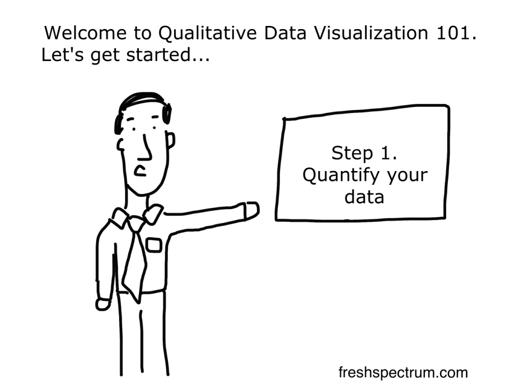
For years I would just say that good qualitative data visualization is really just illustration. But you could say the same thing about quantitative data visualization. So after digging in a bit over the last few years my definition started to become a bit more nuanced and specific.

In today’s post:

  • My definition of qualitative data visualization.
  • The reason why the usual definition of data visualization doesn’t work as well for qualitative.
  • How to use graphics to facilitative and enhance the communication of qualitative information and data.
  • And what I think are the four primary goals of qualitative data visualization.
What is qualitative data visualization? 

Definition: Qualitative data visualization is the use of graphics to facilitate or enhance the communication of qualitative information and data.

Re-defining Qualitative Data Visualization

Qualitative data visualization is the use of graphics to facilitate or enhance the communication of qualitative information and data.

This is how I define qualitative data visualization.

Here is something I’ve learned over the course of my career. The regular old definition of data visualization, and the way most of us think about data visualization, is just not helpful when it comes to qualitative data. Take for instance this definition that comes from tableau.

Data visualization is the graphical representation of information and data. 

What Is Data Visualization? Definition, Examples, And Learning Resources

If we’re talking about a bar chart or a line graph, this definition is perfect. We have turned a bunch of numbers into a picture. And the picture helps us understand the numbers. Without the graphical representation it would be much harder to see what’s going on with the data.

This is why quantitative data visualization is really most similar to descriptive statistics. Just like data viz, descriptive stats help us understand numbers and see things we would not see by just looking at the data table.

So why is qualitative data different?

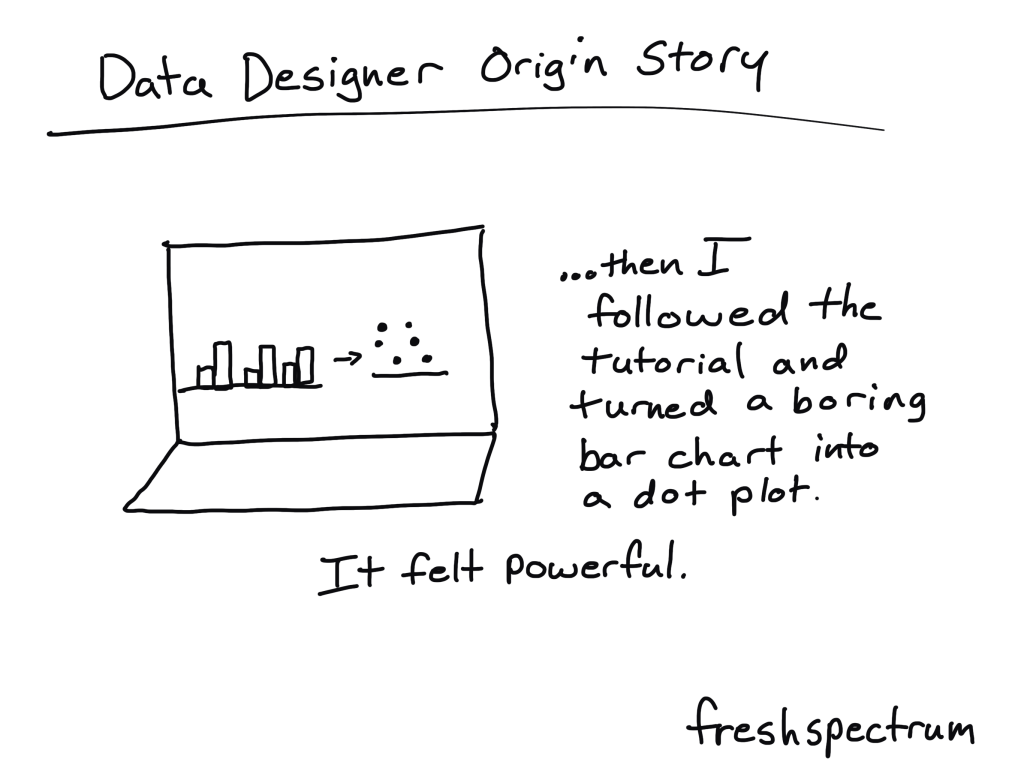
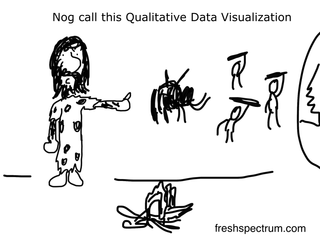
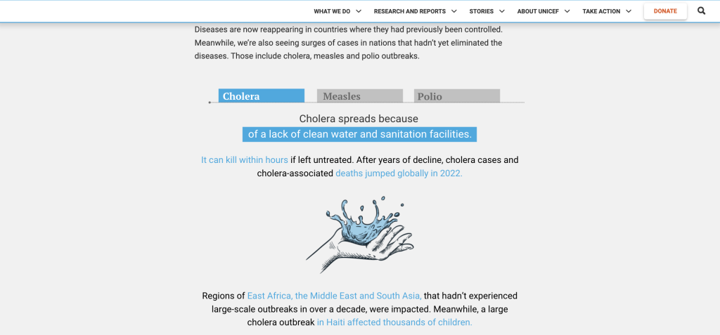
There are some times when a graphical representation of qualitative information can help us see the data in new ways. Even a simple word cloud that counts and visualizes frequencies can be helpful at times. But I would argue that it’s not the main benefit of qualitative data visualization.

Take an interview, a focus group conversation, or a case study. Most of the time you won’t need visuals to help you understand this kind of data. Because the problem is not that the information is hard to interpret.

The problem for most qualitative data is that there is just so much of it. The thing that gives qualitative data value, the depth and richness of the information, makes it harder to share with audiences too overwhelmed to take the time to read it and process what they’ve read.

How to use graphics to facilitative and enhance the communication of qualitative information and data.

At this moment I’m working on a new course on qualitative data visualization (my goal is to have it ready by early fall). In the course I talk about my O.S.E.E. approach to qualitative data visualization.

O.S.E.E. is the acronym I give to the four main goals of qualitative data visualization.

1. Organize

The digital world is a visual world. Just about every article on every major website has at least one featured image. This serves a functional purpose beyond aesthetics. These images are modern navigational tools that help us process information and travel from page to page.

So everything we share needs pictures. Even if that information is not destined for the web, web design has completely altered our expectations for print design.

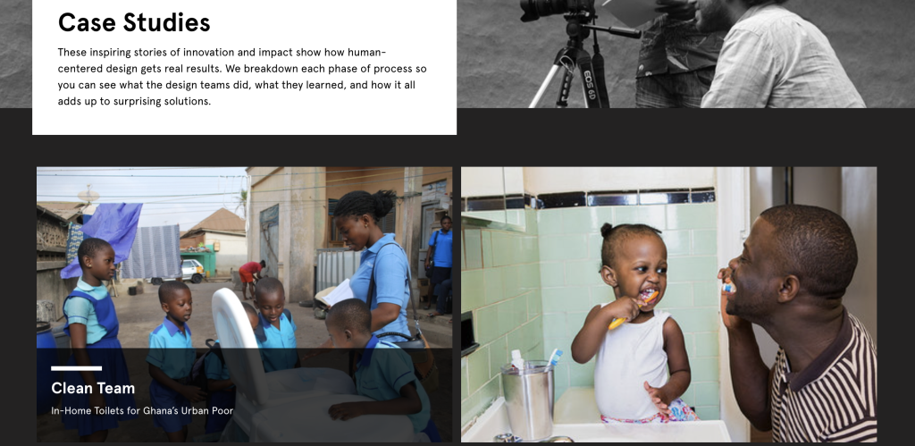
I start with organize, because even basic stock photos, generic icons, or other simple images can provide value in facilitating communication.

Here is a page of case studies on the Design Kit website. Notice how every individual case study has a featured image.

2. Spotlight

When someone picks up a report, they’ll probably skim it first. And in that skim they are most likely to look the pictures before reading the words (even the headers). So if you want to make sure someone comes away from your qualitative report with certain pieces of information stuck in their head, spotlight that information with a visual.

A simple illustration, like this one in UNICEF’s State of the World’s Children report, can break you out of a skimming trance and deliver a quick message.

3. Engage

Time is precious, it’s why most people will skim before they read. With an engage visual you are not just sharing information, you are inviting the viewer to read more. These types of images help create curiosity gaps which propel your reader forward into your analyses.

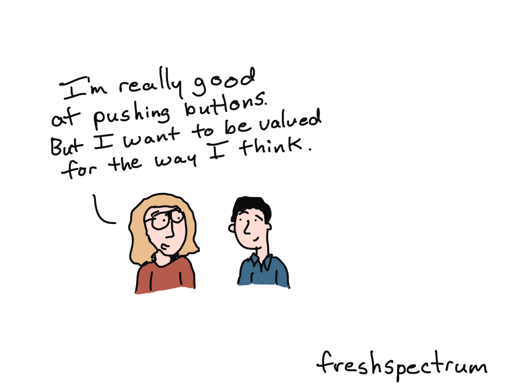
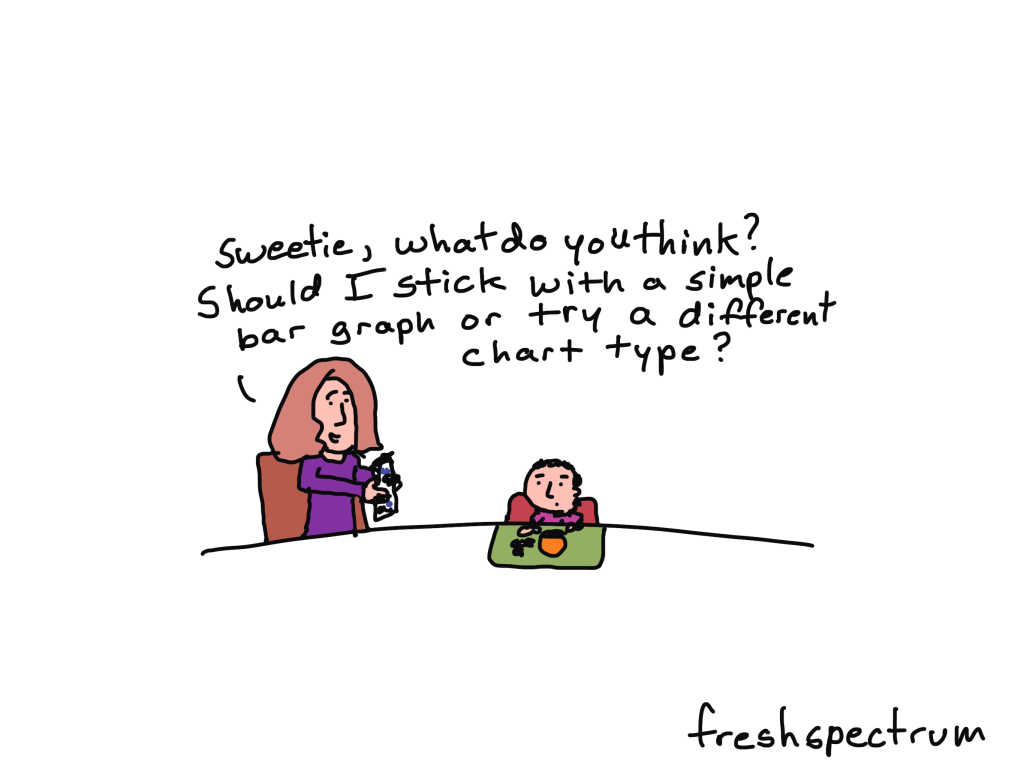
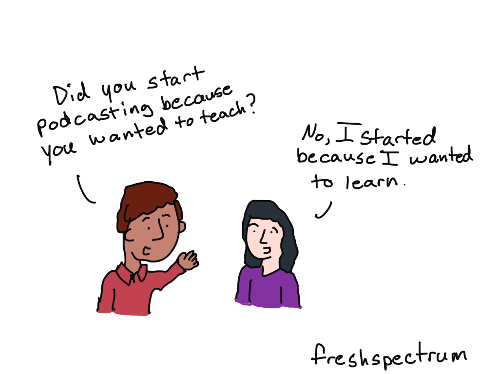
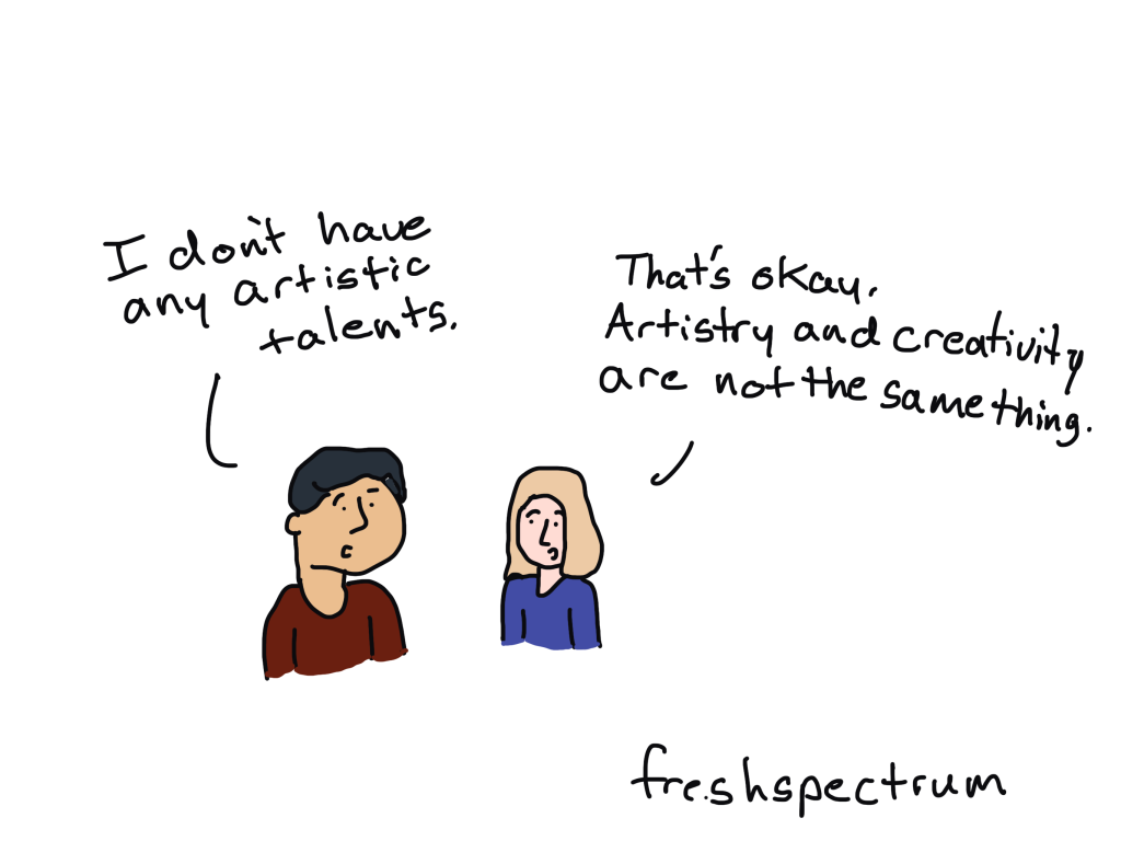
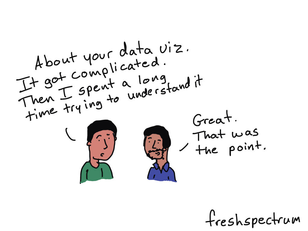
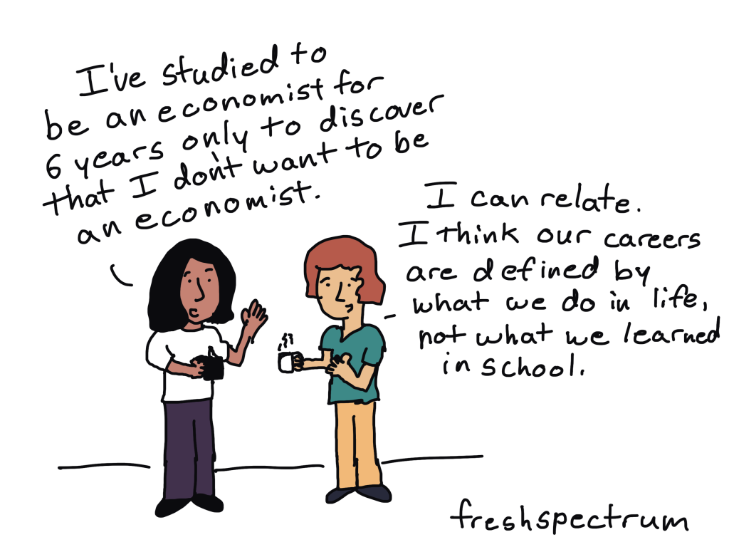
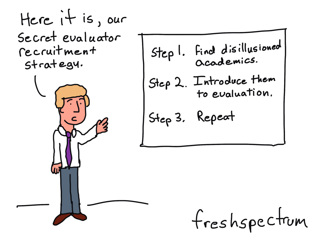
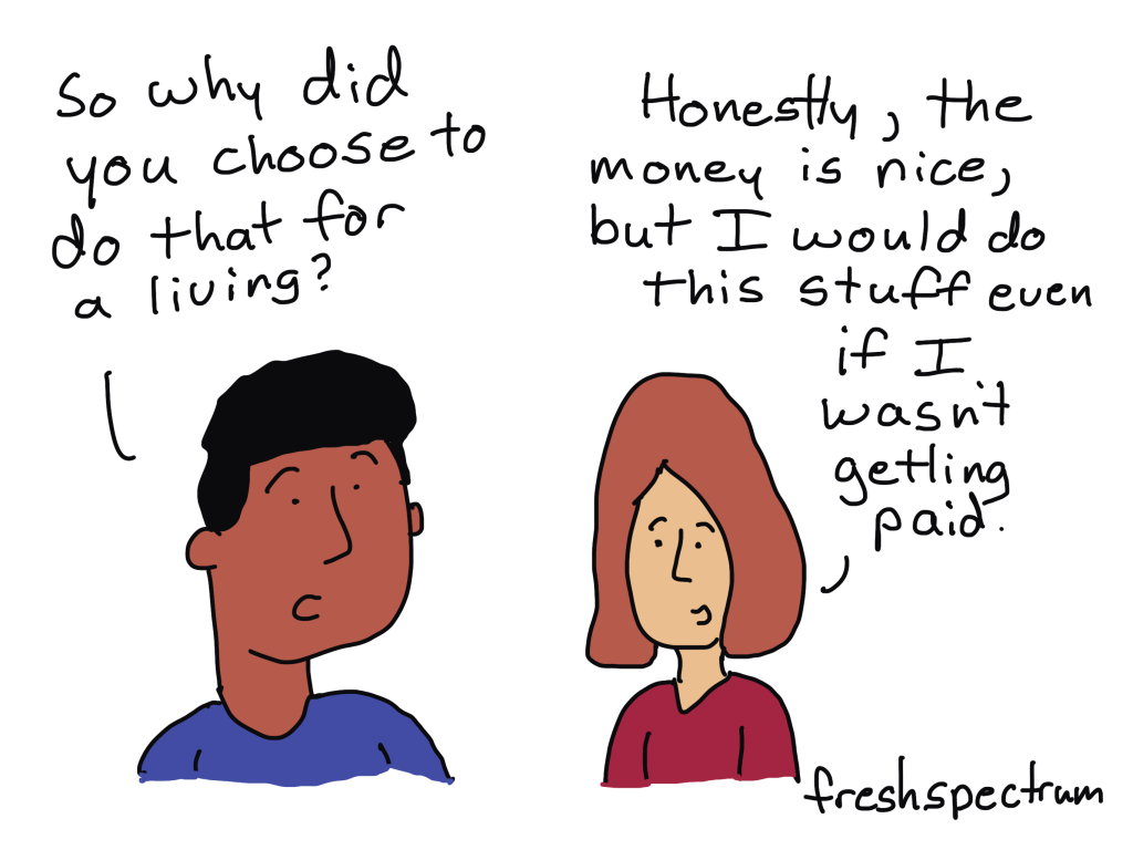
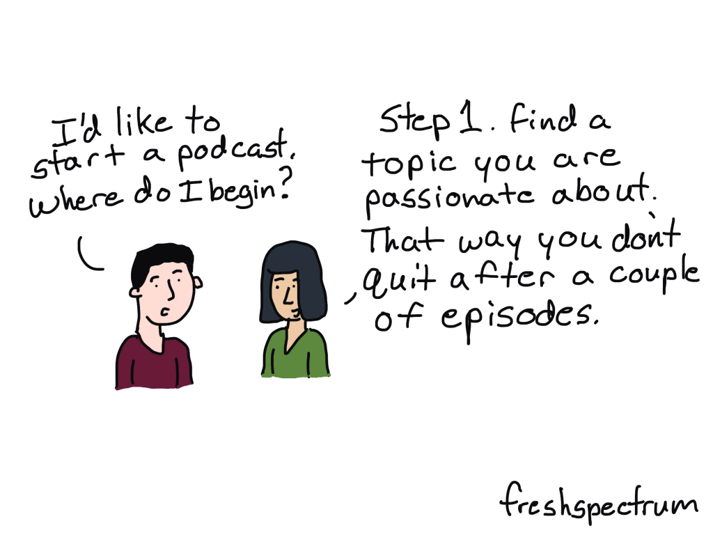
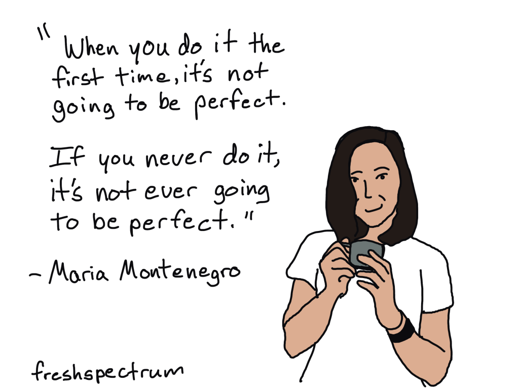
For example, most of my comics are purposefully designed to be engagement tools.

If you want good examples of Engagement visuals, check out YouTube thumbnails or book covers. These videos were on the Gates Foundation YouTube page. Who doesn’t want to click on the image that says Better Toilets Better Students or the one that says Better Cows Better Grades?

4. Enhance

Qualitative data visualization isn’t just a chore. It’s an opportunity to integrate other pieces of information, or re-arrange what has already been shared, in order to enhance communication. Enhancement visuals can often take more work, but they also provide a lot of extra value.

Visuals like timelines and maps can both illustrate your work and offer additional enhanced value. Like this one from the World Food Programme’s 2023 annual report.

What are your thoughts?

How do you conceptualize qualitative data visualization? Leave me a comment and let me know!

Written by cplysy · Categorized: freshspectrum

Jul 26 2024

Seeking your dream job & why artistry and creativity are not the same (Cartoon Q&A with Alli Torban)

Welcome to episode 003 of my cartoon Q&A series.

Technology and the web have really changed what it means to be a modern data professional. The way forward is mostly uncharted. Through these chats with a wide range of creative data professionals, I hope to share a vision of what’s possible.

In today’s conversation I chat with Alli Torban, who is an information designer, a podcaster at dataviz today, and a data literacy advocate. Alli is also the author of Chart Spark, a book that will show you how to harness your creativity in data communication to stand out & innovate.

Among other things, we talk about the difference between artistry and creativity, how podcasts can act as a conversation lifeline, how to go about teaching yourself to illustrate, and why pursuing your dream job might just lead you to a surprising destination. It was a fun conversation that inspired the set of 8 new comics, which you’ll see below (and appear throughout the video).

You can learn more out Chart Spark (Alli’s book) here:
https://www.chartsparkbook.com/

You can check out Data VIZ Today (Alli’s podcast) here:
https://dataviztoday.com/

The Comics from the Q&A

Beyond a valuable button pusher.

Getting chart input from the next generation.

Podcasting to learn.

Artistry and creativity are not the same thing.

Libraries are for learning.

Taking the first imperfect step.

Dream destination plot twist.

Complicated was the point.

Written by cplysy · Categorized: freshspectrum

Jul 17 2024

The Path to Becoming an Evaluator, and a Podcaster (Cartoon Q&A with Maria Montenegro)

Welcome to episode 002 of my cartoon Q&A series.

Technology and the web have really changed what it means to be a modern data professional. The way forward is mostly uncharted. Through these chats with a wide range of creative data professionals and evaluators, I hope to share a vision of what’s possible.

In today’s conversation I chat with Maria Montenegro, who is a credentialed evaluator living and working in Vancouver, BC. She is also the creator of The Evaluation Couch, a podcast discussing topics related to evaluation and navigating a career in evaluation.

Among other things, we talk about discovering evaluation as a career, the process of getting credentialed, Maria’s work with Eval Youth, and the real first step to starting a podcast. It was a fun conversation that inspired a set of 8 new comics, which you’ll see appear throughout the video.

The Comics from the Q&A

Defined by what we do, not what we learned.

Defined by what we do not what we learned comic.

What’s an evaluation framework?

Evaluation framework comic

Is this academic success?

Successful academic comic

Self-credentialed

Self-credentialed comic

Secret evaluator recruitment strategy.

Secret evaluator recruitment strategy

Labor of love

Labor of love comic

Passion first podcast

Passion first podcast comic

If you never do it…

Maria Montenegro Quote Comic

Written by cplysy · Categorized: freshspectrum

Jul 08 2024

Being a PowerPoint Slide Jockey and the Forever Side Hustle (my Cartoon Q&A with Nick Visscher)

Welcome to episode 001 of my new cartoon Q&A series. I started this video series because the thing that gets me most inspired to draw cartoons is having casual conversations with evaluators, researchers, data designers, and all sorts of creative professionals.

In today’s conversation I chat with Nick Visscher, who is an evaluator and also the creator of the Spotlight Impact Data Design YouTube channel.

Among other things, we talk about YouTube, data design in PowerPoint, and if it makes sense to just keep your side hustle as a side hustle. It was a fun conversation that inspired a set of 8 new comics, which you’ll see appear throughout the video.

The Comics from the Q&A

Data Designer Origin Story

Side Hustle Required

Brain Backup

Copy Paste Big Break

Forever Side Hustle

No Adobe Designer

Slide Jockey

The best PowerPoint template.

What do you think?

This is a new YouTube series concept. What do you think about it?

Written by cplysy · Categorized: freshspectrum

Jul 01 2024

How to create dot plots, violin plots, and beeswarms, the easy way.

In this video I’ll show you step by step how to use a tool called Flourish to create beeswarms, dot plots, and violin plots. While you can create dot plots in Excel, this is definitely my preferred approach. In this short video, you’ll learn why.

This is part of the DiY Data Design recipes series.

Full Transcript

Hey data designer!

Today I’m going to show you how to create a beeswarm, violin plot, or dot plot using a tool
called Flourish.

But first, if you’re wondering, you can create perfectly fine dot plots in Excel. You have to
trick it a little, but it’s do-able.

If you’re interested in that approach I suggest checking out this blog post by Stephanie
Evergreen. stephanieevergreen.com/easy-dot-plots-in-excel/

But for me, I prefer to create a lot of my charts using a tool called Flourish. A couple of years ago Flourish was bought by Canva, and while it is compatible with Canva, it’s also a stand alone chart design tool. One that’s really designed to serve the needs of data journalists, but also works really well for most data designers.

You’ll find the site at Flourish.studio where you can register for a free account.

After that, just go ahead and click new visualization.

Flourish is template based. So instead of asking you for data at the start, it gives you a choice of chart templates.

For the one we’re doing today, we’ll scroll down the page and choose “beeswarm” from the Scatter options.

As a template tool, Flourish preloads a chart with data. This makes it really easy to use because we don’t have to guess how to structure our data in order to get our desired chart design.

You’ll notice a ton of options on the right hand side of the page. I find the Flourish menu to be fairly intuitive with lots of little help menus. But since there are a lot of options, you can get a little lost sometimes when trying change things to meet your preferences.

Anytime I start with a template, one of the first things I do is look at the data. You do this by clicking the Data tab at the top of the page. Not only will you see the data, but you’ll also see how the columns are selected for use in the visualization. So if you want to visualize with your own data, the easiest thing to do is just match the format of your spreadsheet with the data format in the template.

Beeswarms, violin plots, and dot plots are just variations on the same type of chart. On the preview side, if you expand the menu for box, violin, and beeswarm plots, you’ll be able to switch between these different variations. Like here where I changed Auto to No in the beeswarm option. Now my beeswarm is a basic dot plot.

Turning the dot plot into a violin plot is as simple as checking the violin plot box. Or, we can get fancy and make a beeswarm violin plot.

Now that we have our visual, we can download it by going to the export & publish menu. You do NOT have to publish your visual to download your visual. You can simply click the download image button.

With every download you have choices of format between PNG, JPG, and SVG.

You can change the size by changing the number of pixels, if you tweak the width or height you’ll see a preview of the change in the snapshot image. Or if you just want to double the size of your PNG (to make it a bit higher resolution) there is an easy check box for that on the page without requiring you to do the pixel math.

And that’s it. Here is our final visual.

I wanted this video to be as simple as possible, so I just stuck with the default and starter
data from Flourish. But I definitely encourage you to play around with all the different
options.

If you enjoyed this video, please go ahead and like, subscribe, and leave a comment. It
means a lot and I will always read every comment. And if you’re interested in free resources like eBooks and courses, visit my resource library at freshspectrum.com/library

Now…Get out of your head and go create some stuff.

Written by cplysy · Categorized: freshspectrum

  • « Go to Previous Page
  • Go to page 1
  • Interim pages omitted …
  • Go to page 6
  • Go to page 7
  • Go to page 8
  • Go to page 9
  • Go to page 10
  • Interim pages omitted …
  • Go to page 54
  • Go to Next Page »

Footer

Follow our Work

The easiest way to stay connected to our work is to join our newsletter. You’ll get updates on projects, learn about new events, and hear stories from those evaluators whom the field continues to actively exclude and erase.

Get Updates

Want to take further action or join a pod? Click here to learn more.

Copyright © 2026 · The May 13 Group · Log in

en English
af Afrikaanssq Shqipam አማርኛar العربيةhy Հայերենaz Azərbaycan dilieu Euskarabe Беларуская моваbn বাংলাbs Bosanskibg Българскиca Catalàceb Cebuanony Chichewazh-CN 简体中文zh-TW 繁體中文co Corsuhr Hrvatskics Čeština‎da Dansknl Nederlandsen Englisheo Esperantoet Eestitl Filipinofi Suomifr Françaisfy Fryskgl Galegoka ქართულიde Deutschel Ελληνικάgu ગુજરાતીht Kreyol ayisyenha Harshen Hausahaw Ōlelo Hawaiʻiiw עִבְרִיתhi हिन्दीhmn Hmonghu Magyaris Íslenskaig Igboid Bahasa Indonesiaga Gaeilgeit Italianoja 日本語jw Basa Jawakn ಕನ್ನಡkk Қазақ тіліkm ភាសាខ្មែរko 한국어ku كوردی‎ky Кыргызчаlo ພາສາລາວla Latinlv Latviešu valodalt Lietuvių kalbalb Lëtzebuergeschmk Македонски јазикmg Malagasyms Bahasa Melayuml മലയാളംmt Maltesemi Te Reo Māorimr मराठीmn Монголmy ဗမာစာne नेपालीno Norsk bokmålps پښتوfa فارسیpl Polskipt Portuguêspa ਪੰਜਾਬੀro Românăru Русскийsm Samoangd Gàidhligsr Српски језикst Sesothosn Shonasd سنڌيsi සිංහලsk Slovenčinasl Slovenščinaso Afsoomaalies Españolsu Basa Sundasw Kiswahilisv Svenskatg Тоҷикӣta தமிழ்te తెలుగుth ไทยtr Türkçeuk Українськаur اردوuz O‘zbekchavi Tiếng Việtcy Cymraegxh isiXhosayi יידישyo Yorùbázu Zulu