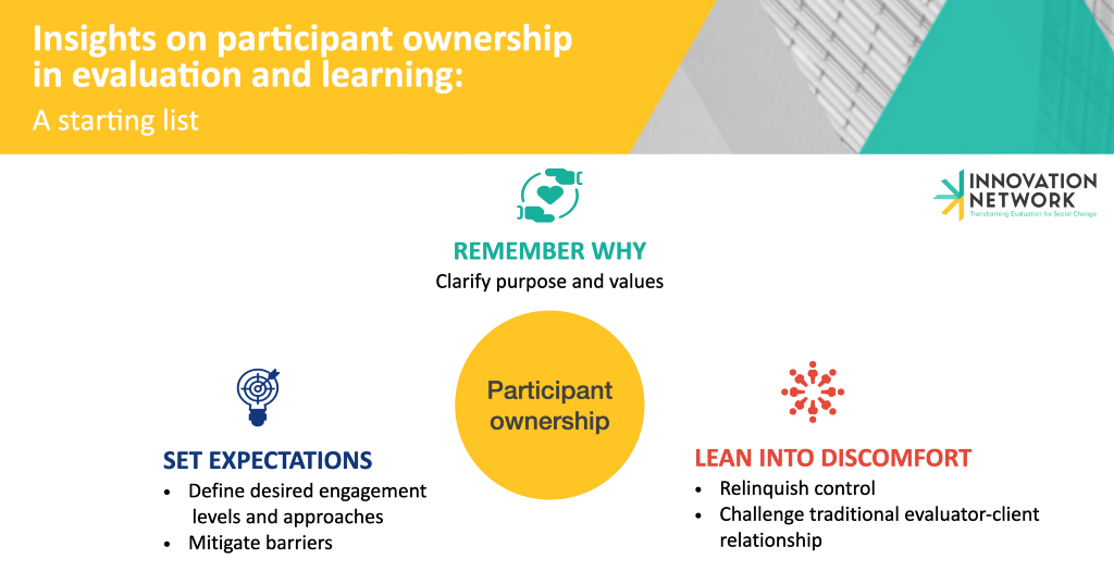
• Skip to main content
  • Skip to footer
  • Home

The May 13 Group

the next day for evaluation

  • Get Involved
  • Our Work
  • About Us
You are here: Home / Archives for allblogs

allblogs

Oct 25 2022

Insights on participant ownership in evaluation and learning

A starting list

Earlier this year we were asking the representative of a grassroots organization whether and how they would be interested in being involved in the learning and evaluation work of one of our foundation clients. They told us that what is truly real is land, water, nature, and animals, not professional titles. Their words stayed with me, reminding me how my evaluation and learning practice truly matters when it serves the communities closest to the issues and solutions that it seeks to understand, as it is these very communities who know what is “truly real” about their experiences, relationships, and lands.

In the past, this was not what I understood my practice was about, or how the field of evaluation conceived its mission. As many outstanding practitioners like Jara Dean-Coffey, Dr. Nicole Bowman, Dr. Geri L. Peak, Dr. Bagele Chilisa, and Dr. Donna M. Mertens have shown, overtly or under the cloak of pursuing the western-colonial construct of objectivity, evaluation has historically centered the learning needs and interests of those groups — usually public administrations and philanthropic funders — that held the most structural and positional power in the ecosystem of those involved in the process. I, too, for many years, understood the primary beneficiary of my work to be whoever had commissioned it. Bringing the lived experience and voices of those most impacted into learning and evaluation was a “nice to-”, as opposed to a “must-have”.

As the Equitable Evaluation Initiative has taught our field, reframing who should be the ultimate beneficiaries of our learning and evaluation work makes sense for everyone. For administrations and foundations that want to ensure the impact of their investment in non-profits, advocacy efforts, and communities, but even more so for those engaged in the evaluation, who are the very same communities and organizations that funders and their investments seek to support. An evaluation approach that defers participants’ or grantees’ learning needs and ways of knowing provides communities with the power, tools, and resources they need to self-determine, tackle both internal and external challenges, and create stronger solutions for themselves. In doing so, it also truly fulfills the ultimate scope of public or philanthropic endeavors aimed at furthering equity and social justice by effectively supporting the communities and issues they seek to elevate. Understanding and truly believing in this now, as an evaluation and learning practitioner, my purpose for practicing participant ownership in projects is also driven by a desire to advocate for power to be in the hand of communities who have the most experience and knowledge about the very issues that affect them directly.

This may sound wonderful but, in actuality, how do we do this? It is hard to make learning and evaluation valuable and engaging to communities because for so long our practice has been far removed from their ways of working, learning, and knowing, taking away from their power to create the change they envisioned. Also, while evaluators and funders are increasingly seeking to engage and center partners, grantees, and clients in their evaluation processes, there is no wholesale approach to participant ownership. The characteristics and interests of the communities we wish to defer to, the nature and quality of relationships between parties involved, and the degree to which evaluators and funders are willing to cede power are among the many factors that influence the design and implementation of projects that authentically center the communities closest to the issues of focus.

So, while it would be disingenuous to say that we are not implementing and learning at the same time, I think it is crucial that we share what we are learning about what it takes to practice participant ownership, not only to further this practice but also to seek the feedback and invite the accountability of those organizations and communities whose learning we seek to facilitate. It is this desire to be in community on this journey that leads me to share and invite your feedback on a few lessons we, at Innovation Network, have learned across the pilot projects we are working on :

1 Participant ownership, from start to finish, necessitates that we ask and remind ourselves of why we are doing this and why this work is important. So, at the start of each project, we have a discussion among ourselves and with our clients about the purpose and values that we want to underpin it (thank you, Heather Krause and Katie Fox for teaching us the importance of doing so). We use the principles distilled in these conversations as a compass throughout a process that may often get complicated as we challenge preconceived notions of power within evaluation and learning. Further, remembering that we do this to shift power to communities to drive involvement that is meaningful to them, safeguards us from perpetuating cosmetic or performative approaches and processes.

2 Also, at the onset and throughout an engagement, it is crucial to set clear expectations for those engaged in the learning or evaluation project. Most often our client is a foundation, while the groups running the organization or implementing the program or activities that we seek to evaluate and learn from are the evaluation participants. To ensure expectations are clear and transparent from the beginning, we have an open conversation with the foundation client about the importance of participant ownership and the need to promote equity within these processes. We also establish to what extent the client is willing to engage with participants, how, and why. From the participants’ end, this also requires doing outreach to understand from them what type of engagement would be meaningful and how barriers to participation can be mitigated. To facilitate these conversations we often use Rosa Gonzales’ Spectrum of Community Engagement to Ownership, which helps to create clarity about what different levels of participant ownership entail.

3 Once expectations have been set, we make conscious efforts to create spaces conducive to participation. To foster participation we must lean into discomforts that, while difficult, often result in the most powerful insights. These include acknowledging that deferring to participants in decision-making for the project entails relinquishing control and that we are no longer the owner but rather the facilitator of the project. We are working to become comfortable with not having a concrete path laid out from the start and not being the ones setting project plans or agendas. Rather, whether it’s in a meeting or the overall design and implementation of a project, we hold containers and listen deeply, so that we can truly shape our work according to the needs and interests of participants. When needed, we also help the client buy into this by providing more education and encouraging them to be excited about the actions they are taking to promote social justice and equity in the process. Often times this process also requires some empathic negotiation skills and the willingness to enter a space of discomfort in the evaluator-client relationship, one in which we ourselves experience and are often challenged by the power dynamics.

We are, once again, conscious that we are learning and growing in our methods continuously as we strive to align our practices with our values. You can learn more about how we at Innovation Network are powered by our values, here. We know that we don’t have all the answers and what we have learned builds on the efforts of those that came before us. So please share with us, what is your team learning about what it takes to authentically foster participant ownership?


Insights on participant ownership in evaluation and learning was originally published in InnovationNetwork on Medium, where people are continuing the conversation by highlighting and responding to this story.

Written by cplysy · Categorized: innovationnet

Oct 24 2022

Stop Using Tiny, Grainy Photos in PowerPoint!!!

It’s not 1995.

Last week, I was leading a post-conference workshop with CQI professionals in California. You can learn more about their annual conferences here.

An attendee asked about best practices for adding photographs to our PowerPoint presentations.

Before

Let’s pretend that you’re giving a presentation about young children and physical fitness.

Avoid Tiny, Grainy Photos

Here’s what I often see: small, low-resolution photos.

It gets The Big Red X.

I want your presentations to look professional, but this one’s giving outdated, unprofessional vibes.

Avoid Small, High-Resolution Photos

Nowadays, it’s easier than ever to find high-resolution photos.

I’ve tried dozens of photo sites, and my favorite is still Pexels.com.

All of their photos are free for both commercial and educational use.

You don’t need to create an account to download their photos (one less username and password to remember!).

You don’t need to add citations to your photos (so your slides stay uncluttered).

Over the past couple years, they’ve added more photos from international photographers, so you’ll see beautiful skin tones and hairstyles showcased among the models.

Here’s the next draft with a high-resolution photo:

Avoid Awkwardly-Enlarged Photos

We’ve solved the grainy issue.

Next, let’s solve the size issue.

I often see slides like this, where the photo is placed awkwardly on the slide.

We can’t keep those white slivers along the sides.

Avoid Stretched Photos

Please please please don’t stretch photos.

Yes, we want full-screen photos. But we must keep the aspect ratio (the proportions) intact.

Be careful if you’re manually dragging the sides, top, or bottom of the photo, as shown below.

The stretching is hardly recognizable on this particular photo, since it shows the backs of young children. But if you stretched a photo of someone’s face, it would be immediately noticeable (and it would look unprofessional).

Avoid Full-Screen Photos with Unreadable Text

As you’re enlarging photos to fill the entire screen—so the audience feels like watching the action from the 50-yard line, not the nosebleeds—make sure you grab the corner.

Grabbing the corner will ensure that photo doesn’t get stretched awkwardly (i.e., it maintains the aspect ratio).

Full-screen photos often fall off the edges of the slide, like this. That feels weird at first! Don’t worry; the audience will only see the completed version, with the beautiful full-screen photo. They won’t know that, behind the scenes, an inch of the photo is falling off the edge of the screen.

After

We’ve got a full-screen photo, woohoo!

Next, let’s make sure the words are readable (i.e., that we have enough contrast to meet official accessibility guidelines).

Full-Screen Photos with a White Overlay

To make sure the words are readable, try adding a white overlay.

Go to Insert –> Shape and draw a large rectangle over the entire slide. Then, adjust the transparency. This one has 15% transparency.

Your audience will easily read the large, 32-point font. And they’ll see the photo peeking out from behind, too.

In this example, the words are the star, and the photo is the sidekick.

Full-Screen Photos with a Colored Overlay

You can use brand-colored overlays, too.

The words are still the star, and the photo is still the sidekick.

Full-Screen Photos with White Text Boxes

In this example, I kept the photo’s original colors.

The text box is filled with white (with a 10% transparency so you can slightly see the photo peeking through the text).

The photo is the star now, and the words are the sidekick.

Full-Screen Photos with Colored Text Boxes

I think you get the idea by now.

You could also fill the text box with one of your brand colors, like this:

Phew! In these redesigned slides, our full-screen photos put the audience in the middle of the action, and the text is readable.

What If My Photo Isn’t Landscape?

We can’t always find landscape photos to fit our landscape slides.

Maybe the photo we want is square, circular, or portrait-oriented, like this one.

We can’t expand those pictures to fill the slide, or they might get too big.

Enlarge the Photo to Fit the Height (or Width) of the Slide

I often enlarge those photos to fill the height of my slide, even if they don’t fill the width of the slide, like this:

Experiment with Removing the Background

When I’m adding headshots to slides, sometimes I remove the background.

(This rarely works with non-headshot photos, like the photo of the children playing. Computers get confused, and they often mix up the background and foreground.)

PowerPoint does have a Remove Background button (!). To use it, click on the picture to activate it, then go to Picture Format à Remove Background.

But PowerPoint’s Remove Background button is meh. It’s a newish feature and Microsoft still has some fine-tuning to work out.

Instead, I upload the photos to Canva, remove the background, download the edited version, and insert that into PowerPoint.

Canva gives me the correct results 90% of the time, whereas Microsoft gives me correct results 10% of the time.

Now, the photo and the words flow better, since they’re both against a white background.

Finally, you can try colored slide backgrounds, like this. You’d use your brand colors, not mine.

I think this final design might be my favorite of the batch.

All of these redesigns are better than the tiny, grainy original, don’t you agree?

Download My Slides

Want to explore these slides? Download them here.

Written by cplysy · Categorized: depictdatastudio

Oct 22 2022

Action Planning for Coalitions – Strategic Doing

Written by cplysy · Categorized: connectingevidence

Oct 19 2022

Make Dissemination Easy

Sharing our work well takes skill and experience. But not every data person has these skills. Should they?

Qualified to Do the Work ? Qualified to Share the Work

The vast majority of PhD and MA programs are not going to give their students enough training around digital dissemination to make them experts in sharing their work online. It’s just not how the programs are designed. Their dissemination focus is on sharing work via academic journals, conference presentations, and traditional reports (aka documentation).

Subsequently, there are a LOT of highly qualified researchers & evaluators who do not have the qualifications necessary to properly share their work over the web.

This isn’t a dig, there is a lot that you need to know in order to do the work. And you don’t need to know how to share the work to do the work. And for a large share of academics, the web is still, more or less, uncharted territory. We have to stop pretending otherwise.

Far too often government agencies, large Non-Profits, and NGOs trust highly educated PIs and project directors to lead the public dissemination of their work. And because of that, millions upon millions of public dollars go into projects that ultimately get shared poorly.

It doesn’t have to be that way.

Cartoon person sitting at desk thinking, "This project cost taxpayers millions of dollars. But our report has only been read by a handful of people. Oh well, we did the best we could."

Right information, wrong format.

In a nutshell, sharing requires more than just the right information.

Information needs also extend to the format of the information shared. One large well designed PDF is insufficient to meet modern information sharing needs.

Your reports should be diverse collections of micrographics, infographics, slidedocs, GIFs, videos, short visual reports, and, yes, long PDFs. This is the only way they can really meet broad audience needs.

Don’t add a step, add a role (or a partner).

There are people who have the skills necessary to create reports fast enough to make creating more reports feasible. Yes, I am one, and I also train others to do this kind of work.

If you’re struggling to create a bunch of different types of reports, it’s because you don’t yet have the skillset or the team that is needed to do the reporting work effectively and efficiently. This is a capacity problem.

But you should also stop thinking about dissemination as the last step in the research or evaluation process. If your project is big enough, you should have a person on your team (or multiple persons) who have the responsibility for disseminating your work. And that person (or persons) should have the qualifications necessary to perform this role.

The Easy Dissemination Process

You want to know the easy dissemination process?

  1. Do the work.
  2. Then have someone with the right qualifications share the work.

It can be that simple.

The person who shares is responsible for understanding your audience’s needs and adapting your work to meet those needs. They are the ones who know how to quickly create micrographics, infographics, slidedocs, gifs, videos, interactives, visual reports, and all the other things modern audiences desire.

And if you want to be that person who know how to do those things. Put some time and effort into learning the skills and developing the qualifications necessary to take on that role.

Want Help?

  • Hire me.
    -or-
  • Learn from me.

Written by cplysy · Categorized: freshspectrum

Oct 17 2022

Do You Need a Single Map, or Several Maps?

Here’s a counterintuitive dataviz principle:

Sometimes, it’s easier to understand several small graphs than a single graph.

I was recently working with an organization to visualize which states were using their software programs.

States might use:

  • Software A
  • Software B
  • Or, both software A and B

Before: A Single Multicolor Map

Here’s what their visualization looked like.

They had a single U.S. map with one color for each scenario:

  • one color for states using Software A
  • another color for states using Software B, and
  • another color for States using A and B.

Fairly straightforward, right?

It took us a while to spot patterns, though. Three colors is a lot to understand at once. It’s not impossible, but we had to think about it for a moment.

Multicolor (well, multi-hue) maps take a while to interpret.

Multi-hue maps aren’t colorblind-friendly. Here’s a simulation of what the map would look thanks to https://www.color-blindness.com/coblis-color-blindness-simulator/.  

Multicolor maps aren’t grayscale-friendly, either.

After: Small Multiples Maps with One Color Each

In lieu of a multicolor map, try small multiples!

In the redesign, we created three maps instead of one.

Now, we’re showing a single variable on each map, so the audience can understand it at a glance.

Small multiples binary maps (your dark brand color + light gray) are often faster to read than mutli-hue maps. It’s counterintuitive, I know. We’re asking people to read three maps instead of one. But, three fast maps will beat one slow map any day of the week.

Small multiples binary maps are colorblind-friendly. Everyone can spot the dark brand color vs. the light gray.

Finally, small multiples binary maps are grayscale-friendly. Everyone can distinguish the dark gray vs. light gray.

Side-by-Side Comparison

Both styles fit on a single page (a goal in their project).

Both styles have room for explanatory sentences (something I recommend in all one-pagers).

Only the small multiples version is colorblind-friendly and grayscale-friendly. I’d argue that the small multiples version is faster to read, too.

Download the Files

Want to explore my Excel file and Word doc?

You’ll see:

  • How I formatted the Excel table that feeds into the maps
  • How I arranged everything inside good ol’ Word

Download them here: https://depictdatastudio.gumroad.com/l/SmallMultiplesMapsInExcel

Your Turn

Have you split your multicolor map into small multiples?! Get in touch when you apply this technique to your own projects.

Written by cplysy · Categorized: depictdatastudio

  • « Go to Previous Page
  • Go to page 1
  • Interim pages omitted …
  • Go to page 114
  • Go to page 115
  • Go to page 116
  • Go to page 117
  • Go to page 118
  • Interim pages omitted …
  • Go to page 310
  • Go to Next Page »

Footer

Follow our Work

The easiest way to stay connected to our work is to join our newsletter. You’ll get updates on projects, learn about new events, and hear stories from those evaluators whom the field continues to actively exclude and erase.

Get Updates

Want to take further action or join a pod? Click here to learn more.

Copyright © 2026 · The May 13 Group · Log in

en English
af Afrikaanssq Shqipam አማርኛar العربيةhy Հայերենaz Azərbaycan dilieu Euskarabe Беларуская моваbn বাংলাbs Bosanskibg Българскиca Catalàceb Cebuanony Chichewazh-CN 简体中文zh-TW 繁體中文co Corsuhr Hrvatskics Čeština‎da Dansknl Nederlandsen Englisheo Esperantoet Eestitl Filipinofi Suomifr Françaisfy Fryskgl Galegoka ქართულიde Deutschel Ελληνικάgu ગુજરાતીht Kreyol ayisyenha Harshen Hausahaw Ōlelo Hawaiʻiiw עִבְרִיתhi हिन्दीhmn Hmonghu Magyaris Íslenskaig Igboid Bahasa Indonesiaga Gaeilgeit Italianoja 日本語jw Basa Jawakn ಕನ್ನಡkk Қазақ тіліkm ភាសាខ្មែរko 한국어ku كوردی‎ky Кыргызчаlo ພາສາລາວla Latinlv Latviešu valodalt Lietuvių kalbalb Lëtzebuergeschmk Македонски јазикmg Malagasyms Bahasa Melayuml മലയാളംmt Maltesemi Te Reo Māorimr मराठीmn Монголmy ဗမာစာne नेपालीno Norsk bokmålps پښتوfa فارسیpl Polskipt Portuguêspa ਪੰਜਾਬੀro Românăru Русскийsm Samoangd Gàidhligsr Српски језикst Sesothosn Shonasd سنڌيsi සිංහලsk Slovenčinasl Slovenščinaso Afsoomaalies Españolsu Basa Sundasw Kiswahilisv Svenskatg Тоҷикӣta தமிழ்te తెలుగుth ไทยtr Türkçeuk Українськаur اردوuz O‘zbekchavi Tiếng Việtcy Cymraegxh isiXhosayi יידישyo Yorùbázu Zulu