• Skip to main content
  • Skip to footer
  • Home

The May 13 Group

the next day for evaluation

  • Get Involved
  • Our Work
  • About Us
You are here: Home / Archives for allblogs

allblogs

Oct 13 2022

Designing a Seesaw Graph with Canva and Flourish [Walkthrough]

So welcome to a new series of blog posts. Each will be a type of design walkthrough. In these posts I will start with a chart or piece of information found in a real report and adapt it into something different (not always better, but always different).

I’ll walk you through my design process as I go and show you my reasoning throughout.

Designing a Seesaw Graph featured image.

My starting point. A 2022 NAEP Long-Term Trend Assessment Report.

So I was strolling through some report highlights from a recent National Assessment of Educational Progress (NAEP) report (Reading and mathematics scores decline during COVID-19 pandemic) when I came across this chart.

Chart from the NAEP report.

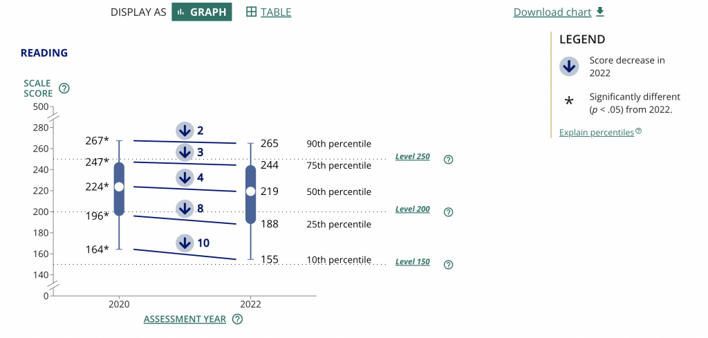
It kind of looks like some version of 5 string guitar tablature and it took me a minute to decipher. It’s a little busy but all in all it does deliver a little story if you can figure out how to read the chart.

Basically reading scores for 9 year old students dropped between 2020 and 2022. The drop was bigger for lower performing kids. Students in the 10th percentile scored 10 points lower in reading in 2022 compared to how students in the 10th percentile scored in 2020.

The gist: COVID happened and the NAEP reading scores went down, but it was worse for lower performing students.

Same was true for math, but for this adaptation I’m going to stick with just reading.

Are the percentiles hiding the story?

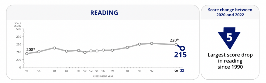
So the drop of scores from 2020 to 2022 across all percentiles is pretty clear. On the NAEP page they shared this through a line graph starting in 1970. Across that entire span the numbers don’t change very often or by very much.

There is only a total 12 point shift between 1970 and 2020, and most of the changes were gradual. Except for last year. That’s an interesting story all on its own, but for the graphic I want to create I’m going to focus on the differences between low performers and high performers.

Chart from the NAEP report showing Reading scores over time.
https://www.nationsreportcard.gov/highlights/ltt/2022/

One thing I learned early in my career is that it’s a good idea to start with the basics, even if they feel completely clear. In this case, since I’ll be zooming in on 2020 to 2022 for the percentiles, it’s a good idea to just start with a matching chart that just shows the overall 2 year average drop.

Now that I have that one, it’s time to break down the data into the percentiles. While the original NAEP chart is accurate, the focus we really want is on the differences between 2020 and 2022 for each of the percentile groups. So separating each percentile into its own chart will help provide that focus.

Can you see how simply splitting up a chart can make it easier to process the information? We already know by default that the 90th percentile is going to have higher scores than the 10th, we don’t need to see them in the same chart to confirm that point.

Is that a seesaw?

Alright, that’s the boring stuff, now let’s play a little.

So after scrolling down the page, I noticed they had other charts as well.

Chart from the NAEP report showing a breakdown of the data.
https://www.nationsreportcard.gov/highlights/ltt/2022/

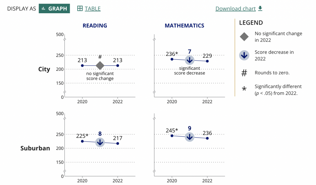
Essentially it’s a two data point line graph. Some people will call this a slope graph.

Given that we’re looking at just the averages we could probably zoom in a little on the actual data by reducing the range on the Y axis.

They ended up using the same scale for all the charts in the report (which I understand). But the average doesn’t vary that much over time so you only get a little bit of a drop. The scale is larger because of the larger range between the 10th and 90th percentiles.

So to make the point a little clearer as to how much of a drop happened, they put the number in bold in the middle above an arrow in a circle. It definitely calls attention to the change.

These ones seem very reminiscent of a seesaw…which gave me an idea.

A little seesaw graph.

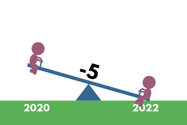
The seesaw graph. Yes, technically you could call it a line graph or a slopegraph. But do they have little children on each end? I think not.

The difference though is that my goal with this one is to present year to year change. And since I’m visualizing change, and not specific scores, I can go ahead and put all the percentiles on the same plane.

As with all line graphs & slopegraphs (and charts in general) the actual comparative size of the y-axis and x-axis is going to make a big difference.

A 5 part seesaw graph.

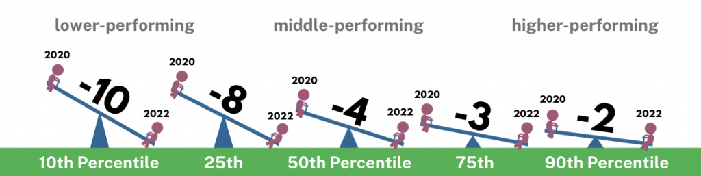
Even if you couldn’t see the story quickly before, I’m sure you can now. That’s quite a difference between the lower performing percentiles (10th & 25th) and the higher performing percentiles (75th & 90th).

And in defense of my more extreme comparison, a ten point difference is extreme when you consider that the average scores didn’t fluctuate more than 12 total points in the last 50 years.

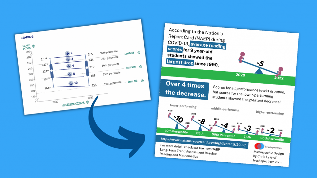
Pulling it all together into a Micrographic.

Micrographics can be little illustrated stories like this one, that you can easily share on social media. If you’re interested, I have a free 10 part email course on Micrographic design.

Here is the micrographic I pulled together from today’s charts.

Canva NAEP Reading Seesaw Graph Template by cplysy

Want the Canva & Flourish Templates from Today’s Post?

All my templates are available exclusively to members of my Designing with Chris workshop. If you’re in the workshop, here is the link for the set of templates.

If you’re not in the workshop, just know it’s always open, and you can join us today!

Written by cplysy · Categorized: freshspectrum

Oct 06 2022

Centering Equity in Collective Impact

Written by cplysy · Categorized: connectingevidence

Oct 05 2022

New Free Course on Micrographics

I’m trying out a new style of course, and for the moment, it’s free.

Even the best designed full reports are only read by so many people. It might be the marquee deliverable you pass on to your client. The thing that addresses everything you learned and documents everything you did. But ultimately long reports have limited audience.

But then there is that one really nice illustration or chart. You know the one, it’s the visual you end up using in all your presentation slide decks. It’s the only image that gets shared in the email newsletter. It’s the image that goes along with all your social media posts.

That one little graphic will get seen by way more people than your full report.

That is, at least, if you have that one little graphic.

Quick Wins Micrographics Course image.

Our biggest reporting problem.

Our biggest reporting problem is not:

  • long boring reports,
  • bad charts,
  • or a lack of audience interest.

Our biggest reporting problem is that our reports are under illustrated.

We do not create enough quality visuals to satisfy the functional needs of our modern image-hungry digital society.

Micrographic...it's like an infographic...but smaller.

What are Micrographics?

I use the term to describe a bunch of different types of visuals.

But in a nutshell, micrographics are visuals that can exist and even thrive in their own right outside of a report. They have a wide range of uses…

  • as power point slides,
  • as blog post featured images,
  • as report illustrations,
  • as social media images,
  • as centerpieces in longer infographics,
  • as marquee visuals in executive summaries,
  • as newsletter illustrations,
  • and more!

Communications’ teams have been picking up the slack.

Since most of our reports are under illustrated and lack the kinds of images that can be stood up on their own, social media teams have had to pick up the slack. This means taking our work and adapting it into a visual format.

We see this the most with large organizations that have their own dedicated comms teams. Their social media accounts share tons of visuals, most of which have been adapted from reports, newsletters, and fact sheets that contain few, if any.

But not all of us work in large organizations. And even if you do, there is no guarantee the social media team is going to pay special attention to your work. Not unless you make it easy for them to do so.

A selection of 8 micrographics.

My email course on Micrographics.

The course is made up of 10 emails sent over 10 days.

With the exception of the introduction and the wrap-up, the emails are all structured using the same pattern.

  • First we will look at an example of a micrographic shared by a large NGO, non-profit, or government organization on Twitter.
  • Second we will look behind the tweet and find the information source behind the graphic.
  • Third we will break down the micrographic into its component parts.
  • And lastly we will recreate the image using free online tools (mostly Canva but also Flourish and DataWrapper). I have done this for each one of the 8 examples and shared my version as a Canva template. It’s up to you to follow my lead (but you can look to my example if you get stuck).

The goal isn’t to teach you how to copy the work of others, but to give you a better perspective on the process of data illustration.

My hope is that by showing you how other large organizations go about creating visuals for social, you’ll be able to apply that same process to your own work. You’ll also get some experience using a few new tools.

Why that doesn't look so hard.

Want to binge the course instead?

The course binge option is only available to Designing with Chris – All Access participants. But you are more than welcome to join us anytime!

Ready to start the email course?

Just click the link, put in your email address, and click to get started. Your first email should come pretty quickly! Then you can expect an email everyday for the next 9 days.

Free course on micrographics.

Written by cplysy · Categorized: freshspectrum

Oct 04 2022

How to Make a Not-So-Scary Starter Dashboard in Excel

Dashboards aren’t scary!

In this video, let’s make a starter dashboard in Microsoft Excel.

You’ll learn how to make four quick visuals:

  1. Sparklines
  2. Data bars
  3. Symbol fonts
  4. Color scales

I use these visuals over and over in my real-life consulting projects.

Watch the Tutorial

Sparklines

Sparklines are helpful for visualizing patterns over time, like daily, weekly, monthly, quarterly, or annual data.

To create sparklines:

  1. Highlight the first row of your table.
  2. Go to the Insert tab.
  3. Go to the Sparklines section.
  4. Click on the first one (a Line sparkline).
  5. Choose where we want to put the sparklines (off to the right of the table).
  6. Click insert and enjoy the sparklines!

We can also edit our sparklines!

We might adjust the data source, type (from line to column), or color. I typically gray everything out and highlight a high point or low point in a dark brand color.

We can also group and ungroup our sparklines (e.g., if we want each category in our dashboard to have its own color).

And if we change our mind, we can clear them out.

Ann K. Emery teaches you how to make a starter dashboard in Excel with sparklines, data bars, symbol fonts, and heat tables.

Data Bars

Data Bars give us horizontal bars (as opposed to sparklines’ vertical columns).

They’re helpful for visualizing summary statistics like totals or averages.

To create data bars:

  1. Highlight the cells you want to visualize (e.g., the total column).
  2. Go to the Home tab.
  3. Click on the Conditional Formatting button.
  4. Select solid-filled data bars.
Ann K. Emery teaches you how to make a starter dashboard in Excel with sparklines, data bars, symbol fonts, and heat tables.

Symbol Fonts

I use checkboxes to visualize whether I met a goal or target.

We can get quick checkboxes through symbol fonts!

In the video, you’ll see me write an =if() statement to transform g’s and c’s into Webdings checkboxes.

Audiences love the checkboxes. They’re intuitive, colorblind-friendly, and grayscale printing-friendly.

Ann K. Emery teaches you how to make a starter dashboard in Excel with sparklines, data bars, symbol fonts, and heat tables.

Color Scales

a.k.a. heat maps or heat tables.

I love color scales for visualizing the interior of my table—when I want to compare lots of rows and columns to each other.

To create color scales:

  1. Highlight the cells you want to visualize (i.e., the interior of the table).
  2. Go to the Home tab.
  3. Click on the Conditional Formatting button.
  4. Select Color Scales. Most of the time, we’ll use a Green-White Color Scale. That’ll make the big numbers dark (and the small numbers will be light).
Ann K. Emery teaches you how to make a starter dashboard in Excel with sparklines, data bars, symbol fonts, and heat tables.

Combos

In real life, we might combine several of these techniques.

We might add color scales to the interior of the table…

We might compare the totals with data bars…

We might add Webdings checkboxes to see whether we met a goal…

And we might add more data bars to see how far we were over or under our goal.

Ann K. Emery teaches you how to make a starter dashboard in Excel with sparklines, data bars, symbol fonts, and heat tables.

Formatting

In real life, we’d edit these quick visuals.

I suggest:

  • Using brand colors and brand fonts.
  • Outlining the color scales in white (so the cells can be differentiated against each other).
  • Placing the data bars in a separate column than their numeric labels.
  • Coloring the checkboxes (rather than boring black).
  • Adjusting the colors in the over/under bars (to avoid scary red).
  • Moving the labels to the over/under bars to their own column (via an =if() statement to save time).
Ann K. Emery teaches you how to make a starter dashboard in Excel with sparklines, data bars, symbol fonts, and heat tables.

Download this Spreadsheet

Try it yourself!

Download this spreadsheet.

Explore the completed version with the =if() statements.

Use the empty version to practice alongside me as you replay the video.

Get in Touch

If you get stuck, reach out o­n LinkedIn.

Written by cplysy · Categorized: depictdatastudio

Sep 28 2022

14 tips to make reporting easier.

Looking for ways to make reporting easier? In this blog post I share a collection of tips.

When talking about my book with folks I get a lot of head nods. But then the obvious question comes next… “Okay, but what do I do about it?”

The truth is, as important as you think it is to effectively communicate our research and evaluation work to a wide variety of audiences, it doesn’t mean you instantly have more time or money to do that. And I don’t think you should expect to have more time put into dissemination.

Right now, if you want to increase the power of your reporting you don’t just need to make it better, it also needs to be easier. Here are 14 small things I would suggest you do to make your reporting process easier.

Cartoon "Why create a style guide when you can just stick with Microsoft defaults?"

1. Create a basic style guide.

A basic style guide saves time when it matters the most. The last thing you should be doing when facing a fast approaching deadline is having a debate about your report’s color scheme and font choices.

Now I’m not talking about a full branding kit. You don’t need pages of information covering all the many ways it’s possible to screw up the use of a logo. Just a basic style guide.

Your basic style guide should include:

  • Logos (SVG or high quality PNG/JPG)
  • Colors (a primary set and a secondary set for use in charts)
  • Fonts with pt size (Header, Sub-header, Body)

Want help coming up with a data visualization color palette?

2. Leave your long boring report, long and boring.

Last week I wrote a post about how reporting is different from documenting. Those super long boring comprehensive reports usually fall well into the documenting category.

Lots of organizations will spend hours upon hours formatting and styling long reports that are not really meant for any specific individual audience. My advice, save your time and keep that long report boring. Then invest that saved time creating reports people will actually want to read.

Don't make your long boring report slightly less boring.  
Just keep it boring, and add other small reports.

3. Create short, simple, focused, visual reports.

There is nothing wrong with having a long boring report, as long you don’t stop with the long boring report. Your reporting focus should be on creating short, simple, focused, visual reports. These could be as simple as square social media infographics, one pagers, executive summaries, or short slide docs.

Pretend you’re at a cocktail party and somebody asks about your work, do you tell them everything? If you do, you probably don’t get invited to many cocktail parties. Reporting is easier when you are focused more on the needs of your audience than on sharing everything about your work, and it’s also more effective.

4. Build a template library.

Having a good template is like a getting a head start. Just like with the style guide, templates reduce the number of design decisions you have to make when you are most pressed for time.

I suggest creating templates in sets. For example, create a matching set of one-pager, 3-pager, and 25 pager templates. Use lorem ipsum text that mirrors content length. Also remember to create your templates using your basic style guide.

Cartoon. "I prefer to create all my reports from scratch. Templates make it all too easy."

5. Create template content worksheets.

Most report writers tend to write first, design second. And since our brains don’t multi-task well, separating the two tasks is usually a good idea. But a problem occurs when we write without the end in mind.

By creating worksheets to pair with your design templates you can make it much easier to write for specific types of content. The worksheet should include sections for each block of written content in a design. It should also include target word counts whenever possible.

6. Build an asset library.

Your asset library should include a collection of icons, illustrations, photographs, and charts. A lot of time gets put into finding the right visual, but often that visual would likely work across a wider range of projects.

While you can find an increasing number of premium stock asset libraries, it’s also a good idea to just have a folder on your computer or your team’s network drive.

Cartoon. "No need showing me any examples. I'll just wait till you put in all the work.  Then if I don't like it, you can just start over."

7. Collect inspiration.

Have you ever watched one of those reality TV shows about interior design? At some point early in the show the designer will share what they have in mind for a space using a mood board. The mood board is a collection of examples, colors, and other pieces of inspiration.

The easiest way to get a team on board with your vision is to show them a picture. You do not have to be the one who created that picture. And if your team does not share your vision, it’s better to find that out before putting in all the work. So when you find examples of report styles you think are effective, save them for later.

8. Start using Canva instead of PowerPoint.

So pretty much everything you can create in Canva you could already create in PowerPoint. So why use Canva instead?

PowerPoint is a design tool. Canva is a template and asset library that also happens to be a design tool. The tool makes creating visual reports easier and faster. It’s also easier to collect and share assets for future use.

Cartoon. "I'll stick with Excel, thank you very much. All those other programs don't let you create the snazzy 3D pie charts everyone loves."

9. Start creating charts in Flourish instead of Excel.

Over the past year I’ve noticed myself creating fewer and fewer charts in Excel. And it’s not because I’ve adopted an expensive or complicated tool.

I use Flourish for charts for many of the same reasons I use Canva for infographics. It’s easier to create higher quality visuals, faster. It’s also easier to share my created works as templates that can be used at a later date.

10. Start writing your reports in Google Docs instead of Word.

If you’re like most researchers and evaluators, you’ve probably spent a large amount of time writing and formatting reports in Microsoft Word. But it’s also likely you’ve developed some pretty bad design habits due in part to the way Microsoft Word is designed.

Switching to a simple Google Doc can help you to focus on just putting down words. That way you don’t get tempted into formatting tables or editing page layouts before the report is ready for that step. The more plain text you keep your writing, the easier it is to transfer into a visual design template.

Cartoon. "Shakespearean Trello Board. To Do. Not to Do."

11. Go Agile with your design process.

You don’t have to become a certified scrum master (or even know what that means) to adopt a simple agile design process. Agile has worked tremendously well for speeding up the software design process, but it can also work well in speeding up a modern design process. I suggest creating a very basic Trello board to keep track of all the tasks that need to be done when producing your report.

Set up your initial Trello board with just a few columns. One column (backlog) should contain all the tasks that need to be done (aka a To Do column). The second column should be in progress (this is the one you move a task to as you’re working on it). The third column should be a a completed column. Based on your team needs you can also add some additional columns including a stuck column, waiting review column, or next up column.

12. Get your HiPPOs involved early and often.

As I mention in my book, The Reporting Revolution, The HiPPO is the Highest Paid Person’s Opinion. That opinion is a report design wild card. In just about every organization there is a person, or people, who can completely disrupt a report design process with a simple suggestion. Why don’t you use green instead of blue? Who decided on using illustration instead of photographs? Shouldn’t we devote more pages to sharing our findings?

As a report designer it’s your job to find the people who can slow down the process or trigger your team to do double the work. You should have a list of all these people whose opinions could stymy your report design, then get them involved in the early parts of the design process. Because this is where you make a lot of little design decisions that would be hard to change later in the process.

Cartoon. "Why spend time talking to potential report readers when we can sit around a board room table asking what if questions and pretending we already know the answers."

13. Less speculation, more user testing.

We like to think we know what others want out of our reports, but do we really? I have spent far too much time across my data career sitting in rooms having conversations about what should and should not be included in a report. Often times these conversations are guided by speculation, not actual audience insight.

A few short, informal conversations with potential audience members seeing your report design for the first time can produce a ton of insight. Maybe they find that super nifty slopegraph you learned how to create super confusing and would just prefer a boring old clustered bar chart. Perhaps they missed that conclusion you thought was presented in a crystal clear fashion. The more you user test, the faster you can eliminate the stuff nobody needs or wants.

Designing with Chris gives you a whole year of takeaways for the same price as a two day workshop.

14. Join my virtual workshop > Designing with Chris.

Designing with Chris (formerly DiY Data Design) is my always open virtual design workshop for busy researchers and evaluators.

You can get a full year of my virtual workshop for less than the cost of a two day live workshop (ex. a two day live workshop with The Evaluators Institute costs well over a thousand dollars, even before factoring in travel costs!).

I first launched my workshop in 2015. Over that time technology has changed considerably. It’s now far easier to create better designs, faster. And that’s what I teach.

My goal is to give all my workshop participants the inspiration, encouragement, and support they need to grow professionally. Whether you want to become a professional information designer or just improve the quality of your reports, I am here for you.

Written by cplysy · Categorized: freshspectrum

  • « Go to Previous Page
  • Go to page 1
  • Interim pages omitted …
  • Go to page 115
  • Go to page 116
  • Go to page 117
  • Go to page 118
  • Go to page 119
  • Interim pages omitted …
  • Go to page 310
  • Go to Next Page »

Footer

Follow our Work

The easiest way to stay connected to our work is to join our newsletter. You’ll get updates on projects, learn about new events, and hear stories from those evaluators whom the field continues to actively exclude and erase.

Get Updates

Want to take further action or join a pod? Click here to learn more.

Copyright © 2026 · The May 13 Group · Log in

en English
af Afrikaanssq Shqipam አማርኛar العربيةhy Հայերենaz Azərbaycan dilieu Euskarabe Беларуская моваbn বাংলাbs Bosanskibg Българскиca Catalàceb Cebuanony Chichewazh-CN 简体中文zh-TW 繁體中文co Corsuhr Hrvatskics Čeština‎da Dansknl Nederlandsen Englisheo Esperantoet Eestitl Filipinofi Suomifr Françaisfy Fryskgl Galegoka ქართულიde Deutschel Ελληνικάgu ગુજરાતીht Kreyol ayisyenha Harshen Hausahaw Ōlelo Hawaiʻiiw עִבְרִיתhi हिन्दीhmn Hmonghu Magyaris Íslenskaig Igboid Bahasa Indonesiaga Gaeilgeit Italianoja 日本語jw Basa Jawakn ಕನ್ನಡkk Қазақ тіліkm ភាសាខ្មែរko 한국어ku كوردی‎ky Кыргызчаlo ພາສາລາວla Latinlv Latviešu valodalt Lietuvių kalbalb Lëtzebuergeschmk Македонски јазикmg Malagasyms Bahasa Melayuml മലയാളംmt Maltesemi Te Reo Māorimr मराठीmn Монголmy ဗမာစာne नेपालीno Norsk bokmålps پښتوfa فارسیpl Polskipt Portuguêspa ਪੰਜਾਬੀro Românăru Русскийsm Samoangd Gàidhligsr Српски језикst Sesothosn Shonasd سنڌيsi සිංහලsk Slovenčinasl Slovenščinaso Afsoomaalies Españolsu Basa Sundasw Kiswahilisv Svenskatg Тоҷикӣta தமிழ்te తెలుగుth ไทยtr Türkçeuk Українськаur اردوuz O‘zbekchavi Tiếng Việtcy Cymraegxh isiXhosayi יידישyo Yorùbázu Zulu