This blog post is part of a series of posts about Innovation Network’s transformation towards equity.
“Innovation is progress in the face of tradition” — Divad @ThereBeKulture
Over the last few years Innovation Network has undergone significant changes that sought to incorporate developments into our organizational structure that have been brewing for years. This included incorporating equity and inclusion in how we function as an organization. This collective and horizontal work encouraged us to rethink our values to more accurately reflect both the work we had been doing and the work we consciously wanted to pursue.
We led with the perspective that values are not simply statements for a website, but rather an ethos to think, work and live by. As a team, we are committed to uplifting projects aligned with our mission: to facilitate meaningful learning and evaluation with and for our partners to advance social justice through equity. Projects where we can actively and proudly embed our values which include equity, curiosity, growing possibility, community, and authenticity.
This is why our first step when reading through, considering, and submitting proposals for any project is to ask ourselves whether these align with our mission and values. Do these projects center and seek to advance social justice and equity? If so, then our work will be purposeful and we will continue by embedding equity and our values within every step of our efforts. Not because we have to, but because our values are a reflection of our team’s beliefs and principles as individuals. This is the first valuable lesson we learned through this transformation process to ensure our team embodies our organization’s mission, vision, and values.
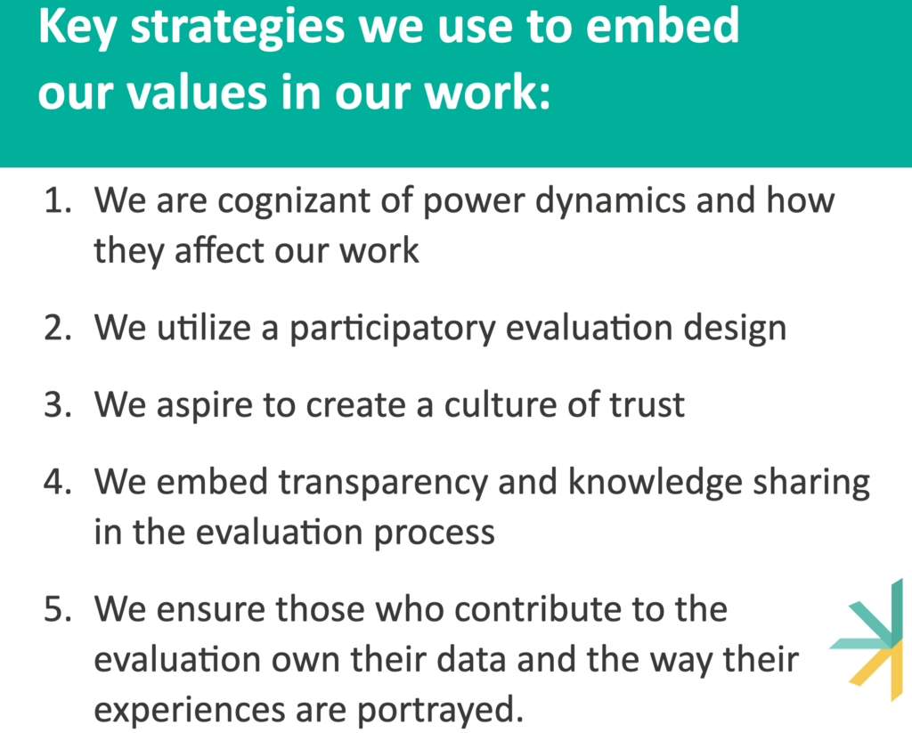
Once we have projects whose mission and objectives seek to advance social justice, our associates, project leads, and project advisors work to implement our values every step of the way. Some key strategies we use to implement these values include the following:

1 We are cognizant of power dynamics and how they affect our work. As external evaluators, navigating power dynamics is not new. However, visualizing those power dynamics and talking about them openly is a new practice that has helped us make changes in the way we do our work to alleviate common marginalization that occurs because of power dynamics. Our team thrives, through our values of equity and authenticity, when we are transparent about the power each of us holds and invite new knowledge and perspectives, no matter how uncomfortable it may be, because we know that diverse perspectives challenge our biases and enrich our projects and findings.
In practice, all our incoming team members are required to undertake the We All Count Foundations of Data Equity training; in addition to other important learning, the training provides them with the tools to create Evaluation Power Maps (check out this example by Heather Krause). For one evaluation that looked at a cross-state coalition, the Evaluation Power Map helped us start a conversation about who is involved and who gets to design the evaluation. We identified that advocates had initially been omitted, which prompted us to create an Evaluation Advisory Group that included advocates as collaborators to design mutually beneficial evaluation questions. The questions developed as a result were far different from what we had expected, centering on the desire of coalition members to explore the purpose of the coalition.
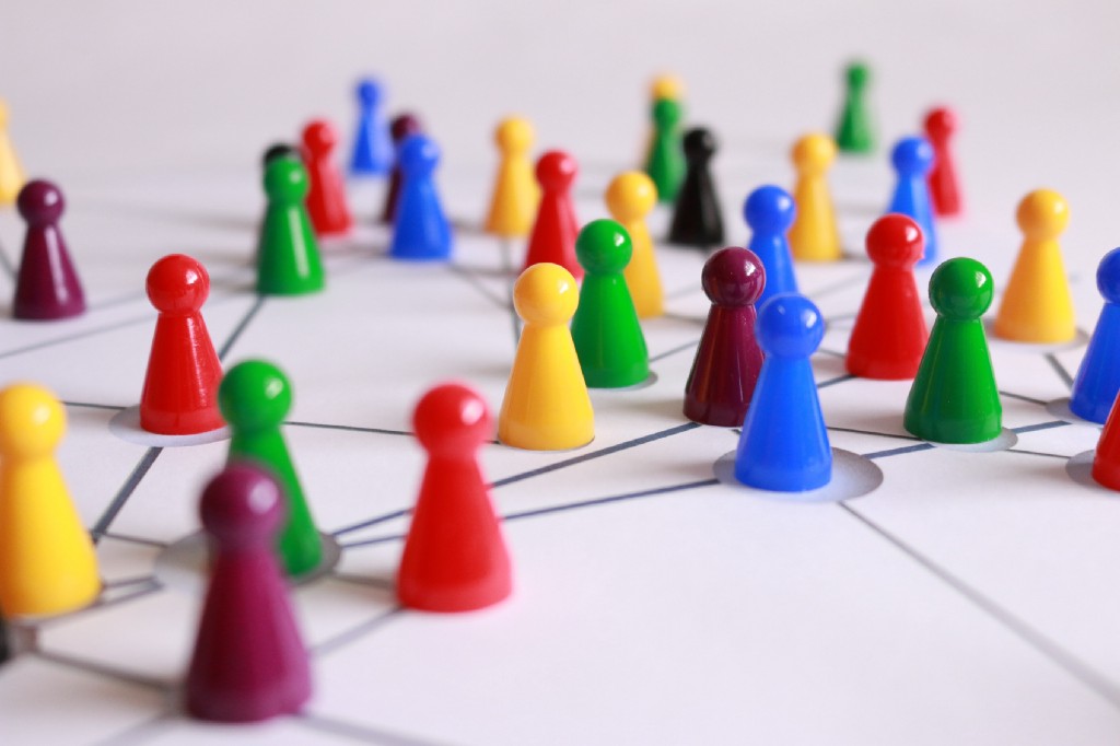
2 We utilize a participatory evaluation design. While we have always taken a collaborative approach with our clients, usually foundations and larger nonprofits, we have shifted to seek out contribution, and compensate whenever possible, the participation of actors involved in the project. This is particularly important to us because historically evaluation and learning have existed in traditionally hierarchical power structures, that not only leave behind but also overburden low-resourced organizations, particularly grantees of funders who may have hired us for an evaluation that involves their grantees. This is problematic because it is the evaluation participants who are doing the vital groundwork to further social justice and have the most experience, yet are often the least engaged in agenda creation and decision making. Our values of community and equity are our guiding lights throughout this strategy, encouraging us to include grantees in the participatory type of work we have always done with our clients
We are working with a Foundation to help them redesign their evaluation and learning objectives and practices to directly benefit their grantees We created a participatory learning agenda and included both grantees and community members throughout the project. We also created an ongoing feedback loop where evaluation participants could share thoughts and concerns about the execution and direction of the project. This was especially helpful as it allowed us to make shorter-term adjustments to the project from both the Foundation and the grantees’ perspectives. Our participatory approach allowed us to ensure the results truly reflected the concerns, desires, and needs of all parties impacted by the Foundation’s work.

3 We aspire to create a culture of trust. To ensure our partners are able to participate actively, we ensure every person is treated with respect, dignity, and empathy. Some strategies to create a culture of trust revolve around the way we listen to each other, ask for opinions and feedback, respond to comments or questions, and provide support to our partners. This effort to be both participatory and create a culture of trust is also why we prefer to call those involved in the evaluation project learning partners. It is a change that shifts our mindset to one of a horizontal and mutually beneficial relationship that recognizes partners as experts of their own experiences with both authority and agency. This strategy highlights our ongoing efforts to live by our values of growing possibility, community, and authenticity.
A clear example of this is our recognition of the evolving process of evaluation and learning during the data collection and sensemaking process of a particular project. In this stage, we found that identified interviewees had felt taken advantage of by someone involved in the initiative we were evaluating and disagreed with the framing in our draft report. We immediately took a step back with humility and empathy, providing space and time for the interviewees to share their concerns. Our team recognized the issue and gave collaborators the power to question the process. We were able to better understand their experience and rework the draft report before presenting it to their funders. This allowed us to have a much more honest and authentic final result and allowed for genuine growth.

4 We embed transparency and knowledge sharing in the evaluation process. We continuously update our partners and collaborators, sharing notes, data, insights, and learning logs. This ensures all involved in the project are on the same page, have equal access to resources, and most importantly, that we have a transparent evaluation and learning process. Ensuring everyone is able to participate actively through honest feedback contributes to an ongoing learning strategy centered around using data for action. This transparency also helps us challenge hierarchical relationships, shifting power towards grantees and community members who are encouraged to participate, co-create and learn with us, highlighting our values of curiosity, growing possibility, and authenticity.
In some of our projects, we create learning logs that capture insights and assumptions that are made accessible, updated, and re-shared to crystallize learnings from each session. Partners have access to a written record of their learning that they can access, at any time, long before any formal report is presented. Learning logs also ensure that those partners that could not join a session are included and given the opportunity to learn and contribute throughout the project.

5 We ensure those who contribute to the evaluation own their data and the way their experiences are portrayed. It is important to think about who is doing the reflection, who is missing from the table, and understand what voices and insights are important to elevate. We want to make sure the final project, and deliverable, is useful for both our client and other evaluation participants. We commonly hold sensemaking sessions to accomplish this. In a sensemaking session, we invite our partners to help us interpret the findings of the evaluation and bring in additional perspectives and insights. This process makes us check our biases, prioritize what is important, and is a facilitated space where partners translate learning into how it can be acted on to improve their work. These efforts highlight, above all, our value of equity as we strive to ensure collaborators have a say in this process, and the findings themselves.
During one sensemaking session, we took particular care to invite the people we had interviewed. The participants pressure-tested the insights we presented during the Sensemaking, weighing in and challenging those that did not align with their experience. Thanks to their active participation, we were able to integrate all perspectives in the final report and create a powerful and comprehensive strategy for the Foundation with recommendations that put forth collective goals that would not only serve the Foundation but also the field of advocacy in the state.
As a team, we have been incorporating many of these strategies for years, but only recently has a critical reflection on our work and a deep organizational transformation helped us distill our efforts into our core values of equity; curiosity; growing possibility; community; and authenticity.
We know that implementing these values with our clients is not enough; we are committed to incorporating our values internally, and today, our team is actively building a culture of trust and intentional, collective, transparent, and horizontal decision-making processes, where everyone’s opinion, independently of their level is respected and leveraged to make decisions.
While we have shared our work ethos and some of our strategies here, we have many more that we currently implement, or are experimenting with that demonstrate the positive impact of a values-based approach, and we know you do too. We encourage you to share and respond to how you incorporate your values into your work or what different strategies you implement to make evaluation and learning more equitable.
Stay tuned to our blog for more ways in which we incorporate our values into our work, reflections, and lessons learned from this transformation process.
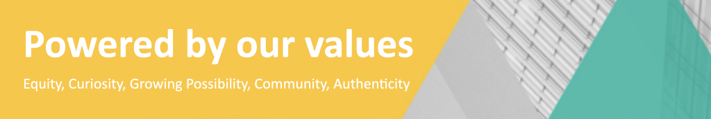
Powered by our values:
Equity, Curiosity, Growing Possibility, Community, and Authenticity was originally published in InnovationNetwork on Medium, where people are continuing the conversation by highlighting and responding to this story.