• Skip to main content
  • Skip to footer
  • Home

The May 13 Group

the next day for evaluation

  • Get Involved
  • Our Work
  • About Us
You are here: Home / Archives for allblogs

allblogs

Feb 12 2021

Picture This

One of the things I have noticed from working with nonprofits and community coalitions is that most people do not consider themselves “data people.”

Instead, they are typically visual learners. And they are doers. They want to make something happen in their community. Maybe that resonates with you.

I know as a community psychologist and evaluator, that data is important. Otherwise, how do you know you are making a difference?

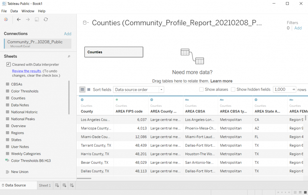
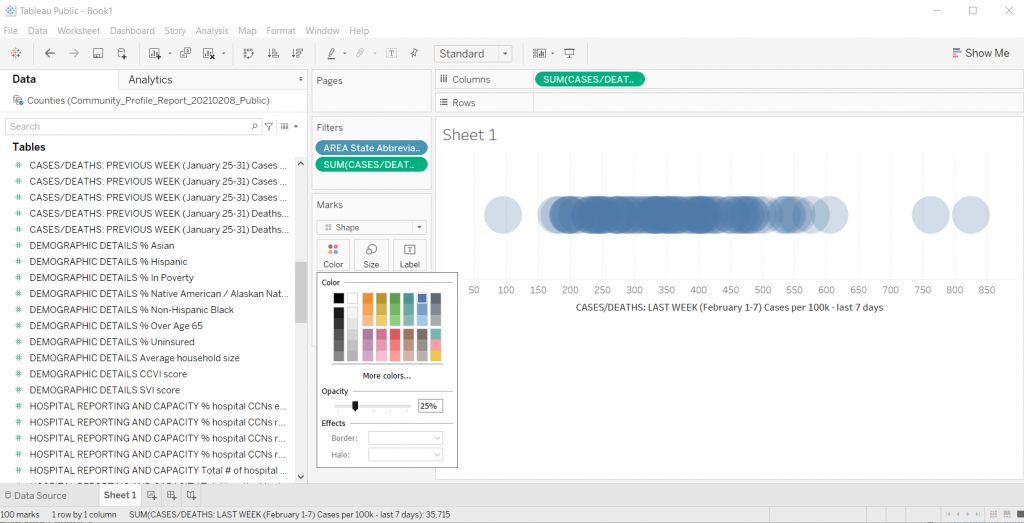
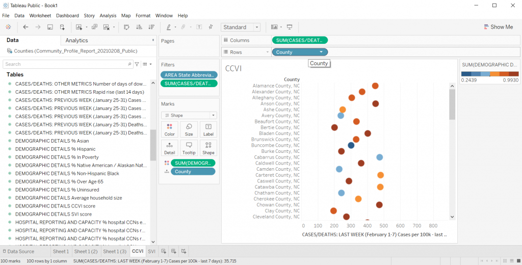
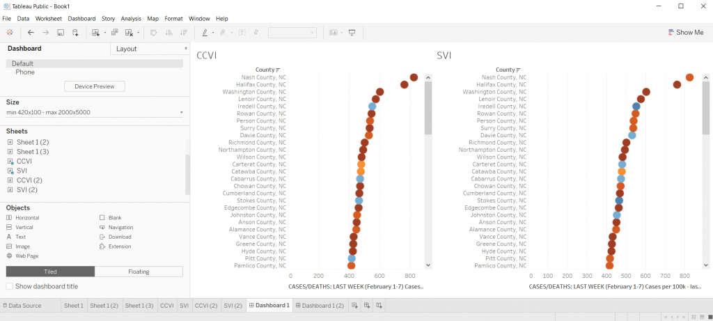
At CES we do our best to create curiosity and engagement with data in a variety of way including dashboards, graphs, success stories, short videos, and infographics.

Last week, I spoke as part of speaker’s series for SAMSHA’s Service Members, Veterans and their Families Technical Assistance (SMVF TA) Center. We talked about all of these ways of using evaluation information. Today I want to share some tips about one of my favorite ways of using data, infographics. Here are ten tips to get you started.

  1. Who is you intended audience? Like all good evaluation reporting techniques, you should start with the evaluation user in mind. What do they most need to know?
  2. What story do you need to tell them?
  3. Choose a few data points (2 or 3) that tell your story.
  4. Don’t forget to cite your data sources. In this age of distrust in data and science, it’s important.
  5. Choose your brand colors, but don’t overdo it.
  6. Choose icons and pictures that help tell your visual story. In my talk the other day, we looked at an infographic that used 20 dog tags to depict the number of veterans who die by suicide every day.
  7. Use words, but minimally. The pictures and your select data points should be the star.
  8. Include an action you want them to take (e.g. get involved, donate resources, call their congressional representative etc.).
  9. Consider people who may be color blind or have some other visual disability when choosing your colors or font sizes.
  10. Make sure you share with some of your folks and get their feedback on your infographic, then make adjustments.

You can use your infographic in newsletters, on your website, on your social media sites, in your annual reports…..so many ways!

Hope this is helpful. Let me know how you use infographics in your work.

Written by cplysy · Categorized: communityevaluationsolutions

Feb 11 2021

Using Timelines To Track Activities

Just as parents will use pencil notches in a wall to track the height of their children as a developmental marker, so too can innovators and evaluators use timelines to help gather and track the development of programs and projects over time.

A timeline is a simple linear visual that gathers activities together that uses time as the variable of distinction.

What makes a timeline useful is that it provides a visual display of temporal relationships between events, activities and outcomes. It makes explicit what we might have in our heads, but are also prone to confusing and forgetting over time.

When to Use Timelines

Timelines are useful in a variety of situations:

  1. Projects with activities that can be organized into a sequence (whether planned or not). They are less useful for projects where there are many activities happening simultaneously.
  2. Projects with a long time horizon.
  3. Projects operating in an environment with many different levels of activities and influences. For example, when there are external factors like policy decisions that have discrete times attached to them and can influence a project’s course, this is a good use of a timeline.
  4. Projects that have a story to tell that involves a beginning, middle, and end.

A timeline can help provide anchors between project activities and events — whether those are policy-related, tied to human (or other) resource use, environmental disruptions, seasons, or cycles. They can help provide hypotheses between causes and consequences or explain mediators.

For example, one non-profit project we worked on had a planned roll-out that was moving along well until their funder abruptly cancelled the program that they relied on. This meant that the six-months after that announcement involved finding new sources of revenue, reductions in staffing, and changes in some activities, yet also persistence in trying to adapt to the situation and still execute the original plan. By showing the data on a timeline it helped explain what happened to project activities, outputs, and outcomes within a certain time period and how that related to the overall project plan.

Examples

Below is an example of a timeline that illustrates distinctive markers along the route. These are clearly defined events that took place on specific dates. The selection of events includes those deemed to be meaningful and significant to the project.

What makes a timeline a powerful tool is that there are many different ways to illustrate events. The example above is a relatively straightforward set of data.

Below is another example that involves much more data and in different forms. This example creates a hybrid of timeline and categorization exercise.

Creating Timelines

There are many templates and tools that can be used to help develop visual graphics. The examples above are from Lucidchart, however, tools like Miro, Mural, SmartDraw, PowerPoint, Google Draw, and many others have templates that can be modified to create useful timelines. These are all simple tools that can be manipulated easily so you’re able to build them as you go.

If you are looking to develop more sophisticated models, we suggest employing a visual communicator or graphic designer to take advantage of the many ways you can represent temporal data.

The result is something that is engaging and can easily be discussed or presented to diverse stakeholders involved in a project who might be able to validate, contribute to, or constructively challenge the arrangements. We find this to be a powerful way to organize our findings, refresh our memories, and recognize all of the activities that go into a project.

Documenting Innovation Development

Lastly, if you are developing an innovation where there is no clear ‘end’ known at the beginning, timelines are useful in telling the story of the project and documenting the different pivots, changes, adaptations, and their consequences. A timeline can be a powerful asset to Developmental Evaluation and a complement to the Living History Method that we often employ in those kinds of evaluations.

A timeline can honour all the work you put into coming up with your final product and can be an engaging way to get people involved in celebrating, documenting, and tracking what you do and create.

We use these all the time and can help you track and evaluate your project. Contact us and let’s talk about timelines, innovation and impact.

Written by cplysy · Categorized: cameronnorman

Feb 10 2021

How to Create Dot Plots in Tableau

This is the first in a series of posts on data design in Tableau. Today I’ll show you how to use Tableau (Public or Desktop) to create a Dot Plot. This time we’ll use our Dot Plot for an Exploratory Analysis.

Visualization is not always just about reporting. Visuals can help you to analyze and make sense of your data, not just report it to others. This is one of the biggest values brought to you by a tool like Tableau. And you can get that value even with the free Tableau Public.

Not Getting Overwhelmed by Your Data.

Alright, so let’s find a dataset that is interesting if not a bit overwhelming. Given that we are still immersed in COVID-19, let’s start there.

Here is a National COVID-19 Community Profile Report.

COVID-19 Community Profile Report

On that page you will find a PDF report that’s updated daily. For each PDF there is also a related Excel spreadsheet. That’s what we’ll explore.

There are bunch of sheets here, the one we’ll look at in Tableau is the County Tab.

COVID-19 Community Profile Report Excel Spreadsheet

Not Getting Overwhelmed by Tableau.

So there is a lot you can do with Tableau. As such, it can be overwhelming if you’re not used to the platform.

Let’s not let it. It doesn’t matter if you know everything Tableau can and can not do. We’re just going to use it to make a spreadsheet less overwhelming.

Drag and Drop your Spreadsheet

So when I use Tableau, most of the time I’ll just open up the program. Then I’ll drag and drop a spreadsheet I want to peruse onto the Tableau window.

Tableau will then open it up.

Opening a File in Tableau

Pick a Sheet

Let’s choose the Counties sheet. Just drag it from the left to the spot where it says “Drag tables here”

Picking a Sheet in Tableau

Tableau will show you the data.

If you take a look at the preview, you’ll notice that it didn’t pull the data in a way that’s super useful. This is because of the formatting of the original Excel file.

I used to advise people to tailor the spreadsheet in Excel first then drop it into Tableau. But that’s just extra work, let’s see what happens if we click the little “Use Data Interpreter” box.

Looking at your data preview in Tableau

Clicking the Use Data Interpreter Box

Sweet, that cleaned up our dataset. If I were going to use this for some major analysis I might do some more cleaning. But I don’t really care about that right now, I just want to explore.

Using Tableau's Data Interpreter Box

Clicking on Sheet 1

Once you have the data source setup, you can start exploring by clicking on the first sheet.

Clicking on Sheet 1 in Tableau

Filtering the Data

Alright, so every county in the Country is a lot. Let me start by just looking at my state.

I’ll drop the “State Abbreviation” variable into the Filter spot on the page. This will give me a popup where I’ll select NC.

Choosing a Filter Variable in Tableau

Showing the data.

The first step in creating a dot plot (there is no real order to this but it ended up being the first thing I did) is to drop county in the detail box under marks.

Dragging a variable to the Detail spot in Tableau

Creating the Dot Plot

Now we just need to drop a variable we want to look at in the Column’s spot.

I’ll look at Cases per 100K from the last 7 days. This will give us a nice normalized set of data to compare across NC counties.

Poof, dot plot created.

*Yes, it says “Sum” but since every county has one and only one data point, the “sum” is just the value. You can check this by changing the data from Sum to Average. If the values change it means you have multiple values per data point.

Creating a Basic Dot Plot in Excel

Filter Out Null

Who wants to look at Nulls. I’ll go ahead and filter it away (this one is just an artifact of the dataset).

Filtering out Null in Tableau

Making the dot plot bigger.

If the chart is too small, you can just drag the bottom down (below the horizontal axis). This will make your chart bigger.

Increasing the chart size in Tableau

Changing the shape.

We can the shape of the mark using the shape button. So if you don’t like the little hollow circles, this is where you change it up.

Changing Shapes in Tableau

Adding Transparency

I like this trick when you have smaller datasets with just a bit of overlap. Click on color then lower the opacity. This gives you a kind of heat map effect on your dot plot (this works well with scatter plots too).

Adding Transparency in Tableau

Trying Different Things by Duplicating the Sheet

When I’m exploring data in Tableau, usually I get to a good base visual, then I duplicate the sheet. Just right click on “Sheet 1” at the bottom of the file and click Duplicate.

Honestly, there is too much overlap for this particular chart to be very useful. If NC only had something like 30 counties it would look different, but with 100, it really looks just like a dark line.

Duplicating sheets in Tableau

Adding a Color Variable

So one of the ways to increase the usefulness of a dot plot (for exploration) is to visualize another variable using color.

So there is a CCVI score in the underlying dataset. It’s something called the COVID-19 Community Vulnerability Index (CCVI). A take on the CDC’s Social Vulnerability Index (also in this dataset).

Since there is a CCVI score for every county, I’m going to drag this variable into the color spot. Then I’m going to change the color (by clicking edit colors) to a diverging Orange-Blue. I’ll also click the Stepped color box (6 steps) and click the reversed box to make the scale go from Dark Blue (low vulnerability) to Dark Orange (high vulnerability).

Adding a color variable in Tableau

This is also kind of impossible to see anything with, so I’ll go ahead and duplicate the sheet again to try something different.

Adding a color variable in Tableau

Let’s add some separation.

There are times when I like seeing everything on the same line, especially if I want to bundle something up at say a National level. But this single line dot plot isn’t really showing me much.

Instead, I’ll drop the County variable into the row column. I also took away the transparency on the dots and fiddled with their size a little. This gave me something I could scroll through and sort.

Creating Dot Plot separation in Tableau

Quick Sorting of the Data

So if you put your cursor to the top of the dot plot, you’ll find a way to quickly sort your visual. This certainly gave me a view where I could see some differences. This particular view/variable didn’t shout at me but it definitely gave me a clearer picture of underlying case data.

Quick sorting data in your Tableau visual

Changing the Data

Once you get a view you like, you can start changing the variable still using the same visual. For instance, instead of just looking at cases per 100K, what if I started to look at deaths per 100K?

Instead of looking at CCVI, what if colored the dots using the SVI data instead? Do certain patterns start to emerge?

Changing your data in Tableau

Comparing Views

In Tableau, if you ever want a side by side view, you can just click on the “Dashboard” tab and give yourself a nice large size dashboard. Then put sheets side by side.

It doesn’t have to be perfect, remember, this whole exercise is just about using visuals to explore your data.

Comparing Views in Tableau

So what have I discovered?

Nothing earth shattering. I was just playing around with data as a way to show you how to play around with data in Tableau.

It does look as though the CCVI is more likely to correlate with a higher incidence of COVID-19 compared to the SVI, and even more so with COVID-19 deaths per 100K. I could sense enough of a pattern to get me curious and push me to dive deeper. And ultimately that was really my goal.

Playing with data means a lot of not-finding anything notable, hopefully followed by a “hmm, that’s interesting.”

Try it Yourself

Now it’s your turn, try to dive into the dataset I shared above. Is there anything you can learn?

Freshspectrum Cartoon.  
"Every time I try to zoom in this happens..."
"Like I said before, the paper is not interactive."

Written by cplysy · Categorized: freshspectrum

Feb 09 2021

Tipos de aprendizaje

Como parte de la serie sobre “aprendizaje” enumeramos diferentes tipos de aprendizaje:

  • Aprendizaje por descubrimiento: Consiste en la adquisición de conceptos, principios o contenidos a través de un método de búsqueda activa, sin una información inicial sistematizada del contenido de aprendizaje.
  • Aprendizaje por ensayo y error: Proceso de aprendizaje en el cual el sujeto enfrentado a una nueva situación, no sabe cuál es la respuesta correcta y comienza emitiendo una variada gama de ellas, hasta que casualmente ejecuta la respuesta correcta, tras la cual recibe un reforzamiento positivo.
  • Aprendizaje Innovador: Supone, la capacidad de control de los acontecimientos que dirigen el rumbo de una sociedad. Los rasgos básicos de este aprendizaje son la participación y la anticipación.
  • Aprendizaje latente: Aprendizaje que tiene lugar en ausencia de reforzamiento o recompensa y que solo se manifiesta en la conducta o actuación de lo contrario permanece latente cuando aparece el reforzamiento.

  • Aprendizaje lector: Intervienen diversas variables; por un lado, las que caracterizan al mismo proceso lector; por otra, una serie de aptitudes en él implicadas que el niño ha de poseer antes de iniciar el aprendizaje.
  • Aprendizaje de mantenimiento: Este aprendizaje se define como la adquisición de criterios, métodos y reglas fijas para hacer frente a situaciones conocidas y recurrentes. Estimula la capacidad de resolver problemas en el supuesto de problemas ya vividos.
  • Aprendizaje social: El término de aprendizaje social ha sido empleado globalmente en la psicología contemporánea de dos maneras diferentes, en virtud de la extensión del concepto y de su vinculación a sistemas teóricos determinados. Para muchos autores, por aprendizaje social se entiende un conjunto de aprendizajes que hacen referencia a conductas específicas y directamente ligadas a la vida social, como hábitos sociales, actitudes, valores. Se trata de un uso genérico que no se señala procesos concretos, sino el ámbito en que se dan.
  • Aprendizaje vicario: Aprendizaje que se obtienen por la observación de la conducta, consecuencias y procesos de un modelo. Se fundamenta en los procesos imitativos complejos (integra dimensiones cognitivas y afectivas). La identificación del sujeto que aprende con el modelo y las recompensas que éste recibe como consecuencia de su conducta son aspectos esenciales en el aprendizaje vicario.
  • Aprendizaje continuo vertical: Tipo de aprendizaje realizado por el alumno, son los procesos mediante los que codifica, transforma y retiene la información. Va del aprendizaje meramente memorístico o repetitivo (un número de teléfono) al aprendizaje plenamente significativo.
  • Aprendizaje significativo: El aprendizaje significativo es, según el teórico estadounidense David Ausubel, un tipo de aprendizaje en que un estudiante asocia la información nueva con la que ya posee; reajustando y reconstruyendo ambas informaciones en este proceso.


Written by cplysy · Categorized: TripleAD

Feb 09 2021

From “Ugh” to “Ooh!” – Reframing Logic Models

From “Ugh” to “Ooh!” – Reframing Logic Models

“Ugh, they’re making us submit a logic model? What is the point of a logic model anyway?

“I don’t understand all that technical jargon. What am I supposed to put in a logic model?”

These are the thoughts I imagine my clients having when a funder or state department of education requires them to create a logic model … and rightfully so.

Logic models are often overly complicated, far too technical, and not connected to ACTUAL practice – so it’s no wonder that they are not intuitive for people doing “the work” in education. 

It doesn’t have to be that way though. Let’s talk about what a logic model actually is and how it can help your organization.

I found the following definition of a logic model on the Community Tool Box (emphasis added):

“A logic model presents a picture of how your effort or initiative is supposed to work… Effective logic models make an explicit, often visual, statement of the activities that will bring about change and the results you expect to see for the community and its people. A logic model keeps participants in the effort moving in the same direction by providing a common language and point of reference.” ​

Here’s what I love about this definition:

1) It clearly conveys that a logic model is a visualization of how your program operates, and

2) It helps teams see that a logic model can actually streamline their work and make sure everyone is on the same page.

​The image below from the CDC is another great way to think about what a logic model can do.

Picture

So instead of an annoying task you have to complete for grant funding, think of a logic model as a dynamic map of your program and how you will collaboratively work towards achieving your goal. 

Recently, I introduced this new way of thinking to a school district team I’m working with.

I’m designing a data dashboard (learn more here!) for them so that all of their family-serving teams can share data and serve their district’s families more efficiently. (I’m really excited about this.)

When we met with each team individually, they were all saying the same things about how they engage with families and what data they already or want to track. 

Yet, collectively, they couldn’t see the forest for the trees. They didn’t know how similarly each team was operating!

Let me be clear: this wasn’t because they were not communicating or working together. It’s because they didn’t have a framework to guide their collective work and show where there was overlap across project teams.

So we got to work. Using Google Slides, we did an interactive work session where the teams brainstormed what they would put in each part of a logic model. Below is a screenshot of their “Activities” brainstorm.​

Picture

Then we did a virtual “gallery walk” so they could see how much overlap there was. See how many “I do this too” stars there are in the image? 

After this, it took no time to put together their ideas into a more traditional logic model format.

If your team is currently struggling with making a logic model, don’t be afraid!

Reframing how we think about logic models can go a long way towards making them purposeful, usable tools to make our family engagement work more effective.

Archives


Select Month May 2021 April 2021 March 2021 February 2021 January 2021 December 2020 November 2020 October 2020 September 2020 August 2020 July 2020 June 2020 May 2020 April 2020 March 2020 February 2020 January 2020 December 2019 November 2019 October 2019

Tags

Attendance
Barriers to Success
Community Schools
Current Events
Data Tracking
Education
ESSA
Evaluation
Family Engagement
Inequality
Microsoft Excel
Professional Learning
Reflections
Surveys
Tools and Resources
Updates

Written by cplysy · Categorized: engagewithdata

  • « Go to Previous Page
  • Go to page 1
  • Interim pages omitted …
  • Go to page 205
  • Go to page 206
  • Go to page 207
  • Go to page 208
  • Go to page 209
  • Interim pages omitted …
  • Go to page 310
  • Go to Next Page »

Footer

Follow our Work

The easiest way to stay connected to our work is to join our newsletter. You’ll get updates on projects, learn about new events, and hear stories from those evaluators whom the field continues to actively exclude and erase.

Get Updates

Want to take further action or join a pod? Click here to learn more.

Copyright © 2026 · The May 13 Group · Log in

en English
af Afrikaanssq Shqipam አማርኛar العربيةhy Հայերենaz Azərbaycan dilieu Euskarabe Беларуская моваbn বাংলাbs Bosanskibg Българскиca Catalàceb Cebuanony Chichewazh-CN 简体中文zh-TW 繁體中文co Corsuhr Hrvatskics Čeština‎da Dansknl Nederlandsen Englisheo Esperantoet Eestitl Filipinofi Suomifr Françaisfy Fryskgl Galegoka ქართულიde Deutschel Ελληνικάgu ગુજરાતીht Kreyol ayisyenha Harshen Hausahaw Ōlelo Hawaiʻiiw עִבְרִיתhi हिन्दीhmn Hmonghu Magyaris Íslenskaig Igboid Bahasa Indonesiaga Gaeilgeit Italianoja 日本語jw Basa Jawakn ಕನ್ನಡkk Қазақ тіліkm ភាសាខ្មែរko 한국어ku كوردی‎ky Кыргызчаlo ພາສາລາວla Latinlv Latviešu valodalt Lietuvių kalbalb Lëtzebuergeschmk Македонски јазикmg Malagasyms Bahasa Melayuml മലയാളംmt Maltesemi Te Reo Māorimr मराठीmn Монголmy ဗမာစာne नेपालीno Norsk bokmålps پښتوfa فارسیpl Polskipt Portuguêspa ਪੰਜਾਬੀro Românăru Русскийsm Samoangd Gàidhligsr Српски језикst Sesothosn Shonasd سنڌيsi සිංහලsk Slovenčinasl Slovenščinaso Afsoomaalies Españolsu Basa Sundasw Kiswahilisv Svenskatg Тоҷикӣta தமிழ்te తెలుగుth ไทยtr Türkçeuk Українськаur اردوuz O‘zbekchavi Tiếng Việtcy Cymraegxh isiXhosayi יידישyo Yorùbázu Zulu