• Skip to main content
  • Skip to footer
  • Home

The May 13 Group

the next day for evaluation

  • Get Involved
  • Our Work
  • About Us
You are here: Home / Archives for allblogs

allblogs

Feb 09 2021

From “Ugh” to “Ooh!” – Reframing Logic Models

“Ugh, they’re making us submit a logic model? What is the point of a logic model anyway?” 

“I don’t understand all that technical jargon. What am I supposed to put in a logic model?” 

These are the thoughts I imagine my clients having when a funder or state department of education requires them to create a logic model … and rightfully so. 

Logic models are often overly complicated, far too technical, and not connected to ACTUAL practice – so it’s no wonder that they are not intuitive for people doing “the work” in education. 

It doesn’t have to be that way though. Let’s talk about what a logic model actually is and how it can help your organization.

I found the following definition of a logic model on the Community Tool Box (emphasis added): 

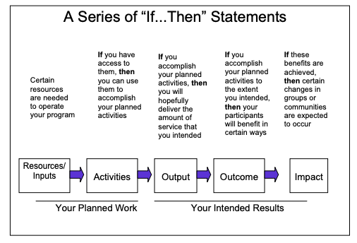
“A logic model presents a picture of how your effort or initiative is supposed to work… Effective logic models make an explicit, often visual, statement of the activities that will bring about change and the results you expect to see for the community and its people. A logic model keeps participants in the effort moving in the same direction by providing a common language and point of reference.” ​

Here’s what I love about this definition:

1) It clearly conveys that a logic model is a visualization of how your program operates, and

2) It helps teams see that a logic model can actually streamline their work and make sure everyone is on the same page. 

​The image below from the CDC is another great way to think about what a logic model can do.

Picture

So instead of an annoying task you have to complete for grant funding, think of a logic model as a dynamic map of your program and how you will collaboratively work towards achieving your goal. 

Recently, I introduced this new way of thinking to a school district team I’m working with. 

I’m designing a data dashboard (learn more here!) for them so that all of their family-serving teams can share data and serve their district’s families more efficiently. (I’m really excited about this.)

When we met with each team individually, they were all saying the same things about how they engage with families and what data they already or want to track. 

Yet, collectively, they couldn’t see the forest for the trees. They didn’t know how similarly each team was operating!

Let me be clear: this wasn’t because they were not communicating or working together. It’s because they didn’t have a framework to guide their collective work and show where there was overlap across project teams.

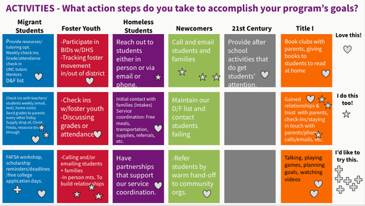
So we got to work. Using Google Slides, we did an interactive work session where the teams brainstormed what they would put in each part of a logic model. Below is a screenshot of their “Activities” brainstorm.​

Picture

Then we did a virtual “gallery walk” so they could see how much overlap there was. See how many “I do this too” stars there are in the image? 

After this, it took no time to put together their ideas into a more traditional logic model format. 

If your team is currently struggling with making a logic model, don’t be afraid!

Reframing how we think about logic models can go a long way towards making them purposeful, usable tools to make our family engagement work more effective.

Written by cplysy · Categorized: engagewithdata

Feb 05 2021

What is Formative Evaluation? Cartoon Glossary

This is a series of posts providing quick overviews of important topics in research and evaluation. Each post in this series will include at least 3 cartoons from my archives and at least 3 links to recommended resources. I only give quotes here and recommend that you follow the links below each quote for more detailed information.

Formative Evaluation Cartoon by Chris Lysy of freshspectrum. When the chef tastes the soup. Chef holding a spoon thinking "needs more ginger."

When the cook tastes the soup, that’s formative; when the guests taste the soup, that’s summative.

Quote by Bob Stake and shared in Michael Scriven’s 1991 Book, Evaluation Thesaurus 4th Edition.

Formative Evaluation Cartoon by Chris Lysy of freshspectrum.  "So tell me about that new model you're implementing. Is it effective?"
"Honestly, we're still in our formative phase."

Formative evaluation is generally any evaluation that takes place before or during a project’s implementation with the aim of improving the project’s design and performance.

Formative evaluation complements summative evaluation and is essential for trying to understand why a program works or doesn’t, and what other factors (internal and external) are at work during a project’s life.

Formative evaluation does require time and money and this may be a barrier to undertaking it, but it should be viewed as a valuable investment that improves the likelihood of achieving a successful outcome through better program design.

Community Sustainability Engagement Evaluation Toolbox 

Formative Evaluation Cartoon by Chris Lysy of freshspectrum. 
"So this report tells us our program model doesn't work. But it doesn't give us any insight on how we can make it better."
"You said you wanted to know if it worked, so I did a summative evaluation.  I can do a formative evaluation, but that'll cost extra."

Formative evaluation ensures that a program or program activity is feasible, appropriate, and acceptable before it is fully implemented. It is usually conducted when a new program or activity is being developed or when an existing one is being adapted or modified.

CDC STD Program – Types of Evaluation 2-Pager

Written by cplysy · Categorized: freshspectrum

Feb 03 2021

Webinar Notes: The “Coin Model of Privilege and Critical Allyship”

Title: The “Coin Model of Privilege and Critical Allyship”: Orienting Ourselves for Accountable Action on Equity

Speaker: Dr. Stephanie Nixon, University of Toronto

Hosted by: Simon Fraser University, Faculty of Health Sciences

  • Dr. Nixon asked us to jot down our thoughts on the following three questions:

What are new insights?

  • the coin model = privilege (unearned advantages) and oppression (unearned disadvantages)
  • we have words for those people whose health is affected by oppressions: “marginalized”, “vulnerable”, “at risk”, “target population” – but we don’t have any words for those people who are on the other side of the coin. We frame equity as solely around those on the bottom of the coin – and we thus limit our thinking of possible solutions to these “problem” of the bottom of the coin – we disappear those on the “top of the coin” – we disappear the coin altogether
  • we frame the privileged as neutral instead of as complicit in the oppression
  • when is EDI used to avoid actually dealing with oppression?

What feels important but is still muddy?

What do I feel as I lean into reflecting on privilege? body, emotions. (“We cannot think our way out of oppression.”)

Other notes:

  • I’ve seen the original version of this experiment, and appreciated this updated version. When they did the reveal, I felt my stomach fall – I missed something that should be so obvious again! I also appreciated Dr. Nixon’s use of this as a metaphor for privilege: e.g., those who don’t experience oppression not only don’t see it, they don’t believe it when others tell them that they experience it and gaslight them by saying that what they have experienced did not happen.
  • strengths that helped me get to my level of education: parents who supported me to pursue higher education, availability of student loans; barriers: cost of tuition and living as a student without an income, not having role models in my family who had done higher education before
  • the people on the “bottom” of the coin are the experts on how oppression affects them – those on the privileged side of the coin can’t see the ways in which they are privileged (it’s like the gorilla!)
  • white supremacy – the view that white is “normal”, the “default”
  • people on one side of the coin are not homogeneous – e.g., if we think about colonialism, the people on the oppressed side are indigenous, and there are many different indigenous groups; similarly, the group on the privileged side of the coin of colonialism are settlers and they are also not homogenous
  • education on antiracism, anti-oppression is not enough – it doesn’t change the material conditions that people experience, it doesn’t dismantle the systems of oppression
  • what is my work to do on “EDI”?
    • when you are on the top of a coin, you need to work in solidary with the people who are experiencing the oppression
    • it is not about the person with privilege “saving” or “fixing” the populations experiencing the oppression
    • when privilege is unchecked it leads to an irrational sense of neutrality
    • when you are on “top” of the coin, you need to understand your position as having unearned privilege (and even recognizing there is a coin) and that you are not the expert

Dr. Nixon’s article on this model: https://bmcpublichealth.biomedcentral.com/articles/10.1186/s12889-019-7884-9

Written by cplysy · Categorized: drbethsnow

Feb 03 2021

Ask Nicole: Use Your 9-to-5 to Build Your Consulting Business

Have a question you’d like featured? Let me know. In last month’s Ask Nicole, I shared from quick advice to get your started in consulting. This month, I’m touching on a topic I saw in response to what I shared and more broadly. One of the main reasons why people want to get into consulting […]

The post Ask Nicole: Use Your 9-to-5 to Build Your Consulting Business appeared first on Nicole Clark Consulting.

Written by cplysy · Categorized: nicoleclark

Feb 03 2021

How to Create a Sidebar Style One-Pager in Adobe XD

This is the third in a series of posts on data design in Adobe XD. Today instead of charts, I’ll show you how to use Adobe XD as a print design tool for one-pagers. We’ll design a really simple but totally versatile sidebar style one-pager.

What you’ll find in this post:

  • An Oversimplified How To
  • How to do more with your one-pager.
  • Some nice free graphic design guides.
  • My new virtual learning community.
How to create a sidebar style one-pager in Adobe XD.

Before we dive into today’s tutorial. A note about using columns or grids in your designs. Do it. It’s one of the best ways to give your reporting a more polished professional look.

Using a grid permits a designer to more rapidly lay out enormous amounts of information because many design considerations are addressed in building the grid’s structure at the outset of a project.

From Making and Breaking the Grid by Timothy Samara

An Oversimplified How To

Sidebar Style One-Pager in Adobe XD Illustration Step 1

Step 1. Create a custom size artboard in Adobe XD. We’ll be creating a simple 8.5 by 11 one-pager, but we’ll need to convert that to pixels.

A web search will tell you to do 300 pixels for every inch which will give you a 2550 by 3300 art board. (I’ll tell you later in this post the pixel dimensions I use most often for one-pagers, because it’s different).

Sidebar Style One-Pager in Adobe XD Illustration Step 2

Step 2. Once we create the artboard we’ll select it and check the box under grid for the layout.

Sidebar Style One-Pager in Adobe XD Illustration Step 3

Step 3. Let’s go with one of the most common page layouts and use 3 columns.

Sidebar Style One-Pager in Adobe XD Illustration Step 4

Step 4. Once the columns are set, draw a rectangle (and give it a dark color) and place from the left edge to the edge of the column.

Sidebar Style One-Pager in Adobe XD Illustration Step 5

Step 5. Now add some text boxes in the right two grids where the text will go, the font sizing will be wonky so just create what you think looks okay (this is because of the artboard size that I’ll get into later).

Sidebar Style One-Pager in Adobe XD Illustration Step 6

Step 6. Now add some text boxes in white for the left hand sidebar.

Sidebar Style One-Pager in Adobe XD Illustration Step 7

Step 7. Now export your completed one-pager design as a PDF. Then open it in Acrobat and marvel at your new layout design skills.

Sidebar Style One-Pager in Adobe XD Illustration in Acrobat

How to do more with your one-pager.

Okay, so that was a really basic one-pager design. Let’s tweak it a bit and make it cooler/more useful.

Change the Artboard Size to 72 pixels per inch

So the conventional web guidance of 300 pixels per inch is based on old print thinking. The idea goes, well a high quality print is 300 dots per inch, so we should just multiply inches by 300.

But our digital screens are optimized at 72 pixels per inch. And since XD is a vector design tool (the pixel ratio won’t impact quality) and a web design tool, let’s create an artboard that is 612 w and 792 h.

Don’t worry I won’t go anymore into the pixel nerdery. Just know that using this ratio, all of the font sizes suddenly will work out properly!

Sidebar Style One-Pager in Adobe XD Illustration 8.5 by 11 artboard 72 pixel per inch

Adjust the Gutter Width, Margins, and Fonts

The Gutter is the space between columns (I’ll usually go with multiples of 4). With this one I went with a gutter width of 12 pixels and a margin of 36 pixels. This automatically set the column width at 172 pixels.

Now I can also set the font sizes at appropriate levels. So for the main body text I used a 10 point Proxima Nova font and a size 26 bolded header font.

Sidebar Style One-Pager in Adobe XD Illustration Adding Textboxes

Icon Illustrating the Sidebar

Sidebars are a good spot for a little icon illustration. I’ll left justify those against the side the column (you’ll see why in a few).

Sidebar Style One-Pager in Adobe XD Illustration Icon Illustrating

Charts and Pictures in the Main Body Section

I like using the main body to make the major point the one-pager is trying to express, then add any relevant chart or illustration. You can even drop a final thought and make it stand out through italics or a larger size.

In XD your text and shapes will be vector (meaning they will scale to any size without quality loss). If the Pixels/Icons/Charts you enter into the document are not vector (i.e. pngs, jpgs) they might lose quality. Usually if the file size is large enough and you don’t skew it, you won’t notice a difference. But the best way to check is to export it into a pdf and see what it looks like at 100%.

Sidebar Style One-Pager in Adobe XD Illustration Charts and Pictures

Takeaway – Page Numbers

One-pagers are often sub-reports with content pulled out of larger reports. They don’t tell the whole story, but give teasers.

When there is a larger report, I like to drop in page numbers for anyone wanting more detail.

Sidebar Style One-Pager in Adobe XD Illustration Page Numbers

Don’t be afraid to leave white space.

I like to leave a bit of white space when possible. This can make the one-pager feel less intimidating.

Most often I’ll leave it in the top of the right two columns. Putting it at the top makes it feel more intentional, not like you just ran out of thoughts.

Sidebar Style One-Pager in Adobe XD Illustration Exporting into PDF

Exporting into PDF

You can export your reports right into pdf.

I never suggest writing your report in design program. I usually use Word documents or Google Docs to write. Then I copy and paste the text into prepared templates in XD.

Sidebar Style One-Pager in Adobe XD Illustration Final look in Acrobat

Some nice free graphic design guides.

A lot of my interest in grid based design started when I found the work of the late Massimo Vignelli. There are a couple of his works available on the web for free download, and they are well worth the read.

The Vignelli Canon

massimo vignelli canon free pdf graphic design

The famous Italian designer Massimo Vignelli allows us a glimpse of his understanding of good design in this book, its rules and criteria. He uses numerous examples to convey applications in practice – from product design via signaletics and graphic design to Corporate Design. By doing this he is making an important manual available to young designers that in its clarity both in terms of subject matter and visually is entirely committed to Vignelli’s modern design.

Designed by Massimo Vignelli, 2009, 96 pages.

From Rationale Design

Graphic Design for Non-Profit Organizations

rationale resources vignelli non-profit organizations manual cover

The document presented here focuses on improving structural design and general best practices for Non-Profit Organizations. However, the scope of the teachings apply to achieving good design across any industry. These works are the property of their respective owners and should be used for non-commercial research and education purposes only.

Designed by Massimo Vignelli & Peter Laundy in partnership with AIGA, 1980, 52 pages.

From Rationale Design

A Learning Community for Creative Data People

So I’m considering building a new virtual learning community. This would be a peer learning group, not just me telling you how to do things. It’s for data people (researchers, evaluators, public health professionals, etc.) who are interested in exploring and building up their creative side.

It’s for the people who believe as I do, that if we want people to make data informed decisions, we (the people who know the data) have to be more creative in how we approach doing and sharing our work.

Interested? You can learn more here and join the waitlist:

DiY Data Design Waitlist

Written by cplysy · Categorized: freshspectrum

  • « Go to Previous Page
  • Go to page 1
  • Interim pages omitted …
  • Go to page 206
  • Go to page 207
  • Go to page 208
  • Go to page 209
  • Go to page 210
  • Interim pages omitted …
  • Go to page 310
  • Go to Next Page »

Footer

Follow our Work

The easiest way to stay connected to our work is to join our newsletter. You’ll get updates on projects, learn about new events, and hear stories from those evaluators whom the field continues to actively exclude and erase.

Get Updates

Want to take further action or join a pod? Click here to learn more.

Copyright © 2026 · The May 13 Group · Log in

en English
af Afrikaanssq Shqipam አማርኛar العربيةhy Հայերենaz Azərbaycan dilieu Euskarabe Беларуская моваbn বাংলাbs Bosanskibg Българскиca Catalàceb Cebuanony Chichewazh-CN 简体中文zh-TW 繁體中文co Corsuhr Hrvatskics Čeština‎da Dansknl Nederlandsen Englisheo Esperantoet Eestitl Filipinofi Suomifr Françaisfy Fryskgl Galegoka ქართულიde Deutschel Ελληνικάgu ગુજરાતીht Kreyol ayisyenha Harshen Hausahaw Ōlelo Hawaiʻiiw עִבְרִיתhi हिन्दीhmn Hmonghu Magyaris Íslenskaig Igboid Bahasa Indonesiaga Gaeilgeit Italianoja 日本語jw Basa Jawakn ಕನ್ನಡkk Қазақ тіліkm ភាសាខ្មែរko 한국어ku كوردی‎ky Кыргызчаlo ພາສາລາວla Latinlv Latviešu valodalt Lietuvių kalbalb Lëtzebuergeschmk Македонски јазикmg Malagasyms Bahasa Melayuml മലയാളംmt Maltesemi Te Reo Māorimr मराठीmn Монголmy ဗမာစာne नेपालीno Norsk bokmålps پښتوfa فارسیpl Polskipt Portuguêspa ਪੰਜਾਬੀro Românăru Русскийsm Samoangd Gàidhligsr Српски језикst Sesothosn Shonasd سنڌيsi සිංහලsk Slovenčinasl Slovenščinaso Afsoomaalies Españolsu Basa Sundasw Kiswahilisv Svenskatg Тоҷикӣta தமிழ்te తెలుగుth ไทยtr Türkçeuk Українськаur اردوuz O‘zbekchavi Tiếng Việtcy Cymraegxh isiXhosayi יידישyo Yorùbázu Zulu