• Skip to main content
  • Skip to footer
  • Home

The May 13 Group

the next day for evaluation

  • Get Involved
  • Our Work
  • About Us
You are here: Home / Archives for allblogs

allblogs

Sep 27 2024

Common Pie Chart Misuses (and How to Fix Them)

This article is rated as:


Pie charts are a widely and (often) inappropriately used form of data visualization. Their simplicity makes them appealing to visualize parts of a whole. However, pie charts are often misused, leading to the misinterpretation or distortion of data. Below, I’ll outline some common misuses of pie charts and offer practical suggestions for improving your data visualizations.
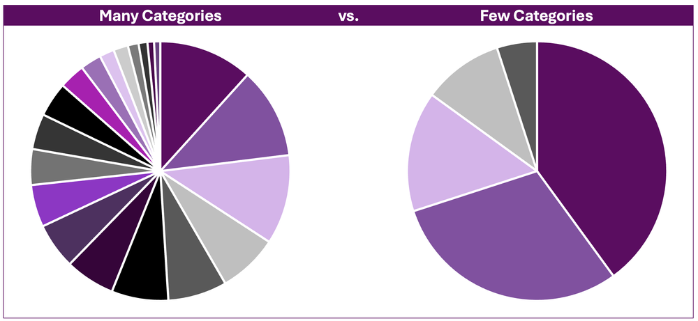

Too Many Categories

A common misuse of the pie chart is presenting too many categories (or slices) in a single chart. Pie charts with numerous slices quickly become cluttered and difficult to read. This inhibits interpretation of the chart, making it impossible to discern between slices or to compare between slices accurately.

The Fix

If you decide to use a pie chart, consider grouping smaller categories or like categories together to reduce the number of slices in the pie chart and improve its readability. However, sometimes aggregating data together is not appropriate. For these data, consider bar and column charts as better alternatives, as they more effectively display categorical data.


Close Comparisons

Pie charts are not well suited to presenting data requiring precise comparisons between categories. That is, slices that are close in size are difficult to distinguish between. This is because angles are more difficult to interpret (Skau, D. and Kosara, R., 2016) relative to lengths (e.g., as in the bars in bar charts).
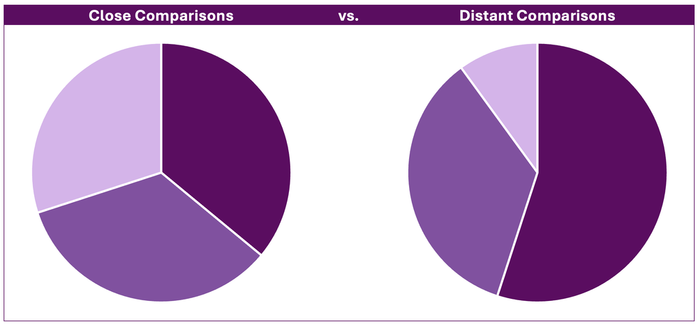
The Fix

Bar or column charts are more suitable for visualizing close comparisons between categories. Bars allow for easier comparison, as the length of each bar is easily interpreted relative to distinguishing between similar angles in a pie chart.


3D Pie Charts

Using 3D pie charts further distorts our ability to read them. The 3D perspective can make some slices appear disproportionately larger due to their relative position within the visual. That is, segments that are closer appear larger relative to slices farther back, regardless of their actual proportions.
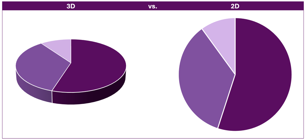
The Fix

This fix is simple: do not use 3D charts. Standard 2D charts are superior in visualizing data (for all chart types, including pie charts) compared to 3D charts. Use 2D pie charts for easier interpretation.


Unsorted Categories

Another issue in pie charts is when categories are plotted in a seemingly random order. Without the logical ordering of categories (e.g., largest to smallest) it becomes difficult to extract meaningful insights from the data.
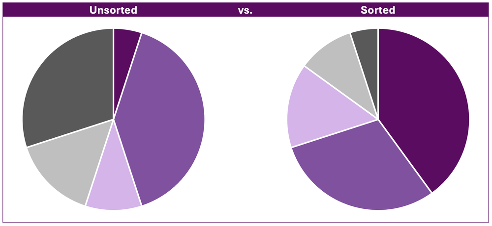
The Fix

Ordering categories from largest to smallest improves the readability of pie charts. The intent is to draw attention to the largest categories first, which are often the most important.


Non-Proportional Data

Pie charts are useful for visualizing the proportions of a whole. Using pie charts to visualize non-proportional data (i.e., proportions exceeding 100%) often leads to confusion as it is designed to represent a complete whole only.

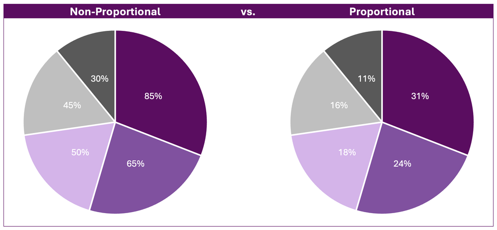
*While identical in appearance, the above example illustrates how misleading non-proportional data are when visualized using pie charts. The first slice, 85%, clearly does not represent 85% of the total pie chart. Therefore, it is difficult to gain meaningful insights from a chart the requires the reader to both interpret the overall percentage of each slice and the relative proportion of each slice relative to the rest of the pie chart.

The Fix

Use alternative data visualizations, such as bar or column charts. These visualizations are better suited to display non-proportional data, as they show individual values without suggesting a proportional relationship between categories.


Too Much Colour

Too much colour in a pie chart can detract from the message of the pie chart. Colour is important for distinguishing between slices, but its overuse can be overwhelming and hard to interpret. Additionally, certain colour combinations can be difficult to distinguish, especially for those with colour vision deficiencies.
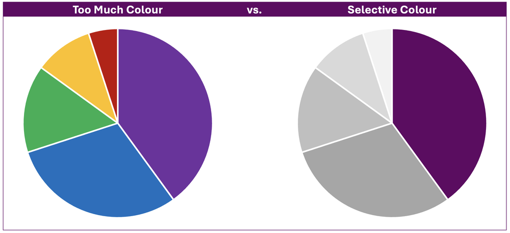
The Fix

Use colour strategically to highlight the most important point in your pie chart. Applying muted tones, such as greyscale, to less relevant data allows the primary colour and key message to stand out allowing your pie chart to clearly communicate its main point.


Final Thoughts

Pie charts can be effective when used appropriately. However, they are less effective in visualizing complex data or data requiring close comparisons. Before defaulting to a pie chart, consider alternative data visualizations (such as bar charts) that may be more suitable for communicating the message of your data.

The key to effective data visualization is clarity. Avoiding these common pie chart pitfalls and selecting the right chart type for your data will ensure that your visualizations communicate information both accurately and effectively.

Written by cplysy · Categorized: evalacademy

Sep 27 2024

How to Support Evaluation Success: Tips for Program Managers

This article is rated as:


If you’re a program manager, you may be required, or better yet, want to evaluate your program. One of the first steps is identifying if you have internal evaluation capacity or require an external evaluator (Internal vs External Evaluators: What’s the Difference and Which One is Right for You?). In either case, evaluation can be an overwhelming prospect.

And that’s fair! Evaluation can be new, and you may not fully understand the process. Evaluations can be complex, with lots of moving pieces. It can be a challenge to navigate timelines and schedules, stay on top of various steps and phases, and make sure that everyone knows what they need to know.

Luckily, there are a few actions you can take to help yourself and your team prepare! These certainly aren’t mandatory, but you might find that these tips can help an evaluation stay on track and go a little smoother!


Involve us early

Evaluation often comes up when a grant is wrapping up or a budget cycle is ending, but it can be harder to evaluate a program that is done or nearing completion. In fact, evaluators love when people have thought about evaluation early into a project, even right from the planning stages!

Being included early makes our jobs as evaluators easier, but it can also help you plan your program or initiative effectively and set yourself up for a successful evaluation. Starting early means you can adjust your program in response to feedback, collect baseline information, and implement procedures to gather other useful data. It also gives you a great opportunity to conduct other types of evaluation than summative, like formative evaluation, process evaluation, developmental evaluation, or participatory evaluation.

Even if your program is already underway, it’s not too late! You can start planning to evaluate as soon as you think of it. Evaluation can still help you gather feedback, make changes, and demonstrate the effectiveness of your program (if you want to apply for a grant, for example).


Consider your goals

Reflect on what you hope to learn by evaluating your program. The clearer you are about your goals, the more you’ll be able to act on the findings. Check out this infographic for 10 reasons why you might want to evaluate.

You might also want to consider what you plan to do with the results. What will you share with leadership, staff, and the public? Are you hoping to adjust your processes, or tell a story about the impact of your program? Knowing what you want to do with the results will help your evaluator collect the right data and craft reports or other products that meet your needs!


Help us understand

To be effective in our roles, evaluators need to have certain information about the program or initiative being evaluated. Having an understanding of the program, key partners, and goals of the evaluation will help at every stage of the process. For internal evaluators, this may be a simple process, as they likely have some familiarity already. Sharing information is even more relevant if the evaluator is external. When the evaluator has a good understanding of the program and its context, they can help ensure that the evaluation turns out useful and presents valuable insights for you.

We’ve written about this on Eval Academy before, so definitely check out this article to read more about what information you should be prepared to share with an evaluator.

How you share this information can be flexible. If you don’t have existing documents that perfectly summarize everything, just be prepared to share it verbally during a meeting!


Engage staff and other partners

In our work at Three Hive Consulting, we typically involve various partners in the evaluation process; we ask for representatives from various departments or roles. While it does depend on what you’re hoping to gain from the evaluation, we often like to speak with staff, clients/patients, and organizational partners. We can capture valuable insights by gathering thoughts and feedback from people that are involved in the program or initiative in different ways.

Making sure that these partners are aware the evaluation is occurring and that they might have an opportunity to be involved can make data collection easier. Even if specific dates haven’t been established yet, letting people know ahead of time that they’ll be invited to participate in surveys, interviews, or focus groups can give people time to get used to the idea and ensures that the invitation won’t be a confusing surprise! We often ask representatives to be the champions of the evaluation, encouraging others to participate in data collection.

Continuing to engage with staff and other partners throughout the entire process can also encourage interest in the evaluation and its results, and support the adoption of changes afterwards.


Think about data

Evaluators also often make use of existing data that has already been collected. These can look like intake forms, participant data, meeting minutes, facilitator notes, annual reports, and previous evaluations. You can begin to take stock of available data even before the evaluation kicks off. You might even start identifying potential difficulties in accessing data, like privacy procedures or the format and location of files.


Think about obstacles early

Because the data collection phase often involves several different groups of people, the logistics can be tricky; this sometimes causes delays in the evaluation. Planning for these challenges can support more efficient and timely data collection. You can start to discuss potential barriers with your evaluator early on—like team capacity, conflicting schedules, and missing contact information—and then collaborate on a plan to address them!


Communicate often

Last, but certainly not least! Regular communication should occur at every stage of an evaluation, and all parties, including evaluators, program managers, and evaluation committee members, play a role in making this happen!  Be prepared for meetings or regular touchpoints with your evaluator. They will require your time to explain processes or feasibility, to review and approve plans or data collection tools, and to offer your insights. If capacity is an issue, one strategy is to identify other decision makers who can represent your program.

Effective communication can help avoid misunderstandings, circumvent obstacles, and keep an evaluation on track. Proactively identifying and communicating an issue gives everyone time to strategize or shift approaches. It also gives you and your team a chance to provide context on emerging findings or give feedback on deliverables. For Three Hive’s projects, we tend to set up biweekly or monthly meetings to establish an opportunity for everyone to share updates and exchange feedback.  


Keep learning about evaluation

Evaluation-focused content is often directed at evaluators, but that doesn’t mean that non-evaluators don’t have an important role to play in supporting the success of evaluations! We hope these actionable tips help you feel more confident and prepared for the next time you’re involved in an evaluation!

For more in-depth training in evaluation, our Program Evaluation for Program Managers course has been developed for program managers like you.


If you’re new to evaluation, check out these other articles and resources:

Infographic: A Beginner’s Guide to Evaluation: A summary of introductory resources for new evaluators — Eval Academy

Common Evaluation FAQs — Eval Academy

Evaluation as self-care for your program — Eval Academy

Written by cplysy · Categorized: evalacademy

Sep 25 2024

What’s the Difference between Clustered Bars and Dumbbell Dots??

Maybe you’re already familiar with dot plots…

Maybe you’re already using them…

Maybe you can make ’em in your sleep…

Or maybe you have no idea what I’m even talking about! (If that’s the case, stick around! This video is for you.)

You’ll learn about the differences between clustered bar charts and dot plots. Then, you’ll see a real-life example so you can start thinking about how you’d apply these in your own workplace.

Transcript

Ann K. Emery: [00:00:00] Maybe you’re already familiar with dot plots. Maybe you’re already using them. Maybe you can make them in your sleep.

Or maybe you have no idea what I’m even talking about! If that’s the case, stick around. This video is for you.

You’re going to learn about the differences between clustered bar charts and dot plots.

And then I’ll show you a real life example. So you can start thinking about how you might apply this chart type to your own workplace.

I’m Ann Emery. You’re watching Dataviz on the Go, the series where I make quick tutorials as I’m racing around between workshops and webinars and conferences and consulting projects.

And speaking of consulting projects, I was recently in a meeting with a client and they were asking about these chart types, clustered bar charts and dumbbell dot plots.

And right away when you look at them, they’re obviously different! One’s got bars, one’s got dots, but there is a slight, smaller nuance that I want to draw your attention to here. [00:01:00] And that’s related to attention!

It’s related to where our eyes and brains, and therefore where our precious attention, goes when we look at each of these graphs.

So when you look at a bar chart, your eyes are going to look at obviously the end point, right? That’s the really juicy part of the bar chart.

With dot plots, they don’t waste any time. They cut right to the chase. I love them for their brevity and they just plot the end point. Okay, they don’t waste our ink and waste our time with all this, all this unnecessary ink.

Another slight difference is when you want to compare the end points, you have to do a little bit of a diagonally down movement to compare them, where dot plots plot everything on the same plane, so that it’s just a little bit faster, right?

Instead of stacked endpoints, it’s side by side: same line, same plane.

Alright, let’s look at a real life example because [00:02:00] this one with A, B, C, D and group one and group two is obviously super made up!

Let’s go back into the vault in my memory, where about 15 years ago, which is a million years ago, I was working on a lot of school climate surveys.

I did a lot of consulting for the U S Department of Education. I looked at test scores, all sorts of academic performance and school climate surveys, and I don’t remember the exact details of how this was measured, but I do know that we surveyed parents. And school staff, like the teachers and the principals and all the administrative staff. And then we compared how they responded on different measures.

This is the default graph that Excel is going to give you, which of course, if you’ve watched any of my other YouTube tutorials or read any of my blog posts over the years, you know, we can’t keep that. Okay. Let me just let, you know, just make it super duper clear what we’re not doing.

We’re not keeping these default, inaccessible settings. At a bare minimum, we’re going [00:03:00] to add Big A Accessibility –508 compliance and ADA compliance. That’s the usual stuff. That’s like making sure the font is big enough and dark enough, removing the legend and adding the direct labels right here, which is a win for grayscale printing and for custom words. Colorblindness.

And then we might even, I hope, I hope you do this. I hope you keep going with “little a accessibility” edits to make sure that your graph is really intuitive.

That’s going to be things like grouping, right? Finding groups of elements where parents scored the school higher, versus staff.

That’s going to be things like adding annotations, which, guess what? That’s just a good old text box. It’s a call- out box to help people figure out what the patterns are so that they’re not just guessing and searching and hunting for any type of insight.

This one, honestly, when it’s Big A and little a accessible, I’d say [00:04:00] it’s not that bad!

I wouldn’t lose sleep over this.

If you go this far with editing with your clustered bar charts, I’m going to say: virtual high five, leave it alone. You’ve graduated. No need to keep on going with editing unless you want to, unless you’re ready to really keep boosting your skills and try out something that’s a little bit more advanced.

And that advanced, uh, approach would be the dumbbell dot plot. Which as you know, only puts the emphasis on the end point, the juicy important part. And it helps draw your attention with this connecting line, the, the dumbbell part of it to the difference between the staff and the parents- or whatever groups you’re comparing in your project.

Now, you’re going to have to put the annotations on these finished charts in a little bit different spot, depending on whether you’re doing a landscape final project or a portrait final project.

So if this was going to be landscape, you’re going to have [00:05:00] space for the annotations off to the side. If it’s portrait, It’s going to be a lot narrower.

You’re just not going to have the space. So you’re probably going to have to put the call out boxes above each chart, something like this.

Here’s what I mean: landscape versus portrait. You’re just going to have to think very carefully about where everything fits. So it’s not so condensed that people can’t actually notice those important differences between your groups.

It’s your turn. Comment below this video. Let me know, are you using dot plots? For what? You probably aren’t doing school climate surveys. You’re probably using them for something completely different from this. And also let me know what types of how to questions you have. These are possible in good old Excel and PowerPoint and Word, but they require some advanced behind the scenes magic tricks to make them happen, which I am happy to share with you in future [00:06:00] videos.

Written by cplysy · Categorized: depictdatastudio

Sep 24 2024

Estrategias Clave para Mejorar la Colaboración Intersectorial en Organizaciones de Desarrollo

I.Introducción

La colaboración intersectorial es esencial para abordar problemas complejos y multidimensionales en organizaciones de desarrollo. Este artículo presenta estrategias clave para mejorar el trabajo intersectorial, así como los desafíos y soluciones para una implementación efectiva.

II.Estrategias para Mejorar el Trabajo Intersectorial

  1. Fortalecimiento de la Gobernanza
    • Liderazgo Claro: Designar líderes responsables de coordinar esfuerzos intersectoriales asegura que todos los sectores trabajen hacia objetivos comunes.
    • Mecanismos de Rendición de Cuentas: Implementar sistemas de monitoreo y evaluación para asegurar que los objetivos se cumplan de manera efectiva.
  2. Incentivos para la Colaboración
    • Reconocimiento y Recompensas: Crear incentivos para equipos que logren resultados significativos a través de la colaboración.
    • Financiamiento Conjunto: Establecer fondos que requieran la colaboración de múltiples sectores.
  3. Capacitación y Desarrollo Profesional
    • Programas de Capacitación: Ofrecer programas específicos para desarrollar habilidades en trabajo intersectorial.
    • Intercambio de Conocimientos: Facilitar el intercambio de conocimientos y mejores prácticas entre sectores.
  4. Uso de Tecnología y Datos
    • Plataformas de Datos Compartidos: Crear plataformas para compartir datos y análisis para una mejor toma de decisiones.
    • Herramientas de Comunicación: Utilizar herramientas tecnológicas para mejorar la comunicación y coordinación.

III.Desafíos y Soluciones

  1. Resistencia al Cambio
    • Cultura Organizacional: Las culturas arraigadas pueden resistir el cambio y la colaboración.
    • Miedo a la Pérdida de Autonomía: Los sectores pueden temer perder su autonomía y control.
  2. Desigualdades de Poder
    • Desbalance de Poder: Algunos sectores pueden tener más influencia y recursos, creando desequilibrios.
    • Conflictos de Intereses: Diferentes prioridades y objetivos pueden no estar alineados.
  3. Complejidad de los Problemas
    • Problemas Multidimensionales: Los problemas complejos dificultan encontrar soluciones integrales.
    • Falta de Recursos Adecuados: La falta de recursos financieros y humanos limita la capacidad de implementar soluciones efectivas.

IV.Estrategias Detalladas

  1. Coordinación Eficiente
    • Equipos Intersectoriales: Crear equipos con miembros de diferentes sectores para mejorar la coordinación.
    • Uso de Tecnología: Implementar herramientas de gestión de proyectos y comunicación como Microsoft Teams o Slack.
    • Reuniones Regulares: Programar reuniones periódicas para revisar el progreso y ajustar estrategias.
  2. Reorganización en Recursos Limitados
    • Evaluación de Recursos: Realizar evaluaciones exhaustivas y redistribuir tareas para optimizar recursos.
    • Automatización de Procesos: Implementar soluciones tecnológicas para automatizar tareas repetitivas.
  3. Superar Barreras Institucionales
    • Transparencia y Comunicación: Fomentar una cultura de transparencia y comunicación abierta.
    • Descentralización de Decisiones: Permitir decisiones a niveles más bajos para reducir burocracia.
    • Monitoreo y Evaluación: Establecer sistemas robustos de monitoreo y evaluación con indicadores claros.
    • Capacitación en Liderazgo: Ofrecer programas de capacitación en liderazgo para manejar mejor la colaboración.

V.Ejemplos de Buenas Prácticas

  • Mesas Intersectoriales Cantonales: En Ecuador, las Mesas Intersectoriales Cantonales han demostrado ser efectivas en articular acciones entre diferentes actores sociales e institucionales para garantizar la atención integral y oportuna de niños, niñas y mujeres gestantes.
  • Protocolo Intersectorial para la Prevención y Persecución del Delito: Este protocolo mejora la coordinación entre los actores involucrados en la lucha contra la trata de personas, mostrando cómo la colaboración intersectorial puede abordar problemas complejos de manera más efectiva

VI.Conclusión

Mejorar el trabajo intersectorial en organizaciones de desarrollo requiere estrategias claras, incentivos adecuados, y el uso efectivo de tecnología y capacitación. Superar los desafíos institucionales y culturales es crucial para lograr una colaboración efectiva y abordar problemas complejos de manera integral.

Written by cplysy · Categorized: TripleAD

Sep 24 2024

Creating Fuzzy Icon Arrays

One of the cool things about teaching data design is that I get to personally learn from the people who take my workshops.

Today’s concept comes from Celestyna Galicki. This is the second time I’ve featured one of Celestyna’s creations (see her post on Shadow Logic Models).

If you have ever taken one of my workshops you’ll probably know that I love using icon arrays. You don’t need fancy tools, at the most basic level you can just copy and paste shapes. But Celestyna came up with an interesting way to display the array data that tweaks the visual story quite a bit. So I asked her if she would share her process on this blog.

Simple Tweaks with Icon Arrays (Celestyna’s section)

Simple tweaks to popular data visualizations can change what they communicate and how they are interpreted by the audience. For example, we have 800 squares (representing units of something) and we want to illustrate the scale and impact if we remove 200 of them.

The standard way to do it would be to grey out the 200 squares…

… or to delete them, which will work in a slide or video transition where they disappear from the starting picture:

We can also remove the squares randomly and create an animated transition in which the starting picture becomes full of holes. This is what I’ve done, and it worked very well for the story I was telling.

See, the “cut a piece off” reduction still leaves us with a very solid pattern. The implication is that the new situation will work in the same way, only on a smaller scale. What I wanted to say is that the change will leave us with something that will work in a new, different way, and presenting it in this form effectively underscored this message.

If you want to illustrate a change in numbers, ask: What does this change mean for how things work? How can we reflect this in how we show this change? That set of squares can be a floor and when holes appear whoever walks on it can fall through, but it could also be a wall in which we knock out a few bricks to let in some light and create space for innovation while the wall is still stands and serves its purpose. Or it could be a net that can handle the smaller holes but will lose its functionality if there is a big enough hole. Which of these visual metaphors fits the story you’re telling?

(You could make the visual metaphor explicit by making the squares look like floor tiles or bricks in a wall. I don’t, for two reasons: I do not have time, and I find that it works well enough when the audience discovers that meaning on their own – “this looks like ….!”. What you write in the report or speak in the presentation can guide them towards this interpretation.)

Did you use any modifications of common graphs or visualisations to support the meaning of the story you were telling? Share in the comments!

Playing around with Fuzzy Icon Arrays in Canva (Chris’ section)

Celestyna’s icon array made me think of a pixelated photo. So I thought, what if we actually purposefully pixelated to tell a story about what a photo shows and does not show. I ended up putting this together in Canva.

I started by turning a bunch of squares into a ten by ten grid (so 100 little squares). Then I arbitrarily removed 20 (leaving 80).

And then I did it again, removing 80 (leaving 20).

For the next step I went ahead and put a square photo grid behind my array. Now only the removed pieces will show the grid.

If you wanted to do something like this I would say it works better if you treat the background image as your base. So if you want to show 80 out of 100, remove 80 (not 20). You’ll see what I mean in a second.

Here is the grid with 20 squares removed and the remaining squares turned the same color as the background. As you can see, the picture is really fuzzy as we are only seeing it through 20%.

Now here is that same picture with the 80 squares removed. You can see almost the full picture.

I could see this being a really cool way to show off response rates to surveys (especially when doing a census approach). It gives you a sense of the missing data, and how we can still see the big picture. But if we were to have a lower response rate, the picture would show up less. A nice visual metaphor while showing off real data.

Want to access my Fuzzy Icon Array Canva Template?

Just follow the link below (just make sure to sign into your Canva account first). Also, it’s okay if you only have a free account as I only used free Canva elements for this template.

Written by cplysy · Categorized: freshspectrum

  • « Go to Previous Page
  • Go to page 1
  • Interim pages omitted …
  • Go to page 33
  • Go to page 34
  • Go to page 35
  • Go to page 36
  • Go to page 37
  • Interim pages omitted …
  • Go to page 310
  • Go to Next Page »

Footer

Follow our Work

The easiest way to stay connected to our work is to join our newsletter. You’ll get updates on projects, learn about new events, and hear stories from those evaluators whom the field continues to actively exclude and erase.

Get Updates

Want to take further action or join a pod? Click here to learn more.

Copyright © 2026 · The May 13 Group · Log in

en English
af Afrikaanssq Shqipam አማርኛar العربيةhy Հայերենaz Azərbaycan dilieu Euskarabe Беларуская моваbn বাংলাbs Bosanskibg Българскиca Catalàceb Cebuanony Chichewazh-CN 简体中文zh-TW 繁體中文co Corsuhr Hrvatskics Čeština‎da Dansknl Nederlandsen Englisheo Esperantoet Eestitl Filipinofi Suomifr Françaisfy Fryskgl Galegoka ქართულიde Deutschel Ελληνικάgu ગુજરાતીht Kreyol ayisyenha Harshen Hausahaw Ōlelo Hawaiʻiiw עִבְרִיתhi हिन्दीhmn Hmonghu Magyaris Íslenskaig Igboid Bahasa Indonesiaga Gaeilgeit Italianoja 日本語jw Basa Jawakn ಕನ್ನಡkk Қазақ тіліkm ភាសាខ្មែរko 한국어ku كوردی‎ky Кыргызчаlo ພາສາລາວla Latinlv Latviešu valodalt Lietuvių kalbalb Lëtzebuergeschmk Македонски јазикmg Malagasyms Bahasa Melayuml മലയാളംmt Maltesemi Te Reo Māorimr मराठीmn Монголmy ဗမာစာne नेपालीno Norsk bokmålps پښتوfa فارسیpl Polskipt Portuguêspa ਪੰਜਾਬੀro Românăru Русскийsm Samoangd Gàidhligsr Српски језикst Sesothosn Shonasd سنڌيsi සිංහලsk Slovenčinasl Slovenščinaso Afsoomaalies Españolsu Basa Sundasw Kiswahilisv Svenskatg Тоҷикӣta தமிழ்te తెలుగుth ไทยtr Türkçeuk Українськаur اردوuz O‘zbekchavi Tiếng Việtcy Cymraegxh isiXhosayi יידישyo Yorùbázu Zulu