• Skip to main content
  • Skip to footer
  • Home

The May 13 Group

the next day for evaluation

  • Get Involved
  • Our Work
  • About Us
You are here: Home / Archives for allblogs / freshspectrum

freshspectrum

Apr 11 2024

What is Card Sorting? UX Methods for Data People

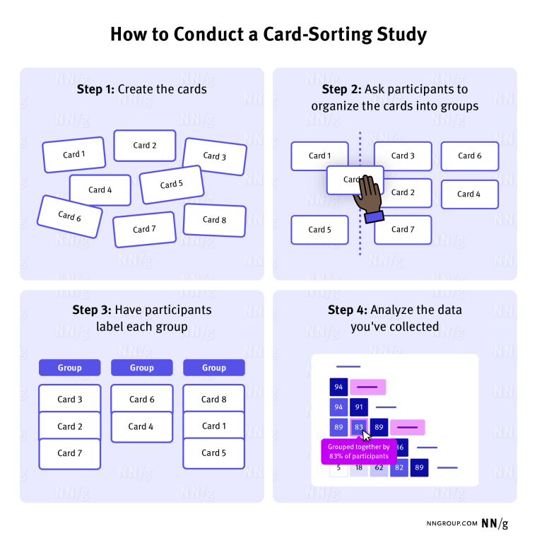
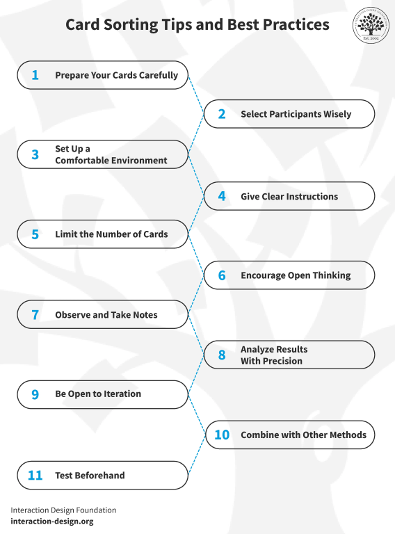
Card sorting is a user experience research method useful in discovering how people organize and prioritize different topics.

The method is pretty simple. You start with a set of topics on notecards or sticky notes. Then you ask your research participant to organize those cards in a way that makes sense to them.

At least that’s the basics, there are all sorts of card sort variations (open, closed, hybrid, moderated, unmoderated) which has been covered on the web in lots of detail. Here are a couple of good sources if you want an in-depth method guide.

  • Card Sorting: The Ultimate Guide (in 2024) – Interaction Design Foundation
  • Card Sorting: Uncover Users’ Mental Models for Better Information Architecture – Nielsen Norman Group
Comic person to second person, "Our goal with this card sort is to help organize the 3,122 topics we plan to cover in our next report."

Card sorting can be used for more than just user interface and web design.

A lot of the guides you’ll find on the web are written to show you how to use card sorting for information architecture. And it is a really good method for discovering where people would expect to find certain pieces of information on a website.

But there are definitely all sorts of different situations where are a card sort could be a really useful research method. Off the top of my head, here are just a few potential uses for researchers and evaluators.

NNGroup - How to Conduct a Card-Sorting Study

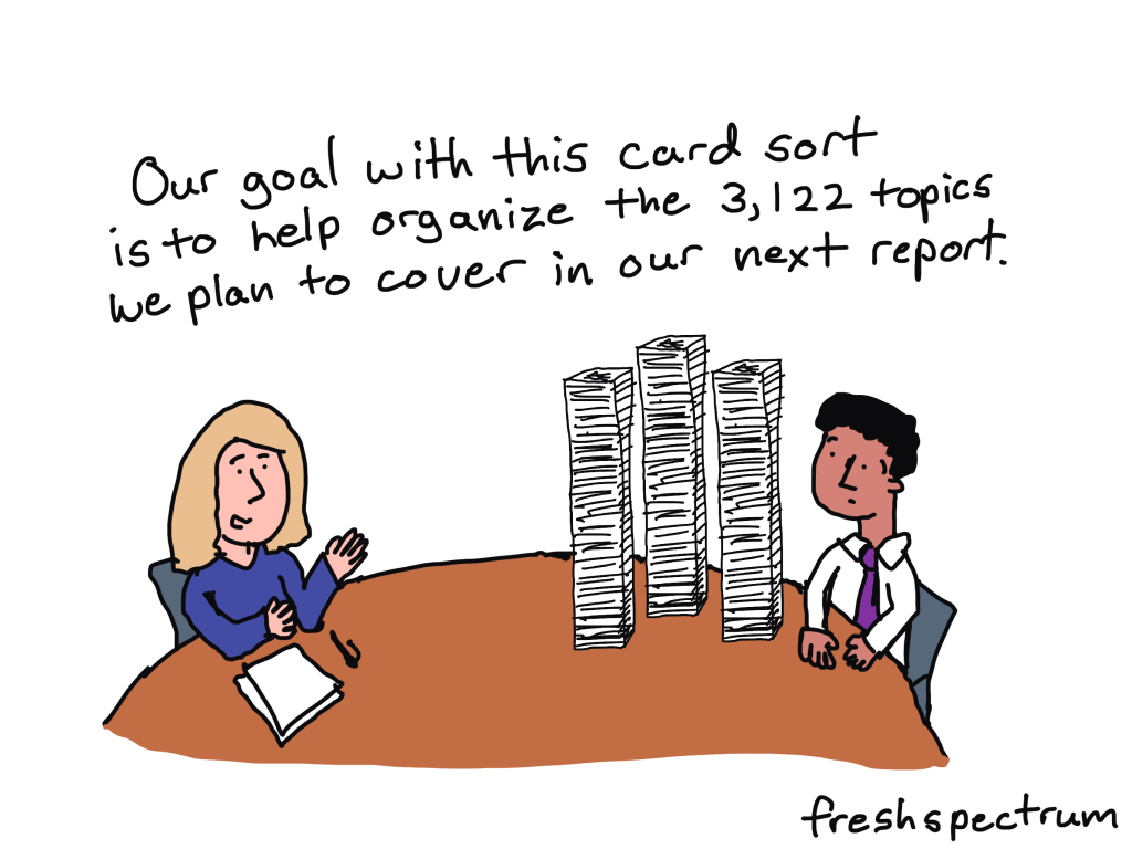
Card sorting to prioritize reporting information.

Are you trying to create a short visual report but don’t know what information should be included or not included? Why not try a card sort with different potential section headings?

Card sorting to determine survey response items.

If you have a really important survey, testing your questions with real survey respondents can provide a lot of insight. Taking it one step further, you can also card sort different response items to see which are most important for inclusion. Or you can card sort the actual survey questions, to determine which questions might provide the best insights.

Card sorting to organize outcomes and activities.

Understanding some of the importance between different program elements, activities, and outcomes could also be discovered through card sorting.

Interaction Design - Card Sorting Tips and Best Practices

Why you should consider leading a moderated card sort.

Moderated card sorting involves a researcher being present in the room while the user participates in the card sort. The researcher will encourage the participant to think aloud during the process and probe into why they are making certain choices.

dscount People Nerds – Card Sorting

Card sorting can provide a lot more insight than just the order and groupings of different topics. By asking participants to think aloud, you can get a ton of added insight into their thought process.

Bonus: Card sorting is a visual qualitative method.

A lot of data people struggle with visualizing qualitative data. Which is not surprising because many “qualitative data visualization” methods involve quantifying the data first.

Card sorting is a visual method. At the beginning and end of the sort you have a natural visual artifact that can be used when illustrating your qualitative reports. Just take a picture (or if you are leading the card sort virtually, take a screenshot).

Unlike most stock photos, process pictures of visual methods are highly relevant and easy to use illustrations.

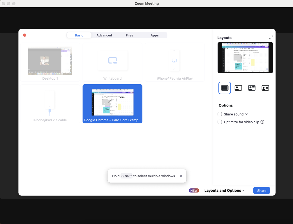
How to lead a Card Sort using Canva and Zoom.

There are a bunch of virtual tools that can used to lead a card sort. But here is a simple approach using Zoom and Canva.

1. Start a Zoom meeting and share your screen (optional)

This is totally optional, but running a card sort in Zoom (or other video meeting tool) will give you the ability to share your screen and record the process.

Screenshot - Sharing Screen on Zoom

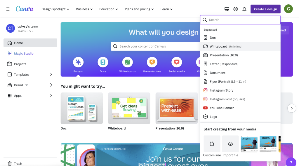
2. Create a Whiteboard in Canva

In Canva, go to create a design and choose “Whiteboard.”

Screenshot - Creating a Whiteboard in Canva

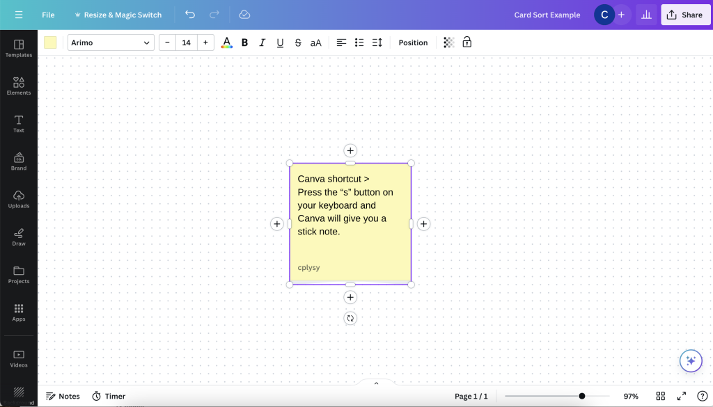
3. Add sticky notes.

If you already have the topics you want your participant to organize, go ahead and create sticky notes to share them. There is a Canva shortcut, just click “s” and a sticky note will appear.

Screenshot - Creating a sticky note in Canva

4. Change sticky note colors (optional)

The default sticky note is yellow, but you can always change the colors by selecting the sticky notes and clicking on the color button at the top left of the page.

Screenshot - Changing sticky note colors

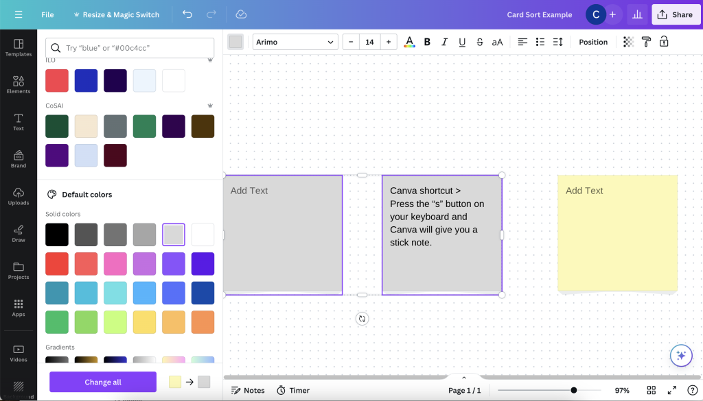
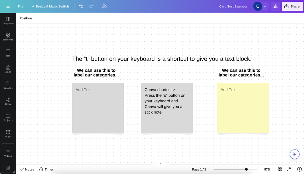
5. Add organizing text blocks.

Here is another Canva shortcut. If you hit the “t” button on your computer a text block will appear. You can use these to include labels on the page.

Screenshot - Canva text block shortcut

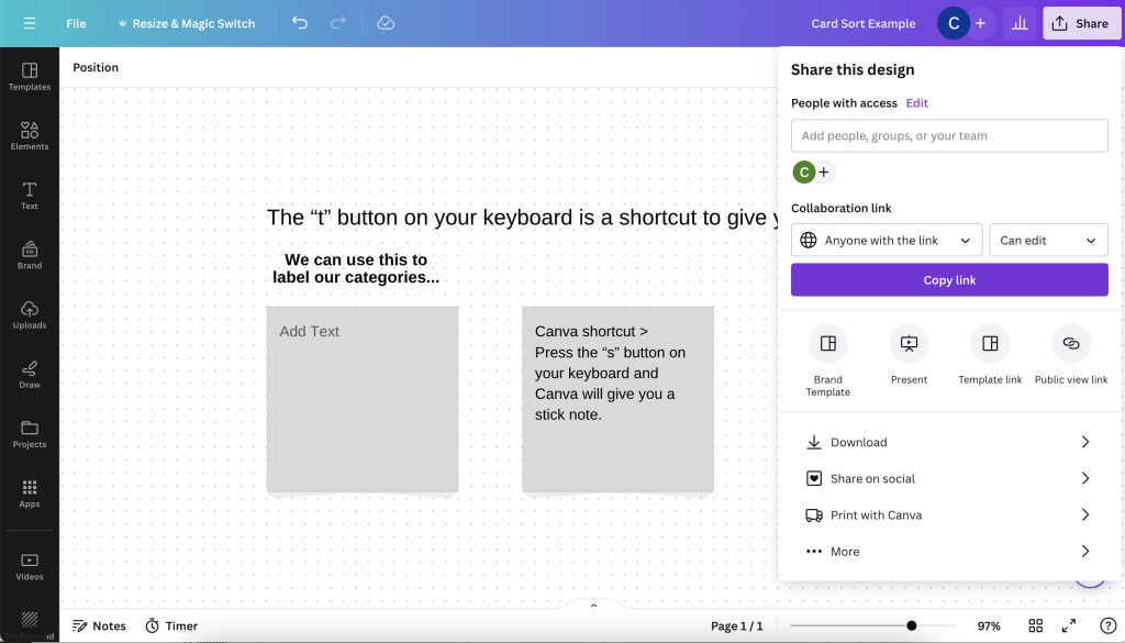
6. Invite your participant to the Canva file.

You can share your canva document directly with your participant. You just need to click share and then send a “Collaboration link” that anyone can edit.

Screenshot - Sharing an edit link in Canva

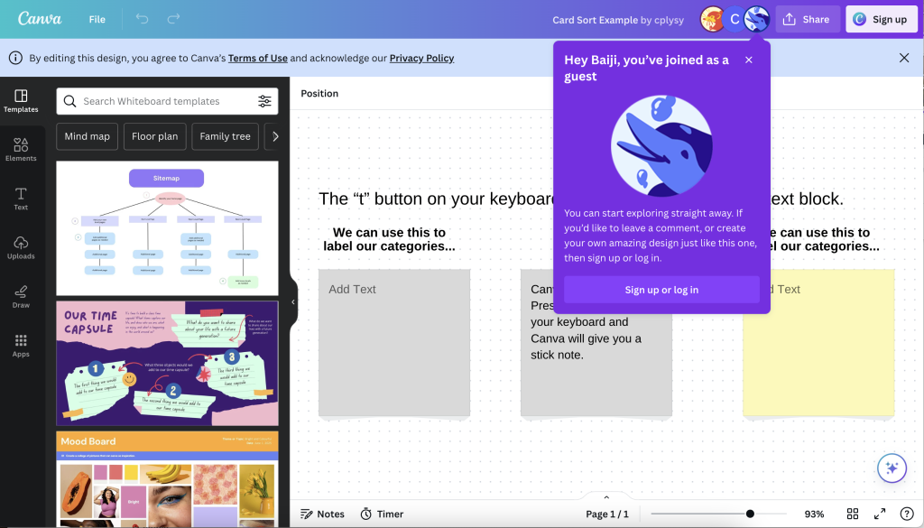
7. Your participant does not need a Canva account to engage with the document.

By sharing an open link, your participant can just open the link in a web browser. They will be able to interact with the design without signing up or logging into a Canva account. They will just show up in the Canva document as a generic user.

Screenshot - Opening a Canva link without logging into Canva

8. Let your participant move the sticky notes around the page and ask them to talk through the process.

Your user will be able to move sticky notes around, change sticky note colors, and even add new sticky notes. It’s just up to you to show them how.

Screenshot - Moving sticky notes around

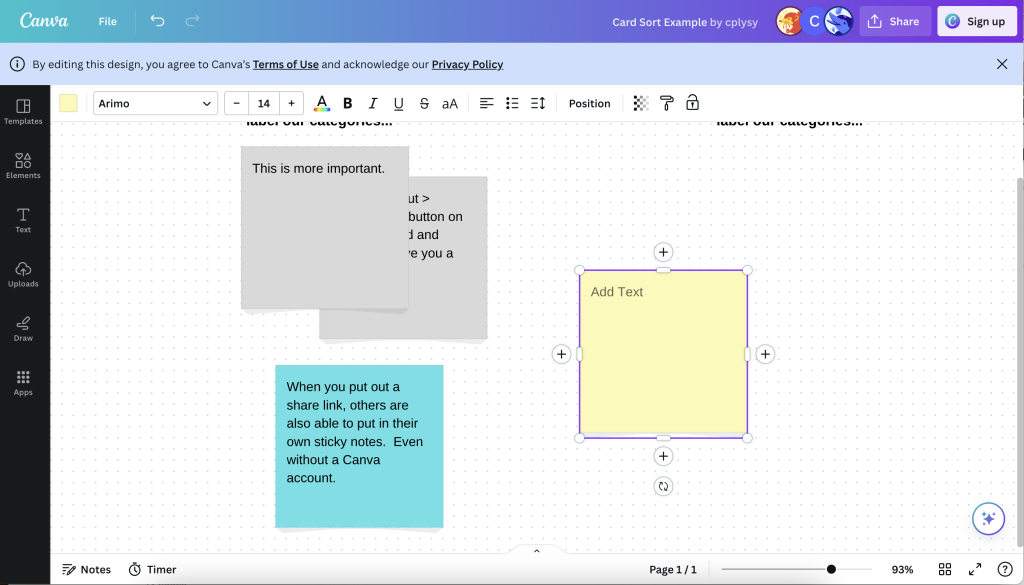
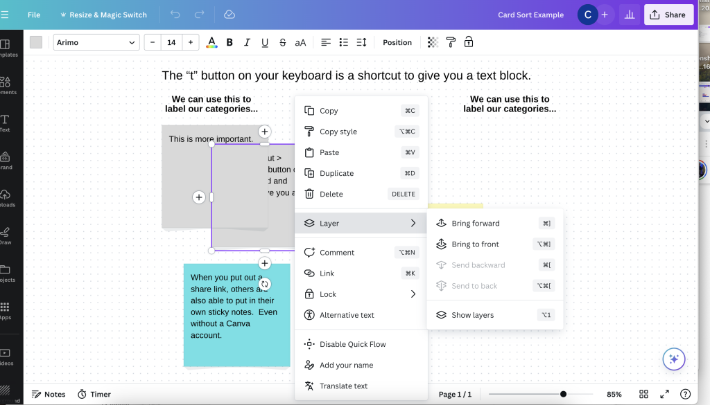
9. Sticky notes can be stacked.

The sticky notes can definitely be stacked. By right clicking on a sticky note you can access the layer menu (which will allow your participant to move a sticky note forward or backward in a pile). Whiteboards are also infinite in Canva, so they can always just order the sticky notes up and down the page or left to right.

Since you are both in the document at the same time, you can always help the participant move items around as they direct the process.

Screenshot - Layer options in Canva

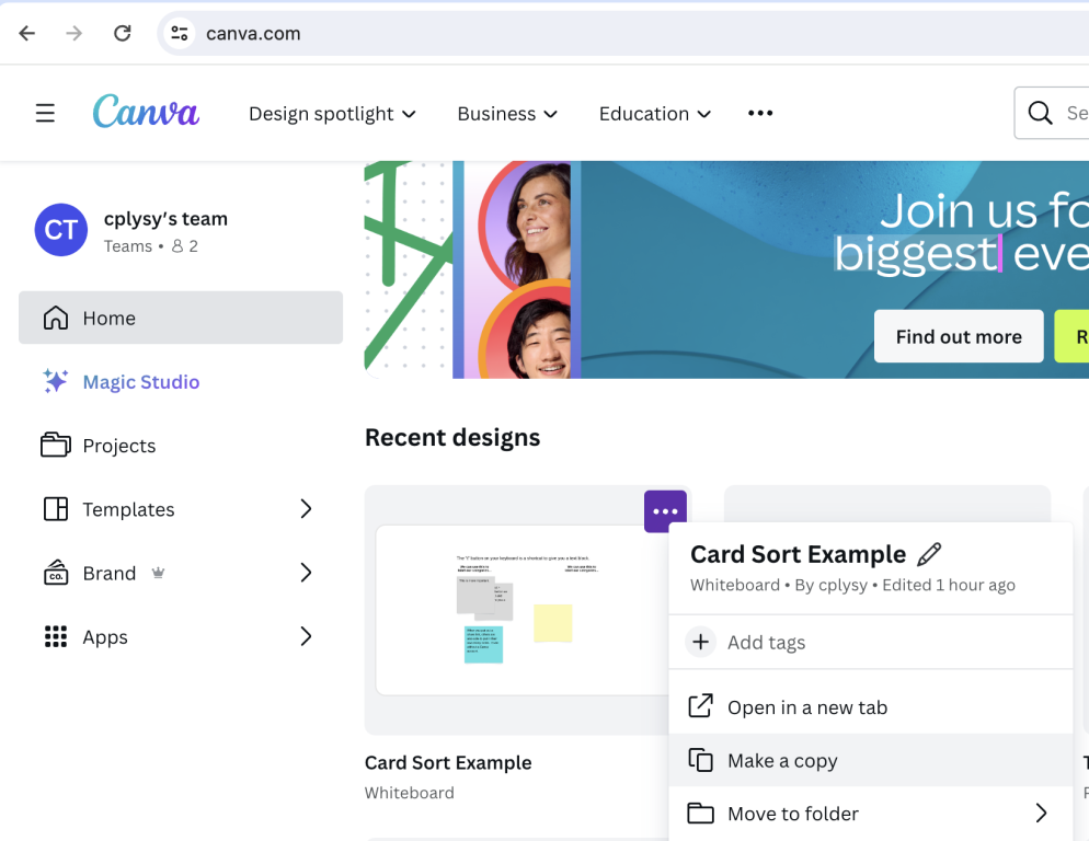
10. Want to use the same sticky notes over and over again?

During the Canva setup process, after you have your sticky notes set, go ahead and make a copy of the design file. Do this for as many interviews as you want to lead. This way you’ll have a visual record for each.

Screenshot - Making a copy of a Canva file.

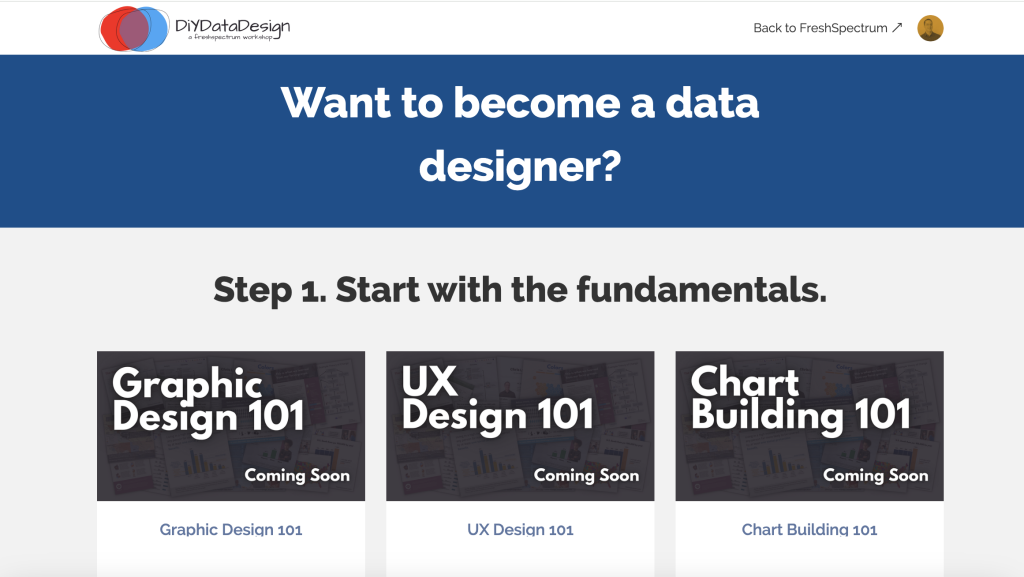
This post is part of a new series on specific design methods. Card sorts are just one of many potentially useful user experience design methods I suggest to researchers and evaluators. If you’re interested in learning more UX design methods, visit my diydatadesign course catalog and look for UX Design 101.

Written by cplysy · Categorized: freshspectrum

Apr 03 2024

How to become a data designer.

Ever wonder why some data teams deliver really nice looking reports while others seem like they’re stuck in the late 90s?

The more I work with different research and evaluation teams, the more I find that reporting quality usually comes down to the skills of just a few people.

First, you need a manager who is willing to allow their team to try new things and occasionally break from the status quo. They don’t have to be creative themselves, or even have a good eye for design, but they have to trust the people on their team and give them the time and flexibility required to grow.

Second, you need at least one member of your data team with the interest, and the skills, required to do the hard creative work. Most research and evaluation teams are small, even teams that work in larger organizations. And one member with the right creative skills can make a big difference in how effectively data is shared internally and externally.

Comic with one person talking to someone confused about their report.

We built a team of brilliant statisticians, methodologists, and analysts all trained at prestigious universities.  

Unfortunately, none of us knew anything about good report design.

The much needed role on every evaluation, research, and data team.

At least at this point in time, you are rarely going to find someone on a data team with the title of data designer. But while the position doesn’t often exist, the role usually does.

The data designer on your team is the one everyone goes to when there is some kind of creative project. Need an infographic created, that’s a job for (insert person’s name here). Need someone to run a social media account, call (insert person’s name here). Is someone asking you to turn your long pdf into a shorter visual report, time to email (insert person’s name here). Want some really nice looking charts, reach out to (insert person’s name here).

If you have a good data designer on your team, that person usually becomes a linchpin. And if you don’t have a good data designer on your team, you will likely struggle with creative requests.

"I was having a hard time coming up with a unique illustration style for our report. Then I remembered how much I loved making macaroni art as a kid."

What is data design?

Data design is a blend of two very different skillsets. It requires a mix of skills in research methods, data analysis, graphic design, communications strategy, UX design, and data visualization.

That skill mix allows an individual to create useful data products, find and tell good data stories, uncomplicate complex information, connect with audiences across multiple platforms, increase reporting effectiveness (a.k.a. create better reports), and increase reporting efficiency (a.k.a. implement a faster design process).

These skills are usually not taught together in graduate school. Most data analysts, researchers, and program evaluators leave university without taking a single course on graphic design, communications strategy, or UX design. So the people who take on the data design role are usually university instructed data people who also happen to be self-taught creatives.

Comic.

Person one holding a sparkly chart "Did you bedazzle all of your charts?
Person two, "Fancy, right?"

First, how NOT to become a data designer.

There is not just one way to develop your creative side. But try not to do what I did and attempt to learn EVERYTHING.

I spent over a decade teaching myself web design, dataviz, coding, BI tools, professional graphic design tools, UX design, UI design tools, communications strategy, and more. I would go from one rabbit hole to another. Trying to learn a bit of everything can be fun if you love learning, and it does make you really well-rounded, but it’s not very practical.

I also don’t suggest focusing on learning a specific software product. Most design challenges faced by data teams can be met using simple tools, whether they are freemium web software products or just the basic software you already have installed on your computer.

Instead, here are some things I suggest you do learn.

Learn some graphic design.

The modern digital world is a visual place. Graphic design is critical to your ability to uncomplicate complex information, which is super important for data products. Whether you are formatting reports, designing graphs, creating social media content, or building web pages, a solid grasp of graphic design fundamentals will serve you well.

Person with monocle and tophat saying "You Sir, get me some data."

Learn some user experience design.

You need a design process that can get you from nothing to something useful. And that’s what UX design can do for you. UX design is not interface design, instead it is a design process where you let the needs/desires of the end user guide your process. I have found consistently that a good UX design process results in better data products.

Learn some modern communications strategy.

“If you build it, they will come,” is bad advice in our modern digital world. The web has fundamentally changed how people send and receive information. Knowing a bit about communications strategy can help you to increase the likelihood that your audience will actually experience your work.

Goldilocks talking to a bear.
"This report is just right!"
Bear replies, "speaking for myself, I prefer a longer report."

Learn how to create basic graphs and maps.

Most of the time, you can get by with really basic charts, graphs, and maps. And often, the simpler the better. Knowing a bit of data visualization best practices is helpful for any researcher or evaluator as charts, graphs, and maps are some of those most common and impactful illustration tools we have in our creative toolkit.

But just keep in mind, that data design is so much more than just data visualization. Knowing how to create a good graph will only get you so far.

Learn a basic set of software tools.

In the field of web development there is this concept of a software stack. Basically it’s a set of software tools that allow you to do something (like a host a website). The stack itself is made up of individual pieces of software that can be somewhat interchangeable. I suggest building off the concept for your own work.

Here are some basic categories to consider.

  • Writing Tools: Word, Google Docs
  • Graphic Design Tools: PowerPoint, Canva, Adobe Illustrator/InDesign
  • Data Visualization Tools: Excel, Flourish, DataWrapper, R, Tableau, PowerBI
  • Web Design Tools: WordPress, Squarespace, Wix

Most data people start by writing in Word, designing in PowerPoint, and creating charts and graphs with Excel. This is the stack people know, and are sometimes forced into by their organization’s software policies. But as many have shown, you can still do impressive creative data design work even if you are stuck with MS Office.

My favorite stack right now is to write using Google Docs, design and illustrate using Canva, visualize data using Flourish, and design interactive web reports using WordPress. The tools are all user friendly, inexpensive, and help speed up the data design process.

There are certainly data designers that have built impressive portfolios using tools like Adobe Creative Cloud, Tableau, and R. These professional tools do provide benefits but also come with steep learning curves and sometimes high subscription costs (R excluded).

Continue building your creative skills through practice.

After you have a firm grasp of the fundamentals, you continue building your skillset through practice. Seek out inspiration from people and organizations you admire, then try to replicate those products using the tools you know. Give yourself specific creative challenges and work through the design process.

DiY Data Design Screen capture

Want a guide to help you learn? I can be that guide.

I’m currently in the process of updating my online workshop, DiY Data Design. The goal of the workshop is to train, mentor, and support data designers by teaching researchers and evaluators the creative skills they did not learn in graduate school.

The new updates are intended to create a program that will ultimately give you the experience you need to take on the data design role for your team. Many of the courses are currently in the development phase, but if you want to join the waitlist for a specific course, you can do so by following this link and filling out the Google form.

Google Form Screenshot

Written by cplysy · Categorized: freshspectrum

Mar 18 2024

My Cartoon Illustration Process – Realist Evaluation Comics

Back in 2017 I was commissioned by the RAMESES II project (funded by *NIHR) to draw a series of cartoons on realist evaluation.  They have been made available for royalty-free use at ramesesproject.org, along with a collection of other realist evaluation resources.

In this blog post I want to take you through my cartoon illustration process using this project as an example.  The cartoons were created through direct collaboration with the wonderful Joanne Greenhalgh and Ana Manzano of the University of Leeds.  The full RAMSES II project provided insights throughout the process.

*The RAMESES II project was funded by NIHR HS&DR 14/19/19. The views expressed are those of the author(s) and not necessarily those of the NHS, the NIHR or the Department of Health.

Starting with the Illustration Challenge

A cartoon illustration project always starts with something to illustrate.  In this case it was a series of briefs on realist evaluation.

The challenge was to develop a series of cartoons inspired by the content within the briefs.  To get a sense of my process, let’s focus on one of those briefs.

A realist understanding of programme fidelity [PDF].

Finding cartoon inspiration and narrowing the scope.

In any substantive piece of literature, brief, or written report there is usually a ton that could inspire a cartoon.

The challenge is to figure out the important pieces and the ones that create the best cartoons.  Good illustration is about supporting the words, not replacing the words.

I find that the best cartoon illustrations usually come from the challenges, problems, and confusions.  My philosophy is to illustrate the problem, and the reader will read the text in search of the solution.

To find the key challenges I turn to the experts.  Through conversation I engage them in the process by finding where to focus.  Ultimately we narrow the scope.

Here is one of those areas of narrow focus.   This certainly helped to inspire the cartoons I have shared below.

Common confusion: illusion of control (that you can standardise programmes and control the context into which they are implemented either within an evaluation or the real world). RCTs are ardent believers in this illusion and think its possible to create at ‘closed system’ by controlling everything about context so that you can have ‘programme on’ compared to ‘programme off’ and everything else is the same except the existence of the programme. This idea has been transferred from drug trials to complex social programmes.

Sketching out the concepts.

Before diving into drawing the final cartoon, I start with a pen and my notebook.

With the low tech approach I can come up with more concepts than I could if started with my iPad.  And if a cartoon doesn’t work, or the client doesn’t like a certain cartoon, we can cut it here instead of putting more effort into the process.

Refining and completing.

After drawing the sketches and sharing with my client we have another conversation.  This time we talk about the concepts (what do they like? what don’t they like?).

At this point we tweak and cut.  And sometimes the sketches lead to more concepts.  Cartoon illustration is an iterative process, but hopefully with each revision we get a better product.

Here are a couple of the final fidelity cartoons.  What do you think?

A note from Joanne

We really enjoyed working with Chris. Not only was it fun, but it challenged us to think about what we really wanted to communicate about realist methods. The idea of illustrating ideas or issues people found confusing or difficult really resonated with us, as that had been one of the main reasons for embarking on the whole project in the first place. It felt like a genuine collaboration and I’m really pleased with what we have produced.

Here are a few more of my favorite comics from the collaboration.

What a realist reviewer looks like.

Realist recipe.

The protocol says we go this way.

Written by cplysy · Categorized: freshspectrum

Mar 13 2024

Evaluation versus Measurement

Today’s post started as a comic request and turned into a Q&A.

Here is the question that came to me from Randi Knox.

I’m looking for a comic to communicate the difference between program monitoring vs program evaluation. I didn’t see anything specific to this in your existing materials. I was wondering if you’d be open to making a comic for this purpose?

It’s certainly a topic that I haven’t fully delved into, but I did think of one comic from a couple of years ago.

But I think the question is a good one, and I wanted a little more inspiration. So I asked Randi a couple of follow-ups. Here is what she said.

I’m a relatively new internal evaluator in a department that recently rediscovered the joys of evaluation. I feel fortunate to work with a team of folks who are eager to evaluate, but I also get the sense that ‘evaluation’ is a loaded word for many team members. Some tend to call everything ‘evaluation’ and assume all data collection is for ‘evaluation,’ when this is not necessarily the case.

In considering how to create a shared understanding among team members, I thought it could be helpful to adopt the term monitoring as a less threatening, helpful, and natural part of program implementation and management. I also expect differentiating monitoring and evaluation could help decrease evaluation anxiety. So now I’m challenged to clarify what I mean by each of these terms.

Here are the comics the conversation inspired.

“Some tend to call everything ‘evaluation’ and assume all data collection is for ‘evaluation,’ when this is not necessarily the case.”

“I also expect differentiating monitoring and evaluation could help decrease evaluation anxiety.”

“So now I’m challenged to clarify what I mean by each of these terms.”

I did a bit of internet searching in the hope of finding a really good explanation of the differences. But what I found was all a little bit too jargony to be useful.

I focused on monitoring because I already have a fair number of comics designed to define evaluation. In these kinds of situations I usually fall back to metaphor. What could be fitting, or silly enough, to communicate the definition of measurement. You’ll find the following two as attempts to fit that description.

Here is a speedometer metaphor.

And this one is the silly one 🙂

Do you have a good way of describing the differences between monitoring and evaluation?

I don’t think I’ve cracked this one yet, so I would love to hear it. Let me know in the comments.

Randi Knox is a Supervisor of Research Evaluation & Program Management at Boys Town National Research Hospital in Omaha, Nebraska.  If you want to connect with Randi, you can find her on LinkedIn.

Written by cplysy · Categorized: freshspectrum

Mar 13 2024

Evaluation versus Monitoring

Today’s post started as a comic request and turned into a Q&A.

Here is the question that came to me from Randi Knox.

I’m looking for a comic to communicate the difference between program monitoring vs program evaluation. I didn’t see anything specific to this in your existing materials. I was wondering if you’d be open to making a comic for this purpose?

It’s certainly a topic that I haven’t fully delved into, but I did think of one comic from a couple of years ago.

But I think the question is a good one, and I wanted a little more inspiration. So I asked Randi a couple of follow-ups. Here is what she said.

I’m a relatively new internal evaluator in a department that recently rediscovered the joys of evaluation. I feel fortunate to work with a team of folks who are eager to evaluate, but I also get the sense that ‘evaluation’ is a loaded word for many team members. Some tend to call everything ‘evaluation’ and assume all data collection is for ‘evaluation,’ when this is not necessarily the case.

In considering how to create a shared understanding among team members, I thought it could be helpful to adopt the term monitoring as a less threatening, helpful, and natural part of program implementation and management. I also expect differentiating monitoring and evaluation could help decrease evaluation anxiety. So now I’m challenged to clarify what I mean by each of these terms.

Here are the comics the conversation inspired.

“Some tend to call everything ‘evaluation’ and assume all data collection is for ‘evaluation,’ when this is not necessarily the case.”

“I also expect differentiating monitoring and evaluation could help decrease evaluation anxiety.”

“So now I’m challenged to clarify what I mean by each of these terms.”

I did a bit of internet searching in the hope of finding a really good explanation of the differences. But what I found was all a little bit too jargony to be useful.

I focused on monitoring because I already have a fair number of comics designed to define evaluation. In these kinds of situations I usually fall back to metaphor. What could be fitting, or silly enough, to communicate the definition of monitoring. You’ll find the following two as attempts to fit that description.

Here is a speedometer metaphor.

And this one is the silly one 🙂

Do you have a good way of describing the differences between monitoring and evaluation?

I don’t think I’ve cracked this one yet, so I would love to hear it. Let me know in the comments.

Randi Knox is a Supervisor of Research Evaluation & Program Management at Boys Town National Research Hospital in Omaha, Nebraska.  If you want to connect with Randi, you can find her on LinkedIn.

Written by cplysy · Categorized: freshspectrum

  • « Go to Previous Page
  • Go to page 1
  • Interim pages omitted …
  • Go to page 9
  • Go to page 10
  • Go to page 11
  • Go to page 12
  • Go to page 13
  • Interim pages omitted …
  • Go to page 54
  • Go to Next Page »

Footer

Follow our Work

The easiest way to stay connected to our work is to join our newsletter. You’ll get updates on projects, learn about new events, and hear stories from those evaluators whom the field continues to actively exclude and erase.

Get Updates

Want to take further action or join a pod? Click here to learn more.

Copyright © 2026 · The May 13 Group · Log in

en English
af Afrikaanssq Shqipam አማርኛar العربيةhy Հայերենaz Azərbaycan dilieu Euskarabe Беларуская моваbn বাংলাbs Bosanskibg Българскиca Catalàceb Cebuanony Chichewazh-CN 简体中文zh-TW 繁體中文co Corsuhr Hrvatskics Čeština‎da Dansknl Nederlandsen Englisheo Esperantoet Eestitl Filipinofi Suomifr Françaisfy Fryskgl Galegoka ქართულიde Deutschel Ελληνικάgu ગુજરાતીht Kreyol ayisyenha Harshen Hausahaw Ōlelo Hawaiʻiiw עִבְרִיתhi हिन्दीhmn Hmonghu Magyaris Íslenskaig Igboid Bahasa Indonesiaga Gaeilgeit Italianoja 日本語jw Basa Jawakn ಕನ್ನಡkk Қазақ тіліkm ភាសាខ្មែរko 한국어ku كوردی‎ky Кыргызчаlo ພາສາລາວla Latinlv Latviešu valodalt Lietuvių kalbalb Lëtzebuergeschmk Македонски јазикmg Malagasyms Bahasa Melayuml മലയാളംmt Maltesemi Te Reo Māorimr मराठीmn Монголmy ဗမာစာne नेपालीno Norsk bokmålps پښتوfa فارسیpl Polskipt Portuguêspa ਪੰਜਾਬੀro Românăru Русскийsm Samoangd Gàidhligsr Српски језикst Sesothosn Shonasd سنڌيsi සිංහලsk Slovenčinasl Slovenščinaso Afsoomaalies Españolsu Basa Sundasw Kiswahilisv Svenskatg Тоҷикӣta தமிழ்te తెలుగుth ไทยtr Türkçeuk Українськаur اردوuz O‘zbekchavi Tiếng Việtcy Cymraegxh isiXhosayi יידישyo Yorùbázu Zulu