• Skip to main content
  • Skip to footer
  • Home

The May 13 Group

the next day for evaluation

  • Get Involved
  • Our Work
  • About Us
You are here: Home / Archives for allblogs / freshspectrum

freshspectrum

Aug 16 2023

Annual Report Design – How to create 5 reports with 1 design.

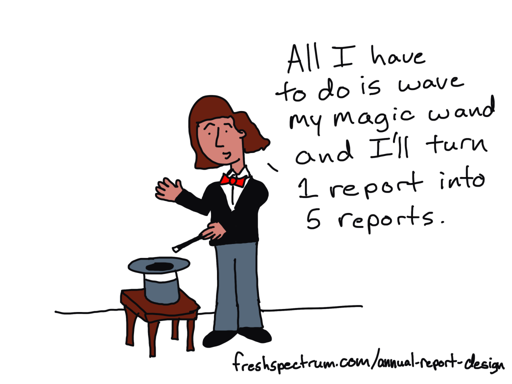
In today’s blog post I’ll show you a contemporary approach to annual report design. Instead of ending up with 1 report, you’ll end up with 5, each designed to meet a separate need.

At the end of this process you will have 5 different styles of report.

  • An Annual Report Slidedoc.
  • A Presentation Deck.
  • A set of 2 pagers.
  • A set of Micrographics.
  • An Interactive Online Report.

But before we jump into design, let’s first talk about the big design challenge and a few rules for reducing reporting frustration.

All I have to do is wave my magic wand and I'll turn 1 report into 5 reports.

How do we write more reports without requiring a lot more time, effort, and expense?

This is our big design challenge. It’s the question I always get after I suggest that should focus as much, if not more, on writing more reports instead of just better reports.

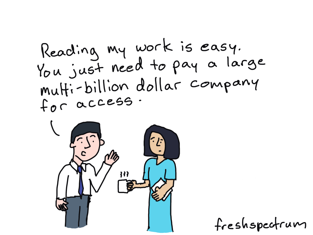
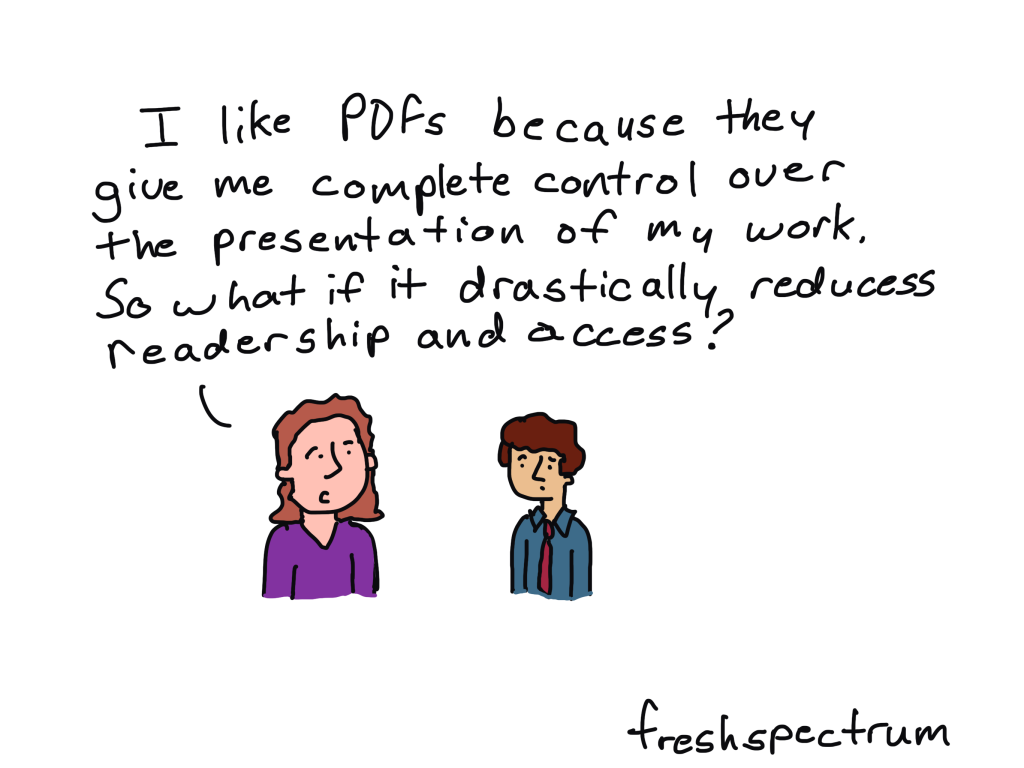
To reach overwhelmed audiences we need to deliver the right amount of information at the right time. Yes, all the information your audiences need might exist inside your big “well-designed” pdf report. But overwhelmed people rarely even attempt to read long pdfs.

If we really want to reach these audiences, we need to offer our reporting through different mediums and communication channels. But to do that effectively, without spending lots more time and money, we need to change how we approach reporting.

That starts by reducing some of the frustration that creates time-sucks.

There is still a place for boring/long word documents.

How to reduce reporting frustration.

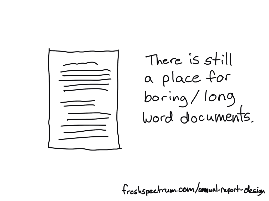
First, understand that there is a difference between project documentation and reporting.

Documentation is about systematically describing the work. There are all sorts of reasons why this is an important thing to do, especially for researchers and evaluators whose work might face public scrutiny.

Reporting is about translating your work in a way to communicate it to a specific audience.

If you try to do both things with one document, you are likely going to fail at both challenges. This is what leads to a document that is too long for an audience but too short to act as proper project documentation.

Instead, I suggest treating these as different challenges. Write your project documentation in a Word Doc or Google Doc without a lot of worry about design. Just use simple headers, and don’t worry about being too concise. Unlike your reporting, your documentation might never be seen by an audience. And if it is, that audience will likely be small.

By using filler text like lorem ipsum, you can design before you have the words.

Second, reporting requires multitasking.

Almost any good report will require design, writing, and illustration.

Most amateur report creators try to do these three things simultaneously. They will write, tweak tables, move text around, visualize data, and add illustration as they go. As with most multitasking, this is a bad idea. It takes away the proper attention required for each step and forces you to focus only on the current part you are working on, and not the whole.

I approach these three things as separate tasks.

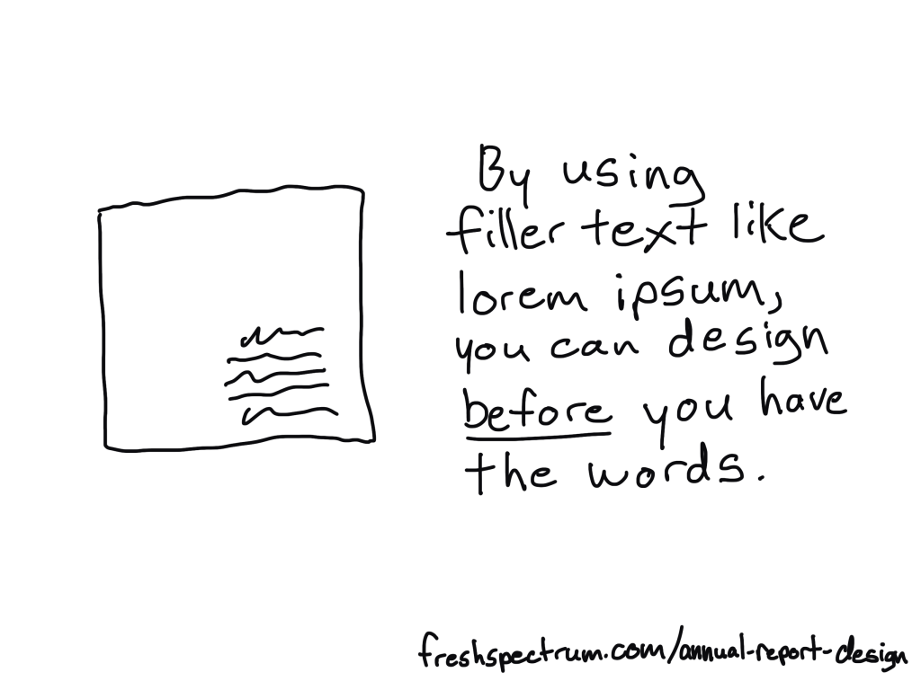
You can design before you have the content ready. I use filler text (lorem ipsum) and design individual page spreads based on target page counts and the anticipated amount of charts/visuals we plan to use.

You can, and should, let the design influence your report writing. This means sometimes writing with word counts in mind, or to meet structural needs of the report. But you should not adjust the design as you write. In fact, it’s usually better to write outside of the design in a separate document then merge them together later.

The illustration step is my last one. Even when I write these blog posts, I write them first and illustrate later. That way I can use illustrations strategically and really pair each one with the written text.

The 5 in 1 report design approach.

Our goal is to approach report design in a way that minimizes the required effort. Instead of treating each individual report type as a separate design, we look at the design holistically.

We start with the more comprehensive report design, then work our way down through the different adaptations. Personally, through my work with ReportPress, I would start with the interactive online report.

But considering you are likely NOT a web designer like I am, I would suggest starting with the Annual Report Slidedoc. This is the most comprehensive.

Slidedoc Tip: By using color sparingly you make it more meaningful.

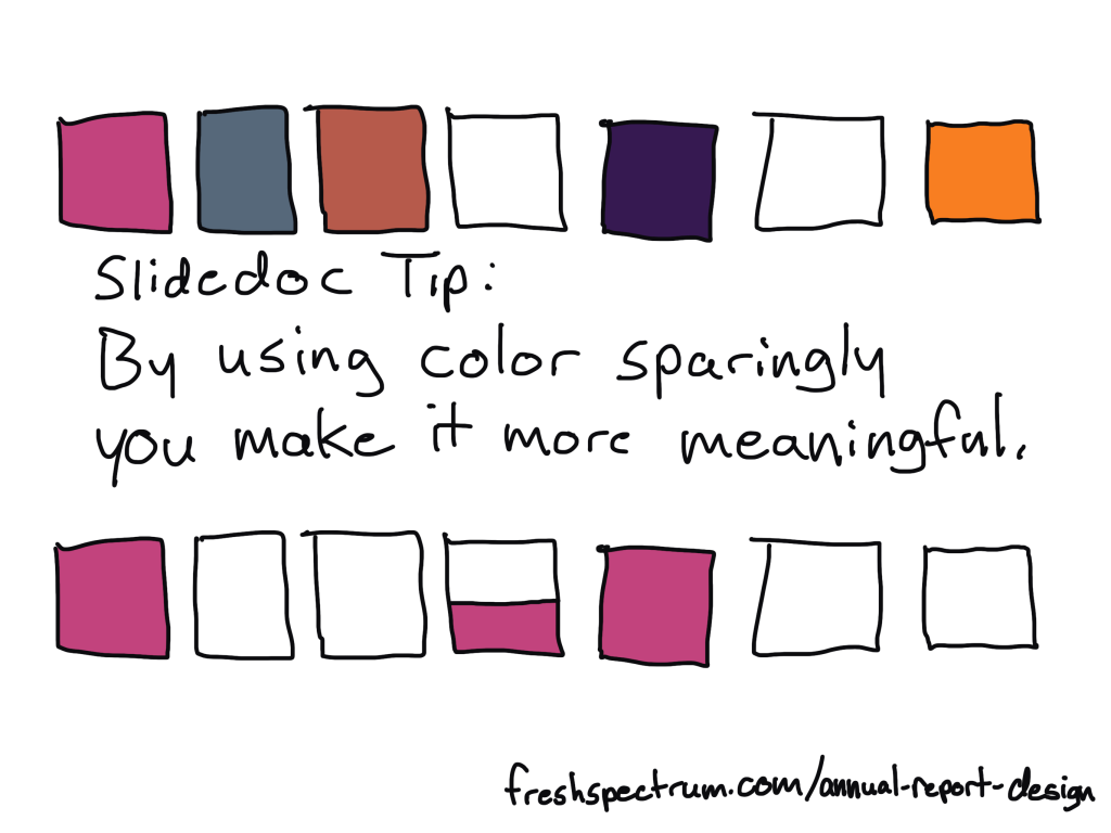
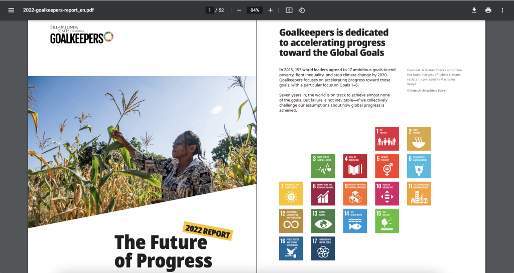
Step 1. Annual Report Slidedoc Design

I have written about slidedocs in the past, so if you are interested in the approach you should check out that blog post.

In short, I suggest using Canva or PowerPoint to design your slidedoc. It should be widescreen. Most of your readers will view pdfs on either a laptop or desktop screen, so this format takes advantage of the screen dimensions and limits unnecessary scrolling.

Don’t overload the slides, there is no trophy for having the fewest pages. As with any modern design that is read on a screen, your goal is efficiency in comprehension. It is better to be easy to flip through and read than it is to be short on page count.

I’ll have more guides on creating these styles of reports in the future, along with templates you can use, so if you are not currently following me by email you should join us.

The difference between a good slidedeck and a slidedoc is just the words on the slide.

Step 2. Presentation Deck Adaptation

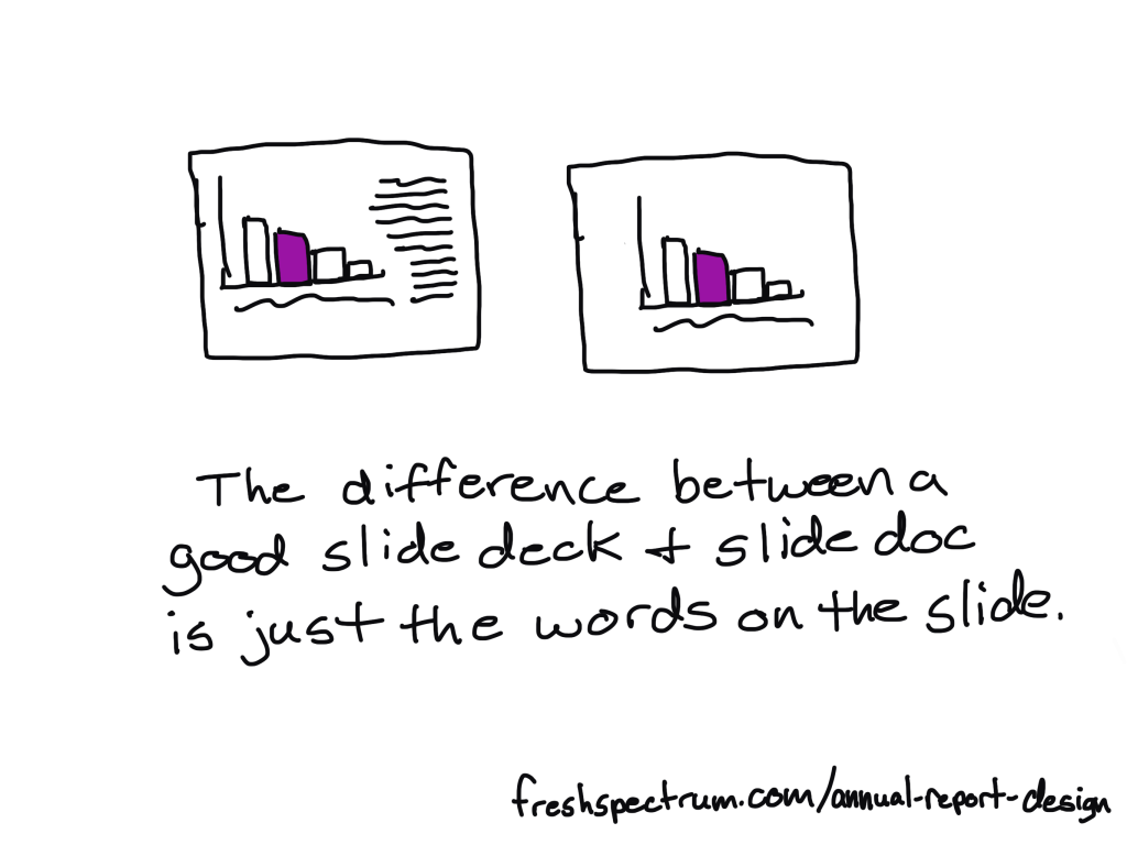
If you approach your slidedoc reporting like you are creating a presentation without the presenter, this first adaptation is simple.

Just make a copy of the slidedoc and remove most of the text. As a presenter, whether by webinar or live in-person, you are going to deliver all the talking points. The report itself can keep the same pace.

If you need to shorten the presentation, remove slides. If you need to focus the presentation for a specific audience, you will also remove slides.

The goal of this report design approach is that the presentation slidedeck is essentially completed in the process of building out your slidedoc.

Two pagers "can" be easy.

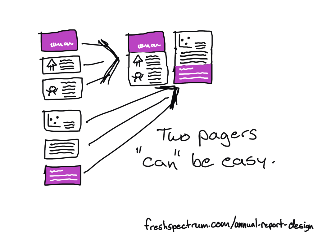
Step 3. Two Pager Adaptations

There are lots of times in our work where you will want a short download, handout, or attachment in the form of a two-pager (or sometimes one-pager).

Originally when using this approach I would create a long infographic at this step. But the two pager is just far more versatile and delivers essentially the same amount of information.

To make the two pager adaptations, you will take 4 to 6 slides and stack the content across two 8.5 by 11 pages. How many will fit depends on your content and reporting needs. A print-out can have smaller fonts, so you can often get away with 3 slides per pages stacked one on top of the other.

What that also means, is that you can start envisioning your two pagers as you design your original slidedoc. If you create sub-sections in sets of 5 or 6 slides, you set yourself up for an easy adaptation.

Every slidedoc should have at least a few slides that can be taken out of context.

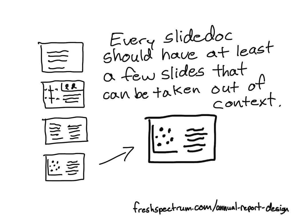
Step 4. Micrographic Adaptations

Okay, first question you probably have, what are micrographics? Are they the same as infographics?

Short answer, yes. It’s just a term I use for little infographics that are about the same size as a PowerPoint slide.

Micrographics are super useful. They can be shared as social media posts. They can get attached to blog posts as featured images. They can be used to illustrate articles. They can find their way into other people’s presentation decks.

Micrographics help spread evidence and ideas beyond the original report.

And a micrographic adaptation is easy. If you have a really nice slide in your slidedoc, add a link at the bottom of the slide to the source landing page (where the slidedoc lives) and export the slide as a separate image (png or jpg).

Micrographics are slides that can stand alone. Sometimes they are charts. Sometimes they are quotes. Sometimes they are diagrams. Sometimes they are just well written slides. By the time you complete a slidedoc, you should aim to have a handful of slides with stand-alone potential. These are the ones you adapt into Micrographics.

Well designed slidedocs are easy to adapt into websites.

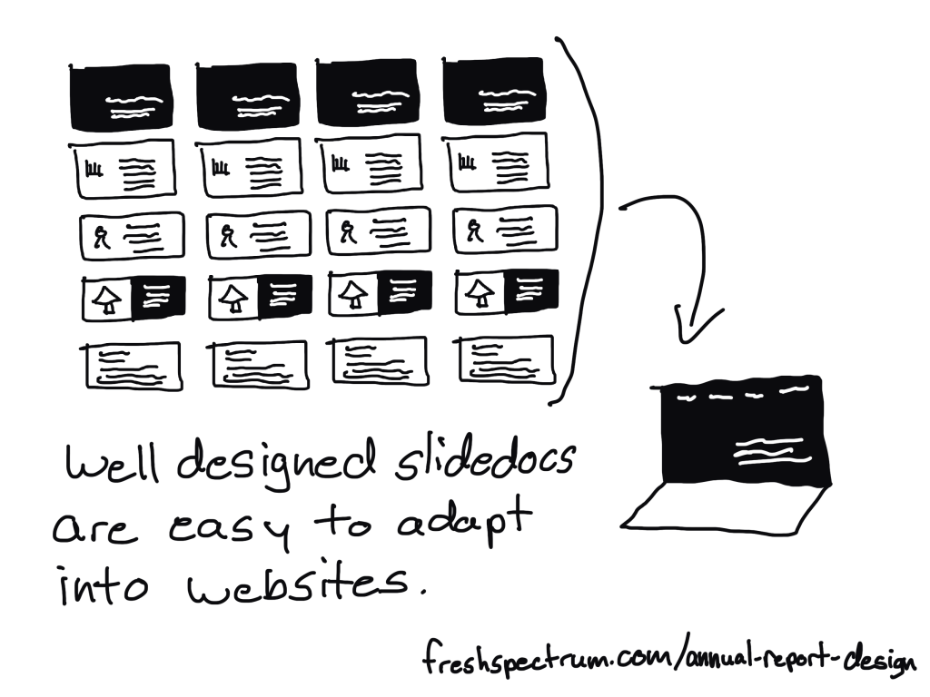
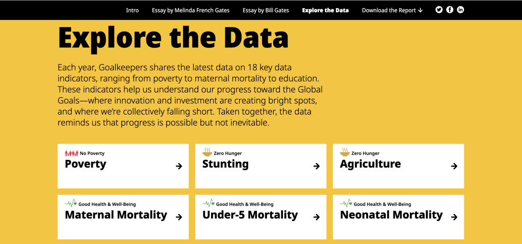
Step 5. Interactive Online Report Adaptation

There are lots of benefits to building an online report instead of just delivering a pdf slidedoc. But it also does not have to be an either/or thing. My recommendation is to do both.

It can be really easy to adapt a well designed slidedoc into an interactive online report. Modern websites are often designed using containers, which align really well to slides in a slidedoc.

A few of the benefits to adapting your slides into a websites.

  • Online reports can have interactive elements. Especially useful for charts that can take advantage of tool tips.
  • Online reports can be built to be mobile-responsive making them much easier to read on a phone.
  • Online reports can be auto-translated using modern web browsers (or a Google Translate plugin).
  • Online reports are much better at being found through SEO (at the end of a Google search).

This is something a web designer can easily do with a CMS like WordPress. If you want help, reach out to me for a free consultation.

TLDR Summary

  • Create a slidedoc report.
  • Duplicate the report and erase most of the text, turning your slidedoc into a presentation.
  • Quickly turn a set of 4 to 6 slides into a two pager.
  • Find slides that can stand alone outside the report and download them as separate micrographics.
  • Adapt your slidedoc into an interactive online report.

Conclusion.

I know creating a bunch of reports can sound overwhelming, but it doesn’t have to be overwhelming. You just need practice. But that’s why I’m here, to help you move forward.

If you have any questions, let me know in the comments.

Written by cplysy · Categorized: freshspectrum

Aug 08 2023

Report Study – Ford Foundation Evaluations

In this series of blog posts I will share examples of professionally designed modern reports. For each report I’ll also write out a list of things to notice. My goal is not to critique but to show you real life examples of design concepts to help you become a better report designer.

This week I want to look at content that you might not consider to be “reports” but are totally reports. It’s the Program Evaluation Landing Pages in the Ford Foundation’s Learning Library.

To get the most out of this post I suggest opening the report in another browser tab so you can bounce and forth as your read this post.

1. How do you define the word, “report?”

So for this week I want you to explore just the landing pages for several different Ford Foundation evaluation reports. Don’t download the PDFs (unless you really want to) as they are not my focus this week.

For me, a report is just a type of communication vehicle. It could be a PDF but it could also be a person delivering a presentation through a webinar. In this case, I want you to notice how the landing page acts as its own report.

2. What is a landing page?

The landing page is the web link people go to when they download your report. You might also refer to this as the download page.

I find that for most evaluators the report they refer to is just the document at the end. Which I think misses a huge amount of opportunity. Instead, think about every point in a reporting process as a kind of audience touch point.

In that way, a social media post would be an audience touch point. Same goes for the descriptive blurb that might go into an organization’s newsletter. The landing page would also be an audience touch point. And all of these things come before anyone ever gets to the document at the end.

3. Notice how the structure of each landing page is standardized?

There are three sections.

  • The Challenge
  • What We Did
  • What We Learned

It can be really hard to standardize reporting inside large organizations. They work with so many different individual projects and consultants. Yes, you can introduce design standards, but is it always worth the effort?

4. It’s like a blog post!

I really like how the “What We Learned” section is built like a listicle blog post. This isn’t an infographic, there really are no graphics here. The landing pages are just like a blog series introducing each individual report.

That said, if you wanted to make an infographic out of these it would be super simple. I mean they are already 75% of the way to a final product.

5. Bonus, check out the overview, approach, and principles at the top of the Learning page.

I think it’s cool how the Learning “search” page leads in with an overview.

Since this information is universal across all the reports, it makes sense to include it on the page you visit to search through all the reports.

How are your report landing pages formatted?

Are you using this space for more than just a simple abstract? If not, why not? Let me know in the comments.

Written by cplysy · Categorized: freshspectrum

Aug 01 2023

Report Study – Goalkeepers 2022

In this series of blog posts I will share examples of professionally designed modern reports. For each report I’ll also write out a list of things to notice. My goal is not to critique but to show you real life examples of design concepts to help you become a better report designer.

First up, the 2022 Goalkeepers Report put out by Bill & Melinda Gates Foundation.

To get the most out of this post I suggest opening the report in another browser tab so you can bounce and forth as your read this post.

Bill and Melinda Gates Foundation Goalkeepers 2022 Report (Header Screenshot)

1. Notice the Tiny Header and Subheader

Notice how they didn’t mention “Goalkeepers,” in the report header or use the word, “Report.”

They didn’t need to. The report lives on the Goalkeepers page under the 2022 Report heading. So instead, they could put something simpler. Not quite sure what “The Future of Progress” means but the subheader, “Halfway into the Sustainable Development Goals era, it’s time to change our approach,” really sets up the report.

2022 Goalkeepers Report Intro section screenshot.

2. You are not forced to read the full introduction.

This report introduces a lot of choice. It gives you a paragraph of introduction, but if you want to read more, you have to click the expandable link for “Read the introduction.”

This is not the only time the report does this. Both featured essays are also only provided if you click to read. So right away the report feels more like the front page of a modern blog or newspaper than something you have to scroll through.

Screenshot of the Goalkeepers Report Essay Section.

3. The left column is for the narrative.

There is a principle in design called “continuation.”

Basically, when you share something to read you want it to flow. If you constantly move your paragraphs around the page or break it up constantly with pictures and charts, it will stop feeling like something to read.

Across the intro and essays there is a two column setup with ample white space surrounding the columns. But only the left column contains the narrative. In the right column you’ll find charts, photo captions, and occasional photos. In this way, the page is broken down so you can easily read through the narrative.

As a bonus, since the narrative takes up very little space on the page, there isn’t a huge difference between how it reads on the web as to how it would read on a phone. This is increasingly common. For example, go check out a news site like the NY Times and notice how little landscape the column of narrative actually takes up.

Screenshot of the Goalkeepers report Explore the Data section.

4. Look at how the data exploration takes advantage of repetition.

One of the mistakes amateur report creators make all the time is that they think every single new chart needs to be different from the last chart. You know, “to keep it fresh.”

But there is also a comfort in repetition, especially when you are looking at different indicators. Click around the different indicators in the “Explore the Data” section. Notice how they use the same chart types over and over and over again.

This lets you view the charts for the data, and not have to relearn how each specific chart is supposed to work on every page.

Screenshot of the Goalkeepers Report PDF.

5. Check out the changes made in the PDF version.

Like many modern reports created by larger organizations, there is also a downloadable PDF. You get to it by clicking “Download the Report.”

Look at how the PDF compares to online version. Ask yourself what’s the same and what’s different? Personally, I really like how they kept the repetition in the “Explore the Data” section. Each indicator is given its own page, even if that means a bit of white space.

I also like how the Sources and Notes section isn’t just a list of reference links. There are narrative style notes and explanations shared within the section.

What are your takeaways?

Did you check out the report? Anything interesting catch your eye? If yes, leave a comment and let me know what you noticed.

Written by cplysy · Categorized: freshspectrum

Jul 06 2023

Stop trying to create Goldilocks reports.

You know the story of Goldilocks and the three bears?

Little girl breaks into the house of three bears while they’re out for a walk. Then proceeds to eat their food, break one of their chairs, and eventually falls asleep in one of their beds.

The story came to mind when I was thinking about modern reporting challenges. Which I know makes absolutely no sense at all, but I stopped trying to understand my mind years ago. But I digress.

I think there is a lot we can get from the story that we can apply to how we report. Just not in an obvious way.

Goldilocks and the Three Reports

One day Goldilocks was talking to her organization’s evaluator about a few of the reports set to go out to their stakeholders.

According to Goldilocks, the first report, the one designed for the large bear, was too long. It also had too few pictures and charts.

The second report, the one designed for the medium bear, was too short. This one had too many pictures and charts given the length.

Now the third report, the one designed for the little bear, was just right. Goldilocks loved everything about this report.

And because Goldilocks was the evaluator’s direct supervisor, she instructed the evaluator trash the too long report and the too short report. Because the “just right” report is the best of the bunch and why should the organization share anything that’s not the best?

So what’s the problem?

The “just right” report is only “just right” for Goldilocks (who is not the target audience) and for one of the three bears (who are part of the target audience).

By picking just the one report, she excluded 67% of the target audience. Not because the other reports didn’t work, but because the other reports didn’t match her vision of a good report.

Unfortunately this happens all the time.

We often design reports for just a small portion of our audience. And the reports that get the green light are the ones preferred by those with authority.

What to do instead.

The simple answer. Create and share all three reports. Actually, create more reports than that if you can.

Stop assuming that one report can do it all.

Want to learn how to approach reporting in a modern kind of way?

Join me for a free webinar on July 18 at 3PM Eastern.

Click the image below to learn more and register.

https://www.eventbrite.com/e/designing-with-chris-tickets-672609191197

Written by cplysy · Categorized: freshspectrum

Jun 28 2023

Access is NOT a Vanity Metric

Do you ever think about the amount of work that goes into a conference presentation?

How many hours do people spend planning their conference proposal, meeting with collaborators, putting together their presentation (or poster), traveling to the event, and then eventually presenting?

And then they complain that having a blog would take too much of their time.

This has bugged me for years. In fact, it was the topic of my first ever American Evaluation Association conference presentation. It was an ignite session that just so happened to be recorded and posted to YouTube.

Fun facts. I had dark hair then, it’s pretty much all gray now! It was at the start of “Movember” (to explain the peach fuzz). I had also just purchased my first iPad, which launched my cartooning. After the presentation, Kylie Hutchinson gave me a hug (we had never met before this moment).

Academic conferences and journals restrict access (so do PDFs)

An academic conference can be exclusive. It often requires physical participation, registration fees, and insight into when and where it will take place.

A journal article can be exclusive. It often requires a hefty subscription, enrollment in a University, or membership in an association. You also have to have the patience/ability to read academic-speak that likely has little to no illustrations.

A PDF report or guide is often exclusive. It does not show up easily in search engines or on social media, does not change to meet the needs of mobile phones, cannot be quickly auto-translated by a tool like Google Translate, and is usually written in the same academic-speak found in journal articles.

Increase Access through Adaptation

I have learned a lot over the last 12 years since I delivered that presentation.

One of the things that I’ve learned is that trying to change the way academically trained researchers and evaluators write and share their work is not really a good idea. It’s not a lost cause, just really inefficient.

The better way to increase access faster is to just adapt their work. For instance, you can…

  • take a PDF and adapt it into an HTML-based report.
  • take a long wordy report and adapt it into a string of infographics.
  • take a report written at a post-graduate reading level and adapt it into a report that doesn’t require more than a lower secondary education level.
  • turn big tables or complicated charts into nice, easy-to-follow charts.
  • turn qualitative interview transcripts into a story collection.

There is no one right way to share or ensure access. But the more we do to adapt, the more accessible our work becomes. And there is so much more value in adaptation than there is in revision.

If you want help. I can help.

This is my job.

  • I can turn your pdf report into a html report.
  • I can turn your long reports into a string of infographics.
  • I can help you create illustrated versions of your resources for more appropriate reading levels.

All you have to do to get started, is grab a slot on my calendar.

https://calendly.com/clysy/30min

Written by cplysy · Categorized: freshspectrum

  • « Go to Previous Page
  • Go to page 1
  • Interim pages omitted …
  • Go to page 15
  • Go to page 16
  • Go to page 17
  • Go to page 18
  • Go to page 19
  • Interim pages omitted …
  • Go to page 54
  • Go to Next Page »

Footer

Follow our Work

The easiest way to stay connected to our work is to join our newsletter. You’ll get updates on projects, learn about new events, and hear stories from those evaluators whom the field continues to actively exclude and erase.

Get Updates

Want to take further action or join a pod? Click here to learn more.

Copyright © 2026 · The May 13 Group · Log in

en English
af Afrikaanssq Shqipam አማርኛar العربيةhy Հայերենaz Azərbaycan dilieu Euskarabe Беларуская моваbn বাংলাbs Bosanskibg Българскиca Catalàceb Cebuanony Chichewazh-CN 简体中文zh-TW 繁體中文co Corsuhr Hrvatskics Čeština‎da Dansknl Nederlandsen Englisheo Esperantoet Eestitl Filipinofi Suomifr Françaisfy Fryskgl Galegoka ქართულიde Deutschel Ελληνικάgu ગુજરાતીht Kreyol ayisyenha Harshen Hausahaw Ōlelo Hawaiʻiiw עִבְרִיתhi हिन्दीhmn Hmonghu Magyaris Íslenskaig Igboid Bahasa Indonesiaga Gaeilgeit Italianoja 日本語jw Basa Jawakn ಕನ್ನಡkk Қазақ тіліkm ភាសាខ្មែរko 한국어ku كوردی‎ky Кыргызчаlo ພາສາລາວla Latinlv Latviešu valodalt Lietuvių kalbalb Lëtzebuergeschmk Македонски јазикmg Malagasyms Bahasa Melayuml മലയാളംmt Maltesemi Te Reo Māorimr मराठीmn Монголmy ဗမာစာne नेपालीno Norsk bokmålps پښتوfa فارسیpl Polskipt Portuguêspa ਪੰਜਾਬੀro Românăru Русскийsm Samoangd Gàidhligsr Српски језикst Sesothosn Shonasd سنڌيsi සිංහලsk Slovenčinasl Slovenščinaso Afsoomaalies Españolsu Basa Sundasw Kiswahilisv Svenskatg Тоҷикӣta தமிழ்te తెలుగుth ไทยtr Türkçeuk Українськаur اردوuz O‘zbekchavi Tiếng Việtcy Cymraegxh isiXhosayi יידישyo Yorùbázu Zulu