• Skip to main content
  • Skip to footer
  • Home

The May 13 Group

the next day for evaluation

  • Get Involved
  • Our Work
  • About Us
You are here: Home / Archives for allblogs / freshspectrum

freshspectrum

Sep 27 2023

Report Study – Map the Meal Gap 2023

In this series of blog posts I will share examples of professionally designed modern reports. For each report I’ll also write out a list of things to notice. My goal is not to critique but to show you real life examples of design concepts to help you become a better report designer.

Today let’s take a look at Feeding America’s Map the Meal Gap 2023.

This report is a good example of a modern layered approach. Meaning it’s more of a report bundle than a stand alone document. For this study let’s view the report holistically and not to spend too much time focusing on any one specific element.

To get the most out of this post I suggest opening the report in another browser tab so you can bounce and forth as your read this post.

1. The report is anchored by a dashboard style interactive map.

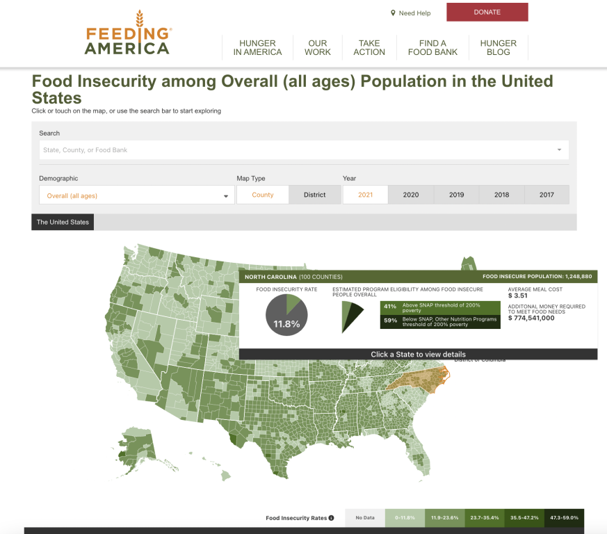
The interactive map is “deep” not “wide.” Meaning there are only a handful of variables (food insecurity rate, SNAP eligibility, average meal cost, population, money required to meet food needs) but you can filter the map to show different localities, demographic groups, and across different years. The presentation style won’t change, only the data. But there is a ton to explore.

2. Check out the four tab Q&A below the map.

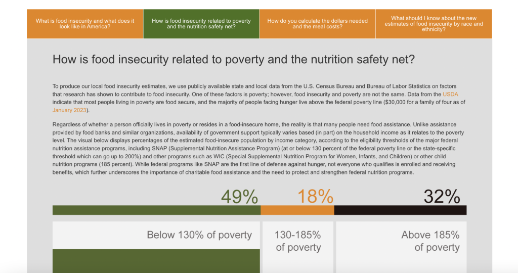
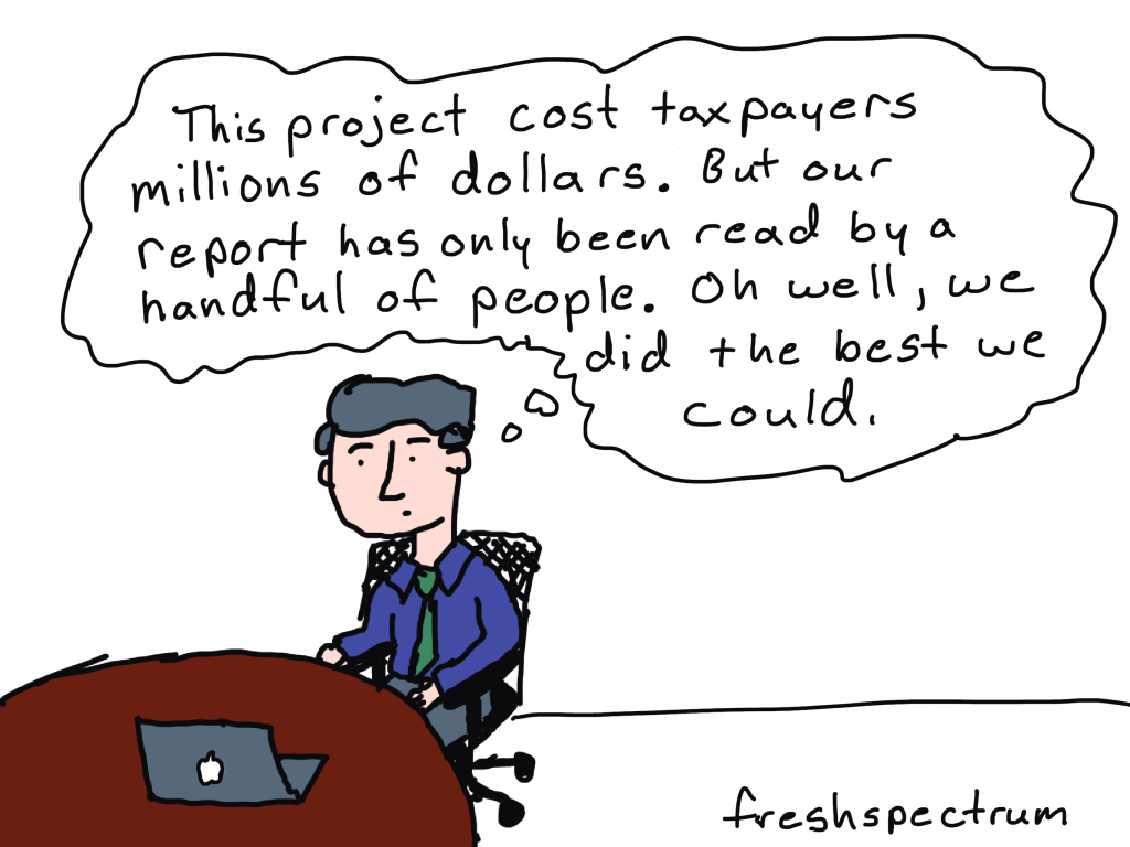
“Everyone is Overwhelmed.” I say this a lot when teaching workshops and writing on this blog, but it’s true. As a report designer you need to find ways to layer information so it doesn’t overwhelm the reader. The initial landing page for this report doesn’t look too intimidating, outside of the interactive map there is only so much content showing and just a few links. But in order to pack in more information they used a simple tabbed box at the bottom of the page that features answers to four essential questions.

3. What else is included in the reporting bundle?

Let’s list out all of the elements that were created when sharing this report. Elements that then become part of the reporting process and contain additional information for interested readers.

  • The Interactive Map
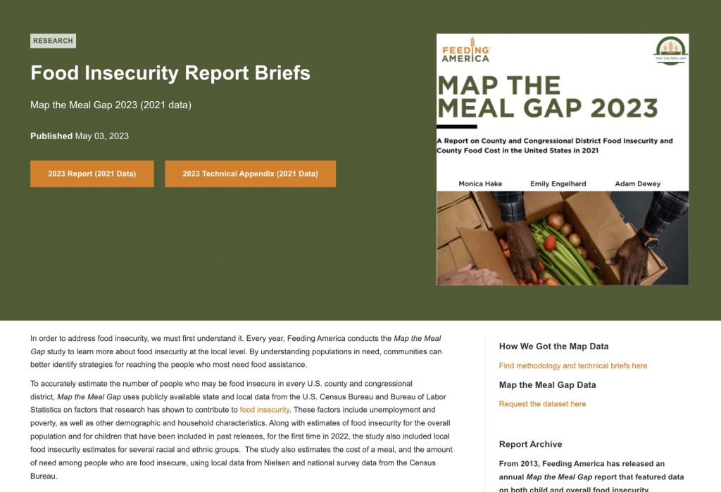
  • The “Map the Meal Gap 2023” visual PDF report.
  • The “Map the Meal Gap 2023” PDF technical brief.
  • The landing page where the Interactive Map is shared.
  • The landing page you end up on when you click the “report” link. Where you will find the “Food Insecurity Report Briefs.”
  • The landing page you end up on when you click the “methodology” link.
  • The landing page you end up on when you click the “data” link.

This list just includes the primary pieces of content that make up the report. It does not include any associated social media, email communications, presentations, or featured images (which likely also exist but were not noticeably linked on these pages).

4. The main downloadable PDF report is visual and easy to read.

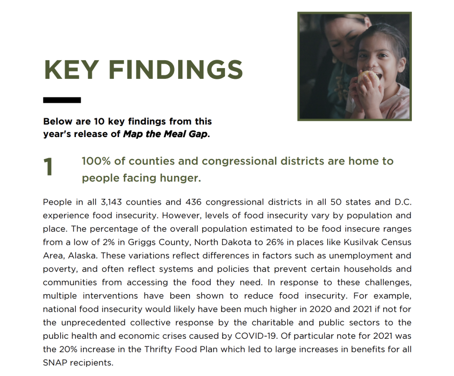
This report was clearly designed to reach a broad audience of stakeholders and politicians. Even the decisions to map the data by both county and congressional district hints at how this report was designed to have a policy influence. The pages are not overloaded and it reads more like a magazine or brochure than it does a technical report.

5. The technical brief is text heavy and only includes a few visuals.

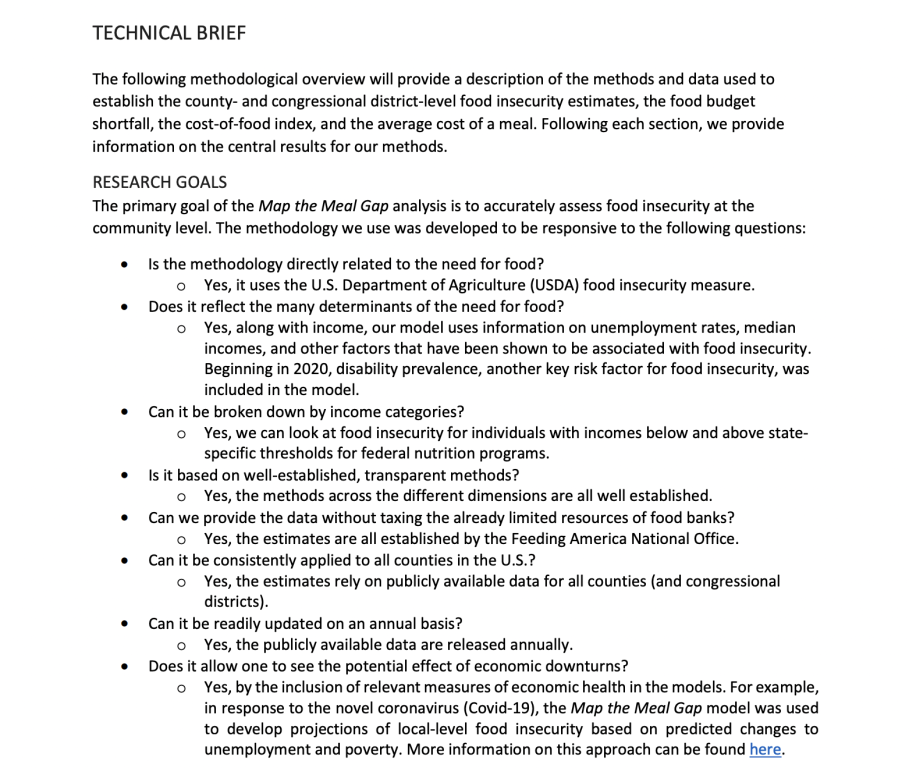
The technical brief is not a work of art. It uses a smaller font and includes far fewer visuals. But it serves its purpose.

Not all reports need to be pretty. Spending extra time, effort, or money making a technical report designed for a very small technical audience is wasteful. Simple formatting and basic fonts are really all that is required.

What are your takeaways?

Did you check out the report? Anything interesting catch your eye? If yes, leave a comment and let me know what you noticed.

Written by cplysy · Categorized: freshspectrum

Sep 19 2023

How to create video explanations

Today’s blog post will walk you through a method you can use to create explanation videos using Canva and Zoom.

The concept was designed as a simple way to walk an audience through a some type of model (ex. logic model, theory of change, etc.).

The Concept Video

This video was recorded using Zoom and edited with Canva. It is embedded here using Canva’s Embed feature.

The Basic Steps.

There are eight basic steps in this process.  Let’s go ahead and walk through each one.

  1. Write the script.
  2. Record the video.
  3. Drop it into Canva.
  4. Setup your initial frame.
  5. Split the scenes.
  6. De-emphasize the model.
  7. Add transitions.
  8. Export your video.

Step 1. Write the script. 

Pretend like you are explaining your model to a colleague.  Break it down into little pieces and walk through piece by piece.

Step 2. Record the video. 

Now that you have the script, record yourself or someone else reading the script.  I suggest using Zoom, because you probably already know how to use it.  I also suggest downloading the recording to your computer in high definition.  As you read the script, pause slightly between segments to leave room for video transitions.

Step 3. Drop it into Canva. 

Now that you have a video, click the button to create a 1920 by 1080 video in Canva.  Once you have the file started, drop in the video.

Step 4. Setup your initial frame. 

I like going full screen for the introduction and closeout, but for the majority of the video I want it to be me alongside the actual model.  You can set this up by adding in a frame and dropping the video inside.

Step 5.  Split the scenes.

Once you have the general look, go through and split your video by scene.

Step 6. De-emphasize the model. 

To focus audience attention, you can take a simple model and emphasize what you want the audience to see.  OR, you can take a bold model and de-emphasize what you don’t want the audience to see.  This is what I will do scene by scene, making use of the transparency slider in Canva.

Step 7. Add transitions. 

I have Canva Pro, and with that some extra transition options.  My favorite to use is the match and move transition.

Step 8. Export your video. 

After you are through, make sure to watch it a time or two just in case you need to edit something.  Then when you are happy, download the video.

Bonus. Embed your video.

Did you know that you can embed video right from Canva? Only caution, from personal experience, some organizations block Canva. But if it works for your audience, embedding straight from Canva certainly saves extra steps.

How are you using Video in your reporting?

Doing anything interesting with video? Have you ever used Canva to edit video? Leave a comment and let me know.

Written by cplysy · Categorized: freshspectrum

Sep 13 2023

How to Evaluate your Reporting

If you are serious about creating better reports, it’s time to take a step back. In this post I’m going to share my F.R.E.D. method for evaluating modern report dissemination.

But let’s start with something I’ve learned slowly over the last two decades of my data design career.

The biggest problem with most evaluation, research, and data reports is NOT the quality of the charts or visual design of the report. The biggest problem IS that most reporting is not designed to reach and engage an audience.

You can create the most interesting, delightfully designed, value packed report and still fail at reporting. Because if that report does not fall into the hands of your target audience, that report will not have an impact.

So how do you assess whether or not your reporting is reaching your audience?

You can use my F.R.E.D. method.

Why tracking PDF downloads is not enough.

PDF downloads is a pretty lame measure without any additional context.

It tends to be used like any other vanity metric (ex. social media followers). Without knowing how many people are in your target audience, which members of your target audience actually know your report exists, or even how many members saw your download page (without downloading), it’s just an out of context number.

Is 100 downloads good? What about 1,000 or 10? Any of these can be an absolute success or disappointing failure. But if you don’t do a little extra work, you won’t have any idea of what success looks like.

What is the F.R.E.D. method?

F.R.E.D. stands for Frame, Reach, Engage, Deliver. These are the four basic steps I would suggest you follow when evaluating your reporting efforts.

For the sake of this post I am going to assume you are actually interested in report engagement and uptake. I’ve talked about this a lot in recent presentations, like the Eval Cafe I delivered for the Evaluation Center at Western Michigan. There is a big difference between a technical report and the kind of reporting designed for reach and engagement.

Let’s walk through each phase one by one.

FRAME your audience.

For a lot of evaluation reports the audience is either unidentified, a laundry list of disconnected groups of people, or generically described through the use of blanket phrases like “the general public.” It’s often nebulous or just a bunch of wishful thinking.

I would suggest that for each and every identified audience type, you should be able to identify by name a specific member of that audience. If you can’t, you’re likely too disconnected to actually reach that audience. That is, if it exists at all.

Once you can name your audiences, try to frame them.

For one of my projects I was working with evaluation teams in ~66 individual state or local jurisdictions. For each team I could anticipate an average of 3 members. So in total, I would have an audience of about 198 (we’ll make it easy and round up to 200).

Additionally, we had other stakeholders that were part of our the broader audience. Around 20 members associated with the client and perhaps 50 more who were loosely connected.

I can total these audiences, but it’s actually more valuable to keep them separated. But running with this example, let’s say I have 270 members overall. Getting 2,000 downloads of a report would be incredibly bizarre and probably mean I reached outside my target.

Whom do you REACH and ENGAGE?

I’ll talk about these two together as the data for each is usually found in the same place.

REACH

A report reaches potential audience members when it shows up on a social media feed, inside their email inbox, or within web search results. You can REACH an audience member via social media even if they do not follow your account. You are not guaranteed to REACH an audience member just because they follow your social media accounts or subscribed to your email list.

REACH stats can be influenced through a good social media campaign, so it’s a good number to track.

REACH stats include Impressions, Opens, and Keyword Search Volume.

ENGAGE

A reader is engaged when they perform some action when seeing your report. This means they did not simply let it scroll by on their social media feed or mindlessly mark it as read in their email inbox.

ENGAGE stats can be influenced through content design, such as infographic design and copywriting.

ENGAGE stats include Reactions, Comments, Reposts, Retweets, Clicks, and Expands.

Finding REACH and ENGAGE stats.

You’ll find reach and engage stats mostly inside of your organization’s communication platforms.

For instance, inside of LinkedIn you can see post impressions and view analytics for any of your own LinkedIn posts.

You can find the same information in Twitter (now X) by visiting analytics.twitter.com and logging into your account.

Most email providers will also give you data on recipients, opens (or open rate), and clicks (or click rate).

There are a number of tools that exist that allow you to see search engine stats. One of those tools is called Ubersuggest. Here you can search your page and find out its usual position in Google search results.

Based on the keywords where your page is found, the search volume for that term, and the relative position on the search page (lower the better), Ubersuggest provides you with estimated visits.

When is the report DELIVERED?

I like to think of reporting as a conversation but generally there is a desired reporting output. Historically the key DELIVER stat is often downloads.

If your report exists in HTML you could also consider unique pageviews as a key metric. Then, if you would like to dive deeper, you can look at other stats like time on page or bounce rate.

If the bounce rate is high, it means people are visiting the page but not diving any deeper into supporting content. If the time on page is low, it means people are leaving quickly and not likely digesting much of your report.

If you do decide to still deliver a downloadable PDF, that will also give you additional stats. You can find out how many people downloaded (or registered to download) your report. You may also learn how many people visited the page where your report is set to download.

TLDR Recap

Frame your audience: Try to identify real humans and come up with actual numbers to estimate audience size.

Whom do you reach? How many people actually noticed your reporting (ex. impressions & opens)? What percentage of your total audience had an opportunity to engage with your reports?

How many engaged? Of those who you reached, how many engaged with your work? This could be things like clicking on links in your emails or engaging with social media posts.

How many reports were delivered? Given the number that engaged, how many people actually viewed your web report? If HTML, how long did users stay on the page to read? If it was downloadable, how many were downloaded?

All of this information can be used in the future to help you improve your report delivery. Or in the present to be more strategic about reaching missed audiences.

More Resources

If you are more concerned about the quality of your reports, and not your reporting strategy, I have a guide for that as well. It’s my User Experience evaluation approach to evaluating dashboards, reports, and data visualization. You can download the eBook by following this link.

Written by cplysy · Categorized: freshspectrum

Sep 07 2023

How to create simple infographics.

Stop overthinking infographics. Not every infographic needs to be a fully illustrated well-developed story. It can be enough to just share a simple factoid or quote and give it some pretty colors.

In my workshops I tend to call simple infographics, micrographics. But you also might see them mentioned as featured images, small infographics, or social graphics.

But let’s just look at an example. Take the following shared on UNICEF’s twitter account.

Children are more vulnerable to air pollution because they breathe faster and take in more pollutants.

The recently published General Comment 26 affirms that children have a right to a clean and healthy environment.

Let’s work together to make this a reality. #WorldCleanAirDay pic.twitter.com/LVtnb8CgU5

— UNICEF (@UNICEF) September 7, 2023

Clearly, there is not much to soak in here. There is a factoid, “99% of the world’s population breathes polluted air” with simple colors and basic illustration of a lung. It also shows a few social media hashtags and names the source program.

There is NOTHING deep about this micrographic.

But it serves a purpose as a transition tool. One goal of this image is to share a fact, but the bigger goal is to engage the reader into digging deeper.

Creating Simple Infographics in Canva.

Canva is by far my favorite tool for creating micrographics. It’s just so darn simple.

I created a sample set of templates as examples for the tips in this blog post. Just to note, I did use Canva pro when making these templates. So there may be a few elements you would need to swap out if you wanted to use any of these in the free version.

But the techniques are so simple, it’s probably easier to just create your own.

7 Tips for Creating Simple Infographics

Tip 1. Add a photo in the background but make it transparent.

One of the easiest ways to use a photo, but stay on brand colors, is to start with the background in a color of your choosing. Then add a photo on top, turning down the transparency. This will let the color shine through.

Tip 2. Add some text effects.

Sometimes the text just doesn’t pop, or the backdrop isn’t interesting enough to draw attention. Using a text effect might help a little. I like using “Lift” or “Neon” effects in Canva to help text stand out a little, especially when the background isn’t light or dark enough to provide good contrast.

Tip 3. Sometimes a block of color is enough.

Not everything has to be fancy. A solid block of color in the background might be enough to have your micrographic stand out in a social media feed. And the lack of extra flair can help your audience retain focus on the text.

Tip 4. Photo effects can be used as well.

With a micrographic you really want there to be enough contrast between the text and background. So using photos can be complicated. I showed one way to filter up top, but the simple way is just to use one of Canva’s photo filters.

Tip 5. Use gradients

A gradient will just merge two different colors in your background. You just choose the colors and style in Canva’s color menu.

Tip 6. Simple quote with a solid background.

When using images that don’t give sufficient contrast, one simple way to adapt is to just give the text some background. You can do this manually with shapes or use the Canva Background text effect.

Tip 7. Simple photo masks using Canva frames

One of Canva’s basic tools is a type of photo mask they call Frames. A simple frame let’s you use photos without taking over the space needed for the text.

Just have fun with it.

Evaluators and researchers are notorious for overthinking creative work. Whether it’s from a lack of practice or just an underdeveloped creative confidence, it’s something I see all the time.

Over and over again I hear stories where an evaluator spend weeks working on a long infographic, data dashboard, or report only to get crickets in response.

But then they end up working on some other kind of passion project or side work and just spend a little time creating something fun. And it’s the fun thing, that took very little time, that people love.

It’s okay to have fun when designing.

And if anyone complains, you can tell them I said it was okay.

Written by cplysy · Categorized: freshspectrum

Aug 29 2023

What is a quadrant graph?

Interactivity can really elevate certain charts, graphs, and illustrations. In this series of posts I will be highlighting visuals that work particularly well within interactive reports and data dashboards. First up, the quadrant graph.

You will find this example quadrant graph in my ReportPress inspiration gallery.

What is a quadrant graph? 

Simply, it’s a scatterplot with a two by two grid overlayed on top. There are different variations and sometimes the visual gets tagged with a different name. For example, a perceptual map is a kind of quadrant graph as are Gartner’s well-known magic quadrants (like the one below that Microsoft is more than happy to show off).

Here are 3 reasons why you should consider creating a quadrant graph.

Reason 1: Scatterplots in general make great interactive charts, but they have a drawback.

A scatterplot is a really great chart for showing possible relationships between two continuous variables. You also get the chance to show off all the data without hiding it behind descriptive statistics. The downside is that a bunch of dots on a graph can be tricky to discuss without some other visual aid, even when there is a pretty clear relationship.

One way to discuss the chart is to use stat talk. You can mention the mean, linear relationships, highlight outliers, and talk about standard deviation. But even the most basic stat talk can quickly lose a large portion of your audience.

By adding a two by two grid on top we create an additional way to discuss the graph. Instead of a collection of dots, we can talk about each of the 4 quadrants. Or we can talk about the top half and bottom half. Or we can talk about the left half and right half.

Reason 2: A quadrant graph can be data dense without introducing information overload.

Interactivity gives you the ability to use tooltips that provide additional information about each point on the graph with a simple mouse hover. With a quadrant graph, the scatterplot works as a simple interface. In my example you only get one extra piece of information with the mouseover (the name of the state) but it also gives you the precise numbers behind each plot. You can also use the tooltip menu to embed other interesting data.

Reason 3: Some quantitative data is important to discuss, even when there is no clear relationship.

Not all quantitative datasets will show a pattern, but that doesn’t mean it’s worthless to discuss. Let’s say for example that there was no linear relationship between vote margin and firearm death rate. It would still be interesting to discuss where on the chart each state appeared, because every data point is a story. The quadrant graph makes it easier to tell every one of those stories.

This is most important when you have census data (ex. all states, all program sites, all students in a classroom, etc.). Each data point is meaningful. With sampled data, where the goal is to find patterns within the dataset that can be generalized to a larger population, you can still use a quadrant graph, but it’s less useful.

Want to some help building interactive charts or infographics like the one I shared?

That’s what I do for a living! Connect with me for a free consultation.

Written by cplysy · Categorized: freshspectrum

  • « Go to Previous Page
  • Go to page 1
  • Interim pages omitted …
  • Go to page 14
  • Go to page 15
  • Go to page 16
  • Go to page 17
  • Go to page 18
  • Interim pages omitted …
  • Go to page 54
  • Go to Next Page »

Footer

Follow our Work

The easiest way to stay connected to our work is to join our newsletter. You’ll get updates on projects, learn about new events, and hear stories from those evaluators whom the field continues to actively exclude and erase.

Get Updates

Want to take further action or join a pod? Click here to learn more.

Copyright © 2026 · The May 13 Group · Log in

en English
af Afrikaanssq Shqipam አማርኛar العربيةhy Հայերենaz Azərbaycan dilieu Euskarabe Беларуская моваbn বাংলাbs Bosanskibg Българскиca Catalàceb Cebuanony Chichewazh-CN 简体中文zh-TW 繁體中文co Corsuhr Hrvatskics Čeština‎da Dansknl Nederlandsen Englisheo Esperantoet Eestitl Filipinofi Suomifr Françaisfy Fryskgl Galegoka ქართულიde Deutschel Ελληνικάgu ગુજરાતીht Kreyol ayisyenha Harshen Hausahaw Ōlelo Hawaiʻiiw עִבְרִיתhi हिन्दीhmn Hmonghu Magyaris Íslenskaig Igboid Bahasa Indonesiaga Gaeilgeit Italianoja 日本語jw Basa Jawakn ಕನ್ನಡkk Қазақ тіліkm ភាសាខ្មែរko 한국어ku كوردی‎ky Кыргызчаlo ພາສາລາວla Latinlv Latviešu valodalt Lietuvių kalbalb Lëtzebuergeschmk Македонски јазикmg Malagasyms Bahasa Melayuml മലയാളംmt Maltesemi Te Reo Māorimr मराठीmn Монголmy ဗမာစာne नेपालीno Norsk bokmålps پښتوfa فارسیpl Polskipt Portuguêspa ਪੰਜਾਬੀro Românăru Русскийsm Samoangd Gàidhligsr Српски језикst Sesothosn Shonasd سنڌيsi සිංහලsk Slovenčinasl Slovenščinaso Afsoomaalies Españolsu Basa Sundasw Kiswahilisv Svenskatg Тоҷикӣta தமிழ்te తెలుగుth ไทยtr Türkçeuk Українськаur اردوuz O‘zbekchavi Tiếng Việtcy Cymraegxh isiXhosayi יידישyo Yorùbázu Zulu